Categories
Line Graphs are arguably among the most straightforward visualization designs you can use for visualizing your data in Excel.
You can use them to understand key data points in depth.
There’re four variants of Line Graphs you can use in your data stories, namely:
It’s relatively straightforward to plot Line Charts with a single variable. But it becomes a complex process when you have more than two variables in your data.
Excel has pretty basic charts that need more time and effort in editing. Besides, Excel lacks a sizable chunk of the charts highlighted above.
It turns out you actually don’t have to do away with Excel. You can supercharge it by installing third-party add-ins to access ready-to-use and visually appealing Line Graph variants, such as Dual Axis Grouped Bar Charts.
Before addressing the how-to guide, let’s cover the following vital topic: introduction to the Line graph in Excel with multiple variables .
A Line Chart is a visualization design that displays information as a series of data points connected by straight lines. You can use the chart to extract trends and patterns insights into raw data.
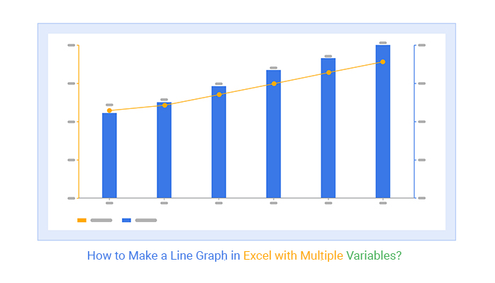
How to make a Line Graph with multiple lines in Excel with multiple variables should never be a nerve-wracking or time-intensive affair. Keep reading to learn more.
There are four variants of Line Graphs you can use in your data stories, namely:
A Dual Axis Bar and Line Chart uses two y-axes to illustrate the relationships between two variables with different magnitudes and scales of measurement.
The relationship between two variables is referred to as correlation. When applying Multivariate Analysis, the visualization design illustrates plenty of information using limited space, and a correlation matrix in Excel makes these relationships easier to interpret. This approach allows you to uncover hidden insights, such as trends and patterns, with ease.
Charts like the Multi-Axis Chart in Excel allow you to emphasize key data points within categories by using a secondary axis. This feature enables you to compare important data points effectively, often through a combination of bars and lines.
An Area Chart is a visualization design that uses a line graph and color combination to display pattern and trend insights into key data points in a specified period.

The visualization design is ideal if your goal is to display trends. One of the best charts to use to track performance in a specified period of time is the Area Chart.
The visualization design is amazingly easy to read and interpret. Furthermore, its minimalist design ensures you’ll never have to obscure key insights.

Visualization Source: ChartExpo
A Vertical Axis Line Chart combines an Area and a Line Graph. Besides, it has a secondary y-axis to help you compare two varying metrics in your data.
Use the visualization design, if your goal is to display comparison insights. The chart is incredibly easy to decode even for non-technical audiences.
To read the chart, check the patterns and trends of the shaded area and the curve for more insights.
A Dual Axis Chart uses two axes to illustrate the relationships between two variables with different magnitudes and scales of measurement.

The relationship between two variables is referred to as correlation. A Dual Axis Chart illustrates plenty of information using limited space. And this means you can uncover hidden insights, such as trends and patterns, easily.
The chart is incredibly easy to decode even for non-technical audiences.
To read the chart, check the patterns and trends of the lines.
In the coming section, we’ll address the following question: how to make a Line Graph in Excel with multiple variables?
Excel is one of the go-to data visualization tools for businesses and professionals.
However, this freemium spreadsheet tool comes with a very basic Line Chart in Excel with multiple variables, which require a lot of extra work in editing. Also, it lacks a sizable number of Line Charts variants highlighted earlier.
Well, you don’t have to do away with the spreadsheet app.
You can turn Excel into a reliable data visualization tool loaded with advanced charts by installing third-party apps, such as ChartExpo.
Like we said, how to make a Line Graph in Excel with multiple variables should never be a time-intensive task. Keep reading to learn more.
ChartExpo is a Line Graph in Excel maker that comes as an add-in you can easily install in your Excel.
With a large number of insightful and ready-to-use visualizations, ChartExpo turns your complex, raw data into compelling, easy-to-digest, visual renderings that tell the story of your data.
This Line Chart generator produces simple and clear visualization designs with just a few clicks. Yes, ChartExpo generates straightforward charts that are easy to interpret, even for non-technical audiences. Plus, if you need to make a graph from a table, ChartExpo simplifies the process, ensuring your data is presented clearly and effectively.


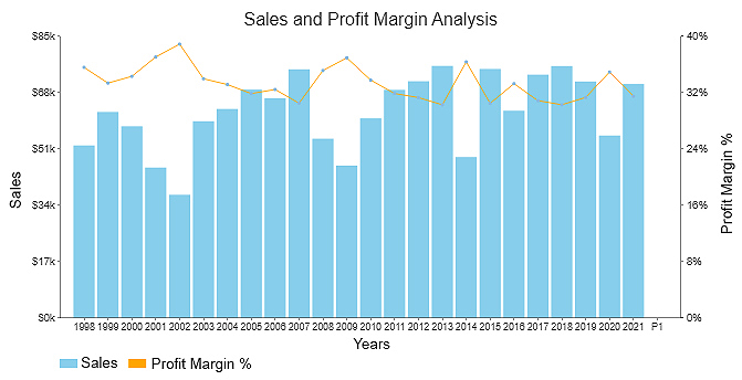
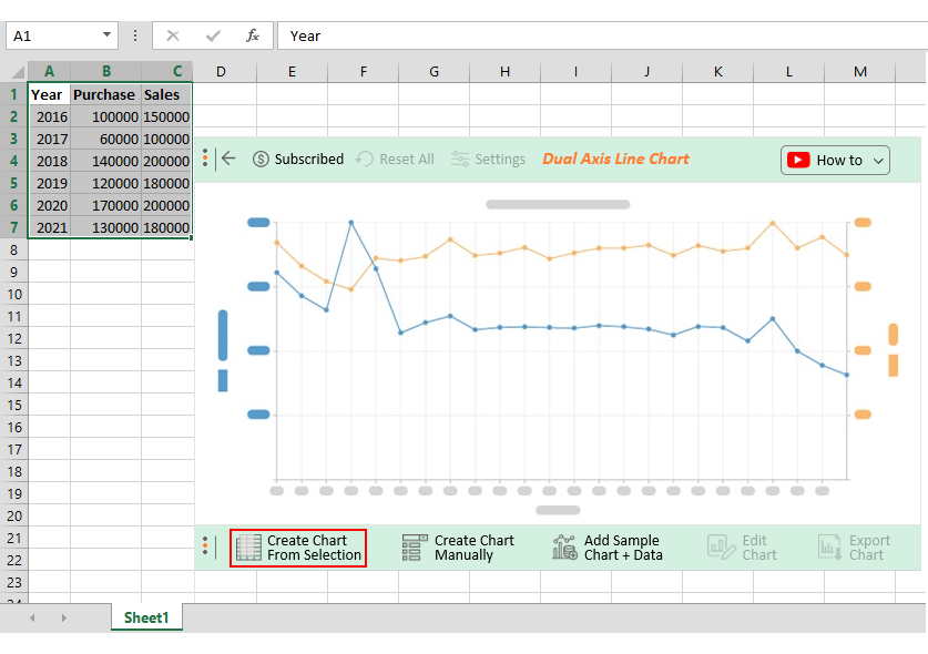
This section will use a Line Graph to display insights into the tabular data below.
| Year | Purchase | Sales |
| 2016 | 100000 | 150000 |
| 2017 | 60000 | 100000 |
| 2018 | 140000 | 200000 |
| 2019 | 120000 | 180000 |
| 2020 | 170000 | 200000 |
| 2021 | 130000 | 180000 |
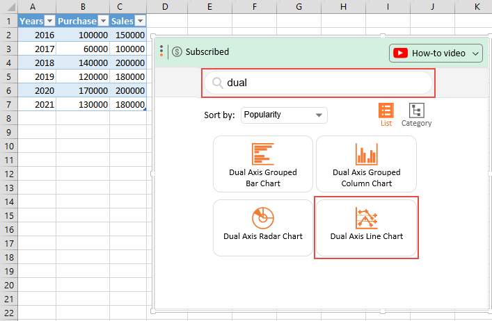
To install ChartExpo into your Excel, click this link.


Avoid cluttering your chart with a lot of information. And this is because it may obscure key insights.
Always use y-axes that start from zero to avoid misrepresentation of data.
Excel is one of the go-to data visualization tools for businesses and professionals.
However, Excel has very basic Line Charts, which require a lot of extra work in terms of editing. But you can supercharge the app by installing add-ins, such as ChartExpo, to access ready-made Line Charts.
As we said, Line Graphs are arguably among the most straightforward visualization designs you can use for visualizing your data in Excel.
There are four variants of Line Graphs you can use in your data stories, namely:
It’s relatively straightforward to plot Line Charts with a single variable. However, it becomes a complex process when you have more than two variables in your data.
Excel is a popular data visualization tool among professionals and owners. However, the application has very basic Line Chart variants. Essentially, you have to manually edit the chart, which is time-intensive.
So, what’s the solution?
We recommend you install third-party apps, such as ChartExpo, into your Excel to access ready-made Line Graphs in Excel.
ChartExpo is an add-in you can easily download and install in your Excel app. Besides, this tool comes loaded with insightful and easy-to-interpret Line Graphs.
Here’s the bottom line: You don’t need programming or coding skills to visualize your data using ChartExpo.
How to make a Line Graph in Excel with multiple variables should never stress you or even consume a lot of your time.
Sign up for a 7-day free trial today to access easy-to-interpret and visually appealing Graphs.
How much did you enjoy this article?


Learn how to use sparklines in Excel to quickly visualize trends inside cells. Discover types, creation steps, customization, use cases, benefits, and best practices.

Learn what a confidence interval graph is, how to create it in Excel, and how to interpret results to make more reliable, data-driven decisions.

A correlation matrix in Excel helps identify relationships between variables. Learn how to create, read, and use it for effective data analysis.


