• Home
  • Tools dropdown img
    • Spreadsheet Charts

      • ChartExpo for Google Sheets
      • ChartExpo for Microsoft Excel
    • Power BI Charts

      • Power BI Custom Visuals by ChartExpo
    • Word Cloud

  • Charts dropdown img
    • Chart Category

      • Bar Charts
      • Circle Graphs
      • Column Charts
      • Combo Charts
      • Comparison Charts
      • Line Graphs
      • PPC Charts
      • Sentiment Analysis Charts
      • Survey Charts
    • Chart Type

      • Box and Whisker Plot
      • Clustered Bar Chart
      • Clustered Column Chart
      • Comparison Bar Chart
      • Control Chart
      • CSAT Survey Bar Chart
      • CSAT Survey Chart
      • Dot Plot Chart
      • Double Bar Graph
      • Funnel Chart
      • Gauge Chart
      • Likert Scale Chart
      • Matrix Chart
      • Multi Axis Line Chart
      • Overlapping Bar Chart
      • Pareto Chart
      • Radar Chart
      • Radial Bar Chart
      • Sankey Diagram
      • Scatter Plot Chart
      • Slope Chart
      • Sunburst Chart
      • Tornado Chart
      • Waterfall Chart
      • Word Cloud
    • Google Sheets
      Microsoft Excel
  • Services
  • Pricing
  • Contact us
  • Blog
  • Support dropdown img
      • Gallery
      • Videos
      • Contact us
      • FAQs
      • Resources
    • Please feel free to contact us

      atsupport@chartexpo.com

Categories
All Data Visualizations Data Analytics Surveys
Add-ons/
  • Google Sheets
  • Microsoft Excel
  • Power BI
All Data Visualizations Data Analytics Surveys
Add-ons
  • Google Sheets
  • Microsoft Excel
  • Power BI

We use cookies

This website uses cookies to provide better user experience and user's session management.
By continuing visiting this website you consent the use of these cookies.

Ok

ChartExpo Survey


Home > Blog > Power BI

Power BI Workspaces: How to Use for Better Visuals

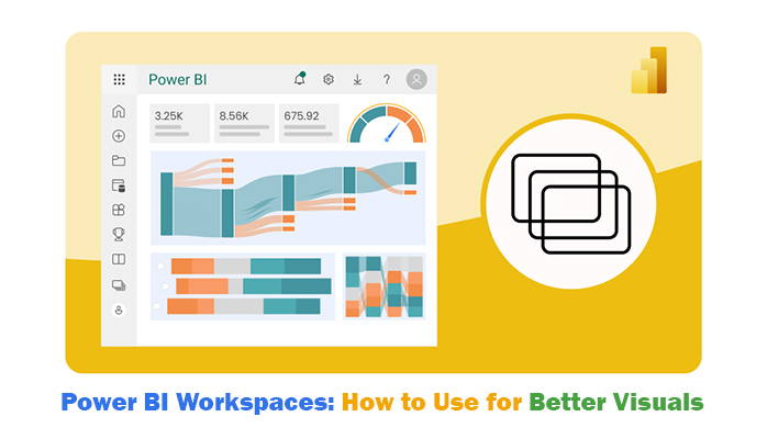
Power BI workspaces are collaborative environments where users can share, organize, and manage reports, datasets, and dashboards. These workspaces help teams to work together, and control access to content and data.

Power BI Workspaces

In this guide, you’ll discover what the workspace in Power BI is, types of Power BI workspaces, permissions in the Premium Power BI Workspace, how to create a Power BI Workspace, and how to view my workspace in Power BI Desktop.

Table of Contents:

  1. What is a Workspace in Power BI?
  2. Power BI Workspace Explanation
  3. Types of Power BI Workspaces
  4. Permissions in the Premium Power BI Workspace
  5. How to Create Power BI  Workspace?
  6. How to View My Workspace in Power BI Desktop?
  7. How to Use Power BI Workspaces?
  8. Advantages of Power BI Workspace
  9. Limitations of Power BI Workspace
  10. FAQs
  11. Wrap Up

What is a Workspace in Power BI?

The Power BI workspace is a container for sharing, organizing, and managing Power BI content like reports, datasets, and dashboards.

It gives users the room to collaborate and control access and ensures a streamlined process for distributing and creating insights across teams (or organizations).
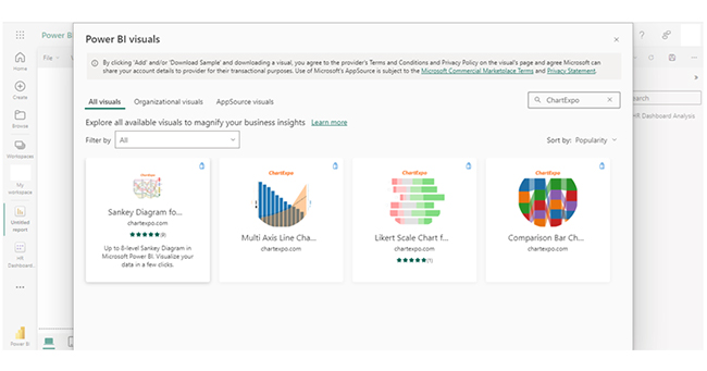
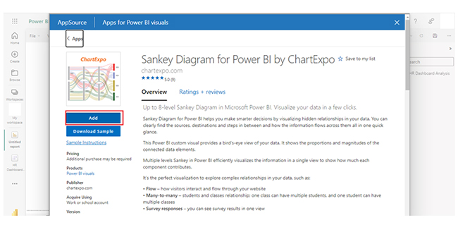
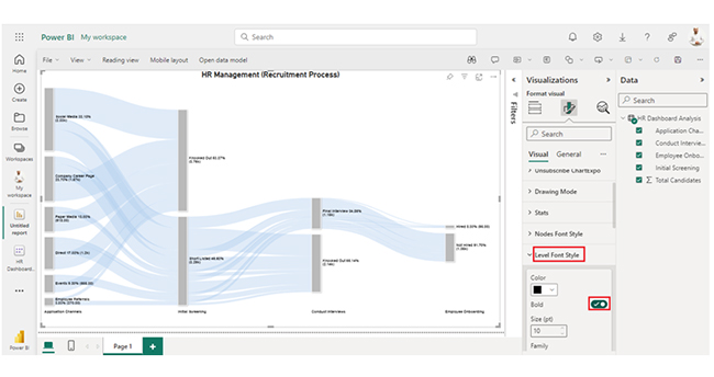
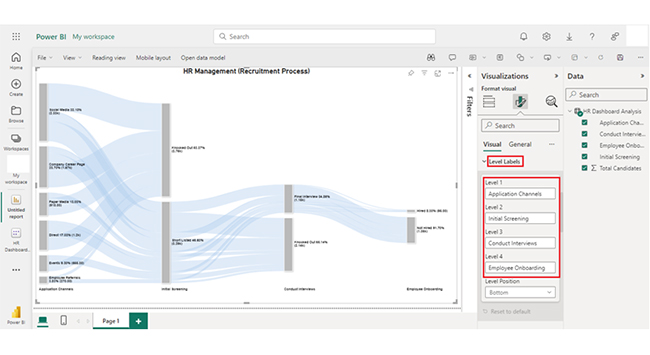
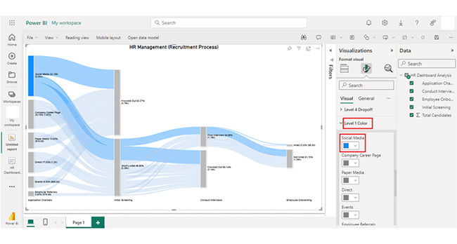
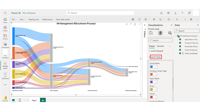
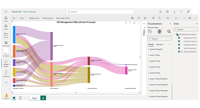
Process of Building a Sankey Diagram in Power BI for Better Data Insights

Process of Building a Sankey Diagram in Microsoft Excel for Better Data Insights

Process of Building a Sankey Diagram in Google Sheets for Better Data Insights

Power BI Workspace Explanation

  1. Collaboration: Workspaces give room for users to work on the same content and roles and permissions manage access levels. For instance, members of a workspace can view, edit, or manage reports, datasets, and dashboards.
  2. Roles and Permissions: Workspaces offer different roles — Admin, Member, Contributor, and Viewer.
  3. Content Management: Users within a workspace can upload and manage reports, dashboards, and datasets. This enables centralized access to all essential analytics for a team.
  4. Data Sharing: Workspaces make it easy to share reports and dashboards with other users in the organization. It ensures the right individuals have access to the right data.
  5. Publishing and Deployment: Users can publish content from the workspace to the Power BI service. This way, it becomes available to external stakeholders, depending on the sharing settings.

Types of Power BI Workspaces

1. Classic Workspaces (Old Experience)

  • Use Case: These were the original workspace version, and are usually used for legacy dashboards and reports.
  • Features:
    • Limited collaboration options.
    • Roles include Admin, Member, Contributor, and Viewer, but with fewer granular permission controls compared to modern workspaces.
    • Primarily designed for small groups (or single-user) control of content.

2. New Workspaces (Modern Workspaces)

  • Use Case: These workspaces are the current standard, and they offer enhanced control and collaboration.
  • Features:
    • Enhanced collaboration with richer role-based access control.
    • Roles are more flexible, and that include Admin, Member, Contributor, and Viewer. Additionally, new roles like Workspace Member and Workspace Admin give room for better control over data and content.
    • Support organizational workspaces, and makes it easier to manage content across the company.

Permissions in the Premium Power BI Workspace

Key Workspace Roles:

  1. Admin: Admin has full control, including managing users, content, and workspace settings.
  2. Member: A member can create, edit, and view content but cannot manage user roles (or workspace settings).
  3. Contributor: A contributor can add content (like reports and dashboards) but cannot modify workspace settings.
  4. Viewer: A viewer has view-only access to content with no editing (or sharing capabilities).

Content Permissions:

  • Datasets: Users with build permissions can create reports. Others can only view (or interact) with data.
  • Reports/Dashboards: Permissions allow either editing (or view-only) access, and that depends on the user’s role.

External Sharing:

Premium workspaces support sharing content externally with users outside your organization. The recipient should have a Power BI Pro license or be within a Premium workspace.

Row-Level Security (RLS):

RLS can be implemented to restrict data access based on the user’s role, and it ensures that the user only sees data relevant to them.
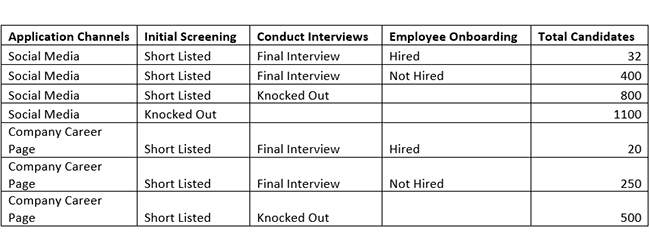
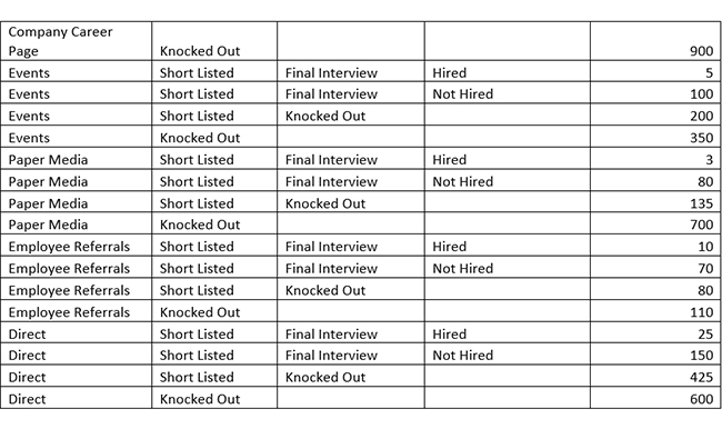
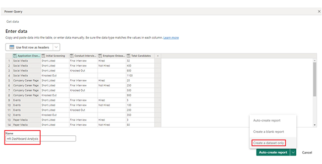
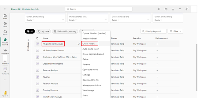
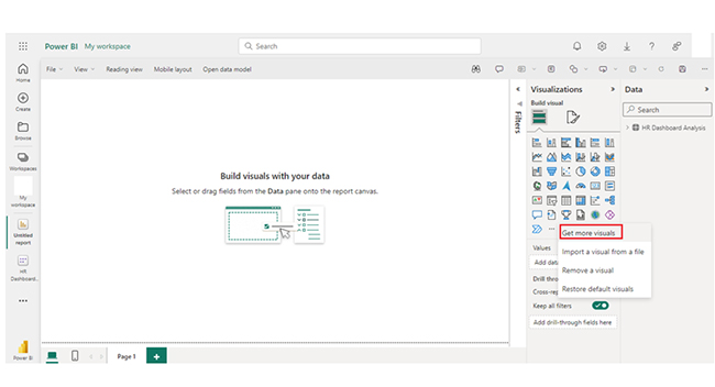
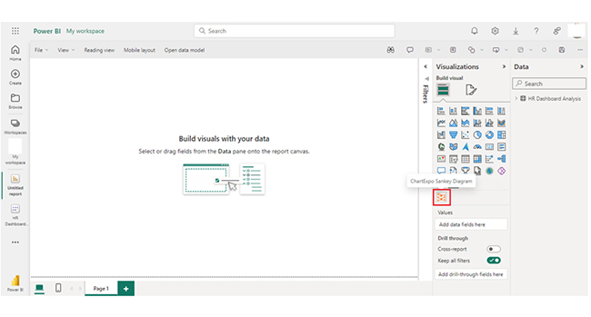
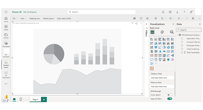
How to Create Power BI  Workspace?

Professionals who use the Power BI in Office 365, Power BI web, and other Power BI service can start creating reports by following the steps below:

  • Stage 1: Log into Power BI, enter your email, and click the “Submit” button.
Power BI Workspaces
  • You’ll be redirected to a Microsoft account. Enter your password, and click “Sign in.”
Power BI Workspaces
  • You can opt to stay signed in.
Power BI Workspaces
  • Stage 2: Create a Data Set and Select the Data Set to Use in the Sankey Chart
  • Navigate to the left-side menu, and click the “Create” option. After that, select “Paste or manually enter data.”
Power BI Workspaces
  • The HR data table below will be used for this illustration.
Power BI Workspaces
Power BI Workspaces
  • Paste the data table above into the “Power Query” window. You’ll have to select the “Create a dataset only” option.
Power BI Workspaces
  • Navigate to the left-side menu, and click on the “Data Hub” option. Power BI populates the data set list. If no data set has been created, you’ll get an error message.
Power BI Workspaces
  • Click on the “Create Report” dropdown.
Power BI Workspaces
  • To add the Power BI Sankey Diagram Extension by ChartExpo, you’ll need to use an add-in or Power BI visual from AppSource. Navigate to the right side of the Power BI dashboard, and open the Power BI Visualizations panel. Click the ellipsis symbol (…) to import the Power BI Sankey Diagram extension by ChartExpo.
  • In the following menu that opens, select the “Get more visuals” option.
Power BI Workspaces
  • Enter “ChartExpo” in the highlighted search box. You’ll see the “Sankey Diagram for Power BI by ChartExpo.”
Power BI Workspaces
  • After that, click on the Sankey Diagram, and also click on the highlighted “Add” button.
Power BI Workspaces
  • Power BI will add the “Sankey Diagram for Power BI by ChartExpo” icon in the data visualization panel.
Power BI Workspaces
  • To draw a Sankey Diagram with ChartExpo’s Power BI extension, you’ll have to select the “Sankey Diagram for Power BI by ChartExpo” icon in the visualization panel. A window similar to the image below opens in the report section of your dashboard.
Power BI Workspaces
  • You’ll have to select the fields in your Sankey chart.
Power BI Workspaces
  • Follow the sequence below when selecting the fields.
    • Application Channels
    • Initial Screening
    • Conduct Interviews
    • Employee Onboarding
    • Total Candidates.
  • You’ll have to provide your email address or a ChartExpo license key. Add the key under the Visual section. After that, the Sankey Chart will display on your screen.
Power BI Workspaces
  • You can add the top header text in the chart under the General section as shown below.
Power BI Workspaces
  • After that, you’ll have to click on the Visual and set the number, and enable the options.
Power BI Workspaces
  • You can change the “Node Font Style.”
Power BI Workspaces
  • You can change the “Level Font Style.”
Power BI Workspaces
  • Here are the Level Labels.
Power BI Workspaces
  • You can change the Nodes color by following the steps below:
Power BI Workspaces
  • Here’s “How to change Level 1 color.” You can follow the same step to change the Nodes color of other levels.
Power BI Workspaces
  • Here’s the final look of the HR Dashboard in Power BI using ChartExpo after changing the all-nodes color.
Power BI Workspaces

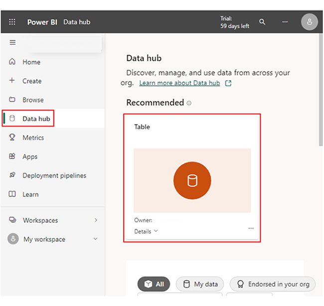
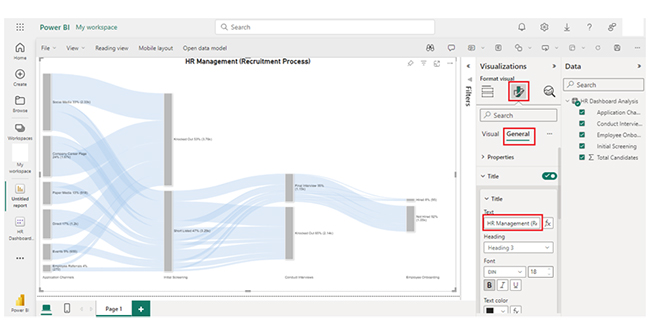
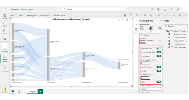
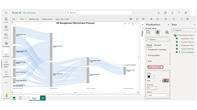
Aside from the Sankey diagram in Power BI, data analysis can be performed using a chart maker and other data visualization tools. To get the most out of your data visualization process, you should explore features in the Power BI dashboard. One of the features to explore is the filters in Power BI.

Insights:

  • Social Media is the primary application channel with the highest number of candidates (1100).
  • The company’s Career Page has 900 candidates.
  • Paper Media and Events have comparatively lower candidate counts (700 and 350, respectively).
  • Direct applications have 600 candidates.

How to View My Workspace in Power BI Desktop?

  1. Open Power BI Desktop: Launch the Power BI Desktop application on your computer.
  2. Sign In: Sign in using your Power BI account to access cloud content.
  3. Get Data from Power BI Service:
    • Click on the “Home” in the ribbon.
    • Select “Get Data” > “Power BI.”
    • You’ll see a list of workspaces and datasets stored in the Power BI service.
  4. Choose Workspace: Select the workspace and the dataset (or report) you want to access. After that, click “Connect” to load the data into the Power BI Desktop.

How to Use Power BI Workspaces?

  1. Create a Workspace: Sign into Power BI Service and create a workspace from the “Workspaces” pane. You have to choose between the personal or Premium workspaces.
  2. Add Content: Upload datasets, create reports, and build dashboards within the workspace. This is done through “Get Data” or by importing content from Excel or other sources.
  3. Manage Permissions: Assign roles (like Admin, Member, Contributor, or Viewer) to control who can view (or edit) content within the workspace.
  4. Collaborate: Share reports, dashboards, and datasets with team members or publish them as apps for wider access.
  5. Monitor and Update: Regularly update content and manage security settings to ascertain that the data is up-to-date and accessible.

Advantages of Power BI Workspace

  1. Collaboration: Multiple team members can collaborate on report creation and data analysis by sharing content and working together in a centralized space.
  2. Access Control: Workspace roles (like Admin, Member, Contributor, and Viewer) enable granular control over who can view, edit, and manage content. This will, in turn, ensure data security.
  3. App Sharing: Workspaces allow users to bundle reports and dashboards into apps for easy distribution across organizations or teams.
  4. Centralized Management: Workspaces organize dashboards, reports, and datasets in one location. This makes it easy to manage and distribute content.

Limitations of Power BI Workspace

  1. Limited Customization: Workspace layouts are basic, and they offer limited customization options for organizing content.
  2. Capacity and Storage: Free workspaces come with limited storage capacity, while Premium workspaces offer enhanced storage but also have limits based on the Power BI Premium capacity.
  3. Complex Permissions: Managing permissions at a granular level can be complex, especially when dealing with multiple content types or large teams.
  4. External Sharing Restrictions: To share content with external users, you’ll need the Power BI Pro licenses (or Premium capacity), and that can be restrictive for some organizations.

The next section will uncover the Power BI dashboard design, and the Power BI report design. You’ll also see a data presentation of a Power BI data model.

FAQs

What is the difference between Power BI apps and workspaces?

Power BI workspaces are collaborative environments for managing and creating content. Power BI apps, on the other hand, are packaged collections of dashboards and reports shared with users. It gives room for easy distribution and consumption.

How many workspaces can you have in Power BI?

There is no fixed limit on the number of workspaces you can create in Power BI. The maximum number depends on your licensing type — the Pro or Premium capacity offers more flexibility.

What are the four roles available in Power BI workspaces?

The four roles available in Power BI workspaces are Admin, Member, Contributor, and Viewer.

Wrap Up

The Power BI workspace is a collaborative environment for managing reports, dashboards, and datasets. It streamlines collaboration, access control, centralized management, scalability, and easy sharing through Power BI apps.

To use the Power BI workspaces effectively, you’ll have to create a workspace, add content, and manage permissions. You also need to collaborate, monitor, and update content.

Collaborating involves sharing reports, dashboards, and datasets with team members. It also involves publishing these reports, dashboards, and datasets as apps for wider access.

You’d agree that data storytelling is an integral part of data analytics (or business analytics). It can also make the data in self-service analytics come alive.

By following the steps in this guide, you’ll be able to use the workspace in Power. Now you know what the Power BI workspace is, how will you incorporate it into your overall visualization process?

How much did you enjoy this article?

PBIAd2
Start Free Trial!
148620

Related articles

next previous
Power BI12 min read

How to Create Sankey Diagram in Microsoft Power BI?

Learn How to Create Sankey Diagram in Microsoft Power BI using Desktop & Web Service. What they are and how to use them effectively.

Power BI8 min read

Power BI Artificial Intelligence: Insights Using Visuals

Discover all there is to know about the Power BI artificial intelligence. You'll also discover how AI is used in Power BI, and how to use it for analysis and more.

Power BI9 min read

Budgeting in Healthcare: Use Visuals to Spot Budget Gaps

This guide helps you discover what budgeting in healthcare is. You'll also discover the factors that affect hospital budgets and types of budgeting in healthcare.

Power BI9 min read

Predictive Analytics in Power BI for Making Insightful Visuals

This guide shows you everything you need to know about Predictive Analytics in Power BI. It also shows you how it works, and how to interpret the results.

Power BI8 min read

Quarterly Business Review Template for Optimum Reports

Discover what the quarterly business review template is. This guide also shows you the best practices to consider when using the QBR template.

ChartExpo logo

Turn Data into Visual
Stories

CHARTEXPO

  • Home
  • Gallery
  • Videos
  • Services
  • Pricing
  • Contact us
  • FAQs
  • Privacy policy
  • Terms of Service
  • Sitemap

TOOLS

  • ChartExpo for Google Sheets
  • ChartExpo for Microsoft Excel
  • Power BI Custom Visuals by ChartExpo
  • Word Cloud

CATEGORIES

  • Bar Charts
  • Circle Graphs
  • Column Charts
  • Combo Charts
  • Comparison Charts
  • Line Graphs
  • PPC Charts
  • Sentiment Analysis Charts
  • Survey Charts

TOP CHARTS

  • Sankey Diagram
  • Likert Scale Chart
  • Comparison Bar Chart
  • Pareto Chart
  • Funnel Chart
  • Gauge Chart
  • Radar Chart
  • Radial Bar Chart
  • Sunburst Chart
  • see more
  • Scatter Plot Chart
  • CSAT Survey Bar Chart
  • CSAT Survey Chart
  • Dot Plot Chart
  • Double Bar Graph
  • Matrix Chart
  • Multi Axis Line Chart
  • Overlapping Bar Chart
  • Control Chart
  • Slope Chart
  • Clustered Bar Chart
  • Clustered Column Chart
  • Box and Whisker Plot
  • Tornado Chart
  • Waterfall Chart
  • Word Cloud
  • see less

RESOURCES

  • Blog
  • Resources
  • YouTube
SIGN UP FOR UPDATES

We wouldn't dream of spamming you or selling your info.

© 2025 ChartExpo, all rights reserved.