• Home
  • Tools dropdown img
    • Spreadsheet Charts

      • ChartExpo for Google Sheets
      • ChartExpo for Microsoft Excel
    • Power BI Charts

      • Power BI Custom Visuals by ChartExpo
    • Word Cloud

  • Charts dropdown img
    • Chart Category

      • Bar Charts
      • Circle Graphs
      • Column Charts
      • Combo Charts
      • Comparison Charts
      • Line Graphs
      • PPC Charts
      • Sentiment Analysis Charts
      • Survey Charts
    • Chart Type

      • Box and Whisker Plot
      • Clustered Bar Chart
      • Clustered Column Chart
      • Comparison Bar Chart
      • Control Chart
      • CSAT Survey Bar Chart
      • CSAT Survey Chart
      • Dot Plot Chart
      • Double Bar Graph
      • Funnel Chart
      • Gauge Chart
      • Likert Scale Chart
      • Matrix Chart
      • Multi Axis Line Chart
      • Overlapping Bar Chart
      • Pareto Chart
      • Radar Chart
      • Radial Bar Chart
      • Sankey Diagram
      • Scatter Plot Chart
      • Slope Chart
      • Sunburst Chart
      • Tornado Chart
      • Waterfall Chart
      • Word Cloud
    • Google Sheets
      Microsoft Excel
  • Services
  • Pricing
  • Contact us
  • Blog
  • Support dropdown img
      • Gallery
      • Videos
      • Contact us
      • FAQs
      • Resources
    • Please feel free to contact us

      atsupport@chartexpo.com

Categories
All Data Visualizations Data Analytics Surveys
Add-ons/
  • Google Sheets
  • Microsoft Excel
  • Power BI
All Data Visualizations Data Analytics Surveys
Add-ons
  • Google Sheets
  • Microsoft Excel
  • Power BI

We use cookies

This website uses cookies to provide better user experience and user's session management.
By continuing visiting this website you consent the use of these cookies.

Ok

ChartExpo Survey


Home > Blog > Power BI

Power BI Quick Measure: Boosting Efficiency and Insights

Power BI supports both implicit and explicit quick measures. Internal calculations that Power BI automatically generates are implicit quick measures, while complex calculations users create are typically represented as model and Power BI quick measures. These are usually easy to change and implement.

Power BI Quick Measure

In this guide, you’ll discover what Power BI quick measure is, and why it is important. You’ll also discover how to create a quick measure.

Table of Contents:

  1. Define a Quick Measure in Power BI
  2. Why is Quick Measure in Power BI important?
  3. Difference between Measures vs Quick Measure in Power BI
  4. How to Create Power BI Quick Measures?
  5. How to Use Quick Measure in Power BI?
  6. How to Analyze Quick Measures in Power BI?
  7. Wrap Up

First…

Define a Quick Measure in Power BI

Definition: Quick measures are used for performing calculations. They are made of Data Analysis Expressions (DAX) queries that run in the background, and the results are usually displayed in the report.

Therefore, writing DAX queries in Power BI is unnecessary when creating quick measures or calculated measures, as the calculations running in the background will automatically be displayed in the report.

Why is Quick Measure in Power BI important?

Quick Measure in Power BI is important for several reasons:

  1. Ease of Use: With quick measures, you don’t need to have deep knowledge of DAX or be familiar with the DAX format before creating common calculations. It’s a good fit for users who cannot write complex DAX formulas.
  2. Accuracy and Consistency: Quick measures take advantage of consistent and accurate calculation patterns. This reduces the chances of error as calculations adhere to best practices and standard methodologies.
  3. Time Savings: With mere clicks, quick measures enable users to create powerful calculations. This eliminates the time spent on the manual creation of DAX expressions. It also helps report builders and analysts spend more time analyzing data and drawing insights from it.
  4. Customization and Flexibility: Quick measures give room for data customization. Users can customize their DAX code to meet their desired requirements. It also enables them to tweak calculations in such a way that aligns with their business needs.
  5. Standardization: Quick measures always come with standardized calculation templates. This ensures that there is consistency across dashboards and reports.

Difference between Measures vs Quick Measure in Power BI

Here are the major differences between Measures vs Quick measures in Power BI.

Measures:

  • Definition: Power BI measures are typically written in DAX and they’re used for performing transformations, calculations, and aggregations on data within the Power BI model.
  • Manual Creation: Measures are manually created and they’re written using DAX formulas. To get started, you need to have a good grasp of DAX syntax and functions.
  • Flexibility and Control: Since measures are created from scratch, users get full control and flexibility over the calculations and logic. Users have the option of customizing measures to fit their business.

Quick Measures:

  • Definition: Quick measures are predefined patterns or calculation templates offered by Power BI. Quick measures enable users to perform calculations without manually writing DAX codes.
  • Template-based Creation: Users can choose calculation types and input parameters when working with quick measures. Power BI also generates the DAX formula that fits your chosen template.
  • Ease of Use: Quick measures are simple and accessible and they’re a good fit for users who are not familiar with DAX. It gives users the option of creating complex calculations using a few clicks.

How to Create Power BI Quick Measures?

Here’s a brief overview of how to create quick measures.

  1. Access Quick Measure: After opening Power BI Desktop, go to the “Modeling” tab.
  2. Initiate New Quick Measure: Select “New Quick Measure” to get the Quick Measures dialog box opened.
  3. Select Calculation Type: Choose your desired calculation type from a list of categories like Time Intelligence and Aggregation. Common examples include Year-to-Date Total, Average, and Sum.
  4. Specify Calculation Inputs: From your calculation type, choose your preferred fields (or columns) from the data model. For instance, you can choose a date field for time-based calculations.
  5. Configure Additional Parameters: There are instances where you’ll need additional parameters when working with quick measures. These could be base measures when working with percentage calculations.
  6. Review and Name: Review your quick measure, and come up with a custom name (if needed).
  7. Create the Quick Measure: To generate your quick measure, click “OK.” After that, a new measure will be automatically created by Power BI.
  8. Utilize in Reports: The new quick measure is made available in the Power BI reports. To analyze data based on your calculated values, you’ll have to drag the quick measure onto the visuals and drop it. Visuals could be charts or tables.
  9. Optional Customization: There is an option to customize the DAX formula. To do that, you’ll have to edit the quick measure in your fields pane.

How to Use Quick Measure in Power BI?

From the demonstration file in File Explorer, let’s create a quick measure for the average sale in each region. Navigate to the Reports window Quick Measure, and take the steps below.

  1. Navigate to the Visualization pane, and click “Matrix.”
  2. Expand your customer table, and drag the “Country-Regions” onto the Rows bucket.
  3. Expand your Sales table, and drag the Sale Amount onto the Values bucket. That is seen in Figure A.
Figure A of Power BI Quick Measure

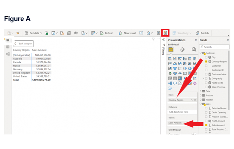
The quick measure will be added to the table by Power BI. You’ll have to select the Sales table at this stage. Since the matrix visualization has already been selected, you’ll need to click on the quick measure icon. The quick measure icon is found at the top-right side and it has a lightning bolt sign.

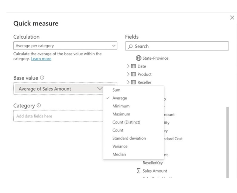
From the Calculation dropdown menu that shows up on the next page, choose Average Per Category. Next, expand the Sales table, and drag the Sales Amount onto the Base Value bucket. Click on the dropdown menu, and select Average (Figure B).

Figure B

Figure B of Power BI Quick Measure

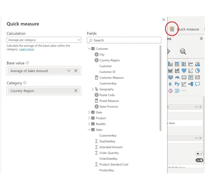
Expand your customer table, and drag the Country-Region onto the Category bucket (Figure C). After that, click OK.

Figure C

Figure C of Power BI Quick Measure

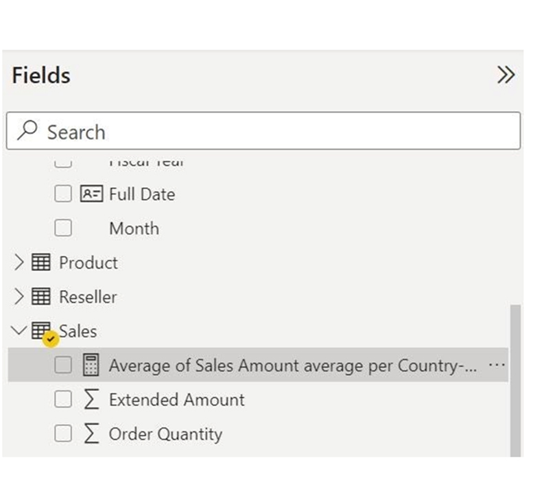
From Figure D, you’ll notice that the new quick measure is added to the Sales table by Power BI. However, it won’t be displayed by Power BI until you add it.

Figure D

Figure D of Power BI Quick Measure

Before moving on, you should change the default name. Here’s how to do that:

  • Right-click on the quick measure icon, and choose the rename option.
  • Enter the new name. You can include the word “measure” during the naming.

Figure E below shows you how to add the new measure to the matrix visualization.

Figure E of Power BI Quick Measure

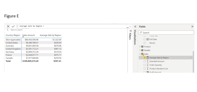
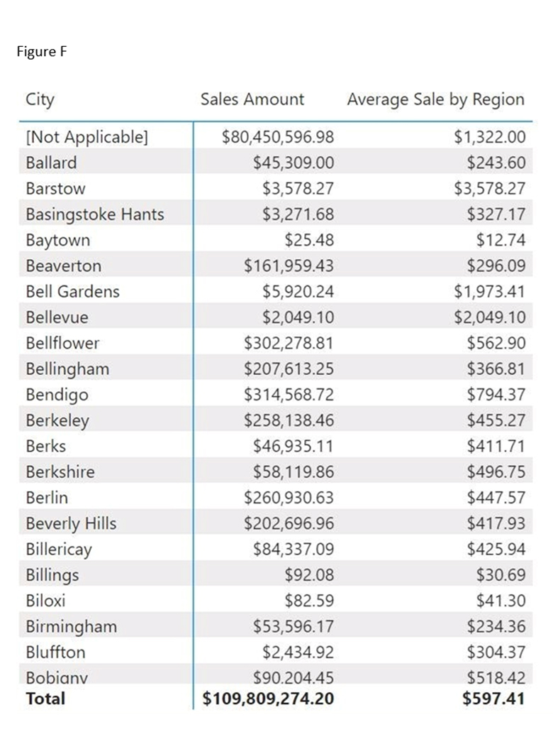
The new measure will most likely work in the other visualization. From Figure F, you’ll see that the quick measure updates align with any changes made. For instance, the quick measure updates to accommodate changes made when the Country-Region field is removed, and City is added. You can also shorten the name to “Average Sale.”
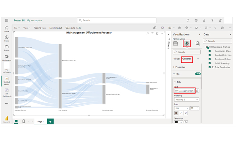
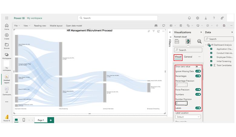
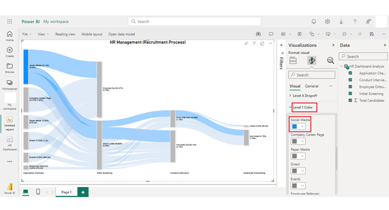
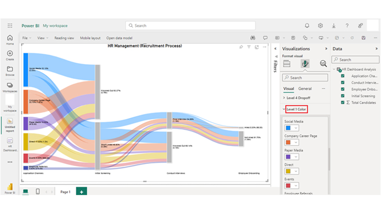
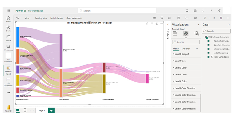
Figure F of Power BI Quick Measure

How to Analyze Quick Measures in Power BI?

Stage 1: Logging in to Power BI

  • Log in to Power BI.
  • Enter your email address and click the “Submit” button.
Enter email to login to Power BI
  • You’ll be redirected to a Microsoft account. Enter the password and select the “Sign in” option.
Enter Password to login to Power BI
  • Choose to stay signed in.
Click on stay signed in
  • After that, the Power BI home screen will be displayed.

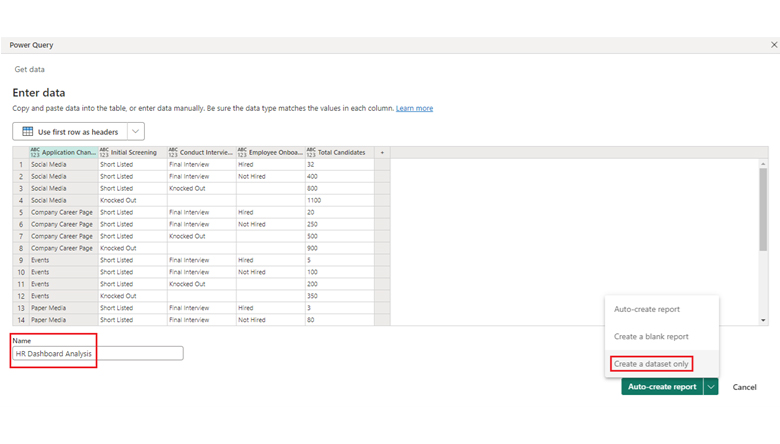
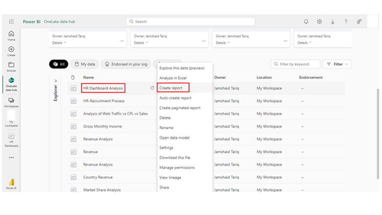
Stage 2: Create a Data Set and Select the Data Set to be used in the Sankey Chart.
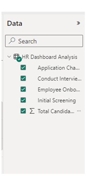
  • On the left-side menu, click on the “Create” button.
  • Choose “Paste or manually enter data.”
select Paste or manually enter data in Power BI ce487
  • The sample data below will be used for this illustration.
Application Channels Initial Screening Conduct Interviews Employee Onboarding Total Candidates
Social Media Short Listed Final Interview Hired 32
Social Media Short Listed Final Interview Not Hired 400
Social Media Short Listed Knocked Out 800
Social Media Knocked Out 1100
Company Career Page Short Listed Final Interview Hired 20
Company Career Page Short Listed Final Interview Not Hired 250
Company Career Page Short Listed Knocked Out 500
Company Career Page Knocked Out 900
Events Short Listed Final Interview Hired 5
Events Short Listed Final Interview Not Hired 100
Events Short Listed Knocked Out 200
Events Knocked Out 350
Paper Media Short Listed Final Interview Hired 3
Paper Media Short Listed Final Interview Not Hired 80
Paper Media Short Listed Knocked Out 135
Paper Media Knocked Out 700
Employee Referrals Short Listed Final Interview Hired 10
Employee Referrals Short Listed Final Interview Not Hired 70
Employee Referrals Short Listed Knocked Out 80
Employee Referrals Knocked Out 110
Direct Short Listed Final Interview Hired 25
Direct Short Listed Final Interview Not Hired 150
Direct Short Listed Knocked Out 425
Direct Knocked Out 600
  • Navigate to the “Power Query” window and paste the data table above. From the list that comes up, choose “Create a dataset only.”
Click Create a Dataset Only of Power BI Quick Measure
  • From the left-side menu, select the “Data Hub” option. If there’s a data set list, it will get populated by Power BI. However, if there is no data set list, an Error message will be displayed.
Click Data Hub for Power BI Quick Measure
  • From the dropdown menu, click on “Create report.”
Click Create Report of Power BI Quick Measure
  • If you’re using ChartExpo, you can add the Power BI Sankey Diagram Extension by following the steps below.
    • You need to have the add-in or get the Power BI visual from AppSource
    • The Power BI visualization panel is found on the right side of the Power BI dashboard
    • Click on the ellipsis symbol (…)
    • From the menu that comes up, choose “Get more visuals.”
Click Get More Visuals of Power BI Quick Measure
  • In the next window that opens up, input “ChartExpo” into the search box. The “Sankey Diagram for Power BI by ChartExpo” will be displayed, click on it.
Click Sankey Diagram Icon of Power BI Quick Measure
  • Click on the “Add” button.
Click Add Button of Power BI Quick Measure
  • The “Sankey Diagram for Power BI by ChartExpo” icon will be added to the visualization panel.
Sankey Diagram Icon Added of Power BI Quick Measure
  • To draw a Sankey Diagram with ChartExpo Power BI extension, you’ll have to:
    • Choose the “Sankey Diagram for Power BI by ChartExpo” option from the visualization panel.
  • After that, a window similar to the one below will be displayed on your screen.
Choose Sankey Diagram Icon of Power BI Quick Measure
  • Choose the fields you’ll use from the given options.
Choose Fields of Power BI Quick Measure
  • When selecting the fields, follow the sequence below:
    • Application Channels
    • Initial Screening
    • Conduct Interviews
    • Employee Onboarding
    • Total Candidates.
  • You’ll have to provide your email address or ChartExpo license key. You’ll see a space where you’ll input the license key.
Add License Key for Creating Visuals Power BI Quick Measure
  • Your chart will be displayed after you’ve inputted the key. Navigate to the General section and add the top header under it.
Add Top Header of Power BI Quick Measure
  • Click on the visual to set your number and enable the options as shown below.
Click Enable Visual Numbers of Power BI Quick Measure
  • The image below shows you how to change the “Node Font Style.”
Change Node Font Style of Power BI Quick Measure
  • Here’s how to change the “Level Font Style.”
Change Level Font Style of Power BI Quick Measure
  • The image below shows you the Level Labels.
Level Labels of Power BI Quick Measure
  • The image below shows you how to change the Node’s color.
Change 1st Node Colors of Power BI Quick Measure
  • From the image above, you’ll see “How to change Level 1 color.” The image below shows you how to change the node color of other levels.
Change All Node Colors of Power BI Quick Measure
  • After changing the color of all nodes, here’s what the HR dashboard looks like.
Final Power BI Quick Measure

Insights

  • The application channel that has the highest number of candidates (1100) is social media.
  • 600 candidates applied directly
  • Social media has the highest number of shortlisted candidates (32 hired, 400 not hired).
  • Paper Media and Events have the lowest number of shortlisted candidates.

FAQs

How do I edit a quick measure in Power BI?

You’ll need to right-click on the quick measure in the field plane. After that, choose the “Edit” option to modify the DAX formula.

What time intelligence calculations are supported by quick measures?

Time intelligence calculations supported by the quick measure are the same Period Last Year, Moving Total, Previous Period Total, and Year-to-Date Total.

Wrap Up

Quick measure in Power BI is a calculation mode that enables the user to create quick measures without the need to write DAX code. It enables faster development of reports and eases the creation process for non-experts. It also helps to ascertain that calculations across multiple reports are consistent.

Creating an attractive dashboard in Power BI involves the use of a Sankey chart, and also similar visualizations. This visualization helps to effectively evaluate data.

Power BI quick measure can serve as an educational resource for users who are learning DAX. With Power BI quick measure, users can easily take a close look at generated DAX code and figure out the underlying logic.

Now you know how Power BI quick measure works, what data will you be representing with the tool?

How much did you enjoy this article?

PBIAd1
Start Free Trial!
136012

Related articles

next previous
Power BI12 min read

Power BI Group By Guide for Effective Data Insights

Learn how Power BI Group By helps you aggregate data, clarify trends, and create reports by grouping values to make large datasets manageable & insightful.

Power BI12 min read

How to Create Sankey Diagram in Microsoft Power BI?

Learn How to Create Sankey Diagram in Microsoft Power BI using Desktop & Web Service. What they are and how to use them effectively.

Power BI8 min read

Power BI Artificial Intelligence: Insights Using Visuals

Discover all there is to know about the Power BI artificial intelligence. You'll also discover how AI is used in Power BI, and how to use it for analysis and more.

Power BI9 min read

Budgeting in Healthcare: Use Visuals to Spot Budget Gaps

This guide helps you discover what budgeting in healthcare is. You'll also discover the factors that affect hospital budgets and types of budgeting in healthcare.

Power BI9 min read

Predictive Analytics in Power BI for Making Insightful Visuals

This guide shows you everything you need to know about Predictive Analytics in Power BI. It also shows you how it works, and how to interpret the results.

ChartExpo logo

Turn Data into Visual
Stories

CHARTEXPO

  • Home
  • Gallery
  • Videos
  • Services
  • Pricing
  • Contact us
  • FAQs
  • Privacy policy
  • Terms of Service
  • Sitemap

TOOLS

  • ChartExpo for Google Sheets
  • ChartExpo for Microsoft Excel
  • Power BI Custom Visuals by ChartExpo
  • Word Cloud

CATEGORIES

  • Bar Charts
  • Circle Graphs
  • Column Charts
  • Combo Charts
  • Comparison Charts
  • Line Graphs
  • PPC Charts
  • Sentiment Analysis Charts
  • Survey Charts

TOP CHARTS

  • Sankey Diagram
  • Likert Scale Chart
  • Comparison Bar Chart
  • Pareto Chart
  • Funnel Chart
  • Gauge Chart
  • Radar Chart
  • Radial Bar Chart
  • Sunburst Chart
  • see more
  • Scatter Plot Chart
  • CSAT Survey Bar Chart
  • CSAT Survey Chart
  • Dot Plot Chart
  • Double Bar Graph
  • Matrix Chart
  • Multi Axis Line Chart
  • Overlapping Bar Chart
  • Control Chart
  • Slope Chart
  • Clustered Bar Chart
  • Clustered Column Chart
  • Box and Whisker Plot
  • Tornado Chart
  • Waterfall Chart
  • Word Cloud
  • see less

RESOURCES

  • Blog
  • Resources
  • YouTube
SIGN UP FOR UPDATES

We wouldn't dream of spamming you or selling your info.

© 2025 ChartExpo, all rights reserved.