Categories
In today’s era of customer reviews and online forums, you can’t just pay for marketing and try to cover up your company’s flaws.


Customers today may spread positive and negative opinions about your company. Your employees are also in a position to either boost or damage your company’s image as an employer.
So, how can you make sure that people are talking positively about your brand? You collect customer and worker feedback data and act on it.
And how would you go about gathering that information? Using a Likert-type scale is one approach. This article will explain why it’s important to pay attention to the frequency of the Likert scale.
Definition: Respondents are asked to rate how often they engage in certain behaviors or hold certain attitudes using a range of possibilities known as “frequency” on a Likert scale. An individual may be asked to score their level of agreement with a statement like “I exercise regularly” using a Likert scale, with response possibilities including “Never,” “Rarely,” “Sometimes,” “Often,” and “Always.”
The Likert scale is commonly employed in survey research to gauge respondents’ opinions, perspectives, and actions. It enables researchers to quantify the intensity and trend of people’s attitudes and actions using a numerical scale amenable to analysis.
Researchers can use Likert scale frequency responses to inform public policy, marketing, and other fields.
The Likert scale frequency can help survey researchers assess how often people do specific things or have certain views. Comprehending frequency can hold significance for various purposes:
The Likert scale frequency pertains to the count of instances wherein the participants choose a specific response alternative. To determine the frequency of a Likert scale, one must undertake the following steps:
To determine the frequency and proportion of responses on a Likert scale, it is necessary to tally the number of responses that correspond to each category and subsequently compute the ratio of responses in each category.
The following is an illustration of how to accomplish this task:
Assuming a Likert scale of 1 to 5, where 1 denotes “Never,” and 5 represents “Often,” a survey has been administered. One has received a total of one hundred responses, and how these responses are distributed is as follows:
To determine the frequency of individual response categories, one would conduct a count of the total number of responses within each respective category. As an illustration, the data set comprises 10 observations in Category 1, 20 in Category 2, and so forth.
To determine the proportion of responses within each category, one would divide the frequency of each type by the total number of reactions and subsequently multiply the result by 100.
An illustration of the percentage of responses in category 1 can be computed as follows: multiplying the ratio of 10 responses to 100 responses, which is 0.1, by 100, the resulting percentage is 10%.
Likewise, the proportion of reactions falling under category 2 can be calculated as follows: (20 / 100) x 100 = 20%.
Subsequently, the remaining classifications will follow suit.
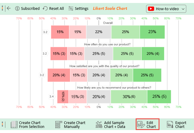
The next step, after data collection, is to analyze the information. While Excel is useful for tabulating data, analyzing it can yield much greater insights.
Excel offers several options for presenting data; however, these may be limited when analyzing data from a website design survey due to potential constraints in representation.
Add-ons from outside sources, such as ChartExpo, can be helpful in this regard.
ChartExpo provides tools that make it easier to interpret data effectively.
The capacity to create dynamic charts, the library’s user-friendliness, and the room for personalization are just a few reasons this resource is valuable.
Using ChartExpo, you can easily make eye-catching charts, including those for a 4-point Likert scale, that will aid in comprehending and sharing the findings of your survey about website design.
How to Install ChartExpo in Excel?
ChartExpo charts and graphs are available both in Google Sheets and Microsoft Excel. Please use the following CTAs to install the tool of your choice and create beautiful charts with a few clicks in your favorite tool.
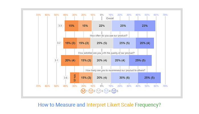
Suppose an online survey is conducted to obtain feedback for enhancing a recently launched product. Upon receiving sufficient data from various customers, the objective is to conduct a pooled analysis of the customer feedback. Survey Questionnaire Examples for this scenario Questionnaire Design are:
A good questionnaire endeavors to distinguish your needs from your desires. It should be of value and originate from the respondent’s perspective. Questionnaires should be succinct and straightforward, eliciting the respondent’s experience with your organization.
You were anticipating a response to each of the following questions:
One of the most efficient and inexpensive ways to find out what your consumers think about your company is to send them a questionnaire.
The Survey was conducted, and subsequently, the data table was generated as presented below:
| How often do you use our product? | How satisfied are you with the quality of our product? | How likely are you to recommend our product to others? |
| Never | Rarely | Never |
| Rarely | Often | Often |
| Sometimes | Never | Rarely |
| Often | Sometimes | Sometimes |
| Sometimes | Often | Often |
| Never | Often | Never |
| Often | Never | Sometimes |
| Often | Often | Often |
| Sometimes | Rarely | Often |
| Rarely | Sometimes | Rarely |
| Never | Always | Often |
| Often | Always | Sometimes |
| Often | Never | Often |
| Always | Sometimes | Always |
| Sometimes | Always | Always |
| Always | Always | Always |
| Always | Never | Sometimes |
| Sometimes | Always | Always |
| Rarely | Sometimes | Rarely |
| Always | Rarely |


Likert scales often fail to capture nuanced frequency variations. For example, respondents who choose “Often” might experience the frequency differently based on context, but this subtlety is lost in a fixed-scale response.
Terms like “Never,” “Rarely,” “Sometimes,” “Often,” and “Always” are subjective and may be interpreted differently by respondents, leading to inconsistent results.
Respondents are restricted to a fixed set of frequency options, which may not align with their experience, potentially leading to biased or inaccurate data.
Some respondents might avoid extreme options, leading to a clustering of responses around the middle (e.g., “Sometimes”), which may not accurately reflect their true frequency.
Respondents might overstate or understate their behavior or feelings to align with socially acceptable norms, especially for frequency questions related to sensitive topics.
Likert scales measure perceptions of frequency rather than absolute frequency (e.g., the exact number of times an event occurred), which may be less precise for certain research needs.
Responses are isolated from contextual factors, such as why or when certain frequencies occur, limiting the depth of the analysis.
Ensure response options (e.g., Never, Sometimes, Often, Always) are well-defined and easy to understand to avoid confusion.
Provide an equal number of positive and negative choices to prevent bias and ensure fair data representation.
A 5- or 7-point scale is ideal for capturing meaningful variations without overwhelming respondents with too many choices.
Arrange response options in a natural order from least to most frequent, making it intuitive for respondents.
Pilot your survey with a small group to ensure respondents interpret the scale correctly and provide reliable data.
Choose a frequency scale that fits the type of insights you need, whether measuring customer habits, employee feedback, or service usage patterns.
The five most fundamental questions in any survey’ how, why, who, when, and what’ rarely receive any responses. They really ought to, though. Before composing your survey, please take a few moments to complete these five questions.
The famous 7-point Likert Scale has been used since its creation in 1932. It gives respondents a choice between two moderate viewpoints, two extreme viewpoints, two intermediate viewpoints, and one neutral viewpoint.
The following is a sample frequency-based 7-point Likert scale.
How often do you use the product or service?
In a survey questionnaire, frequency refers to how often a particular response or answer appears in the collected data. It helps analyze trends and patterns in respondent answers.
In many ways, data analysis is more complex than astrophysics. Before getting into data analysis, it is crucial to gather a meaningful dataset. The atmosphere and the individuals in it could make this problematic.
You can use a Likert scale survey to find out how people feel about something. Unfortunately, some people may need to be kinder to deliver an impartial evaluation. People can have so many ideas at once that they might rush through your survey.
A Likert scale frequency survey is deemed significant in obtaining customer feedback on a product. It enables researchers to gauge the frequency of product usage, the incidence of encountered issues, and the level of customer satisfaction.
The data above can be utilized to enhance the quality of the product, pinpoint specific areas that require improvement, and augment the level of contentment among customers.
How much did you enjoy this article?


Google Forms to Google Sheets keeps your data organized and current with every submission. Learn the steps, methods, and tips now!

Product survey questions reveal what customers truly think. Learn how to ask the right ones and act on the survey results. Read on!

Learn how the 5-Point Performance Rating Scale improves employee evaluations with clear, consistent, and fair performance reviews across teams.


