Categories
In statistics, you primarily deal with data collection, analysis, and presentation.


These three tasks are essential to help you achieve your objective of obtaining facts from your field. When you carry out research or a survey task, the result is to present the same information to your target audience.
Our primary focus is on how you present your findings. This is where data visualization comes in to save your day.
When you collect survey data about how the general public feels about your business, a chart called the Likert Scale can significantly help you.
This blog will help you understand how to present Likert Scale data to your target audience. Buckle up as we get to know more about a Likert Scale.
Definition: A Likert Scale is a visualization scale with two opposing poles. This scale visualizes how respondents choose agreement and disagreement levels.
Let us delve more profoundly into this scale.
You can use the Likert Scale to identify other people’s opinions, attitudes, and feelings about a specific product and service you provide.
You will visualize such information to obtain meaningful insights in such a case. This will also help you understand how to present Likert Scale data to your target audience.
As a business owner, knowing how your customers feel about your business services is essential. You want to understand if your customers are pleased or unhappy with your particular service. And for that, you will need to know how to visualize survey results.
Others, such as entertainment shows, can also benefit from such visualizations because they are interested in knowing how their audience feels. Therefore, collecting survey responses from some of your audiences is crucial.
If you have a marketer, psychologist, or sociologist profession, presenting Likert scale data is meant for you. This is because your career involves interacting with others to obtain their feedback and views about particular topics of interest.
Through such interaction, you can collect views from different people. By the end of it all, it is essential to understand how to report Likert scale data.
Let’s reveal one interesting fact about the Likert Scale.
The chart assumes that opinions, attitudes, and feelings are always in linear form.
Essentially, the path from an agreement to a disagreement is usually one that follows a straight line. Preparing your survey data and then presenting it on a Likert Scale is usually tedious work.
With that in mind, let us understand how to present Likert Scale data.
When presenting Likert Scale data, your goal is to make it presentable. You want to present a Likert Scale with meaningful insights your target audience can easily identify.
The Likert Scale is the best way to present survey results because it has unique features that make it easy to read and interpret.
Let’s discuss these unique features that should be present in a Likert Scale Chart.
A question section has a phrase you used in your question.
There is a bar that is divided into various segments. Still, every section has its inner labels.
There are Stats, which is the overall scale for your question. Stats are always auto-calculated.
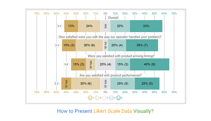
Below is an example of how a Likert Scale should look like.

From the image, the example used is a 5-scale Likert Chart. The bar has five different colors you can use. The colors help your target audience to differentiate the responses easily. If you look into the image, you will notice the following:
The width of each bar is calculated based on the response values. Understanding your visualization will help you understand how to present Likert Scale Data.
Before you understand how to present Likert Scale data in a table, it is essential you understand how to prepare the survey results.
For visualization to bear fruit, you need to fill a table on the responses you collected. Some of the information you need to fill in your table includes:
Questions: These are the phrases you asked your respondents in your survey.
Scale: These range from one extreme positive attitude to a negative attitude. A Likert scale can be a 3-range, 5-range, or up to 10-range. Some of the most famous Likert scales used in surveys are:
Responses: These are the number of people who answered the survey for individual ranges. They give their feedback or opinions to the questions you provide.
For example, you can ask, ” Were you satisfied with the product arrival timing?” this is your question.
Such a question will require that you use a 5-Likert Scale. 1 for Strongly Dissatisfied, 2 for Dissatisfy, 3 for Neutral, 4 for Satisfy, and 5 for Strongly Satisfy. These 1, 2, 3, 4, and 5 are your Scales.
Let’s assume 292 people answered 1 (Strongly Dissatisfied), 242 answered 2 (dissatisfied), 491 answered 3 (Neutral), 787 answered 4 (Strongly Satisfy), and 834 answered 5 (Satisfy). So you got 292 responses for 1, 242 responses for 2, 491 responses for 3, 787 responses for 4, and 834 responses for 5.
Your table will appear as shown below.
| Questions | Scale | Responses |
| Were you satisfied with product arriving timing? | 1 | 292 |
| Were you satisfied with product arriving timing? | 2 | 242 |
| Were you satisfied with product arriving timing? | 3 | 491 |
| Were you satisfied with product arriving timing? | 4 | 787 |
| Were you satisfied with product arriving timing? | 5 | 834 |
Whether you’re using a 2-point Likert Scale or a 10-point scale, the structure of this survey response method is exceptionally easy to use.
You can arrange each response precisely and logically on a linear scale. This makes it easy to distinguish the sentiments behind each answer. It becomes easier to use appropriate Likert Scale labels for each entry.
The structure of the Likert Scale will become easy from your perspective. Still, the respondents of your questionnaire also find your statements, questions, and scoring system exceptionally straightforward.
On how we report Likert scale data, we have to use Microsoft Excel or Google Sheets. These spreadsheet tools will help you grasp how to present Likert Scale data.
We are sure that you have it installed on your personal computer.
However, your Excel or Google Sheets application does not have a Likert scale chart in its charts library.
Here comes the good news.
You can supercharge your Google Sheets and Excel with a third-party application called ChartExpo.
It comes with the benefit of numerous charts and graphs. When you use this third-party application, it is a sure bet that you will find a Likert Scale Chart.
Let’s use a practical example of an individual who owns a software business.
Suppose you own an online store. Your survey to collect responses from customers. You want to understand customers’ attitudes toward your products and services.
Your objective was to obtain meaningful insights into the general attitude of his customers. He wanted to present the same information to his potential investors.
Before visualizing his survey results, he drafted some questions he would ask his customers. They include:
The questions were crucial because they would help him understand how to represent Likert Scale data.
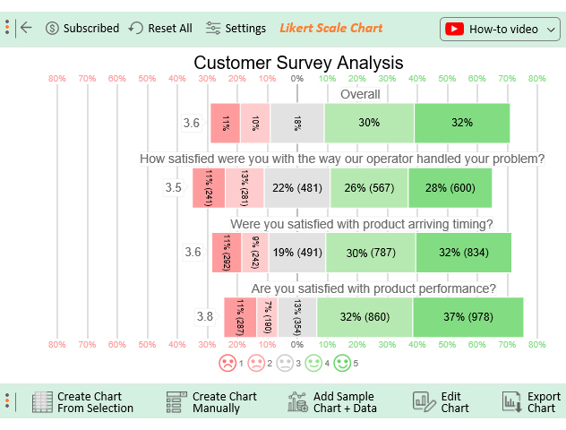
His customers answered the survey questions, and he tabulated that data in an Excel table, as shown.
| Questions | Scales | Responses |
| How satisfied were you with the way our operator handled your problem? | 1 | 241 |
| How satisfied were you with the way our operator handled your problem? | 2 | 281 |
| How satisfied were you with the way our operator handled your problem? | 3 | 481 |
| How satisfied were you with the way our operator handled your problem? | 4 | 567 |
| How satisfied were you with the way our operator handled your problem? | 5 | 600 |
| Were you satisfied with product arriving timing? | 1 | 292 |
| Were you satisfied with product arriving timing? | 2 | 242 |
| Were you satisfied with product arriving timing? | 3 | 491 |
| Were you satisfied with product arriving timing? | 4 | 787 |
| Were you satisfied with product arriving timing? | 5 | 834 |
| Are you satisfied with product performance? | 1 | 287 |
| Are you satisfied with product performance? | 2 | 190 |
| Are you satisfied with product performance? | 3 | 354 |
| Are you satisfied with product performance? | 4 | 860 |
| Are you satisfied with product performance? | 5 | 978 |
To get started with ChartExpo in Excel, follow the steps below:


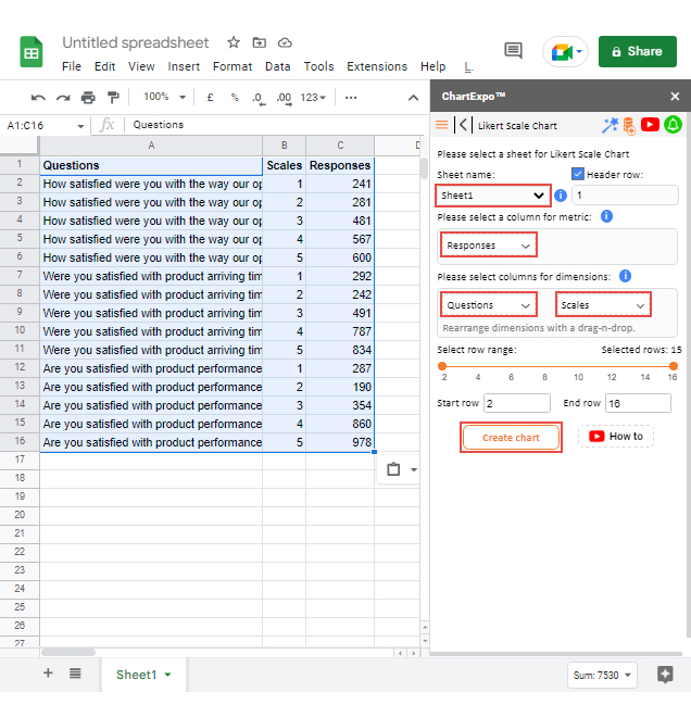
In our Google Sheets, we will use the same practical example discussed in Excel. These are the easy-to-follow steps you need to take in presenting your Likert Scale data in Google Sheets:


Your final chart will appear as shown below.
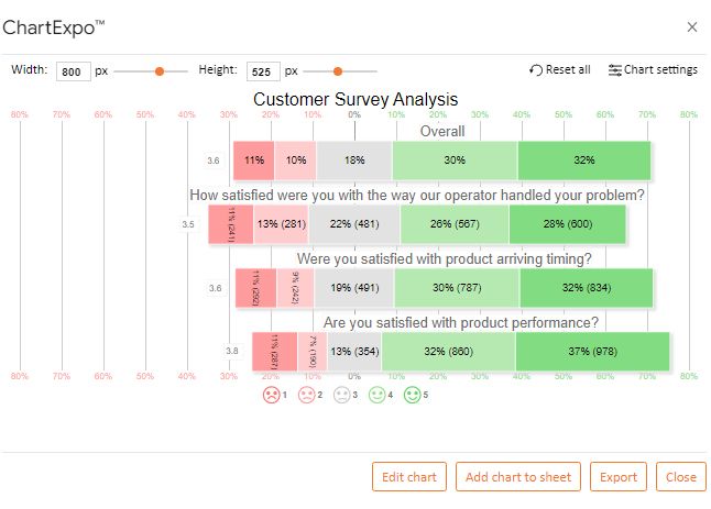
From this Likert Scale Chart, you can identify how customers view your products and services.
That is how to report Likert scale survey results.
Respondents select the option on a Likert scale that most closely matches their opinion. Asking respondents how much they agree or disagree with a given issue or statement, is frequently used to gauge the sentiments of respondents.
Likert scales cannot be used to evaluate characteristics like a person’s age or gender, for instance. However, it is the most effective tool for determining people’s sentiments and obtaining more detailed information about a particular topic.
Let’s recap what we have covered.
We understand that survey data requires you to collect survey responses from your audience and present the same information. Your target audience needs to obtain meaningful insights from your survey results.
The objective of this blog was to help you, as a reader, understand how to present Likert Scale data. Your audience can be potential customers or future investors who want to be part of your business.
That’s not all.
In our discussions, we have come across one interesting third-party application that has made this all possible. We have used this third-party application in our Excel and Google Sheets spreadsheets. This third-party application is called ChartExpo.
How much did you enjoy this article?


Google Forms to Google Sheets keeps your data organized and current with every submission. Learn the steps, methods, and tips now!

Product survey questions reveal what customers truly think. Learn how to ask the right ones and act on the survey results. Read on!

Learn how the 5-Point Performance Rating Scale improves employee evaluations with clear, consistent, and fair performance reviews across teams.


