• Home
  • Tools dropdown img
    • Spreadsheet Charts

      • ChartExpo for Google Sheets
      • ChartExpo for Microsoft Excel
    • Power BI Charts

      • Power BI Custom Visuals by ChartExpo
    • Word Cloud

  • Charts dropdown img
    • Chart Category

      • Bar Charts
      • Circle Graphs
      • Column Charts
      • Combo Charts
      • Comparison Charts
      • Line Graphs
      • PPC Charts
      • Sentiment Analysis Charts
      • Survey Charts
    • Chart Type

      • Box and Whisker Plot
      • Clustered Bar Chart
      • Clustered Column Chart
      • Comparison Bar Chart
      • Control Chart
      • CSAT Survey Bar Chart
      • CSAT Survey Chart
      • Dot Plot Chart
      • Double Bar Graph
      • Funnel Chart
      • Gauge Chart
      • Likert Scale Chart
      • Matrix Chart
      • Multi Axis Line Chart
      • Overlapping Bar Chart
      • Pareto Chart
      • Radar Chart
      • Radial Bar Chart
      • Sankey Diagram
      • Scatter Plot Chart
      • Slope Chart
      • Sunburst Chart
      • Tornado Chart
      • Waterfall Chart
      • Word Cloud
    • Google Sheets
      Microsoft Excel
  • Services
  • Pricing
  • Contact us
  • Blog
  • Support dropdown img
      • Gallery
      • Videos
      • Contact us
      • FAQs
      • Resources
    • Please feel free to contact us

      atsupport@chartexpo.com

Categories
All Data Visualizations Data Analytics Surveys
Add-ons/
  • Google Sheets
  • Microsoft Excel
  • Power BI
All Data Visualizations Data Analytics Surveys
Add-ons
  • Google Sheets
  • Microsoft Excel
  • Power BI

We use cookies

This website uses cookies to provide better user experience and user's session management.
By continuing visiting this website you consent the use of these cookies.

Ok

ChartExpo Survey


Home > Blog > Microsoft Excel

Hemoglobin A1C: What It is, Test, and Chart

Take a Hemoglobin A1C Chart: Turn it into a game-changer for diabetes management.

Let me introduce you to Charlotte. Charlotte is a 45-year-old woman who was diagnosed with type 2 diabetes. Charlotte hates the daily blood sugar monitoring. She often feels drowning in the number of readings taking up all her time.

Hemoglobin A1C Chart

Charlotte’s doctor recommended the Hemoglobin A1C Chart, and her perception of blood glucose readings changed. After getting relief, she realized that the HbA1c test measures about a 3-month average blood sugar. It means more than daily glucose readings and will help her stay more stable and manageable.

A 1% HbA1c reduction presents the opportunity to lower Charlotte’s risk of complications by even 21%. That’s what motivates her.

Creating a Hemoglobin A1C Chart becomes Charlotte’s mission. She starts by recording her quarterly A1C results. She color-codes the chart: green for target range, yellow for caution, and red for high-risk levels.

As Charlotte tracks her progress, she notices patterns. Her A1C levels improve after she increases her daily steps and reduces carbohydrate intake. This visual representation of her health journey keeps her motivated.

In half a year, Charlotte’s A1C decreases to 6.8%. She is advancing, yet there is still potential for enhancement. Using the Hemoglobin A1C Chart assists her in establishing attainable targets and acknowledging little achievements.

Keep in mind that dealing with diabetes is a long-term journey, not a quick race. An effectively planned Hemoglobin A1C Chart can be your guide to improved well-being. It transforms intricate medical information into practical insights, allowing you to control diabetes care.

Are you ready to create your own Hemoglobin A1C Chart?

Follow my lead.

Table of Contents:

  1. What is a Hemoglobin A1C Chart?
  2. What Does Hemoglobin A1C Stand For?
  3. What are the Hemoglobin A1C Ranges?
  4. What is the Hemoglobin A1C Test Measure?
  5. How to Create a HbA1c Chart?
  6. What are the Advantages of a Hemoglobin A1C Chart?
  7. Wrap Up

First…

What is a Hemoglobin A1C Chart?

Definition: A Hemoglobin A1C chart is a tool for monitoring long-term blood sugar levels. It measures the average blood glucose over the past two to three months. The A1C test shows the percentage of hemoglobin coated with sugar (glycated).

The chart helps people with diabetes understand their blood sugar control. Values on the chart range from normal to diabetic levels.

  • An A1C below 5.7% is normal.
  • Levels between 5.7% and 6.4% indicate prediabetes.
  • An A1C of 6.5% or higher signals diabetes.

Doctors use the chart to adjust treatment plans through trend analysis. It helps identify trends and the effectiveness of medications. The goal is to keep A1C levels within a target range, reducing the risk of complications.

Key Points:

  • Measurement: HbA1c is presented as a percentage indicating the glucose level bound to hemoglobin in red blood cells.
  • Time frame: Represents typical blood sugar levels from two to three months. It is based on the fact that red blood cells last around 120 days.
  • Target levels: Most individuals with diabetes aim to keep their HbA1c level below 7%. Nevertheless, individual goals may differ depending on personal health conditions and medical recommendations.
  • Conversion: To enhance comprehension, the chart typically converts HbA1c percentages into average blood glucose levels in mg/dL or mmol/L.

What Does Hemoglobin A1C Stand For?

Definition: Hemoglobin A1C stands for glycated hemoglobin. Hemoglobin is a protein in red blood cells that carries oxygen. When blood sugar (glucose) levels are high, glucose attaches to hemoglobin. This forms glycated hemoglobin or A1C.

The A1C test measures the percentage of hemoglobin that is glycated. It shows the average blood sugar levels over the past two to three months. The higher the blood sugar, the more hemoglobin gets glycated.

Doctors use the A1C test to diagnose and monitor diabetes. It provides a longer-term view compared to daily blood sugar tests.

Understanding hemoglobin A1C helps manage and control diabetes. It is a key indicator of overall blood sugar control.

What are the Hemoglobin A1C Ranges?

Hemoglobin A1C ranges indicate average blood sugar levels. They help diagnose and monitor diabetes.

  • Normal range: An A1C level below 5.7% is considered normal. This indicates reasonable blood sugar control.
  • Prediabetes range: An A1C level between 5.7% and 6.4% signals prediabetes. This range shows higher-than-normal blood sugar levels.
  • Diabetes range: An A1C level of 6.5% or higher indicates diabetes. It means blood sugar levels are consistently high.

Doctors aim to keep diabetes patients’ A1C levels below 7%. This reduces the risk of complications. However, target levels can vary based on individual health conditions.

Regular A1C testing is crucial for diabetes management. It provides a clear picture of long-term blood sugar control. Understanding these ranges helps patients and doctors make informed treatment decisions.

What is the Hemoglobin A1C Test Measure?

Definition: The Hemoglobin A1C test measures average blood sugar levels over the past two to three months. It focuses on the percentage of glycated hemoglobin in the blood.

The test shows how much glucose is attached to hemoglobin. Higher percentages indicate higher average blood sugar levels. Unlike daily blood sugar tests, the A1C test provides a long-term view of blood sugar control.

Doctors use the A1C test to diagnose diabetes and prediabetes. It also helps monitor the effectiveness of diabetes treatment plans.

  • Normal A1C levels are below 5.7%.
  • Levels between 5.7% and 6.4% indicate prediabetes.
  • Levels of 6.5% or higher indicate diabetes.

Regular A1C testing is essential for managing diabetes. It helps inform decisions about treatment and lifestyle changes.

How to Create a HbA1c Chart?

The HbA1c chart is where blood sugar meets graph paper, and diabetes management gets a visual makeover.

Have you ever tried to create one in Excel? You might have felt your blood sugar rising faster than your frustration levels. Bless its heart, Excel is like that friend who’s great at crunching numbers but terrible at visual storytelling. It can calculate your HbA1c faster than you can say “glucose.” But ask it to whip up a stunning, intuitive chart, and it might give you a blank stare.

Enter ChartExpo, the superhero of data visualization. This tool transforms your HbA1c data from a jumble of numbers into a visual masterpiece. One that your doctor will want to frame.

Let’s learn how to install ChartExpo in Excel.

  1. Open your Excel application.
  2. Open the worksheet and click the “Insert” menu.
  3. You’ll see the “My Apps” option.
  4. In the Office Add-ins window, click “Store” and search for ChartExpo on my Apps Store.
  5. Click the “Add” button to install ChartExpo in your Excel.

ChartExpo charts are available both in Google Sheets and Microsoft Excel. Please use the following CTAs to install the tool of your choice and create beautiful visualizations with a few clicks in your favorite tool.

Example

Let’s create an HbA1c Chart of the data below in Excel using ChartExpo.

Patient ID Hemoglobin Actual A1C (%) Hemoglobin Target A1C (%)
AOO1 5.2 5
  • To get started with ChartExpo, install ChartExpo in Excel.
  • Now Click on My Apps from the INSERT menu.
insert chartexpo in excel
  • Choose ChartExpo from My Apps, then click Insert.
open chartexpo in excel
  • Once it loads, scroll through the charts list to locate and choose the “Gauge Chart”.
search gauge chart in excel
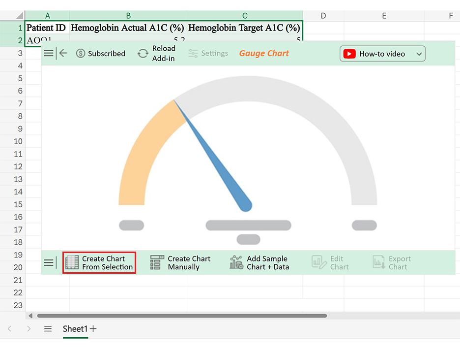
  • Click the “Create Chart From Selection” button after selecting the data from the sheet, as shown.
Click Create Chart From Selection for Making Hemoglobin A1C Chart
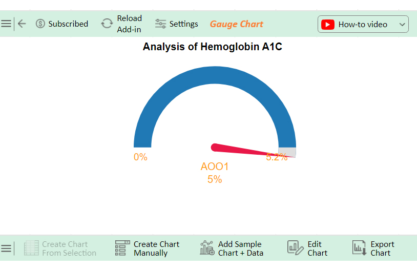
  • ChartExpo will generate the visualization below for you.
Initial Visuals for Making Hemoglobin A1C Chart
  • If you want to add anything to the chart, click the Edit Chart button:
  • Click the pencil icon next to the Chart Header to change the title.
  • It will open the properties dialog. Under the Text section, you can add a heading in Line 1 and enable Show.
  • Give the appropriate title of your chart and click the Apply button.
Add Chart Header for Making Hemoglobin A1C Chart
  • You can change the color of the Needle as follows:
Change Color of Needle After Making Hemoglobin A1C Chart
  • Add the percentage sign with values as follows:
Add Percentage After Making Hemoglobin A1C Chart
  • Click the “Save Changes” button to persist the changes made to the chart.
Click Save Changes After Making Hemoglobin A1C Chart
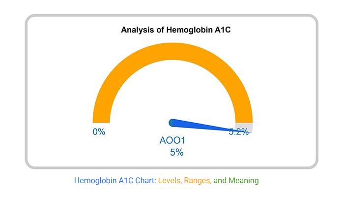
  • Your final Gauge Chart will look like the one below.
Final Hemoglobin A1C Chart

Insights

  • Patient A001’s Hemoglobin A1C is currently at 5.2%, higher than the desired 5%.

Optimize Your Data Presentation with Hemoglobin A1C Charts in Microsoft Excel:

  1. Open your Excel Application.
  2. Install ChartExpo Add-in for Excel from Microsoft AppSource to create interactive visualizations.
  3. Select the Gauge Chart from the list of charts.
  4. Select your data.
  5. Click on the “Create Chart from Selection” button.
  6. Customize your chart properties to add header, axis, legends, and other required information.

The following video will help you create a Gauge Chart in Microsoft Excel.

What are the Advantages of a Hemoglobin A1C Chart?

Using a Hemoglobin A1C chart is a win-win for patients and healthcare providers. Why? Here are the advantages that make this chart indispensable:

  1. Ease of understanding: The A1C chart simplifies complex blood sugar data. It converts numbers into easy-to-read percentages, helping patients quickly grasp their blood sugar status. This straightforward approach makes it accessible to everyone and can positively influence results in a patient satisfaction survey.
  2. Goal setting and patient engagement: Setting and tracking goals becomes easier with an A1C chart. Patients can see their progress over time, which boosts motivation. It fosters active participation in managing diabetes, leading to better health outcomes.
  3. Predictive value and clinical decision support: The chart’s predictive value is a game-changer. It helps doctors foresee potential complications and make data-driven decisions. This proactive approach improves patient care and prevents issues before they arise.
  4. Standardized measurement: A1C provides a consistent, standardized measurement of blood sugar levels. This standardization allows for accurate comparisons over time and across different healthcare settings. It ensures reliable monitoring and management.
  5. Long-term monitoring and research: Long-term monitoring is crucial in diabetes care. The HbA1c chart tracks blood sugar trends over months and years, providing essential data for trend analysis. This data is invaluable for patient management and diabetes research, paving the way for advancements in treatment.

FAQs

How to calculate HbA1c manually?

To calculate HbA1c manually, use the formula:

HbA1c (%) = (Average Blood Glucose (mg/dL) + 46.7) / 28.7

First, find the average blood glucose level over 2-3 months. Then, plug this value into the formula.

What is a normal A1C level chart?

A normal A1C levels chart typically shows percentages:

  • Below 5.7%: Normal
  • 7% to 6.4%: Prediabetes
  • 5% or higher: Diabetes

These ranges help identify average blood sugar control over 2-3 months.

What is a normal A1c level chart?

A normal A1C levels chart typically shows:

  • Below 5.7%: Normal
  • 7% to 6.4%: Prediabetes
  • 5% or higher: Diabetes

These percentages indicate average blood sugar control over 2-3 months.

Wrap Up

Creating a Hemoglobin A1C chart is a powerful tool in diabetes management. It provides a clear picture of your long-term blood sugar levels. This simple process helps you and your healthcare team make informed decisions for better health outcomes.

First, collect your A1C test results. These are usually given as percentages. Ensure you have several months of data for an accurate trend analysis. The more data points you have, the better.

Next, set up your chart. Use graph paper or a digital spreadsheet. Label the x-axis with the dates of your A1C tests. Label the y-axis with A1C percentages, typically 4% to 10%.

Plot your data points. For each test result, mark the corresponding date on the x-axis and the A1C percentage on the y-axis. Connect the dots to see the trend. This visual representation makes it easy to track changes over time.

Add a target range to your chart. Draw horizontal lines to indicate normal, prediabetes, and diabetes ranges. This helps you see where your results fall relative to these benchmarks.

Finally, review your chart regularly. Share it with your healthcare provider during check-ups. Use it to adjust your treatment plan and set new goals. Regular monitoring helps maintain reasonable blood sugar control and manage diabetes effectively.

ChartExpo makes the creation of a Hemoglobin A1C chart easy.

Do not hesitate.

Get started with ChartExpo today to revolutionize your diabetes management.

How much did you enjoy this article?

ExcelAd1
Start Free Trial!
138424

Related articles

next previous
Microsoft Excel8 min read

Excel Task Tracker Template for Smarter Task Insights

Task tracker template in Excel organizes tasks, tracks deadlines, and boosts efficiency. Learn its benefits, and explore expert tips to simplify task management.

Microsoft Excel10 min read

Invoice Tracker Template in Excel for Better Insights

An invoice tracker Excel template helps track invoices, due dates, and payments. Learn how to use this template for better financial management.

Microsoft Excel12 min read

Key Performance Indicators in Healthcare for Better Insights

Key Performance Indicators in healthcare track patient care and efficiency. Learn about these KPIs, top examples, and how to use them to improve outcomes.

Microsoft Excel10 min read

BMI Calculation Formula in Excel for Better Fitness Insights

The BMI calculation formula in Excel helps track and analyze body mass index. Explore step-by-step instructions and tips to simplify BMI tracking in Excel.

Microsoft Excel29 min read

How to Create a Tornado Chart in Excel? A Complete Guide

Click to learn how to plot a Tornado Chart in Excel using easy-to-follow steps. Also, we’ll address the following question: what is a Tornado Diagram?

ChartExpo logo

Turn Data into Visual
Stories

CHARTEXPO

  • Home
  • Gallery
  • Videos
  • Services
  • Pricing
  • Contact us
  • FAQs
  • Privacy policy
  • Terms of Service
  • Sitemap

TOOLS

  • ChartExpo for Google Sheets
  • ChartExpo for Microsoft Excel
  • Power BI Custom Visuals by ChartExpo
  • Word Cloud

CATEGORIES

  • Bar Charts
  • Circle Graphs
  • Column Charts
  • Combo Charts
  • Comparison Charts
  • Line Graphs
  • PPC Charts
  • Sentiment Analysis Charts
  • Survey Charts

TOP CHARTS

  • Sankey Diagram
  • Likert Scale Chart
  • Comparison Bar Chart
  • Pareto Chart
  • Funnel Chart
  • Gauge Chart
  • Radar Chart
  • Radial Bar Chart
  • Sunburst Chart
  • see more
  • Scatter Plot Chart
  • CSAT Survey Bar Chart
  • CSAT Survey Chart
  • Dot Plot Chart
  • Double Bar Graph
  • Matrix Chart
  • Multi Axis Line Chart
  • Overlapping Bar Chart
  • Control Chart
  • Slope Chart
  • Clustered Bar Chart
  • Clustered Column Chart
  • Box and Whisker Plot
  • Tornado Chart
  • Waterfall Chart
  • Word Cloud
  • see less

RESOURCES

  • Blog
  • Resources
  • YouTube
SIGN UP FOR UPDATES

We wouldn't dream of spamming you or selling your info.

© 2025 ChartExpo, all rights reserved.