• Home
  • Tools dropdown img
    • Spreadsheet Charts

      • ChartExpo for Google Sheets
      • ChartExpo for Microsoft Excel
    • Power BI Charts

      • Power BI Custom Visuals by ChartExpo
    • Word Cloud

  • Charts dropdown img
    • Chart Category

      • Bar Charts
      • Circle Graphs
      • Column Charts
      • Combo Charts
      • Comparison Charts
      • Line Graphs
      • PPC Charts
      • Sentiment Analysis Charts
      • Survey Charts
    • Chart Type

      • Box and Whisker Plot
      • Clustered Bar Chart
      • Clustered Column Chart
      • Comparison Bar Chart
      • Control Chart
      • CSAT Survey Bar Chart
      • CSAT Survey Chart
      • Dot Plot Chart
      • Double Bar Graph
      • Funnel Chart
      • Gauge Chart
      • Likert Scale Chart
      • Matrix Chart
      • Multi Axis Line Chart
      • Overlapping Bar Chart
      • Pareto Chart
      • Radar Chart
      • Radial Bar Chart
      • Sankey Diagram
      • Scatter Plot Chart
      • Slope Chart
      • Sunburst Chart
      • Tornado Chart
      • Waterfall Chart
      • Word Cloud
    • Google Sheets
      Microsoft Excel
  • Services
  • Pricing
  • Contact us
  • Blog
  • Support dropdown img
      • Gallery
      • Videos
      • Contact us
      • FAQs
      • Resources
    • Please feel free to contact us

      atsupport@chartexpo.com

Categories
All Data Visualizations Data Analytics Surveys
Add-ons/
  • Google Sheets
  • Microsoft Excel
  • Power BI
All Data Visualizations Data Analytics Surveys
Add-ons
  • Google Sheets
  • Microsoft Excel
  • Power BI

We use cookies

This website uses cookies to provide better user experience and user's session management.
By continuing visiting this website you consent the use of these cookies.

Ok

ChartExpo Survey


Home > Blog > Google Sheets

Google Sheets Linear Regression for Clear Data Insights

Why perform Google Sheets linear regression? It’s a powerful tool that identifies trends and makes predictions based on historical data. Google Sheets’ linear regression helps you effortlessly analyze and visualize data sets using a statistical graph to predict future outcomes.

Google Sheets Linear Regression

Google Sheets linear regression helps you understand relationships between variables. Whether you’re working with sales data or customer trends, Google Sheets Functionality makes creating a linear regression graph that clearly illustrates these connections easy. Doing so lets you quickly identify patterns that influence key business decisions.

You can enhance your visualizations by adding a Google Sheets progress bar to track task completion visually. Moreover, applying what-if analysis in Google Sheets lets you quickly predict outcomes by adjusting input values.

How can I run a regression analysis? Don’t sweat it—Google Sheets makes it very easy. You don’t require specialized software or advanced technical skills to start. With only a handful of simple reforms, you can glean data-driven insights to inform your business strategy.

Without further ado, let’s see how linear regression in Google Sheets can help you make better decisions.

But first…

Table of Contents:

  1. What is Linear Regression in Google Sheets?
  2. Why Perform Google Spreadsheet Linear Regression?
  3. How to Perform Linear Regression in Google Sheets?
  4. How to do the Google Sheets Multiple Regression?
  5. How to Analyze Linear Regression in Google Sheets?
  6. How to Use Google Sheets Linear Regression?
  7. Use Cases of Google Sheets Linear Regression
  8. FAQs
  9. Wrap Up

What is Linear Regression in Google Sheets?

Definition: Linear regression in Google Sheets is a method for analyzing the relationship between two variables. It helps predict one variable based on the value of another.

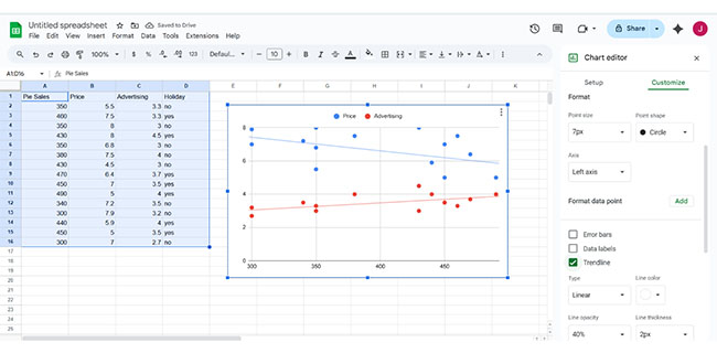
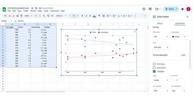
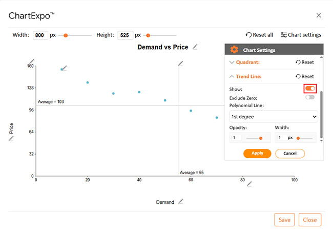
To make these predictions seamless, you can visualize this data using a linear regression graph. By adding a trendline, Google Sheets automatically calculates the best-fit line. This tool allows you to understand correlations and forecast future data points. It’s a powerful feature for anyone looking to make data-driven decisions directly within Google Sheets.

Why Perform Google Spreadsheet Linear Regression?

It’s an essential tool for anyone looking to analyze data and make predictions. Google Sheets linear regression helps you easily uncover relationships and predict future outcomes. How?

  • Analyze relationships between variables: Google Sheets linear regression helps identify how two or more variables are connected. By analyzing the data, you can understand how marketing spend affects sales or how weather impacts customer visits.
  • Predict future outcomes: With Google Sheets linear regression, you can forecast what will happen based on past data. For instance, you can predict future sales, revenue, or expenses. This makes it an indispensable tool for businesses and individuals.
  • Simplicity and accessibility: One key benefit is its ease of use. There is no need for complex statistical software; anyone can perform regression analysis using Google Sheets’ built-in functions.
  • Real-time collaboration: Google Sheets allows for easy collaboration across teams. Multiple users can work on the same document simultaneously, making it perfect for group analysis.
  • Cost-effective analysis: Performing Google Sheets linear regression is a low-cost solution for analyzing data. You can get detailed insights and create statistical graphs without investing in expensive software. This makes it an excellent tool for budget-conscious users.

How to Perform Linear Regression in Google Sheets?

Are you looking for a guide on how to perform linear regression in Google Sheets? Don’t look further. Follow these steps to analyze your data effectively. It’s quick and straightforward:

  • Enter your data: Start by adding your data to Google Sheets. Make sure it’s organized with one variable in each column.
Google Sheets Linear Regression
  • Insert a Scatter Plot: Highlight your data and click the Insert Chart button. Then, switch from the default line chart to a Scatter Chart.
Google Sheets Linear Regression
  • Add the trendline: Go to the “Customize” tab in the chart editor and select trendline. This will add a regression line to your scatter plot.
Google Sheets Linear Regression
  • Display the equation: For more insights, you can display the equation and R-squared value for the trendline. This helps you understand the strength of the relationship between your variables.
Google Sheets Linear Regression

How to do the Google Sheets Multiple Regression?

Want to dive into Google Sheets multiple regression? It’s a handy tool for analyzing how multiple factors interact with each other and how they can influence a particular outcome. Whether you’re predicting sales, customer behavior, or stock market trends, multiple regression gives you the insights to make smarter, data-driven decisions.

Here are a few steps:

  • Add your data: Start by entering your data into Google Sheets. Ensure you have multiple variables—this is key for a meaningful multiple regression analysis.
  • Select your data and insert a chart: Highlight the range you want to analyze once your data is ready. Then, click the “Insert” button at the top of the page and choose “Chart” from the drop-down menu.
Google Sheets Linear Regression
  • Change the chart type to scatter: Google Sheets will create a line chart by default. Click on the chart, go to the chart type drop-down, and select “Scatter Chart.” This will clearly show your data points.
Google Sheets Linear Regression
  • Add the trendline: To add the regression line, click on your chart and open the chart editor. Under the “Customize” tab, scroll down to “Series” and check the box for “Trendline.” This will display the best-fit line for your data.
Google Sheets Linear Regression

How to Analyze Linear Regression in Google Sheets?

Have you ever tried analyzing Google Sheets data and felt something was missing? Sure, you can plug in numbers, but when it comes to visualizing trends, Google Sheets is lackluster. While Google Sheets does the heavy lifting, its built-in chart options don’t always hit the mark.

That’s where Google Sheets linear regression and ChartExpo come in handy. They allow you to spot patterns and relationships.

ChartExpo is the game-changer that brings rich, dynamic data visualizations to Google Sheets. With ChartExpo, you can take your Google Sheets linear regression analysis to the next level. How? It effectively turns raw data into clear, actionable insights.

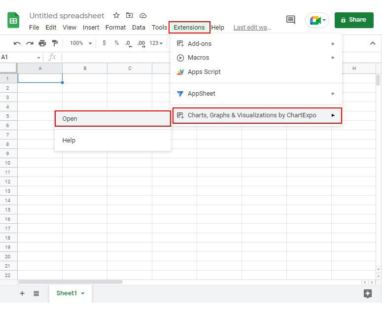
How to Install ChartExpo in Google Sheets?

  1. To start using ChartExpo, download it directly from the Google Sheets program. To do this, select Extensions from the top toolbar.
  2. A menu will appear. Click the Get add-ons option.
  3. Search for ChartExpo, and click on Charts, Graphs & Visualizations by ChartExpo when it appears in the results.
  4. Click the Install button. You will have to confirm your Google account and accept some permissions.

ChartExpo charts are available both in Google Sheets and Microsoft Excel. Please use the following CTAs to install the tool of your choice and create beautiful visualizations in a few clicks in your favorite tool.

Example

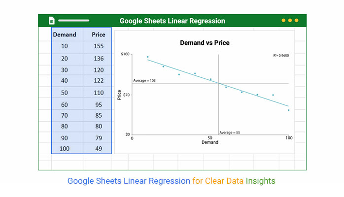
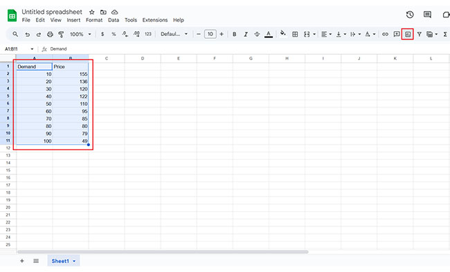
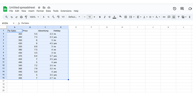
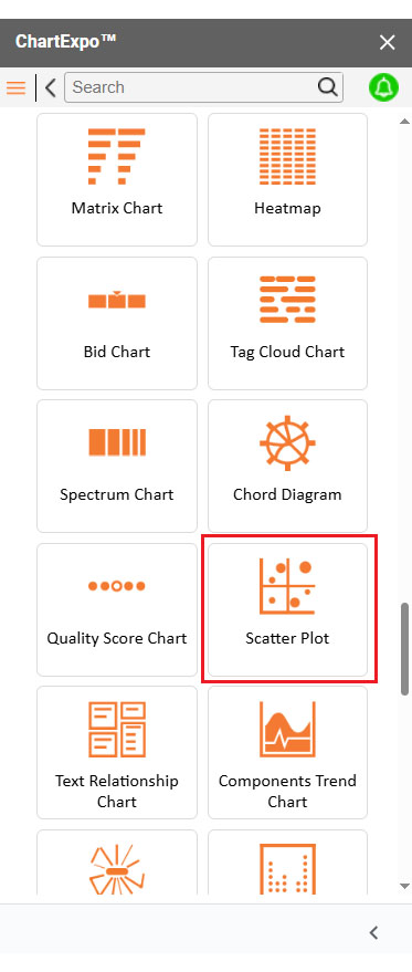
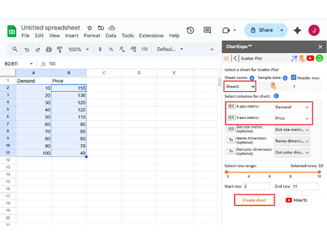
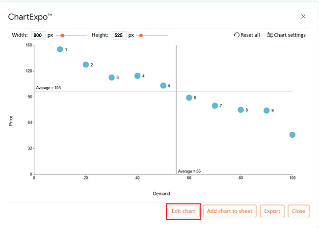
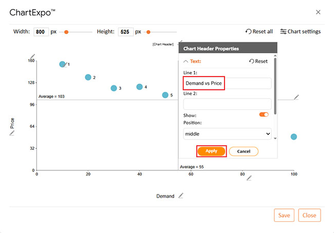
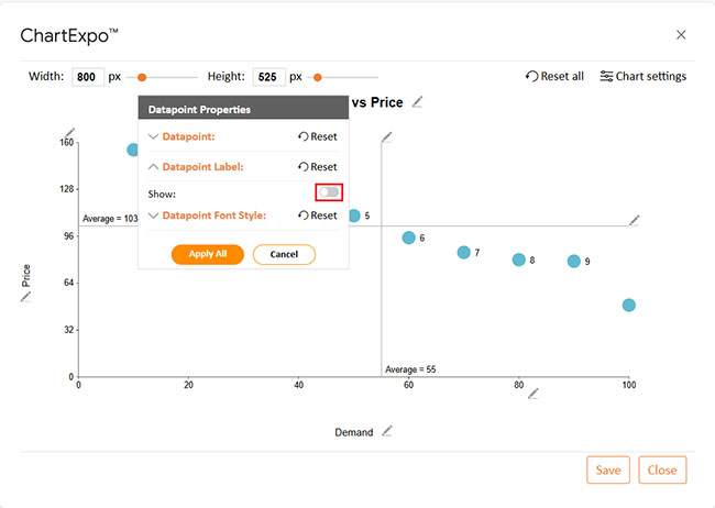
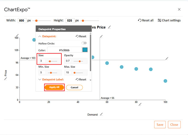
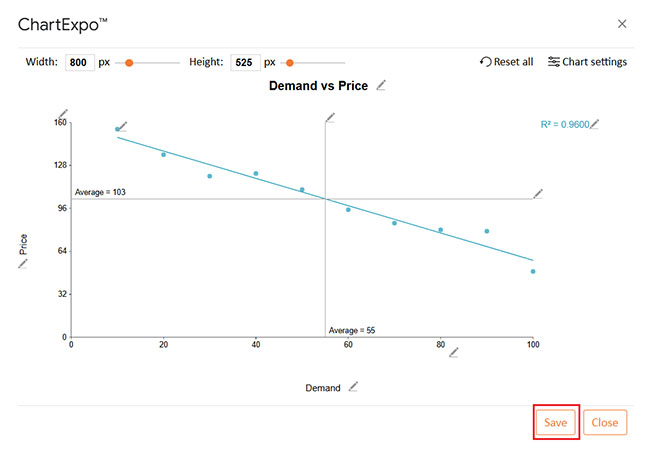
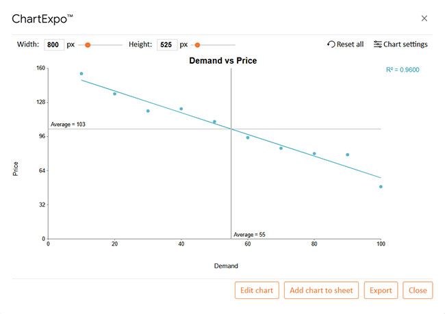
Let’s analyze this sample data in Google Sheets using ChartExpo.

Demand Price
10 155
20 136
30 120
40 122
50 110
60 95
70 85
80 80
90 79
100 49
  • To get started with ChartExpo, install ChartExpo in Google Sheets.
  • Go to Extensions > Charts, Graphs & Visualizations by ChartExpo > Open.
Google Sheets Linear Regression
  • To access the charts library, click the Add new chart button.
Google Sheets Linear Regression
  • Once ChartExpo is loaded. Click on “Scatter Plot”.
Google Sheets Linear Regression
  • First, insert the data table into the sheet. Then, choose the Sheet name from the drop-down menu in the ChartExpo section.
  • Select the metric column; the metric is the numeric column in your data sheet.
  • Select the dimensions column; the dimension is the categorical column in your datasheet that contains text information.
  • Click the Create chart button to complete the process.
Google Sheets Linear Regression
  • Click the Edit chart button to make custom changes.
Google Sheets Linear Regression
  • Click the pencil icon next to the Chart Header to change the chart’s title.
  • It will open the properties dialog. Under the Text section, you can add a heading in Line 1 and enable the Show option. Give the appropriate title of your chart and click the Apply button.
Google Sheets Linear Regression
  • You can disable the labels on Circle as follows:
Google Sheets Linear Regression
  • You can change the size of circles as follows:
Google Sheets Linear Regression
  • Now show the trend line:
Google Sheets Linear Regression
  • Click the “Save changes” button:
Google Sheets Linear Regression
  • Your final chart will appear as below.
Google Sheets Linear Regression

Insights

  • The chart illustrates an inverse relationship between demand and price.
  • As demand increases, the price decreases.
  • A sharp price drop occurs at higher demand levels.
  • This indicates price sensitivity in the market.

How to Use Google Sheets Linear Regression?

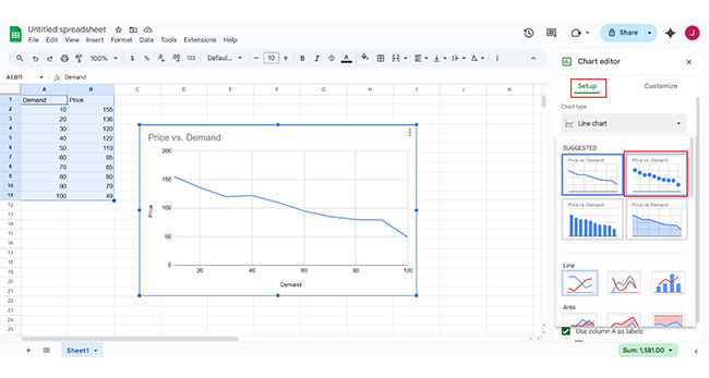
It’s simple and can help you analyze data trends. Whether predicting sales or tracking performance, this method will make your data more meaningful. Here’s how you can use it effectively:

  1. Prepare your data: Organize your data in Google Sheets. Make sure each variable you want to analyze is in its column. This helps the regression analysis work properly.
  2. Create a Scatter Plot: Select your data and insert a Scatter Chart. It will plot your data points on a graph, making it easier to see trends.
  3. Add a trendline: Click on your chart and go to the “Customize” tab. Add a Trendline to visualize the regression line showing your variables’ relationship.
  4. Use the LINEST function: For a more detailed analysis, use the LINEST function. This gives you the slope, intercept, and other statistical data about your regression.
  5. Interpret the results: Look at the trendline and the LINEST output. The slope shows the strength of the relationship. A higher R-squared value means your data fits the regression well.

Use Cases of Google Sheets Linear Regression

Are you interested in using Google Sheets linear regression? It’s a great tool for analyzing data and predicting many areas. Here are some practical use cases:

  • Sales forecasting: Use Google Sheets linear regression to predict future sales. A Linear Regression Graph will help you visualize the trend.
  • Trend analysis: Identify patterns in your data. You can test different scenarios and forecast outcomes with what-if analysis in Google Sheets.
  • Financial modeling: Create financial projections easily. Google Sheets lets you build statistical graphs to predict future revenue and expenses.
  • Budgeting and expense tracking: Predict future expenses using regression analysis. Track your progress with a Google Sheets progress bar to stay on budget.
  • Real estate valuation: Estimate property values with linear regression. Analyze factors like location and size to predict market value.
  • Health and fitness tracking: Track your fitness goals over time using Google Sheets linear regression to predict progress. Moreover, master how to make a line graph with multiple lines in Google Sheets to compare data points.

FAQs

How do you calculate multiple linear regression in Google Sheets?

  1. Enter your data into Google Sheets.
  2. Select the range for your dependent and independent variables.
  3. Use the LINEST function to calculate multiple linear regression.
  4. Press Enter, and the function will output the regression coefficients and statistics.

Can Google Sheets do linear regression?

Yes, Google Sheets can perform linear regression. Use the “LINEST” function or create a Scatter Plot with a trend line. It’s an easy way to analyze data relationships and predict trends directly within Google Sheets.

Wrap Up

Google Sheets linear regression is an easy and effective way to analyze data. It allows you to identify relationships between variables and predict future trends. Whether tracking sales or expenses, it offers valuable insights.

With the Google Sheets functionality, you can apply regression analysis with just a few clicks. The process is simple, and you don’t need advanced skills to get started. Google Sheets makes it accessible for everyone.

However, Google Sheets has limitations when it comes to data visualization. While you can create basic charts, it falls short in advanced charting features. Creating charts in Google Sheets is limited compared to more specialized tools.

This is where a Google Sheets extension like ChartExpo can help. ChartExpo offers advanced charting and graphing capabilities, making it easier to visualize the regression results. With ChartExpo, you can enhance your analysis and display data more clearly.

Google Sheets linear regression can be a game-changer. It simplifies complex data analysis and provides valuable predictions. Using a Google Sheets extension helps take your data visualization to the next level.

In conclusion, Google Sheets linear regression is accessible for anyone looking to understand trends and make data-driven decisions.

With the right tools, you can unlock its full potential. Install ChartExpo to make linear regression in Google Sheets your decision-making companion.

How much did you enjoy this article?

GSAd2
Start Free Trial!
151394

Related articles

next previous
Google Sheets11 min read

Google Spreadsheet Timesheet Template: A Visual Guide

A Google spreadsheet timesheet template simplifies time tracking and payroll management. Learn how to create, customize, and analyze timesheets.

Google Sheets9 min read

Google Sheets Transpose: A Complete Guide

Discover what Google Sheets Transpose is and how to flip data in your spreadsheet. You’ll learn methods and tips to enhance data analysis and visualization.

Google Sheets12 min read

How to Make Progress Bar in Google Sheets: Step-by-Step

Learn how to create a dynamic progress bar in Google Sheets to visually track goals, tasks, or project completion. Step-by-step guide with tips and examples.

Google Sheets10 min read

Google Workspace for Education for Better Insights

Google Workspace for Education boosts collaboration and remote learning. Explore its features, benefits, and how ChartExpo enhances data analysis.

Google Sheets9 min read

Google Workspace Marketplace for Boosting Insights

Google Workspace Marketplace provides apps to enhance Gmail, Drive, and Docs. Learn about this tool and how to improve data visualization and analysis.

ChartExpo logo

Turn Data into Visual
Stories

CHARTEXPO

  • Home
  • Gallery
  • Videos
  • Services
  • Pricing
  • Contact us
  • FAQs
  • Privacy policy
  • Terms of Service
  • Sitemap

TOOLS

  • ChartExpo for Google Sheets
  • ChartExpo for Microsoft Excel
  • Power BI Custom Visuals by ChartExpo
  • Word Cloud

CATEGORIES

  • Bar Charts
  • Circle Graphs
  • Column Charts
  • Combo Charts
  • Comparison Charts
  • Line Graphs
  • PPC Charts
  • Sentiment Analysis Charts
  • Survey Charts

TOP CHARTS

  • Sankey Diagram
  • Likert Scale Chart
  • Comparison Bar Chart
  • Pareto Chart
  • Funnel Chart
  • Gauge Chart
  • Radar Chart
  • Radial Bar Chart
  • Sunburst Chart
  • see more
  • Scatter Plot Chart
  • CSAT Survey Bar Chart
  • CSAT Survey Chart
  • Dot Plot Chart
  • Double Bar Graph
  • Matrix Chart
  • Multi Axis Line Chart
  • Overlapping Bar Chart
  • Control Chart
  • Slope Chart
  • Clustered Bar Chart
  • Clustered Column Chart
  • Box and Whisker Plot
  • Tornado Chart
  • Waterfall Chart
  • Word Cloud
  • see less

RESOURCES

  • Blog
  • Resources
  • YouTube
SIGN UP FOR UPDATES

We wouldn't dream of spamming you or selling your info.

© 2025 ChartExpo, all rights reserved.