• Home
  • Tools dropdown img
    • Spreadsheet Charts

      • ChartExpo for Google Sheets
      • ChartExpo for Microsoft Excel
    • Power BI Charts

      • Power BI Custom Visuals by ChartExpo
    • Word Cloud

  • Charts dropdown img
    • Chart Category

      • Bar Charts
      • Circle Graphs
      • Column Charts
      • Combo Charts
      • Comparison Charts
      • Line Graphs
      • PPC Charts
      • Sentiment Analysis Charts
      • Survey Charts
    • Chart Type

      • Box and Whisker Plot
      • Clustered Bar Chart
      • Clustered Column Chart
      • Comparison Bar Chart
      • Control Chart
      • CSAT Survey Bar Chart
      • CSAT Survey Chart
      • Dot Plot Chart
      • Double Bar Graph
      • Funnel Chart
      • Gauge Chart
      • Likert Scale Chart
      • Matrix Chart
      • Multi Axis Line Chart
      • Overlapping Bar Chart
      • Pareto Chart
      • Radar Chart
      • Radial Bar Chart
      • Sankey Diagram
      • Scatter Plot Chart
      • Slope Chart
      • Sunburst Chart
      • Tornado Chart
      • Waterfall Chart
      • Word Cloud
    • Google Sheets
      Microsoft Excel
  • Services
  • Pricing
  • Contact us
  • Blog
  • Support dropdown img
      • Gallery
      • Videos
      • Contact us
      • FAQs
      • Resources
    • Please feel free to contact us

      atsupport@chartexpo.com

Categories
All Data Visualizations Data Analytics Surveys
Add-ons/
  • Google Sheets
  • Microsoft Excel
  • Power BI
All Data Visualizations Data Analytics Surveys
Add-ons
  • Google Sheets
  • Microsoft Excel
  • Power BI

We use cookies

This website uses cookies to provide better user experience and user's session management.
By continuing visiting this website you consent the use of these cookies.

Ok

ChartExpo Survey


Home > Blog > Google Sheets

Google Sheets Apps for Presentable Insights

Google Sheets apps—have you explored what they can do? Every day, teams waste hours juggling tabs, sifting through data, or manually updating reports. Over and above this, over 2 billion people use Google Workspace, and Google Sheets apps are powering their workflows.

Google Sheets Apps

From finance teams to marketers, spreadsheets are no longer a static tool. They’re alive, connected, and more intelligent than most people realize.

Think of how fast data moves. Sales trends shift overnight, and customer behavior changes weekly. Therefore, decisions can’t wait. This is where Google Sheets apps step in. These tools turn spreadsheets into command centers. They link data sources, run calculations, and deliver instant updates. From this, you save time, reduce errors, and accomplish more.

Here’s an interesting piece of information: People are building full dashboards without writing a single line of code. Others are running “what if” scenarios with a few clicks. And it doesn’t stop here; some even integrate Google Sheets’ artificial intelligence features to forecast outcomes. This isn’t the future. It’s already happening.

Collaboration, once a pain point, is seamless. Teams worldwide can edit, comment, and analyze in real-time. Need to share a report? Learn how to share Google Sheets securely with a few clicks. No more endless email threads or version mismatches.

Let me help you get started…

Table of Contents:

  1. What are Google Sheets Apps?
  2. Why are Spreadsheet Apps Important?
  3. What are the Best Google Sheets Apps for Data Analysis?
  4. How to Download the Google Sheets Application?
  5. How to Use a Google Spreadsheet App for Charting?
  6. Benefits of Using the Google Spreadsheet App
  7. FAQs
  8. Wrap Up

What are Google Sheets Apps?

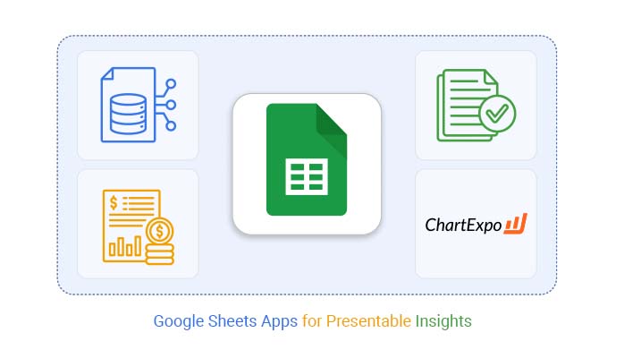
Definition: Google Sheets apps are tools and add-ons that expand what you can do inside Sheets. They help automate tasks, analyze data, and build visuals faster. You can even use them to create dashboards in Google Sheets that update in real time.

Some apps add AI features. Others improve how data connects and flows. And the best part? You can find them in the Google Sheets Extension library for free. These tools save time and give your spreadsheets superpowers, without needing you to have any coding knowledge.

Why are Spreadsheet Apps Important?

Have you ever felt like spreadsheets should do more? Most people use them to track numbers. But with apps, spreadsheets become innovative tools that think with you. Here’s why Google Sheets apps matter:

  • Enhanced functionality: Spreadsheet apps extend Google Sheets functionality far beyond basic formulas and formatting. They help you organize, filter, and process data more efficiently, reducing errors and saving time.
  • Data integration: You can connect Sheets to other tools like CRMs, APIs, and databases with ease. By linking everything, Google Sheets Extension apps allow real-time updates so your data is always current.
  • Visualization & reporting: Creating reports becomes easier with tools that help you build charts, summaries, and dashboards. Wondering how to add a trendline in Google Sheets? These apps guide you through it visually and interactively.
  • Automation: Automate repetitive tasks like sending follow-up emails or updating reports every hour. These apps help remove the manual work so you can focus on insights, not busywork.
  • Accessibility: Spreadsheet apps simplify how to share Google Sheets securely with teammates or clients. You can control access, track changes, and keep everyone in sync, wherever they are.

What are the Best Google Sheets Apps for Data Analysis?

Let’s face it. Manual data crunching gets old fast. If you want faster insights, more innovative trends, and cleaner reports, use the right Google Sheets apps. Here’s how the best ones can help you stop wrestling with your data and start getting answers:

  • Supermetrics: Pull data from platforms like Facebook Ads, Google Analytics, or Shopify directly into your spreadsheet. It helps automate reports so you don’t have to.
  • Power tools: A lifesaver for cleaning and organizing data. You can merge sheets, remove duplicates, split columns, and do more with just a few clicks.
  • Google Analytics add-on: This tool is ideal if you want to blend web data with your spreadsheets. You can schedule automatic updates and run quick analysis in Sheets.
  • Coefficient: This Google Sheets extension connects Sheets to your live business systems, like Salesforce, HubSpot, Snowflake, etc. No need for copy and paste. Everything stays synced.
  • BigML for Sheets: Use this to apply machine learning right inside Sheets. It brings powerful Google Sheets artificial intelligence tools to your fingertips. It doesn’t care if you’re not a data expert.
  • Sheetgo: This one is ideal for linking multiple spreadsheets together. It is handy for teams that work across different files but want one connected view.

How to Download the Google Sheets Application?

Sometimes, all you need is your quick data. Whether you’re checking sales numbers on your phone or building reports at your desk, having the Google Sheets app ready makes everything easier. Here’s how to get started, even with zero technical skills:

  1. Android: Open the Google Play Store, and search for Google Sheets. Tap “Install.” Once it’s downloaded, sign in with your Google account, and you’re all set.
  2. On iOS: Go to the App Store on your iPhone or iPad. Type Google Sheets into the search bar, tap “Get”, then “Install”. Open the app and log in with your Google credentials.
  3. Desktop: You don’t need to download anything. Just visit sheets.google.com on your browser. Want quick access? Pin it to your taskbar for one-click entry into all your Google Sheets apps.

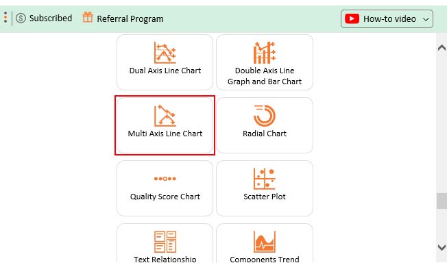
Top 10 ChartExpo Visuals using Google Sheets Apps

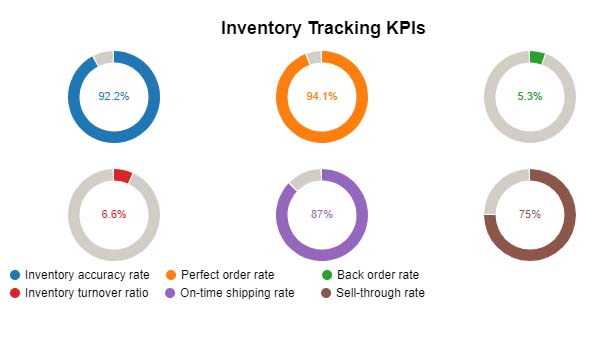
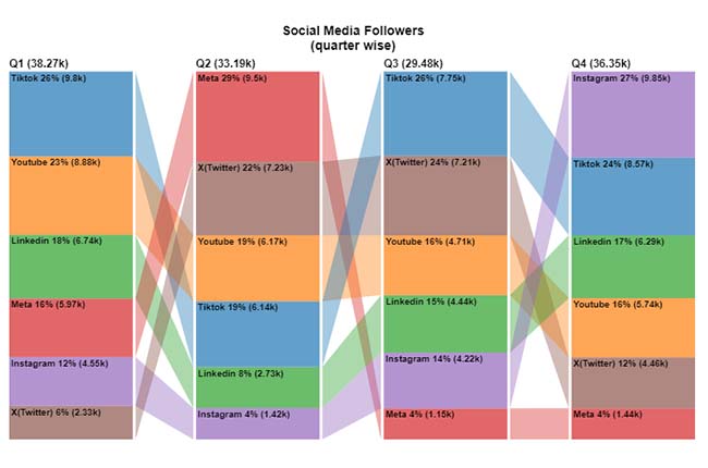
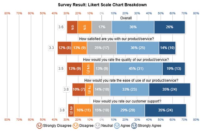
Spreadsheets don’t have to be boring. That’s why more users are turning to ChartExpo visuals inside Google Sheets apps. ChartExpo turns raw data into visuals that speak. Here are 10 powerful visuals you can use right now to make your spreadsheets smarter and way more useful:

  • Progress Circle Chart: Think of it as a visual high-five. This circular meter shows how close you are to your target. Use it for sales goals and project milestones.
Google Sheets Apps
  • Comparison Bar Chart: Need to compare data across time or groups? This chart shows shifts in trends and category performance with a clean, easy-to-read layout.
Google Sheets Apps
  • Likert Chart: Running surveys? This one breaks down responses beautifully, showing how people feel across different statements. It is ideal for HR, education, or product feedback.
Google Sheets Apps
  • Heatmap: This chart highlights the highs and lows in your data using color. It is useful for seeing what’s working, what’s not, and where to focus next using Google Sheets functionality.
Google Sheets Apps
  • Multi Axis Line Chart: Got multiple metrics on different scales? This chart lines them up side by side. It is ideal for comparing workload, capacity, or scheduling needs on one screen.
Google Sheets Apps
  • Sankey Chart: Want to trace how users move through a process? The Sankey chart clearly illustrates transitions, bottlenecks, and drop-offs. This makes it ideal for visualizing user flows or resource allocation.
Google Sheets Apps
  • Scatter Plot Chart: This one’s for spotting trends and outliers. Use it when comparing projects or exploring What-If Analysis in Google Sheets.
Google Sheets Apps
  • Multi-Axis Spider Chart: Compare teams or performance across several metrics at once. A Multi Axis Spider Chart is bold, visual, and super helpful in benchmarking on a dashboard.
Google Sheets Apps
  • Horizontal Waterfall Chart: Track how each income or expense changes your financial position. It’s a simple way to show cash flow over time in Google Sheets.
Google Sheets Apps
  • Progress Chart: Need a side-by-side view of targets vs. actuals? This visual presents variance percentages and sales comparisons in a clear and easy-to-understand format.
Google Sheets Apps

How to Use a Google Spreadsheet App for Charting?

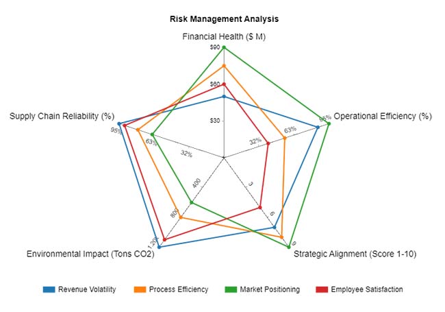
Spreadsheets are smart—until you try to see what your data means. Google Sheets apps are great for crunching numbers, but when it comes to visual storytelling, they fall somewhat short. Sure, you can slap on a bar chart or a pie, but that’s where the magic ends.

Data analysis needs more than numbers. It needs visuals that speak. Here’s where ChartExpo steps in. It fills the gap, turning static sheets into living dashboards. With ChartExpo, your data doesn’t whisper. It shouts insights.

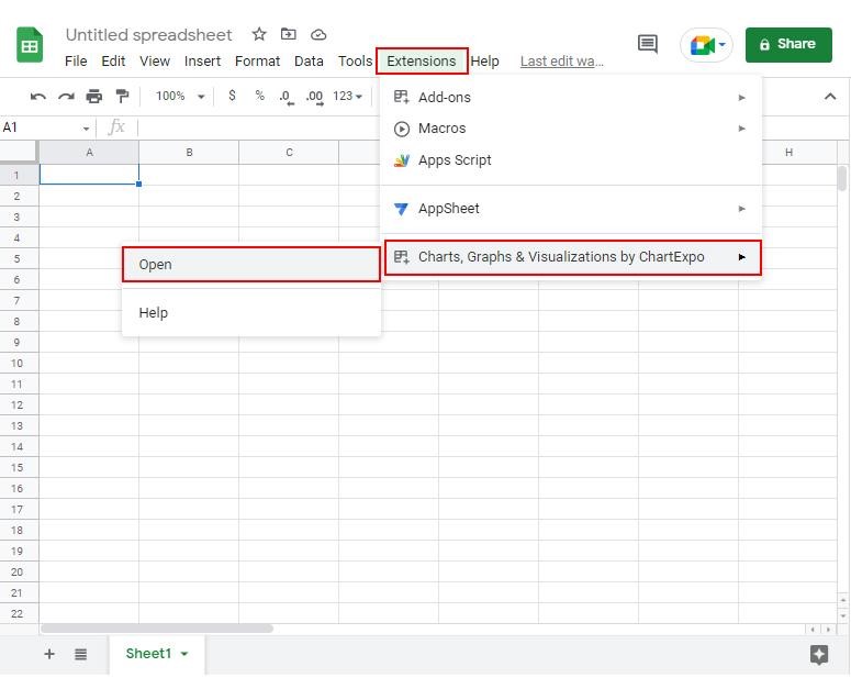
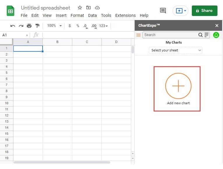
How to Install ChartExpo in Google Sheets?

  1. To start using ChartExpo, download it directly from the Google Sheets program. To do this, select Extensions from the top toolbar.
  2. A menu will appear. Click the Get add-ons option.
  3. Search for ChartExpo, and click on Charts, Graphs & Visualizations by ChartExpo when it appears in the results.
  4. Click the Install button. You will have to confirm your Google account and accept some permissions.

ChartExpo charts are available both in Google Sheets and Microsoft Excel. Please use the following CTAs to install the tool of your choice and create beautiful visualizations in a few clicks in your favorite tool.

Example

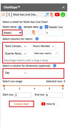
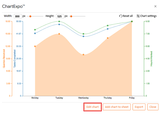
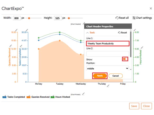
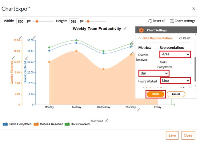
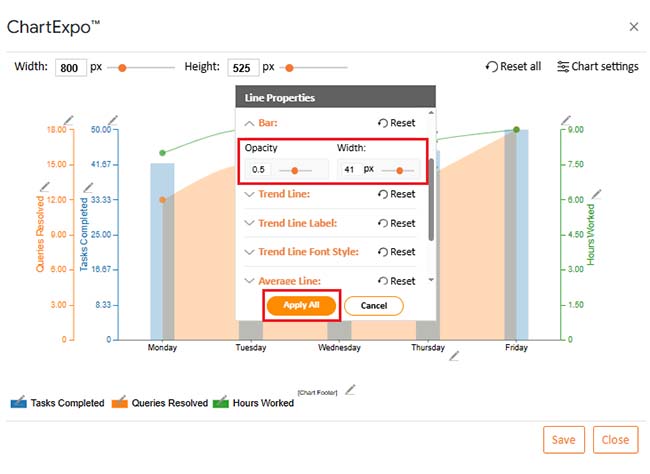
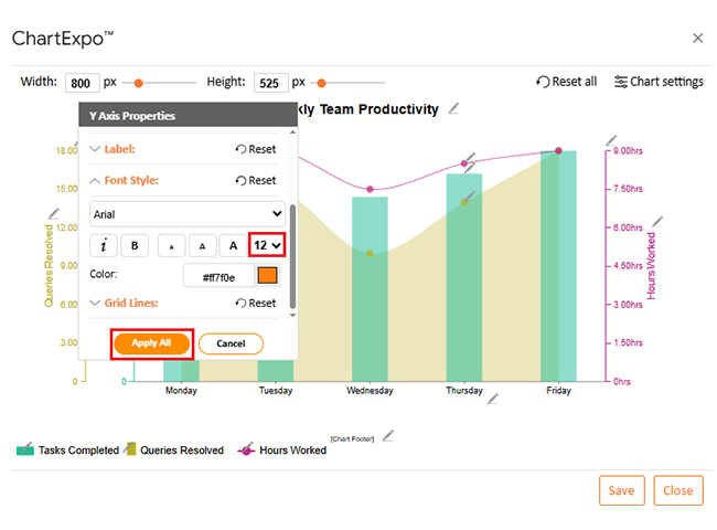
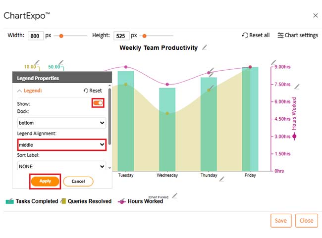
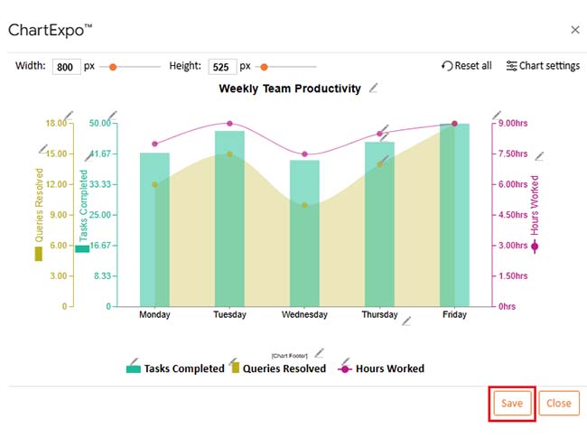
Let’s visualize and analyze this sample data in Google Sheets using ChartExpo.

Day Tasks Completed Hours Worked Queries Resolved
Monday 42 8 12
Tuesday 48 9 15
Wednesday 40 7.5 10
Thursday 45 8.5 14
Friday 50 9 18
  • To get started with ChartExpo, install ChartExpo in Google Sheets.
  • Go to Extensions > Charts, Graphs & Visualizations by ChartExpo > Open.
Google Sheets Apps
  • To access the charts library, click the Add new chart button.
Google Sheets Apps
  • Once it loads, scroll through the charts list to locate and choose the “Multi-Axis Line Chart”.
Google Sheets Apps
  • Click the “Create Chart From Selection” button after selecting the data from the sheet, as shown.
Google Sheets Apps
  • If you want to add anything to the chart, click the Edit Chart button:
Google Sheets Apps
  • Click the pencil icon next to the Chart Header to change the title.
  • It will open the properties dialog. Under the Text section, you can add a heading in Line 1 and enable Show.
  • Give the appropriate title of your chart and click the Apply button.
Google Sheets Apps
  • You can change the Data Representation by clicking on “Chart settings” as follows:
Google Sheets Apps
  • Change bars Opacity and width as follows:
Google Sheets Apps
  • Change the Legend shape type and color as follows:
Google Sheets Apps
  • You can add “hrs” with hours worked as follows:
Google Sheets Apps
  • You can increase font size for better readability as follows:
Google Sheets Apps
  • Change legend alignment from “Legend Properties as follows:
Google Sheets Apps
  • After making all changes, click the “Save” button:
Google Sheets Apps
  • Your final Multi Axis Line Chart will look like the one below.
Google Sheets Apps

Insights

  • Friday shows the highest productivity across all metrics: Tasks Completed, Queries Resolved, and Hours Worked.
  • Tuesday also had a strong output, with a high number of completed tasks and peak hours logged.
  • Wednesday was the least productive day, with low Tasks Completed and Queries Resolved, despite an average Number of Hours Worked.
  • Queries resolved and tasks completed follow a similar trend, suggesting productivity may depend on customer interaction.
  • Hours worked remained steady, indicating that changes in productivity are likely due to task complexity or team efficiency, not time spent.

Benefits of Using the Google Spreadsheet App

Have you ever found yourself updating a spreadsheet while waiting in line for coffee? With the Google Spreadsheet app, you can. It brings your data to your fingertips, anytime, anywhere. No more being tied to your desk or chasing down the latest version.

Here’s why people swear by it:

  • Work from anywhere: Access your data on the go. Whether you’re on your phone, tablet, or laptop, your sheets are always a tap away.
  • Real-time collaboration: No more emailing different versions. You and your team can edit the same sheet simultaneously from anywhere.
  • Easy sharing: Wondering how to share Google Sheets safely? You control who can view, comment, or edit with just a few clicks.
  • More innovative features: It’s more than cells and columns. With tools like Google Sheets Artificial Intelligence, the app can suggest formulas, spot errors, and even help forecast data.
  • Seamless integrations: Connect it with other tools you already use. Whether it’s Docs, Gmail, or third-party apps, it all syncs.
  • Visual insights: Need to spot a trend on the fly? You can create dashboards in Google Sheets or visualize sales numbers with clean, simple charts.

FAQs

Is there a Google Sheets app?

Yes, there is a Google Sheets app for both Android and iOS. It lets you create, edit, and view spreadsheets on the go. You can collaborate in real time, perfect for mobile data work.

How much does the Google Sheets app cost?

The Google Sheets app is entirely free to download and use. It works with your Google account, with no hidden charges. It’s part of the free Google Workspace tools.

Does Google Sheets have a desktop app?

Google Sheets doesn’t have a traditional desktop app. But you can use it in any browser at sheets.google.com. You can also create a desktop shortcut. It works online and syncs automatically.

Wrap Up

You don’t need to be a data expert to get results. You just need better tools. Google Sheets apps give you that edge. They save time, reduce mistakes, and bring clarity to messy data.

Every decision starts with a question. What if sales drop next month? What if we raise prices? What If Analysis in Google Sheets helps you test those ideas. No extra software, nor guessing. You change the numbers, and Sheets shows you the possible outcomes.

Data alone doesn’t say much until you give it a story. That’s where charts come in. They turn numbers into something you can understand quickly. Want to learn how to add a trendline in Google Sheets? Use the Google Sheets app. It’s easy, and incredibly useful. A trendline highlights the direction of your data. Whether it’s growth, decline, or repeating patterns, it shows you what matters.

Dashboards pull it all together, in one sheet, one view, and live data. You can track goals, watch trends, and respond in real time.

Google Sheets apps are more than nice-to-haves. They help you think, move faster, and work smarter. If you’ve only scratched the surface, now’s the time to go deeper. Install ChartExpo to make it all visual, fast, and effortless.

How much did you enjoy this article?

GSAd1
Start Free Trial!
157397

Related articles

next previous
Google Sheets14 min read

Google Sheets Query Function: A Visual Approach

The Google Sheets query function filters and analyzes data fast. Click here to learn the syntax with examples and best practices to boost your data analysis.

Google Sheets14 min read

Google Sheets Automation: Practical Use Cases

Google Sheets automation helps you save time and reduce errors with smart tools. Learn how to automate, analyze, and visualize your data with ease.

Google Sheets9 min read

How to Group Columns in Google Sheets for Faster Insights

Learn how to group columns in Google Sheets to organize data fast. You’ll discover step-by-step tips and charts to manage and analyze spreadsheets easily.

Google Sheets10 min read

Import XML to Google Sheets: Smarter Ways to Use XML

Importing XML to Google Sheets helps you pull structured web data into spreadsheets. This guide will show you how to use it, analyze results, and avert issues.

Google Sheets11 min read

Wedding Budget Template in Google Sheets: Clear Insights

The wedding budget template in Google Sheets tracks and organizes wedding costs. This guide shows you how to set it up and stay on budget with ease.

ChartExpo logo

Turn Data into Visual
Stories

CHARTEXPO

  • Home
  • Gallery
  • Videos
  • Services
  • Pricing
  • Contact us
  • FAQs
  • Privacy policy
  • Terms of Service
  • Sitemap

TOOLS

  • ChartExpo for Google Sheets
  • ChartExpo for Microsoft Excel
  • Power BI Custom Visuals by ChartExpo
  • Word Cloud

CATEGORIES

  • Bar Charts
  • Circle Graphs
  • Column Charts
  • Combo Charts
  • Comparison Charts
  • Line Graphs
  • PPC Charts
  • Sentiment Analysis Charts
  • Survey Charts

TOP CHARTS

  • Sankey Diagram
  • Likert Scale Chart
  • Comparison Bar Chart
  • Pareto Chart
  • Funnel Chart
  • Gauge Chart
  • Radar Chart
  • Radial Bar Chart
  • Sunburst Chart
  • see more
  • Scatter Plot Chart
  • CSAT Survey Bar Chart
  • CSAT Survey Chart
  • Dot Plot Chart
  • Double Bar Graph
  • Matrix Chart
  • Multi Axis Line Chart
  • Overlapping Bar Chart
  • Control Chart
  • Slope Chart
  • Clustered Bar Chart
  • Clustered Column Chart
  • Box and Whisker Plot
  • Tornado Chart
  • Waterfall Chart
  • Word Cloud
  • see less

RESOURCES

  • Blog
  • Resources
  • YouTube
SIGN UP FOR UPDATES

We wouldn't dream of spamming you or selling your info.

© 2025 ChartExpo, all rights reserved.