Categories
Google Sheets is an indispensable tool for data presentation and analysis. It facilitates the creation of dashboards that are both intuitive and insightful.


Developing a dashboard enables you to track progress, analyze trends, and make prompt decisions.
Assume you run a medium-sized business that provides web design and development services. You decide to create a dashboard in Google Sheets for the analysis of your clients’ data. Consequently, visualize trends and compare performance across different clients. You utilize the dashboard to track customer leads, website visits, lead conversion rates, and customer satisfaction.
A dashboard in Google Sheets is beneficial in providing insights into your clients’ data. You can identify customer trends and understand customer behavior with ease. It also helps in decision-making based on the data you have collected. Thus, you can improve your offerings and customer experience.
This guide will show you how to create a dashboard in Google Sheets. Furthermore, you will learn how to use it for data analysis.
Definition: A Google Sheets Dashboard is a visual tool within Google Sheets that displays your data using charts, graphs, and tables to provide a clear snapshot of key metrics. It helps you track performance, monitor progress, and spot trends quickly, making large amounts of data easy to understand at a glance.
With a Google Sheets Dashboard, you can manage projects, analyze business data, and make informed decisions—all in one organized view.
A dashboard in Google Sheets also facilitates the visualization and organization of data from multiple sources. You can use it to track customer leads, website visits, lead conversion rates, customer satisfaction, and other metrics or KPIs.
Additionally, incorporating a Sankey Chart in Google Sheets can enhance your dashboard by providing a clear visual representation of variable impacts and sensitivity analysis.
The following video will help you for building a dashboard in Google Sheets.
Google Spreadsheet Dashboards are helpful because they turn raw data into clear, visual insights that are easy to understand and act on. They allow you to:
When creating a dashboard in Google Sheets, choosing the right chart to represent your data is crucial. Different charts have distinct advantages and disadvantages.
For example, while bar charts and line charts show trends clearly, a Pareto chart in Google Sheets can help you quickly identify the most critical factors contributing to your data outcomes.
Using a Pareto chart makes it easier to focus on the areas that matter most, improving decision-making and providing a clear visual story on your dashboard.
Here are some of the best Google Sheets Dashboard Examples:
A Radar Chart, also referred to as a Spider Chart, a multivariate analysis tool is a useful graphical representation of multivariate data. It allows you to compare several variables at once, offering a clear and easy-to-read visualization of the data.
The most potent characteristic of a Radar Chart is the ability to compare various data sets in a single visualization. You can use it, for instance, to compare the effectiveness of two teams. Additionally, you can compare the success of various items across several marketplaces.
A Radar Chart is also effective for conveying trends. Displaying the data in a circular format makes it easy to spot changes in the data over time.
Here is the yearly sales data for different product categories.
| Months | Garments | Electronics | Cosmetics |
| Jan | 13147 | 14254 | 18388 |
| Feb | 9047 | 19986 | 18692 |
| Mar | 13493 | 19425 | 10639 |
| Apr | 10260 | 19216 | 12218 |
| May | 12127 | 16674 | 14936 |
| Jun | 11048 | 16908 | 10915 |
| Jul | 5435 | 16388 | 19854 |
| Aug | 12624 | 19638 | 11609 |
| Sep | 7768 | 15327 | 18657 |
| Oct | 9459 | 16176 | 15701 |
| Nov | 14201 | 18804 | 11120 |
| Dec | 13790 | 16587 | 12802 |
Below is the Radar Chart visualization of the data.

One of Google Sheets’ most versatile chart types is the Stacked Column Chart. It makes it easy to compare the cumulative values of multiple data sets.
The Stacked Column Chart or a Clustered Stacked Bar graph creates a bar chart wherein individual bars display individual data sets. A series of discrete sub-bars then represent the bar values. This facilitates evaluating how the datasets’ values stack up against the whole.
Moreover, the Stacked Column Chart allows color coding, which aids in highlighting specific data values. This makes it simple to spot the critical values in the data.
Below is quarterly traffic data for various social media platforms.
| Quarters | Direct | Google Ads | |||
| Q1 | 11381 | 20748 | 17861 | 27417 | 19635 |
| Q2 | 23731 | 24678 | 16610 | 16810 | 25242 |
| Q3 | 14378 | 10842 | 20971 | 13941 | 11412 |
| Q4 | 21278 | 25272 | 22648 | 21622 | 28464 |
Here is the visualization of the traffic data.

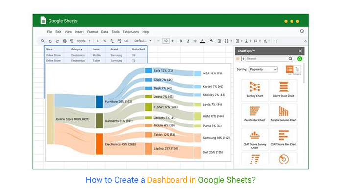
A Sankey Chart is ideal if you’re looking for a solution to make your dashboard interactive. This flowchart clarifies how a system or procedure comes into being by displaying the interdependencies between parts. You can use it to show the flow of anything from energy to money to materials.
You can use a Sankey Chart to monitor the development of a project. It can demonstrate how resources are distributed, tasks are accomplished, and progress is made.
Let’s visualize this online sales data on a Sankey Chart.
| Store | Category | Items | Brand | Units Sold |
| Online Store | Electronics | Mobile | Samsung | 39 |
| Online Store | Electronics | Tablet | Samsung | 73 |
| Online Store | Electronics | Laptop | Dell | 156 |
| Online Store | Garments | Jeans | Levi’s | 46 |
| Online Store | Garments | T-Shirt | H&M | 104 |
| Online Store | Garments | Jackets | Puma | 41 |
| Online Store | Furniture | Sofa | IKEA | 73 |
| Online Store | furniture | Chair | Kartell | 46 |
| Online Store | furniture | Desk | Stickley | 43 |
Below is the Sankey Chart visualization of the data.

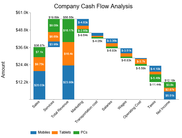
A Waterfall Chart displays the cumulative effect of positive and negative values in a sequence over time. It is also known as a Bridge Chart.
You can also use a Waterfall Chart to observe how modifications affect a starting value. Additionally, it is useful for monitoring cumulative change over time.
This chart can show items such as;
Here is the company’s income data.
| Stacks | Bridges | Amount |
| Sales | Mobiles | 20025 |
| Sales | Tablets | 9746 |
| Sales | PCs | 7095 |
| Services | Mobiles | 3959 |
| Services | Tablets | 6650 |
| Services | PCs | 9077 |
| Total Revenue | Mobiles | 23984 |
| Total Revenue | Tablets | 16396 |
| Total Revenue | PCs | 16172 |
| Marketing | Mobiles | -4630 |
| Marketing | Tablets | -2360 |
| Marketing | PCs | -2650 |
| Transportation | Mobiles | -2150 |
| Transportation | Tablets | -935 |
| Transportation | PCs | -965 |
| Salaries | Mobiles | -3360 |
| Salaries | Tablets | -2340 |
| Salaries | PCs | -1130 |
| Wages | Mobiles | -3510 |
| Wages | Tablets | -2390 |
| Wages | PCs | -930 |
| Operating Cost | Mobiles | -640 |
| Operating Cost | Tablets | -3700 |
| Operating Cost | PCs | -1240 |
| Taxes | Mobiles | -4180 |
| Taxes | Tablets | -1800 |
| Taxes | PCs | -5460 |
| Net Income | Mobiles | 5514 |
| Net Income | Tablets | 2871 |
| Net Income | PCs | 3797 |
Below is the Waterfall Chart visualization of the income data.
This chart allows you to visualize changes in sentiment over time.
You can use it for different purposes, such as:
A Sentiment Trend Chart compares key data points. It utilizes a combination of line and bar graphs to show the differences. Green-colored bars signify growth, while red bars signify a decline in sentiment.
The line chart provides an overview of the overall pattern and trend of the variables under study. This makes it easy to identify changes or discrepancies.
Assume this is the income and expense data of your company.
| Months | Income | Expenses |
| January | 40134 | 8919 |
| February | 21757 | 10038 |
| March | 26950 | 8595 |
| April | 48140 | 10793 |
| May | 46486 | 9584 |
| June | 40333 | 9042 |
Below is the Sentiment Trend Chart visualization of the data.

Track income, expenses, and cash flow easily with a finance dashboard in Google Sheets to gain clear insights into your financial health.
Monitor your spending against your planned budget using a budget dashboard in Google Sheets to stay on top of your financial goals.
Visualize sales data, track targets, and analyze performance trends with a sales dashboard in Google Sheets for better sales decision-making.
It can be daunting to create intuitive dashboards in Google Sheets.
ChartExpo is the perfect platform for creating your Google Sheets dashboard builder without much technical know-how.
ChartExpo is an add-on used in the dashboard for Google Sheets that simplifies the creation of insightful Google Sheets charts and dashboards.
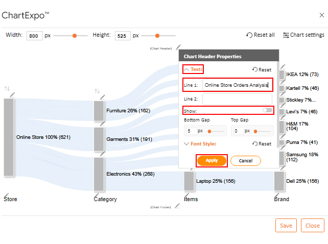
You can create a dashboard using a variety of charts and graphs available on ChartExpo. Its user-friendly interface enables you to create insightful charts, including a Scatter Plot and a progress bar in Google Sheets, which can be used in dashboards even if you have no prior coding knowledge.
Furthermore, you can customize the charts by changing properties such as colors, labels, and fonts.
How to Install ChartExpo in Google Sheets?
ChartExpo is a Google Sheets dashboard builder available for both Google Sheets and Microsoft Excel. Please use the following CTA’s to install the tool of your choice and create beautiful visualizations in a few clicks in your favorite tool.
Suppose you have online store sales data. Let’s map this on the Sankey Chart.
| Store | Category | Items | Brand | Units Sold |
| Online Store | Electronics | Mobile | Samsung | 39 |
| Online Store | Electronics | Tablet | Samsung | 73 |
| Online Store | Electronics | Laptop | Dell | 156 |
| Online Store | Garments | Jeans | Levi’s | 46 |
| Online Store | Garments | T-Shirt | H&M | 104 |
| Online Store | Garments | Jackets | Puma | 41 |
| Online Store | Furniture | Sofa | IKEA | 73 |
| Online Store | furniture | Chair | Kartell | 46 |
| Online Store | furniture | Desk | Stickley | 43 |


To download from Google Sheets:
Google Sheets dashboards can be accessed from any device with internet, allowing you and your team to monitor data in real-time, whether you’re at your desk or on the go.
Your dashboards update automatically as your data changes, ensuring you always have the latest insights without manual refreshes or reloading reports.
You can share dashboards with team members easily, enabling collaboration and feedback while controlling edit or view permissions to keep your data secure.
Google Sheets is free to use, making it an excellent choice for businesses wanting to track KPIs and visualize data without investing in expensive software.
Enhance your dashboards with add-ons like ChartExpo, which allows you to create advanced charts and visualizations in a few clicks, making your dashboards clearer and more impactful.
Handling large datasets can slow down Google Sheets, making dashboards laggy and harder to manage without careful structuring and formula optimization.
Google Sheets offers basic charts, but creating advanced or interactive visualizations can be challenging without using add-ons like ChartExpo.
Data often needs to be cleaned and formatted consistently before it can be visualized, which can be time-consuming and prone to human error.
While Google Sheets is collaborative, simultaneous edits can cause version issues or accidental data overwrites if access controls aren’t managed carefully.
Building dynamic dashboards often requires complex formulas, which can be difficult to maintain or adjust for those not deeply familiar with Google Sheets functions.
Decide which KPIs you want to track before building your dashboard to keep it focused and clear.
Naming your data ranges makes formulas easier to manage and keeps your dashboard organized.
Use color coding to highlight trends and important data points, making your dashboard easier to scan.
Avoid clutter by using clear labels, consistent colors, and only the charts you need to communicate insights.
Use ChartExpo in Google Sheets to add advanced, visually engaging charts easily, saving time while improving data clarity.
Use ChartExpo to create a dashboard in Google Sheets. This potent tool facilitates the creation of insightful charts for your dashboard. It has a wide variety of charts you can use, such as the Radar Chart and Sankey Chart.
You can create a project management dashboard in Google Sheets with ChartExpo. Here, you can use a Sankey Chart to monitor a project’s development. It can demonstrate how resources are distributed, tasks are accomplished, and progress is made.
The best charts to use in Google Sheets dashboards include;
The key advantage of using dashboards in Google Sheets is that they allow you to visualize and track your data in real-time, all in one place. This helps you quickly monitor key metrics, spot trends, and make data-driven decisions without switching between multiple sheets or tools.
You can build a dashboard in Google Sheets for the analysis of your business’s data. It can help you identify trends and insights in the data swiftly. Then make decisions based on these insights and improve your offerings and customer experience.
A dashboard is crucial for tracking critical business operation KPIs and metrics. This helps with improving the efficiency of your business operations. Additionally, it facilitates communication of insights to your team and clients.
How do you create a dashboard in Google Sheets?
This is where charts come into play.
Charts are potent data visualization tools. However, creating charts can be challenging.
ChartExpo comes to the rescue.
It’s a Google Sheets add-on that streamlines the process of making graphs and dashboards. You can create impressive data visualizations using a wide variety of charts available.
The best part?
All the charts you create will be available right away within your dashboard. This way, you can easily access insights and use them to your advantage.
How much did you enjoy this article?


SUMPRODUCT in Google Sheets handles multi-condition calculations without extra columns. Master its syntax, uses, and errors. Read on!

An annual budget template in Google Sheets organizes your yearly finances, tracks every dollar, and reveals spending patterns. Read on!

Learn the best graph to show profit and loss with practical examples and use cases. Discover how to visualize your business data, track trends, and make smarter financial decisions.


