• Home
  • Tools dropdown img
    • Spreadsheet Charts

      • ChartExpo for Google Sheets
      • ChartExpo for Microsoft Excel
    • Power BI Charts

      • Power BI Custom Visuals by ChartExpo
    • Word Cloud

  • Charts dropdown img
    • Chart Category

      • Bar Charts
      • Circle Graphs
      • Column Charts
      • Combo Charts
      • Comparison Charts
      • Line Graphs
      • PPC Charts
      • Sentiment Analysis Charts
      • Survey Charts
    • Chart Type

      • Box and Whisker Plot
      • Clustered Bar Chart
      • Clustered Column Chart
      • Comparison Bar Chart
      • Control Chart
      • CSAT Survey Bar Chart
      • CSAT Survey Chart
      • Dot Plot Chart
      • Double Bar Graph
      • Funnel Chart
      • Gauge Chart
      • Likert Scale Chart
      • Matrix Chart
      • Multi Axis Line Chart
      • Overlapping Bar Chart
      • Pareto Chart
      • Radar Chart
      • Radial Bar Chart
      • Sankey Diagram
      • Scatter Plot Chart
      • Slope Chart
      • Sunburst Chart
      • Tornado Chart
      • Waterfall Chart
      • Word Cloud
    • Google Sheets
      Microsoft Excel
  • Services
  • Pricing
  • Contact us
  • Blog
  • Support dropdown img
      • Gallery
      • Videos
      • Contact us
      • FAQs
      • Resources
    • Please feel free to contact us

      atsupport@chartexpo.com

Categories
All Data Visualizations Data Analytics Surveys
Add-ons/
  • Google Sheets
  • Microsoft Excel
  • Power BI
All Data Visualizations Data Analytics Surveys
Add-ons
  • Google Sheets
  • Microsoft Excel
  • Power BI

We use cookies

This website uses cookies to provide better user experience and user's session management.
By continuing visiting this website you consent the use of these cookies.

Ok

ChartExpo Survey


Home > Blog > Power BI

DAX USERELATIONSHIP: Optimize Power BI Charts

The DAX functions play a vital role in data modeling and analysis in Power BI and Excel. Users are enabled to perform powerful calculations, aggregations, and manipulation of data. This will, in turn, help them make informed decisions.

DAX USERELATIONSHIP

This guide uncovers what the DAX USERELATIONSHIP function is, why it is important, when it should be used, and how to use the USERELATIONSHIP function in Power BI.

Table of Contents:

  1. What is a DAX USERELATIONSHIP Function?
  2. Why is the USERELATIONSHIP Function Important?
  3. When Should the Power BI USERELATIONSHIP Function be Used?
  4. How Do You Use the USERELATIONSHIP Function in Power BI?
  5. How Can You Use the DAX USERELATIONSHIP Function in Power BI to Evaluate Data?
  6. How to Create a Dashboard in Power BI?
  7. What is the Best Practice for Using the USERELATIONSHIP Function in Power BI?
  8. Wrap Up

First…

What is a DAX USERELATIONSHIP Function?

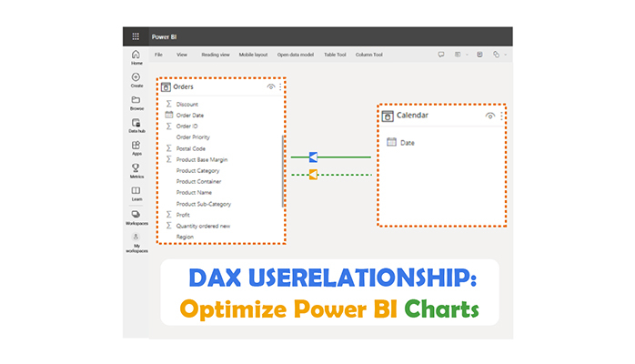
The USERELATIONSHIP function in DAX helps in specifying a relationship between tables in a Power BI or Excel data model. The function helps the user to override the existing relationships defined in the model. It also allows for more flexible calculations and querying.

Here’s the syntax for the USERELATIONSHIP function:

  • USERELATIONSHIP(<column>,<related_column>)

<column>: The column is from the current table you want to establish a new relationship.

<related_column>: The column is from the related table you want to establish the relationship.

The USERELATIONSHIP function plays a major role when the user has multiple relationships between two tables and wants to specify the relationship to use in a specific query (or calculation). It allows the user to dynamically choose the appropriate relationship based on the context of the calculation.

Why is the USERELATIONSHIP Function Important?

The USERELATIONSHIP function helps users to manually define relationships between tables in a data model.

When Should the Power BI USERELATIONSHIP Function be Used?

The USERELATIONSHIP function in Power BI is used to define a relationship between tables for a specific calculation or analysis. It overrides any existing relationships in the data model. This comes in handy when dealing with scenarios like multiple relationships between tables or when the relationship does not suit the analysis requirements.

How Do You Use the USERELATIONSHIP Function in Power BI?

  • Understand the Scenario: You have to figure out the specific scenario where you need to override the default relationships between tables in the data model. It could be due to multiple relationships between tables, or the need for a different relationship for a particular calculation.
  • Write the DAX Expression: The USERELATIONSHIP function within a DAX expression can be used to establish the desired relationship. The syntax is shown below:
    • USERELATIONSHIP(<column>,<related_column>)

Replace <column> with the column from the current table, and <related_column> with the column from the related table you want to establish the relationship.

  • Incorporate the Function: You have to incorporate the USERELATIONSHIP function into the DAX calculations (or measures). It could involve the creation of a new calculated column, measure, or adjusting an existing calculation.
  • Test and Validate: You have to ascertain that the DAX expression with the USERELATIONSHIP function behaves as expected. You can do that by testing it against your data. Also, verify that the results align with the data analysis requirements.

How Can You Use the DAX USERELATIONSHIP Function in Power BI to Evaluate Data?

Let’s say you’ve conducted an experiment and have taken samples from the same individual on two different dates; the first test date and the second test date.

Same Idividual on Two Different Dates for Doing DAX USERELATIONSHIP

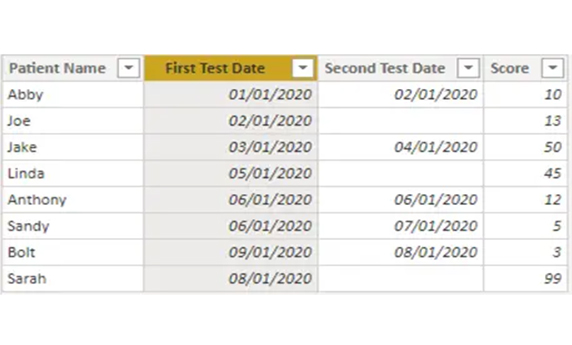
Since the first test date has an active relationship, the score that should be retrieved from the CALCULATE function will be based on the first test date. But how do you retrieve the scores based on the second test date? Well, that’s where the USERELATIONSHIP function comes in.

The second test date has an inactive relationship, and here’s how to use the USERELATIONSHIP function to get your desired results.

Using the score column, you’ll get the sum of scores based on the first test date as a measure.

Get Sum of Scores Based for Doing DAX USERELATIONSHIP

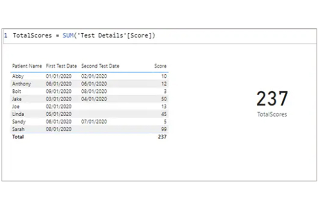
You can get the same total score by the second date and compare the scores, side by side.

Total Score by Second Date = CALCULATE([TotalScores], USERELATIONSHIP (’Test Details’[Second Test Date], DimDate [Date]))

Total Score by Second Date for Doing DAX USERELATIONSHIP

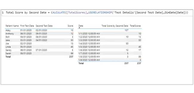
From the expression above, you’ll notice how the Power BI USERELATIONSHIP function was used with the second date, and the CALCULATE function is required to get the test scores based on the second test date.
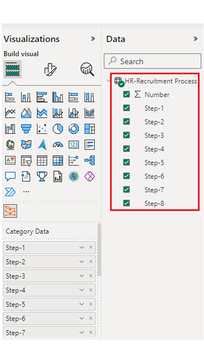
How to Create a Dashboard in Power BI?

Stage 1: Log into Power BI, enter your email, and click “Submit.”

  • Log in to Power BI.
  • Enter your email address and click the “Submit” button.
Enter email to login to Power BI
  • You are redirected to your Microsoft account.
  • Enter your password and click “Sign in“.
Enter Password to login to Power BI
  • You can choose whether to stay signed in.
Click on stay signed in
  • Once done, the Power BI home screen will open.

Stage 2: Create a Data Set and Select the Data Set to Use in the Sankey Chart

  • Go to the left-side menu and click the “Create” button.
  • Select “Paste or manually enter data“.
select Paste or manually enter data in Power BI ce487
  • We’ll use the sample data below for this example.
Step-1 Step-2 Step-3 Step-4 Step-5 Step-6 Step-7 Step-8 Number
Initial Applicants CV Shift CV Failed Null 4 Null 5 Null 6 Null 7 Null 8 150
Initial Applicants CV Shift CV Passed Phone Screen Screen Failed Null 6-2 Null 7-2 Null 8-2 50
Initial Applicants CV Shift CV Passed Phone Screen Screen Failed Face-to-Face Face Failed Decline 50
Initial Applicants CV Shift CV Passed Phone Screen Screen Failed Face-to-Face Face Passed Offer Accepted 125
Initial Applicants CV Shift CV Passed Phone Screen Screen Failed Face-to-Face Face Passed Offer Rejected 50
Initial Applicants CV Shift CV Passed Phone Screen Screen Failed Face-to-Face Face Passed Offer Rejected-location 25
  • Paste the data table above into the “Power Query” window. After that, select the “Create a dataset only” option.
Select Create a Dataset Only Option After Doing DAX USERELATIONSHIP
  • Navigate to the left-side menu, and click on the “Data Hub” option. Power BI will populate the data set list. If no data set has been created, you’ll get an error message.
Click on Data Hub After Doing DAX USERELATIONSHIP
  • Click on the “Create report” dropdown.
Click on Create Report After Doing DAX USERELATIONSHIP
  • To create the Sankey Diagram, you’ll have to use an add-in or the Power BI visual from AppSource. Navigate to the right side of the Power BI dashboard, and open the Power BI visualizations panel. Click the ellipsis symbol (…) to import the Power BI Sankey Diagram extension by ChartExpo. In the following menu that opens, select the “Get more visuals” option.
Select Get More Visuals After Doing DAX USERELATIONSHIP
  • Enter “ChartExpo” in the highlighted search box. You’ll see the “Sankey Diagram for Power BI by ChartExpo.”
Enter ChartExpo in Search Box After Doing DAX USERELATIONSHIP
  • After clicking on the Sankey Diagram, click on the highlighted “Add” button.
Click Add Button After Doing DAX USERELATIONSHIP
  • Power BI adds the “Sankey Diagram for Power BI by ChartExpo” icon in the visualization panel.
Add Sankey Diagram Icon in Visualization Panel After Doing DAX USERELATIONSHIP
  • To draw a Sankey Diagram with ChartExpo’s Power BI extension, select the “Sankey Diagram for Power BI by ChartExpo” icon in the visualization panel. A window, similar to the one below, opens in the report section of your dashboard.
Opens in report Section of Dashboard After Doing DAX USERELATIONSHIP
  • Select the fields to use in the Sankey chart.
Select Fields to Use in Sankey Chart After Doing DAX USERELATIONSHIP
  • You’ll have to provide a ChartExpo license key (or email address).
Provide License Key After Doing DAX USERELATIONSHIP
  • You’ll have to add the top header text in the chart under the General section.
Add Top Header Text After Doing DAX USERELATIONSHIP
  • Here’s the final look at the HR Dashboard in Power BI by using ChartExpo.
Final DAX USERELATIONSHIP

Insights

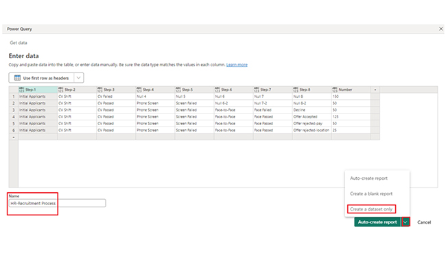
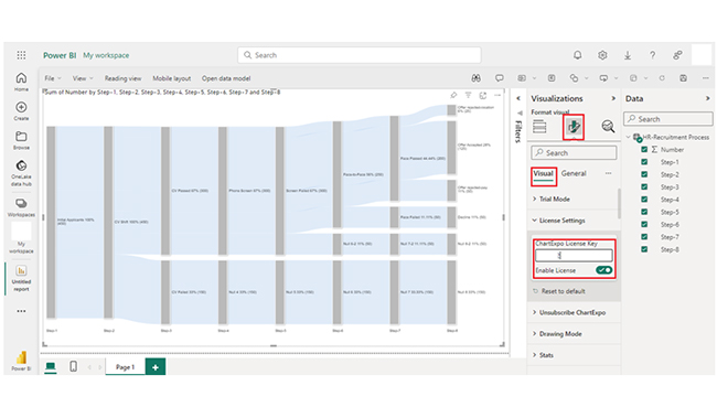
You’ll notice that of the 450 applicants who submitted their CVs, 300 (67%) passed while 150 (33%) failed. 330 (67%) performed a phone screen while 150 (33%) had a null performance.

The data shows a stepwise reduction in applicants and emphasizes the critical role of Face-to-Face interaction and the diverse factors that influence an offer acceptance or rejection..

How to Manage Relationships in Power BI Charts With DAX USERELATIONSHIP:

  1. Open your Power BI Desktop or Web.
  2. From the Power BI Visualizations pane, expand three dots at the bottom and select “Get more visuals”.
  3. Search for “Sankey Chart by ChartExpo” on the AppSource.
  4. Add the custom visual.
  5. Select your data and configure the chart settings to create the chart.
  6. Customize your chart properties to add header, axis, legends, and other required information.
  7. Share the chart with your audience.

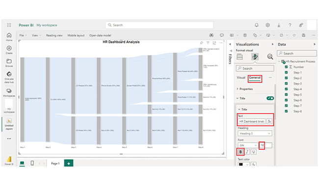
The following video will help you create a Sankey Chart in Microsoft Power BI.

What is the Best Practice for Using the USERELATIONSHIP Function in Power BI?

The best practice for using the USERELATIONSHIP function in Power BI involves the following key considerations:

  • Document Usage: Document the context and purpose of each use of USERELATIONSHIP within the Power BI reports (or data models). This will help other users figure out why some relationships were overridden.
  • Ensure Clear Naming Conventions: Name the calculated columns (or measures) containing the USERELATIONSHIP function to indicate the purpose of the overridden relationship.
  • Document Default Relationship: Document the default relationships between tables in the Power BI data model. Having a good grasp of these default relationships helps in figuring out when to effectively use USERELATIONSHIP.
  • Validate Results: Use the USERELATIONSHIP function against expected outcomes to test and validate the results of calculations.
  • Review Regularly: Perform a periodic review and reassess the need for using USERELATIONSHIP. As the data model evolves, evaluate whether the overridden relationships are needed or if there are adjustments to be made.

FAQs

What is the difference between CROSSFILTER and USERELATIONSHIP?

CROSSFILTER applies a filter from one table to the next, and it affects calculations. USERELATIONSHIP helps in establishing a specific relationship between tables, and it overrides default relationships for calculations.

USERELATIONSHIP defines relationships, while CROSSFILTER filters data.

Can you use USERELATIONSHIP in a calculated column?

Yes, USERELATIONSHIP can be used in a calculated column to define relationships between tables for each row. It gives room for customized calculations based on specific relationships in Power BI.

What is the purpose of the USERELATIONSHIP function in DAX?

The USERELATIONSHIP function in DAX defines relationships between tables in Power BI. It allows users to override default relationships and customize calculations based on specific analysis requirements.

Wrap Up

The DAX USERELATIONSHIP function gives users the room to manually specify relationships between tables in Power BI, and override default relationships. This flexibility comes in handy when dealing with multiple potential relationships in complex data models.

The DAX USERELATIONSHIP function is vital for users who deal with hierarchical data structures. You can use it to establish relationships between different levels of the hierarchy dynamically.

Furthermore, you can use USERELATIONSHIP to perform comparison during scenario analysis. It is particularly used when establishing temporary relationships between tables.

There are cases where default relationships don’t provide the necessary filtering behavior. In such cases, use USERELATIONSHIP to define custom filtering logic for specific visuals or calculations.

Now you know what the DAX USERELATIONSHIP is and how it works, how will you incorporate it into your data analysis process?

How much did you enjoy this article?

PBIAd1
Start Free Trial!
146569

Related articles

next previous
Power BI12 min read

In-depth Look at Effective Healthcare Dashboard Examples

Immerse yourself in Healthcare Dashboard Examples, illustrating innovative ways to transform complex data into actionable insights for healthcare professionals.

Power BI12 min read

Power BI Group By Guide for Effective Data Insights

Learn how Power BI Group By helps you aggregate data, clarify trends, and create reports by grouping values to make large datasets manageable & insightful.

Power BI12 min read

How to Create Sankey Diagram in Microsoft Power BI?

Learn How to Create Sankey Diagram in Microsoft Power BI using Desktop & Web Service. What they are and how to use them effectively.

Power BI8 min read

Power BI Artificial Intelligence: Insights Using Visuals

Discover all there is to know about the Power BI artificial intelligence. You'll also discover how AI is used in Power BI, and how to use it for analysis and more.

Power BI9 min read

Budgeting in Healthcare: Use Visuals to Spot Budget Gaps

This guide helps you discover what budgeting in healthcare is. You'll also discover the factors that affect hospital budgets and types of budgeting in healthcare.

ChartExpo logo

Turn Data into Visual
Stories

CHARTEXPO

  • Home
  • Gallery
  • Videos
  • Services
  • Pricing
  • Contact us
  • FAQs
  • Privacy policy
  • Terms of Service
  • Sitemap

TOOLS

  • ChartExpo for Google Sheets
  • ChartExpo for Microsoft Excel
  • Power BI Custom Visuals by ChartExpo
  • Word Cloud

CATEGORIES

  • Bar Charts
  • Circle Graphs
  • Column Charts
  • Combo Charts
  • Comparison Charts
  • Line Graphs
  • PPC Charts
  • Sentiment Analysis Charts
  • Survey Charts

TOP CHARTS

  • Sankey Diagram
  • Likert Scale Chart
  • Comparison Bar Chart
  • Pareto Chart
  • Funnel Chart
  • Gauge Chart
  • Radar Chart
  • Radial Bar Chart
  • Sunburst Chart
  • see more
  • Scatter Plot Chart
  • CSAT Survey Bar Chart
  • CSAT Survey Chart
  • Dot Plot Chart
  • Double Bar Graph
  • Matrix Chart
  • Multi Axis Line Chart
  • Overlapping Bar Chart
  • Control Chart
  • Slope Chart
  • Clustered Bar Chart
  • Clustered Column Chart
  • Box and Whisker Plot
  • Tornado Chart
  • Waterfall Chart
  • Word Cloud
  • see less

RESOURCES

  • Blog
  • Resources
  • YouTube
SIGN UP FOR UPDATES

We wouldn't dream of spamming you or selling your info.

© 2025 ChartExpo, all rights reserved.