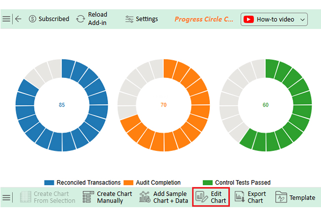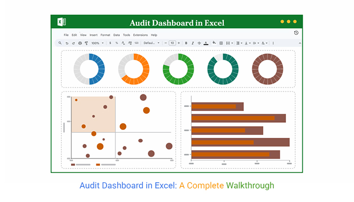


Let’s be honest. Excel is excellent, until it isn’t. Sorting rows? Perfect. Crunching numbers? No problem. But when it’s time to visualize all that data with Excel charts, Excel starts to sweat. Building a clear, dynamic audit dashboard often turns into a maze of charts, colors, and formulas that are barely comprehensible.
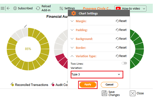
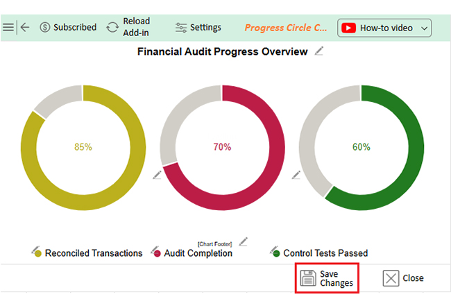
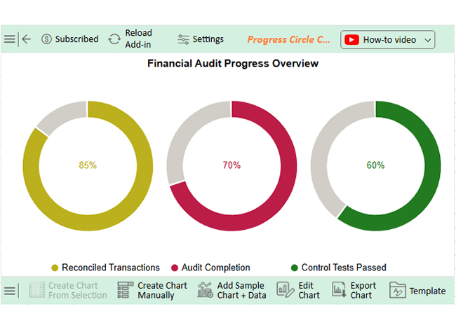
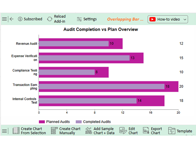
Excel was built for data, not storytelling. While you can handle calculations like a weighted average in Excel, turning numbers into clear visual narratives often requires more advanced visualization. For visual data storytelling, use ChartExpo. This tool integrates seamlessly with Excel, making your dashboard look less like a spreadsheet and more like actionable insights.