Categories
Raw data rarely arrives in a usable state. Values conflict, records repeat, and formats vary across sources, making any analysis built on that data inherently unreliable.
Knowing how to normalize data closes this gap, turning messy inputs into clean, structured datasets ready for accurate reporting and consistent analytics.
This guide walks through every key aspect of the normalization process: what it is, when to apply it, which methods work best, and how to carry out each step in Power BI.
You will also find worked examples, concrete best practices, and answers to common questions to make each concept practical and immediately applicable.
Definition: Normalizing data is the practice of restructuring datasets to eliminate redundancy and enforce consistency. Rather than storing the same value in multiple locations, each piece of information lives in one place.
Tables become smaller and focused, linked through defined relationships that keep the model coherent and easy to maintain.
In analytics, organized tables form a reliable foundation for accurate reporting and greater accuracy across every dashboard the team builds.
Structured data supports faster queries, reduces update errors, and makes it far simpler to manage information at scale.
Skipping the steps of how to normalize data causes subtle but compounding problems. Reports drift out of sync, updates create conflicts, and performance degrades as datasets grow.
Normalizing data is not always necessary, but large or complex datasets often require it before analysis can produce reliable results.
Several approaches exist for how to normalize data, and the right one depends on your dataset range, distribution, and the type of analysis planned.
Seeing real numbers alongside each technique makes how to normalize data tangible. The three examples below demonstrate the most widely used approaches in practice.
Values are scaled between 0 and 1 using the minimum and maximum values.
Sample data (Sales): 12000, 18000, 9000, 22000, 15000
Formula: (x−min)/(max−min)
Min = 9000, Max = 22000
Values are adjusted using the mean and standard deviation to show distance from the average.
Sample data (Marks): 60, 70, 80, 90, 100
Mean = 80, Std Dev = 14.14
Formula: (x−mean) / std
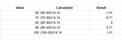
Values are divided by powers of 10 to bring them into a smaller range.
Sample data (Revenue): 45000, 38000, 92000, 61000, 15000
Largest value = 92000
Divide by 100000
Formula: x / 10^n
Power BI supports how to normalize data directly inside Power Query and through DAX column formulas. Completing these steps before building visuals ensures every chart reflects consistent, well-structured figures.
Open the desktop, click Get Data, and connect the required data source in Power BI to load your dataset.
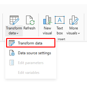
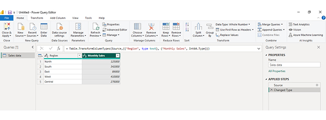
Click Transform Data to open Power Query Editor, where you can clean and modify the dataset.
In the table preview, click the Monthly Sales column because this numeric field needs to be normalized.
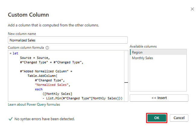
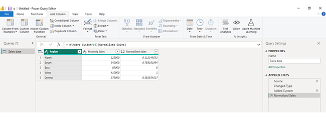
Go to Add Column → Custom Column and enter the Min-Max formula, then click OK to create a normalized column.
If you want to keep the original values unchanged, go to Model → New Column and create a new column for normalized values.
Click Close & Apply to save changes and load the normalized dataset for reporting.
Analyzing normalized data in Power BI helps you work efficiently with structured datasets by reducing redundancy and improving data integrity. Since normalized data is spread across multiple related tables, proper modeling and visualization are essential to extract meaningful insights. Follow these steps to analyze it effectively:
Import your normalized dataset into Power BI. Ensure all tables are loaded correctly and review their structure, including primary and foreign keys.
Examine how tables are connected. Normalized data typically uses relationships between fact and dimension tables, so understanding these links is critical for accurate analysis.
Use the model view to create relationships between tables. Ensure connections are correctly defined so data flows properly across different tables.
Use DAX to create measures such as totals, averages, or performance metrics. These calculations allow you to combine data from multiple tables into meaningful insights.
Create dashboards using charts like bar charts, line charts, and comparison visuals to explore your data. For more advanced and visually engaging dashboards, you can use ChartExpo to simplify complex data visualization.
Interpret your visuals to identify patterns, trends, and performance across different dimensions such as departments, regions, or time periods.
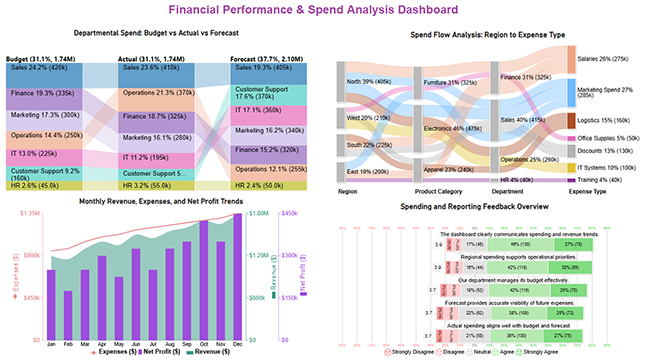
Include a final dashboard image that combines multiple insights, such as budget vs actual comparisons, spend flow analysis, and performance trends. This provides a comprehensive view of your normalized data and helps communicate insights clearly and effectively.
Key Insights
Understanding how to normalize data delivers measurable improvements across performance, reporting, and long-term data management. The gains compound as datasets grow.
Getting how to normalize data right requires more than picking a technique. These guidelines help you apply it without disrupting the relationships your model depends on.
Even when applied carefully, how to normalize data introduces trade-offs worth anticipating. Recognizing these in advance helps you calibrate the process correctly.
Start by auditing the dataset for duplicate and inconsistent values, then divide it into focused tables linked by defined keys. Choose a method such as min-max or z-score based on the data distribution, and validate results before using the output in any live reports.
The core steps are removing duplicate values, dividing data into related tables with clear purposes, and establishing key relationships so you can normalize data without repeating the same information across multiple locations.
First normal form removes repeating groups, second normal form eliminates partial key dependencies, and third normal form addresses transitive dependencies. Together, they form a systematic approach to how to normalize data with progressively tighter structural rules.
Unnormalized datasets accumulate duplicates and conflicting values over time, leading to reports that contradict each other. Applying how to normalize data prevents these problems and keeps analytical outputs trustworthy and consistent.
Applying how to normalize data correctly separates analysis that misleads from analysis that guides decisions with genuine confidence.
Normalization eliminates the structural flaws responsible for conflicting figures, unreliable calculations, and dashboards that mirror data artifacts rather than real patterns in the underlying business.
The benefits accumulate steadily over time. Cleaner tables produce faster queries, reduce the hours spent troubleshooting inconsistencies, and give every stakeholder far greater confidence in the numbers they see.
Whether the work happens in Power BI or any other platform, the principles covered here provide a repeatable framework for building datasets that perform reliably at scale and hold up under scrutiny.
How much did you enjoy this article?


Calculate accounts receivable turnover ratio to measure credit collection speed, improve cash flow, and strengthen your financial strategy. Read on!

Change Management KPIs are the key to tracking adoption, performance, and ROI during transitions. Find out which metrics matter. Read on!

Data collection methods and techniques determine the quality of every insight you act on. Explore key approaches for gathering reliable data. Read on!


