• Home
  • Tools dropdown img
    • Spreadsheet Charts

      • ChartExpo for Google Sheets
      • ChartExpo for Microsoft Excel
    • Power BI Charts

      • Power BI Custom Visuals by ChartExpo
    • Word Cloud

  • Charts dropdown img
    • Chart Category

      • Bar Charts
      • Circle Graphs
      • Column Charts
      • Combo Charts
      • Comparison Charts
      • Line Graphs
      • PPC Charts
      • Sentiment Analysis Charts
      • Survey Charts
    • Chart Type

      • Box and Whisker Plot
      • Clustered Bar Chart
      • Clustered Column Chart
      • Comparison Bar Chart
      • Control Chart
      • CSAT Survey Bar Chart
      • CSAT Survey Chart
      • Dot Plot Chart
      • Double Bar Graph
      • Funnel Chart
      • Gauge Chart
      • Likert Scale Chart
      • Matrix Chart
      • Multi Axis Line Chart
      • Overlapping Bar Chart
      • Pareto Chart
      • Radar Chart
      • Radial Bar Chart
      • Sankey Diagram
      • Scatter Plot Chart
      • Slope Chart
      • Sunburst Chart
      • Tornado Chart
      • Waterfall Chart
      • Word Cloud
    • Google Sheets
      Microsoft Excel
  • Services
  • Pricing
  • Contact us
  • Blog
  • Support dropdown img
      • Gallery
      • Videos
      • Contact us
      • FAQs
      • Resources
    • Please feel free to contact us

      atsupport@chartexpo.com

Categories
All Data Visualizations Data Analytics Surveys
Add-ons/
  • Google Sheets
  • Microsoft Excel
  • Power BI
All Data Visualizations Data Analytics Surveys
Add-ons
  • Google Sheets
  • Microsoft Excel
  • Power BI

We use cookies

This website uses cookies to provide better user experience and user's session management.
By continuing visiting this website you consent the use of these cookies.

Ok

ChartExpo Survey


Home > Blog > Data Analytics

Reporting vs Analytics: Everything You Need to Know

Organizations that want better, faster decisions need to understand what sets reporting apart from analytics. Both methods use data, but they’re built to solve different problems. One summarizes outcomes, the other explains them and points to what’s coming.

Reporting vs Analytics

This guide breaks down analytics vs reporting without fluff. You’ll see exactly when to use each approach, what makes them different, and how they fit into a solid data strategy. Whether you’re new to business intelligence or working to sharpen your team’s processes, the distinctions matter.

Table of Contents:

  1. What is Reporting vs Analytics?
  2. Importance of Reporting and Analytics
  3. Reporting vs Analytics: Key Differences Explained
  4. Core Components of Reporting and Analytics
  5. Reporting vs Analytics: Examples
  6. How to Analyze Analytics vs Reporting in Power BI?
  7. Benefits of Using Reporting and Analytics Together
  8. Best Practices for Choosing Between Reporting vs Analytics
  9. FAQs
  10. Wrap Up

What is Reporting vs Analytics?

Definition: Reporting vs analytics starts with a simple split. Reporting takes historical data and arranges it into structured formats like dashboards or scheduled summaries. Its job is to show what’s already happened. Think performance monitoring, KPI tracking, and status updates for stakeholders.

Analytics digs deeper. It explores data to reveal patterns, connections, and the reasons behind outcomes. Rather than just displaying numbers, analytics answers the “why” and forecasts what’s ahead. This kind of work drives strategic choices and long-term planning.

The central contrast in reporting vs analysis is direction. Reporting looks back and answers “what happened.” Analytics looks forward and tackles “why did it happen” and “what should we do next.” For those just getting started, analytics vs reporting can be thought of as the gap between summary and investigation.

Importance of Reporting and Analytics

They’re essential tools for converting raw information into actionable intelligence. When used properly, they keep organizations both informed and ready to move on what they’ve learned.

Key reasons include:

  • Improves data-driven decision-making.
  • Enhances performance monitoring across management reporting systems.
  • Supports long-term strategic planning initiatives.
  • Identifies trends and patterns across customer journey analytics.
  • Reduces operational and financial risks.
  • Improves accountability and transparency.
  • Enables proactive business actions instead of reactive responses.

Reporting vs Analytics: Key Differences Explained

Grasping analytics vs reporting gets easier with a clear structure.

Aspect Reporting Analytics
Purpose Summarize past performance Discover insights and predictions
Data focus Historical, structured data Historical and real-time data
Time orientation Past-focused Present and future-focused
Level of complexity Low to moderate Moderate to advanced
User type Executives, managers Analysts, strategists
Tools commonly used Dashboards, BI reports Statistical and BI tools
Output format Tables, charts, summaries Insights, forecasts, models

Core Components of Reporting and Analytics

To fully grasp reporting and analytics, you need to know what powers them. Key components include:

  • Data sources supporting data analytics initiatives.
  • Data models for structured and scalable insights.
  • Metrics and KPIs aligned with organizational goals.
  • Visualization elements such as charts and dashboards.
  • Analysis methods used in digital analytics workflows.
  • Reporting and delivery tools enabling bi reporting.

Reporting vs Analytics: Examples

Real-world scenarios clarify reporting vs analysis by showing how each gets applied.

Example # 1:

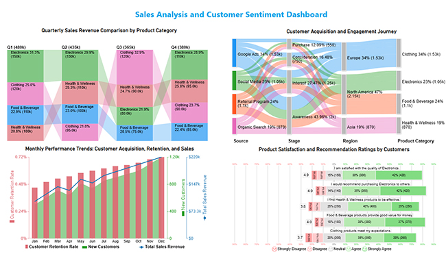
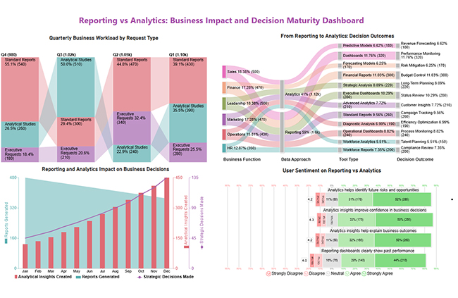
This sales analytics and customer sentiment dashboard unifies revenue performance, customer journeys, growth trends, and satisfaction insights to reveal key sales drivers and customer perceptions.

Reporting vs Analytics

Example # 2:

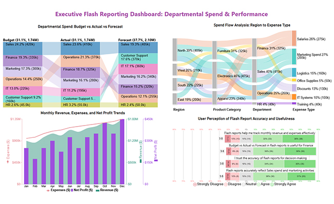
This executive dashboard gives leaders a high-level snapshot of budgets, spending, revenue trends, and user confidence for quick, informed decision-making.

Reporting vs Analytics

Example # 3:

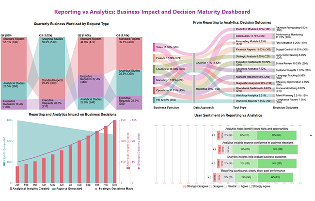
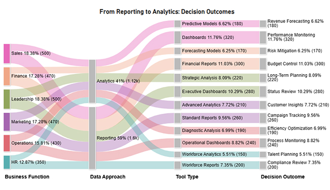
This dashboard highlights the shift from reporting to analytics, showing changing workloads, stronger decision impact, and rising confidence in analytics-driven insights.

Reporting vs Analytics

Example # 4:

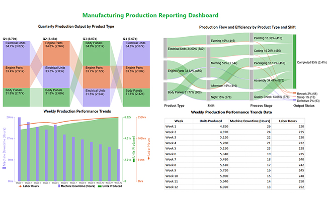
This manufacturing dashboard uses product analytics to monitor output, efficiency, downtime, and quality, helping teams optimize production and reduce losses.

Reporting vs Analytics

How to Analyze Analytics vs Reporting in Power BI?

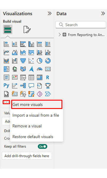
Power BI delivers a strong environment for evaluating reporting vs analysis through interactive dashboards and advanced visualizations.
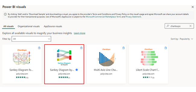
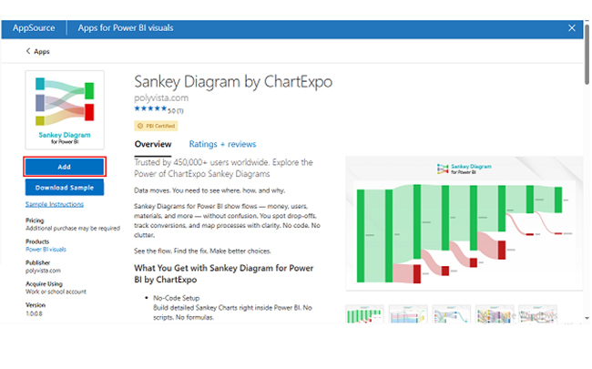
  • Connect structured datasets to build standard reports for performance tracking.
  • Design dashboards that summarize KPIs for data reporting needs.
  • Apply advanced visuals to uncover patterns across HR analytics datasets.
  • Enhance insights with ChartExpo, which extends Power BI’s capabilities by enabling insight-driven visuals that reveal relationships traditional charts may miss.

Why use ChartExpo?

  • Adds advanced visuals to uncover insights beyond standard charts.
  • Makes complex data easier to understand with clear, decision-ready visuals.
  • Offers a 7-day free trial and costs $10/month.

Example:

First, Install the Power BI and Log in to Power BI.

  • Enter your email. Click the “Submit” button.
Reporting vs Analytics
  • You are redirected to your Microsoft account.
  • Enter your password and click “Sign in”.
Reporting vs Analytics
  • Once done, the Power BI home screen will open.

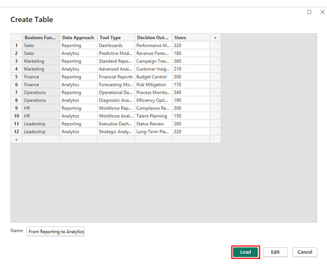
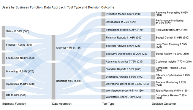
Now, consider we have the following data for a Sankey Chart.

Business Function Data Approach Tool Type Decision Outcome Users
Sales Reporting Dashboards Performance Monitoring 320
Sales Analytics Predictive Models Revenue Forecasting 180
Marketing Reporting Standard Reports Campaign Tracking 260
Marketing Analytics Advanced Analytics Customer Insights 210
Finance Reporting Financial Reports Budget Control 300
Finance Analytics Forecasting Models Risk Mitigation 170
Operations Reporting Operational Dashboards Process Monitoring 240
Operations Analytics Diagnostic Analysis Efficiency Optimization 190
HR Reporting Workforce Reports Compliance Review 200
HR Analytics Workforce Analytics Talent Planning 150
Leadership Reporting Executive Dashboards Status Review 280
Leadership Analytics Strategic Analysis Long-Term Planning 220
  • First, you need to add data to your report and click on the “Paste data into a blank report”.
Reporting vs Analytics
  • Paste the data table above into a blank table, name it, and click on the “Load” button.
Reporting vs Analytics
  • To build a Sankey Chart, import the visual from App Source by opening the Visualizations panel.
  • Select “Get more Visuals”.
Reporting vs Analytics
  • Search ChartExpo and select the Sankey Diagram. It’s also recommended to add the Multi Axis Line Chart, Comparison Bar Chart, and Likert Chart to support different insights.
Reporting vs Analytics
  • Click on the “ADD” button.
Reporting vs Analytics
  • Once you have added all four charts to your visuals, you’ll see the chart icons in your visuals list.
Reporting vs Analytics
  • To add a Sankey Chart visual, click on the chart icon and choose the dimension and measures.
Reporting vs Analytics
  • In Visualization’s properties, click on License Settings and add the key. So that you’ll see the Sankey Chart without a watermark.
Reporting vs Analytics
  • Now, after applying the key, the watermark is removed from the chart.
Reporting vs Analytics
  • Now, we will enhance the chart’s appearance and modify the title to better align with the visualized data.
Reporting vs Analytics
  • You can set bar colors from “Visual”.
Reporting vs Analytics
  • The final look of the Sankey Chart is given below.
Reporting vs Analytics

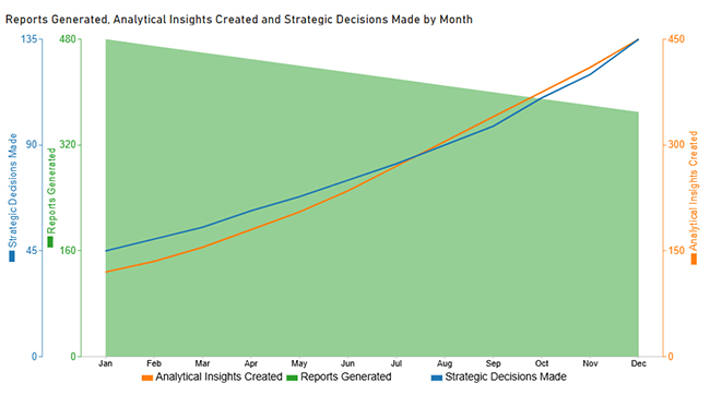
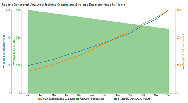
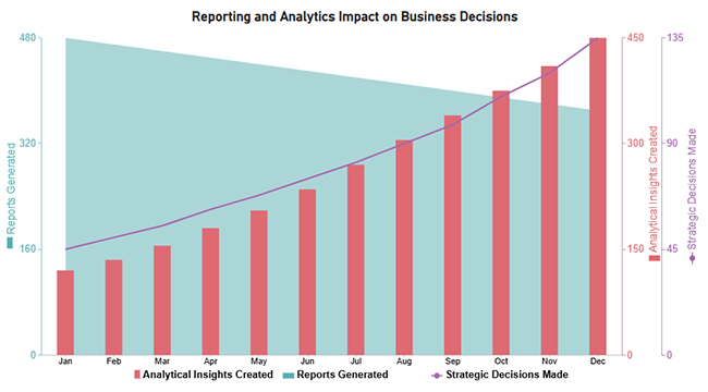
Now discuss the second chart. Consider we have the following data for the Multi Axis Line Chart.
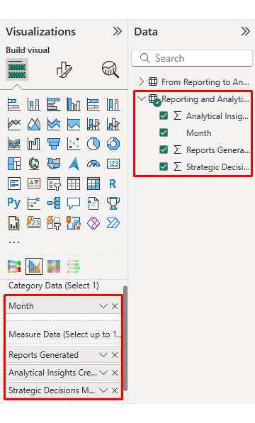
Month Reports Generated Analytical Insights Created Strategic Decisions Made
Jan 480 120 45
Feb 470 135 50
Mar 460 155 55
Apr 450 180 62
May 440 205 68
Jun 430 235 75
Jul 420 270 82
Aug 410 305 90
Sep 400 340 98
Oct 390 375 110
Nov 380 410 120
Dec 370 450 135
  • Once the data is manually pasted or exported from Excel, choose the dimension and measures.
Reporting vs Analytics
  • Before creating the chart, enter the key to remove the watermark. Once applied, the chart will appear without the watermark.
Reporting vs Analytics
  • If you notice in the chart, the months in x-axis are not ordered correctly. Create a new table to sort the data from Jan to Dec.
  • Enter data manually, name it, and click on the “Load” button.
Reporting vs Analytics
  • Open “Table View”, select the “Sort Order” table, select the “Month Column”, and set the sorting order column.
Reporting vs Analytics
  • Choose sort by order.
Reporting vs Analytics
  • With the custom sorting set, use the Month column from the Sort Order table instead of the original table’s Month column.
Reporting vs Analytics
  • The chart should now display with the custom sorting order applied on the X-axis.
Reporting vs Analytics
  • First, we will change the title of the chart, then we will change the data representation.
Reporting vs Analytics
  • Next, we will change legend properties to set the shape type.
Reporting vs Analytics
  • The final look of the Multi Axis Line Chart is given below.
Reporting vs Analytics

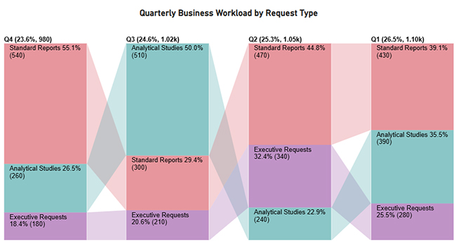
Now discus third chart. Consider we have the following data for a Comparison Bar Chart.

Quarter Request Type Business Workload Volume
Q1 Standard Reports 430
Q1 Analytical Studies 390
Q1 Executive Requests 280
Q2 Standard Reports 470
Q2 Analytical Studies 240
Q2 Executive Requests 340
Q3 Standard Reports 300
Q3 Analytical Studies 510
Q3 Executive Requests 210
Q4 Standard Reports 540
Q4 Analytical Studies 260
Q4 Executive Requests 180
  • Once data is manually pasted in Power BI or exported from Excel, choose the dimension and measures.
Reporting vs Analytics
  • Enter the key to remove the watermark, then update the chart title and change the bar color.
Reporting vs Analytics
  • The final look of the Comparison Bar Chart is given below.
Reporting vs Analytics

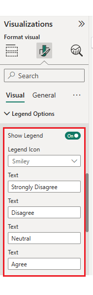
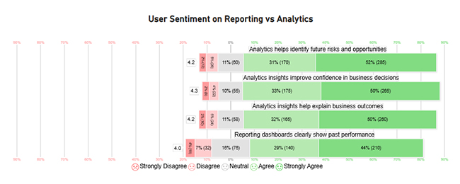
Now, discuss the fourth chart, consider we have the following data for the Likert Chart.
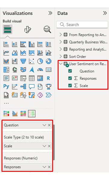
Question Scale Responses
Reporting dashboards clearly show past performance 1 18
Reporting dashboards clearly show past performance 2 32
Reporting dashboards clearly show past performance 3 76
Reporting dashboards clearly show past performance 4 140
Reporting dashboards clearly show past performance 5 210
Analytics insights help explain business outcomes 1 10
Analytics insights help explain business outcomes 2 24
Analytics insights help explain business outcomes 3 58
Analytics insights help explain business outcomes 4 165
Analytics insights help explain business outcomes 5 260
Analytics helps identify future risks and opportunities 1 12
Analytics helps identify future risks and opportunities 2 26
Analytics helps identify future risks and opportunities 3 60
Analytics helps identify future risks and opportunities 4 170
Analytics helps identify future risks and opportunities 5 285
Analytics insights improve confidence in business decisions 1 9
Analytics insights improve confidence in business decisions 2 22
Analytics insights improve confidence in business decisions 3 55
Analytics insights improve confidence in business decisions 4 175
Analytics insights improve confidence in business decisions 5 265
  • Once the data is manually pasted or exported from Excel, choose the dimension and measures.
Reporting vs Analytics
  • Enter the key to remove the watermark, update the title, and adjust rating colors and labels. You can change the legend text as well.
Reporting vs Analytics
  • The final look of the Likert Chart is shown below.
Reporting vs Analytics

Arrange the charts efficiently and add interactivity to create a clear, engaging dashboard. After placement, the dashboard should appear as shown below.

Reporting vs Analytics

Key Insights

  • In the Sankey Chart, analytics claims 41% compared to reporting’s 59%, yet drives more strategic results like forecasting and risk mitigation.
  • In the Comparison Bar Chart, standard reports decline from 540 to 430, while analytical studies jump from 260 to 390, and executive requests climb from 180 to 280.
  • In the Multi-Axis Line Chart, reports fall from 480 to 370 as analytical insights surge from 120 to 450 and strategic decisions leap from 45 to 135.
  • In the Likert Chart, 50-52% strongly agree analytics boosts confidence and outcomes, with over 80% total agreement, while reporting stays anchored to the past.

Benefits of Using Reporting and Analytics Together

Combining reporting and analytics lets organizations balance control with innovation. Key benefits include:

  • Enhanced decision-making using historical context and predictive insight.
  • Increased efficiency and productivity across teams.
  • Deeper customer understanding supported by business analytics.
  • Proactive risk management and forecasting.
  • Faster response to market changes.
  • Improved financial performance through insight-driven planning.
  • Greater transparency and accountability in operations.

Best Practices for Choosing Between Reporting vs Analytics

Picking the right approach in reporting vs analytics depends on business objectives, data maturity, and user capabilities.

Best practices include:

  • Identify decision-making needs clearly.
  • Assess data maturity and governance readiness.
  • Select tools aligned with complexity and scale.
  • Align with strategic goals.
  • Train users based on analytical responsibilities.
  • Review and refine processes regularly using pivot reporting.

FAQs

When should I use reporting instead of analytics?

Reporting works best when you need consistent summaries of past performance for monitoring KPIs and compliance.

Can reporting and analytics be used together?

Yes, blending reporting and analytics delivers both historical visibility and forward-looking insights.

Is analytics more advanced than reporting?

Analytics is typically more advanced since it involves exploration, modeling, and prediction beyond static reporting.

Which tools are best for reporting vs analytics?

Modern BI platforms support both analytics and reporting, letting users scale from summaries to insights within a single ecosystem.

 Wrap Up

Reporting turns raw data into clear snapshots of past performance and progress. It supports routine monitoring, compliance, and quick status checks for stakeholders. Analytics goes further, testing drivers, patterns, and relationships behind the results. Together they answer what happened, why it happened, and what to do.

Use a shared data model, then build reports and analytic views in Power BI. Add ChartExpo visuals, like Sankey and Likert, to explain flows and sentiment. Validate insights with KPIs, segment filters, and repeatable steps for decision-making. This blend improves planning, reduces risk, and highlights opportunities before they vanish. When reporting and analytics work together, teams move faster and act confidently.

How much did you enjoy this article?

PBIAd1
Start Free Trial!
159065

Related articles

next previous
Data Analytics10 min read

Booking Dashboard: Charts for Booking Insights

Learn how a Booking Dashboard centralizes reservations, tracks KPIs, and improves forecasting. How to create and analyze booking dashboards in Power BI.

Data Analytics11 min read

Growth Metrics: Growth Insights Made Visual

Growth metrics measure performance and growth. This blog shows key KPIs and tools to help you track progress and make smarter decisions.

Data Analytics11 min read

Renovation Budgeting: A Visual Approach

Learn how to use renovation budgeting to plan and track your home project. This guide shows tips, tools, and visuals to control costs and avoid overspending.

Data Analytics8 min read

What is ROI in Business: ROI Insights Made Simple

Understand ROI in Business, how to calculate it, analyze returns, and use real examples to make smarter, data-driven investment decisions.

Data Analytics9 min read

Healthcare Datasets: Step-by-Step Guide for Insights

Learn what datasets for healthcare are, why they matter, real-world examples, and how to analyze medical data effectively with Power BI and advanced visuals.

ChartExpo logo

Turn Data into Visual
Stories

CHARTEXPO

  • Home
  • Gallery
  • Videos
  • Services
  • Pricing
  • Contact us
  • FAQs
  • Privacy policy
  • Terms of Service
  • Sitemap

TOOLS

  • ChartExpo for Google Sheets
  • ChartExpo for Microsoft Excel
  • Power BI Custom Visuals by ChartExpo
  • Word Cloud

CATEGORIES

  • Bar Charts
  • Circle Graphs
  • Column Charts
  • Combo Charts
  • Comparison Charts
  • Line Graphs
  • PPC Charts
  • Sentiment Analysis Charts
  • Survey Charts

TOP CHARTS

  • Sankey Diagram
  • Likert Scale Chart
  • Comparison Bar Chart
  • Pareto Chart
  • Funnel Chart
  • Gauge Chart
  • Radar Chart
  • Radial Bar Chart
  • Sunburst Chart
  • see more
  • Scatter Plot Chart
  • CSAT Survey Bar Chart
  • CSAT Survey Chart
  • Dot Plot Chart
  • Double Bar Graph
  • Matrix Chart
  • Multi Axis Line Chart
  • Overlapping Bar Chart
  • Control Chart
  • Slope Chart
  • Clustered Bar Chart
  • Clustered Column Chart
  • Box and Whisker Plot
  • Tornado Chart
  • Waterfall Chart
  • Word Cloud
  • see less

RESOURCES

  • Blog
  • Resources
  • YouTube
SIGN UP FOR UPDATES

We wouldn't dream of spamming you or selling your info.

© 2026 ChartExpo, all rights reserved.