• Home
  • Tools dropdown img
    • Spreadsheet Charts

      • ChartExpo for Google Sheets
      • ChartExpo for Microsoft Excel
    • Power BI Charts

      • Power BI Custom Visuals by ChartExpo
    • Word Cloud

  • Charts dropdown img
    • Chart Category

      • Bar Charts
      • Circle Graphs
      • Column Charts
      • Combo Charts
      • Comparison Charts
      • Line Graphs
      • PPC Charts
      • Sentiment Analysis Charts
      • Survey Charts
    • Chart Type

      • Box and Whisker Plot
      • Clustered Bar Chart
      • Clustered Column Chart
      • Comparison Bar Chart
      • Control Chart
      • CSAT Survey Bar Chart
      • CSAT Survey Chart
      • Dot Plot Chart
      • Double Bar Graph
      • Funnel Chart
      • Gauge Chart
      • Likert Scale Chart
      • Matrix Chart
      • Multi Axis Line Chart
      • Overlapping Bar Chart
      • Pareto Chart
      • Radar Chart
      • Radial Bar Chart
      • Sankey Diagram
      • Scatter Plot Chart
      • Slope Chart
      • Sunburst Chart
      • Tornado Chart
      • Waterfall Chart
      • Word Cloud
    • Google Sheets
      Microsoft Excel
  • Services
  • Pricing
  • Contact us
  • Blog
  • Support dropdown img
      • Gallery
      • Videos
      • Contact us
      • FAQs
      • Resources
    • Please feel free to contact us

      atsupport@chartexpo.com

Categories
All Data Visualizations Data Analytics Surveys
Add-ons/
  • Google Sheets
  • Microsoft Excel
  • Power BI
All Data Visualizations Data Analytics Surveys
Add-ons
  • Google Sheets
  • Microsoft Excel
  • Power BI

We use cookies

This website uses cookies to provide better user experience and user's session management.
By continuing visiting this website you consent the use of these cookies.

Ok

ChartExpo Survey


Home > Blog > Data Analytics

Agile Performance Metrics: From Activity to Real Outcomes

It might have caught you off guard. Or you saw the shift happening all along. But here we are, in a space where performance metrics decide whether a team moves forward or falls behind.

Agile teams cannot afford guesswork. Decisions backed by data push projects faster, smarter, and with sharper results.

Agile Performance Metrics

Ask yourself this. Are you tracking the right performance metrics? Many teams focus on output alone. Yet speed without direction can quickly lead to waste.

That is why leaders now turn to business metrics that measure not just delivery but impact. A sprint completed means little if customer value is missing. Agile thrives on feedback loops, and metrics fuel those loops with clarity.

The conversation does not end with the basics. High-performing organizations rely on smart KPIs to guide every sprint. These KPIs are clear, measurable, and directly linked to goals. Teams using them stay aligned while cutting through distractions.

So the question is simple. Are you tracking numbers that push your team to grow, or are you measuring for the sake of reporting? Agile success depends on choosing the right performance metrics and acting on them. That is where the real advantage begins.

So…

Table of Contents:

  1. What are Agile Metrics?
  2. Why are Agile Metrics Important?
  3. Types of Agile KPIs
  4. Examples of Agile Metrics
  5. 13 Agile Metrics and KPIs to Track
  6. How to Track Agile Team Metrics?
  7. How to Analyze Agile Performance Metrics in Excel?
  8. Benefits of Agile Development Metrics
  9. How to choose Agile Performance Metrics?
  10. Best Practices of Agile Performance Metrics
  11. FAQs
  12. Wrap Up

What are Agile Metrics?

Definition: Agile metrics are measures that track how teams perform and deliver value. They show progress, efficiency, and quality in simple numbers. Teams use them to see what works and what slows things down.

Agile metrics go beyond speed. They also highlight collaboration, adaptability, and outcomes. A strong customer success metric shows if the work creates value for the end user.

Leaders use metrics and KPIs to set direction and align goals. The goal is not to collect data for reports. The goal is to drive action. Agile metrics give teams clarity and help them improve with each sprint.

Why are Agile Metrics Important?

Imagine running a race without knowing where the finish line is. You may be moving fast, but you cannot tell if you are winning. Agile metrics change that. They turn movement into meaningful progress that teams and leaders can see.

Why?

  • Clarity: Agile metrics provide direction by showing what truly impacts success. They replace guesswork with data that keeps teams aligned with their goals.
  • Improvement: Metrics give teams a way to measure growth over time. Each sprint becomes an opportunity to learn from results and apply those lessons in the next cycle.
  • Smart KPIs: Smart KPIs link actions directly to business objectives. They ensure teams focus on outcomes that create value rather than chasing empty numbers.
  • Visuals: KPI graphs transform data into stories that are easy to grasp. Trends, patterns, and gaps become visible at a glance, making decisions faster and more accurate.

Types of Agile KPIs

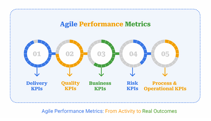
Not all Agile KPIs tell the same story. Some reveal how fast teams deliver, while others show if the work creates real impact. Think of them as signals that guide leaders and teams toward meaningful improvement:

  • Delivery KPIs: These KPIs measure how quickly and effectively work is delivered. They track velocity, lead time, and cycle time to show if teams are meeting commitments.
  • Quality KPIs: Quality metrics reflect customer satisfaction and product stability. A strong customer success metric here might track defect rates, test coverage, or issue resolution time.
  • Business KPIs: These numbers connect work to value. They often link with financial metrics, showing whether the output supports revenue, growth, or efficiency goals.
  • Risk KPIs: These KPIs highlight exposure to problems before they grow. Key risk indicators help leaders act early and prevent costly failures.
  • Process and Operational KPIs: These KPIs reveal how well workflows function. They indicate whether daily processes are efficient and sustainable.

Examples of Agile Metrics

Metrics become powerful when they move from theory to practice. Agile teams do not succeed by guessing. They succeed by tracking numbers that reveal progress and expose problems. Each metric tells a different story. Together, they guide smarter choices, much like financial metrics guide business health.

Here are some agile metrics  to help you act with confidence instead of assumptions:

  • Velocity: This measures the amount of work a team completes in a sprint. It helps forecast future capacity and builds trust in the planning process.
  • Cycle Time: Cycle time shows how long a single task takes from start to finish. Shorter times often mean smoother processes and faster delivery.
  • Lead Time: Lead time captures the full journey from request to completion. It highlights how quickly value reaches the customer.
  • Cumulative Flow Diagram: This visual tool shows work in different stages. Teams can use it as a simple KPI dashboard in Excel to spot bottlenecks and track flow.
  • Escaped Defects: Escaped defects measure issues that slip into production. Tracking them is a strong form of key risk indicators because they reveal the cost of poor quality.

13 Agile Metrics and KPIs to Track

Every team wants to move fast, but speed alone can be misleading. Agile metrics bring transparency to progress. They show where effort creates value, where delays appear, and how teams can improve. Use these 13 metrics as a checkpoint to guide smarter decisions and drive real results:

  1. Velocity: Tracks how much work a team completes in a sprint. It helps forecast future capacity and builds trust in the planning process.
  2. Sprint Burndown: Measures progress toward sprint goals each day. It gives teams early warnings when tasks risk falling behind.
  3. Release Burndown: Monitors progress toward larger releases. It ensures major commitments stay realistic and achievable.
  4. Cycle Time: Shows how long it takes to finish a single task once it begins. Shorter times reflect smoother processes and faster delivery.
  5. Lead Time: Captures the full journey from a request being made to completion. It reveals how quickly value reaches the customer.
  6. Throughput: Measures how many tasks are finished in a set period. It highlights productivity trends and team consistency.
  7. Work in progress (WIP): Shows how many tasks are currently active. It prevents teams from spreading focus too thin.
  8. Epic and Release Progress: Tracks how larger bodies of work are moving forward. It keeps long-term objectives visible and aligned.
  9. Cumulative Flow Diagram: Visualizes work across different stages. It makes bottlenecks easy to identify and resolve.
  10. Defect Density: Measures the number of defects compared to completed work. It offers a clear picture of overall product quality.
  11. Escaped Defects: Tracks issues that appear after release. They highlight risks that impact customer trust and satisfaction.
  12. Customer Satisfaction Score (CSAT): Captures how satisfied users are with a product or service. It provides direct, actionable feedback from real customers.
  13. Net Promoter Score (NPS): Measures loyalty by asking how likely customers are to recommend the product. A high score signals long-term growth and stronger retention.

How to Track Agile Team Metrics?

Measuring Agile success is not about tracking every number you can find. It is about focusing on the signals that matter most. Agile teams thrive when they have clarity, visibility, and alignment. Follow these steps to make progress tangible and guide better decisions with every sprint:

  • Start with consistency: Use tools that track work from backlog to delivery. This ensures no task gets lost and progress remains transparent.
  • Keep it visual: Charts and boards make patterns easy to see. They save time and help teams spot trends at a glance.
  • Focus on what matters: Choose metrics and KPIs that tie directly to team or business goals. Ignoring vanity numbers keeps the team aligned with tangible outcomes.
  • Review results often: Look at metrics at the end of each sprint. Frequent check-ins keep performance visible and improvement continuous.
  • Make insights shareable: A KPI dashboard in Excel or a project tool helps everyone access the same information. Shared visibility builds accountability across the team.
  • Balance depth and simplicity: Tracking too much data creates confusion. The right mix of measures drives improvement without slowing down delivery.

How to Analyze Agile Performance Metrics in Excel?

Agile teams run on focus, speed, and smart choices. But how do you know if your team is truly winning? Agile performance metrics hold the answer. Data shows the story, but how you see that data makes all the difference.

Spreadsheets can crunch numbers, yet Excel often falls short when it comes to clear data visualization. Rows and columns rarely inspire action.

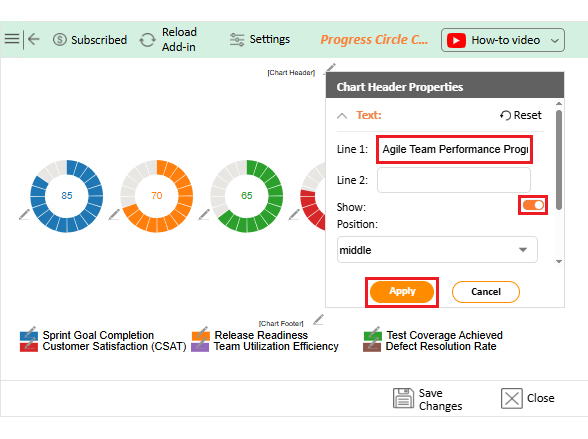
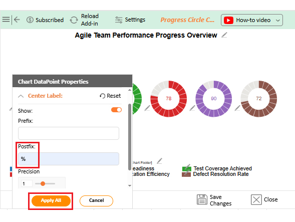
This is where ChartExpo steps in. It transforms raw numbers into visuals that teams can actually use. Charts replace confusion with clarity, making tracking KPIs to measure and improve success simple, fast, and effective.

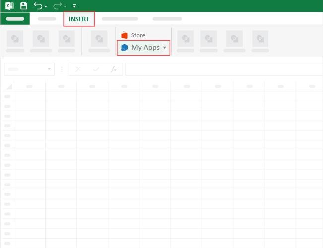
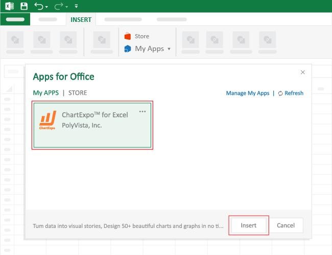
How to Install ChartExpo in Excel?

  1. Open your Excel application.
  2. Open the worksheet and click the “Insert” menu.
  3. You’ll see the “My Apps” option.
  4. In the Office Add-ins window, click “Store” and search for ChartExpo on my Apps Store.
  5. Click the “Add” button to install ChartExpo in your Excel.

ChartExpo charts are available both in Google Sheets and Microsoft Excel. Please use the following CTAs to install the tool of your choice and create beautiful visualizations with a few clicks in your favorite tool.

Example

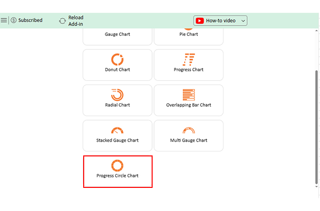
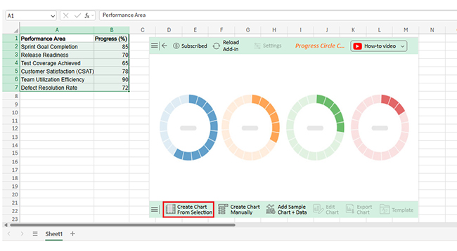
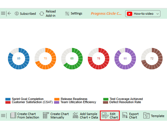
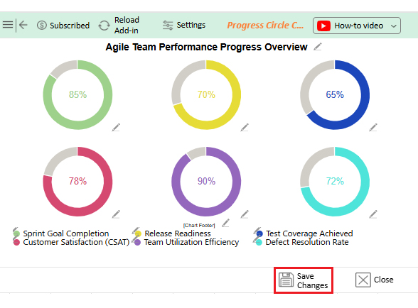
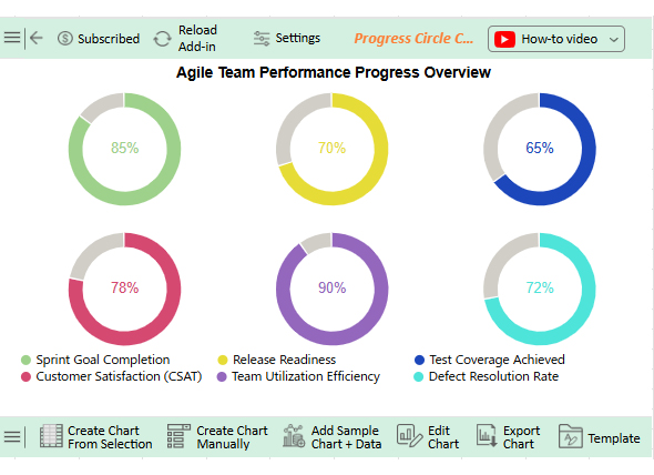
Let’s analyze this agile performance metrics sample data in Excel using ChartExpo.

Performance Area

Progress (%)

Sprint Goal Completion 85
Release Readiness 70
Test Coverage Achieved 65
Customer Satisfaction (CSAT) 78
Team Utilization Efficiency 90
Defect Resolution Rate 72
  • To get started with ChartExpo, install ChartExpo in Excel.
  • Now, click on My Apps from the INSERT menu.
Agile Performance Metrics
  • Choose ChartExpo from My Apps, then click Insert.
Agile Performance Metrics
  • Once it loads, scroll through the charts list to locate and choose the “Progress Circle Chart”.
Agile Performance Metrics
  • Click the “Create Chart From Selection” button after selecting the data from the sheet, as shown.
Agile Performance Metrics
  • ChartExpo will generate the visualization below for you.
Agile Performance Metrics
  • If you want to add anything to the chart, click the Edit Chart button:
  • Click the pencil icon next to the Chart Header to change the title.
  • It will open the properties dialog. Under the Text section, you can add a heading in Line 1 and enable Show.
  • Give the appropriate title of your chart and click the Apply button.
Agile Performance Metrics
  • You can add the (%) with all values:
Agile Performance Metrics
  • Change the color or shape of the legend as follows:
Agile Performance Metrics
  • You can change the Variation type by clicking on the settings button as follows:
Agile Performance Metrics
  • You can increase the font size for better readability.
Agile Performance Metrics
  • Click the “Save Changes” button to persist the changes made to the chart.
Agile Performance Metrics
  • Your final Progress Circle Chart will look like the one below.
Agile Performance Metrics

Insights

  • Sprint goal completion (85%) – Teams deliver most of what they commit to, showing reliable planning.
  • Release readiness (70%) – Progress is slower, signaling more work or testing is needed before release.
  • Test coverage (65%) – Lowest score, highlighting weak quality assurance and higher post-release risk.
  • Team utilization efficiency (90%) – Very high, showing strong resource use but potential risk of overutilization.

Benefits of Agile Development Metrics

Picture a coach trying to win games without tracking scores or player stats. It would feel random and blind. Agile development metrics don’t slow teams down. They shine a light on progress, quality, and value. The real benefit is turning activity into insight and insight into results.

How?

  • Clear visibility: Agile development metrics make progress easy to track and monitor. Teams no longer have to guess where they stand because the data speaks clearly.
  • More substantial alignment: Metrics connect daily tasks to broader business goals. This keeps everyone focused on outcomes that matter, not just activity.
  • Continuous improvement: Each metric provides feedback that fuels learning. Teams use this insight to adapt, refine, and deliver better results over time.

How to choose Agile Performance Metrics?

Choosing Agile performance metrics can feel tricky. Measure too much, and the team drowns in numbers. Measure too little, and you lose sight of progress. The right balance makes success visible and actionable. And how do you achieve this balance?

  1. Start with purpose: Ask what success really means for your team. Without a clear purpose, metrics become noise instead of guidance.
  2. Align with goals: Metrics should tie daily work to business outcomes. This makes each sprint meaningful beyond task completion.
  3. Keep it simple: Too many measures slow decision-making. A focused set of metrics and KPIs brings clarity without confusion.
  4. Balance speed and quality: Track efficiency but never ignore value. A strong customer success metric indicates that fast delivery continues to meet user expectations.
  5. Make them visible: Numbers work best when everyone can see them. A simple chart or KPI dashboard in Excel makes insights accessible.

Best Practices of Agile Performance Metrics

Agile metrics are powerful, but only when used wisely. Too often, teams measure for the sake of reporting. That creates noise instead of clarity. The real value lies in practices that turn data into informed decisions. Done right, they drive improvement, trust, and measurable success.

  • Focus on outcomes: Measure impact, not activity. A strong customer success metric shows whether the work creates real value.
  • Use visuals wisely: Charts tell stories faster than spreadsheets. A simple KPI dashboard in Excel can work, but advanced tools reveal insights more clearly.
  • Balance different views: Mix operational KPIs with business measures. This gives both a ground-level and strategic picture of performance.
  • Review often: Metrics lose power if ignored. Regular reviews keep progress visible and improvement continuous.

FAQs

What are the leading indicators in agile?

Leading indicators are predictive metrics that show future performance. They signal potential risks or successes before outcomes occur. Teams use them to adjust work, prevent delays, and improve delivery.

What are the metric values in Agile?

Metrics offer valuable insights into team performance, progress, and quality. They help guide decisions, improve processes, and ensure work aligns with business goals. Without metrics, teams risk inefficiency and missed opportunities.

Wrap Up

Agile success is never accidental. It comes from focus, teamwork, and the right measurements. Metrics turn effort into insight and insight into action.

Each KPI tells a different part of the story. Some show speed while others reveal quality. Together, they create a clear picture of progress and value.

Teams that rely on data make better choices. Financial metrics prove business impact. A strong balance between delivery and results ensures every sprint supports long-term growth and success.

And that’s not all.

Visualization matters as much as measurement. Numbers locked in rows do not inspire action. A KPI dashboard in Excel can help, but it often feels limited and static. This is where ChartExpo makes a difference. It transforms raw data into visuals that teams can read in seconds. Whether you are tracking velocity, quality, or even KPIs for the manufacturing industry, the right chart removes confusion and sparks smarter conversations.

Now is the time to act. Do not leave metrics buried in spreadsheets. Install ChartExpo and start using it today. This will make your Agile KPIs clear, engaging, and useful. With the right visuals, every sprint becomes a chance to deliver better results and stronger success.

How much did you enjoy this article?

PBIAd1
Start Free Trial!
158185

Related articles

next previous
Data Analytics13 min read

Cash Flow Forecasting Template: A Complete Guide

Cash flow forecasting template designed to help businesses monitor liquidity, plan expenses, and prepare for financial changes.

Data Analytics13 min read

Social Media Marketing Plan Template for SMM Success

A template for a social media marketing plan organizes goals and tracking. This blog shows you how to plan, analyze, and report smarter for better results.

Data Analytics12 min read

Cash Flow Analysis Template: A Complete Guide

A cash flow analysis template helps track inflows and outflows with clarity. Discover how Google Sheets and smart tools improve analysis and decision-making.

Data Analytics12 min read

Cap Table Template: Simplifying Equity Analysis

A cap table template tracks ownership and dilution. This blog shows how to create, analyze, and visualize cap tables in Google Sheets for better decisions.

Data Analytics14 min read

Visual Encoding: The Rules That Improve Insights

Visual encoding converts complex data into visuals that are simple to read. It uses color, size, shape, and position to reveal trends, comparisons, and insights.

ChartExpo logo

Turn Data into Visual
Stories

CHARTEXPO

  • Home
  • Gallery
  • Videos
  • Services
  • Pricing
  • Contact us
  • FAQs
  • Privacy policy
  • Terms of Service
  • Sitemap

TOOLS

  • ChartExpo for Google Sheets
  • ChartExpo for Microsoft Excel
  • Power BI Custom Visuals by ChartExpo
  • Word Cloud

CATEGORIES

  • Bar Charts
  • Circle Graphs
  • Column Charts
  • Combo Charts
  • Comparison Charts
  • Line Graphs
  • PPC Charts
  • Sentiment Analysis Charts
  • Survey Charts

TOP CHARTS

  • Sankey Diagram
  • Likert Scale Chart
  • Comparison Bar Chart
  • Pareto Chart
  • Funnel Chart
  • Gauge Chart
  • Radar Chart
  • Radial Bar Chart
  • Sunburst Chart
  • see more
  • Scatter Plot Chart
  • CSAT Survey Bar Chart
  • CSAT Survey Chart
  • Dot Plot Chart
  • Double Bar Graph
  • Matrix Chart
  • Multi Axis Line Chart
  • Overlapping Bar Chart
  • Control Chart
  • Slope Chart
  • Clustered Bar Chart
  • Clustered Column Chart
  • Box and Whisker Plot
  • Tornado Chart
  • Waterfall Chart
  • Word Cloud
  • see less

RESOURCES

  • Blog
  • Resources
  • YouTube
SIGN UP FOR UPDATES

We wouldn't dream of spamming you or selling your info.

© 2026 ChartExpo, all rights reserved.