• Home
  • Tools dropdown img
    • Spreadsheet Charts

      • ChartExpo for Google Sheets
      • ChartExpo for Microsoft Excel
    • Power BI Charts

      • Power BI Custom Visuals by ChartExpo
    • Word Cloud

  • Charts dropdown img
    • Chart Category

      • Bar Charts
      • Circle Graphs
      • Column Charts
      • Combo Charts
      • Comparison Charts
      • Line Graphs
      • PPC Charts
      • Sentiment Analysis Charts
      • Survey Charts
    • Chart Type

      • Box and Whisker Plot
      • Clustered Bar Chart
      • Clustered Column Chart
      • Comparison Bar Chart
      • Control Chart
      • CSAT Survey Bar Chart
      • CSAT Survey Chart
      • Dot Plot Chart
      • Double Bar Graph
      • Funnel Chart
      • Gauge Chart
      • Likert Scale Chart
      • Matrix Chart
      • Multi Axis Line Chart
      • Overlapping Bar Chart
      • Pareto Chart
      • Radar Chart
      • Radial Bar Chart
      • Sankey Diagram
      • Scatter Plot Chart
      • Slope Chart
      • Sunburst Chart
      • Tornado Chart
      • Waterfall Chart
      • Word Cloud
    • Google Sheets
      Microsoft Excel
  • Services
  • Pricing
  • Contact us
  • Blog
  • Support dropdown img
      • Gallery
      • Videos
      • Contact us
      • FAQs
      • Resources
    • Please feel free to contact us

      atsupport@chartexpo.com

Categories
All Data Visualizations Data Analytics Surveys
Add-ons/
  • Google Sheets
  • Microsoft Excel
  • Power BI
All Data Visualizations Data Analytics Surveys
Add-ons
  • Google Sheets
  • Microsoft Excel
  • Power BI

We use cookies

This website uses cookies to provide better user experience and user's session management.
By continuing visiting this website you consent the use of these cookies.

Ok

ChartExpo Survey


Home > Blog > Microsoft Excel

Audit Dashboard in Excel: A Complete Walkthrough

Audit Dashboard in Excel—Can a spreadsheet power smarter audits? More audit teams are answering yes. Excel remains the top choice for data tasks, used by over 750 million people globally.

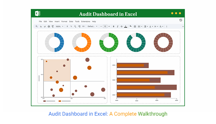
Audit Dashboard in Excel

When built correctly, an audit dashboard in Excel turns raw numbers into actionable insights. You can identify red flags, track risks, and report findings more quickly.
A digital dashboard changes the game. Instead of jumping between files, everything is consolidated in one place. KPIs, risk scores, timelines, and status updates are presented in a clear, concise, and visually appealing format. It brings confidence to what used to feel uncertain.

The beauty? You’re not starting from scratch. You can use dashboard templates in Excel to set the foundation. Then, customize them to fit your controls, objectives, and compliance needs. It saves hours, reduces errors, and gives your team a real sense of control.

An audit dashboard in Excel doesn’t need to be fancy. However, it must be smart, focused, easy to read, and ready to answer tough questions at a glance.

The best part? You already have the tools. Excel is on your desktop, and your audit data is ready. Now it’s about putting them together—clearly and with purpose.

Let’s see how to make that happen.

First…

Table of Contents:

  1. What is an Audit Dashboard in Excel?
  2. Why Use an Internal Audit Dashboard for Reporting?
  3. What Does a Good Internal Audit Format in Excel Include?
  4. Audit Dashboard Examples in Excel
  5. How to Create an Audit Dashboard in Excel?
  6. How to Analyze an Excel Financial Audit Dashboard?
  7. How to Use the Excel Audit Dashboard?
  8. Benefits of Using an Internal Audit Excel Dashboard Template
  9. Limitations of an Audit Dashboard in Excel
  10. FAQs
  11. Wrap Up

What is an Audit Dashboard in Excel?

Definition: An audit dashboard in Excel visually tracks audit activities and internal controls using charts, tables, and KPIs. It displays KPIs, timelines, and exceptions in real time. A well-structured KPI dashboard in Excel enables auditors to identify trends, gaps, and outliers quickly.

You can adapt this dashboard into a finance dashboard in Excel to monitor audit-related financial data. It simplifies reporting and keeps everyone aligned with compliance goals, eliminating the need for multiple tools.

Why Use an Internal Audit Dashboard for Reporting?

Have you ever felt like audit reports take forever and still miss something? You’re not alone. Many teams are moving from static reports to dashboards—for good reason. If you’ve ever wondered how to create a dashboard using Excel for audits, you’re already halfway there. It’s about turning data into action.

Here’s why an internal audit dashboard is worth your time:

  • Improved visibility: With a dashboard, you don’t need to dig through dozens of sheets to find one red flag. It shows trends, control gaps, and outliers – all in one view.
  • Centralized reporting: One file. One screen. That’s the goal. You can track multiple audit areas in one place, eliminating the need to flip through tabs and folders.
  • Real-time insights: Audit data changes quickly—your reports should too. Dashboards update instantly, so decisions are always based on current information.
  • Leader engagement: No one wants to read a 20-page audit summary. A clean dashboard provides senior leaders with the story quickly, without overwhelming them with details.
  • Compliance monitoring: Dashboards facilitate the easy tracking of regulatory KPIs. You can spot early signs of non-compliance before they snowball.

What Does a Good Internal Audit Format in Excel Include?

A clean audit file should work like a map. One glance, and you know what’s done, what’s at risk, and what needs attention. Whether you’re using a complete KPI dashboard in Excel or a simple table, structure matters. It’s not about looking fancy. It’s about being useful.

Here’s what every solid internal audit format in Excel should include:

  • Objective and scope of audit: Begin by explaining why the audit was conducted and what it encompassed. This sets the stage and keeps your reader focused.
  • Low, medium, high risk assessment: Classify risks by level of risk. It helps teams understand what’s critical and what can wait.
  • Findings summary: No fluff—only facts. Summarize issues clearly so decision-makers know what went wrong.
  • Compliance scores: Show how well departments or processes align with standards. A clear score (like 85%) speaks louder than long explanations.
  • Status (open, closed, in progress): Track the current state of every issue. It keeps everyone on the same page and shows what has been handled.
  • Action plan and responsible person: Every problem should have a fix. And someone who owns it.
  • Due dates/escalations: Timelines matter, and so do consequences. Use this section to flag overdue tasks and trigger follow-ups.

Audit Dashboard Examples in Excel

You don’t need special software to build helpful audit visuals. You need the correct layout, the right formulas, and a clear goal. Whether you’re reporting to leadership or tracking team tasks, an innovative dashboard makes all the difference. These audit dashboard examples in Excel demonstrate the power of this approach.

  • Risk Heatmap Dashboard: Utilize colors to identify the locations of the most significant threats. A Heatmap makes it easy to focus on what matters—high-risk areas that need immediate attention.
  • Tracking Audit Finding: List every issue with its risk level, department, owner, and due date. It keeps accountability visible and follow-up simple.
  • Audit KPIs Dashboard: Display key performance indicators at a glance—open issues, resolution times, audit coverage, and overdue actions. You don’t need to scroll through spreadsheets when it’s all in one view.
  • Monthly Audit Dashboard: Great for recurring reports. This dashboard compares audits month over month, helping teams spot patterns or recurring problems.
  • Internal Audit Compliance Scoreboard: Use this to track how different departments or regions stack up against compliance standards. It’s a smart way to encourage improvement and show progress over time.

How to Create an Audit Dashboard in Excel?

Knowing how to create an audit dashboard in Excel starts with one thing: clarity. Not colors. Not charts. Clarity! The goal is to make issues, risks, and actions visible without explanation.

Here’s how to build one that works:

  • Prepare your data: Organize your audit logs, risk ratings, departments, statuses, and dates into structured tables for easy analysis and interpretation. Insufficient data means bad dashboards—so double-check before you build.
  • Create pivot tables: Pivot Tables help you group, sort, and filter data fast. They’re perfect for showing audit findings by department, risk level, or status.
  • Add financial illustrations: Use bar charts, pie charts, or a gauge to visualize aspects such as budget variance, control costs, or risk exposure. This adds weight to the numbers you’re presenting.
  • Show KPIs: Include metrics such as the number of open audits, overdue actions, average resolution time, or compliance scores. A solid KPI dashboard in Excel highlights these key metrics front and center, so nothing gets missed.
  • Clarity format: Use clear labels, bold headers, light colors, and consistent spacing. Add slicers or drop-downs to allow users to filter what they want to see.

How to Analyze an Excel Financial Audit Dashboard?

Let’s be honest—Excel is excellent, until it isn’t. Sorting rows? Perfect. Crunching numbers? No problem. But when is the time to visualize all that data? Excel starts to sweat. Building a clear, dynamic audit dashboard in Excel often turns into a maze of charts, colors, and formulas that are barely comprehensible.

Excel was built for data, not storytelling. For visual data storytelling, use ChartExpo. This tool integrates seamlessly with Excel, making your dashboard appear less like a spreadsheet and more like insights.
How to Install ChartExpo in Excel?

  1. Open your Excel application.
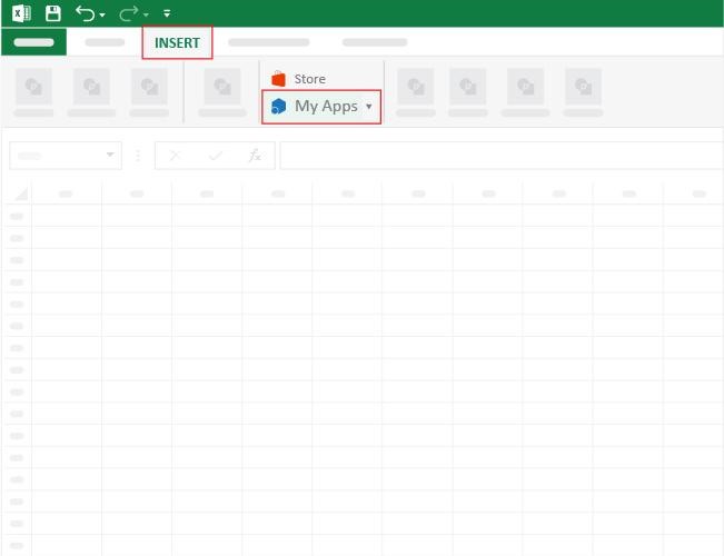
  2. Open the worksheet and click the “Insert” menu.
  3. You’ll see the “My Apps” option.
  4. In the Office Add-ins window, click “Store” and search for ChartExpo on the My Apps Store.
  5. Click the “Add” button to install ChartExpo in your Excel.

ChartExpo charts are available both in Google Sheets and Microsoft Excel. Please use the following CTAs to install the tool of your choice and create beautiful visualizations with a few clicks in your favorite tool.

Example

Let’s visualize and analyze this sample data in Excel using ChartExpo.

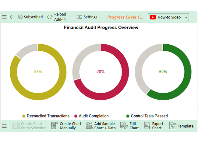
Audit Metric Progress (%)
Reconciled Transactions 85
Audit Completion 70
Control Tests Passed 60
  • To get started with ChartExpo, install ChartExpo in Excel.
  • Now, click on My Apps from the INSERT menu.
Audit Dashboard in Excel
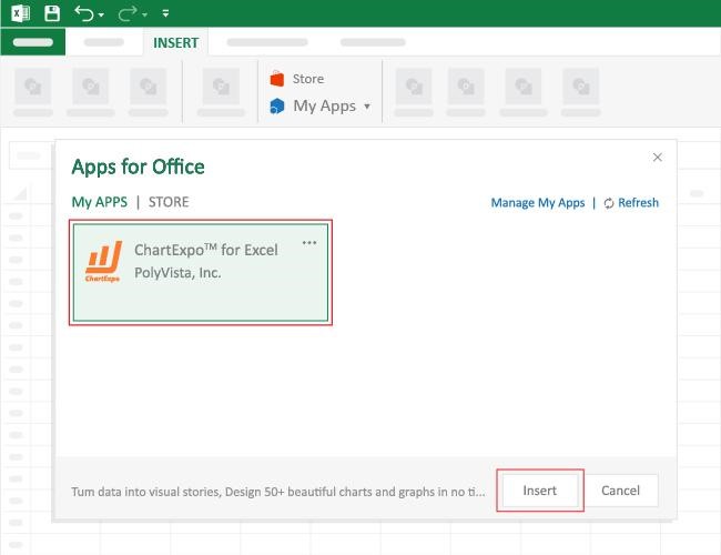
  • Choose ChartExpo from My Apps, then click Insert.
Audit Dashboard in Excel
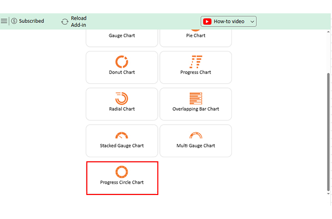
  • Once it loads, scroll through the charts list to locate and choose the “Progress Circle Chart”.
Audit Dashboard in Excel
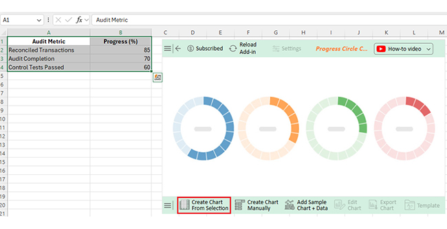
  • Click the “Create Chart From Selection” button after selecting the data from the sheet, as shown.
Audit Dashboard in Excel
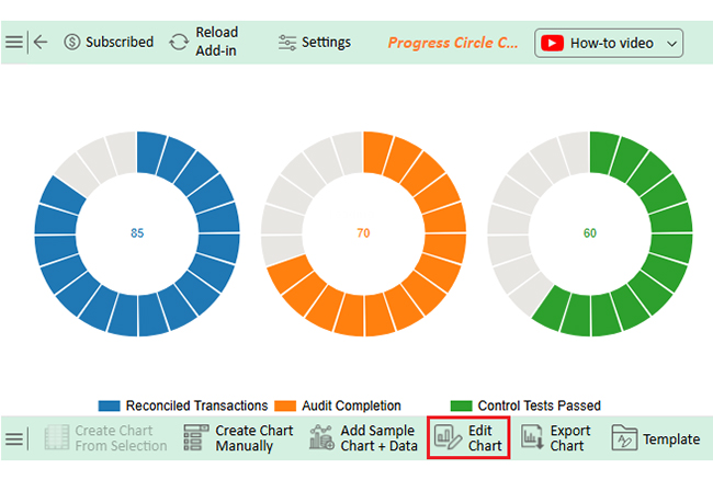
  • ChartExpo will generate the visualization below for you.
Audit Dashboard in Excel
  • If you want to add anything to the chart, click the Edit Chart button:
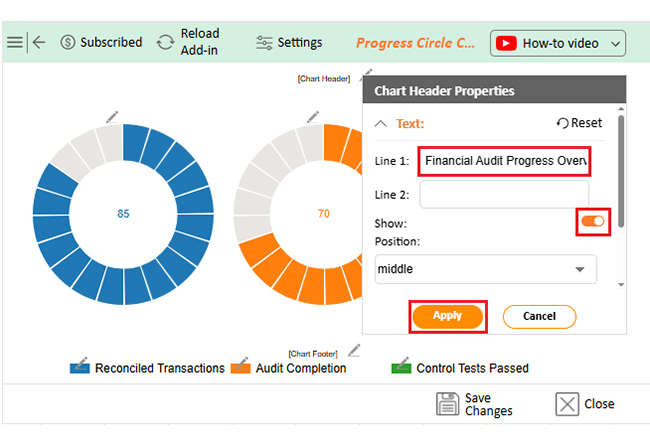
  • Click the pencil icon next to the Chart Header to change the title.
  • It will open the properties dialog. Under the Text section, you can add a heading in Line 1 and enable Show.
  • Give the appropriate title of your chart and click the Apply button.
Audit Dashboard in Excel
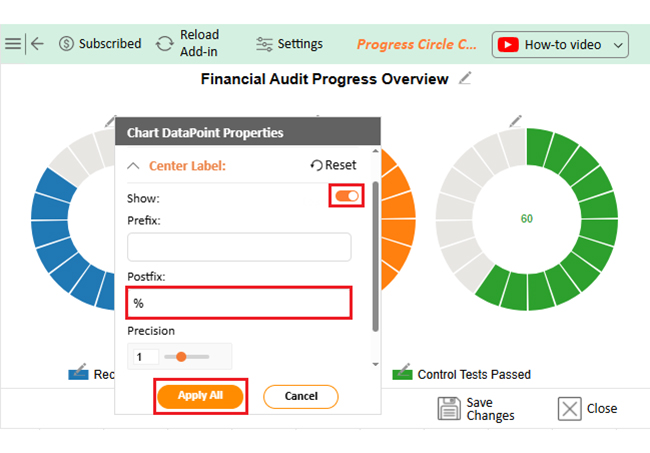
  • You can add the (%) with all values:
Audit Dashboard in Excel
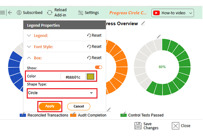
  • Change the legend shape type and color from the Legend Properties.
Audit Dashboard in Excel
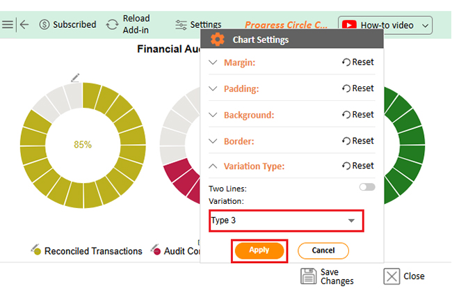
  • You can change the variation type by clicking on the settings button as follows:
Audit Dashboard in Excel
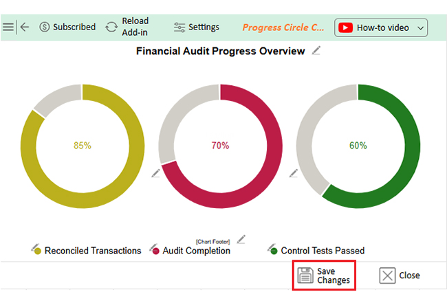
  • Click the “Save Changes” button to persist the changes made to the chart.
Audit Dashboard in Excel
  • Your final Progress Circle Chart will look like the one below.
Audit Dashboard in Excel

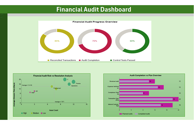
Next, we can add 2 more charts for the financial dashboard:

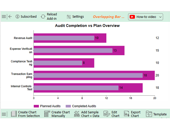
  • Overlapping Bar Chart: Position this chart in the top-left section to show audit progress by area. It immediately highlights performance gaps between planned and completed audits.
Audit Area Planned Audits Completed Audits
Revenue Audit 12 10
Expense Verification 15 13
Compliance Testing 10 8
Transaction Sampling 20 18
Internal Controls Test 18 14
Audit Dashboard in Excel
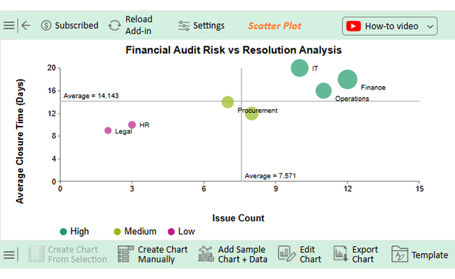
  • Scatter Plot Chart: Stretch this chart across the lower section.
Department Risk Level Issue Count Average Closure Time (Days) Monetary Impact (USD)
Finance High 12 18 25,000
Procurement Medium 7 14 12,500
HR Low 3 10 5,000
IT High 10 20 22,000
Sales Medium 8 12 15,000
Operations High 11 16 19,000
Legal Low 2 9 3,500

It compares departments by risk level, issue volume, closure time, and financial impact—great for spotting high-risk areas fast.

Audit Dashboard in Excel
  • Interactive Filters on the Side: Add slicers or drop-downs on the left or right side of the screen. This enables you to filter by risk level, department, or audit area for a more dynamic experience.
Audit Dashboard in Excel

Insights

Progress Circle Chart (Top):

  • Audit completion is at 70%.
  • Reconciled transactions are strong at 85%.
  • The control test success rate is low at 60%, indicating weak internal controls.

Overlapping Bar Chart (Right):

  • Notable gaps between planned and completed audits.
  • Compliance Testing and internal controls reveal the most significant shortfalls.

Scatter Plot (Left):

  • Finance and Operations are flagged as high-risk.
  • Both departments have high issue counts and slow resolution times.

How to Use the Excel Audit Dashboard?

Excel dashboards aren’t meant to sit in a folder collecting digital dust. They’re designed for daily, weekly, or even real-time use. A well-crafted audit dashboard in Excel becomes more than just a report; it becomes a powerful tool. It becomes part of how your team works, shares, and makes decisions.

Here’s how to get the most out of it:

  1. Frequently update information: Keep your data fresh. Outdated audits mean outdated decisions.
  2. Filter & drill down using slicers: Add slicers for department, risk level, or status. They make it easy to zoom in without needing to access the raw data.
  3. Collaboration and sharing with stakeholders: Save the dashboard to the cloud (OneDrive or SharePoint). Give access to team members and decision-makers—no email chains needed.
  4. Proactive KPIs monitoring: Use your dashboard to track audit KPIs before issues grow. Spot trends early and act fast.
  5. Review meetings and presentation use: Replace slides with the dashboard during audit reviews. Interactive charts make the conversation clearer and more impactful.

Benefits of Using an Internal Audit Excel Dashboard Template

Let’s face it—building audit reports from scratch every time is exhausting. Copy-pasting data, formatting tables, and hoping charts don’t break. Sound familiar? That’s where an internal audit Excel dashboard template comes in handy.

Here’s why using one makes sense:

  • Saves time: Pre-built layouts mean less setup and more action. You focus on insights, not formatting.
  • Reduces errors: Templates come with tested formulas and charts, ensuring accuracy and reliability. That means fewer mistakes and cleaner reports.
  • Keeps reports consistent: No more messy tabs or missing labels. Every report follows the same structure—easy to read, easy to share.
  • Customizable to your needs: Add your metrics, KPIs, or visuals to tailor the report to your specific needs. You’re in control, without starting from zero.
  • Better decision-making: A good template brings data to life. Stakeholders see what matters and act faster.

Limitations of an Audit Dashboard in Excel

Excel is powerful, but it has its limits. Yes, an audit dashboard in Excel can organize data, track KPIs, and look quite impressive. But let’s be real—it’s not built for everything. The more complex your data, the more cracks start to show.

Here are some common limitations to keep in mind:

  • Manual data refresh: Unless connected to live sources, updates are manual. That means more time spent importing, copying, and double-checking.
  • Performance issues with large datasets: Excel becomes significantly slower with large files. Multiple formulas, charts, and sheets can freeze or crash the workbook.
  • Limited visualization options: Excel charts are basic and have limited capabilities. You may struggle to create engaging visuals without add-ins like ChartExpo.
  • Not built for multi-user collaboration: Sharing files can get messy. Version control issues and overwrite risks are familiar to multiple editors.
  • Lacks built-in alerts or automation: No alerts if KPIs go off track. You have to check the dashboard manually every time.

FAQs

What is an Excel auditing tool?

It’s a feature or add-in that helps you review formulas, track changes, and spot errors in spreadsheets. Think of it as a competent helper. It keeps your data accurate and your work clean.

What is the best software for an Audit?

The best audit software depends on your needs. Tools like AuditBoard, TeamMate+, and CaseWare offer advanced features. They support risk management, real-time tracking, and compliance monitoring. For small teams, Excel with ChartExpo can still be very effective.

Wrap Up

An audit dashboard in Excel is more than a spreadsheet. It’s a tool for control, clarity, and more intelligent decisions. Teams can see what’s working—and what’s not—at a glance.

Using dashboards keeps audits organized—no more chasing updates or digging through reports. Everything is visible and up to date. Think of it like a marketing dashboard. Just as marketers track ROI and campaign performance, auditors can track risks, issues, and resolutions. Both need clear visuals to drive results.

You’ll find many data dashboard examples across departments. Finance, HR, compliance—they all benefit from visual reports. The key is to build dashboards that are simple and useful. A strong dashboard supports better monthly reviews. If you’re sharing a monthly finance report, add visuals that explain the numbers. It saves time in meetings and improves understanding.

Ultimately, Excel still gets the job done. Especially when paired with innovative tools like ChartExpo. Your audit dashboard in Excel, when done well, can be a reliable source of insight every single month.

How much did you enjoy this article?

ExcelAd1
Start Free Trial!
157134

Related articles

next previous
Microsoft Excel11 min read

How to Create a Matrix in Excel: Core Insights

Learn how to create a matrix in Excel to organize and analyze data. This guide shares simple steps, smart tips, and how to use visual tools like ChartExpo.

Microsoft Excel12 min read

How to Make a Template in Excel: A Simple Guide

Discover how to make a template in Excel for faster, cleaner work. Here, you’ll learn steps, examples, and how ChartExpo enhances your data and more.

Microsoft Excel9 min read

How to Compare Columns in Excel for Clear Insights

Learn how to compare columns in Excel using simple tools and formulas. This guide helps you spot differences, analyze data, and improve accuracy.

Microsoft Excel10 min read

How to Copy Formatting in Excel for Better Insights

Master how to copy formatting in Excel with quick tools and smart tips. You’ll learn methods that boost speed, improve data analysis, and simplify reporting.

Microsoft Excel9 min read

Group Worksheets in Excel for Quick Insights

Discover how to group worksheets in Excel to update multiple sheets at once. Learn with clear steps, visuals, and tips to save time and reduce errors.

ChartExpo logo

Turn Data into Visual
Stories

CHARTEXPO

  • Home
  • Gallery
  • Videos
  • Services
  • Pricing
  • Contact us
  • FAQs
  • Privacy policy
  • Terms of Service
  • Sitemap

TOOLS

  • ChartExpo for Google Sheets
  • ChartExpo for Microsoft Excel
  • Power BI Custom Visuals by ChartExpo
  • Word Cloud

CATEGORIES

  • Bar Charts
  • Circle Graphs
  • Column Charts
  • Combo Charts
  • Comparison Charts
  • Line Graphs
  • PPC Charts
  • Sentiment Analysis Charts
  • Survey Charts

TOP CHARTS

  • Sankey Diagram
  • Likert Scale Chart
  • Comparison Bar Chart
  • Pareto Chart
  • Funnel Chart
  • Gauge Chart
  • Radar Chart
  • Radial Bar Chart
  • Sunburst Chart
  • see more
  • Scatter Plot Chart
  • CSAT Survey Bar Chart
  • CSAT Survey Chart
  • Dot Plot Chart
  • Double Bar Graph
  • Matrix Chart
  • Multi Axis Line Chart
  • Overlapping Bar Chart
  • Control Chart
  • Slope Chart
  • Clustered Bar Chart
  • Clustered Column Chart
  • Box and Whisker Plot
  • Tornado Chart
  • Waterfall Chart
  • Word Cloud
  • see less

RESOURCES

  • Blog
  • Resources
  • YouTube
SIGN UP FOR UPDATES

We wouldn't dream of spamming you or selling your info.

© 2025 ChartExpo, all rights reserved.