Categories
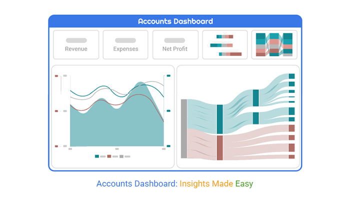
The Accounting dashboard provides a clear, real-time overview of financial performance. This will, in turn, help businesses track revenues, expenses, and key metrics.


This guide dives deep into how to create a dashboard in Power BI and also shows you all you need to know about the Power BI KPI dashboard. Newbies will be exposed to Power BI dashboard design, dashboard user interface design, and some executive dashboard examples.
There are sections in this guide that uncover things you should know about digital dashboards, business intelligence dashboards, and finance dashboards in Power BI.
Definition: An accounting dashboard is a visual tool that showcases key financial data like income, expenses, profits, and cash flow in one place. Business owners use it to monitor their financial health in real time, spot trends, and make informed, quick decisions.
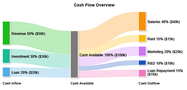
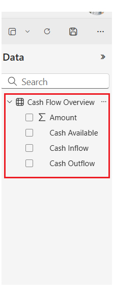
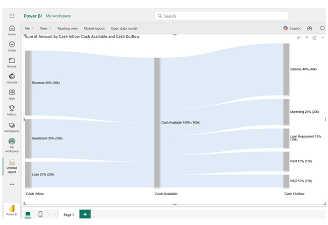
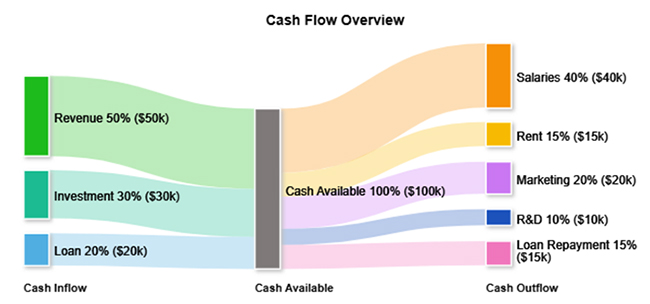
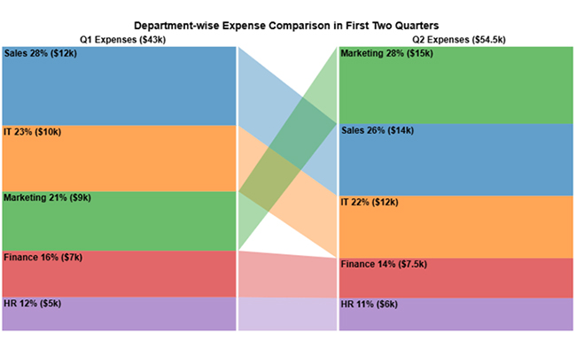
It showcases trends in expenses, revenue, and outstanding invoices through a Power BI Sankey Chart. This way, business owners will be able to forecast more accurately. Early identification of overspending or potential shortfalls helps companies adjust strategies before problems grow.
Automating the reporting process through a dashboard reduces the chance of human error and saves time. Data is updated automatically and presented visually through KPIs, charts, and graphs. This allows financial teams to focus more on strategy and analysis rather than data entry, especially when using a KPI visual in Power BI for clear performance tracking.
A clear and organized view of financial data empowers businesses to make faster, smarter decisions. It helps identify profitable areas, prepare audits, and manage cash flows.
Select an accounting dashboard template that matches your business needs. Some templates focus on cash flow, while others highlight profit and loss, expenses, or revenue. Pick the right one that aligns with the financial areas you want to track.
Adjust the template to focus on the metrics that matter most to your business needs. These metrics could be cash flow, net profit, revenue growth, and accounts receivable. You can modify graphs, charts, and KPIs to reflect these priorities.
You can manually input your financial data or connect your accounting software to the dashboard if integration is available. You can include key figures like expenses, assets, income, outstanding invoices, and liabilities.
Analyze the visual data using Power BI charts to spot areas of concern, trends, and growth opportunities. Share the dashboard with relevant stakeholders to maintain transparency and alignment across the team.
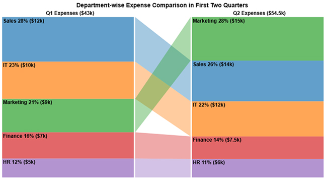
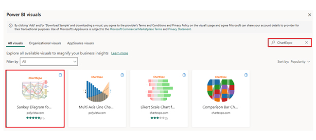
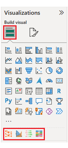
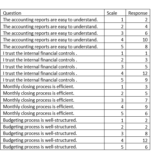
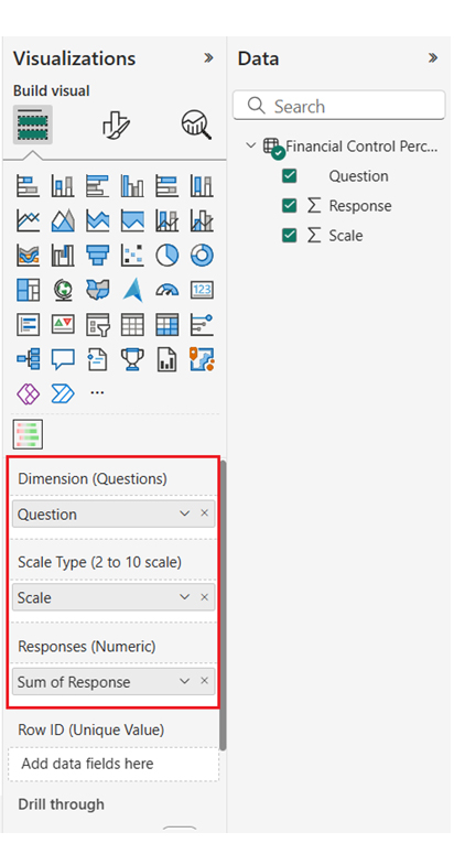
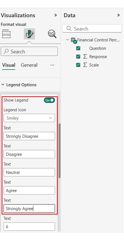
Here, we will explain the Sankey diagram generator, Multi-Axis Line Chart, Likert Scale Chart, and Comparison Bar Chart with datasets and examples.


Insights:
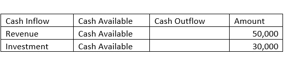
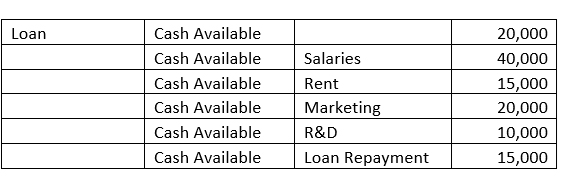
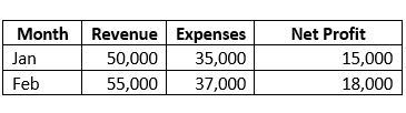
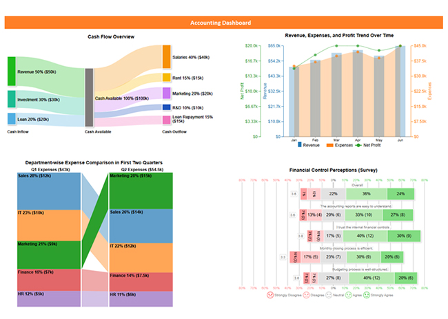
The company has strong cash inflows from investments, revenue, and loans totaling $100,000, while outflows amount to $100,000, balancing available cash.
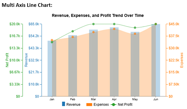
Monthly revenues and profits are stable and growing, and that indicates consistent financial health.
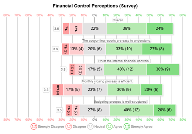
The overall financial processes appear efficient and trusted across stakeholders.
It connects directly to accounting systems and provides up-to-date financial information.
It identifies trends, analyzes profitability, monitors cash flow, and forecasts future financial performance using Power BI’s advanced analytical tools.
It provides clear and quick insights that support faster, smarter financial decisions at all organizational levels.
You can set financial goals and receive automated alerts when critical thresholds are reached. This gives room for proactive management.
You have to select the most important financial indicators relevant to the business goals. Common examples are net profit, revenue, expenses, and outstanding receivables.
Real-time data updates ensure that your dashboard reflects the current financial situation. Automated data connections with accounting software help maintain accuracy without manual efforts.
The alert features notify you of financial thresholds being crossed. It could be high outstanding invoices or low cash reserves. You can also integrate financial goals into the dashboard to track progress.
A clean and simple layout makes it easier to figure out the data at a glance. Always use clear labels, organized sections, and consistent colors. Too much information (or too many visuals) can overwhelm users and reduce the dashboard’s effectiveness.
To create an accounting dashboard, collect financial data, select key metrics (like expenses or revenue), choose visualization tools (like graphs or charts), and use software like Excel or Power BI for real-time tracking and insights.
An accounting dashboard is a visual tool that tracks financial metrics like expenses, revenue, and profit. It plays a vital role in generating real-time insights, improving decision-making, and efficient financial planning and management.
The accounting dashboard helps in better collaboration and sharing, and also gives room for enhanced financial analysis. You can share dashboards securely with team members and stakeholders. This ensures everyone has access to the same real-time financial insights.
The accounting dashboard uses Power BI’s advanced analytical tools to identify trends, analyze profitability, monitor cash flow, and forecast future financial performance.
Now you know how to use visualizations to represent data. What metrics will you look for in your accounting dashboard?
How much did you enjoy this article?


Calculate accounts receivable turnover ratio to measure credit collection speed, improve cash flow, and strengthen your financial strategy. Read on!

Change Management KPIs are the key to tracking adoption, performance, and ROI during transitions. Find out which metrics matter. Read on!

Data collection methods and techniques determine the quality of every insight you act on. Explore key approaches for gathering reliable data. Read on!


