• Home
  • Tools dropdown img
    • Spreadsheet Charts

      • ChartExpo for Google Sheets
      • ChartExpo for Microsoft Excel
    • Power BI Charts

      • Power BI Custom Visuals by ChartExpo
    • Word Cloud

  • Charts dropdown img
    • Chart Category

      • Bar Charts
      • Circle Graphs
      • Column Charts
      • Combo Charts
      • Comparison Charts
      • Line Graphs
      • PPC Charts
      • Sentiment Analysis Charts
      • Survey Charts
    • Chart Type

      • Box and Whisker Plot
      • Clustered Bar Chart
      • Clustered Column Chart
      • Comparison Bar Chart
      • Control Chart
      • CSAT Survey Bar Chart
      • CSAT Survey Chart
      • Dot Plot Chart
      • Double Bar Graph
      • Funnel Chart
      • Gauge Chart
      • Likert Scale Chart
      • Matrix Chart
      • Multi Axis Line Chart
      • Overlapping Bar Chart
      • Pareto Chart
      • Radar Chart
      • Radial Bar Chart
      • Sankey Diagram
      • Scatter Plot Chart
      • Slope Chart
      • Sunburst Chart
      • Tornado Chart
      • Waterfall Chart
      • Word Cloud
    • Google Sheets
      Microsoft Excel
  • Services
  • Pricing
  • Contact us
  • Blog
  • Support dropdown img
      • Gallery
      • Videos
      • Contact us
      • FAQs
      • Resources
    • Please feel free to contact us

      atsupport@chartexpo.com

Categories
All Data Visualizations Data Analytics Surveys
Add-ons/
  • Google Sheets
  • Microsoft Excel
  • Power BI
All Data Visualizations Data Analytics Surveys
Add-ons
  • Google Sheets
  • Microsoft Excel
  • Power BI

We use cookies

This website uses cookies to provide better user experience and user's session management.
By continuing visiting this website you consent the use of these cookies.

Ok

ChartExpo Survey


Home > Blog > Data Analytics

Semantic Layer for Reports Everyone Can Understand

Every business runs on data, but not everyone speaks data fluently. That’s where a semantic layer steps in. It acts as a translator, turning complicated table names and SQL logic into familiar terms anyone can use.

Semantic Layer

Think about how often teams misread reports because of inconsistent terms. One person’s “total sales” might be another’s “net revenue.” A semantic layer fixes that by setting shared definitions across your data.

This matters more than ever in tools like Power BI, where dashboards power fast decisions. But without a unified structure, reports become a guessing game. Data loses meaning. Time gets wasted. Trust breaks down.

By adding a semantic layer, Power BI becomes more than a report builder. It turns into a living, breathing knowledge system. That’s why this guide focuses on making the most of your semantic layer — from types and architecture to configuration and best uses inside Power BI.

We’ll also look at how tools like ChartExpo give visual meaning to what your model defines. Whether you’re building from scratch or improving your stack, we’ll break it all down in plain terms.

Table of Contents:

  1. What is a Semantic Layer?
  2. Why Do Organizations Need a Semantic Layer?
  3. Types of Semantic Layers
  4. How Does the Semantic Data Layer Work?
  5. How to Build a Semantic Layer in Power BI?
  6. How to Analyze the Semantic Layer in Power BI?
  7. How to Configure the Semantic Layer in Power BI?
  8. Business Benefits of a Data Semantic Layer
  9. Power BI Semantic Layer Use Cases
  10. FAQs
  11. Wrap-up

What is a Semantic Layer?

Definition: A semantic layer is a logical layer between your raw data and the people using it. It changes technical field names into easy terms. It adds structure with defined relationships, filters, and rules.

Instead of digging into table joins or SQL queries, users interact with terms like “Quarterly Revenue” or “New Customers.” The layer does the hard work behind the scenes.

It also brings clarity when working with multiple Power BI datasets. You get consistency across visuals, filters, and KPIs — no matter which report or team is looking at them.

To make sense of what Power BI is used for, the semantic layer helps present the right numbers with the right labels at the right time.

Why Do Organizations Need a Semantic Layer?

Most companies collect data from multiple sources — CRMs, databases, cloud apps. Without an asemantic layer, every team defines metrics differently. Confusion follows.

That’s why the semantic layer in Power BI matters. It acts as the single source of meaning.

Here’s what it brings:

  • Consistency: All reports pull from the same definitions.
  • Ease of use: No technical skills needed to understand key fields.
  • Data governance: Sensitive fields are protected by role-based access.
  • Speed: Teams don’t waste time redefining metrics.
  • Scale: It supports many users and skills without chaos.

It’s also critical to follow Power BI best practices when expanding your reporting stack.

Types of Semantic Layers

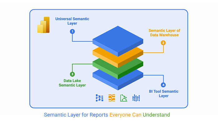
Choosing the right type of semantic layer depends on how your data is stored and accessed. Each model serves a different purpose but solves the same core problem: making data easier to work with.

Using the right structure ensures your Power BI data model stays efficient, flexible, and accurate.

Universal Semantic Layer

This version works across tools, warehouses, and platforms. It defines logic once and lets any BI tool use it.

  • Central management: Edit once, update everywhere.
  • Unified rules: Apply the same access and definitions globally.
  • Tool independence: Switch platforms without changing the logic.

It’s ideal for large data ecosystems with mixed tools and tech.

Semantic Layer of Data Warehouse

Built into the warehouse, this layer works closer to the raw data. It’s created by data engineers and supports cleaner architecture.

  • Consistent naming: Columns and tables follow clear standards.
  • Defined relationships: Keys and joins are baked in.
  • Trackability: Changes and flows are easy to monitor.

This works well in platforms like Snowflake, BigQuery, or Synapse.

Data Lake Semantic Layer

For raw, unstructured data, this layer makes sense of the chaos. It adds structure and meaning to file-based or semi-structured sources.

  • Schema support: Translates JSON, CSV, and more into useful formats.
  • Metadata tags: Labels help users find what they need.
  • Linking logic: Connects unrelated elements for smart querying.

This model is common in Hadoop or Azure Data Lake setups.

BI Tool Semantic Layer

This is the layer inside Power BI, Tableau, and similar tools. It’s the one most users see and interact with.

  • Friendly field names: “Customer Count” replaces “cust_id_num.”
  • Relationships: Joins are built for filtering and accuracy.
  • Predefined KPIs: Metrics like ROI or Conversion Rate are ready to use.

This is where the Power BI semantic model shines — clear, accessible, and controlled.

How Does the Semantic Data Layer Work?

The semantic data layer sits above your raw storage systems. Think SQL tables, Excel files, APIs — all turned into a clean logic model.

Here’s how it works:

  • Mapping: Field names become readable.
  • Metrics: Averages, sums, and KPIs are set globally.
  • Relationships: Time, region, or product links are defined.
  • Security: Users see only what they’re allowed to.

It only works if you Power BI transform data correctly before mapping. That step makes the magic possible.

How to Build a Semantic Layer in Power BI?

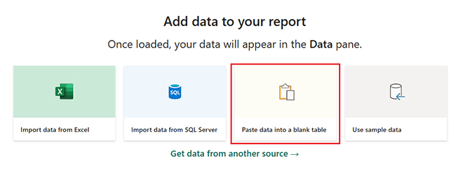
To build a clean semantic layer in Power BI, follow these steps in Power BI Desktop:

  1. Import and clean data
    • Use built-in tools to filter, shape, and clean raw tables.
  2. Define relationships
    • Link tables by keys and choose the correct Power BI cross-filter direction for accurate filtering.
  3. Create measures and fields
    • Use DAX to define fields like Net Margin or Revenue Growth.
  4. Use business-friendly names
    • Rename fields and tables into readable language. Group fields for easy access.
  5. Add row-level security
    • Control access by user roles — limit what each department sees.
  6. Test with dummy reports
    • Always validate your design with sample data for Power BI before deploying the semantic layer to production.

How to Analyze the Semantic Layer in Power BI?

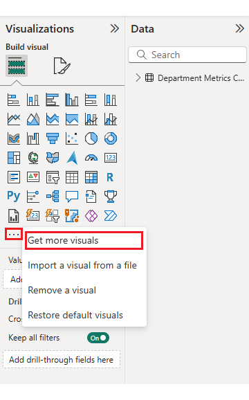
Why use ChartExpo with Power BI Semantic Layer Analysis?

Once your semantic layer is live, you need a way to make it visible. Enter ChartExpo.

ChartExpo brings clarity to the Power BI semantic layer by visualizing predefined fields without needing technical input. You don’t need DAX. You don’t need formatting. You just select a chart and go.

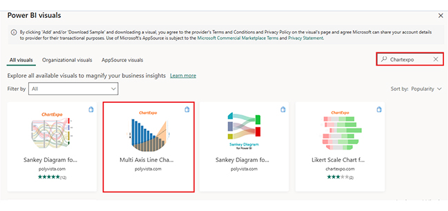
It gives you tools like Sankey, Radar, and Multi Axis Line Charts — all ready to use.

ChartExpo adds depth to Power BI data visualization by bringing visual clarity to metrics already defined in the semantic layer.

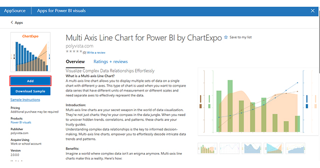
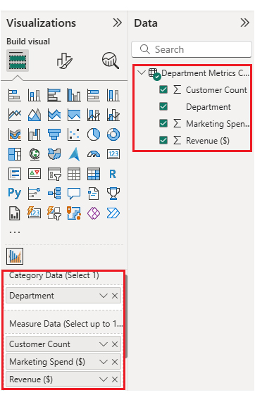
ChartExpo Multi Axis Line Chart

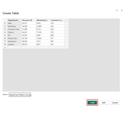
This chart compares departments by Revenue, Marketing Spend, and Customer Count. It reveals how well resources turn into results.

Dataset:

Department Revenue ($) Marketing Spend ($) Customer Count
Sales 42,511 9,953 319
Marketing 34,306 14,895 425
Customer Care 31,980 8,110 543
Finance 44,247 11,332 319
HR 22,297 6,462 606
Product Dev 35,129 12,083 477
Operations 48,302 7,911 497
Logistics 39,574 9,671 541

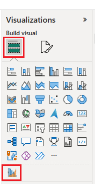
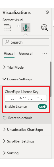
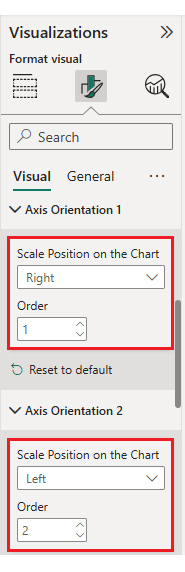
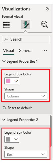
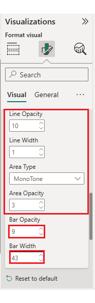
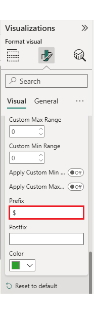
Step-by-Step Chart Creation with Screenshots

  • Users begin by logging into Power BI. The process starts with account access.
Semantic Layer
  • After that, the system asks for a password.
Semantic Layer
  • You’ll choose whether to stay signed in.
Semantic Layer
  • Once inside, paste your dataset into a new report.
Semantic Layer
  • Label the table and load it.
Semantic Layer
  • Find more visuals by clicking into the library.
Semantic Layer
  • Search for ChartExpo and choose the right chart.
Semantic Layer
  • Click to add it to your report.
Semantic Layer
  • Choose the chart from your visual panel.
Semantic Layer
  • Pick your category and metrics.
Semantic Layer
  • Enter your license key to remove branding.
Semantic Layer
  • Now the watermark is gone, and the chart is clean.
Semantic Layer
  • Change the title for clarity.
Semantic Layer
  • Sort the values to compare more easily.
Semantic Layer
  • You can tweak the data display if needed.
Semantic Layer
  • Adjust the axis if it feels off.
Semantic Layer
  • Tweak the color and shape of your legends.
Semantic Layer
  • Change bar width or opacity.
Semantic Layer
  • Add currency signs to your numbers.
Semantic Layer
  • Here’s the final output:
Semantic Layer

Key Insights

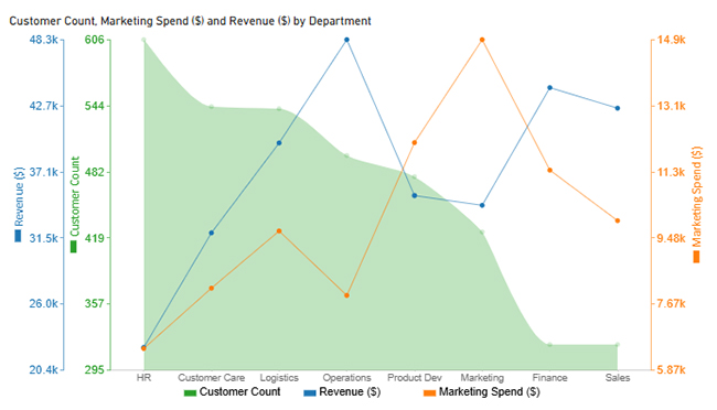
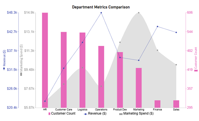
Before we move on, here’s what stands out in the chart:

  • HR’s high engagement but low spend
    HR has the most customer count, yet the lowest budget. This could signal post-sale engagement or support-heavy interactions.
  • Marketing delivers return
    Strong spending and solid revenue suggest good ROI. It’s a positive trend for campaign investment.
  • Product Dev underperforms
    High spending with lower returns and fewer customers may mean misalignment or inefficiency.
  • Finance and Sales are balanced
    Moderate on all fronts. Possibly a support role, or simply steady performance.
  • Marketing leads in outreach, but not in return
    The team reaches many, but returns might lag. High lead volume doesn’t always equal revenue.

How to Configure the Semantic Layer in Power BI?

Building is one thing. Configuring it for real-world use is another.

Here’s how to tune your semantic layer inside Power BI:

  • Use Tabular Editor
    Needed for field groups, calculation folders, and advanced metadata.
  • Define hierarchies
    Time, regions, and product categories all need nested logic for drill-down.
  • Set aggregate defaults
    Choose SUM or AVERAGE as defaults, so fields work the same everywhere.
  • Publish with a data dictionary
    Include descriptions of fields and metrics for others to reference.
  • Share as a dataset
    Push to Power BI Service and reuse the model across reports.

Business Benefits of a Data Semantic Layer

The data semantic layer unlocks collaboration. It speeds up reporting. It avoids duplicate logic. It makes data more secure.

By aligning teams under shared definitions, the semantic model builds trust. You don’t have to explain what “net margin” means every time. The system already knows.

It supports reuse, meaning reports don’t start from scratch. Teams work faster and smarter.

A well-maintained data semantic layer boosts confidence in KPIs and reduces errors across dashboards.

Power BI Semantic Layer Use Cases

Semantic layers bring structure to different teams and goals. The same logic can power reports across finance, marketing, and HR.

  • Sales Dashboards: Every team sees the same pipeline and close rate metrics.
  • Finance Reports: Clean definitions avoid reporting errors or disputes.
  • HR Analytics: Metrics like turnover or diversity are always consistent.
  • Marketing Funnels: Track lead-to-sale conversion using shared terms.

An effective Power BI semantic model helps unify the logic used across dashboards, enabling a single source of truth for analytics.

You also gain control using the Power BI cross-filter direction to shape how your data responds to user clicks.

FAQs

What Is a Semantic Layer in BI?

It’s a logic model between raw data and business users. It defines names, rules, and calculations so reports stay clean and clear. You’ll see it used in tools like Power BI Report Builder.

What Is the Difference Between the Semantic Layer and the Metrics Layer?

The semantic layer includes names, joins, rules, and labels. The metrics layer only handles KPIs and formulas.

Wrap-up

The semantic layer isn’t optional anymore. It’s required if you want clean, fast, and accurate reporting inside Power BI.

Whether you’re dealing with HR dashboards or marketing funnels, this layer lets teams speak the same language. No more guessing what a field means. No more mismatched logic across reports.

A strong semantic layer in Power BI makes it easier for every user — from analysts to execs — to see and act on the same data. Combine it with ChartExpo to visualize those definitions without writing DAX or building custom visuals.

Power BI isn’t just about visuals. It’s about meaning. The semantic layer gives your data meaning.

How much did you enjoy this article?

PBIAd1
Start Free Trial!
153438

Related articles

next previous
Data Analytics13 min read

Store Performance Dashboards: Optimizing Retail Success

Discover how a store performance dashboard centralizes sales, inventory, and employee data into one view to improve retail performance and strategy.

Data Analytics9 min read

Slowly Changing Dimensions: Insight and Visual Made Easy

Slowly changing dimensions track changes in business data over time, helping improve historical reporting accuracy and long-term analysis.

Data Analytics16 min read

Construction Project Daily Report Template for Clear Insights

The Construction Project Daily Report Template in Google Sheets helps you track work, hours, and issues so you can act fast and keep projects on schedule.

Data Analytics13 min read

Profit and Loss Statement for a Small Business:Easy Analysis

Learn what a profit and loss statement for a small business is, its key components, and how it helps track revenue, expenses, and net profit for smarter decisions.

Data Analytics13 min read

Make vs Buy Analysis: Visuals for Better Insights

Make versus buy analysis helps you pick in-house or vendor with clear steps, Excel setup, and charts that cut cost and speed decisions.

ChartExpo logo

Turn Data into Visual
Stories

CHARTEXPO

  • Home
  • Gallery
  • Videos
  • Services
  • Pricing
  • Contact us
  • FAQs
  • Privacy policy
  • Terms of Service
  • Sitemap

TOOLS

  • ChartExpo for Google Sheets
  • ChartExpo for Microsoft Excel
  • Power BI Custom Visuals by ChartExpo
  • Word Cloud

CATEGORIES

  • Bar Charts
  • Circle Graphs
  • Column Charts
  • Combo Charts
  • Comparison Charts
  • Line Graphs
  • PPC Charts
  • Sentiment Analysis Charts
  • Survey Charts

TOP CHARTS

  • Sankey Diagram
  • Likert Scale Chart
  • Comparison Bar Chart
  • Pareto Chart
  • Funnel Chart
  • Gauge Chart
  • Radar Chart
  • Radial Bar Chart
  • Sunburst Chart
  • see more
  • Scatter Plot Chart
  • CSAT Survey Bar Chart
  • CSAT Survey Chart
  • Dot Plot Chart
  • Double Bar Graph
  • Matrix Chart
  • Multi Axis Line Chart
  • Overlapping Bar Chart
  • Control Chart
  • Slope Chart
  • Clustered Bar Chart
  • Clustered Column Chart
  • Box and Whisker Plot
  • Tornado Chart
  • Waterfall Chart
  • Word Cloud
  • see less

RESOURCES

  • Blog
  • Resources
  • YouTube
SIGN UP FOR UPDATES

We wouldn't dream of spamming you or selling your info.

© 2025 ChartExpo, all rights reserved.