Categories
Every day, people move data between systems—CRMs, spreadsheets, databases. Most of that data travels in a single format, the comma-delimited file.


This format is simple. It doesn’t care about styles or colors. It only cares about structure. It keeps information clear and flat—one row per record, one column per value.
If you’ve used Excel or downloaded data from a tool, you’ve likely seen a comma-delimited file with a .csv extension. That file helps bridge the gap between raw data and readable content. It can open in Excel, Google Sheets, or even a plain text editor.
This blog shows you what a comma-delimited file is, why it matters, and how to import and analyze it inside Excel. You’ll learn how to create charts, use smart tools like ChartExpo, and understand the story inside your spreadsheet.
Definition: A comma-delimited file is a text file that uses commas to separate values. Each line is a record. Each value in that line is separated by—you guessed it—a comma.
Here’s what it looks like:
Employee ID, Full Name, Department, Email
E001,Ali Khan,Marketing,ali.khan@company.com
E002,Sara Ahmed,Finance,sara.ahmed@company.com
The file doesn’t hold bold text or colors. It holds information. And it does that cleanly.
This simple format works with Excel, databases, and code. It’s fast, portable, and readable. It travels well between tools and teams.
Speed. Compatibility. Ease. That’s why we use a comma-delimited file.
You can open it in Excel. You can edit it in Notepad. And it’s accepted by most apps that work with structured data.
Need to move records from a CRM to a spreadsheet? Export to CSV.
Need to convert survey responses into a report? Use a CSV.
Need data cleaned up and ready for a dashboard? Again—CSV.
One benefit of using a comma-delimited file is how easy it is to convert text files to Excel. Tools recognize the format without complaints.
Think of a spreadsheet. Each row is one record. Each column is one field. That’s what a comma-delimited CSV captures—but in plain text.
Let’s say one value has a comma in it—like New York, NY. That field gets quotes around it: “New York, NY”. This way, Excel doesn’t break it into two columns.
When done right, parsing this file is like learning how to parse data in Excel. The columns fall in line, the data makes sense, and nothing breaks.
Here’s what sets this format apart:
A comma-delimited Excel format gives you structure without frills. It’s the raw version of your data.
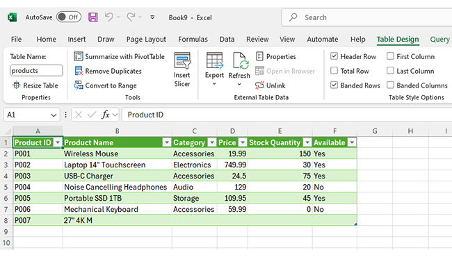
Let’s take a real-life example. You export your contact list from a CRM:
Full Name, Company, Phone Number, Email
Alice Johnson,TechCorp,555-1234,alice@techcorp.com
Bob Lee,InnovaSoft,555-5678,bob@innovasoft.com
That top row is the header. Every row after that is one contact.
Once imported, this file makes it easy to understand how to organize data in Excel. Each value goes into a separate column. Each record is its own row.
You can apply automatic formatting in Excel—like filters, highlights, or conditional rules—to clean or compare data.
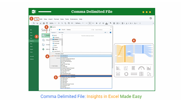
Step 1:
Open a new or existing Excel workbook.
Step 2:
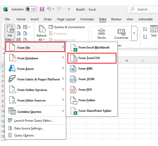
Click the Data tab in the top ribbon.
Go to Get Data → From File → From Text/CSV.
Step 3:
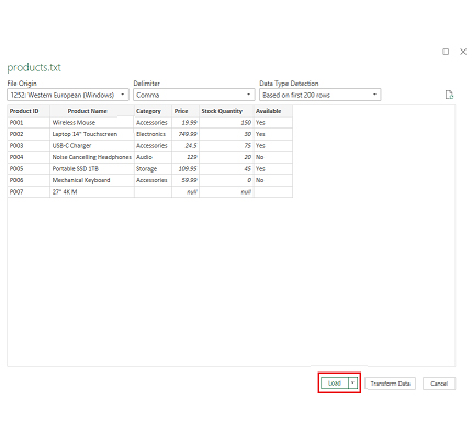
Browse to your file.
Click Load to import directly or Transform Data to clean it up first.
Once loaded, Excel places the data in a table format—ready to work with.
To import a comma-delimited file into Excel, that’s all it takes.
Top 10 ChartExpo Visuals in Excel
Once your CSV data is inside Excel, visualizing it matters. ChartExpo helps you do this in minutes.
Let’s explore chart types that work well with comma-separated data.
Example #1
Comparison Bar Chart is great for tracking budget vs actuals across teams. Each bar tells a budget story.
Example #2
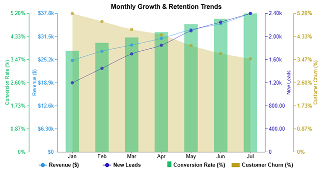
Multi-axis line chart is useful for multiple datasets—revenue, churn, leads—all with different scales.
Example #3
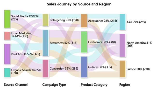
A Sankey Diagram shows flows—like user journeys or conversions. Great for tracking paths.
Example #4
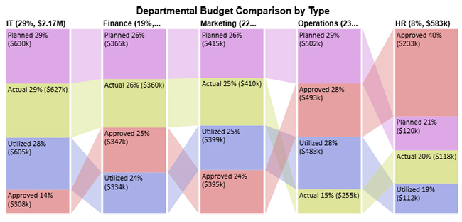
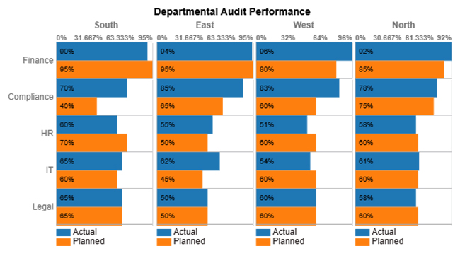
Matrix Chart compares values across two axes. Think planned vs actual performance.
Example #5
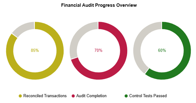
Progress Circle Chart highlights completion or progress. Use it to track form submissions or projects.
Example #6
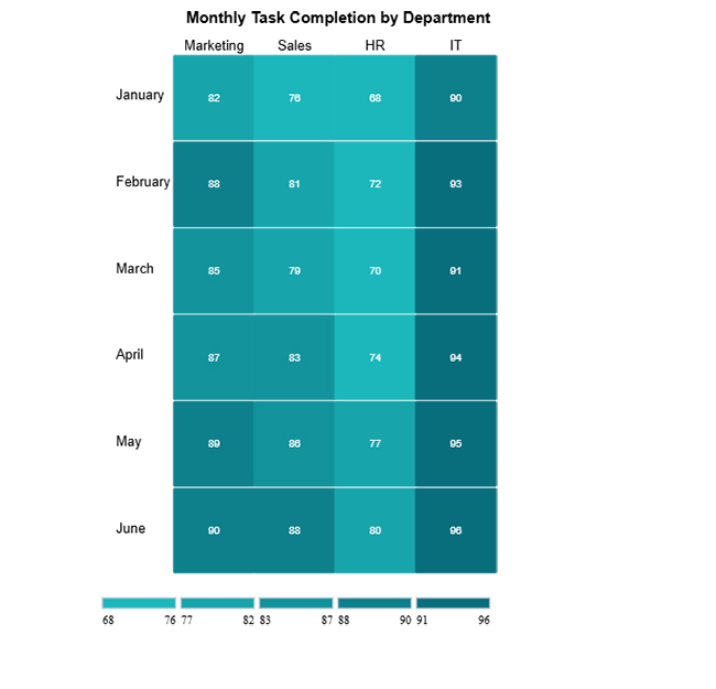
Heatmap spot patterns quickly. Colors guide your eyes to highs and lows.
Example #7
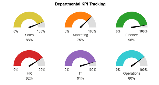
Gauge Chart helps to instantly see KPIs—how far are you from target?
Example #8
The Likert Scale Chart visualizes survey answers or sentiment data.
Example #9
Scatter Plot: find trends, relationships, or outliers in big datasets.
Example #10
An overlapping Bar Chart compares actual vs planned numbers side-by-side.
Once imported, you can use filters, pivots, and formulas to analyze your file.
Need graphs? ChartExpo helps. Install it in Excel, load your CSV, and choose a chart. No coding needed.
ChartExpo makes turning Excel data into a graph simple and fast, even for beginners.
Why use ChartExpo?
How to Install ChartExpo in Excel
Before using ChartExpo to create stunning visualizations from your comma-delimited Excel data, you must first install the ChartExpo add-in. Follow these steps:
Step-by-Step Installation Guide
Step 1: Open your Excel workbook.
Step 2: Click on the “Insert” tab in the ribbon.
Step 3: Select “Get Add-ins” (or “Office Add-ins” depending on your Excel version).
Step 4: In the Office Add-ins store, type “ChartExpo” in the search bar.
Step 5: Once ChartExpo appears, click the “Add” button to install it into your Excel environment.
Step 6: After the installation is complete, ChartExpo will appear as a pane on the right side of your Excel interface.
Step 7: Click the “Start” button to launch ChartExpo.
You’re now ready to create your first visualization using your data!
Dataset Introduction
Here’s a sample dataset used for visualizing budgets across departments. It shows different budget types: planned, approved, actual, and utilized.
These values help identify gaps, overspending, and approval lags across business units.
| Department | Type | Budget (USD) |
|---|---|---|
| IT | Planned | 320000 |
| Finance | Actual | 182000 |
| Marketing | Utilized | 198000 |
| Operations | Approved | 245000 |
| IT | Actual | 312000 |
| HR | Approved | 115000 |
| Finance | Planned | 180000 |
| Marketing | Planned | 205000 |
| Operations | Planned | 250000 |
| Finance | Utilized | 165000 |
| IT | Approved | 308000 |
| Marketing | Approved | 200000 |
| Operations | Utilized | 243000 |
| HR | Actual | 118000 |
| Finance | Approved | 175000 |
| IT | Utilized | 300000 |
| Operations | Actual | 255000 |
| HR | Utilized | 112000 |
| Marketing | Actual | 203000 |
| Finance | Utilized | 169000 |
| IT | Planned | 310000 |
| Marketing | Planned | 210000 |
| HR | Planned | 120000 |
| Finance | Approved | 172000 |
| Operations | Approved | 248000 |
| Marketing | Actual | 207000 |
| IT | Actual | 315000 |
| Operations | Utilized | 240000 |
| HR | Approved | 118000 |
| Finance | Actual | 178000 |
| IT | Utilized | 305000 |
| Marketing | Utilized | 201000 |
| Operations | Planned | 252000 |
| Finance | Planned | 185000 |
| Marketing | Approved | 195000 |
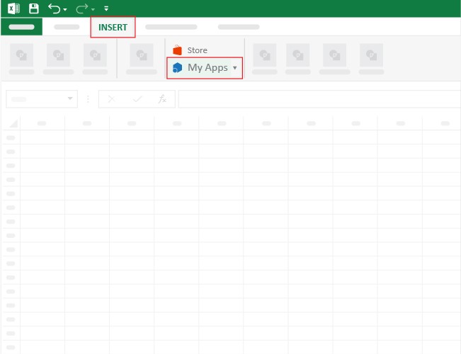
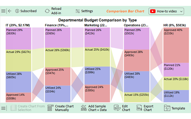
Step 1:
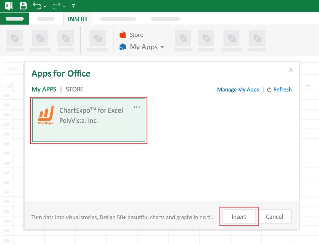
Click Excel’s INSERT tab → My Apps submenu
Step 2:
The Office Add-ins window appears. Find ChartExpo and click Insert.
Step 3:
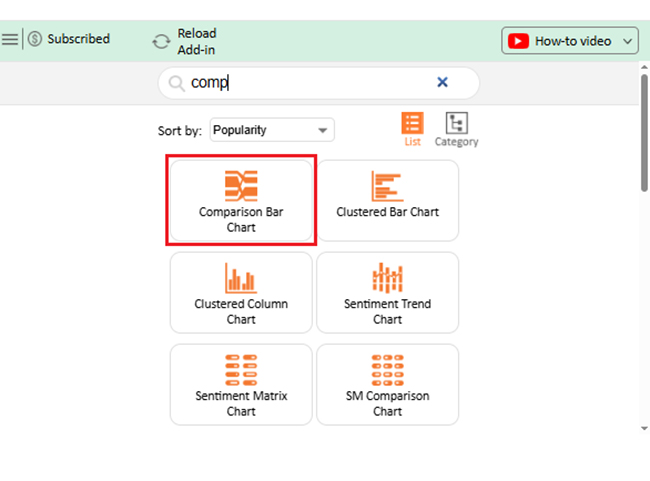
Search or select Comparison Bar Chart
Step 4:
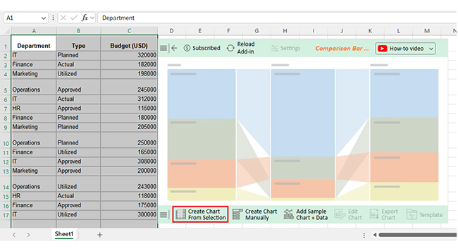
Select your dataset and click Create Chart from Selection
Step 5:
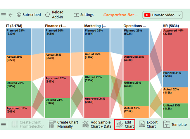
To update the chart, click Edit Chart
Step 6:
Change the title by clicking the pencil icon
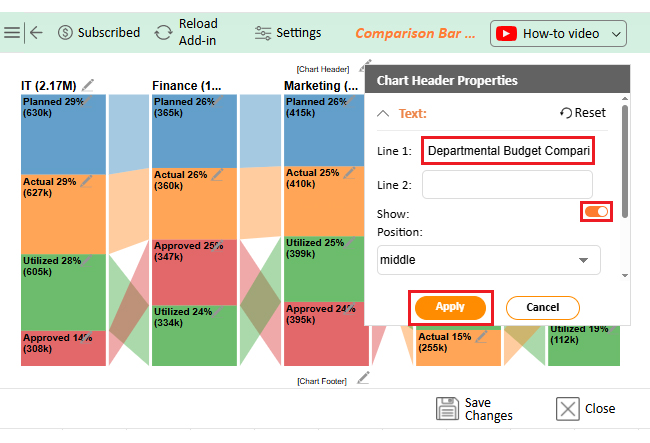
Step 7:
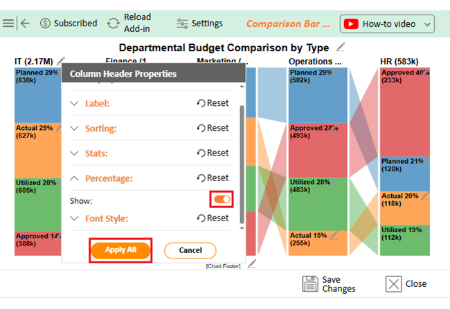
Enable percent signs from Column Header Properties
Step 8:
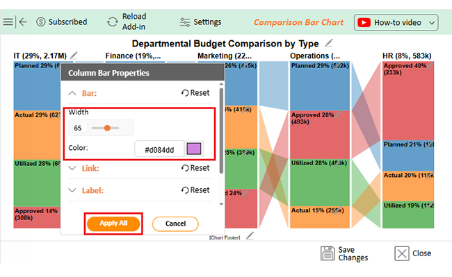
Adjust bar colors and widths
Step 9:
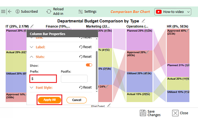
Add dollar signs via Column Bar Chart settings
Step 10:
Click Save to finalize
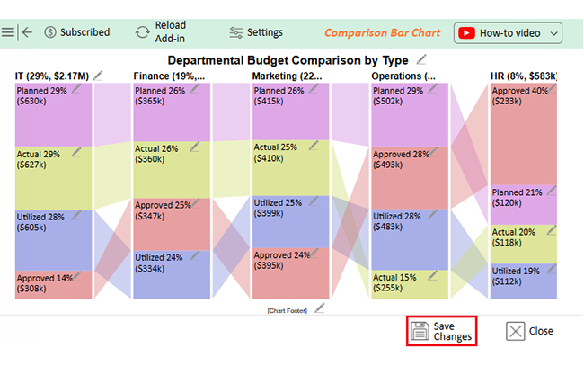
The result? A polished chart ready to export.
IT: Strong performance. High actual and utilized numbers. Low approval shows a bottleneck.
Finance: Well-balanced. Good distribution across all budget types.
Marketing: Steady across categories. Budget control appears consistent.
Operations: High planned/approved. Low actual = possible delays or inefficiencies.
HR: High approval but underused. May indicate overspending approval or poor execution.
This format helps you move fast.
Using structured files like CSV helps with how to create a report in Excel and sharing updates across teams quickly.
If you’re editing comma-delimited online, tools like Google Sheets are reliable.
| Problem | Reason |
| No formatting | Can’t store styles or formulas |
| Fragile text | Quotes are easy to forget |
| Hard to scale | Not built for large datasets |
| Not relational | Lacks links between rows |
| No formulas | It’s static data |
| Easy to break | One missing comma causes issues |
| Lacks types | Everything is a string |
| Poor readability | Hard to skim raw |
| No validation | Anything goes—good or bad |
| Manual clean-up | Often needs polishing in Excel |
CSV is a common type of comma-delimited file. Others use tabs or semicolons instead of commas.
Make a table in Excel → Save As → select CSV. That’s how to save Excel as CSV with structured values.
The comma-delimited file is a go-to for moving clean, flat data between systems. It’s fast, flexible, and almost universally accepted.
Whether you’re building dashboards, organizing reports, or cleaning inputs for analysis, this format works.
These files also enhance the process of sharing Excel workbook updates across departments.
Want better visuals? ChartExpo turns raw numbers into clean, clear charts—fast. Comparison bars, Sankey flows, or heatmaps—whatever the data demands.
The next time you’re staring at a mess of rows and values, remember that the comma-delimited file keeps it simple and structured.
How much did you enjoy this article?


Learn how to use sparklines in Excel to quickly visualize trends inside cells. Discover types, creation steps, customization, use cases, benefits, and best practices.

Learn what a confidence interval graph is, how to create it in Excel, and how to interpret results to make more reliable, data-driven decisions.

A correlation matrix in Excel helps identify relationships between variables. Learn how to create, read, and use it for effective data analysis.


