• Home
  • Tools dropdown img
    • Spreadsheet Charts

      • ChartExpo for Google Sheets
      • ChartExpo for Microsoft Excel
    • Power BI Charts

      • Power BI Custom Visuals by ChartExpo
    • Word Cloud

  • Charts dropdown img
    • Chart Category

      • Bar Charts
      • Circle Graphs
      • Column Charts
      • Combo Charts
      • Comparison Charts
      • Line Graphs
      • PPC Charts
      • Sentiment Analysis Charts
      • Survey Charts
    • Chart Type

      • Box and Whisker Plot
      • Clustered Bar Chart
      • Clustered Column Chart
      • Comparison Bar Chart
      • Control Chart
      • CSAT Survey Bar Chart
      • CSAT Survey Chart
      • Dot Plot Chart
      • Double Bar Graph
      • Funnel Chart
      • Gauge Chart
      • Likert Scale Chart
      • Matrix Chart
      • Multi Axis Line Chart
      • Overlapping Bar Chart
      • Pareto Chart
      • Radar Chart
      • Radial Bar Chart
      • Sankey Diagram
      • Scatter Plot Chart
      • Slope Chart
      • Sunburst Chart
      • Tornado Chart
      • Waterfall Chart
      • Word Cloud
    • Google Sheets
      Microsoft Excel
  • Services
  • Pricing
  • Contact us
  • Blog
  • Support dropdown img
      • Gallery
      • Videos
      • Contact us
      • FAQs
      • Resources
    • Please feel free to contact us

      atsupport@chartexpo.com

Categories
All Data Visualizations Data Analytics Surveys
Add-ons/
  • Google Sheets
  • Microsoft Excel
  • Power BI
All Data Visualizations Data Analytics Surveys
Add-ons
  • Google Sheets
  • Microsoft Excel
  • Power BI

We use cookies

This website uses cookies to provide better user experience and user's session management.
By continuing visiting this website you consent the use of these cookies.

Ok

ChartExpo Survey


Home > Blog > Microsoft Excel

Converting Text Files to Excel to Unlock Powerful Graphs

What is converting text files to Excel, and why does it matter?

Every day, businesses generate massive amounts of data. Much of it arrives in plain text files, from sales reports to inventory lists. These files are easy to create but hard to work with. That’s where Excel steps in.

Excel is more than a spreadsheet tool. It’s a powerful way to organize, analyze, and visualize data. Converting text files to Excel turns raw information into something meaningful. Imagine trying to sift through a 1,000-line text document. Now, picture that data is neatly sorted in columns, ready for sorting, filtering, or graphing with advanced Excel charts. The difference is remarkable.

Converting Text Files to Excel

Excel functions save hours of manual work. Converting text files to Excel is a game-changer for finance, logistics, and research industries. It ensures accuracy, speeds up workflows, and reduces errors. With tools like the Excel charts Add-in, creating visually engaging charts becomes seamless, enabling data-driven decision-making.

But how does it work? Think of formats like CSV or TXT. These files hold raw data but lack structure. Excel adds that structure. With tools like delimiters or formatting options, text transforms into actionable insights. The process can be automated with simple macros or advanced scripts, making your work efficient.

The demand for streamlined data handling keeps growing. A recent study found that 85% of professionals use spreadsheets weekly. That’s a huge number relying on tools like Excel to manage information. Converting text to Excel files bridges the gap between scattered data and clear insights.

This process is simple but impactful. It allows you to make better decisions faster. Let’s learn how it works.

Table of Contents:

  1. Understanding to Convert Txt to Excel
  2. Why Convert Text Document to Excel?
  3. What are the Differences Between Txt and Xls File Types?
  4. How to Convert Text Files to Excel (Txt to Xlsx)?
  5. How to Analyze Text Files Into Excel?
  6. FAQs
  7. Wrap Up

First…

Understanding to Convert Txt to Excel

Definition: Converting TXT to Excel transforms plain text into structured data while ensuring data integrity. TXT files often contain raw, unorganized information. Excel provides the tools to effectively sort, filter, and analyze that data, making it a critical resource for business analytics.

This process uses delimiters, such as commas or tabs, to separate values into neat columns. It’s a simple yet powerful way to make data usable. Businesses, students, and analysts rely on it to turn plain text into clear, actionable insights, saving time and improving accuracy.

Why Convert Text Document to Excel?

Because the raw text isn’t always easy to work with – imagine scrolling through endless lines of unstructured data. It’s messy, slow, and prone to errors. Excel charts organize, analyze, and visualize data effortlessly, turning complex datasets into clear, actionable insights. Let’s break down why converting TXT to Excel matters:

  • Better data organization: Excel brings order to chaos. Text data is neatly arranged in rows and columns. This structure makes finding and managing information a breeze.
  • Advanced data analysis: Excel offers tools like formulas, pivot tables, and conditional formatting.
  • Custom Excel charts transform data into visually impactful insights, turning basic text into powerful narratives.
  • Data visualization: Numbers alone tell part of the story. Excel turns them into charts, graphs, and dashboards, making trends and patterns easy to spot.
  • Efficiency in data processing: Manually sifting through text is time-consuming. Excel automates repetitive tasks, saving hours. Functions that take minutes in Excel take hours in plain text.
  • Improved collaboration: Sharing a clean Excel sheet is easier than a cluttered text file. Teams can work together, edit in real-time, and maintain data consistency.

What are the Differences Between Txt and Xls File Types?

Have you ever wondered why your boss asks for a spreadsheet instead of a plain text file? Or why you can’t just copy-paste data from one to the other without it looking like chaos? Here’s a table to help you understand the major differences between TXT and XLS files at a glance:

Aspect TXT (Plain Text File) XLS (Excel Spreadsheet)
File Format Simple, unformatted text stored as plain ASCII or Unicode. Complex format with rows, columns, and cell data.
File Extension .txt .xls or .xlsx
Structure Linear, line-by-line. Tabular, with cells, rows, and columns.
Data Representation Just text—raw and flat. Supports text, numbers, formulas, charts, and more.
Formatting None. Rich formatting: fonts, colors, borders, etc.
File Size Smaller due to the lack of formatting or extra data. Larger because it stores formatting and metadata.
Usage Quick notes, logs, or basic data storage. Complex data analysis, calculations, and visualization.
Editing Tools Simple text editors like Notepad or TextEdit. Spreadsheet software like Microsoft Excel or Google Sheets.
Interactivity None. Dynamic, with interactive features like pivot tables.
Compatibility Universally readable across all platforms. Requires spreadsheet software to open properly.

So, when should you use one over the other? A TXT file is perfect for jotting down a grocery list. But if you’re tracking expenses or managing data for your team, XLS is the MVP.

In addition, TXT files lack structure, making them difficult to analyze or sort. The Analysis Toolpak in Excel can process such data and turn raw text into actionable information for deeper insights.

How to Convert Text Files to Excel (Txt to Xlsx)?

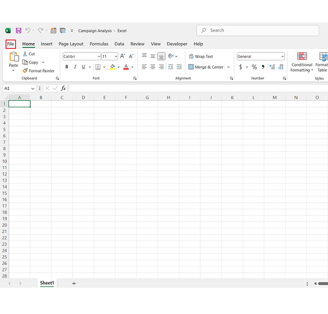
Let’s face it—managing data in plain text can get tedious. But converting that flat TXT file into a shiny, organized Excel spreadsheet? That’s a game-changer for your data analytics! Here’s how you can do it, step by step:

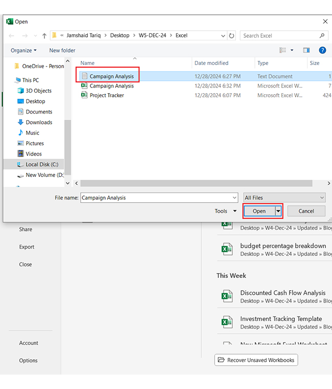
Step 1: Open Excel and click on the File menu at the top.

Click on File Menu for Converting Text Files to Excel

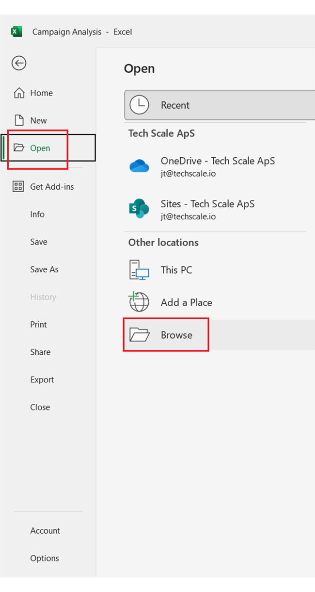
Step 2: Select Open, then choose Browse to find your text file.

Choose Browse to Find Text File for Converting Text Files to Excel

Step 3: Change the file type to All Files so you can see your TXT file in the list.

Change File Type to All Files for Converting Text Files to Excel

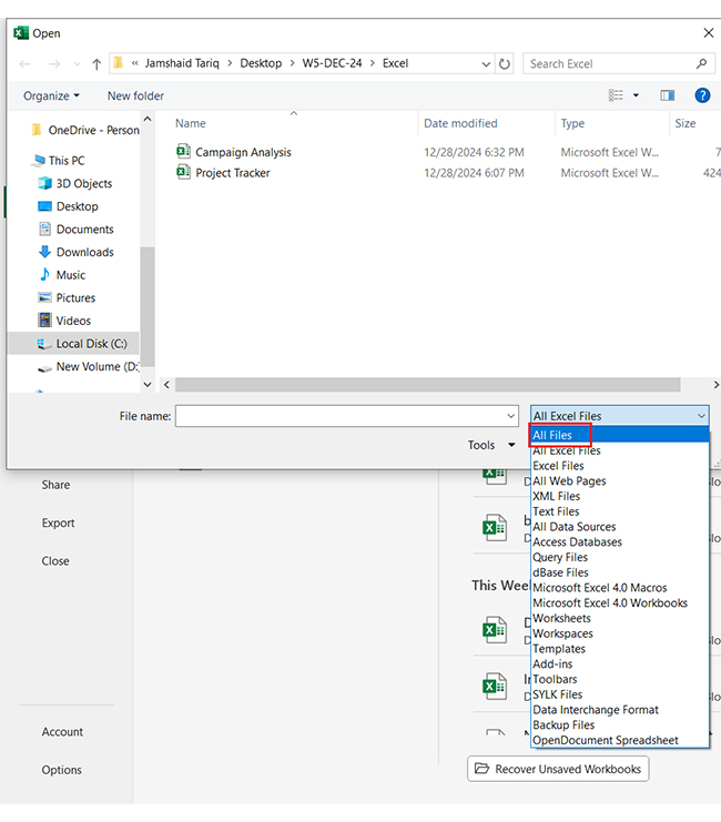
Step 4: Select the TXT file and click Open to begin the import process.

Select TXT File and Click Open for Converting Text Files to Excel

Step 5: The Text Import Wizard will appear. Click Next to start configuring your file.

Text Import Wizard for Converting Text Files to Excel

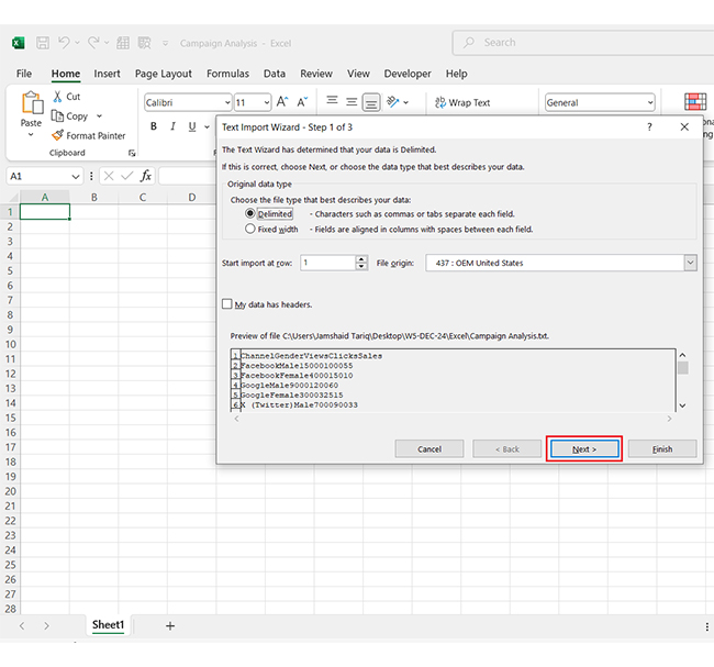
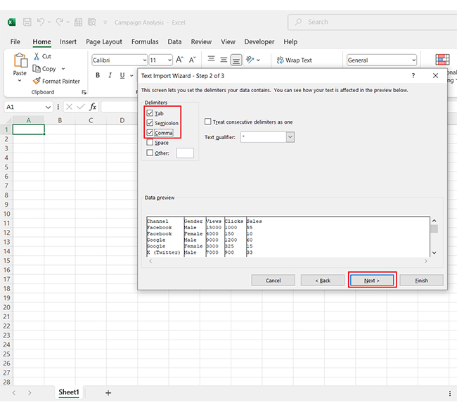
Step 6: Select the delimiter used in your file (commas, tabs, etc.) and check the correct boxes. Then, click Next to proceed.

Select Delimiter Use in File for Converting Text Files to Excel

Step 7: Verify your selections, adjust column formats if needed, and click Finish to load the data.

Adjust Column Formats for Converting Text Files to Excel

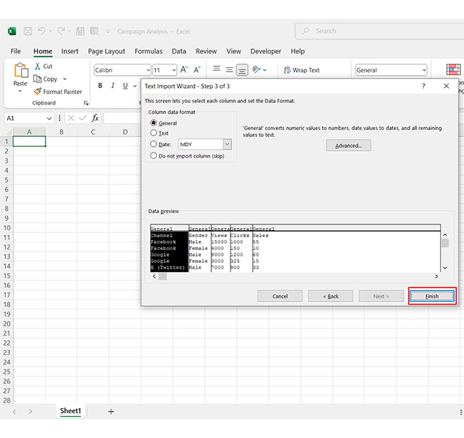
Finally, it will appear as shown below;

Data Appear for Converting Text Files to Excel

How to Analyze Text Files Into Excel?

Converting a text file to Excel is like giving raw data a structured home. It transforms unorganized information into a more readable and actionable format.

But here’s the catch: while Excel excels in data management, its built-in data visualization tools can sometimes feel limited. That’s where ChartExpo steps in—a powerful solution that helps you create cool Excel charts and graphs. ChartExpo elevates your data visualization game and turns dull spreadsheets into engaging insightful visuals.

Let’s learn how to install ChartExpo in Excel.

  1. Open your Excel application.
  2. Open the worksheet and click the “Insert” menu.
  3. You’ll see the “My Apps” option.
  4. In the Office Add-ins window, click “Store” and search for ChartExpo on my Apps Store.
  5. Click the “Add” button to install ChartExpo in your Excel.

ChartExpo charts are available both in Google Sheets and Microsoft Excel. Please use the following CTAs to install the tool of your choice and create beautiful visualizations with a few clicks in your favorite tool.

Example

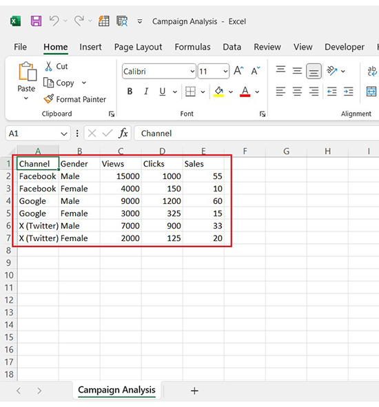
Let’s see how to visualize and analyze this sample data for Excel chart using ChartExpo.

Channel Gender Views Clicks Sales
Facebook Male 15000 1000 55
Facebook Female 4000 150 10
Google Male 9000 1200 60
Google Female 3000 325 15
X (Twitter) Male 7000 900 33
X (Twitter) Female 2000 125 20
  • To get started with ChartExpo, install ChartExpo in Excel.
  • Now Click on My Apps from the INSERT menu.
insert chartexpo in excel
  • Choose ChartExpo from My Apps, then click Insert.
open chartexpo in excel
  • Once it loads, scroll through the charts list to locate and choose the “Clustered Stacked Bar Chart”. This chart is best suited to this scenario.
search clustered stacked bar chart in excel
  • You will see a Clustered Stacked Bar Chart on the screen.
See Clustered Stacked Bar Chart After Converting Text Files to Excel
  • Click the “Create Chart From Selection” button after selecting the data from the sheet, as shown.
Click Create Chart From Selection After Converting Text Files to Excel
  • ChartExpo will generate the visualization below for you.
Initial Visual After Converting Text Files to Excel
  • If you want to have the chart’s title, click Edit Chart, as shown in the above image.
  • Click the pencil icon next to the Chart Header to change the title.
  • It will open the properties dialog. Under the Text section, you can add a heading in Line 1 and enable Show.
  • Give the appropriate title of your chart and click the Apply button.
Add Chart Header After Converting Text Files to Excel
  • You can change the color of the Male section by clicking on the Legend small pencil icon:
Change Legend Color of Male Section After Converting Text Files to Excel
  • You can change the color of the Female section by clicking on the Legend small pencil icon:
Change Legend Color of Female Section After Converting Text Files to Excel
  • Click the “Save Changes” button to persist the changes.
Click Save Changes After Converting Text Files to Excel
  • Your Clustered Stacked Bar Chart will appear as below.
Final Converting Text Files to Excel

Insights

  • Male users outperform female users in views, clicks, and sales across all channels.
  • Google drives the most sales, particularly among male users.
  • Facebook garners the highest views overall but lags in sales efficiency.

Converting Text Files to Microsoft Excel: Unlocking Charting Potential:

  1. Open your Excel Application.
  2. Install ChartExpo Add-in for Excel from Microsoft AppSource to create interactive visualizations.
  3. Select the Clustered Stacked Bar Chart from the list of charts.
  4. Select your data.
  5. Click on the “Create Chart from Selection” button.
  6. Customize your chart properties to add header, axis, legends, and other required information.

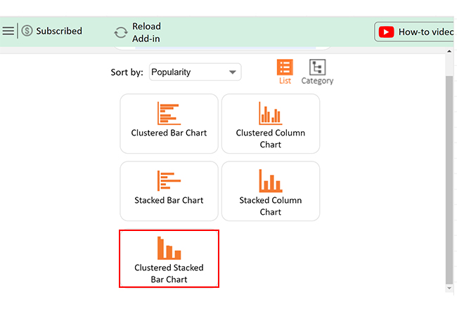
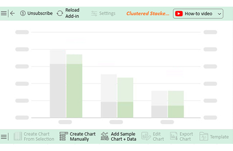
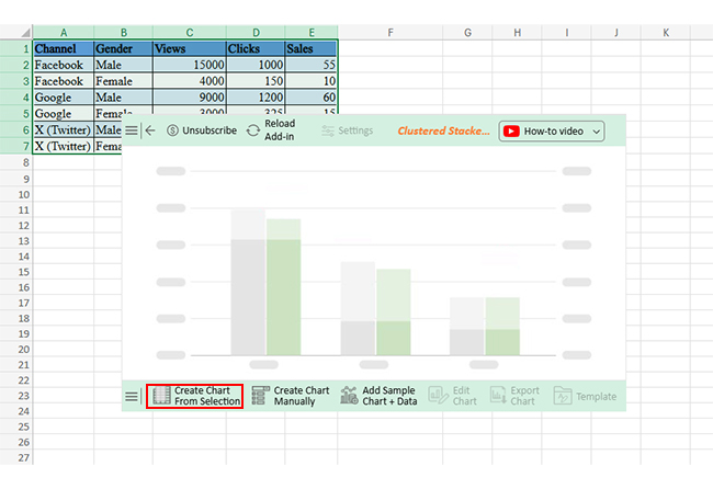
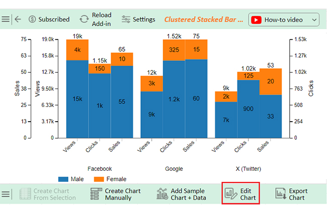
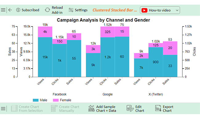
The following video will help you create a Clustered Stacked Bar Chart in Microsoft Excel.

FAQs

How do I convert a text file to Excel and separate columns?

To convert a text file to Excel:

  • Open Excel and import the text file.
  • Choose “Delimited” during import.
  • Select delimiters like commas or tabs to separate columns.
  • Preview and finish importing.

How do I convert text to data in Excel?

To convert text to data in Excel:

  • Select the text cells.
  • Click “Data” and choose “Text to Columns”.
  • Pick “Delimited” or “Fixed Width”.
  • Set delimiters (e.g., commas).
  • Click “Finish” to convert

How do I convert a text file to a table in Excel?

To convert a text file to a table in Excel:

  • Open Excel and import the text file.
  • Use “Delimited” or “Fixed Width” to separate data.
  • Format the imported data as a table.
  • Click “Insert” > “Table”.

Wrap Up

Converting text files to Excel is a valuable skill beyond basic data organization—it’s a gateway to information design. This process transforms unstructured text into organized data, making information easier to read, analyze, and share. By separating values into rows and columns, Excel enables you to sort, filter, and calculate data quickly. This simplifies tasks that once took hours into manageable minutes.

This skill unlocks new possibilities for professionals across industries. Businesses leverage it to create digital dashboards for sales reports and budgets, while researchers use it to analyze large datasets. Even students benefit from managing projects efficiently.

Excel’s tools, such as delimiters, formatting options, and chart elements in Excel, streamline the conversion process. With its user-friendly interface, creating dynamic graph Excel solutions becomes second nature, allowing you to visualize trends and insights effectively.

This transformation boosts productivity by reducing errors and saving time. Clean, well-organized data leads to better decision-making, empowering you to tackle small lists and massive datasets.

Do not hesitate.

Install ChartExpo to enhance your visualizations and take your data storytelling to the next level.

How much did you enjoy this article?

ExcelAd2
Start Free Trial!
147424

Related articles

next previous
Microsoft Excel10 min read

Compound Interest in Excel for Smarter Reporting

Discover compound interest in Excel and how it works. Learn its formulas, calculation tips, and common errors to avoid for more accurate financial analysis.

Microsoft Excel9 min read

KPI Dashboard in Excel: A Complete Guide

A KPI dashboard in Excel helps track key metrics and streamline data visualization. Discover how to create, analyze, and use it with clear guides and examples.

Microsoft Excel11 min read

How to Plot a Speedometer Chart in Excel?

Create a Speedometer Chart in Excel to track KPIs, goals, and performance metrics visually. Explore templates, examples, and step-by-step instructions for better dashboards.

Microsoft Excel13 min read

Excel for Teachers for Insightful Preparation

Excel for teachers simplifies grading, tracks attendance, and organizes data. Find its key features, expert tips, and how ChartExpo enhances data visualization.

Microsoft Excel14 min read

How to Make a Cash Flow Diagram in Excel?

Learn how to make a Cash Flow Diagram in Excel. It will help you learn to visualize and analyze inflows and outflows of your business cash flow.

ChartExpo logo

Turn Data into Visual
Stories

CHARTEXPO

  • Home
  • Gallery
  • Videos
  • Services
  • Pricing
  • Contact us
  • FAQs
  • Privacy policy
  • Terms of Service
  • Sitemap

TOOLS

  • ChartExpo for Google Sheets
  • ChartExpo for Microsoft Excel
  • Power BI Custom Visuals by ChartExpo
  • Word Cloud

CATEGORIES

  • Bar Charts
  • Circle Graphs
  • Column Charts
  • Combo Charts
  • Comparison Charts
  • Line Graphs
  • PPC Charts
  • Sentiment Analysis Charts
  • Survey Charts

TOP CHARTS

  • Sankey Diagram
  • Likert Scale Chart
  • Comparison Bar Chart
  • Pareto Chart
  • Funnel Chart
  • Gauge Chart
  • Radar Chart
  • Radial Bar Chart
  • Sunburst Chart
  • see more
  • Scatter Plot Chart
  • CSAT Survey Bar Chart
  • CSAT Survey Chart
  • Dot Plot Chart
  • Double Bar Graph
  • Matrix Chart
  • Multi Axis Line Chart
  • Overlapping Bar Chart
  • Control Chart
  • Slope Chart
  • Clustered Bar Chart
  • Clustered Column Chart
  • Box and Whisker Plot
  • Tornado Chart
  • Waterfall Chart
  • Word Cloud
  • see less

RESOURCES

  • Blog
  • Resources
  • YouTube
SIGN UP FOR UPDATES

We wouldn't dream of spamming you or selling your info.

© 2025 ChartExpo, all rights reserved.