Categories
This guide shows you how to write the introductory paragraph (Power BI features), what Power BI features are, why Microsoft Power BI features are important, and the top 10 best features of Power BI.
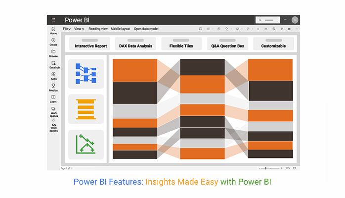


There are sections in this guide that show you some Power BI design ideas, and also show you some Power BI advanced features like bookmarks in Power BI, Power BI cross filter direction, data gateway in Power BI, and Power BI connectors.
Whether you’re using a Power BI cloud or a Power BI web, this guide shows you the Power BI features you should know.
How can you use the key features of Power BI for charting, and what are the benefits of using Power BI Premium features? Well, this guide exposes you to all that and also shows you tips for using Power BI Pro features.
Power BI offers powerful data visualization, reporting, and analytics features. That enables businesses to create interactive dashboards, AI-driven analytics, and real-time insights for streamlined data management and better decision-making.
Here are key features of Power BI that make it a must-have tool for businesses of all sizes.
Power BI’s custom visualizations and interactive dashboards allow organizations to present complex data in an easy-to-understand format. With the drag-and-drop functionality, users are able to create real-time visualizations and dynamic reports. All these add to better storytelling and insights.
Power BI can process and display real-time data. This comes in handy in industries like retail, finance, and manufacturing, where timely insights are necessary for decision-making.
Power BI’s mobile app helps users access reports anytime. It’s a great fit for remote teams and business leaders who need real-time access to data insights.
Power BI offers enterprise-level security and allows organizations to control who has access to what data through role-based access controls (RBAC). This ascertains data privacy and compliance with industry regulations.
With Power Query, users are able to transform, clean, and manipulate data before visualization. This will, in turn, eliminate the need for external data processing tools and make Power BI a self-service analytics solution.
Power BI can integrate with Microsoft 365 tools like SharePoint, Teams, Power Apps, and Excel. All these streamline workflows and enhance collaboration within organizations.
Power BI integrates machine learning and artificial intelligence (AI) to provide automated insights, predictive analytics, and anomaly detection. Business owners can leverage these AI-powered features to uncover hidden patterns and make data-driven decisions.
Power BI connects with over 100 data sources like Google Analytics, cloud-based applications, Salesforce, SQL Server, Excel, and Azure. This wide range of connectivity ensures that businesses can analyze and aggregate data from multiple platforms in one place.
Microsoft Power BI is a superb business intelligence (BI) tool that helps organizations visualize and analyze data efficiently. Here are the top 10 features you should know:
Power BI comes with built-in artificial intelligence (AI) and machine learning that provide automated insights, predictive analytics, and anomaly detection. This makes data interpretation smarter and faster.
Users have the option to choose from pre-built visualizations or create custom visuals using Power BI’s visualization SDK. This will, in turn, enable more engaging and informative reports.
Power BI offers a mobile app that allows users to access reports on the go. This ensures business insights are always available.
Power BI supports connections to 100+ data sources, and that includes SQL Server, Excel, Salesforce, Google Analytics, and cloud services. It allows seamless integration across platforms.
Power BI enables users to create interactive and visually appealing dashboards that provide real-time insights. Users can easily apply filters, customize reports, and drill down into data for better decision-making.
Power BI gives businesses the room to monitor live data streams, and it ensures they have access to the most up-to-date information for quick decision-making.
Power BI integrates with SharePoint, Excel, and Teams. It streamlines workflows and improves collaborations.
With Power Query, users can transform, clean, and shape data before visualization. This reduces the need for external data processing tools.
Power BI ascertains data security by allowing organizations to assign role-based access permissions, and it ensures that only authorized users can modify or view reports.
Power BI integrates with SharePoint, Teams, Excel, and Power Apps. It streamlines workflows and improves collaboration.
Do you know how Power BI transforms data? Well, the next section dives deep into that. In the meantime, here are some common Power BI data visualizations:
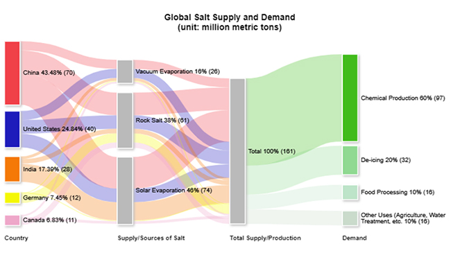
Sankey Diagram:
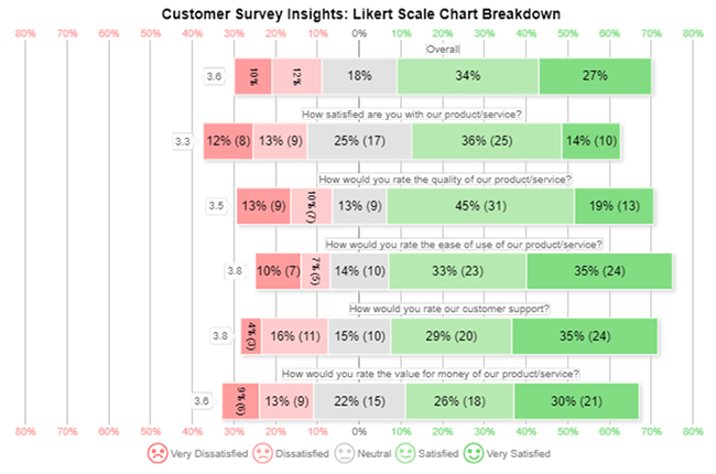
Likert Scale Chart:
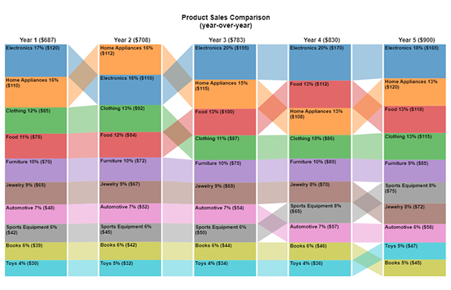
Comparison Bar Chart:
Multi-Axis Line Chart:
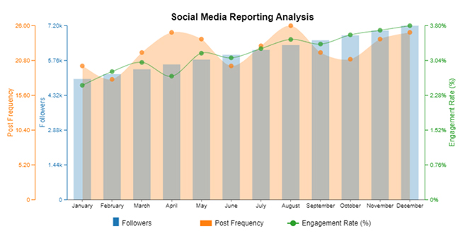
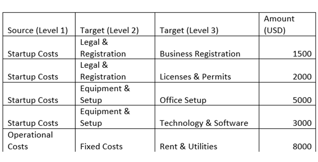
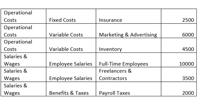
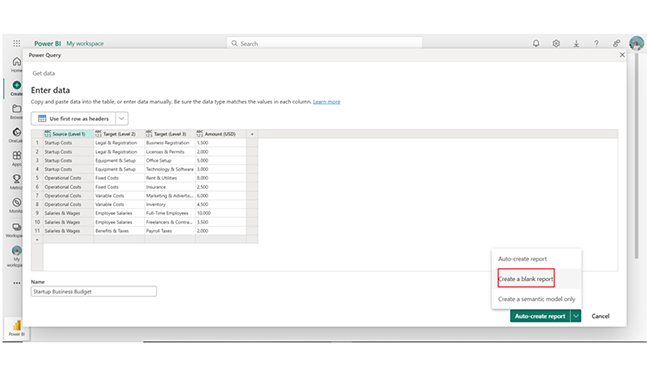
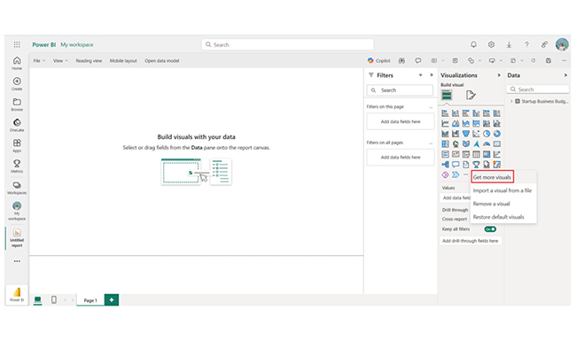
The section below shows how the Power BI report builder can be used to track important Power BI metrics. You will also see steps to help you create a Sankey chart in Power BI. The use case used below is a startup business budget.
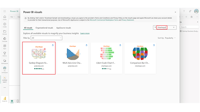
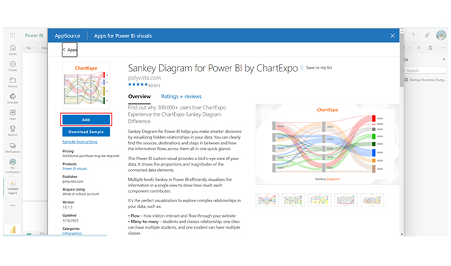
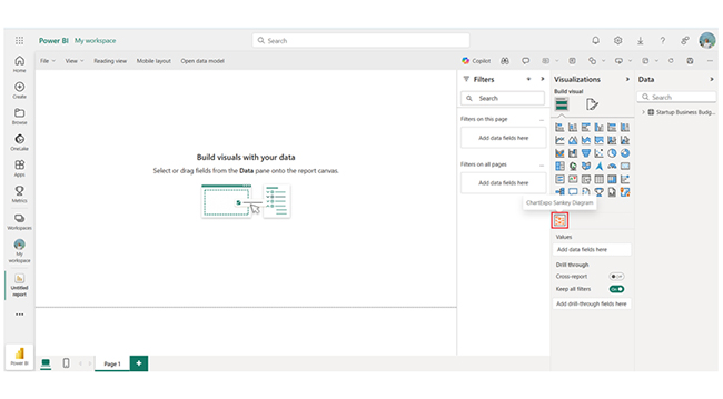
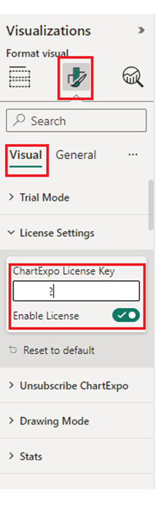
Here are the stages needed in the creation of the Sankey Diagram by ChartExpo in Power BI for a startup business budget.

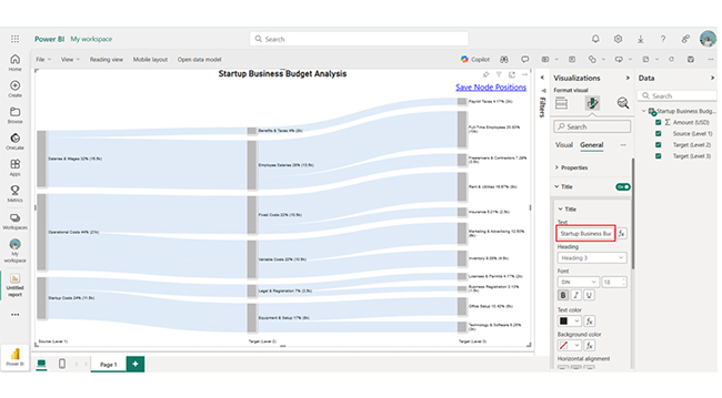
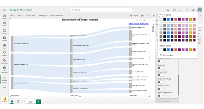
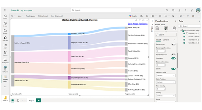
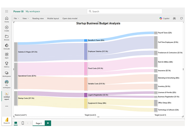
The stages above can be used to visualize any kind of Power BI Data Model.
The startup allocates most funds to Salaries & Wages (43%), and that emphasizes workforce investment. Operational Costs (36%) focus on marketing, inventory, and rent.
Startup Costs (21%) cover essential setup, and Office Setup (25% of startup costs) is the largest. Efficient allocation highlights a balance between growth essentials, staffing, and operations.
The unique feature of Power BI Service lies in its cloud-based, collaborative environment. This enables real-time data sharing, AI-powered insights, automatic updates, and secure role-based access for seamless business intelligence and decision-making.
To troubleshoot report performance, user activities, data refresh issues, and query execution problems, you should consider using Performance Analyzer and Audit Logs. You can also use Dataset Refresh History and Query Diagnostics.
Power BI features include AI-powered analytics, interactive dashboards, extensive data connectivity, role-based security, and real-time data processing. These features help in efficient data visualization, secure sharing, and seamless integration. It helps businesses make data-driven decisions.
But why are these features important? Well, they enhance data visualization and reporting and give room for real-time data processing. The custom visualizations and interactive dashboards in Power BI allow organizations to present complex data in an easy-to-understand format.
Furthermore, Power BI processes and displays real-time data. This comes in handy for industries in finance, manufacturing, and retail, where timely insights are necessary for decision-making.
Now you know the various Power BI features, which of these features is the most valued in your workplace?
How much did you enjoy this article?


Discover diverse and high-quality Power BI report examples for inspiration and insights. Elevate your reporting with strategic visualization techniques.

A Customer Relationship Management Dashboard centralizes data, tracks key metrics, and drives smarter business decisions. Discover now!

Explore Healthcare Dashboard Examples and learn how to turn complex healthcare data into clear, actionable insights for better decision-making.


