• Home
  • Tools dropdown img
    • Spreadsheet Charts

      • ChartExpo for Google Sheets
      • ChartExpo for Microsoft Excel
    • Power BI Charts

      • Power BI Custom Visuals by ChartExpo
    • Word Cloud

  • Charts dropdown img
    • Chart Category

      • Bar Charts
      • Circle Graphs
      • Column Charts
      • Combo Charts
      • Comparison Charts
      • Line Graphs
      • PPC Charts
      • Sentiment Analysis Charts
      • Survey Charts
    • Chart Type

      • Box and Whisker Plot
      • Clustered Bar Chart
      • Clustered Column Chart
      • Comparison Bar Chart
      • Control Chart
      • CSAT Survey Bar Chart
      • CSAT Survey Chart
      • Dot Plot Chart
      • Double Bar Graph
      • Funnel Chart
      • Gauge Chart
      • Likert Scale Chart
      • Matrix Chart
      • Multi Axis Line Chart
      • Overlapping Bar Chart
      • Pareto Chart
      • Radar Chart
      • Radial Bar Chart
      • Sankey Diagram
      • Scatter Plot Chart
      • Slope Chart
      • Sunburst Chart
      • Tornado Chart
      • Waterfall Chart
      • Word Cloud
    • Google Sheets
      Microsoft Excel
  • Services
  • Pricing
  • Contact us
  • Blog
  • Support dropdown img
      • Gallery
      • Videos
      • Contact us
      • FAQs
      • Resources
    • Please feel free to contact us

      atsupport@chartexpo.com

Categories
All Data Visualizations Data Analytics Surveys
Add-ons/
  • Google Sheets
  • Microsoft Excel
  • Power BI
All Data Visualizations Data Analytics Surveys
Add-ons
  • Google Sheets
  • Microsoft Excel
  • Power BI

We use cookies

This website uses cookies to provide better user experience and user's session management.
By continuing visiting this website you consent the use of these cookies.

Ok

ChartExpo Survey


Home > Blog > Power BI

Power BI Scheduled Export: A Complete User Guide

Power BI is software that turns unrelated data sources into coherent, visually immersive interactive dashboards and reports. It helps users draw insights from raw data. This dives deep into the Power BI scheduled export function.

Power BI Scheduled Export

It shows you why the Power BI scheduled export feature is important, the benefits of using it, and how to schedule data export in Power BI.

Table of Contents:

  1. What is Power BI Scheduled Export?
  2. Why is Power BI Scheduling Important?
  3. How to Schedule Data Export in Power BI?
  4. How to Visualize Data in Power BI?
  5. What are the Best Practices for Power BI Scheduled Export?
  6. Wrap Up

First…

What is Power BI Scheduled Export?

Power BI Scheduled Export is a functionality within Microsoft Power BI that automatically exports reports and dashboards at specified intervals. The feature is of immense value to users who need to distribute Power BI content to stakeholders regularly and keep offline records of their reports.

Why is Power BI Scheduling Important?

  • Automated Data Refresh: Dashboards and reports are always up-to-date with the latest datasets, and that helps in making data-driven decisions. Power BI scheduling also eliminates the need for manual data refreshes. This will, in turn, save time and reduce the potential for errors.
  • Consistent Reporting: Stakeholders are guaranteed to receive reports in a consistent format and at regular intervals. It also builds trust among users who want to obtain accurate and timely reports consistently.
  • Improved Collaboration: Power BI schedules come with automated email distribution, and that enables stakeholders to receive reports without additional effort. It also makes it easier for team members to review and access the latest data. All these fosters collaboration and decision-making among team members.
  • Enhanced Productivity: With Power BI scheduling, business users and analysts get freed up to focus on data analysis and interpretation rather than data preparation and report generation. You also have the option of integrating with tools like Power Automate to create seamless workflows, and further enhance efficiency and productivity.

How to Schedule Data Export in Power BI?

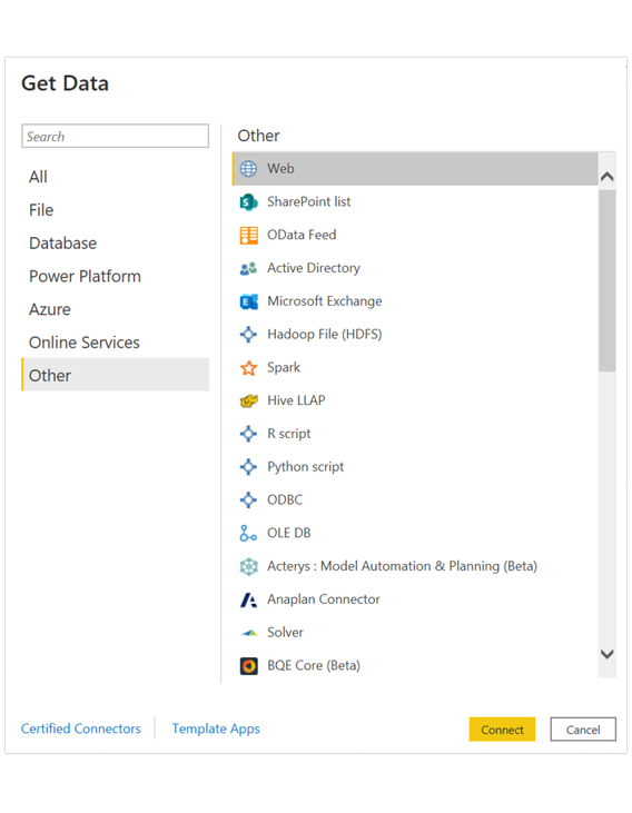
Open the Power BI Desktop, and click “Get data.” Click the “Other” tab and choose Web. After that, click “Connect.”

Click Connect to Learn Power BI Scheduled Export

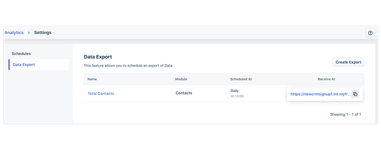
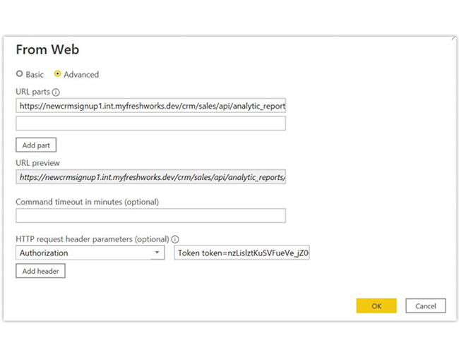
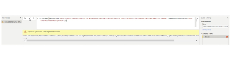
In the box that opens up, click “Advanced.” Under URL parts, copy and paste the “Data Export” API from the web application.

Paste Data Export to Learn Power BI Scheduled Export

Under HTTP request parameters, type Authorization in the first box. In the second box, type in Token token=<Product API Key>

Type in Token API to Learn Power BI Scheduled Export

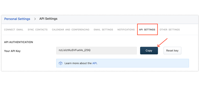
Navigate to Profile Settings > API Settings to get the Product API key. There must be no space in between ”˜=’ and the Product API key.

Enter Product API Key to Learn Power BI Scheduled Export

Click “OK.” In the Home tab that appears with the CSV document URL, append Csv.document. The format should be CSV.Document(Web.Contents(CSV document URL)).

Append CSV.Document to Learn Power BI Scheduled Export

Click the tick icon to populate the API data as a table.

Click Tick Icon Populate API Data to Learn Power BI Scheduled Export

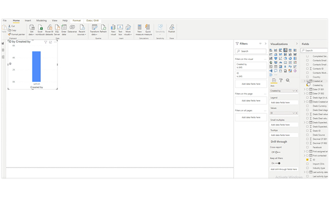
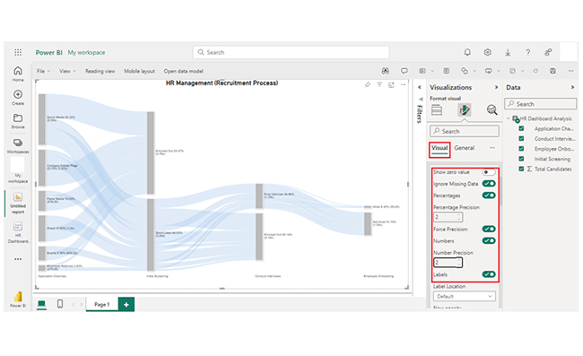
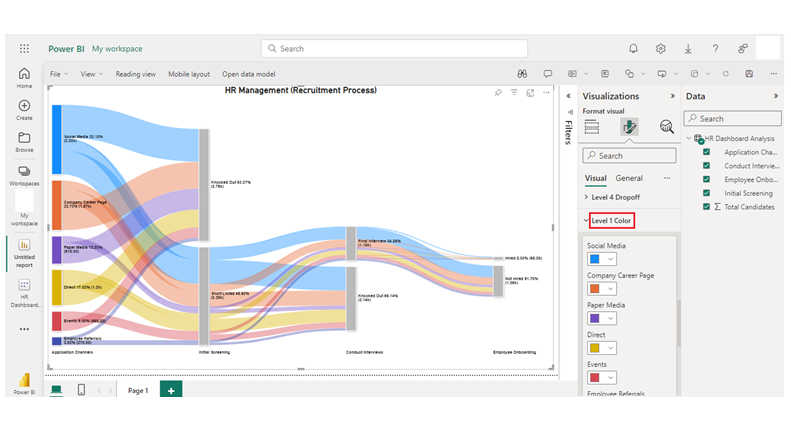
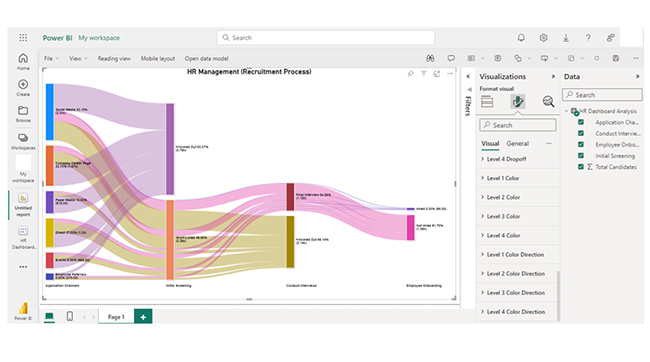
Use the filters on the right to visualize the data in a chart form.
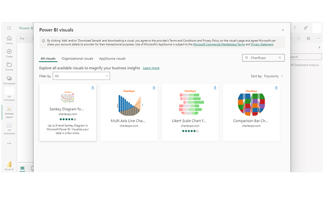
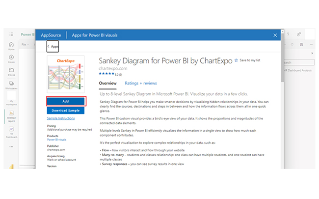
Use Filters to Learn Power BI Scheduled Export

How to Visualize Data in Power BI?

Stage 1: Logging in to Power BI
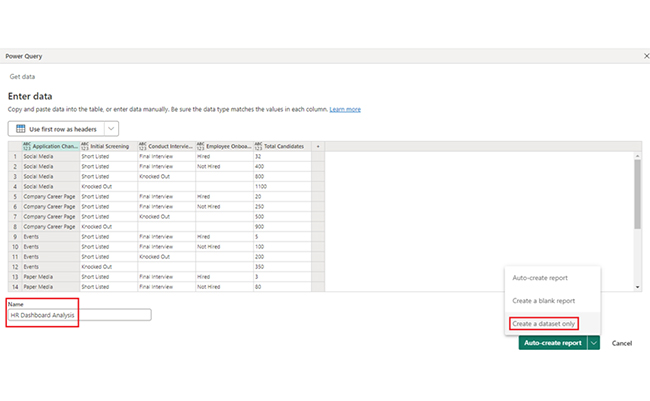
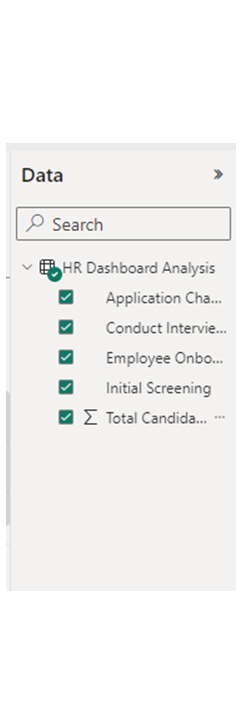
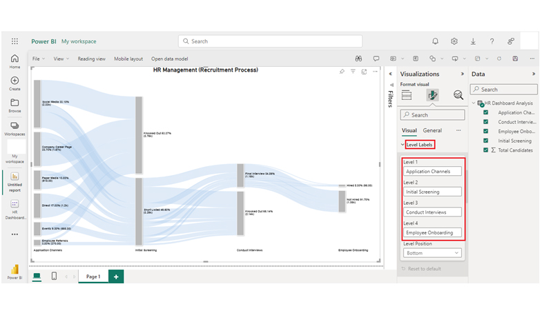
  • Log in to Power BI.
  • Enter your email address and click the “Submit” button.
Enter email to login to Power BI
  • You are redirected to your Microsoft account.
  • Enter your password and click “Sign in“.
Enter Password to login to Power BI
  • You can choose whether to stay signed in.
Click on stay signed in
  • Once done, the Power BI home screen will open.

Stage 2: Creating a Data Set and Selecting the Data Set to Use in Your Chart

  • Go to the left-side menu and click the “Create” button.
  • Select “Paste or manually enter data“.
select Paste or manually enter data in Power BI ce487
  • We’ll use the sample data below for this example.
Application Channels Initial Screening Conduct Interviews Employee Onboarding
Total Candidates
Social Media Short Listed Final Interview Hired 32
Social Media Short Listed Final Interview Not Hired 400
Social Media Short Listed Knocked Out 800
Social Media Knocked Out 1100
Company Career Page Short Listed Final Interview Hired 20
Company Career Page Short Listed Final Interview Not Hired 250
Company Career Page Short Listed Knocked Out 500
Company Career Page Knocked Out 900
Events Short Listed Final Interview Hired 5
Events Short Listed Final Interview Not Hired 100
Events Short Listed Knocked Out 200
Events Knocked Out 350
Paper Media Short Listed Final Interview Hired 3
Paper Media Short Listed Final Interview Not Hired 80
Paper Media Short Listed Knocked Out 135
Paper Media Knocked Out 700
Employee Referrals Short Listed Final Interview Hired 10
Employee Referrals Short Listed Final Interview Not Hired 70
Employee Referrals Short Listed Knocked Out 80
Employee Referrals Knocked Out 110
Direct Short Listed Final Interview Hired 25
Direct Short Listed Final Interview Not Hired 150
Direct Short Listed Knocked Out 425
Direct Knocked Out 600
  • Paste the data table above into the “Power Query” window. Next, select the “Create a dataset only” option.
Select Create a Dataset Only After Learning Power BI Scheduled Export
  • Navigate to the left-side menu, and click the “Data Hub” option. The Power BI populates the data set list. If no data set has been created, you’ll get an error message.
Click Data Hub to Popualte Dataset After Learning Power BI Scheduled Export
  • Click on the “Create Report” dropdown.
Click on Create Report After Learning Power BI Scheduled Export
  • To create the Sankey Diagram, you’ll need an add-in or Power BI visual from AppSource. Navigate to the right side of the Power BI dashboard, and open the Power BI visualizations panel. Next, click the ellipsis symbol (…) to import the Power BI Sankey Diagram extension by ChartExpo. In the next menu that opens, select the “Get more visuals” option.
Click Get More Visuals After Learning Power BI Scheduled Export
  • Enter “ChartExpo” in the highlighted search box. You’ll see the “Sankey Diagram for Power BI by ChartExpo” as shown below.
Enter ChartExpo After Learning Power BI Scheduled Export
  • Next, click on the Sankey Diagram. After that, click the “Add” button.
Click Add Button After Learning Power BI Scheduled Export
  • Power BI will add the “Sankey Diagram for Power BI by ChartExpo” icon in the visualization panel.
Sankey Diagram Icon in Visualization Panel After Learning Power BI Scheduled Export
  • To draw a Sankey Diagram with ChartExpo’s Power BI extension, you’ll have to select the “Sankey Diagram for Power BI by ChartExpo” icon in the visualization panel. After that, a window opens in the report section of your dashboard.
Select Sankey Diagram Icon from Visualization Panel After Learning Power BI Scheduled Export
  • Select the fields to be used in the Sankey chart.
Select Fields to Use Sankey Chart After Learning Power BI Scheduled Export
  • Follow the sequence below when selecting the fields:
    • Application Channels
    • Initial Screening
    • Conduct Interviews
    • Employee Onboarding
    • Total Candidates
  • You’ll have to provide your email address or a ChartExpo license key. To see the Sankey Chart, add the key under the visual section.
Enter License Key After Learning Power BI Scheduled Export
  • After adding the key, you’ll see the chart with respect to your data. There’s the option of adding the top header text in the chart under the general section.
Add Top Header Text After Learning Power BI Scheduled Export
  • After that, click on visual and set the number. You should also enable the options as shown below:
Click Visual and Set Number After Learning Power BI Scheduled Export
  • You can change the “Node Font Style.”
Change Node Font Style After Learning Power BI Scheduled Export
  • There’s also the option of changing the “Level Font Style.”
Change Level Font Style After Learning Power BI Scheduled Export
  • Here’s what the Level Labels look like:
Have a Look on Level Labels After Learning Power BI Scheduled Export
  • You can change the Node color as shown below:
Change Node Color After Learning Power BI Scheduled Export
  • Here’s “How to change Level 1 color,” and you can follow the same steps to change the node color of other levels.
Change Color of Level 1 After Learning Power BI Scheduled Export
  • After changing all node colors, here’s the final look of the HR Dashboard in Power BI using ChartExpo.
Final Power BI Scheduled Export

Insights

  • Social Media is the primary application channel with the highest number of candidates (1100).
  • Company Career Page follows with 900 candidates.
  • Paper Media and Events have comparatively lower candidate counts (700 and 350, respectively).
  • Direct applications have 600 candidates.

Refine Data Delivery with Power BI Scheduled Export for Graphical Insights:

Unlock the power of Power BI Scheduled Export in this practical tutorial, where you’ll learn how to automate the export of reports and dashboards with dynamic charts and graphs. By setting up scheduled exports, you can ensure that your data is regularly delivered in the format you need, whether it’s for regular stakeholder meetings, automated reporting, or timely updates. Power BI’s scheduling feature allows you to export interactive reports and visuals directly to email or save them to a location of your choice, ensuring your team has up-to-date insights at their fingertips. Mastering this process enables you to maintain consistency in reporting, save time on manual exports, and focus on using the data to drive decisions. With scheduled exports, you can easily share key metrics, performance trends, and visualizations across your organization, empowering better collaboration and streamlined workflows.

What are the Best Practices for Power BI Scheduled Export?

  • Data Refresh Planning: Data refreshes should be scheduled during off-peak hours. This minimizes impact on system performance and ensures timely updates. If you’re working with large datasets, you can reduce load times and improve efficiency by using incremental data refresh.
  • File Management: Your export format should be based on the nature of the report and the needs of the recipients. These export formats could be PowerPoint, Excel, or PDF. You can also use the version control strategy to keep track of the report changes and ensure consistency.
  • Security and Permissions: Only authorized users should have access to exporting and scheduling functionalities. When exporting and distributing reports, you should keep the data sensitivity and compliance requirements in mind.
  • Monitoring and Maintenance: Always monitor and review scheduled exports. This will help you ascertain that they’re functioning correctly and address issues (if any).
  • User Communication and Training: Always inform stakeholders about the schedule and format of exports. Users should be trained on how to access and interpret exported reports. This will come in handy when there are changes in content and format.
  • Testing and Validation: All new schedules should be thoroughly tested before implementation. This ensures that it works as expected, and that exported files meet quality standards. Also, validate the data in exported reports regularly. It will help you ascertain accuracy and consistency with source data.

FAQs

Can You Schedule an Export from Power BI?

Yes, you can schedule exports in Power BI. To do that, set up scheduled refreshes and use Power Automate for automated export and email distribution of dashboards and reports at specified intervals.

What are the Exporting Options in Power BI?

Power BI offers exporting options to PowerPoint, CSV formats, Excel, and PDF.

Can Power BI be Used for Scheduling?

Yes, Power BI supports scheduling through scheduled data refreshes and export automation. This will enable timely updates and distribution of dashboards and reports to stakeholders at predefined intervals.

Wrap Up

Power BI scheduled export automates the distribution and export of reports at specified intervals. It’s important for timely updates, enhanced productivity, consistent reporting, and efficient data management.

To get the most out of the Power BI scheduled export, you have to ascertain that the reports are optimized for performance. That includes efficient data visualization and modeling practices to minimize export and refresh times. You should also reduce the size of exported files by filtering unnecessary data and focusing on key insights.

Backup and recovery are of the essence. Always schedule regular backups of critical reports and data exports to prevent data loss and ensure recovery in cases of issues.

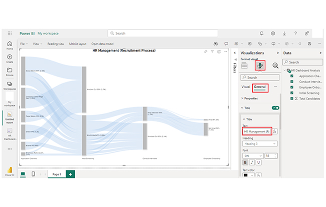
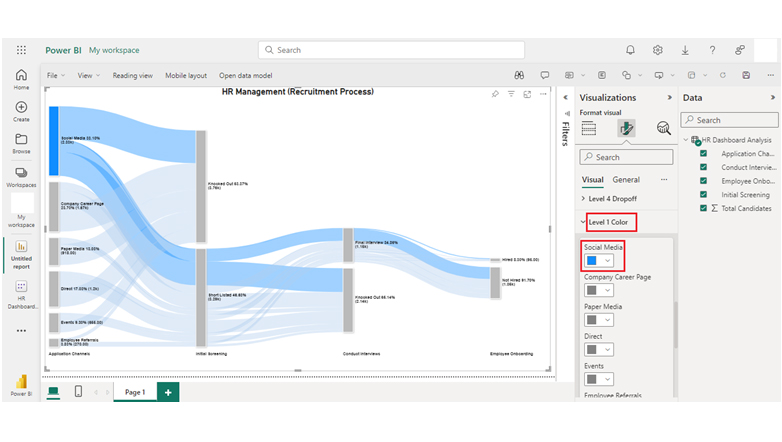
Regardless of your industry, you can create a dashboard similar to the HR data used in this guide. After that, you can proceed to create compelling visualizations like the Sankey chart to represent the evolving total over time. All these aid in effective data evaluation.

How much did you enjoy this article?

PBIAd2
Start Free Trial!
142029

Related articles

next previous
Power BI12 min read

Power BI Group By Guide for Effective Data Insights

Learn how Power BI Group By helps you aggregate data, clarify trends, and create reports by grouping values to make large datasets manageable & insightful.

Power BI12 min read

How to Create Sankey Diagram in Microsoft Power BI?

Learn How to Create Sankey Diagram in Microsoft Power BI using Desktop & Web Service. What they are and how to use them effectively.

Power BI8 min read

Power BI Artificial Intelligence: Insights Using Visuals

Discover all there is to know about the Power BI artificial intelligence. You'll also discover how AI is used in Power BI, and how to use it for analysis and more.

Power BI9 min read

Budgeting in Healthcare: Use Visuals to Spot Budget Gaps

This guide helps you discover what budgeting in healthcare is. You'll also discover the factors that affect hospital budgets and types of budgeting in healthcare.

Power BI9 min read

Predictive Analytics in Power BI for Making Insightful Visuals

This guide shows you everything you need to know about Predictive Analytics in Power BI. It also shows you how it works, and how to interpret the results.

ChartExpo logo

Turn Data into Visual
Stories

CHARTEXPO

  • Home
  • Gallery
  • Videos
  • Services
  • Pricing
  • Contact us
  • FAQs
  • Privacy policy
  • Terms of Service
  • Sitemap

TOOLS

  • ChartExpo for Google Sheets
  • ChartExpo for Microsoft Excel
  • Power BI Custom Visuals by ChartExpo
  • Word Cloud

CATEGORIES

  • Bar Charts
  • Circle Graphs
  • Column Charts
  • Combo Charts
  • Comparison Charts
  • Line Graphs
  • PPC Charts
  • Sentiment Analysis Charts
  • Survey Charts

TOP CHARTS

  • Sankey Diagram
  • Likert Scale Chart
  • Comparison Bar Chart
  • Pareto Chart
  • Funnel Chart
  • Gauge Chart
  • Radar Chart
  • Radial Bar Chart
  • Sunburst Chart
  • see more
  • Scatter Plot Chart
  • CSAT Survey Bar Chart
  • CSAT Survey Chart
  • Dot Plot Chart
  • Double Bar Graph
  • Matrix Chart
  • Multi Axis Line Chart
  • Overlapping Bar Chart
  • Control Chart
  • Slope Chart
  • Clustered Bar Chart
  • Clustered Column Chart
  • Box and Whisker Plot
  • Tornado Chart
  • Waterfall Chart
  • Word Cloud
  • see less

RESOURCES

  • Blog
  • Resources
  • YouTube
SIGN UP FOR UPDATES

We wouldn't dream of spamming you or selling your info.

© 2025 ChartExpo, all rights reserved.