• Home
  • Tools dropdown img
    • Spreadsheet Charts

      • ChartExpo for Google Sheets
      • ChartExpo for Microsoft Excel
    • Power BI Charts

      • Power BI Custom Visuals by ChartExpo
    • Word Cloud

  • Charts dropdown img
    • Chart Category

      • Bar Charts
      • Circle Graphs
      • Column Charts
      • Combo Charts
      • Comparison Charts
      • Line Graphs
      • PPC Charts
      • Sentiment Analysis Charts
      • Survey Charts
    • Chart Type

      • Box and Whisker Plot
      • Clustered Bar Chart
      • Clustered Column Chart
      • Comparison Bar Chart
      • Control Chart
      • CSAT Survey Bar Chart
      • CSAT Survey Chart
      • Dot Plot Chart
      • Double Bar Graph
      • Funnel Chart
      • Gauge Chart
      • Likert Scale Chart
      • Matrix Chart
      • Multi Axis Line Chart
      • Overlapping Bar Chart
      • Pareto Chart
      • Radar Chart
      • Radial Bar Chart
      • Sankey Diagram
      • Scatter Plot Chart
      • Slope Chart
      • Sunburst Chart
      • Tornado Chart
      • Waterfall Chart
      • Word Cloud
    • Google Sheets
      Microsoft Excel
  • Services
  • Pricing
  • Contact us
  • Blog
  • Support dropdown img
      • Gallery
      • Videos
      • Contact us
      • FAQs
      • Resources
    • Please feel free to contact us

      atsupport@chartexpo.com

Categories
All Data Visualizations Data Analytics Surveys
Add-ons/
  • Google Sheets
  • Microsoft Excel
  • Power BI
All Data Visualizations Data Analytics Surveys
Add-ons
  • Google Sheets
  • Microsoft Excel
  • Power BI

We use cookies

This website uses cookies to provide better user experience and user's session management.
By continuing visiting this website you consent the use of these cookies.

Ok

ChartExpo Survey


Home > Blog > Power BI

Power BI into SharePoint to Boost Collaboration & Insights

Power BI is a business intelligence tool that helps analyze and visualize raw data. With Power BI, stakeholders and users can make data-driven decisions. In this guide, you’ll discover how to connect Power BI into SharePoint.

Power BI into SharePoint

You’ll also discover the benefits of integrating Power BI into SharePoint and the best practices for SharePoint lists in Power BI.

Table of Contents:

  1. How to Connect Power BI to SharePoint List?
  2. How to Create Visualizations in Power BI?
  3. What are the Benefits of Integrating Power BI into SharePoint Online?
  4. What are the Best Practices for SharePoint Lists in Power BI?
  5. Wrap Up

First…

How to Connect Power BI to SharePoint List?

Connecting Power BI to a SharePoint List allows you to visualize and analyze list data with ease. Here’s a step-by-step guide to establish the connection:

Step 1: Get Your SharePoint List URL

Navigate to your SharePoint site, go to your preferred list, and copy the URL of the SharePoint List.

Step 2: Open Power BI Desktop

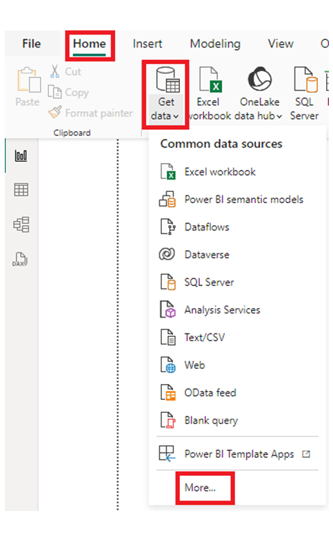
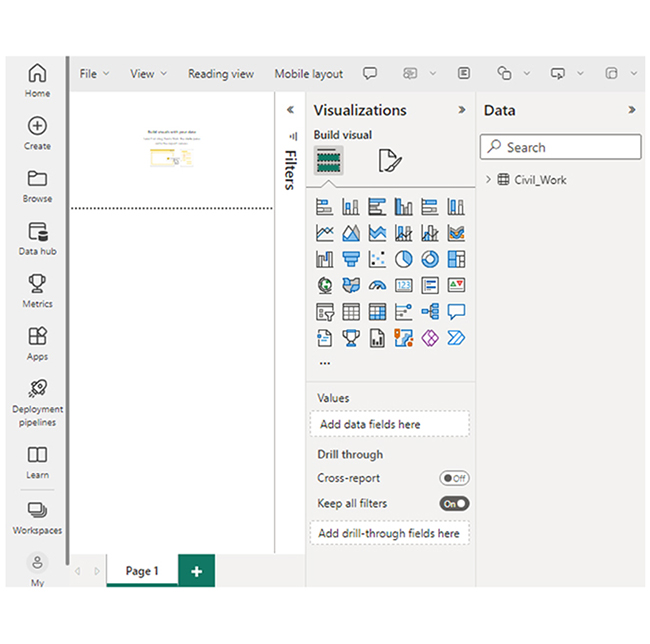
Launch the Power BI Desktop, and go to the Home tab.

Step 3: Get Data from SharePoint Online List

Click on “Get Data,” and select “More,” to open the Get Data window.

Select More Button to Open Get Data Window for Connecting Power BI into SharePoint

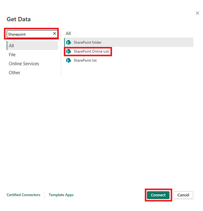
Navigate to the search box, and type “SharePoint.” After that, select “SharePoint Online List,” and click the “Connect” button.

Type SharePoint and Click Connect for Connecting Power BI into SharePoint

Step 4: Enter the SharePoint List URL

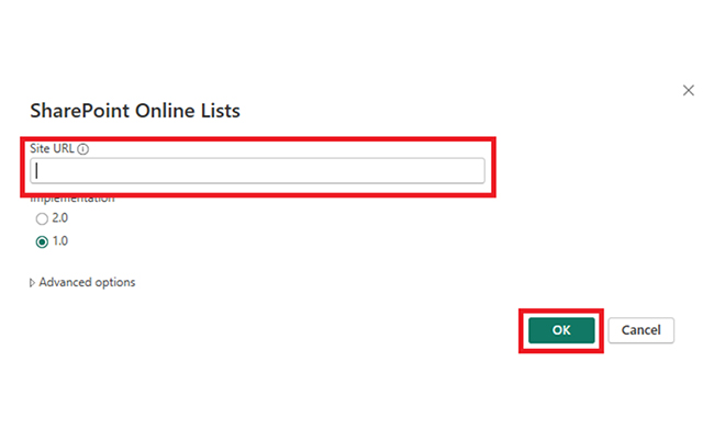
Look out for the SharePoint Online List dialog box, and paste the URL of the SharePoint List that has been copied earlier. Next, click “OK.”

Paste URL of SharePoint List and Click OK for Connecting Power BI into SharePoint

Step 5: Sign Into SharePoint

You’ll be prompted to sign in with your SharePoint credentials. After signing in, select the authentication method (usually organizational account), and click “Connect.”

Step 6: Select the SharePoint List

In the navigation window, you will see a list of all available on the SharePoint site. Choose the list you want to import into the Power BI. You can also choose multiple lists (if needed). To import the data into Power BI, click “Load.”

Step 7: Transform Data (Optional)

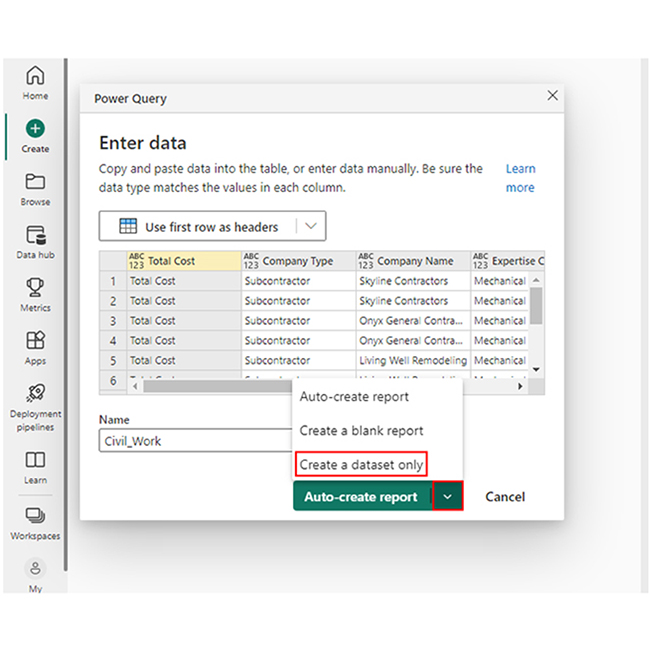
There are cases where you’ll have to transform the data before loading it. To do that, click “Transform Data” instead of “Load.” The Power Query Editor will open to enable you to perform multiple data transformation tasks. After making the changes, click “Close & Apply.”

Step 8: Create Visualizations

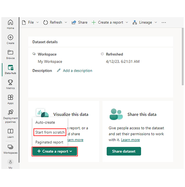
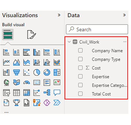
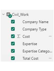
To create data visualizations in Power BI, you’ll have to wait until the data is loaded. After that, you will use the fields pane to drag and drop fields into the report canvas to create tables, charts, graphs, and other visual elements.

Step 9: Publish to Power BI Service (Optional)

Navigate to the File menu, and select Publish. After that, click “Publish to Power BI.” To select the workspace where you’ll want to publish the report, sign into your Power BI account.

How to Create Visualizations in Power BI?

Stage 1: Logging in to Power BI
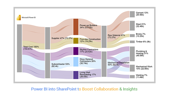
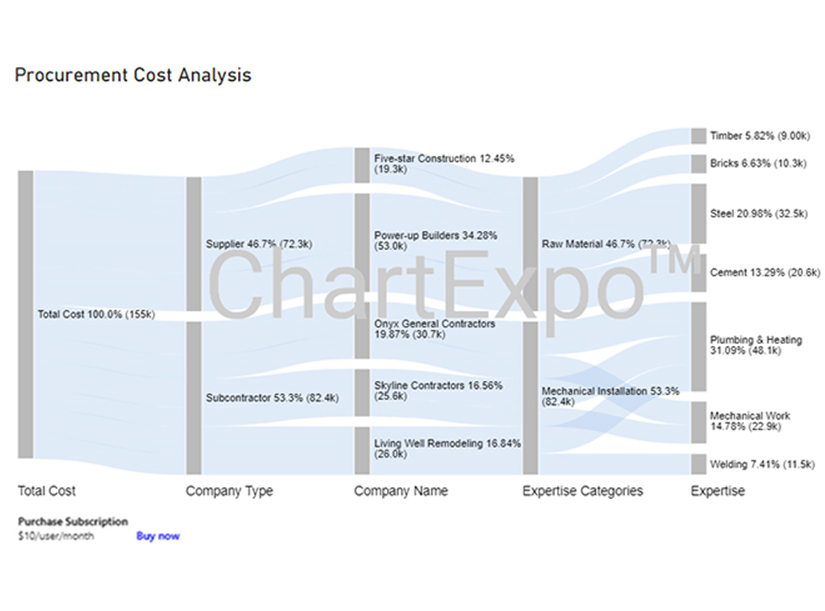
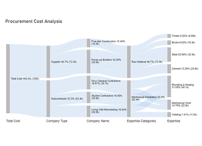
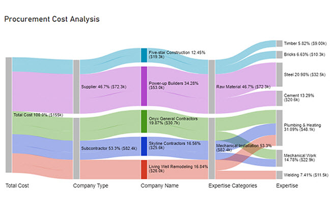
  • Log in to Power BI.
  • Enter your email address and click the “Submit” button.
Enter email to login to Power BI
  • You are redirected to your Microsoft account.
  • Enter your password and click “Sign in“.
Enter Password to login to Power BI
  • You can choose whether to stay signed in.
Click on stay signed in
  • Once done, the Power BI home screen will open.

Stage 2: Creating a Data Set and Selecting the Data Set to Use in Your Chart

  • Go to the left-side menu and click the “Create” button.
  • Select “Paste or manually enter data“.
select Paste or manually enter data in Power BI ce487
  • We’ll use the sample data below for this example.
Total Cost Company Type Company Name Expertise Categories Expertise Cost
Total Cost Subcontractor Skyline Contractors Mechanical Installation Plumbing & Heating 15456
Total Cost Subcontractor Skyline Contractors Mechanical Installation Mechanical Work 10159
Total Cost Subcontractor Onyx General Contractors Mechanical Installation Plumbing & Heating 18045
Total Cost Subcontractor Onyx General Contractors Mechanical Installation Mechanical Work 12695
Total Cost Subcontractor Living Well Remodeling Mechanical Installation Plumbing & Heating 14589
Total Cost Subcontractor Living Well Remodeling Mechanical Installation Welding 11456
Total Cost Supplier Power-up Builders Raw Material Cement 20561
Total Cost Supplier Power-up Builders Raw Material Steel 32456
Total Cost Supplier Five-star Construction Raw Material Bricks 10253
Total Cost Supplier Five-star Construction Raw Material Timber 9000
  • Paste the data table above into the “Power Query” window. Next, select the “Create a dataset only” option.
Select Create a Dataset Only After Connecting Power BI into SharePoint
  • Navigate to the left-side menu, and click on the “Data Hub’ option. Power BI will populate the data set list. If no data set has been created, you’ll get the error message.
Click Data Hub to Get Data After Connecting Power BI into SharePoint
  • Choose the data set to be used for the creation of the Sankey diagram. Power BI will populate the screen as shown below.
Choose Data Set for Creation Sankey Diagram After Connecting Power BI into SharePoint
  • From the dropdown, click “Create a report.” Next, select “Start from scratch.”
Click Create a Report After Connecting Power BI into SharePoint
  • The Report Canvas is displayed as shown below.
Report Canvas is Displayed After Connecting Power BI into SharePoint

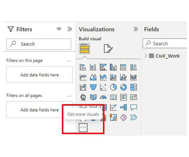
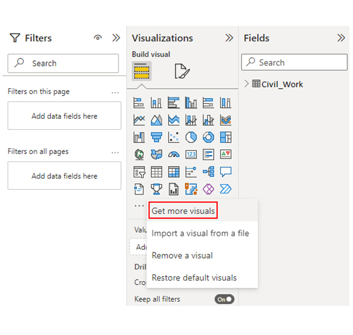
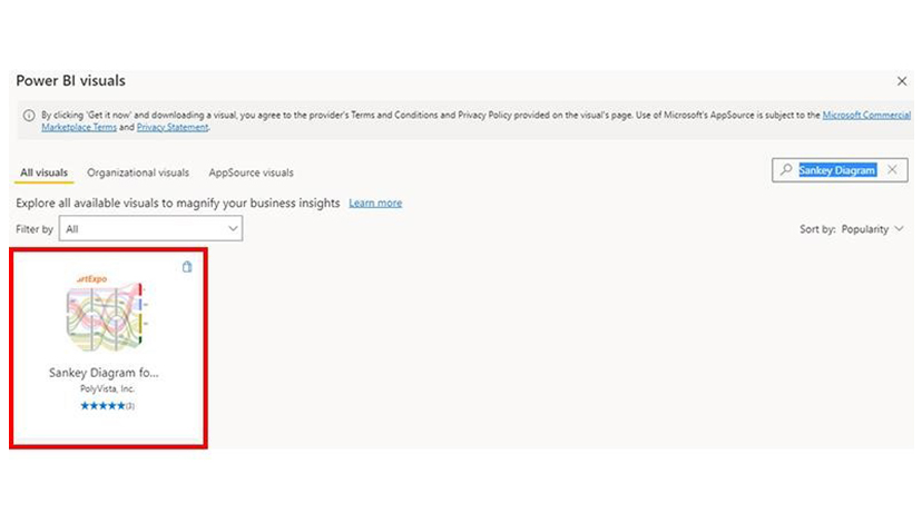
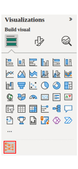
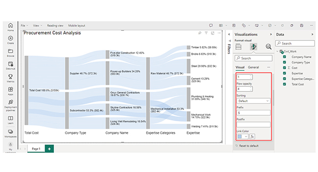
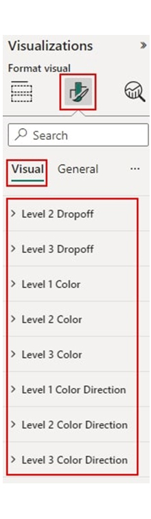
Stage 3: Add the Power BI Sankey Diagram Extension by ChartExpo

  • An add-in or Power BI visual from AppSource is needed for the creation of the Sankey Diagram. You’ll have to navigate to the right side of the Power BI dashboard and open the Power BI Visualizations panel.
  • After that, click the ellipsis symbol (…) as shown in the diagram below. Clicking the ellipsis symbol is a way of importing the Power BI Sankey Diagram extension by ChartExpo.
Open Power BI Visualizations Panel After Connecting Power BI into SharePoint
  • From the menu that opens, select the “Get more visuals” option.
Select Get More Visuals After Connecting Power BI into SharePoint
  • In the window that opens, enter “Sankey Diagram for Power BI by ChartExpo” in the highlighted search box. You’ll see the “Sankey Diagram for Power BI by ChartExpo” as shown below.
Enter Sankey Diagram After Connecting Power BI into SharePoint
  • Click the highlighted “Add” button.
Click Add Button After Connecting Power BI into SharePoint
  • The “Sankey Diagram for Power BI by ChartExpo” icon will be added to the visualization panel.
Sankey Diagram Icon After Connecting Power BI into SharePoint

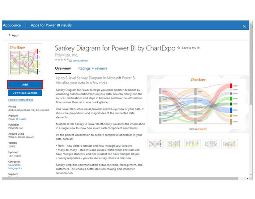
Stage 4: Draw a Sankey Diagram with ChartExpo’s Power BI extension.

  • Select the “Sankey Diagram for Power BI by ChartExpo” icon from the visualization panel. A window similar to the one below will open in the report section of your dashboard.
Select Sankey Diagram Icon Visualization After Connecting Power BI into SharePoint
  • There’s the option of resizing the visual. Navigate to the right side of the Power BI dashboard, and look out for “Fields” next to “Visualizations.”
Look Out for Fields Next to Visualizations After Connecting Power BI into SharePoint
  • You’ll have to select the fields to be used in the Sankey chart. Select the fields in the following sequence:
    • Total Cost
    • Company Type
    • Company Name
    • Expertise Categories
    • Expertise
    • Cost
Select Fields in Sankey Chart After Connecting Power BI into SharePoint
  • You’ll have to provide your email address or the ChartExpo license key.
Provide Email Address and License Key After Connecting Power BI into SharePoint

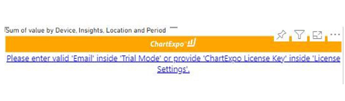
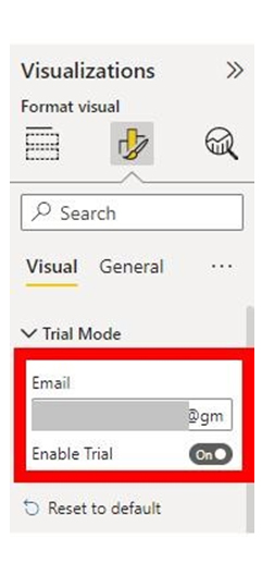
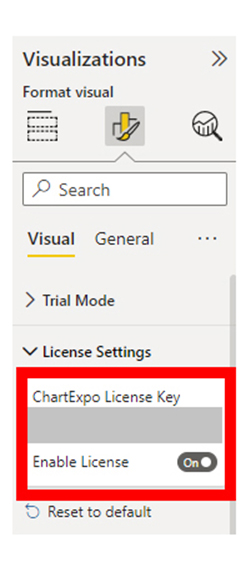
Stage 5: Apply a Subscription Key or Activate the ChartExpo Trial.

  • Select the ChartExpo visual, and look out for the three icons below “Build Visual” in the Visualizations panel.
Select ChartExpo Visual in Visualizations Panel After Connecting Power BI into SharePoint
  • Select the middle icon, “Format visual.” You’ll see the visual properties populated as shown below.
Select Middle Icon After Connecting Power BI into SharePoint
  • As a new user, you should enter your email address in the textbox under the “Trial Mode” section. The license key will be sent to the email. After that, you’ll have to toggle “Enable Trial” to activate the 7-day trial.
Enter Email Address in Trial Mode Section After Connecting Power BI into SharePoint
  • The Sankey Diagram created under the 7-day trial will have the ChartExpo watermark.
Sankey Diagram Created Under 7 Days After Connecting Power BI into SharePoint
  • If you have a license key, enter it in the “ChartExpo License Key” textbox in the “License Settings” section. Next, slide the toggle switch next to “Enable License” to “On.”
Enter ChartExpo License Key and Enable License After Connecting Power BI into SharePoint
  • The Sankey diagram created will not have a watermark.
Sankey Diagram Created without Watermark After Connecting Power BI into SharePoint
  • You can add a Prefix (like the $ sign) with the numeric values in the chart. To do that, expand the “Stats” properties and include the Prefix value.
Add Prefix with Number Values in Chart After Connecting Power BI into SharePoint
  • To add colors to each node, expand the “Level Colors” properties and select the colors.
Add Colors to Each Node After Connecting Power BI into SharePoint
  • Changes will be saved automatically.
Final Power BI into SharePoint

Insights

  • At Level 1 (Total Cost), the procurement cost is $155K.
  • At Level 2 (Company Type), out of the $155k cost, $82.4K (53.3%) was spent on subcontractors, while $72.3K (46.7%) was allocated to the supplier.
  • At Level 3 (Company Name), the $72.3K supplier cost was divided between two companies: Five-star Construction and Power-up Builder, with charges of $19.3K and $53.0K, respectively.
  • The subcontractor cost of $82.4K was distributed among three companies: Onyx General Contractors, Living Well Remodeling, and Skyline Contractors. They charged $30.7K, $26.0K, and $25.6K, respectively, for their services.

Unlock Seamless Reporting by Integrating Power BI into SharePoint:

Unlock seamless collaboration and data visualization by integrating Power BI into SharePoint with this practical tutorial. With dynamic charts and graphs, you can share interactive reports, track key metrics, and provide real-time updates directly within your SharePoint environment. Whether you’re monitoring team progress, visualizing departmental performance, or centralizing project data, this integration ensures critical insights are accessible to everyone. By mastering the use of Power BI within SharePoint, you can enhance decision-making, improve communication, and drive alignment across your organization. With engaging visuals and streamlined dashboards, this powerful combination transforms how teams interact with and act on data.

What are the Benefits of Integrating Power BI into SharePoint Online?

Integrating Power BI into SharePoint Online offers several benefits, enhancing data accessibility, collaboration, and decision-making. Here are the key advantages:

  • Enhanced Data Visualization

Power BI offers interactive and visually appealing dashboards and reports. All these make it easy to analyze and understand data.

  • Improved Collaboration

Power BI reports are embedded directly into SharePoint Online pages. That makes it easy for users to interact and view data without leaving SharePoint. There’s also the option to share dashboards and reports with team members within SharePoint. All these fosters a collaborative environment.

  • Centralized Information

You can combine data from multiple SharePoint lists and other sources into a single Power BI report to provide a unified view of the data.

  • Improved Decision Making

With real-time data and rich visualizations, stakeholders can make data-driven decisions based on up-to-date and accurate information.

  • User-Friendly Interface

Users with no technical skills can create and interact with reports. There’s also a simple drag-and-drop feature that allows users to build custom dashboards even if they don’t have advanced technical skills.

What are the Best Practices for SharePoint Lists in Power BI?

When using SharePoint Lists in Power BI, following best practices ensures smooth data integration, optimal performance, and accurate reporting. Here are some key recommendations:

  • Data Preparation and Structure

The SharePoint list data has to be well-structured and clean. Your data types have to be consistent and also avoid unnecessary columns. You should also provide context for your data by including metadata and using meaningful column names.

  • Performance Optimization

Power BI’s query editor can be used to reduce and filter the amount of imported data. Users should only load necessary rows and columns to improve performance.

  • Security and Permissions

Proper permissions have to be set in SharePoint to control who can edit and view the data. You should use the Power BI’s row-level security (RLS) to manage data access within reports.

FAQs

Do you need a Power BI license to view reports in SharePoint?

Yes, a Power BI Pro license is needed or the report has to be hosted in the Power BI Premium workspace.

Does Power BI work on SharePoint?

Yes, Power BI works on SharePoint by embedding interactive reports and dashboards into SharePoint Online pages. This enables data visualization and collaboration directly within the SharePoint environment.

Wrap Up

Connecting Power BI to SharePoint Online list helps in enhancing data visualization. With it, you can gain real-time insights, improve collaboration, and foster centralized data.

To get the most out of the setup, you’ll have to use a consistent layout and design across your Power BI reports. This will give it a unified feel and look. You should also consider incorporating interactive elements like filters and slicers to help users to explore data.

Furthermore, you should always follow data visualization best practices to create effective and clear reports.

Data cleaning, optimizing performance, securing data, and creating interactive, user-friendly reports are other major ways to help you get the most out of the setup.

Now you know how to connect Power BI to SharePoint, what kind of data will you be exploring using the setup?

How much did you enjoy this article?

PBIAd1
Start Free Trial!
140992

Related articles

next previous
Power BI12 min read

In-depth Look at Effective Healthcare Dashboard Examples

Immerse yourself in Healthcare Dashboard Examples, illustrating innovative ways to transform complex data into actionable insights for healthcare professionals.

Power BI12 min read

Power BI Group By Guide for Effective Data Insights

Learn how Power BI Group By helps you aggregate data, clarify trends, and create reports by grouping values to make large datasets manageable & insightful.

Power BI12 min read

How to Create Sankey Diagram in Microsoft Power BI?

Learn How to Create Sankey Diagram in Microsoft Power BI using Desktop & Web Service. What they are and how to use them effectively.

Power BI8 min read

Power BI Artificial Intelligence: Insights Using Visuals

Discover all there is to know about the Power BI artificial intelligence. You'll also discover how AI is used in Power BI, and how to use it for analysis and more.

Power BI9 min read

Budgeting in Healthcare: Use Visuals to Spot Budget Gaps

This guide helps you discover what budgeting in healthcare is. You'll also discover the factors that affect hospital budgets and types of budgeting in healthcare.

ChartExpo logo

Turn Data into Visual
Stories

CHARTEXPO

  • Home
  • Gallery
  • Videos
  • Services
  • Pricing
  • Contact us
  • FAQs
  • Privacy policy
  • Terms of Service
  • Sitemap

TOOLS

  • ChartExpo for Google Sheets
  • ChartExpo for Microsoft Excel
  • Power BI Custom Visuals by ChartExpo
  • Word Cloud

CATEGORIES

  • Bar Charts
  • Circle Graphs
  • Column Charts
  • Combo Charts
  • Comparison Charts
  • Line Graphs
  • PPC Charts
  • Sentiment Analysis Charts
  • Survey Charts

TOP CHARTS

  • Sankey Diagram
  • Likert Scale Chart
  • Comparison Bar Chart
  • Pareto Chart
  • Funnel Chart
  • Gauge Chart
  • Radar Chart
  • Radial Bar Chart
  • Sunburst Chart
  • see more
  • Scatter Plot Chart
  • CSAT Survey Bar Chart
  • CSAT Survey Chart
  • Dot Plot Chart
  • Double Bar Graph
  • Matrix Chart
  • Multi Axis Line Chart
  • Overlapping Bar Chart
  • Control Chart
  • Slope Chart
  • Clustered Bar Chart
  • Clustered Column Chart
  • Box and Whisker Plot
  • Tornado Chart
  • Waterfall Chart
  • Word Cloud
  • see less

RESOURCES

  • Blog
  • Resources
  • YouTube
SIGN UP FOR UPDATES

We wouldn't dream of spamming you or selling your info.

© 2025 ChartExpo, all rights reserved.