

See Sankey Diagram for Power BI app by ChartExpo here.
Categories
In today’s world, businesses rely heavily on analytics and visualizations to make informed decisions. Power BI publishing to web has become an essential tool for creating compelling reports and dashboards, bringing data to life.
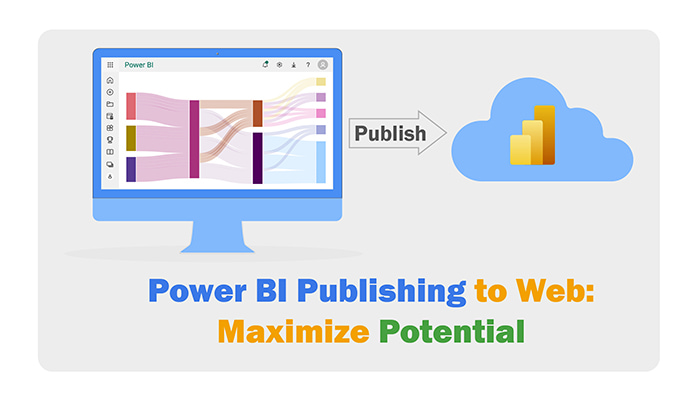


With Power BI publishing to web, organizations can seamlessly share their insights, fostering a collaborative culture and maximizing the impact of their visuals. You can leverage the Power BI Publish to Web feature to embed content on diverse platforms. These include emails, blog posts, websites, or social media.
It also grants easy control over editing, updating, and sharing visuals.
The Power BI publishing to web feature empowers individuals and organizations to transform data into shared knowledge.
This fosters a collaborative culture where insights transcend boundaries, enriching decision-making and driving collective progress.
This article will explore Power BI’s web publishing feature. We’ll begin by defining what Power BI publishing to the web is. We’ll also look at the benefits of Power BI publishing to the web.
We’ll then discuss who should use the Power BI publishing to web feature. We’ll also learn the best practices for Power BI publishing to web. We will finally learn how to publish a Power BI report on the web.
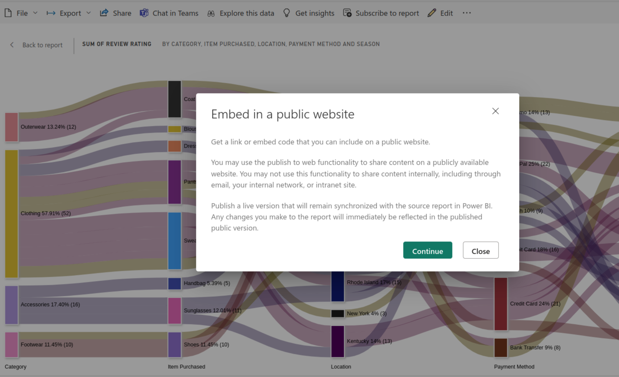
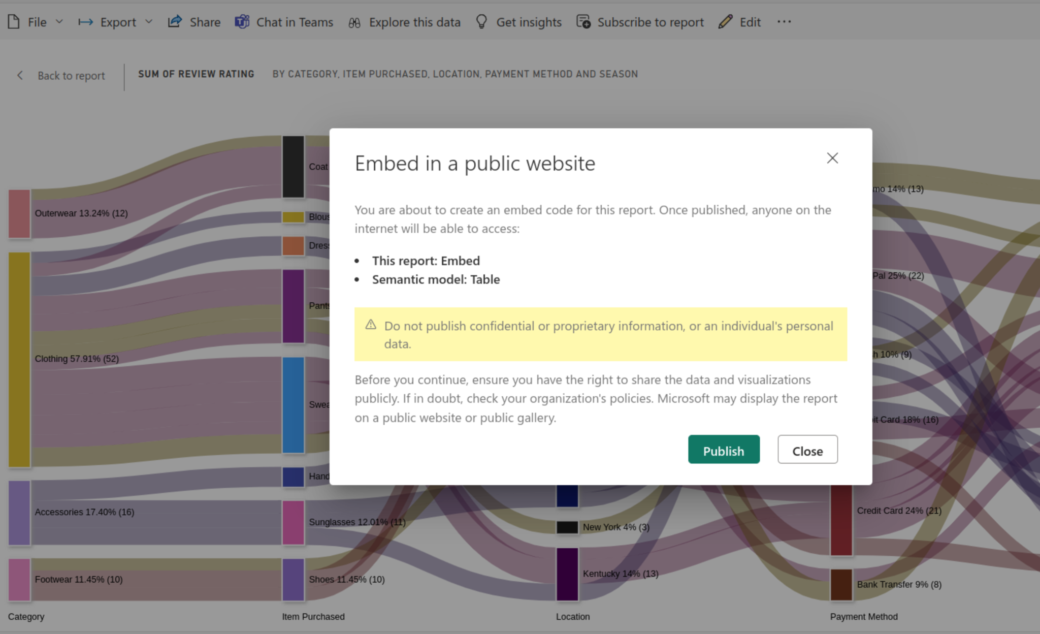
Definition: Power BI Publishing to Web is a feature that lets you share interactive reports and dashboards publicly. When you publish, Power BI generates an embed code that can be added to websites, blogs, or emails, allowing anyone to view the content without signing in. Since these reports are accessible to all, it’s important to avoid publishing sensitive or confidential data.
Use Publish to Web when you want to share non-sensitive Power BI reports with a broad audience. It’s ideal for marketing dashboards, research findings, public reports, or embedding visuals in blogs and websites. Avoid using it for confidential or internal data since the reports are publicly accessible.
Power BI publishing to the Web is suitable for various types of individuals, such as:
Imagine you’ve created a sales performance dashboard in Power BI that shows revenue by region, top-selling products, and monthly growth trends. Instead of sharing it only with your internal team, you use Publish to Web to make it publicly accessible.
This is especially useful for marketing teams, educational institutions, or public reports, where the goal is to share insights widely while keeping the process simple.
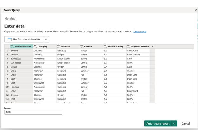
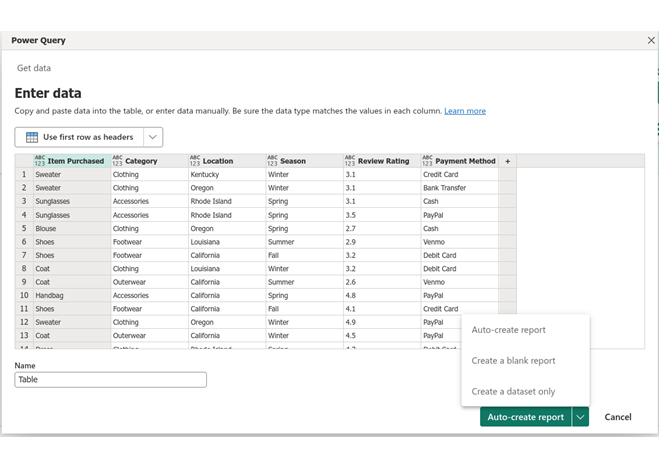
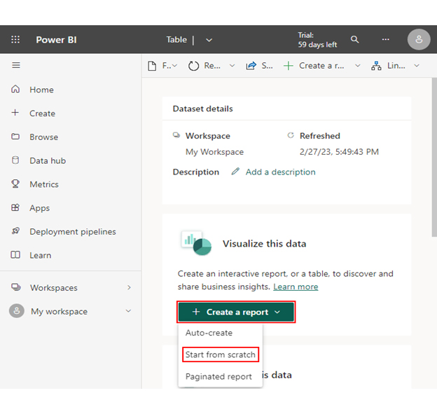
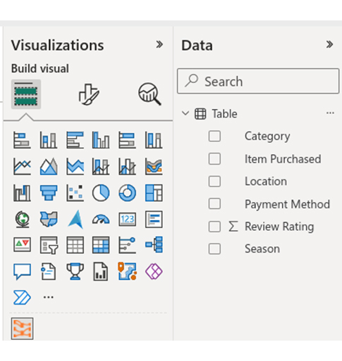
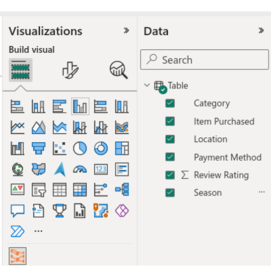
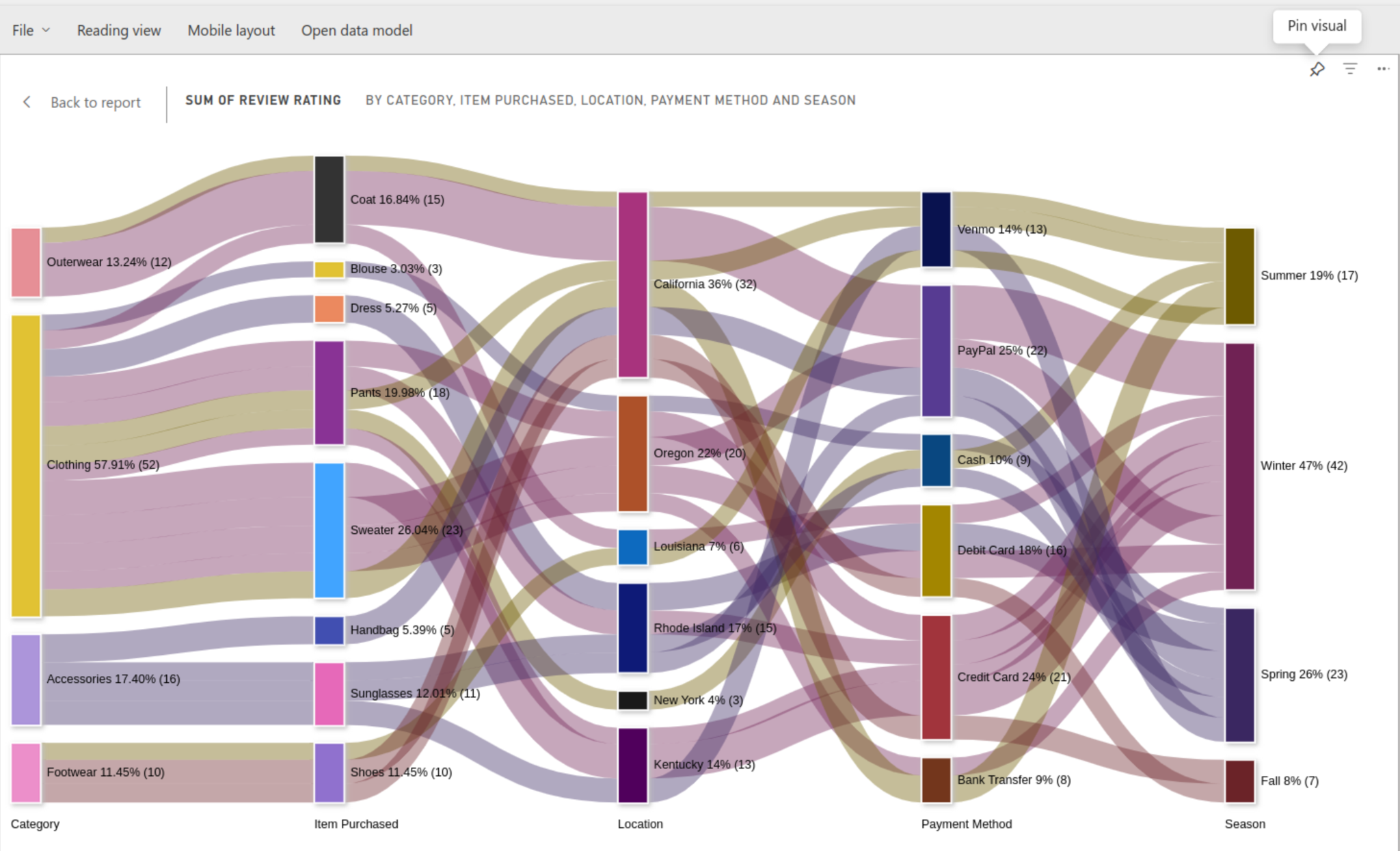
In this section, we learn how to publish a Power BI visualization to the web. We’ll use the Sankey Diagram in Power BI (Sankey Chart) as an example.


| Item Purchased | Category | Location | Season | Review Rating | Payment Method |
| Sweater | Clothing | Kentucky | Winter | 3.1 | Credit Card |
| Sweater | Clothing | Oregon | Winter | 3.1 | Bank Transfer |
| Sunglasses | Accessories | Rhode Island | Spring | 3.1 | Cash |
| Sunglasses | Accessories | Rhode Island | Spring | 3.5 | PayPal |
| Blouse | Clothing | Oregon | Spring | 2.7 | Cash |
| Shoes | Footwear | Louisiana | Summer | 2.9 | Venmo |
| Shoes | Footwear | California | Fall | 3.2 | Debit Card |
| Coat | Clothing | Louisiana | Winter | 3.2 | Debit Card |
| Coat | Outerwear | California | Summer | 2.6 | Venmo |
| Handbag | Accessories | California | Spring | 4.8 | PayPal |
| Shoes | Footwear | California | Fall | 4.1 | Credit Card |
| Sweater | Clothing | Oregon | Winter | 4.9 | PayPal |
| Coat | Outerwear | California | Winter | 4.5 | PayPal |
| Dress | Clothing | Rhode Island | Spring | 4.7 | Debit Card |
| Coat | Outerwear | California | Winter | 4.7 | PayPal |
| Sweater | Clothing | Kentucky | Winter | 2.8 | Credit Card |
| Sunglasses | Accessories | Kentucky | Spring | 4.1 | Venmo |
| Sweater | Clothing | Oregon | Winter | 4.7 | Debit Card |
| Sweater | Clothing | California | Summer | 4.6 | Bank Transfer |
| Pants | Clothing | California | Summer | 3.3 | Venmo |
| Pants | Clothing | Kentucky | Winter | 2.8 | Credit Card |
| Pants | Clothing | Rhode Island | Winter | 4.1 | Credit Card |
| Pants | Clothing | New York | Summer | 3.2 | Cash |
| Pants | Clothing | Oregon | Winter | 4.4 | Credit Card |


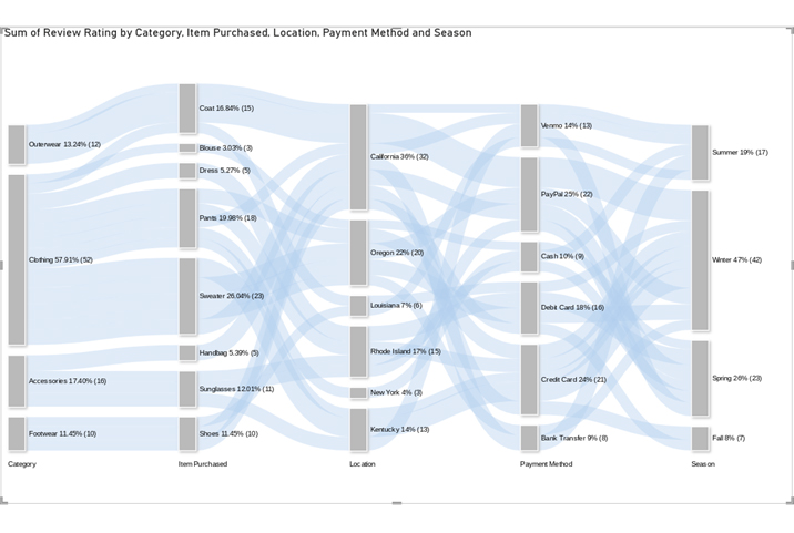

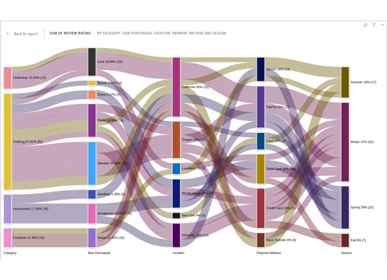
Insights
The provided data illustrates customer behavior regarding the timing and method of their purchases.
It reveals the specific types of items bought, the top purchasing states, and the preferred payment methods in those regions.
It also shows the correlation between purchases and different seasons.
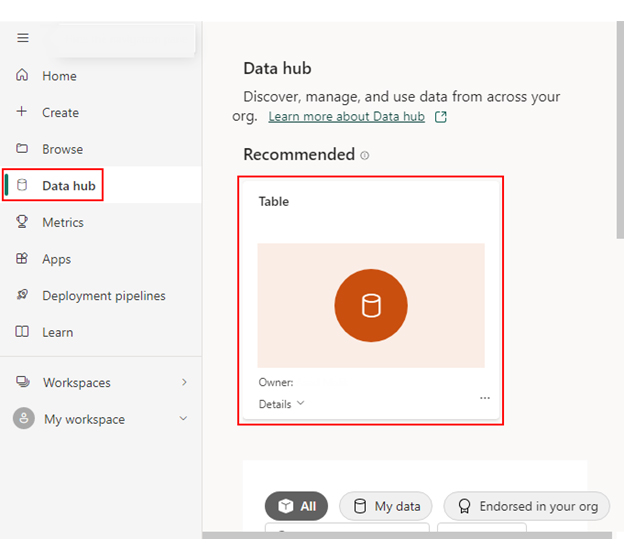
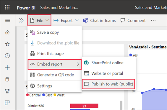
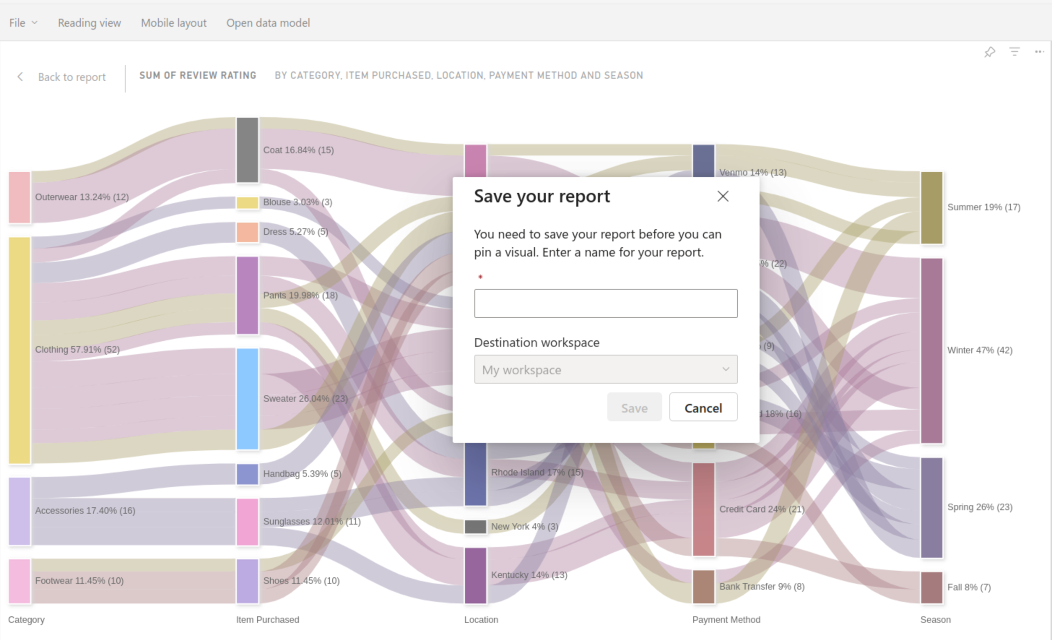
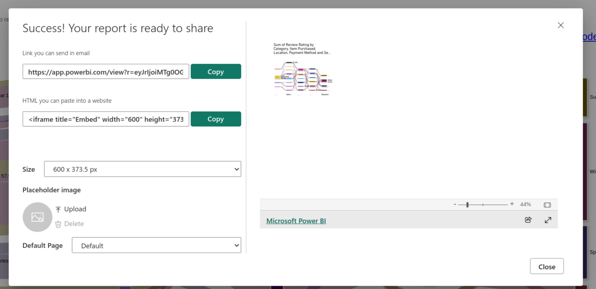
You can now share your Sankey chart on the Web. Let’s learn how to do so step by step.
Below are recommended best practices for Power BI publishing to the web:
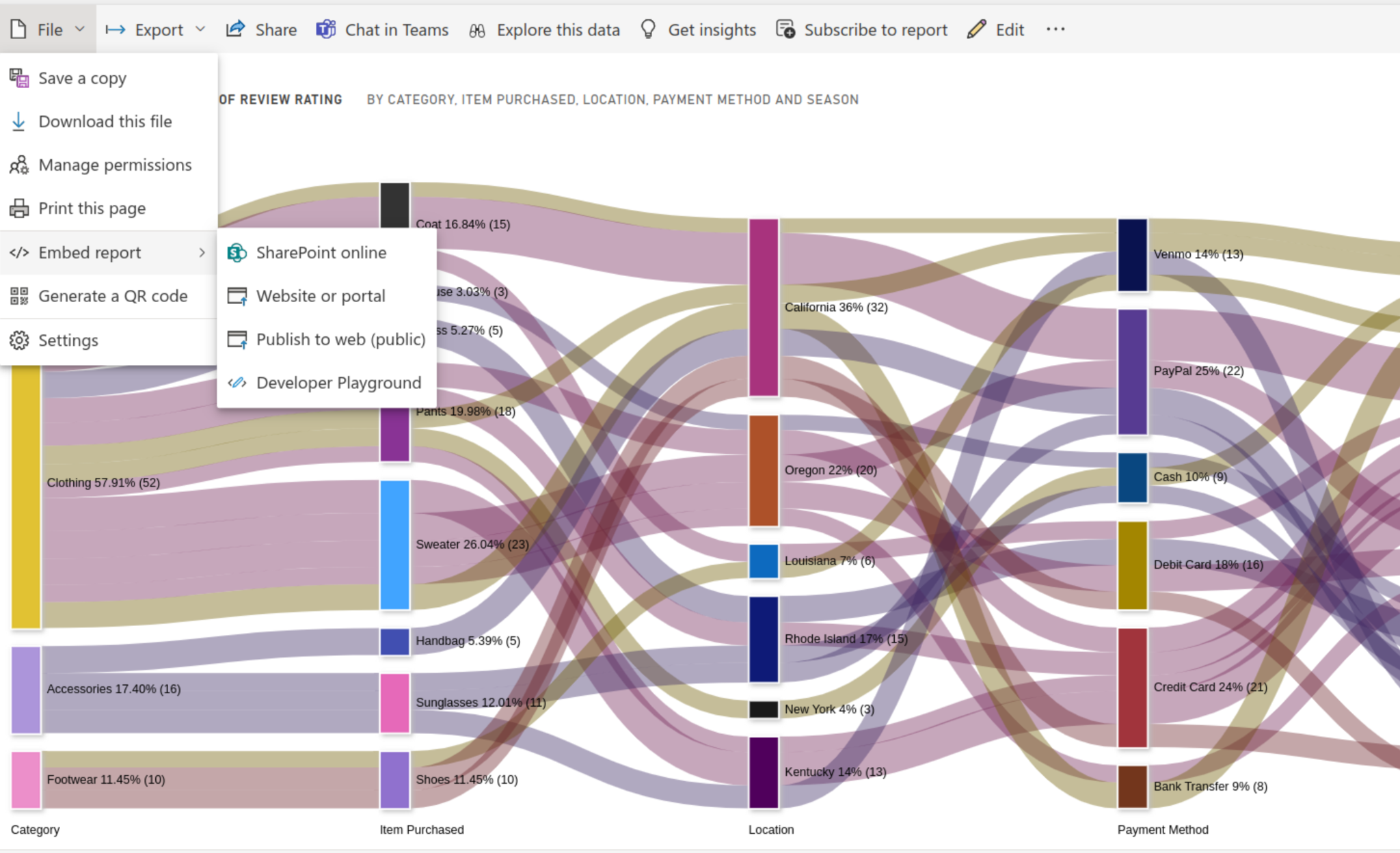
Power BI reports can be published to the web using the ”˜Publish to Web’ feature. It can publish reports through an integration feature, Power BI Embedded.
This feature allows viewers to access published information without needing a Power BI account.
The data should be restricted, as anyone with the URL can access it. You can also determine which kind of data to publish.
The publish-to-web feature allows you to share interactive reports using a public link or embed code. This allows universal access to content via a browser without authentication. However, it lacks robust security features and offers limited customization options.
On the other hand, the embedded feature integrates your report with online platforms. It provides greater control over access, allowing restrictions on specific users or groups.
To access information, users should authenticate their access, providing heightened security for your data.
It also offers more customization options, such as filters, slicers, and fonts, enabling users to interact extensively with your data.
Power BI Publishing to Web feature allows users to effortlessly embed interactive content across multiple online platforms.
It seamlessly integrates with various platforms, enabling users to manipulate data for more in-depth insights.
Despite this flexibility, you retain control over your published data, preventing unauthorized republishing.
We began by describing Power BI publishing to the web and its benefits. We then looked at who should use this apt Power BI feature.
We explored best practices for Power BI publishing to the web. We then used ChartExpo’s Sankey Diagram as an example of how to publish a Power BI report to the web.
We hope that you are now comfortable publishing your Power BI visualizations to the web.
How much did you enjoy this article?


Discover diverse and high-quality Power BI report examples for inspiration and insights. Elevate your reporting with strategic visualization techniques.

A Customer Relationship Management Dashboard centralizes data, tracks key metrics, and drives smarter business decisions. Discover now!

Explore Healthcare Dashboard Examples and learn how to turn complex healthcare data into clear, actionable insights for better decision-making.


