• Home
  • Tools dropdown img
    • Spreadsheet Charts

      • ChartExpo for Google Sheets
      • ChartExpo for Microsoft Excel
    • Power BI Charts

      • Power BI Custom Visuals by ChartExpo
    • Word Cloud

  • Charts dropdown img
    • Chart Category

      • Bar Charts
      • Circle Graphs
      • Column Charts
      • Combo Charts
      • Comparison Charts
      • Line Graphs
      • PPC Charts
      • Sentiment Analysis Charts
      • Survey Charts
    • Chart Type

      • Box and Whisker Plot
      • Clustered Bar Chart
      • Clustered Column Chart
      • Comparison Bar Chart
      • Control Chart
      • CSAT Survey Bar Chart
      • CSAT Survey Chart
      • Dot Plot Chart
      • Double Bar Graph
      • Funnel Chart
      • Gauge Chart
      • Likert Scale Chart
      • Matrix Chart
      • Multi Axis Line Chart
      • Overlapping Bar Chart
      • Pareto Chart
      • Radar Chart
      • Radial Bar Chart
      • Sankey Diagram
      • Scatter Plot Chart
      • Slope Chart
      • Sunburst Chart
      • Tornado Chart
      • Waterfall Chart
      • Word Cloud
    • Google Sheets
      Microsoft Excel
  • Services
  • Pricing
  • Contact us
  • Blog
  • Support dropdown img
      • Gallery
      • Videos
      • Contact us
      • FAQs
      • Resources
    • Please feel free to contact us

      atsupport@chartexpo.com

Categories
All Data Visualizations Data Analytics Surveys
Add-ons/
  • Google Sheets
  • Microsoft Excel
  • Power BI
All Data Visualizations Data Analytics Surveys
Add-ons
  • Google Sheets
  • Microsoft Excel
  • Power BI

We use cookies

This website uses cookies to provide better user experience and user's session management.
By continuing visiting this website you consent the use of these cookies.

Ok

ChartExpo Survey


Home > Blog > Data Analytics

What is a Confusion Matrix? A Quick Guide

After gathering data, it has to undergo data cleaning, pre-processing, and wrangling. Next, you’ll have to feed it into an outstanding model and get output in probabilities. All these make up the confusion matrix.

What is a Confusion Matrix

In this guide, you’ll discover answers to the “what is a confusion matrix” question. You’ll also discover what a confusion matrix tells you, and when you should use a confusion matrix.

Table of Content:

  1. What is a Confusion Matrix?
  2. Why Do We Need a Confusion Matrix?
  3. What Does a Confusion Matrix Tell You?
  4. Confusion Matrix Example
  5. What is the Confusion Matrix Formulas?
  6. How to Create a Confusion Matrix?
    • Step 1: Obtain Predictions and Actual Labels
    • Step 2: Identify TP, TN, FP, and FN
    • Step 3: Construct the Confusion Matrix
    • Step 4: Calculate Performance Metrics
    • Step 5: Visualize and Interpret Results
  7. How to Interpret a Confusion Matrix?
  8. How Do You Read the Confusion Matrix?
  9. How to Create a Confusion Matrix Diagram in Power BI?
  10. Advantages and Disadvantages of Using a Confusion Matrix
  11. Applications of Confusion Matrix in Real World
  12. Confusion Matrix – FAQs
  13. Wrap Up

First…

What is a Confusion Matrix?

Definition: A confusion matrix is a table used to evaluate the performance of a machine learning classification model. It helps you understand how well your model is predicting results by comparing actual outcomes with predicted ones.

Here’s what it shows:

  • True Positives (TP): Model correctly predicts a positive case.
  • True Negatives (TN): Model correctly predicts a negative case.
  • False Positives (FP): Model incorrectly predicts a positive case.
  • False Negatives (FN): Model incorrectly predicts a negative case.

The confusion matrix gives a clear snapshot of model accuracy, helping you spot where predictions go wrong and analyze performance especially useful when dealing with imbalanced datasets.

Why Do We Need a Confusion Matrix?

Here are the major reasons why a confusion matrix is essential for evaluating the performance of a classification model.

  • Performance Evaluation: It offers a thorough breakdown of how well a model is performing in terms of correctly and incorrectly classified instances across multiple classes. This helps stakeholders to get a good grasp of the model’s strengths and weaknesses.
  • Metrics Calculation: You can calculate various performance metrics from the confusion matrix. These performance metrics could be precision, specificity, recall (sensitivity), accuracy, and F1-score. All these metrics offer quantitative measures of the model’s effectiveness and suitability for the intended application.
  • Business Impact: A good grasp of the confusion matrix in assessing the business impact of model prediction. For instance, in medical diagnostics, correctly identifying disease patients (true positives) and minimizing missed diagnoses (false negatives) is critical for patient care and outcomes.
  • Error Analysis: It helps in pointing out the types of errors a model is making. It could be false positives and false negatives. This helps in figuring out where the model needs improvement or where adjustments in data preprocessing or thresholds are necessary.
  • Model Selection: Stakeholders can choose the best-performing model by comparing confusion matrices from different models. This helps in making data-driven decisions on the model to deploy based on its capability to correctly classify instances.

What Does a Confusion Matrix Tell You?

Confusion matrix offers insights into the performance of a classification model:

  • Accuracy: Shows the overall correctness of predictions.
  • Precision: It shows the proportion of true positives among positive predictions.
  • Recall (Sensitivity): It shows the proportion of actual positives correctly predicted.
  • Specificity: It shows the proportion of actual negatives correctly predicted.
  • False Positives and Negatives: Instances where the predictions do not match actual outcomes.
  • True Positives and Negatives: Instances where predictions match actual outcomes.
  • Performance Across Classes: Helps in identifying the classes that are well-predicted, and the ones that need improvement.
  • Threshold Optimization: Guides adjustments to decision thresholds based on desired trade-offs between different types of errors.

Confusion Matrix Example

Let’s understand a confusion matrix with a simple example of a binary classification problem predicting whether an email is Spam or Not Spam.

Actual / Predicted Spam Not Spam
Spam 80 (TP) 10 (FN)
Not Spam 5 (FP) 105 (TN)

Explanation:

  • True Positives (TP = 80): 80 spam emails correctly identified as spam.
  • True Negatives (TN = 105): 105 non-spam emails correctly identified.
  • False Positives (FP = 5): 5 non-spam emails wrongly flagged as spam.
  • False Negatives (FN = 10): 10 spam emails missed and labeled as not spam.

What are the Confusion Matrix Formulas

The confusion matrix is the foundation for calculating key performance metrics in classification models.

Here are the main formulas derived from it:

Accuracy:

Accuracy Formula

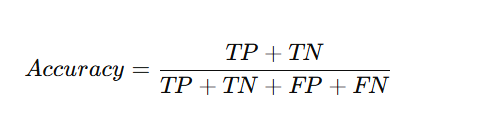
Measures how often the model makes correct predictions.

Precision:

Precision Formula

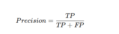
Shows how many predicted positives were actually correct.

Recall (Sensitivity):

Recall Formula

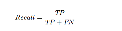
Indicates how many actual positives were correctly identified.

Specificity:

Specificity Formula

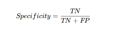
Measures how well the model identifies negative cases.

F1 Score:

F1 Score Formula

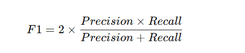
Balances precision and recall for overall performance.

How to Create a Confusion Matrix?

Here are the steps to help you create a confusion matrix:

Step 1: Obtain Predictions and Actual Labels

  • Start with two sets of data the predictions made by your classification model and the actual (true) labels from your dataset.

Step 2: Identify TP, TN, FP, and FN

Compare each prediction with the actual label to categorize results:

  • TP (True Positive): Predicted positive and actually positive.
  • TN (True Negative): Predicted negative and actually negative.
  • FP (False Positive): Predicted positive but actually negative.
  • FN (False Negative): Predicted negative but actually positive.

Step 3: Construct the Confusion Matrix

Create a 2×2 table where:

  • Rows represent actual classes (Positive, Negative).
  • Columns represent predicted classes (Predicted Positive, Predicted Negative).
    Fill in the matrix with the counts of TP, TN, FP, and FN.

Step 4: Calculate Performance Metrics

Use the matrix values to compute performance metrics such as:

  • Accuracy = (TP + TN) / (TP + TN + FP + FN)
  • Precision = TP / (TP + FP)
  • Recall (Sensitivity) = TP / (TP + FN)
  • F1 Score = 2 × (Precision × Recall) / (Precision + Recall)

Step 5: Visualize and Interpret Results

Display the confusion matrix using a heatmap or chart for better clarity.
Analyze the results to understand where the model performs well and where misclassifications occur.

How to Interpret a Confusion Matrix?

A confusion matrix helps you see how accurately a classification model makes predictions by comparing actual and predicted values.

Here’s how to read it:

  • True Positives (TP): Correctly predicted positive cases.
  • True Negatives (TN): Correctly predicted negative cases.
  • False Positives (FP): Incorrectly predicted positives.
  • False Negatives (FN): Missed positive cases.

How Do You Read the Confusion Matrix?

Here are easy ways of reading and interpreting a confusion matrix.

Components of a Confusion Matrix

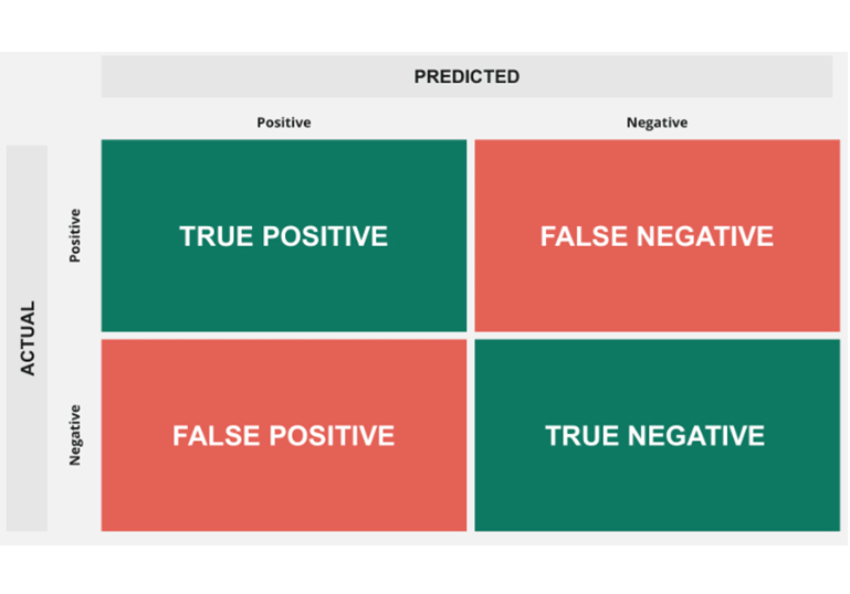
The confusion matrix for a binary classification problem (two classes, denoted as Positive and Negative) looks like this:
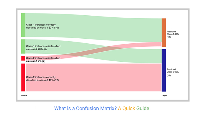
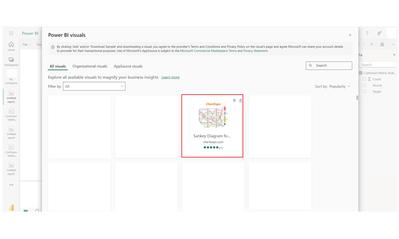
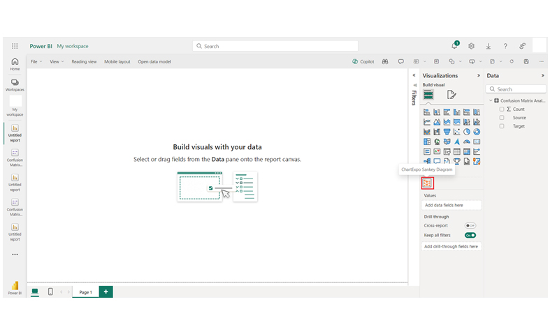
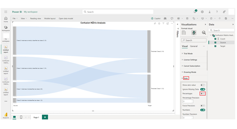
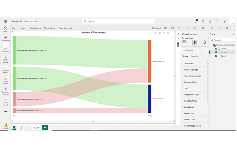
Components of Confusion Matrix for Learning What is a Confusion Matrix

Interpretation of Cells

  • True Positive (TP):
  • False Positive (FP):
  • False Negative (FN):
  • True Negative (TN):

How to Create a Confusion Matrix Diagram in Power BI?

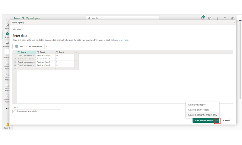
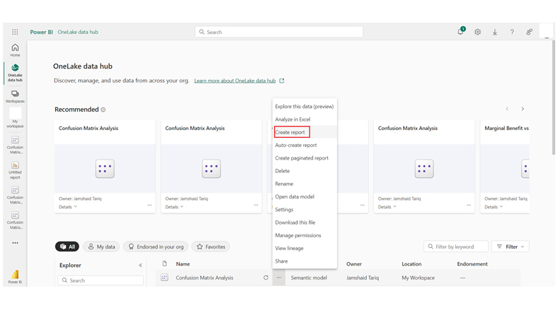
Stage 1: Logging in to Power BI

  • Log in to Power BI.
  • Enter your email address and click the “Submit” button.
Enter email to login to Power BI
  • You are redirected to your Microsoft account.
  • Enter your password and click “Sign in“.
Enter Password to login to Power BI
  • You can choose whether to stay signed in.
Click on stay signed in
  • Once done, the Power BI home screen will open.

Stage 2: Creating a Data Set and Selecting the Data Set to Use in Your Chart

  • Go to the left-side menu and click the “Create” button.
  • Select “Paste or manually enter data“.
select Paste or manually enter data in Power BI ce487
  • We’ll use the sample data below for this example.
Source Target Count
Class-1 instances correctly classified as class-1 Predicted Class-1 10
Class-1 instances misclassified as class-2 Predicted Class-2 6
Class-2 instances misclassified as class-1 Predicted Class-1 2
Class-2 instances correctly classified as class-2 Predicted Class-2 12
  • Paste the data table into the “Power Query” window. Next, choose the “Create a semantic model only” option.
Choose Create a Semantic Model Only After Learning What is a Confusion Matrix
  • Navigate to the left-side menu, and click on the “Data Hub” option. The Power BI populates the data set list. If no data set has been created, you’ll get the error message. Next, click “Create report.”
Click Data Hub and Create Report After Learning What is a Confusion Matrix
  • Click on “Get more visuals” and search ChartExpo. After that, select “Sankey Chart.”
Click Get More Visuals After Learning What is a Confusion Matrix
  • Click on “Add.”
Click Add Button After Learning What is a Confusion Matrix
  • You’ll see the Sankey Chart in the visuals list.
Sankey Diagram in Visual List After Learning What is a Confusion Matrix
  • In the visual, click on “License Settings,” and add the key. After adding the key, the Sankey Chart will be displayed on your screen.
Add License Key After Learning What is a Confusion Matrix
  • You’ll have to add the header text on top of the chart.
Add Chart Header After Learning What is a Confusion Matrix
  • You can disable the percentage values as shown below:
Disable Percenatge Values After Learning What is a Confusion Matrix
  • You can add the color of all nodes.
Add Color to All Nodes After Learning What is a Confusion Matrix
  • The final look of the Sankey Chart is shown below.
Final What is a Confusion Matrix

Insights

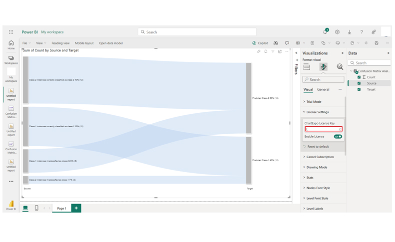
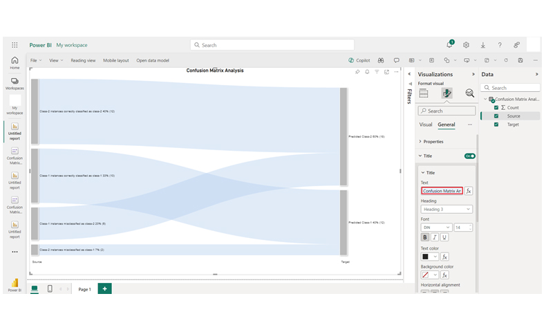
From the data, you’ll see the classification model’s performance: 10 Class-1 instances are correctly identified, while 6 are misclassified as Class-2. For Class-2, 12 instances are correctly classified, but 2 are misclassified as Class-1.

Master Data Evaluation with Confusion Matrix Charts in Power BI:

Dive into the concept of the Confusion Matrix with this interactive tutorial. This essential tool allows you to visualize the performance of classification models, highlighting key metrics like accuracy, precision, recall, and F1 score. By mastering the Confusion Matrix, you gain a deeper understanding of your model’s strengths and weaknesses, empowering you to fine-tune predictions. Using charts and graphs to represent the matrix makes it easier to identify patterns, enhance decision-making, and improve model outcomes. With a clear visual representation, the Confusion Matrix becomes an invaluable asset for optimizing machine learning processes and ensuring better, more reliable results.

Advantages and Disadvantages of Using a Confusion Matrix

Advantages

  • Provides a detailed view of model performance beyond simple accuracy.
  • Helps identify the types of misclassifications, such as false positives and false negatives.
  • Forms the basis for calculating key metrics like precision, recall, specificity, and F1 score.
  • Useful for comparing multiple models to determine which performs best.
  • Offers clear insight into where a model performs well and where improvements are needed.

Disadvantages

  • Applicable only to classification models, not regression problems.
  • Becomes harder to interpret in multi-class classification scenarios.
  • Does not explain why the model made specific errors.
  • Can be misleading when used with imbalanced datasets.

Applications of Confusion Matrix in Real World

  • Healthcare Diagnosis

Used to evaluate medical classification models, such as predicting whether a patient has a disease based on test results. Helps analyze false positives and false negatives to improve accuracy.

  • Spam Email Detection

Helps measure how well an email filter classifies messages as Spam or Not Spam, reducing errors like marking important emails as spam.

  • Credit Risk Assessment

In banking, confusion matrices are used to check how accurately models predict loan defaults or credit risk levels.

  • Customer Churn Prediction

Businesses use it to assess models that predict whether a customer will stay or leave, helping reduce false predictions and improve retention strategies.

  • Image and Speech Recognition

Used to evaluate models in AI systems that classify images, faces, or spoken words, showing how often the system correctly identifies different categories.

Confusion Matrix – FAQs

What are the 4 values in a confusion matrix?

The four values in a confusion matrix are:

  • True Positive (TP)
  • True Negative (TN)
  • False Positive (FP)
  • False Negative (FN).

What are Type 1 and Type 2 errors in the confusion matrix?

Type 1 error (False Positive): Predicted positive but negative.

Type 2 error (False Negative): Predicted negative but positive.

Which confusion matrix is good?

A good confusion matrix shows high values on the diagonal (True Negatives and True Positives) and low values off-diagonal (False Negatives and False Positives). All these help to indicate accurate predictions across classes.

Wrap Up

A confusion matrix is designed to show model predictions versus the actual outcomes in a classification task. It helps in evaluating model performance and understanding errors (like false negatives/positives). It also helps in calculating metrics like recall, precision, and accuracy.

With a confusion matrix, you can easily set decision thresholds for classification inputs. Stakeholders have the option of adjusting these thresholds based on the trade-offs between different types of errors.

To analyze the confusion matrix, you’ll have to use good visuals – and that’s where tools like ChartExpo come into play.

How much did you enjoy this article?

PBIAd1
Start Free Trial!
139397

Related articles

next previous
Data Analytics10 min read

Consulting Report Template for Better Decision Insights

A consulting report template organizes insights and data for clients. Click here to learn how to write, analyze, and enhance reports with charts and examples.

Data Analytics10 min read

Data Export in Salesforce: Insights Made Simple

Salesforce data export helps you download and use your CRM data. Click here to learn how to export, analyze, and track sales with easy steps and visuals.

Data Analytics10 min read

Analytics in Banking Industry: A Complete Walkthrough

Learn how analytics in the banking industry improves decisions and manages risks. Explore key types, uses, and tips to make data work for your bank.

Data Analytics10 min read

Manufacturing Dashboard: Insights Made Easy

Explore the power of manufacturing dashboards to visualize KPIs, detect bottlenecks, and streamline production. A complete guide for data-driven manufacturers.

Data Analytics8 min read

Real Estate Lead Tracker: Analytics for Smarter Growth

A real estate lead tracker helps organize and manage leads efficiently. Discover how to create one in Google Sheets and analyze data with ChartExpo charts.

ChartExpo logo

Turn Data into Visual
Stories

CHARTEXPO

  • Home
  • Gallery
  • Videos
  • Services
  • Pricing
  • Contact us
  • FAQs
  • Privacy policy
  • Terms of Service
  • Sitemap

TOOLS

  • ChartExpo for Google Sheets
  • ChartExpo for Microsoft Excel
  • Power BI Custom Visuals by ChartExpo
  • Word Cloud

CATEGORIES

  • Bar Charts
  • Circle Graphs
  • Column Charts
  • Combo Charts
  • Comparison Charts
  • Line Graphs
  • PPC Charts
  • Sentiment Analysis Charts
  • Survey Charts

TOP CHARTS

  • Sankey Diagram
  • Likert Scale Chart
  • Comparison Bar Chart
  • Pareto Chart
  • Funnel Chart
  • Gauge Chart
  • Radar Chart
  • Radial Bar Chart
  • Sunburst Chart
  • see more
  • Scatter Plot Chart
  • CSAT Survey Bar Chart
  • CSAT Survey Chart
  • Dot Plot Chart
  • Double Bar Graph
  • Matrix Chart
  • Multi Axis Line Chart
  • Overlapping Bar Chart
  • Control Chart
  • Slope Chart
  • Clustered Bar Chart
  • Clustered Column Chart
  • Box and Whisker Plot
  • Tornado Chart
  • Waterfall Chart
  • Word Cloud
  • see less

RESOURCES

  • Blog
  • Resources
  • YouTube
SIGN UP FOR UPDATES

We wouldn't dream of spamming you or selling your info.

© 2025 ChartExpo, all rights reserved.