• Home
  • Tools dropdown img
    • Spreadsheet Charts

      • ChartExpo for Google Sheets
      • ChartExpo for Microsoft Excel
    • Power BI Charts

      • Power BI Custom Visuals by ChartExpo
    • Word Cloud

  • Charts dropdown img
    • Chart Category

      • Bar Charts
      • Circle Graphs
      • Column Charts
      • Combo Charts
      • Comparison Charts
      • Line Graphs
      • PPC Charts
      • Sentiment Analysis Charts
      • Survey Charts
    • Chart Type

      • Box and Whisker Plot
      • Clustered Bar Chart
      • Clustered Column Chart
      • Comparison Bar Chart
      • Control Chart
      • CSAT Survey Bar Chart
      • CSAT Survey Chart
      • Dot Plot Chart
      • Double Bar Graph
      • Funnel Chart
      • Gauge Chart
      • Likert Scale Chart
      • Matrix Chart
      • Multi Axis Line Chart
      • Overlapping Bar Chart
      • Pareto Chart
      • Radar Chart
      • Radial Bar Chart
      • Sankey Diagram
      • Scatter Plot Chart
      • Slope Chart
      • Sunburst Chart
      • Tornado Chart
      • Waterfall Chart
      • Word Cloud
    • Google Sheets
      Microsoft Excel
  • Services
  • Pricing
  • Contact us
  • Blog
  • Support dropdown img
      • Gallery
      • Videos
      • Contact us
      • FAQs
      • Resources
    • Please feel free to contact us

      atsupport@chartexpo.com

Categories
All Data Visualizations Data Analytics Surveys
Add-ons/
  • Google Sheets
  • Microsoft Excel
  • Power BI
All Data Visualizations Data Analytics Surveys
Add-ons
  • Google Sheets
  • Microsoft Excel
  • Power BI

We use cookies

This website uses cookies to provide better user experience and user's session management.
By continuing visiting this website you consent the use of these cookies.

Ok

ChartExpo Survey


Home > Blog > Data Analytics

Quality of Care Measures in Healthcare: A Complete Guide

What is the quality of care measures in healthcare? This question has become increasingly crucial in modern healthcare systems. Quality of care measures evaluate whether medical services are delivered effectively, safely, and patient-centrically. In recent decades, these measures have been the focus of much research, action by public policymakers, and common discussions.

Are you aware that The OECD and EU Commission are increasing their efforts to evaluate healthcare quality internationally? This emphasizes the increase in cross-border, standardized quality measures. Quality of care is now routinely reported by many countries.

Quality of Care Measures in Healthcare

Quality of care in healthcare is generally classified into three broad categories: structure, process, and outcome. The structure reflects the ability of a provider and its systems. Process measures represent how we maintain or improve our health. Outcome measures indicate how the health status of patients who received a given healthcare intervention has changed.

Interestingly, the majority of publicly reported healthcare quality measures are process measures. These indicators can inform patients about the care they can expect for specific conditions. For example, they might track the percentage of people receiving preventive services. Or the proportion of diabetes patients with controlled blood sugar.

In this age of accountability, the desire for continuous improvement has found its way into healthcare. After all, access to care is useless if it is not high-quality. Without reliable data, it’s impossible to identify good and bad providers or practitioners.

So, let’s demystify the quality of care measures in healthcare.

Table of Contents:

  1. What is the Quality of Care in Healthcare?
  2. Why are Quality Measures in Healthcare Important?
  3. How Many Types of Quality Care Measures in Healthcare?
  4. How Do Quality of Care Measures Work in Healthcare?
  5. How to Analyze Healthcare Quality Measurement?
  6. What are the Best Practices in Performance Measures in Healthcare?
  7. Wrap Up

First…

What is the Quality of Care in Healthcare?

Definition: The quality of care in healthcare ensures effective, safe, patient-centered, timely, and efficient services. It depends on resource access, provider expertise, and patient engagement.

High-quality care involves accurate diagnosis, effective treatment, and patient-centered communication. It also includes safety, timely care, and coordination among providers.

However, disparities exist, especially in underserved areas. Technological advancements and evidence-based practices improve care quality, but challenges like staff shortages and system inefficiencies persist. Continuous monitoring and improvement efforts are essential to maintain and enhance the quality of care across healthcare settings.

Why are Quality Measures in Healthcare Important?

Quality measures in healthcare might sound like technical jargon, but they’re the backbone of a well-functioning health system. Here’s why they matter:

  • Improving patient outcomes: Quality measures help track how well treatments work, leading to better patient health results. Integrating these measures into a healthcare dashboard allows providers to easily identify areas for improvement and ensure patients receive the best possible care.
  • Ensuring patient safety: Monitoring and adhering to quality standards can minimize risks and prevent harm, creating a safer patient environment.
  • Enhancing patient satisfaction: Quality care isn’t just about outcomes; it’s also about the patient experience. Measures focusing on patient satisfaction ensure compassionate, timely, and respectful care.
  • Accountability and transparency: Quality measures make healthcare providers accountable. By incorporating healthcare data visualization, these measures offer a clear way to compare performance, leading to more transparency and trust in the healthcare system.

How Many Types of Quality Care Measures in Healthcare?

Here are the main types of quality metrics in healthcare. Each type of measure plays a crucial role in painting a full picture of healthcare quality.

  1. Structural measures: These measures examine the infrastructure of healthcare settings, such as facilities, equipment, and staff qualifications. They ensure the right resources are in place to deliver quality care.
  2. Process measures: These focus on the actions taken during care, like how often patients receive preventive screenings or follow-up appointments. It’s all about the steps providers take to ensure effective treatment.
  3. Outcome measures: These metrics measure healthcare results, such as patient recovery rates, complication rates, and overall health improvements. They reflect the end goal of all care efforts.

How Do Quality of Care Measures Work in Healthcare?

Understanding how quality of care measures work in healthcare can seem complex. However, it all boils down to a few key steps:

  1. Defining quality measures: Healthcare organizations first establish clear standards and metrics that define good care.
  2. Data collection and analysis: Data is gathered from patient records, surveys, and other sources. Then, it is analyzed to assess how well care meets those defined standards.
  3. Reporting and feedback: The results are reported to stakeholders, including healthcare providers, patients, and regulators. Feedback is provided to help identify strengths and areas needing improvement.
  4. Patient involvement: Patients play a role by providing feedback on their experiences. Their feedback helps to refine care practices and ensure the measures align with patient needs.
  5. Continuous improvement and regulation: Healthcare providers use the insights from these measures to improve care continuously. They are often driven by incentives or regulatory requirements to meet high standards.

How to Analyze Healthcare Quality Measurement?

Data analysis from healthcare quality measurement tools is a data beast of epic proportions.

Raw figures? Yawn-inducing.

Spreadsheets? Eye-glazing.

But fear not data visualization is here to the rescue! It transforms dull numbers into captivating graphics. Suddenly, trends pop, and patterns emerge.

Excel tries its best, but let’s be honest: it’s not winning any visualization Oscars. Its chart options are limited, and healthcare quality measurement tools demand more.

Enter ChartExpo, the superhero of data viz. This tool flexes where Excel fumbles. It turns your healthcare data into stunning, insightful visuals faster than you can say “patient satisfaction scores”.

Let’s learn how to install ChartExpo in Excel.

  1. Open your Excel application.
  2. Open the worksheet and click the “Insert” menu.
  3. You’ll see the “My Apps” option.
  4. In the Office Add-ins window, click “Store” and search for ChartExpo on my Apps Store.
  5. Click the “Add” button to install ChartExpo in your Excel.

ChartExpo charts are available both in Google Sheets and Microsoft Excel. Please use the following CTAs to install the tool of your choice and create beautiful visualizations with a few clicks in your favorite tool.

Examples of Quality Measures in Healthcare

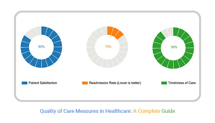
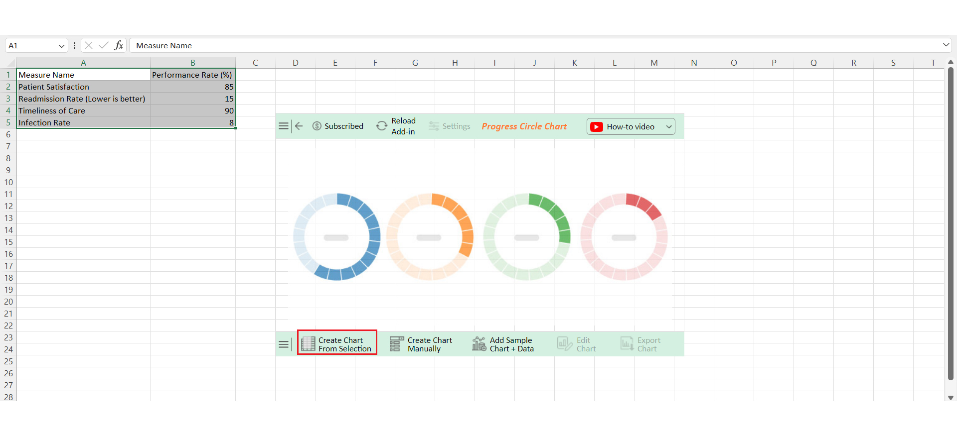
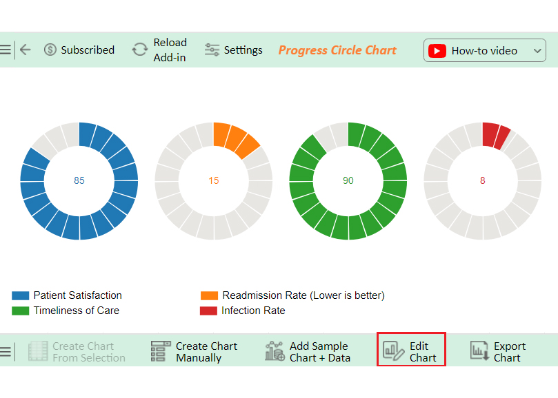
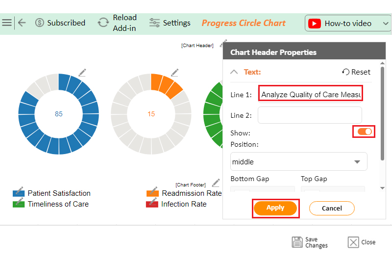
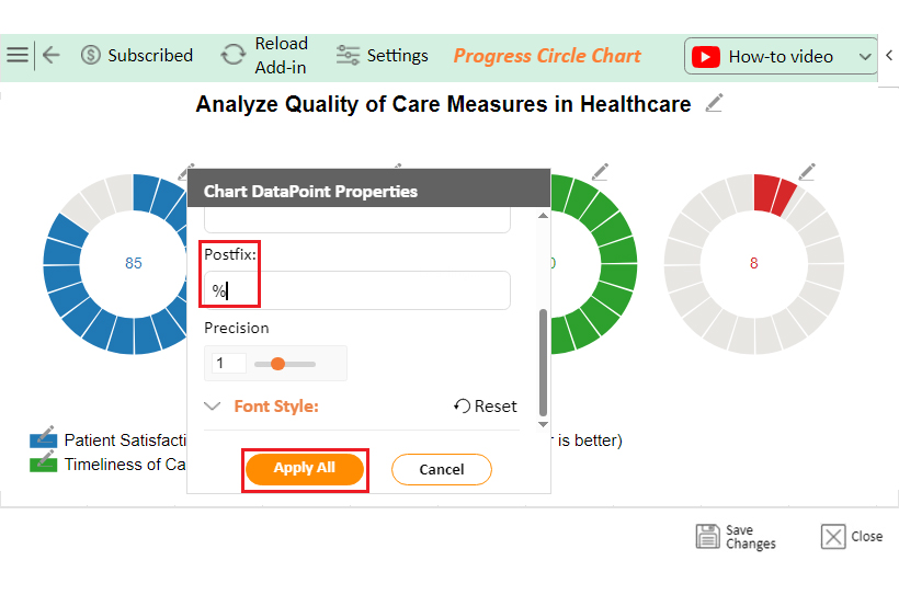
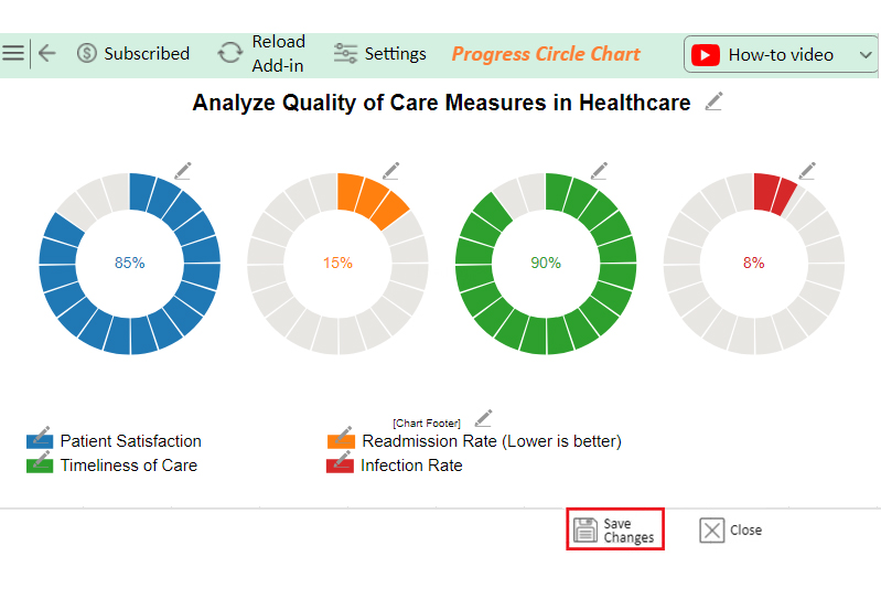
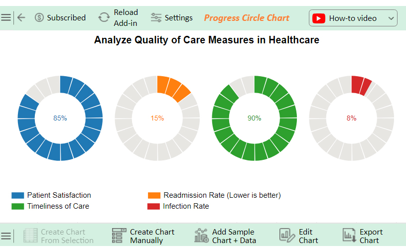
Let’s analyze the quality of care measures in the healthcare data sample below using ChartExpo.

Measure Name Performance Rate (%)
Patient Satisfaction 85
Readmission Rate (Lower is better) 15
Timeliness of Care 90
Infection Rate 8
  • To get started with ChartExpo, install ChartExpo in Excel.
  • Now Click on My Apps from the INSERT menu.
insert chartexpo in excel
  • Choose ChartExpo from My Apps, then click Insert.
open chartexpo in excel
  • Once it loads, scroll through the charts list to locate and choose the “Progress Circle Chart”.
search Progress Circle Chart in Excel
  • Click the “Create Chart From Selection” button after selecting the data from the sheet, as shown.
Click Create Chart From Selection for Doing Quality of Care Measures in Healthcare
  • ChartExpo will generate the visualization below for you.
Click Edit Chart for Doing Quality of Care Measures in Healthcare
  • If you want to add anything to the chart, click the Edit Chart button:
  • Click the pencil icon next to the Chart Header to change the title.
  • It will open the properties dialog. Under the Text section, you can add a heading in Line 1 and enable Show.
  • Give the appropriate title of your chart and click the Apply button.
Add Chart Header for Doing Quality of Care Measures in Healthcare
  • You can add the sign of (%) with value:
Add Postfix for Doing Quality of Care Measures in Healthcare
  • Click the “Save Changes” button to persist the changes made to the chart.
Click Save Chanes for Doing Quality of Care Measures in Healthcare
  • Your final Progress Circle Chart will look like the one below.
Final Quality of Care Measures in Healthcare

Insights

  • High patient satisfaction (85%) and timely care (90%) show strong performance.
  • The infection rate (8%) needs to be reduced; to improve overall quality, focus on decreasing the readmission rate (15%).

Boost Healthcare Standards with Quality of Care Measures in Microsoft Excel:

  1. Open your Excel Application.
  2. Install ChartExpo Add-in for Excel from Microsoft AppSource to create interactive visualizations.
  3. Select the Progress Circle Chart from the list of charts.
  4. Select your data.
  5. Click on the “Create Chart from Selection” button.
  6. Customize your chart properties to add header, axis, legends, and other required information.

The following video will help you create the Progress Circle Chart in Microsoft Excel.

Boost Healthcare Standards with Quality of Care Measures in Google Sheets:

  1. Open your Google Sheets Application.
  2. Install ChartExpo Add-in for Google Sheets from Google Workspace Marketplace.
  3. Select the Progress Circle Chart from the list of charts.
  4. Fill in the necessary fields.
  5. Click on the Create Chart button.
  6. Customize your chart properties to add header, axis, legends, and other required information.
  7. Export your chart and share it with your audience.

The following video will help you to create the Progress Circle Chart in Google Sheets.

What are the Best Practices in Performance Measures in Healthcare?

Using the right performance measures in healthcare is crucial for ensuring high-quality care. Here are the best practices to follow:

  • Evidence-based metrics: Use metrics rooted in solid research to ensure that performance measures reflect the best available medical knowledge.
  • Clear definitions and data collection: Establish clear, standardized definitions for each metric and ensure comprehensive data collection to maintain consistency and accuracy.
  • Risk adjustment and data validation: Adjust for patient risk factors to ensure fair provider comparisons and validate data to maintain reliability.
  • Transparency and communication: Share performance data openly with providers, patients, and stakeholders to build trust and drive improvements.
  • Provider and patient engagement: Involve providers and patients in developing and refining metrics to ensure they are relevant, practical, and patient-centered.
  • Continuous improvement and accountability: Use the data to refine practices and create accountability through incentives, ensuring ongoing enhancements in care quality.

FAQs

What is the best measure of quality of care?

The best measure of quality of care is patient outcomes. These include health improvements, patient satisfaction, and safety. Effective treatments, timely care, and positive experiences also indicate high-quality care that meets patient needs.

What are the tools for measuring the quality of care?

Tools for measuring quality of care include patient surveys, clinical outcome measures, healthcare audits, and performance indicators. Other tools are:

  • Electronic health records (EHRs).
  • Patient safety metrics.
  • Standardized reporting systems like the Healthcare Effectiveness Data and Information Set (HEDIS).

What factors might be considered when considering quality measures in healthcare?

Factors in healthcare quality measures include patient outcomes, safety, effectiveness, accessibility, and patient satisfaction. Other considerations are care coordination, efficiency, adherence to clinical guidelines, and health equity. These factors ensure all patients receive consistent, high-quality care regardless of background.

Wrap Up

Quality of care measures in healthcare are essential tools. They help evaluate how well healthcare services meet established standards. These measures ensure patients receive safe, effective, and timely care.

Structural measures assess the foundation of healthcare, including facilities, equipment, and staffing. Process measures focus on the actions taken to deliver care, ensuring that providers follow best practices. Outcome measures look at care results, such as patient recovery and health improvements.

Patient experience measures capture the patient’s perspective on their care. These include communication, respect, and overall satisfaction. Balanced measures integrate multiple types to provide a comprehensive view of quality.

Healthcare providers use these measures to identify areas for improvement. Continuous monitoring and feedback loops drive better patient outcomes. They ensure care evolves to meet changing needs.

Accountability and transparency are also key. Quality measures make healthcare organizations answerable to patients and regulators. They help maintain trust and push for higher standards.

In summary, quality of care measures are vital. They ensure that healthcare is effective, patient-centered, and reliable.

How much did you enjoy this article?

PBIAd1
Start Free Trial!
139030

Related articles

next previous
Data Analytics31 min read

Business Analytics: How to Get Heard, Trusted, & Funded

Business analytics can defend decisions or spark chaos. Learn how to align insights, eliminate noise, and get results. Read on!

Data Analytics29 min read

Data Analytics: Metrics, Mayhem, and Misunderstandings

Data analytics helps teams align strategy, spot failures, and act fast, but only if insights drive action. Ready to make it count? Get started now!

Data Analytics31 min read

Data Analysis Without Nonsense: Fix the Right Problem, Fast

Data analysis can mislead when metrics look right but outcomes fail. Learn how to spot red flags, fix failures, and make better decisions. Read on!

Data Analytics29 min read

Variance Analysis Isn’t a Math Problem, It’s a Trust Problem

Variance analysis helps identify what went wrong, who owns it, and what to do next. Use it to drive decisions, not just reports. Learn more!

Data Analytics10 min read

Supplier Comparison Template: Download It Now

A supplier comparison template streamlines vendor evaluation by comparing cost and quality. Click here to learn its benefits and how to analyze them.

ChartExpo logo

Turn Data into Visual
Stories

CHARTEXPO

  • Home
  • Gallery
  • Videos
  • Services
  • Pricing
  • Contact us
  • FAQs
  • Privacy policy
  • Terms of Service
  • Sitemap

TOOLS

  • ChartExpo for Google Sheets
  • ChartExpo for Microsoft Excel
  • Power BI Custom Visuals by ChartExpo
  • Word Cloud

CATEGORIES

  • Bar Charts
  • Circle Graphs
  • Column Charts
  • Combo Charts
  • Comparison Charts
  • Line Graphs
  • PPC Charts
  • Sentiment Analysis Charts
  • Survey Charts

TOP CHARTS

  • Sankey Diagram
  • Likert Scale Chart
  • Comparison Bar Chart
  • Pareto Chart
  • Funnel Chart
  • Gauge Chart
  • Radar Chart
  • Radial Bar Chart
  • Sunburst Chart
  • see more
  • Scatter Plot Chart
  • CSAT Survey Bar Chart
  • CSAT Survey Chart
  • Dot Plot Chart
  • Double Bar Graph
  • Matrix Chart
  • Multi Axis Line Chart
  • Overlapping Bar Chart
  • Control Chart
  • Slope Chart
  • Clustered Bar Chart
  • Clustered Column Chart
  • Box and Whisker Plot
  • Tornado Chart
  • Waterfall Chart
  • Word Cloud
  • see less

RESOURCES

  • Blog
  • Resources
  • YouTube
SIGN UP FOR UPDATES

We wouldn't dream of spamming you or selling your info.

© 2025 ChartExpo, all rights reserved.