• Home
  • Tools dropdown img
    • Spreadsheet Charts

      • ChartExpo for Google Sheets
      • ChartExpo for Microsoft Excel
    • Power BI Charts

      • Power BI Custom Visuals by ChartExpo
    • Word Cloud

  • Charts dropdown img
    • Chart Category

      • Bar Charts
      • Circle Graphs
      • Column Charts
      • Combo Charts
      • Comparison Charts
      • Line Graphs
      • PPC Charts
      • Sentiment Analysis Charts
      • Survey Charts
    • Chart Type

      • Box and Whisker Plot
      • Clustered Bar Chart
      • Clustered Column Chart
      • Comparison Bar Chart
      • Control Chart
      • CSAT Survey Bar Chart
      • CSAT Survey Chart
      • Dot Plot Chart
      • Double Bar Graph
      • Funnel Chart
      • Gauge Chart
      • Likert Scale Chart
      • Matrix Chart
      • Multi Axis Line Chart
      • Overlapping Bar Chart
      • Pareto Chart
      • Radar Chart
      • Radial Bar Chart
      • Sankey Diagram
      • Scatter Plot Chart
      • Slope Chart
      • Sunburst Chart
      • Tornado Chart
      • Waterfall Chart
      • Word Cloud
    • Google Sheets
      Microsoft Excel
  • Services
  • Pricing
  • Contact us
  • Blog
  • Support dropdown img
      • Gallery
      • Videos
      • Contact us
      • FAQs
      • Resources
    • Please feel free to contact us

      atsupport@chartexpo.com

Categories
All Data Visualizations Data Analytics Surveys
Add-ons/
  • Google Sheets
  • Microsoft Excel
  • Power BI
All Data Visualizations Data Analytics Surveys
Add-ons
  • Google Sheets
  • Microsoft Excel
  • Power BI

We use cookies

This website uses cookies to provide better user experience and user's session management.
By continuing visiting this website you consent the use of these cookies.

Ok

ChartExpo Survey


Home > Blog > Data Visualization

Breast Cancer Charts for Clear and Effective Insights

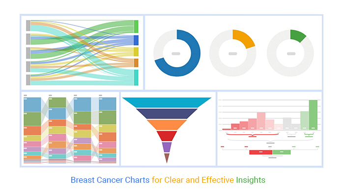
Breast cancer charts are essential in combating this widespread illness.

Picture this: Mary is nervously awaiting test results in a doctor’s office. The doctor walks in, holding a colorful chart. This scenario affects millions of lives daily.

Breast cancer is a prevalent illness worldwide. The World Health Organization reported in 2022 that 2.3 million women were diagnosed with breast cancer. These statistics emphasize how crucial it is to have a straightforward and precise visual display of information.

Breast Cancer Charts

There is good evidence that biomedical charts can transform complex medical data into easily understandable visuals. They help patients understand their diagnoses, treatment plans, and prognoses. These charts expedite decision-making and empower patient communication, crucial to delivering high-quality care.

Creating impactful breast cancer charts necessitates a combination of medical expertise and proficiency in data representation. It involves clearly and succinctly presenting information without overloading the audience. Color choices, chart types, and data arrangement are vital in crafting these visual aids.

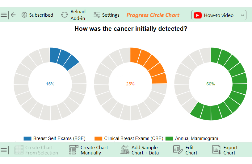
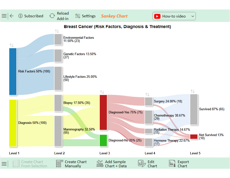
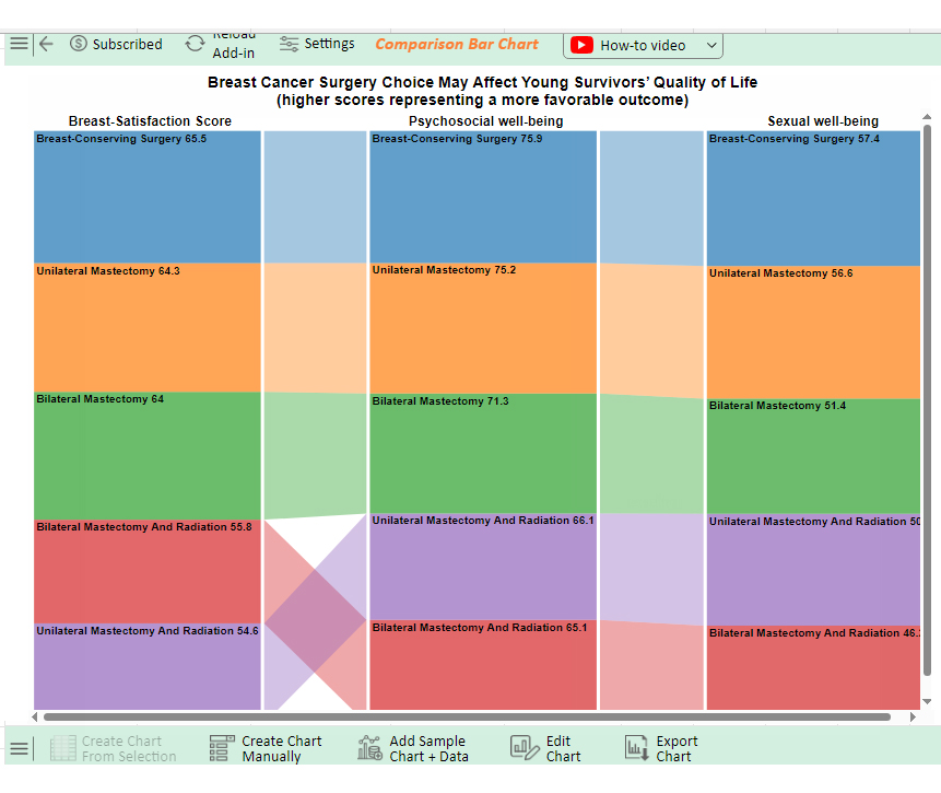
Consider the power of a well-designed survival rate chart. It can offer hope to newly diagnosed patients or highlight the effectiveness of different treatment approaches. Similarly, charts depicting risk factors can raise awareness and promote early detection. Breast cancer charts have the potential to educate, inform, and ultimately save lives in the ongoing battle against breast cancer.

Let’s explore the various techniques and best practices for creating these charts.

Table of Contents:

  1. What is Breast Cancer?
  2. Top 5 Best Charts of Breast Cancer Create in Excel by Using ChartExpo
  3. How to Create a Breast Cancer Chart?
  4. What are the Benefits of a Breast Cancer Graph?
  5. What are the Best Practices for Creating a Breast Cancer Report?
  6. Wrap Up

First…

What is Breast Cancer?

Definition: Breast cancer is a disease where malignant cells form in the tissues of the breast. It can originate in different parts, most commonly the ducts or lobules.

Causes:

  • Genetic mutations (BRCA1 and BRCA2 genes): Inherited changes in these genes significantly increase the risk.
  • Family history of breast cancer: Having close relatives with breast cancer raises the risk.
  • Aging: The risk increases as you get older.
  • Radiation exposure: Previous treatment with radiation therapy, especially to the chest.
  • Hormone replacement therapy: Long-term use can increase the risk.
  • Lifestyle factors: High alcohol consumption and obesity contribute to the risk.

Symptoms:

  • Lumps in the breast or underarm: Hard mass or swelling that feels different from the surrounding tissue.
  • Changes in breast shape or size: Noticeable difference in appearance.
  • Dimpling or puckering of the skin: Skin texture changes, resembling an orange peel.
  • Nipple discharge: Unusual fluid from the nipple, other than breast milk.
  • Redness or scaling of the nipple or breast skin: Irritated or flaky skin.
  • Pain in the breast or nipple: Persistent pain not associated with the menstrual cycle.

Types:

  • Ductal carcinoma in situ (DCIS): Non-invasive cancer confined to the ducts.
  • Invasive ductal carcinoma (IDC): Cancer that begins in the ducts and spreads to surrounding tissue.
  • Invasive lobular carcinoma (ILC): Cancer that starts in the lobules and spreads.

Diagnosis:

  • Mammogram: X-ray of the breast to detect abnormalities.
  • Ultrasound: Uses sound waves to create images of the breast.
  • MRI: Detailed imaging using magnetic fields.
  • Biopsy: Removing a tissue sample for laboratory analysis.
  • Blood tests: Assess overall health and organ function.

Treatment:

  • Surgery: Removes cancerous tissue.
  • Lumpectomy: Removes the tumor and a small margin of surrounding tissue.
  • Mastectomy: Removes one or both breasts, partially or completely.
  • Radiation therapy: Uses high-energy rays to target and kill cancer cells.
  • Chemotherapy: Uses drugs to destroy cancer cells or stop their growth.
  • Hormone therapy: Blocks hormones that fuel certain cancers.
  • Immunotherapy: Helps the immune system fight cancer.

Prevention and Early Detection:

  • Regular screening: Mammograms can detect cancer early.
  • Breast self-exams: Regularly check your breasts for changes.
  • Maintaining a healthy diet and weight: Reduces overall cancer risk.
  • Exercising regularly: Helps maintain a healthy weight and hormone levels.
  • Avoiding smoking: Reduces overall cancer risk.
  • Genetic counseling and testing: These are for those with a strong family history to understand their risk.

Top 5 Best Charts of Breast Cancer Create in Excel by Using ChartExpo

Progress Circle Chart

Progress Circle Chart of Breast Cancer Charts

Sankey Chart

Sankey Chart of Breast Cancer Charts

Comparison Bar Chart

Comparison Bar Chart of Breast Cancer Charts

CSAT Score Survey Chart

CSAT Score Survey Chart of Breast Cancer Charts

Funnel Chart

Funnel Chart of Breast Cancer Charts

How to Create a Breast Cancer Chart?

Creating a breast cancer chart might sound daunting, but it’s a crucial task in data analysis. Data visualization transforms heaps of raw data into insightful and compelling stories.

While Excel is the trusty old sidekick, it often falls short in the flashy world of data visualization.

Enter ChartExpo, the superhero charting tool. It swoops in to save the day with its robust and user-friendly features.

Let’s learn how to install ChartExpo in Excel.

  1. Open your Excel application.
  2. Open the worksheet and click the “Insert” menu.
  3. You’ll see the “My Apps” option.
  4. In the Office Add-ins window, click “Store” and search for ChartExpo on my Apps Store.
  5. Click the “Add” button to install ChartExpo in your Excel.

ChartExpo charts are available both in Google Sheets and Microsoft Excel. Please use the following CTAs to install the tool of your choice and create beautiful visualizations with a few clicks in your favorite tool.

Example

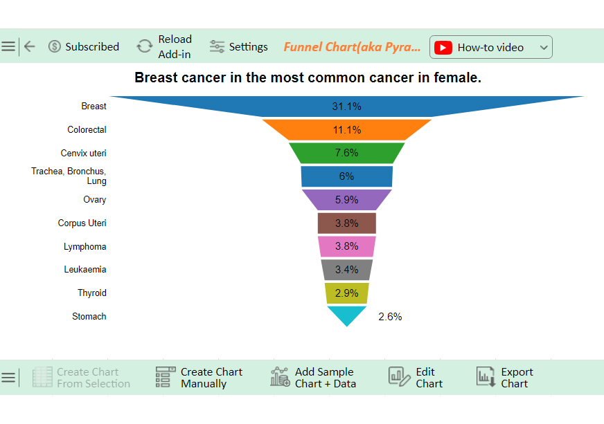
Let’s create a breast cancer chart using ChartExpo from the data below.

Type Percentage
Breast 31.1
Colorectal 11.1
Cervix uteri 7.6
Trachea, Bronchus, Lung 6
Ovary 5.9
Corpus Uteri 3.8
Lymphoma 3.8
Leukemia 3.4
Thyroid 2.9
Stomach 2.6
  • To get started with ChartExpo, install ChartExpo in Excel.
  • Now Click on My Apps from the INSERT menu.
insert chartexpo in excel
  • Choose ChartExpo from My Apps, then click Insert.
open chartexpo in excel
  • Once it loads, scroll through the charts and choose the “Funnel Chart (aka Pyramid Chart)” from the list.
Search Funnel Chart
  • Click the “Create Chart From Selection” button after selecting the data from the sheet, as shown.
Click Create Chart From Selection for Creating Breast Cancer Charts
  • ChartExpo will generate the visualization below for you.
Initial Visual for Creating Breast Cancer Charts
  • If you want to have the chart’s title, click Edit Chart, as shown in the above image.
  • First, you can add the percentage sign with all values of the chart:
Edit Chart for Creating Breast Cancer Charts
  • Click the pencil icon next to the Chart Header to change the title.
  • It will open the properties dialog. Under the Text section, you can add a heading in Line 1 and enable Show.
  • Give the appropriate title of your chart and click the Apply button.
Add Chart Header for Creating Breast Cancer Charts
  • Click the Save Changes button to persist the changes.
Click Save Changes for Creating Breast Cancer Charts
  • Your Funnel Chart will appear below.
Final Breast Cancer Charts

Insights

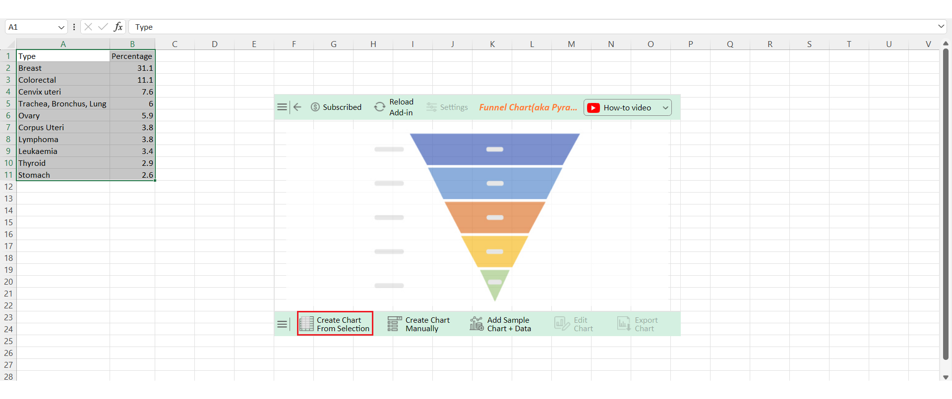
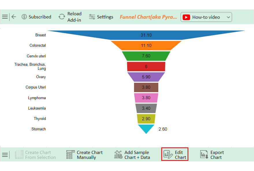
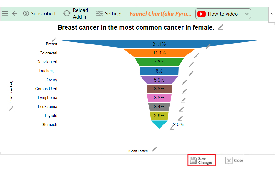
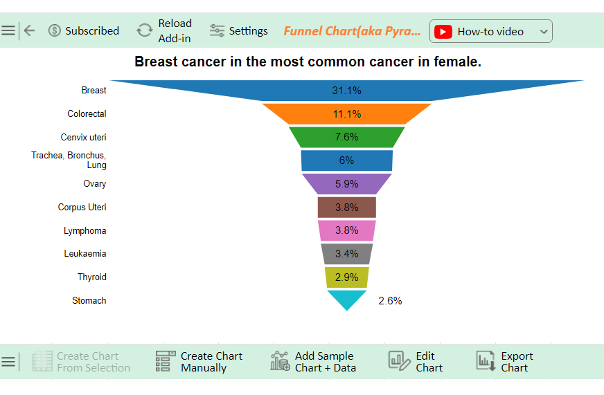
The data represents the percentage distribution of various cancer types:

  • Breast cancer:1% (most prevalent)
  • Colorectal:1%
  • Cervix uteri:6%
  • Trachea, bronchus, lung: 6%
  • Ovary:9%
  • Less common: Corpus uteri, lymphoma, leukemia, thyroid, stomach.

Streamline Your Breast Cancer Data with Charts in Microsoft Excel:

  1. Open your Excel Application.
  2. Install ChartExpo Add-in for Excel from Microsoft AppSource to create interactive visualizations.
  3. Select the Funnel Chart from the list of charts.
  4. Select your data.
  5. Click on the “Create Chart from Selection” button.
  6. Customize your chart properties to add header, axis, legends, and other required information.

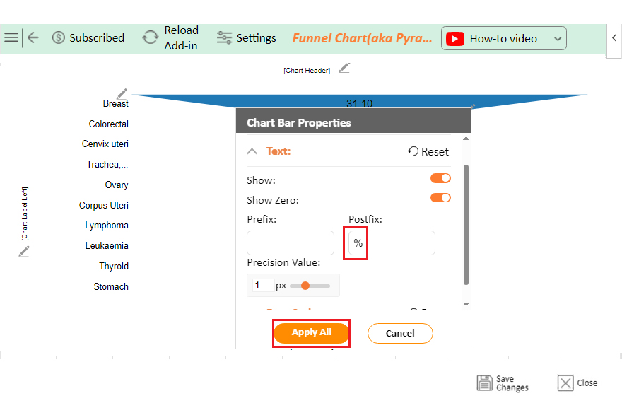
The following video will help you create a Funnel Chart in Microsoft Excel.

What are the Benefits of a Breast Cancer Graph?

Imagine trying to understand a sea of numbers and medical terms without any visual aid. It sounds daunting, right? That’s where a breast cancer graph comes in, using visual storytelling to make things clearer and easier to grasp. Here are the main benefits of using a breast cancer graph:

  • Simplifies complex data: A breast cancer statistics graph transforms complicated statistics into visual representations. This makes it easier to see trends and understand and display information at a glance.
  • Enhances understanding and communication: A breast cancer graph helps explain complex concepts. It makes it easier for patients, doctors, and policymakers to communicate. By presenting data visually, graphs ensure everyone is on the same page, fostering better discussions and understanding.
  • Supports decision-making and monitoring: These graphs help identify trends, patterns, and outliers quickly, which is crucial for making data-driven decisions. They also facilitate monitoring and evaluation, allowing for timely progress tracking. This helps assess the effectiveness of treatments and interventions, leading to better healthcare outcomes.

What are the Best Practices for Creating a Breast Cancer Report?

Creating a comprehensive breast cancer report is crucial for conveying important information effectively. Follow these best practices to ensure your report is informative, clear, and impactful.

  1. Define the purpose and audience: Start by identifying the purpose of your report. Is it for medical professionals, patients, or researchers? Knowing your audience will guide the tone and depth of your content.
  2. Structured format: A clear structure helps readers navigate your report easily. Follow a logical sequence to present your information coherently.
  3. Introduction: Begin with an engaging introduction. Provide an overview of the report’s importance and what readers can expect to learn.
  4. Methodology: Explain the methods used to gather and analyze data. This section adds credibility and transparency to your report.
  5. Epidemiology: Discuss the prevalence and incidence of breast cancer. Include statistics and trends to give a comprehensive view.
  6. Pathophysiology: Describe the biological mechanisms behind breast cancer. Explain how the disease develops and progresses.
  7. Symptoms and diagnosis: Outline the common symptoms of breast cancer. Include information on diagnostic tools and procedures.
  8. Treatment options: Detail the various treatment options available. Cover surgery, chemotherapy, radiation, and emerging therapies.
  9. Prognosis and survival rates: Provide information on survival rates and factors affecting prognosis. Use data to support your statements.
  10. Prevention and early detection: Highlight strategies for preventing breast cancer. Emphasize the importance of early detection and screening.
  11. Current research and developments: Update readers on the latest research and advancements in breast cancer treatment and management.
  12. Case studies: Include case studies to illustrate real-world applications and outcomes. These provide practical insights and context.
  13. Conclusion: Summarize the key points of the report. Reinforce the importance of ongoing research and awareness.
  14. References: List all sources and references used in your report. Ensure they are credible and up-to-date.
  15. Appendices: Include any additional information or data in the appendices. This keeps the main report concise and focused.

FAQs

How do you analyze breast cancer detection?

Use a breast cancer chart to analyze breast cancer detection better. This chart tracks key metrics such as tumor size, stages, and detection methods. It helps identify trends, the effectiveness of screenings, and areas needing improvement for early detection.

What is breast cancer data?

Breast cancer data includes:

  • Information on incidence rates, mortality rates, and survival statistics.
  • Patient demographics, tumor characteristics, treatment outcomes, and risk factors.

This data is crucial for research, diagnosis, treatment planning, and improving patient care.

How do you read a breast cancer report?

To read a breast cancer report:

  1. Review the introduction and methodology.
  2. Check the data on tumor characteristics and staging.
  3. Examine treatment options and prognosis.
  4. Look at graphs and charts for visual insights.
  5. Focus on the conclusions and recommendations.

Wrap Up

Creating breast cancer charts is crucial for presenting data effectively.

Start by defining the chart’s purpose. Know the audience. Are they patients, doctors, or researchers? Then, tailor the chart to meet their needs.

Next, gather accurate and relevant data. Use reliable sources such as medical journals, cancer registries, and clinical studies. Ensure the data is up-to-date and specific to the chart’s objective.

Choose the right type of chart. Bar charts are great for comparing categories. Line charts show trends over time. Pie charts display proportions. Select the one that best represents your data.

Design the chart clearly and simply. Use distinct colors and labels. Avoid clutter. The chart should be easy to read and understand at a glance. Make sure to include a title and legend.

Finally, interpret the data accurately. Provide a brief explanation of the chart. Highlight key points and trends. This helps the audience grasp the significance of the information quickly.

In conclusion, creating effective breast cancer charts involves careful planning and design. Define your purpose and audience. Gather accurate data. Choose the right chart type. Design. Interpret accurately. These steps ensure your charts are informative and impactful.

How much did you enjoy this article?

PBIAd1
Start Free Trial!
138593

Related articles

next previous
Data Analytics31 min read

Business Analytics: How to Get Heard, Trusted, & Funded

Business analytics can defend decisions or spark chaos. Learn how to align insights, eliminate noise, and get results. Read on!

Data Analytics29 min read

Data Analytics: Metrics, Mayhem, and Misunderstandings

Data analytics helps teams align strategy, spot failures, and act fast, but only if insights drive action. Ready to make it count? Get started now!

Data Analytics31 min read

Data Analysis Without Nonsense: Fix the Right Problem, Fast

Data analysis can mislead when metrics look right but outcomes fail. Learn how to spot red flags, fix failures, and make better decisions. Read on!

Data Analytics29 min read

Variance Analysis Isn’t a Math Problem, It’s a Trust Problem

Variance analysis helps identify what went wrong, who owns it, and what to do next. Use it to drive decisions, not just reports. Learn more!

Data Visualization30 min read

Waterfall Chart: From Initial Value to Final Insight

A Waterfall chart shows how each step impacts the total. Use it to earn trust, clarify trends, and guide decisions—fast. Read on to get started!

ChartExpo logo

Turn Data into Visual
Stories

CHARTEXPO

  • Home
  • Gallery
  • Videos
  • Services
  • Pricing
  • Contact us
  • FAQs
  • Privacy policy
  • Terms of Service
  • Sitemap

TOOLS

  • ChartExpo for Google Sheets
  • ChartExpo for Microsoft Excel
  • Power BI Custom Visuals by ChartExpo
  • Word Cloud

CATEGORIES

  • Bar Charts
  • Circle Graphs
  • Column Charts
  • Combo Charts
  • Comparison Charts
  • Line Graphs
  • PPC Charts
  • Sentiment Analysis Charts
  • Survey Charts

TOP CHARTS

  • Sankey Diagram
  • Likert Scale Chart
  • Comparison Bar Chart
  • Pareto Chart
  • Funnel Chart
  • Gauge Chart
  • Radar Chart
  • Radial Bar Chart
  • Sunburst Chart
  • see more
  • Scatter Plot Chart
  • CSAT Survey Bar Chart
  • CSAT Survey Chart
  • Dot Plot Chart
  • Double Bar Graph
  • Matrix Chart
  • Multi Axis Line Chart
  • Overlapping Bar Chart
  • Control Chart
  • Slope Chart
  • Clustered Bar Chart
  • Clustered Column Chart
  • Box and Whisker Plot
  • Tornado Chart
  • Waterfall Chart
  • Word Cloud
  • see less

RESOURCES

  • Blog
  • Resources
  • YouTube
SIGN UP FOR UPDATES

We wouldn't dream of spamming you or selling your info.

© 2025 ChartExpo, all rights reserved.