Categories
KPI graphs (Key Performance Indicator graphs) are one of the most effective ways to track and visualize business performance. They help turn complex data into clear, actionable insights so teams can make faster and smarter decisions.
In this guide, you’ll learn why they matter and how to create them using Excel, Power BI, and Google Sheets. You’ll also explore the best types of KPI charts with practical examples you can use in real dashboards.
Whether you’re building a KPI dashboard or improving your reporting, this guide will help you choose the right KPI visualizations and use them effectively.
Definition: KPI graphs (Key Performance Indicator graphs) are visual charts used to track and display business performance metrics. They help convert complex data into simple visuals so users can quickly monitor progress and make informed decisions.
Common types of KPI charts include bar charts, line charts, gauge charts, and dashboard visualizations used in tools like Excel, Power BI, and Google Sheets. These graphs provide a quick snapshot of performance against specific goals or targets.
Convert large datasets into easy-to-understand visuals. Charts like bar graphs, line charts, and dashboards help users quickly grasp key metrics without deep analysis.
Decision-makers can instantly see what’s working and what’s not. This reduces the time spent on manual data analysis and helps teams respond quickly to changes.
It allows businesses to monitor performance against goals. Whether it’s sales targets, marketing campaigns, or operational efficiency, these graphs provide a real-time snapshot of progress.
Visual data makes it easier to spot trends, patterns, and anomalies. Businesses can detect growth opportunities or potential issues before they become critical.
This graph can make reports more engaging and easier to understand. Teams, stakeholders, and executives can quickly interpret data without needing technical expertise.
A KPI chart is made up of several essential elements that help users quickly understand performance and make data-driven decisions.
This is the most important number displayed in the chart, such as current revenue, total sales, or conversion rate. It represents the core performance indicator being tracked.
A KPI chart should include a reference point, such as a goal, target, or previous period. This allows users to compare current performance against expectations.
A small trendline or sparkline in Excel shows how the metric has changed over time. It helps identify patterns, growth, or decline at a glance, and is often supported by tools like a sparkline in Excel for quick visual tracking of performance.
Colors (green, red, yellow) or symbols are used to quickly signal performance status. For example, green may indicate success, while red highlights areas that need attention.
Every KPI chart should clearly define the time period being measured, such as daily, weekly, monthly, or yearly performance.
Titles, axis labels, and data annotations provide clarity and ensure users understand what the data represents without confusion.
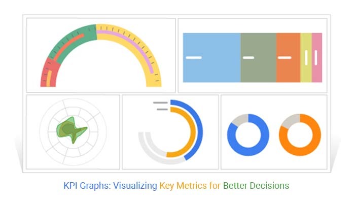
There are different types, each designed to visualize specific types of data and performance metrics. Choosing the right KPI chart helps improve clarity and decision-making.
A Circular Org Chart displays hierarchical relationships in a circular layout. It is useful for visualizing organizational KPIs, team structures, and role-based performance metrics.
Best for: Financial Performance and Team-Level KPIs
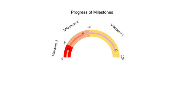
A Multi Gauge Chart shows multiple KPIs in a single view using gauge-style visuals. Each gauge represents a metric compared against a target or benchmark.
Best for: Monitoring multiple KPIs like sales targets, revenue, or performance goals at once
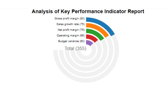
A Radial Bar chart presents data in a circular format to highlight proportions and comparisons. It is often used to visualize performance distribution or progress toward goals.
Best for: Comparing performance metrics and showing progress visually
A Performance Bar Chart uses horizontal or vertical bars to compare KPI values across categories. It is one of the most widely used and easy-to-understand graphs.
Best for: Comparing KPIs such as sales by region, product performance, or campaign results
Below are some common KPI graph examples based on real-world use cases.
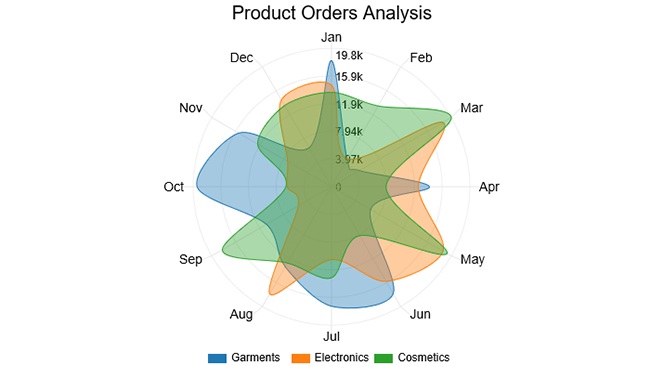
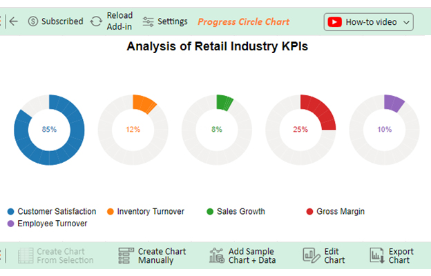
Sales teams use these graphs to monitor revenue, growth, and target achievement. Common examples include monthly sales trends, revenue by region, and quota attainment charts.
Example KPIs:
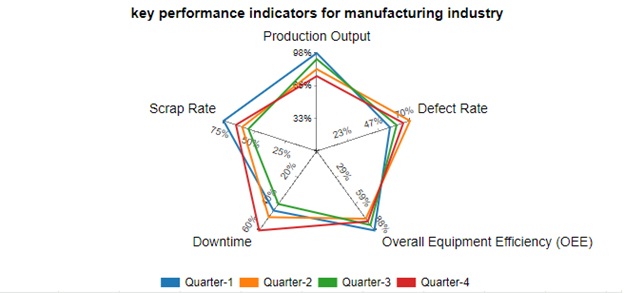
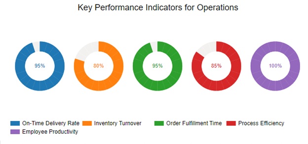
Manufacturing companies rely on KPI charts to monitor production efficiency, quality, and operational performance. These charts help reduce downtime and improve output.
Example KPIs:
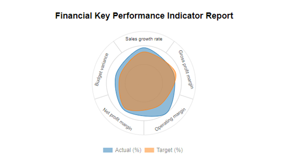
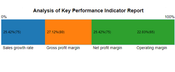
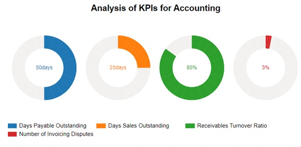
Finance teams rely on graphs to monitor profitability and financial health. These charts provide a clear view of performance over time.
Example KPIs:
Operational graphs track efficiency and productivity within business processes. They help identify bottlenecks and improve performance.
Example KPIs:
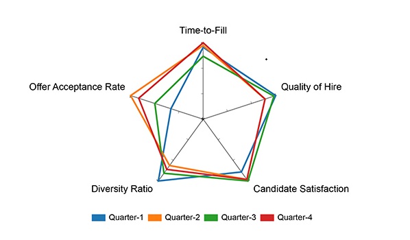
HR teams use graphs to track employee performance, recruitment metrics, and workforce trends. These visuals help improve hiring efficiency, monitor retention, and optimize overall HR strategies.
Example KPIs:
Choosing the right graph depends on the type of data you’re working with and the insights you want to convey. Picking the right visualization ensures your metrics are clear, actionable, and easy to interpret. Here’s a guide to help you decide:
Use line graphs to show trends over time, such as monthly revenue, website traffic, or sales growth. Line charts make it easy to spot patterns, seasonality, and trends.
Use bar charts or column charts to compare different categories, like sales by region, employee performance by department, or product revenue. These charts highlight differences clearly and make comparisons simple.
Use pie charts or donut charts to show parts of a whole, such as market share, expense distribution, or survey results. They provide an at-a-glance view of proportions.
Use gauge or bullet charts to track progress toward goals, like sales targets, project milestones, or KPIs for marketing campaigns. These charts instantly show if performance is on track, behind, or exceeding expectations.
Use heatmaps or matrix charts to visualize intensity or correlation across two dimensions, such as website traffic by source and time, or sales by product and region. They reveal patterns that are difficult to see in standard charts.
Follow this guide to turn your data into clear, actionable visualizations.
Several tools are available to help you create visually appealing and effective graphs. Here are some popular options:
Excel is a versatile tool for creating a wide range of graphs, including bar charts, line charts, and pie charts. It also offers basic KPI dashboard capabilities and is ideal for quick KPI visualizations using structured data.
Best for: Small to medium datasets, simple dashboards, and offline reporting.
Power BI is Microsoft’s business analytics service, allowing users to build interactive dashboards and share insights across an organization. It supports advanced analytics, real-time data, and visually rich KPI visuals.
Best for: Enterprise reporting, real-time dashboards, and interactive KPI visualization.
Google Sheets is a free, cloud-based tool that integrates with multiple data sources. Users can create customizable KPI dashboards and collaborate in real-time with team members.
Best for: Collaborative KPI tracking, cloud-based dashboards, and lightweight reporting.
ChartExpo is a plugin for Excel, Google Sheets, and Power BI that simplifies creating advanced KPI charts and dashboards. It allows users to generate multi-gauge charts, radial charts, and other complex KPI visuals without any formulas.
Best for: Users who want professional, ready-to-use KPI charts quickly with minimal setup.
Select a chart type that matches your data and business goal. For example:
Avoid clutter by showing only the most important metrics. Too much information can confuse viewers. Highlight key KPIs and remove unnecessary elements to maintain clarity.
Use color coding consistently to indicate performance:
Include targets, goals, or benchmarks alongside your KPI metrics. Comparing actual performance against expected results helps users quickly assess if metrics are meeting objectives.
Interactive dashboards or drill-down charts allow users to explore data in detail. Tools like Power BI, Google Sheets, or ChartExpo can help create dynamic KPI graphs that let viewers filter, hover, or click to get deeper insights.
Using a chart type that doesn’t match your data can confuse viewers. For example, using a pie chart for time-series data or a line chart for categorical comparisons makes it harder to interpret performance.
Too many metrics, colors, or labels can overwhelm your audience. Focus on key KPIs and remove unnecessary information to maintain clarity.
Without context, like target lines or benchmarks, it makes it difficult to assess performance. Always include reference points to provide meaningful insights.
Distorted scales, truncated axes, or inconsistent color coding can misrepresent performance. Ensure your visualizations accurately reflect the data.
Charts without proper titles, axis labels, or legends can confuse viewers. Make sure every element is clearly labeled so users can interpret the graph quickly.
Not all viewers have the same technical knowledge. Avoid overly complex charts if your audience is non-technical. Tailor visuals to your viewers’ understanding level.
The best chart for KPIs often depends on the nature of the data. For comparing values, a bar chart is effective; line charts are excellent for tracking trends over time. Use pie charts to illustrate proportions and radar charts to analyze multivariate data. Choose based on your specific KPI goals.
To effectively keep track of KPIs, utilize performance dashboards that offer real-time updates. Implement regular reporting schedules, automate data collection where possible, and establish clear accountability. This ensures timely monitoring and informed decision-making for organizational success.
KPI graphs turn complex data into clear visuals, making it easy to track performance, spot trends, and compare metrics against targets. This helps leaders quickly identify issues, uncover opportunities, and make informed decisions without sifting through spreadsheets.
KPI graphs are more than just charts; they transform raw data into actionable insights, helping businesses track performance, spot trends, and make informed decisions.
By selecting the right metrics, chart types, and benchmarks, organizations can visualize progress clearly and guide teams toward strategic goals. Regular monitoring and review keep dashboards relevant, while consistent formats and context make insights easy to understand for all stakeholders.
Interactive and collaborative KPI dashboards ensure teams can act quickly, improving efficiency and outcomes. Tools like ChartExpo make it simple to create professional, advanced KPI charts without complex formulas.
How much did you enjoy this article?


Calculate accounts receivable turnover ratio to measure credit collection speed, improve cash flow, and strengthen your financial strategy. Read on!

Change Management KPIs are the key to tracking adoption, performance, and ROI during transitions. Find out which metrics matter. Read on!

Data collection methods and techniques determine the quality of every insight you act on. Explore key approaches for gathering reliable data. Read on!


