Categories
Data visualization has become an essential part of businesses today. These days, more is needed to visualize with charts and graphs. Customers expect more from such visualizations.r


Here’s the secret.
You can impress your customers and target audience by using the best colors for graphs. Using the most suitable colors for your charts and graphs can help you easily communicate your ideas and insights.
In this blog, you will learn the best colors for charts and graphs depending on your audience’s wants. This way, you can persuade potential customers and build a brand for your products and services.
Are you ready to learn more about colors? Let’s go.
Definition: Good colors for charts are those that enhance readability, support data interpretation, and maintain visual harmony. They should provide enough contrast to distinguish between data points while avoiding overly bright or distracting shades. Typically, good chart colors include:
Detailed Breakdown for Color Palette For Graphs:
Graphs should use colors that are clear, consistent, and easy to distinguish. Ideally, use your brand’s color palette or a well-designed color palette for graphs with good contrast. Avoid overly bright or clashing colors, and limit the number of colors to keep the graph clean and readable. Accessibility for color-blind viewers is also important; using color combinations that everyone can differentiate improves understanding.
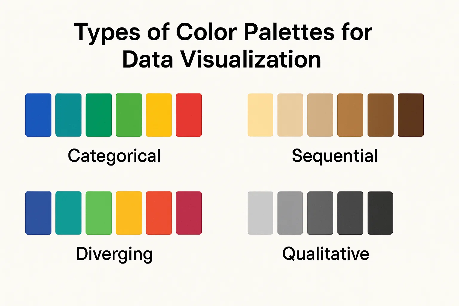
A sequential palette is best used when visualizing data that progresses from low to high. It typically involves different shades or intensities of a single hue, moving from light to dark or vice versa. This gradual change in color helps to highlight variations in magnitude or intensity, making it ideal for heatmaps, population density maps, and other data types that follow a natural order.
Diverging palettes are designed to highlight the difference from a central reference point, such as zero or an average value. They use two contrasting colors that blend into a neutral tone at the midpoint. This type of palette is useful for showing deviations, such as profit vs. loss, temperature anomalies, or performance comparisons above and below a target.
Categorical or qualitative palettes are used for visualizing discrete categories with no inherent order. Each category is represented by a distinct color, making them easily distinguishable. These palettes are the best color combinations for bar charts, pie charts, and any visualization where different groups or labels must be clearly separated.
Qualitative palettes focus specifically on representing distinct categories without any implied ranking or order. They rely on a variety of unique, easily distinguishable colors to help users differentiate between multiple groups or classifications clearly. These palettes are widely used in charts that require color differentiation for categorical data, ensuring clarity and ease of interpretation.
Every color you have known since childhood has its unique features and abilities. Most people bypass the importance of colors because they are unaware of the science of colors in our brains.
Imagine what it would be like if the world didn’t have different colors. Would everything appear dull, right? When it comes to data visualization, colors play a critical role in persuasion and attraction, especially when using a ranking chart maker, where color contrast can instantly highlight top performers, low performers, and key differences in rankings.
One interesting fact about your brain is that it chemically reacts to every color to trigger an emotional response.
Colors create associations and thoughts about a brand or event. If your goal is to persuade your audience to subscribe to a product or service, use the best chart color schemes and chord diagrams.
Each color has its unique abilities and how your audience reacts to every one of them. Colors directly affect your target audience’s perception of your graphs and charts.
Various business owners apply this knowledge of colors to create their unique brands. For instance, restaurants and cafes use Orange or Brown colors to make customers feel at home. Orange and brown are also effective choices for visual presentations, such as in a Side-By-Side Bar Chart, where they can help differentiate data clearly and make the information more engaging
However, some brands and professionals need to improve in properly using colors. They need to use the best color for the Sunburst Chart and other visualizations on their websites to make their brand more appealing.
For instance, in a dot plot, the right choice of colors can significantly enhance the readability and impact of the data presented. Analysts and data scientists still need to recognize the proper use of colors and graph types, like Box and Whisker graphs, to communicate their insights effectively. Don’t make the same mistake, too.
That is why choosing colors for your data visualizations with human psychology in mind is vital. Whether you are creating a Radar Chart or any other type of visualization, it’s essential to understand the different meanings of colors in their various contexts.
Each color has a meaning in your life. Each human experiences colors in significantly different ways. Each individual has unique emotions and cultural and societal affiliations with varying perceptions of colors.
However, some colors are universally accepted by almost every individual. When we understand such colors, we can appreciate the best colors for graphs, especially for Funnel charts.
Let’s use the example of green and red because they are the most common. We know these colors to have opposite meanings, especially if you obey traffic lights daily. In traffic rules, the red light tells you to stop, the orange light tells you to prepare, and the green light tells you to go.
In essence, red is a universal color that signifies danger or caution. However, sports analytics reveals that some sports brands use red in their logos and sports jerseys to convey confidence and power.
Let’s assume you’re creating a Google Ads performance dashboard.
You will have to work with two or three striking colors in this case. Still, your chart needs to display performances for your agency’s 18 campaigns.
It would not be effective if you recycled a three-shade palette. Still, using one color for the four ad categories won’t be appropriate.
Each time a team member views the dashboard, they will strain their eyes to see tiny labels and legends to obtain insights. Therefore, action must be taken so that the dashboard benefits those who walk past it and take a glance.
What options will you have?

When you decide on the best color for graphs, a standard option is to use your brand colors and break them down into many small colors. These small color segments progressively reduce their saturation, and their hues become darker, as shown below. Choosing the right color palette for graphs here is essential because an inconsistent or overly muted palette can make your visuals confusing.
The resulting chart will be muddy and unappealing to your audience.
Another option you can use is the application of random, non-deliberate colors. In this case, you might use colors outside your brand and rarely use them. However, without a thoughtfully selected color palette for graphs, these colors can clash or distract, making the chart harder to interpret.
The palettes will appear as shown below.

Although you will succeed in finding different shades, it doesn’t show a contrast between them, and thus, it will not appear cohesive.
The two options we have mentioned cannot create a high-impact data visualization.
To ensure that you succeed in on-brand visualization with several categories, you must take your time to color each category. For instance, in a 20-color brand palette, please keep it simple and appealing for more straightforward visualizations.

The best way to generate an extensive palette is to utilize light shades of your original brand colors in between them. This strategy is essential since it will stretch the palette.
Some colors are specific to some industries. For instance, many financial institutions will use blue as their brand to signify authority, stability, and customer value.
When choosing the best colors for graphs, you can choose depending on what mood you want to set for your audience. Data storytelling techniques can help you decide on colors that enhance your narrative. Blue can be appropriate if you want to set a soothing mood.
It is essential to consider your target audience’s background and culture when choosing the colors for data visualization, including when creating a Mekko Chart. Various cultures perceive colors differently, so selecting the right color scheme can enhance the chart’s effectiveness and clarity.
For instance, in some Asian cultures, red and gold signify wealth and fortune. You can easily impress Asian investors with such colors in your data visualization.
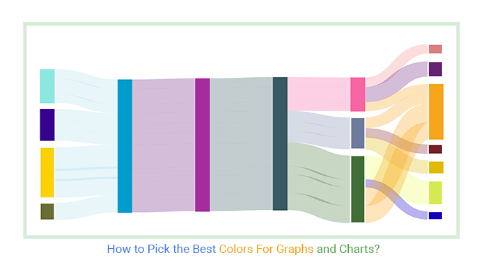
Let’s use the example of the table below to explore the Sankey diagram colors for clear and effective data visualization.
| Earnings Source | Revenue | Proceeds | Expenses | Departments | Outflows | Amount |
| Providing services | Revenue | Proceeds | Expenses | Managerial | Personnel training | 10000 |
| Providing services | Revenue | Proceeds | Expenses | Managerial | Office rental | 16000 |
| Providing services | Revenue | Proceeds | Expenses | Managerial | Wages | 9400 |
| Renting out premises | Revenue | Proceeds | Expenses | Commercial | Wages | 11300 |
| Renting out premises | Revenue | Proceeds | Expenses | Commercial | Travel allowance | 10000 |
| Renting out premises | Revenue | Proceeds | Expenses | Commercial | Advertising | 12000 |
| Sales of products | Revenue | Proceeds | Expenses | Production | Material Payment | 25000 |
| Sales of products | Revenue | Proceeds | Expenses | Production | Loan Payment | 8500 |
| Sales of products | Revenue | Proceeds | Expenses | Production | Wages | 19500 |
| Loans | Proceeds | 18000 |
To get started with the best colors for graphs, install the ChartExpo add-in for Google Sheets from this link.


Some insights from the Sankey Diagram include the following:
Let’s use the table below to visualize your data in Excel.
| Cities | Quarter-1 | Quarter-2 | Quarter-3 | Quarter-4 |
| New York | 500 | 300 | 600 | 650 |
| Chicago | 400 | 550 | 300 | 400 |
| Austin | 350 | 400 | 450 | 500 |
| Boston | 450 | 500 | 550 | 300 |
| Seattle | 600 | 400 | 300 | 250 |
To get started with the best colors for graphs, install the ChartExpo add-in for Excel from this link.


To get started with ChartExpo in Excel, follow the steps below:


Your Clustered Column Chart will appear as shown below.


Your chart will appear as shown below.


The best graph colors for graphs, including Waterfall graphs, are blue, green, and orange. You can use these colors to associate specific variables. For instance, you can use green to show profits over time and blue in your charts to create a soothing effect for your audience.
You should only use colors that are easily distinguishable in charts. This will leave your audience frustrated as they need help distinguishing various variables.
It is essential to use different colors that will help your audience interpret your graph at a glance.
Color is essential in a graph because it triggers an emotional response in your audience. The human brain is easily impressed by colors.
Your aim in coloring your graphs is to easily communicate your insights and persuade your audience to take action.
In a nutshell, we have learned that data visualization is not enough without using colors.
Colors are essential in creating a visual sense. You can persuade your target audience emotionally by using colors wisely.
As a data visualization designer, it is important to consider human psychology and how individuals react to different colors. You should know how to use the best colors for graphs appropriately.
To successfully communicate your insights, you need to consider your target audience’s cultural perception of colors. This helps you build a brand based on your audience’s favorite color.
The ChartExpo third-party application can help you with the appropriate colors for coloring your charts and graphs.
Now it’s your turn. Start a 7-day free trial today with ChartExpo to create charts with appealing colors.
How much did you enjoy this article?


Calculate accounts receivable turnover ratio to measure credit collection speed, improve cash flow, and strengthen your financial strategy. Read on!

Change Management KPIs are the key to tracking adoption, performance, and ROI during transitions. Find out which metrics matter. Read on!

Data collection methods and techniques determine the quality of every insight you act on. Explore key approaches for gathering reliable data. Read on!


