Categories
When dealing with data, there are many types of analysis you can carry out. In some instances, you will find yourself comparing two or more KPIs.


Comparison of metrics is a critical step in data discovery. This is because you want to establish relationships, strengths, and weaknesses of various variables.
Comparing data reveals hidden insights that can help you improve your results. As a businessperson, you can compare two products and see which is more marketable than the other.
For this reason, it is essential to visualize such data with comparison charts.
This blog will help you understand how to make a comparison chart in Google Sheets. By the end of it, you can use a comparison chart of your choice.
But first, let’s define and learn more about comparison charts.
Definition: A comparison chart is a diagram that shows the differences and relationships of particular quantities.
You can use a Comparison Chart to compare key data points in your data story.
For instance, you can compare sales revenue and profits in a specific period. This will help you to understand the variables in your business that are helping you grow.
As a customer, you can use a comparison chart to compare different products before buying them. For example, by utilizing a price comparison template in Excel, you can easily compare the price of one product with other brands before making a purchase.
That’s not all.
You can also use comparison charts to digitally market your products. For instance, you can identify and compare various attribution sources to determine the main source of traffic. Additionally, incorporating elements like ‘cost of living comparison by city‘ can provide valuable insights into how different markets may impact your product’s appeal and pricing strategy.
Let’s look at the visualizations below, which you can use as Comparison charts as well as Scatter plot in Google Sheets.
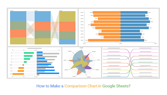
The following are the Comparison Charts:
A Waterfall chart, when utilized as a Comparison Chart, serves as a visual representation that highlights the disparities and similarities between different data points or categories.
It effectively illustrates the changes or variations in values over time or across various segments, enabling easy comparison and analysis of the relative impact of different factors.
This chart type provides valuable insights into trends, patterns, and outliers, facilitating informed decision-making processes across various domains such as finance, sales, and marketing.

A Comparison Bar Chart utilizes bars to represent the same category of items. Still, these bars are placed adjacent to each other.
This chart is a good way to compare data visually. The bars in this chart can help you differentiate items between various groups.
A Comparison Bar Chart is one of the best ways you can make a comparative analysis among various items. Unlike other traditional bar charts, a Comparison Bar Chart digs deeper into your data and shows you the entire picture of your data story.
Below is an illustration of a Comparison Bar Chart.

A Progress Chart is a graph that displays progress in a project or activity. You can use a progress bar in Google Sheets to visually track the advancement of your tasks, making it easier to monitor the progress of your business over time.
A Progress Chart is essential because it can help you compare previous and current sales. You can view such insights from the Progress Chart below.
A Progress Chart is vital, especially in tasks that require continuous evaluation and monitoring. These charts use bars to show the growth of a variable under study.
The bars indicate various variables and how they have progressed over time. When using a Progress Chart, it is essential to customize on color.
You can do this by coloring the previous and current items differently.
Your audience can easily monitor and compare various progress and make conclusions. It can help you view the results side by side, making it easier to see the difference between them in the exact visualization. Learn how to create a chart from a table to enhance your data representation.
You can use this chart to learn how to make a comparison chart in Google Sheets.

The Double Bar Graph is a statistical data representation that uses horizontal or vertical rectangles to reflect different data items in your story.
A Double Bar Graph closely resembles a bar chart. This graph is unique because it uses a pair of bars for each item in your data.
Each bar height indicates its performance in a specific period. Double Bar Graphs use a vertical and horizontal axis to measure and compare the value or magnitude of each bar. You can even incorporate a Pareto chart in Google Sheets to highlight the most significant contributors.
Horizontal Double Bar Graphs allow you to indicate more extended labels. This is because various categories are oriented to how we naturally read text.
However, most individuals will prefer to use vertical bars.
A double bar graph is more effective than a conventional bar graph because it allows you to compare multiple data sets in a single visualization. You can also use a Side-By-Side Bar chart in Google Sheets for this purpose..
This chart is essential in learning how to make a comparison chart in Google Sheets.
Below is an example of a Double Bar Graph.

A Slope Chart is a line chart that you can use to investigate changes and track shifts over time.
A Slope Chart is also called a slope graph.
You will realize that the chart is more concise when you compare slope charts with other comparison charts.
How?
A Slope Chart eliminates unimportant details and allows you to focus on changes and insights. This feature helps your audience to compare various changes in your data items.
But that’s not all.
In most Slope Charts, the focus is primarily on two items. You can compare and contrast how these two items have changed over a specific period.
A Slope Chart shares similar features with a line graph. That is why reading this chart comes naturally.
Slope Charts use parallel vertical axes to represent two variables or time instances. With this in mind, it becomes easy for you to make comparisons.

A Radar Chart is a visual representation showing multiple data points and their differences.
You can use them for comparing the points of two or more different data sets.
There is more to it
You can use them to see which variables have identical values or if any outliers exist in each variable.
Radar Charts are essential in indicating how various variables score in a dataset.
This feature enables a Radar Chart suitable for displaying and comparing various performances.
Each variable has an axis that originates from the center. Every axis has a radial arrangement of equal distances. Still, the axes maintain the same scale between them. Grid lines connect every axis. You can use the grid lines as a guide.
You can plot every item along an individual axis.
All the variables in your dataset will form connections and appear as a polygon, as shown below.

This section will use a practical example to help you understand how to make a comparison chart in Google Sheets.
We will use one of the comparison charts, which is a Comparison Bar Chart. You will need a Google Sheets comparison template to create clear and actionable Google Sheets charts, available in the ChartExpo add-on.
Imagine owning one of the city’s most famous restaurants. To step up in your service delivery, to have to evaluate your various staff’s performance.
You will create a table like the one below.
| Quarters | Products | Orders |
| Q1 | Apple | 374 |
| Q1 | HP | 909 |
| Q1 | Lenovo | 353 |
| Q1 | Dell | 878 |
| Q2 | Apple | 591 |
| Q2 | HP | 731 |
| Q2 | Lenovo | 416 |
| Q2 | Dell | 668 |
| Q3 | Apple | 847 |
| Q3 | HP | 979 |
| Q3 | Lenovo | 718 |
| Q3 | Dell | 459 |
To get started with the ChartExpo, follow the steps below.


It’s as simple as that. You can now gain meaningful insights from your data and understand how to create a comparison chart in Google Sheets. Additionally, Google Sheets offers other chart options, such as the Box and Whisker plot, for further data analysis.
The Store could now compare different products over time. This can help the store focus on improving.
The following video will help you to create a Comparison Bar Chart in Google Sheets.
The best chart for comparison is the Comparison Bar Chart. It is relatively easy to use and interpret, even for a non-technical audience.
With a Comparison Bar Chart or a Mekko chart in Google Sheets, you can compare various items over time. For instance, you can compare multiple product sales in your business across different periods to visualize trends and performance.
In a nutshell, we can see the importance of data visualization in comparing various items. You can achieve better results using comparison charts for business people like you.
We have covered various comparison charts, which include:
Thanks to ChartExpo, we could create a comparison chart in Google Sheets.
This add-on can help you too. Do you want to try it out? Start a 7-day free trial today and improve your data visualization for your business.
How much did you enjoy this article?


SUMPRODUCT in Google Sheets handles multi-condition calculations without extra columns. Master its syntax, uses, and errors. Read on!

An annual budget template in Google Sheets organizes your yearly finances, tracks every dollar, and reveals spending patterns. Read on!

Learn the best graph to show profit and loss with practical examples and use cases. Discover how to visualize your business data, track trends, and make smarter financial decisions.


