• Home
  • Tools dropdown img
    • Spreadsheet Charts

      • ChartExpo for Google Sheets
      • ChartExpo for Microsoft Excel
    • Power BI Charts

      • Power BI Custom Visuals by ChartExpo
    • Word Cloud

  • Charts dropdown img
    • Chart Category

      • Bar Charts
      • Circle Graphs
      • Column Charts
      • Combo Charts
      • Comparison Charts
      • Line Graphs
      • PPC Charts
      • Sentiment Analysis Charts
      • Survey Charts
    • Chart Type

      • Box and Whisker Plot
      • Clustered Bar Chart
      • Clustered Column Chart
      • Comparison Bar Chart
      • Control Chart
      • CSAT Survey Bar Chart
      • CSAT Survey Chart
      • Dot Plot Chart
      • Double Bar Graph
      • Funnel Chart
      • Gauge Chart
      • Likert Scale Chart
      • Matrix Chart
      • Multi Axis Line Chart
      • Overlapping Bar Chart
      • Pareto Chart
      • Radar Chart
      • Radial Bar Chart
      • Sankey Diagram
      • Scatter Plot Chart
      • Slope Chart
      • Sunburst Chart
      • Tornado Chart
      • Waterfall Chart
      • Word Cloud
    • Google Sheets
      Microsoft Excel
  • Services
  • Pricing
  • Contact us
  • Blog
  • Support dropdown img
      • Gallery
      • Videos
      • Contact us
      • FAQs
      • Resources
    • Please feel free to contact us

      atsupport@chartexpo.com

Categories
All Data Visualizations Data Analytics Surveys
Add-ons/
  • Google Sheets
  • Microsoft Excel
  • Power BI
All Data Visualizations Data Analytics Surveys
Add-ons
  • Google Sheets
  • Microsoft Excel
  • Power BI

We use cookies

This website uses cookies to provide better user experience and user's session management.
By continuing visiting this website you consent the use of these cookies.

Ok

ChartExpo Survey


Home > Blog > Microsoft Excel

How to Plot a Speedometer Chart in Excel?

Displaying real-time data in a dashboard can be challenging, especially when clarity and accuracy matter. Choosing the wrong chart often leads to confusion and misinterpretation of key insights.

That’s why selecting the right visualization is essential.

speedometer chart in excel

A Speedometer chart in Excel is designed to present performance data in a simple, easy-to-read format. It helps you quickly understand progress toward a target without analyzing complex tables or multiple charts.

With its clean and minimal design, this chart highlights key metrics at a glance, making it ideal for dashboards that require quick decision-making without overwhelming the viewer.

What is a Speedometer Chart in Excel?

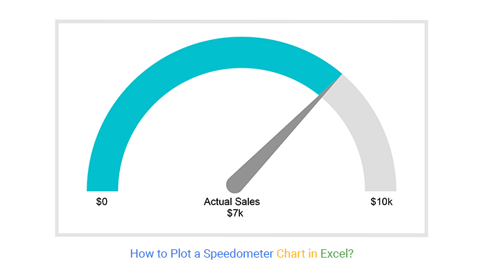
Definition: A Speedometer Chart in Excel (also known as a Gauge Chart or Dial Chart) is a visual tool used to display a single key metric against a defined range, helping users quickly assess performance.

It presents data on a dial with a needle, similar to a car speedometer, making it easy to understand progress at a glance. This chart is commonly used in dashboards to track KPIs such as sales targets, performance scores, or completion rates.

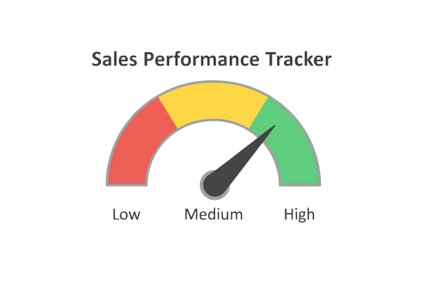
One of its key strengths is simplicity. The chart divides values into segments using color ranges to indicate performance levels. Typically:

  • Green represents optimal or target performance
  • Yellow indicates average or acceptable performance
  • Red highlights low or poor performance

These color cues make it easier to interpret data instantly without detailed analysis. By combining a clear scale with visual indicators, an Excel speedometer chart helps users quickly identify whether performance is on track or needs attention.

How to Create a Speedometer Chart in Excel?

Excel is a widely used tool for data analysis, but it doesn’t offer a built-in speedometer chart. Creating one manually can be complex and time-consuming, especially for beginners.

To simplify the process, you can use an Excel add-in that provides ready-made visualizations and reduces manual effort.

Follow these steps to create a speedometer chart in Excel easily:

Step 1: Install the Add-in

  • Open Excel and install a visualization add-in like ChartExpo from the add-ins store. Once installed, launch it from the Excel interface.

Step 2: Prepare Your Data

  • Organize your data with a clear metric and its corresponding value. For example, include a KPI (like sales performance) and its target range.

Step 3: Select the Chart Type

  • Open the add-in and choose the Excel Speedometer chart (Gauge Chart) from the list of available visualizations.

Step 4: Load Your Data

  • Import or select your dataset within the tool. Ensure the correct values are mapped to the chart.

Step 5: Customize the Chart

  • Adjust ranges, colors, and labels to reflect performance levels (e.g., low, average, high). This improves clarity and visual impact.

Step 6: Insert the Chart into Excel

  • Once satisfied, insert the chart into your worksheet. Position it within your dashboard for better visibility.
speedometer chart

Why Should You Use an Excel Speedometer Chart?

  • Easy to Create

Since a speedometer chart in Excel typically displays a single metric, it’s simple to design and implement. With the right setup or tools, you can build a clear and professional chart quickly.

  • Familiar and Intuitive

Its design resembles a car speedometer or gauge, making it instantly recognizable. Most users can understand it without needing detailed explanations.

  • Easy to Interpret

The visual uses color-coded ranges (such as green, yellow, and red) to indicate performance levels. This makes it easy to assess results at a glance without analyzing complex data.

Top 5 Excel Speedometer Chart Template Examples

1. Sales Performance Tracker

Track monthly sales against targets. The needle shows actual performance, while color ranges highlight whether results are below, meeting, or exceeding expectations.

Sales Performance Speedometer Chart

2. Project Progress Monitoring

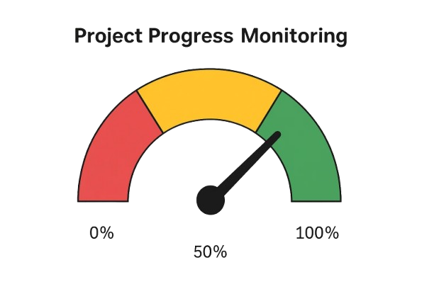
Visualize project completion as a percentage. This helps teams quickly see how much work is done and how close they are to finishing.

Project Progress Monitoring

3. Customer Satisfaction (CSAT) Score

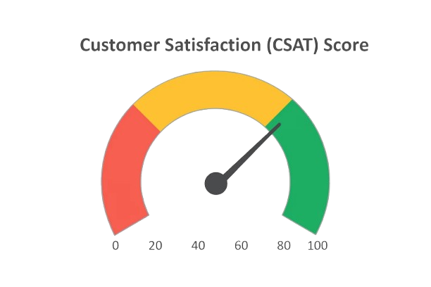
Display customer satisfaction scores on a scale (e.g., 0–100). It provides a quick snapshot of service quality and overall customer experience.

CSAT score

4. Website Conversion Rate Dashboard

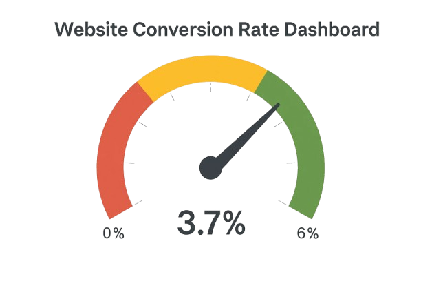
Monitor how effectively your website converts visitors into customers. The chart highlights current performance against a predefined benchmark.

Website Conversion Rate

5. Budget Utilization Gauge

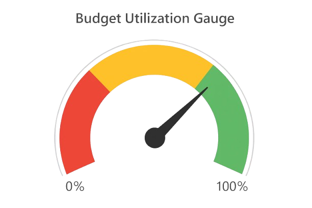
Track how much of the allocated budget has been used. It helps teams manage spending and avoid exceeding limits.

Budget Utilization Guage

When to Use a Speedometer Chart in Excel?

An Excel speedometer chart is most effective for displaying a single key metric against a target or predefined range. Use it in the following scenarios:

1. Tracking Performance Against Targets

When you need to measure progress toward a goal, such as sales targets, revenue goals, or KPI benchmarks.

2. Monitoring a Single KPI

Ideal for dashboards that focus on one important metric at a time, like conversion rate, customer satisfaction, or completion percentage.

3. Presenting Data for Quick Decisions

When stakeholders need a fast, high-level view without analyzing detailed reports or tables.

4. Highlighting Performance Ranges

Useful when your data can be divided into clear zones such as low, average, and high performance.

How to Download & Use the Excel Speedometer Graph Template?

A speedometer chart template in Excel helps you quickly visualize performance against a target without building the chart from scratch. Follow these steps to use it effectively:

Step 1: Download or Open a Template

  • Start by downloading a ready-made speedometer chart template or opening one in Excel. Most templates come pre-designed with a gauge layout and editable fields.

Step 2: Enter Your Data

  • Input your key metric along with minimum and maximum values (e.g., 0 to 100). These values determine how the needle is positioned on the chart.

Step 3: Define Performance Ranges

  • Set thresholds for performance levels, typically divided into segments like low, medium, and high. This helps visually categorize results at a glance.

Step 4: Link Data for Automatic Updates

  • Connect the chart to formulas or live data sources so it updates automatically when values change. This is especially useful for dashboards and ongoing reports.

Step 5: Customize and Share

  • Adjust labels, colors, and formatting to match your dashboard or brand. Once finalized, add the chart to your report or export it for sharing.

Advantages of the Speedometer Chart in Excel

  • Instant Performance Snapshot: Provides a quick view of how a metric performs against a target. With a single glance, users can identify whether performance is low, average, or high using clear visual indicators.
  • Strong Visual Appeal: The gauge-style design is visually engaging and easy to understand. It works especially well for presentations and dashboards used by non-technical audiences.
  • Ideal for Single KPIs: Best suited for tracking one key metric at a time, such as revenue, conversion rate, or completion percentage. This keeps the focus clear and avoids clutter.
  • Flexible Customization: You can adjust ranges, colors, thresholds, and labels to match specific goals or performance criteria, making the chart adaptable to different use cases.
  • Effective for Dashboards: Works well in executive dashboards by summarizing performance in a compact format. Multiple charts can be placed side by side for quick KPI comparisons.

Disadvantages of the Speedometer Chart in Excel

  • No Built-in Chart Type: Excel does not provide a native speedometer chart in Excel. Creating one requires combining multiple chart types, which can be time-consuming and complex for beginners.
  • Limited to a Single Metric: This chart displays only one value at a time, making it unsuitable for comparing multiple datasets or analyzing trends over time.
  • Inefficient Use of Space: Despite showing just one KPI, it occupies a relatively large area on a dashboard, which can be limiting when space is constrained.
  • Risk of Misinterpretation: If scales or ranges are not clearly defined, the chart can give a misleading impression of performance. Proper labeling and design are essential.
  • Maintenance Can Be Challenging: In dynamic reports, updating ranges, values, and formatting manually can become tedious and increase the risk of errors.

FAQs

Which chart is similar to the speedometer chart in Excel?

The Doughnut Chart is the base used to create a speedometer in Excel. It is combined with a Pie Chart to form the needle. Together, they mimic the look of a traditional gauge.

Does Excel have a speedometer chart?

Excel doesn’t offer a built-in speedometer or Needle Graph. However, you can create one manually using Doughnut and Pie Charts. Templates and add-ins can simplify this process.

What is the purpose of a Speedometer Chart?

A Speedometer Chart is a visualization design you can use to display progressive data points.

The advantage of this visualization design lies in its ease of interpretation. It uses various colors to divide a scale into segments representing different values of the same metric.

Can Excel create a speedometer chart without add‑ins?

Yes, by combining a doughnut chart (for the gauge) with a pie chart (for the needle), but this is time-consuming. Add-ins like ChartExpo make it easier.

Wrap Up

Displaying real-time data in a dashboard can be challenging, especially if the wrong chart distorts key insights or confuses your audience.

This is where a Speedometer chart in Excel shines. Its minimalist design makes it easy to interpret at a glance, providing instant insights without overwhelming the viewer.

Since Excel doesn’t offer a ready-made option, the easiest solution is to use a third-party tool like ChartExpo. This Excel add-in comes with pre-built, visually appealing Speedometer Graphs that require no coding or technical skills.

Sign up for a 7-day free trial today to create professional, easy-to-read charts that make your dashboards more insightful.

How much did you enjoy this article?

ExcelAd2
Start Free Trial!
120145

Related articles

next previous
Microsoft Excel11 min read

Sparkline in Excel: Visual Insights at a Glance

Learn how to use sparklines in Excel to quickly visualize trends inside cells. Discover types, creation steps, customization, use cases, benefits, and best practices.

Microsoft Excel10 min read

Confidence Interval Graph and How to Interpret It?

Learn what a confidence interval graph is, how to create it in Excel, and how to interpret results to make more reliable, data-driven decisions.

Microsoft Excel9 min read

Correlation Matrix in Excel for Meaningful Insights

A correlation matrix in Excel helps identify relationships between variables. Learn how to create, read, and use it for effective data analysis.

Microsoft Excel10 min read

How to Create a Clustered Column Chart in Excel?

Learn how to create a clustered column chart in Excel with real use cases, step-by-step guide, tips, and common mistakes.

Microsoft Excel11 min read

How to Make Cool Excel Charts & Graphs?

Discover 11 cool Excel charts and graphs and learn how to turn raw data into clear insights for better analysis, reporting, and decisions.

ChartExpo logo

Turn Data into Visual
Stories

CHARTEXPO

  • Home
  • Gallery
  • Videos
  • Services
  • Pricing
  • Contact us
  • FAQs
  • Privacy policy
  • Terms of Service
  • Sitemap

TOOLS

  • ChartExpo for Google Sheets
  • ChartExpo for Microsoft Excel
  • Power BI Custom Visuals by ChartExpo
  • Word Cloud

CATEGORIES

  • Bar Charts
  • Circle Graphs
  • Column Charts
  • Combo Charts
  • Comparison Charts
  • Line Graphs
  • PPC Charts
  • Sentiment Analysis Charts
  • Survey Charts

TOP CHARTS

  • Sankey Diagram
  • Likert Scale Chart
  • Comparison Bar Chart
  • Pareto Chart
  • Funnel Chart
  • Gauge Chart
  • Radar Chart
  • Radial Bar Chart
  • Sunburst Chart
  • see more
  • Scatter Plot Chart
  • CSAT Survey Bar Chart
  • CSAT Survey Chart
  • Dot Plot Chart
  • Double Bar Graph
  • Matrix Chart
  • Multi Axis Line Chart
  • Overlapping Bar Chart
  • Control Chart
  • Slope Chart
  • Clustered Bar Chart
  • Clustered Column Chart
  • Box and Whisker Plot
  • Tornado Chart
  • Waterfall Chart
  • Word Cloud
  • see less

RESOURCES

  • Blog
  • Resources
  • YouTube
SIGN UP FOR UPDATES

We wouldn't dream of spamming you or selling your info.

© 2026 ChartExpo, all rights reserved.