Categories
A Line Chart is arguably among the most straightforward visualization designs best suited for displaying annual financial data for a 10-year period.
Besides, the chart is amazingly easy to read and interpret. And it’s relatively straightforward to plot Line Charts.
Google Sheets has very basic Line Charts. Yes, the spreadsheet tool comes with pretty basic charts that need more time and effort in editing.
You don’t have to do away with Google Sheets. You can supercharge it by installing third-party add-ons to access ready-to-use and visually appealing Line Charts.
We use financial analysis models to analyze the following:
And this is done by sifting through a sea of numbers for actionable insights. Some of the sources of financial data for analysis include:
We’ll address the following question in the coming section: Which chart is best suited for financial analysis?
The ideal chart for displaying insights into your financial data should also show trends, accelerations, decelerations, or volatility. Besides, it should be easy to decode.
A Line Chart is one of the few visualization designs you can use to analyze the cash flow of your financial data. The chart can present a massive amount of information without causing clutter.
In the coming section, we’ll cover the following topic: how to make a chart for displaying annual financial data for a 10-year period.
Google Sheets is one of the go-to data visualization tools for businesses and professionals.
However, this freemium spreadsheet tool comes with very basic Line Charts, which require a lot of extra work in editing. Also, it lacks a sizable number of Line Charts with multiple lines (highlighted earlier).
Well, you don’t have to do away with the spreadsheet app.
You can turn Google Sheets into a reliable data visualization tool loaded with advanced charts, like a Waterfall chart in Google Sheets, by installing third-party apps, such as ChartExpo.
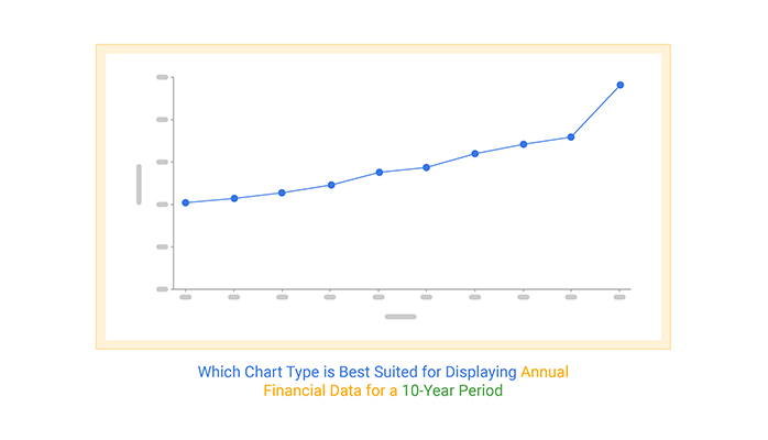
Which chart type is best suited for displaying annual financial data for a 10-year period? Keep reading to discover the answer to the question above.
ChartExpo is a Line Chart maker that comes as an add-on you can easily install in your Google Sheets.
With 50+ ready-made and insightful data visualizations, ChartExpo turns your complex, raw data into compelling, easy-to-digest, visual renderings that tell the story of your data. ChartExpo produces simple and clear Line Charts for your data stories with just a few clicks.
Yes, ChartExpo generates amazingly easy different types of charts and graphs to interpret, even for non-technical audiences.
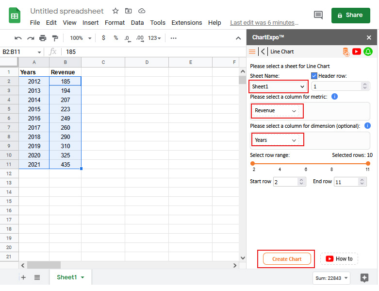
This section will use a Line Chart to display insights into the tabular data below.
| Years | Revenue |
| 2012 | 185 |
| 2013 | 194 |
| 2014 | 207 |
| 2015 | 223 |
| 2016 | 249 |
| 2017 | 260 |
| 2018 | 290 |
| 2019 | 310 |
| 2020 | 325 |
| 2021 | 435 |
Install the ChartExpo add-on for Google Sheets from the link and then follow the simple and easy steps below.


Which chart type is best suited for displaying annual financial data for 10 years? A Line Chart is one of the tested and proven visualization designs for the task.
Line Charts are clear and simple to interpret due to their minimalist design.
Line Charts are among the visualization designs that are familiar to many. Besides, they’re incredibly easy to display insights using the chart. You just need a single metric and dimension to get going.
A Line Chart is one of the few visualization designs you can use to display insights into financial data. More so, the chart can present a massive amount of information without clutter.
The chart can also display trends, accelerations, decelerations, and volatility. And it’s easy to decode.
The answer is a Line Chart.
The graph is among the few designs you can use to visualize your financial data. The chart can present a massive amount of information using its limited space.
You can use a Line Chart to display trends, accelerations, decelerations, or volatility.
Which chart is best suited for displaying annual financial data for 10 years?
A Line Chart is among the most straightforward visualization designs best suited for displaying annual financial data for 10 years.
Besides, the chart is amazingly easy to read and interpret. And it’s relatively straightforward to plot Line Charts.
Google Sheets has very basic Line Charts. Yes, the spreadsheet tool comes with pretty basic charts that need more time and effort in editing.
We recommend installing a particular add-on called ChartExpo in your Google Sheets to access ready-to-use, insightful, and visually appealing Line Charts.
ChartExpo comes loaded with easy-to-interpret and visually stunning Line Charts you can use for data stories.
You don’t need programming or coding skills to visualize your data using this tool. Furthermore, you can easily export your charts in the world’s most recognized formats, JPEG and PNG.
How to make a chart for displaying annual financial data for 10 years should never throw a curveball at you.
Sign up for a 7-day free trial today to access ready-made, insightful, and visually appealing Line Charts.
How much did you enjoy this article?


Google Sheets apps boost productivity with smarter data handling. Click here to learn how to use them for better charts, faster analysis, and smarter decisions.
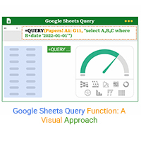
The Google Sheets query function filters and analyzes data fast. Click here to learn the syntax with examples and best practices to boost your data analysis.

Google Sheets automation helps you save time and reduce errors with smart tools. Learn how to automate, analyze, and visualize your data with ease.