Categories
Software teams that ship faster do not do it by accident. They measure what matters. What are DORA Metrics? They are the four performance indicators that translate engineering activity into business outcomes, giving leaders a data-backed view of delivery speed and system reliability.
Developed by the DevOps Research and Assessment program, this framework is now the gold standard for evaluating engineering delivery.
By tracking two velocity signals and two stability signals, teams stop guessing and start improving. This guide covers each metric, the formulas, and how to apply the framework.
Definition: DORA Metrics are a set of four quantitative indicators created by the DevOps Research and Assessment team to measure how effectively software organizations deliver value.
Each indicator captures a distinct dimension of engineering performance, helping teams understand not just how much they ship, but how safely and sustainably they do it.
Rather than rewarding raw activity, this framework connects process decisions to real outcomes. Teams learn whether pipelines are fast, releases are stable, and systems can recover quickly.
Guesswork is expensive. This framework gives engineering organizations a structured, reproducible way to assess delivery health without relying on subjective judgment or vanity counters.
Key advantages include:
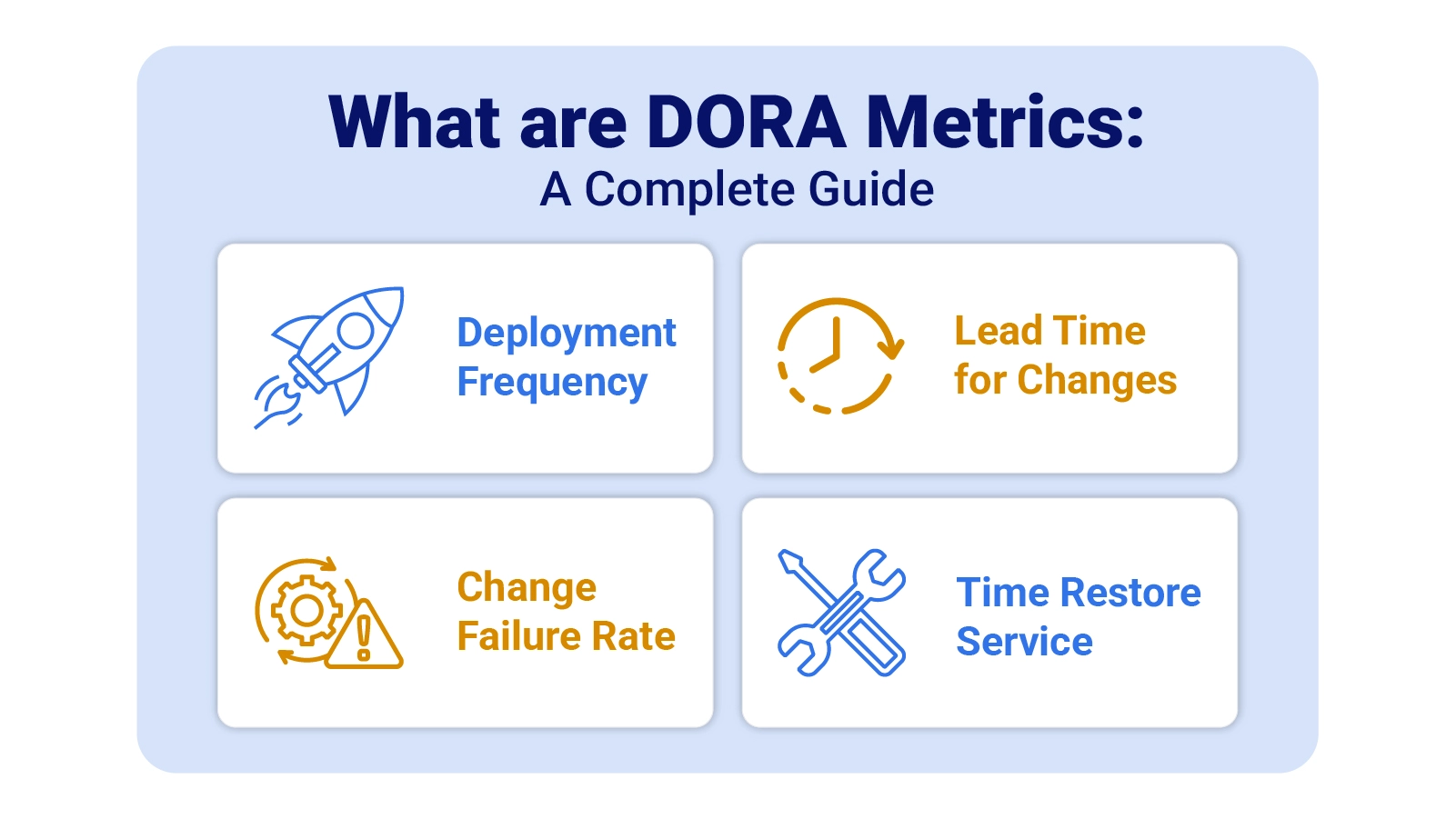
Each of the four core indicators targets a different pressure point in the software delivery lifecycle. Together, they cover the full arc from code commit to production stability.
Counts how often a team pushes code successfully to production. High frequency signals mature automation, disciplined CI/CD pipelines, and a culture of small, incremental releases. Within the context of agile performance metrics, this indicator reflects delivery adaptability and release confidence. Sustained frequency growth shows that deployment workflows are becoming less friction-prone over time.
Measures the elapsed time between a code commit and its arrival in production. Short lead times point to efficient review gates, minimal handoff delays, and fast validation cycles. This reading tells teams how quickly they can respond to user needs or market changes. Persistent lead time growth often signals review backlogs, flaky test suites, or manual approval bottlenecks.
Captures the share of deployments that trigger incidents, require rollbacks, or degrade service. A low rate reflects disciplined testing, hardened release practices, and stable system architecture. Among reliability-focused performance metrics, this is the clearest signal of release safety. Watching it over time helps teams balance shipping speed with production confidence.
Tracks how long it takes a team to return a degraded system to full operation after a failure. Rapid restoration reflects strong monitoring coverage, practiced incident response playbooks, and resilient service design. Unlike the other three indicators, this metric focuses on recovery capability rather than prevention. Steady improvement signals growing operational readiness.
Each calculation maps to a straightforward arithmetic expression. The inputs come from pipeline telemetry and incident logs that most CI/CD platforms already capture automatically, making baseline measurement achievable without custom tooling.
Reflects release cadence by dividing the total number of successful production deployments by a defined time period.
Formula: Total Deployments ÷ Time Period
Quantifies delivery speed by calculating the elapsed time between a commit event and its corresponding production release.
Formula: Production Release Time – Commit Time
Expresses release reliability as the share of deployments that trigger incidents, service degradation, or rollbacks.
Formula: Failed Deployments ÷ Total Deployments × 100
Calculates recovery efficiency by averaging total incident resolution time across all production disruptions in a period.
Formula: Total Incident Resolution Time ÷ Number of Incidents
Putting the four indicators into a real-world context makes their practical value far easier to grasp and act on.
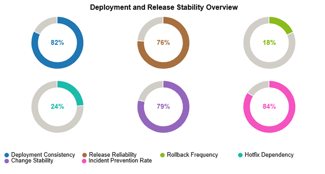
This example depicts a team with a highly reliable deployment pipeline, consistent release velocity, low failure rates, and strong recovery performance across the measured window.

This scenario highlights a pattern of steady deployment volume, high release reliability, minimal rollback risk, and proactive practices that prevent incidents from reaching end users.
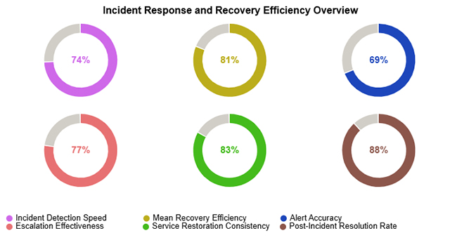
This view captures efficient early detection of service degradation, strong throughput in incident resolution, and consistent restoration of normal operations across measured events.
Embedding DORA KPIs into an existing operation requires deliberate planning rather than bolt-on measurement. A phased rollout produces more reliable signals and lasting adoption.
Spreadsheets offer a practical starting point for delivery measurement, especially for teams still building their data infrastructure.
Arrange columns for deployments, commits, incidents, and resolution times in a clear, query-friendly layout.
Use spreadsheet formulas to calculate frequency, lead times, failure percentages, and average restoration durations.
Ordering rows by date reveals performance trends, one-off anomalies, and meaningful shifts over time.
Raw figures rarely communicate trends on their own. Tools like ChartExpo convert spreadsheet calculations into visual dashboards, much like website performance metrics translate traffic data into actionable insight for stakeholders.
Why use ChartExpo?
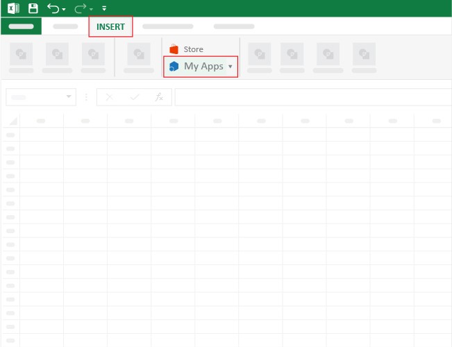
How to install ChartExpo in Excel?
ChartExpo integrates with both Microsoft Excel and Google Sheets. Follow the install prompts for your preferred platform and start building charts with just a few clicks directly inside the tool you already use.
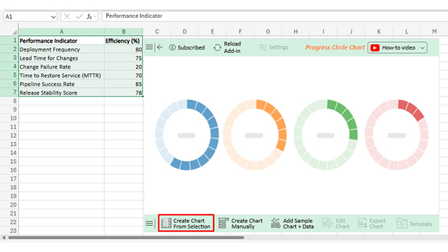
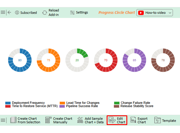
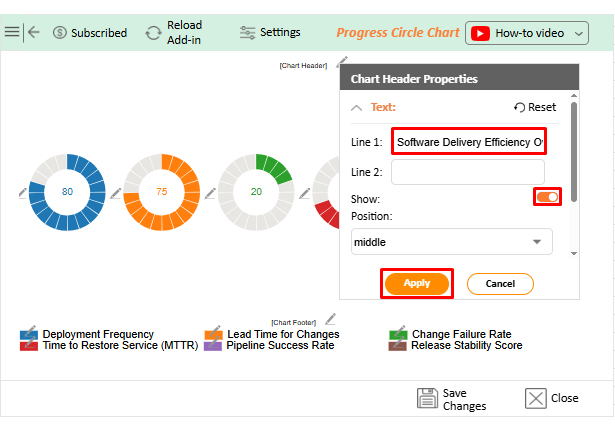
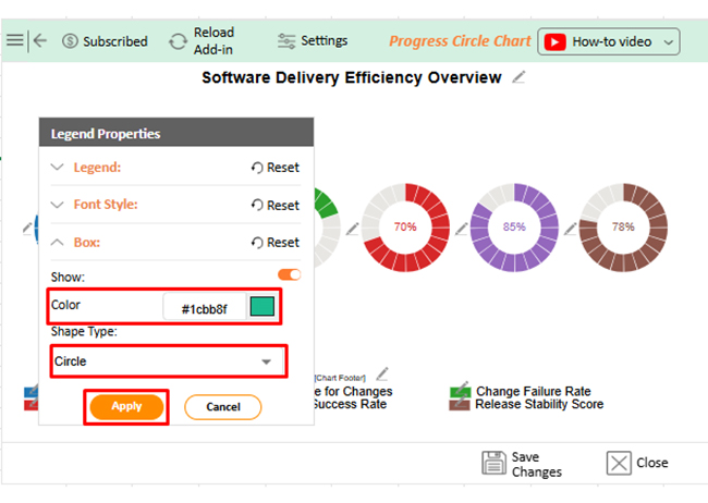
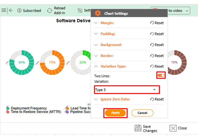
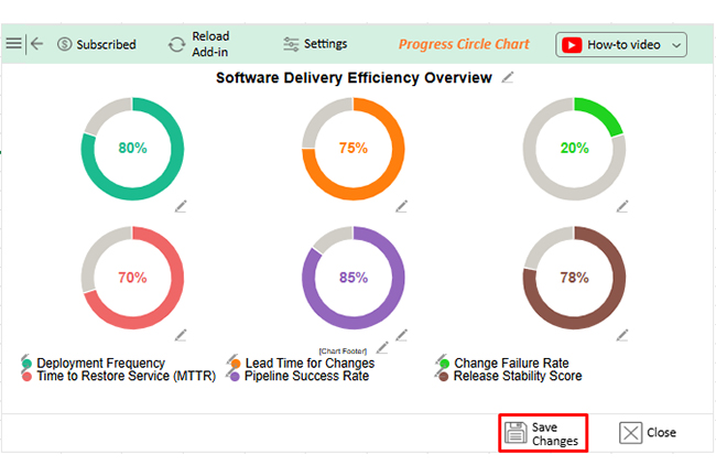
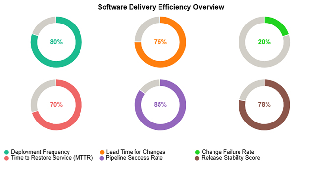
Consider we have the following data for the Progress Circle Chart.
|
Performance Indicator |
Efficiency (%) |
| Deployment Frequency | 80 |
| Lead Time for Changes | 75 |
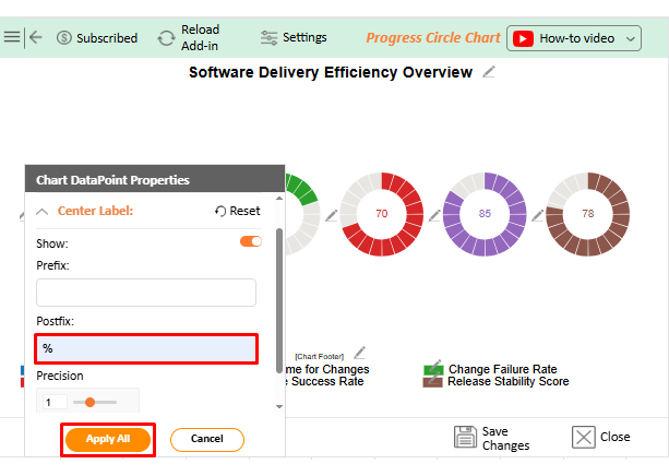
| Change Failure Rate | 20 |
| Time to Restore Service (MTTR) | 70 |
| Pipeline Success Rate | 85 |
| Release Stability Score | 78 |
Teams that commit to structured delivery measurement see consistent gains across release quality, operational resilience, and cross-functional efficiency.
Measurement reveals where to improve. Sustainable gains require consistent engineering discipline applied at the process level.
The standard framework defines four core indicators: deployment frequency, lead time for changes, change failure rate, and MTTR. A fifth reliability-oriented measure appears in some extended interpretations, but the foundational DORA model is built on these four.
DORA stands for DevOps Research and Assessment, a research initiative that studied thousands of software teams to identify which engineering practices most reliably predict high delivery performance and operational stability.
Yes. Many teams start with spreadsheets by recording deployment events, commit timestamps, and incident data in structured columns, then scaling to dedicated tools as measurement needs grow.
What are DORA Metrics in practice? They are the difference between engineering teams that improve by instinct and those that improve by design. Deployment frequency, lead time, change failure rate, and MTTR each expose a different pressure point in the delivery lifecycle, giving leaders the signal clarity needed to prioritize the right investments at the right time.
When paired with consistent analysis and strong visualization, the framework transforms raw pipeline data into decisions. Teams that track these indicators regularly ship with greater confidence, recover from failures faster, and build the operational discipline that compounds over time into a genuine competitive edge.
How much did you enjoy this article?


Calculate accounts receivable turnover ratio to measure credit collection speed, improve cash flow, and strengthen your financial strategy. Read on!

Change Management KPIs are the key to tracking adoption, performance, and ROI during transitions. Find out which metrics matter. Read on!

Data collection methods and techniques determine the quality of every insight you act on. Explore key approaches for gathering reliable data. Read on!


