• Home
  • Tools dropdown img
    • Spreadsheet Charts

      • ChartExpo for Google Sheets
      • ChartExpo for Microsoft Excel
    • Power BI Charts

      • Power BI Custom Visuals by ChartExpo
    • Word Cloud

  • Charts dropdown img
    • Chart Category

      • Bar Charts
      • Circle Graphs
      • Column Charts
      • Combo Charts
      • Comparison Charts
      • Line Graphs
      • PPC Charts
      • Sentiment Analysis Charts
      • Survey Charts
    • Chart Type

      • Box and Whisker Plot
      • Clustered Bar Chart
      • Clustered Column Chart
      • Comparison Bar Chart
      • Control Chart
      • CSAT Survey Bar Chart
      • CSAT Survey Chart
      • Dot Plot Chart
      • Double Bar Graph
      • Funnel Chart
      • Gauge Chart
      • Likert Scale Chart
      • Matrix Chart
      • Multi Axis Line Chart
      • Overlapping Bar Chart
      • Pareto Chart
      • Radar Chart
      • Radial Bar Chart
      • Sankey Diagram
      • Scatter Plot Chart
      • Slope Chart
      • Sunburst Chart
      • Tornado Chart
      • Waterfall Chart
      • Word Cloud
    • Google Sheets
      Microsoft Excel
  • Services
  • Pricing
  • Contact us
  • Blog
  • Support dropdown img
      • Gallery
      • Videos
      • Contact us
      • FAQs
      • Resources
    • Please feel free to contact us

      atsupport@chartexpo.com

Categories
All Data Visualizations Data Analytics Surveys
Add-ons/
  • Google Sheets
  • Microsoft Excel
  • Power BI
All Data Visualizations Data Analytics Surveys
Add-ons
  • Google Sheets
  • Microsoft Excel
  • Power BI

We use cookies

This website uses cookies to provide better user experience and user's session management.
By continuing visiting this website you consent the use of these cookies.

Ok

ChartExpo Survey


Home > Blog > Microsoft Excel

10 Tips to Design a Good Survey Format

Imagine you’re walking down the street, minding your own business. Out of nowhere, a stranger approaches you with a clipboard and a pen.

survey format

“Excuse me, sir/madam,” they say, “would you mind answering a few questions about your shopping habits?”

You glance at the survey form they’re holding and see it’s a dense wall of text. It’s crammed with tiny checkboxes and obscure jargon.

You groan inwardly but smile politely and begin to fill it out. We’ve all been there, and it’s not a pleasant experience.

Surveys are an excellent way to gather information and insights from your audience. But designing a good survey that people want to complete is easier said than done.

Fear not.

I am here to guide you through crafting an engaging and effective survey format. We’ll explore ten tips to help you create an easy-to-understand, fun-to-fill-out survey yielding valuable insights.

Table of Content:

  1. What is a Survey Format?
  2. Why is Survey Format Important?
  3. How Does a Good Survey Format Look Like?
  4. What Are the Principles of Survey Format?
  5. 10 Tips to Design a Good Survey Format
  6. How Do You Write a Survey Format?
  7. How to Analyze Survey Format Data?
  8. Wrap Up

What is a Survey Format?

A survey format refers to the structure and design of a questionnaire for collecting data from respondents. It includes the arrangement of questions, response options, and overall layout.

The format can vary depending on the purpose of the survey, such as when conducting a longitudinal survey, where data is collected from the same respondents over different points in time to observe changes. It aims to ensure clarity, consistency, and ease of survey data collection.

Why is Survey Format Important?

  • Clarity

A well-designed survey format ensures the questions are clear and easily understandable. This reduces confusion and ambiguity, leading to more accurate and reliable responses.

  • Consistency

Survey formats ensure consistency by providing all respondents with the same questions and response options. This uniformity makes analyzing and comparing responses simpler, creating a standardized data collection framework.

  • Data Quality

The format can impact the quality of data collected. Clear instructions and structured response options help ensure respondents provide accurate and meaningful responses. Consequently enhancing the overall data quality.

  • Analysis and Reporting

The format of a survey directly influences the ease of data analysis and reporting. A well-structured format allows for efficient data processing, categorization, and statistical analysis. Consequently facilitating the efficient extraction of valuable insights from the data.

How Does a Good Survey Format Look Like?

A good survey format typically exhibits the following characteristics:

  • Clear and concise: Survey questions should be clear and straightforward, devoid of jargon or perplexing language. Each question should convey a single idea, making it easier for respondents to understand and provide accurate responses.
  • Logical flow: The survey should have a logical sequence of questions. Start with more general or introductory questions and progress to more specific or detailed ones. This flow helps maintain the respondents’ engagement and ensures a smooth progression through the survey.
  • Structured response options: Providing well-defined response options is crucial for collecting standardized data. Whether it’s multiple-choice, Likert scale chart, etc., the response options should be comprehensive, mutually exclusive, and collectively exhaustive. This allows respondents to choose the option that best represents their viewpoint.
  • Avoid leading or biased questions: The survey format should steer clear of leading or biased questions that may influence respondents’ answers. Questions should be neutral and objective, allowing respondents to express their genuine opinions or experiences.
  • Adequate spacing and formatting: The survey layout should be visually appealing and easy to read. Sufficient spacing between questions and response options, proper font size, and clear formatting contribute to a user-friendly experience.

What Are the Principles of Survey Format?

The principles of the survey format include the following:

  • Clarity: Survey questions should be clear, concise, and easily understood by respondents. Ambiguity or confusion can lead to inaccurate or incomplete responses.
  • Simplicity: Avoid complex or convoluted language, technical terms, or excessive use of jargon. This ensures that the survey is accessible to a wide range of respondents.
  • Consistency: Maintain consistency in the survey format throughout. Use consistent scales, response options, and question formats to ensure uniformity and comparability of responses.

10 Tips to Design a Good Survey Format

Are you tired of receiving survey responses that make you want to pull your hair out? Worry no more. With these 10 tips, you’ll design a survey format in Excel that all respondents will enjoy filling out.

  1. Clarity and simplicity: Ensure survey questions are clear, concise, and easily understandable. Avoid complex language or jargon that could confuse respondents.
  2. Logical flow: Arrange questions logically, progressing smoothly from general to specific topics. This helps respondents navigate through the survey more easily.
  3. Visual organization: Use headers, subheadings, and sections to organize the survey visually. This makes it easier for respondents to follow and understand the structure.
  4. Consistency in formatting: Maintain consistent formatting throughout the survey, including font size, style, and colors. Consistency creates a cohesive and professional appearance.
  5. Appropriate question types: Choose the appropriate question types for different purposes, such as multiple-choice, Likert scale, or open-ended questions example. The question types you select should align with the information you want to collect.
  6. Thoughtful response options: Provide clear and relevant response options that cover the range of possible answers. Avoid overlapping or ambiguous response options that could confuse respondents.
  7. Readability and white space: Use legible fonts, appropriate font sizes, and ample white space to enhance readability. Avoid cluttered layouts that can overwhelm respondents.
  8. Clear instructions and guidance: Include clear instructions at the beginning of the survey to guide respondents on how to proceed. Provide additional guidance or explanations when necessary for specific questions.
  9. Mobile-friendly design: Optimize the survey format for mobile devices, as many respondents may complete surveys on smartphones or tablets. Ensure the survey is easily navigable and displays properly on smaller screens.
  10. Pre-testing and refinement: Before launching the survey, test it with a small sample of respondents to identify any issues. Use their survey feedback to refine and improve the survey format.

How Do You Write a Survey Format?

Writing a survey format involves structuring the questions, response options, and overall survey flow. Here’s a step-by-step guide to help you create a survey format:

  1. Define your survey objective: Identify the purpose of your survey. What information are you trying to gather, and what decisions will the survey results help you with?
  2. Determine your target audience: Understand who your survey participants are and tailor your questions to their characteristics and preferences. Consider demographics, knowledge level, and any other relevant factors.
  3. Start with an introduction: Begin the survey with a brief introduction that explains the purpose of the survey. Also, assure respondents of anonymity and set expectations regarding the time required to complete the survey.
  4. Use a mix of questions: Choose appropriate questions based on the information you want to collect. Mix question types to capture both quantitative data and qualitative data.
  5. Group questions logically: Organize questions into sections or thematic groups. This helps maintain a coherent flow and makes it easier for participants to navigate the survey. Each section should have a clear heading that indicates the topic or theme.
  6. Keep it concise and focused: Avoid complex sentence structures and ambiguous terms. Be direct and to the point to minimize participant confusion.
  7. Pilot test the survey: Before launching the survey, conduct a pilot test with a small sample of participants. This will help you identify any issues, ambiguities, or confusing questions. Then revise and refine the survey based on the feedback received.
  8. Review and finalize: Review the survey format for errors or inconsistencies and make any necessary revisions. Ensure the survey is visually appealing and easy to read.

How to Analyze Survey Format Data?

How do you turn those piles of data into meaningful insights? Worry less; ChartExpo for Excel is here to help. It will make you look like a data rockstar. It doesn’t matter whether you’re a seasoned analyst or a newbie. Creating insightful visualizations with ChartExpo is as easy as counting 123.

Benefits of Using ChartExpo

  • ChartExpo is the perfect data visualization tool for creating insightful visualizations. No coding is required.
  • Take your visuals to the next level by customizing every aspect with ChartExpo’s plethora of options.
  • ChartExpo’s free 7-day trial and $10 monthly plan are a steal.

How to Install ChartExpo in Excel?

  1. Open your Excel application.
  2. Open the worksheet and click the “Insert” menu.
  3. You’ll see the “My Apps” option.
  4. In the office Add-ins window, click “Store” and search for ChartExpo on my Apps Store.
  5. Click the “Add” button to install ChartExpo in your Excel.

ChartExpo charts and graphs are available both in Google Sheets and Microsoft Excel. Please use the following CTAs to install the tool of your choice and create beautiful visualizations with a few clicks in your favorite tool.

Example

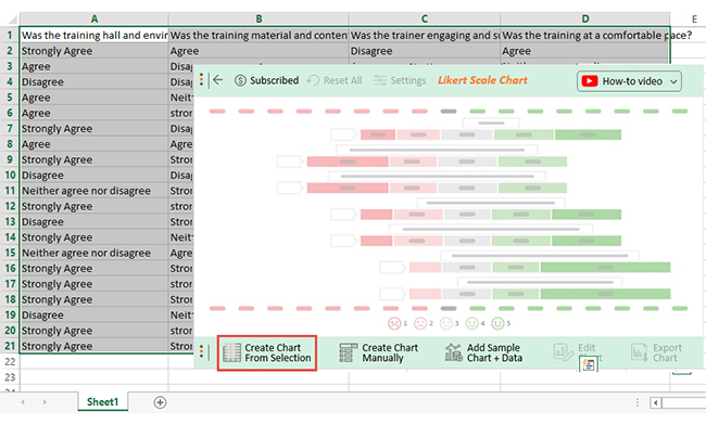
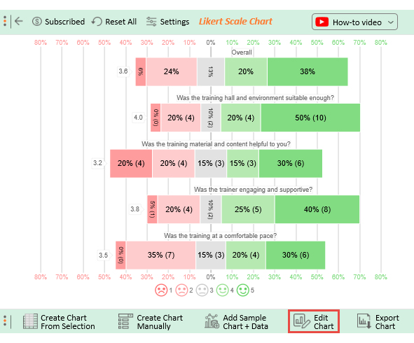
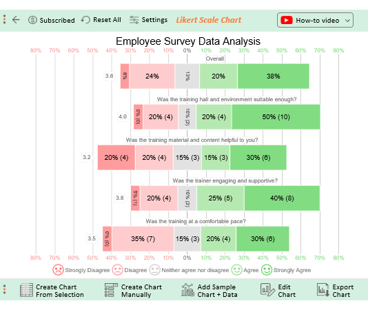
Below is a format survey questionnaire of an employee training survey.

  • Was the training environment suitable enough?
  • Was the training material helpful?
  • Was the trainer supportive?
  • Was the training done at a comfortable pace?

Employees provide feedback using the response scale below.

  1. Strongly Disagree
  2. Disagree
  3. Neither agree nor disagree
  4. Agree
  5. Strongly Agree

Assume the survey yields the results table below.

Was the training environment suitable enough? Was the training material helpful? Was the trainer supportive? Was the training done at a comfortable pace?
Strongly Agree Agree Disagree Agree
Agree Disagree Agree Neither agree nor disagree
Disagree Disagree Neither agree nor disagree Strongly Agree
Agree Neither agree nor disagree Disagree Disagree
Agree strongly Disagree strongly Disagree Agree
Strongly Agree Disagree Agree Neither agree nor disagree
Agree Agree Disagree Strongly Agree
Strongly Agree Strongly Agree Strongly Agree Disagree
Disagree Disagree Strongly Agree Strongly Agree
Neither agree nor disagree Strongly Agree Agree Disagree
Strongly Agree strongly Disagree Strongly Agree Agree
Disagree Strongly Agree Strongly Agree Disagree
Strongly Agree Neither agree nor disagree Strongly Agree Strongly Agree
Neither agree nor disagree Agree Agree Neither agree nor disagree
Strongly Agree Strongly Agree Disagree Strongly Agree
Strongly Agree strongly Disagree Neither agree nor disagree Disagree
Strongly Agree Strongly Agree Strongly Agree Agree
Disagree Neither agree nor disagree Strongly Agree Strongly Agree
Strongly Agree strongly Disagree Agree Disagree
Strongly Agree Strongly Agree Strongly Agree Disagree

This table contains example data. Expect many responses and questions in real life.

  • To get started with ChartExpo, install ChartExpo in Excel.
  • Now Click My Apps from the INSERT menu.
insert chartexpo in excel
  • Choose ChartExpo from My Apps, then click Insert.
open chartexpo in excel
  • Once it loads, choose the “Likert Scale Chart” from the charts list.
search likert scale chart in excel
  • Click the “Create Chart From Selection” button after selecting the data from the sheet, as shown.
create likert scale chart in excel
  • When you click the “Create Chart From Selection” button, you have to map responses with numbers manually. The Likert scale has this arrangement:
    • Strongly Disagree=1
    • Disagree=2
    • Neither agree nor disagree=3
    • Agree=4
    • Strongly Agree=5

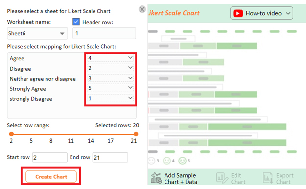
Once all is set, click the “Create Chart” button.

make likert scale chart in excel
  • ChartExpo will generate the visualization below for you.
edit likert scale chart in excel
  • If you want to have the title of chart, click on Edit Chart, as shown in the above image.
  • To change the title of the chart, click on the pencil icon that is available very next to Chart Header.
  • It will open the properties dialog. Under the Text section, you can add a heading in Line 1 and enable the Show Give the appropriate title of your chart and click on Apply button.
set likert scale chart in excel
  • Let’s say you want to add text responses instead of numbers against every emoji.
  • Click the pencil icon next to the respective emoji. Expand the “Label” properties and write the required text. Then click the “Apply All” button.
  • Click the “Save Changes” button to persist the changes.
save likert scale chart in excel
  • The final chart will look as below.
online survey format

Insights

  • 50% of employees found the pace of the training session satisfactory. 35% disagreed, and 15% remained neutral.
  • 65% found the trainer supportive, 25% agreed, and 10% responded neutrally.
  • 45% found the training material helpful, 40% disagreed, and 15% remained neutral.
  • Regarding the training environment, 70% agreed that it was comfortable. 20% did not agree with the environment, and 10% remained neutral.
  • 58% of employees responded positively to the survey questions, 29% gave negative responses, and 13% remained neutral.

FAQs

What are the methods of survey format?

The methods of survey format include;

  • Selecting appropriate question types (e.g., multiple-choice, Likert scale).
  • Organizing questions logically.
  • Utilizing skip logic or branching.
  • Keeping the survey concise.
  • Piloting the survey before finalizing it.

What are examples of survey format types?

  • Multiple-choice format: Participants choose one or more options from a predefined list.
  • Likert scale format: Respondents rate their agreement or disagreement on a scale.
  • Rating scale format: Participants provide a numerical rating to assess something.
  • Open-ended format: Respondents provide written responses to a question without predefined options.

Wrap Up

Designing a good survey format is essential to gather accurate and valuable data. Following these ten tips, you can create a survey that effectively captures the information you seek. At the same time, ensuring a positive experience for participants.

Define the survey objective and target audience to tailor your questions accordingly. Then, structure your survey with a clear introduction, logical grouping of questions, and use appropriate question types. Utilize skip logic or branching to personalize the survey experience and eliminate unnecessary questions.

Before launching the survey, conduct a pilot test to identify any issues and refine the format. Then review and finalize the survey for errors and inconsistencies.

Remember, a well-designed survey format encourages higher response rates, improves data quality, and yields insights to inform decisions. For an effortless gleaning of insights from your survey data, use ChartExpo for Excel.

Why ChartExpo?

No coding is required. The user-friendly interface makes chart creation easy and saves time. This allows you to focus on extracting insights from the data.

How much did you enjoy this article?

ExcelAd2
Start Free Trial!
127200

Related articles

next previous
Microsoft Excel10 min read

Invoice Tracker Template in Excel for Better Insights

An invoice tracker Excel template helps track invoices, due dates, and payments. Learn how to use this template for better financial management.

Microsoft Excel12 min read

Key Performance Indicators in Healthcare for Better Insights

Key Performance Indicators in healthcare track patient care and efficiency. Learn about these KPIs, top examples, and how to use them to improve outcomes.

Microsoft Excel10 min read

BMI Calculation Formula in Excel for Better Fitness Insights

The BMI calculation formula in Excel helps track and analyze body mass index. Explore step-by-step instructions and tips to simplify BMI tracking in Excel.

Microsoft Excel29 min read

How to Create a Tornado Chart in Excel? A Complete Guide

Click to learn how to plot a Tornado Chart in Excel using easy-to-follow steps. Also, we’ll address the following question: what is a Tornado Diagram?

Microsoft Excel14 min read

How to Create a Scatter Plot in Excel with 3 Variables?

Click to discover how to create a Scatter Plot in Excel with 3 variables. We’ll also address the following question: why do we use Scatter Plot Graph?

ChartExpo logo

Turn Data into Visual
Stories

CHARTEXPO

  • Home
  • Gallery
  • Videos
  • Services
  • Pricing
  • Contact us
  • FAQs
  • Privacy policy
  • Terms of Service
  • Sitemap

TOOLS

  • ChartExpo for Google Sheets
  • ChartExpo for Microsoft Excel
  • Power BI Custom Visuals by ChartExpo
  • Word Cloud

CATEGORIES

  • Bar Charts
  • Circle Graphs
  • Column Charts
  • Combo Charts
  • Comparison Charts
  • Line Graphs
  • PPC Charts
  • Sentiment Analysis Charts
  • Survey Charts

TOP CHARTS

  • Sankey Diagram
  • Likert Scale Chart
  • Comparison Bar Chart
  • Pareto Chart
  • Funnel Chart
  • Gauge Chart
  • Radar Chart
  • Radial Bar Chart
  • Sunburst Chart
  • see more
  • Scatter Plot Chart
  • CSAT Survey Bar Chart
  • CSAT Survey Chart
  • Dot Plot Chart
  • Double Bar Graph
  • Matrix Chart
  • Multi Axis Line Chart
  • Overlapping Bar Chart
  • Control Chart
  • Slope Chart
  • Clustered Bar Chart
  • Clustered Column Chart
  • Box and Whisker Plot
  • Tornado Chart
  • Waterfall Chart
  • Word Cloud
  • see less

RESOURCES

  • Blog
  • Resources
  • YouTube
SIGN UP FOR UPDATES

We wouldn't dream of spamming you or selling your info.

© 2025 ChartExpo, all rights reserved.