Categories
Encouraging many responses in your survey exercise is an art. And so is analyzing survey data, which allows you to uncover actionable insights.
Once you’ve done the heavy lifting of convincing your respondents to finish up your survey, the last thing you want is to suffer from analysis paralysis.
Analysis paralysis is having massive data sets at your fingertips and not knowing where to start.
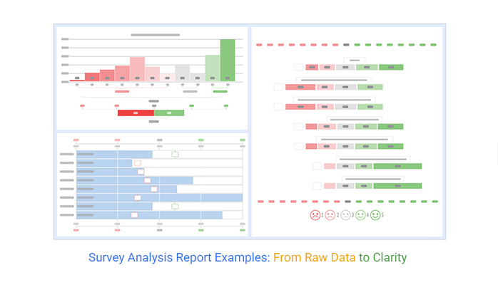
This is where survey report charts, such as Likert, come in.
This visualization design can help you explain emerging trends, patterns, and relationships in key data points.
Google Sheets lacks survey report-oriented visualization designs.
You can supercharge its usability by installing a particular add-on, which will be about in detail throughout the blog post. Keep reading to discover the name and other interesting details about this add-on.
In this blog, you’ll learn:
Before delving into the top survey analysis report examples, we’ll address the following question: What is a survey report?
Definition: A survey report is a comprehensive document that summarizes the outcomes of a survey, transforming raw data into meaningful insights. It outlines the survey’s methodology, findings, and often includes actionable recommendations or conclusions. The primary goal of a survey report is to present data in a way that stakeholders can easily interpret, making it easier to draw conclusions and inform decisions.
Key Components:
A survey analysis report is a document with important data points gathered from customer survey exercises, including longitudinal surveys that track changes over time.
The main objective of a survey report is to present insights into your data in an objective manner. Besides, it presents all the key insights discovered during the analysis phase.
Likert Scale Chart in Power BI for Survey Analysis Report
Likert Scale Chart in Microsoft Excel for Survey Analysis Report
Likert Scale Chart in Google Sheets for Survey Analysis Report
A comprehensive survey analysis report example contains the following:
Other important details that should be present in a survey report include:
The report follows a framework with different sections. And it is usually created at the end of the exercise. We recommend that you always represent accurate data in the report.
To create a comprehensive survey data story, you need easy-to-decode charts and graphs.
Remember: when presenting your survey data story, you’ll have a small space to get the reader’s attention. Use as many tricks as possible to keep your audience engaged.
In the ensuing section, we’ll cover the importance of the survey report.
Check out the importance of crafting a survey report below:
Survey report examples reveal reliable insights into a particular problem in your business. It could be declining sales, an increase in refunds, etc.
It’s important to always include charts in your data story to make it compelling and credible.
For instance, “80% of female employees working in the media sector claim to have faced workplace harassment at some point” is more impactful than saying “Many women face workplace harassment.”
When you distill large data sets into easy-to-read charts and graphs, you make everything easier for the decision-makers.
For example, you’ve performed a product feedback survey to find out the preferences of your target audience. The key insights you get can be leveraged to support product improvement.
After all, it’s the people you’re making the product or service for, right?
This saying is common among forex traders and detectives.
Yes, you read that right.
When you ask one question again and again over time, you’re likely to find a trend of change in the answers. A survey report example can help you track trends in changing preferences and tastes of the niche market.
Keep reading because, in the coming section, you’ll learn how to write a survey report.
If you used Google Forms to collect your data, we have a secret for you.
There’s an add-on you can install in your Google Sheets to access ready-made survey report-based charts for visualizing that data.
Export this real-time survey information into Google Sheets for in-depth analysis.
Filter and clean your data.
Look out for corrupt, biased, or duplicate data points. This step is also called cleaning. After cleaning, use survey-based charts to visualize data. Analyzing the data includes grouping similar aspects, categorizing, and identifying patterns.
For instance, a company conducted an employee satisfaction survey.
In the survey, respondents were asked the following: “How is the relationship between you and your immediate supervisor”?
According to the data collected, 80% of the workforce said that their supervisors were warm and friendly. The remaining 20% had mixed responses.
After visualizing the survey data, the company discovered that most of the employees cooperated with each other closely and with the management.
In the final survey report, the company concluded that 4 out of 5 employees were satisfied and happy with their supervisors. Hence, it was agreed internally that the working environment is conducive and productive.
After visualizing the data, take note of key insights and use them in your data story.
So, what is survey data storytelling?
It’s the ability to effectively communicate insights from data using a story and charts, such as the Likert Scale. Three key components build up survey storytelling.
Data serves as the foundation of your narrative. Analyze your data with descriptive analysis, predictive, and prescriptive analysis models to get a macro-level view.
Use a story to communicate insights gleaned from data, including the following:
Charts and graphs, such as Likert, act as the backdrop of your story. Use charts as part of your data storytelling to encourage a quick buy-in.
In the coming section, we’ll take you through the tested and proven survey analysis report examples.

A Likert Scale Graph is a survey chart you can use in a survey analysis report example, with a psychometric scale commonly involved in visualizing questionnaire data.
You can leverage this chart to measure:
The chart, reminiscent of a Box and Whisker plot, is named after psychologist Rensis Likert. It is based on the 5-Point Performance Rating Scale and consists of two key components: a scale that emerges from collective responses and the score of the responses collected.

Customer Satisfaction (CSAT) Graph or CSAT Score Bar Chart is one of the survey report-based charts you can use to measure customer sentiments.
Data points are displayed on a scale that ranges from -100 (very unsatisfied) to +100 (very satisfied). The green color depicts satisfaction, while the red color shows dissatisfaction.
CSAT score is based on the methodology outlined above. It displays how many ratings received a certain score from -100 (very unsatisfied) to +100 (very satisfied).

The CSAT Score Survey Chart is a survey chart you can use in a survey analysis report example to uncover people who are likely to recommend your brand favorably or tarnish it.
It’s divided into three color codes:
The final CSAT score is the difference between promoters and detractors.
In the coming section, we’ll take you through presenting a survey results report using the Likert Scale Chart.
Google Sheets is one of the most-used visualization instruments because it’s free and convenient for basic data reporting. You just need a Gmail account.
However, the spreadsheet application lacks ready-made survey data visualization charts, such as a Likert.
We’re not advising you to do away with Google Sheets.
This is because there’s an amazingly affordable add-on you can easily install in Google Sheets to access insightful and ready-to-go survey report example charts. This data visualization tool is called ChartExpo.
So, what is ChartExpo?
ChartExpo is an add-on you can easily install in your Google Sheets without needing tutorials.
With many ready-to-go charts, graphs, and maps, ChartExpo turns your complex, raw data into easy-to-interpret and visually appealing survey-oriented charts that tell data stories in real time.
More benefits
In the coming section, we’ll take you through the survey results.
You don’t want to miss this if your goal is to take your survey data storytelling to the next level.
This section will use a Likert Scale Chart to visualize the survey data below.
| Questions | Scale | Responses |
| Was the product a good purchase? | 1 | 138 |
| Was the product a good purchase? | 2 | 186 |
| Was the product a good purchase? | 3 | 176 |
| Was the product a good purchase? | 4 | 230 |
| Was the product a good purchase? | 5 | 270 |
| Is the product affordable? | 1 | 50 |
| Is the product affordable? | 2 | 138 |
| Is the product affordable? | 3 | 186 |
| Is the product affordable? | 4 | 176 |
| Is the product affordable? | 5 | 500 |
| The product is affordable. | 1 | 95 |
| The product is affordable. | 2 | 220 |
| The product is affordable. | 3 | 49 |
| The product is affordable. | 4 | 99 |
| The product is affordable. | 5 | 176 |
| How likely are you to recommend this product to others? | 1 | 330 |
| How likely are you to recommend this product to others? | 2 | 160 |
| How likely are you to recommend this product to others? | 3 | 200 |
| How likely are you to recommend this product to others? | 4 | 238 |
| How likely are you to recommend this product to others? | 5 | 286 |
| Is there any improvement we should bring to the product? | 1 | 330 |
| Is there any improvement we should bring to the product? | 2 | 160 |
| Is there any improvement we should bring to the product? | 3 | 200 |
| Is there any improvement we should bring to the product? | 4 | 238 |
| Is there any improvement we should bring to the product? | 5 | 286 |
To install the ChartExpo add-on for Google Sheets, from this link.


Before analyzing, define what you’re trying to learn. Clear goals help you focus on relevant insights and avoid getting lost in unrelated data.
Ensure the data is accurate by removing duplicates, fixing errors, and handling incomplete responses. Clean data is the foundation of reliable results.
Break down responses by demographics, behavior, or other key criteria. This reveals patterns that might be hidden in the overall data.
Charts and graphs make it easier for stakeholders to understand trends and takeaways quickly. Good visuals turn raw data into compelling stories.
Focus your report on findings that lead to decisions or improvements. Avoid overwhelming readers with every detail prioritize what matters most.
A survey report is a document with important data points gathered from customer survey exercises.
The main objective of a survey report is to present insights into your data in an objective manner. Besides, it presents all the key insights discovered during the analysis phase.
A good survey should have the following attributes:
The report follows a framework with different sections. More so, it is usually created at the end of the exercise.
A complete survey report should have easy-to-interpret charts to reinforce its credibility.
Encouraging many responses in your survey exercise is an art.
And so is analyzing survey data, which allows you to uncover actionable insights.
Once you’ve done the heavy lifting of convincing your respondents to finish up your survey, the last thing you want is to suffer from analysis paralysis. Analysis paralysis is having massive data sets at your fingertips and not knowing where to start.
This is where survey report charts, such as Likert, come in.
This visualization design helps you to explain emerging trends, patterns, and relationships in key data points.
How much did you enjoy this article?


Google Forms to Google Sheets keeps your data organized and current with every submission. Learn the steps, methods, and tips now!

Product survey questions reveal what customers truly think. Learn how to ask the right ones and act on the survey results. Read on!

Learn how the 5-Point Performance Rating Scale improves employee evaluations with clear, consistent, and fair performance reviews across teams.


