Categories
Poorly tested software does not fail quietly. Defects slip through, schedules expand, and remediation costs climb with every release cycle that passes without clear measurement.
Software testing metrics give development teams the quantitative foundation they need to move from assumption to evidence, catching issues earlier and building confidence in every build before it ships.
This guide covers core definitions, practical formulas, real-world dashboard examples, and a step-by-step Excel walkthrough, giving teams everything required to start tracking quality with precision.
Whether a project is in early development or approaching a major release, the right metrics make testing measurable and improvement visible.
Definition: Software testing metrics are quantifiable indicators used to assess the efficiency, coverage, and quality of a testing process across the development lifecycle.
Teams rely on these indicators to track defect rates, verify test coverage, and monitor execution progress at every phase. Software performance testing metrics add a further dimension by capturing system speed, load behavior, and stability under realistic conditions.
When applied consistently, these measurements bridge the communication gap between testers, developers, and project managers, keeping every stakeholder aligned around the same quality picture.
Software testing KPIs derived from these measurements make it straightforward to set targets and detect when testing is drifting off course.
Without visible measurement, a testing process can look thorough on paper while hiding gaps that will surface as production defects. Tracking the right values closes that blind spot.
Key reasons why they are important:
Tracking software testing metrics alongside performance metrics gives project managers the evidence they need to evaluate delivery success at the program level.
Software performance testing metrics span a range of categories, each targeting a specific dimension of quality. Knowing which category applies to a given question helps teams focus their analysis rather than drowning in numbers.
Main categories include:
Understanding how these categories differ is also the key to distinguishing metrics vs. measures in practice, a distinction that sharpens reporting accuracy and avoids misleading comparisons.
Reliable evaluation of testing accuracy starts with formulas grounded in software testing KPIs. The following calculations are the most widely applied across teams of every size and methodology.
Measures how many defects are fixed before release compared to the total number of defects.
Formula: Defects removed before release / Total defects × 100
Shows how many defects are discovered after release compared to all detected defects.
Formula: Defects found after release / Total defects × 100
Calculates the number of defects present in a specific module or the size of the code.
Formula: Total defects / Size of module (Lines of Code or Function Points)
Indicates how many planned test cases have been executed during testing.
Formula: Executed test cases / Total test cases × 100
Shows the percentage of test cases that passed during execution.
Formula: Passed test cases / Total executed test cases × 100
Measures how effective the executed test cases are in finding defects.
Formula: Defects found / Test cases executed
Calculates the average time required to fix each defect.
Formula: Total time to fix defects / Number of defects
Measures the benefit gained from automation compared to the cost of manual testing.
Formula: (Manual testing cost − Automation testing cost) / Automation testing cost × 100
These formulas are core components of DevOps performance metrics frameworks, where testing and deployment quality are tracked together.
Choosing software performance testing metrics that actually support decision-making means anchoring the selection in project goals rather than industry defaults. A metric that matters for a safety-critical embedded system may add no value to a rapid consumer web release.
The right choices stay close to the quality questions the team is actually trying to answer, balance quantitative precision with practical reporting cost, and remain stable enough to allow trend analysis across releases.
When the selection process is disciplined, the resulting measurement set integrates naturally with agile performance metrics used to track sprint velocity and iteration quality in fast-moving environments.
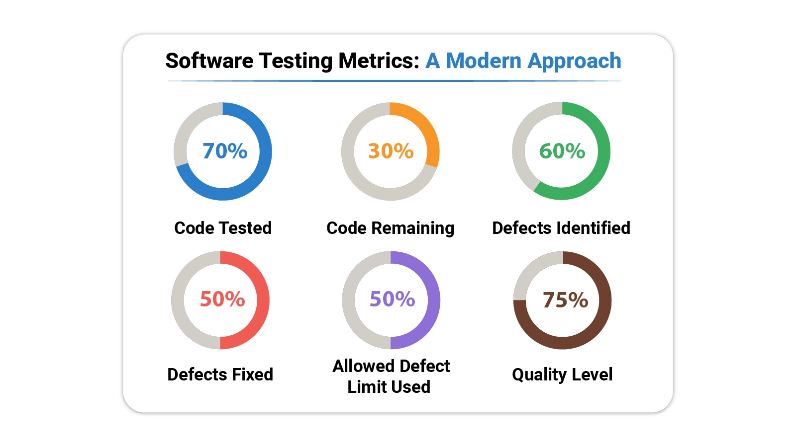
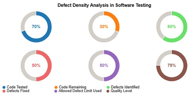
Abstract formulas become more useful when grounded in actual scenarios. The following examples show how these measurements translate into dashboard views that teams can act on.
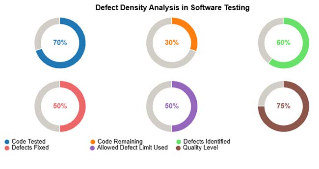
The analysis maps defect concentration across modules against code size, making visible where testing effort has been insufficient and where defect counts approach or exceed acceptable limits.
Example Insight: Pinpoints modules where additional test cycles, targeted fixes, or pre-release code review will have the greatest impact on overall stability.
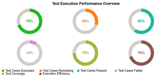
The execution performance view lays out completion status, pass and fail breakdowns, and total coverage achieved, showing at a glance which portions of the test plan are progressing and which remain outstanding.
Example Insight: Surfaces incomplete test runs, clusters of persistent failures, and coverage gaps that need to be closed before a quality release is achievable.
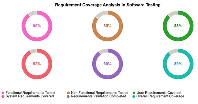
The coverage analysis breaks requirements into functional, non-functional, user, and system categories, then shows what proportion of each category has been validated through the current test suite.
Example Insight: Flags requirement types with low coverage so teams can prioritize testing effort and confirm every category is fully verified before shipment.
Monitoring software testing metrics outputs across release cycles feeds into growth metrics that show whether overall product quality trends in the right direction.
Analyzing software testing KPIs in a spreadsheet puts powerful quality analysis within reach of any team, regardless of tooling budget.
Follow these steps to analyze software testing metrics in Excel effectively:
Create a structured table so that each module and test result is recorded clearly. Proper data organization makes calculations easier and more accurate.
Common columns:
Keeping all data in one sheet helps track testing metrics across modules and releases.
Defect Density shows how many defects exist compared to the size of the code. This helps identify modules that need more testing.
Formula used:
Defect Density = Total Defects / Lines of Code
Example:
If a module contains 30 defects and has 6000 lines of code, then
Defect Density = 30 / 6000 = 0.005
You can also calculate average defect density per module or release. These calculations help evaluate testing quality more accurately.
To get deeper insights, group the testing data based on different conditions. This makes it easier to understand where defects occur more frequently.
You can group data by:
Grouping helps teams quickly see which modules are unstable and which releases require additional testing.
Once defect density is calculated, compare values across modules to find high-risk components. A higher defect density usually means the code is complex, unstable, or not tested enough.
This analysis helps teams decide:
Identifying problem areas early improves software quality and reduces production issues.
Numbers alone can be difficult to interpret, so charts should be used to visualize software testing metrics. Visual reports make it easier to compare modules and track quality trends.
Useful chart examples include:
Excel supports basic charts, while tools like ChartExpo can create more advanced visualizations for clearer analysis and reporting. Excel analysis also makes it easier to compare results with website performance metrics used in product monitoring.
Embedding a consistent measurement program into a regular testing workflow pays dividends across quality, efficiency, and organizational alignment.
The value of this visibility extends beyond release day. Comparing post-release incident data against pre-release customer service metrics reveals how well testing predicted real-world behavior.
Even a well-designed measurement program carries limitations. Teams that understand these constraints read their results more carefully and avoid decisions built on flawed data.
Common problems include:
Seven widely tracked indicators are defect density, requirement coverage, test execution rate, defect leakage, pass percentage, defect removal efficiency, and automation coverage. Together, they provide a balanced view of testing quality and product stability throughout the project lifecycle.
Five foundational approaches are unit testing, integration testing, system testing, acceptance testing, and performance testing. Each method targets a different layer of the software and verifies a distinct aspect of functionality, stability, and readiness.
QA metrics are measurements that evaluate the effectiveness of a quality assurance process. Common examples include defect rate, test execution status, coverage percentage, and average resolution time. They help teams confirm that software meets the quality bar before release.
Software testing metrics transform an abstract quality goal into something concrete, measurable, and actionable. Every formula in this guide links a specific testing activity to a number that informs decisions around defect handling, release readiness, and resource allocation.
Teams that track these values consistently stop guessing and start managing quality with the same rigor they apply to timelines and budgets.
Building a measurement habit takes time, but the returns compound quickly. Start with the indicators most aligned to your current project risks, embed them in your reporting cycle, and expand the framework as your testing practice grows.
Over time, a well-maintained set of metrics becomes one of the most reliable tools in a quality team’s arsenal.
How much did you enjoy this article?


Calculate accounts receivable turnover ratio to measure credit collection speed, improve cash flow, and strengthen your financial strategy. Read on!

Change Management KPIs are the key to tracking adoption, performance, and ROI during transitions. Find out which metrics matter. Read on!

Data collection methods and techniques determine the quality of every insight you act on. Explore key approaches for gathering reliable data. Read on!