• Home
  • Tools dropdown img
    • Spreadsheet Charts

      • ChartExpo for Google Sheets
      • ChartExpo for Microsoft Excel
    • Power BI Charts

      • Power BI Custom Visuals by ChartExpo
    • Word Cloud

  • Charts dropdown img
    • Chart Category

      • Bar Charts
      • Circle Graphs
      • Column Charts
      • Combo Charts
      • Comparison Charts
      • Line Graphs
      • PPC Charts
      • Sentiment Analysis Charts
      • Survey Charts
    • Chart Type

      • Box and Whisker Plot
      • Clustered Bar Chart
      • Clustered Column Chart
      • Comparison Bar Chart
      • Control Chart
      • CSAT Survey Bar Chart
      • CSAT Survey Chart
      • Dot Plot Chart
      • Double Bar Graph
      • Funnel Chart
      • Gauge Chart
      • Likert Scale Chart
      • Matrix Chart
      • Multi Axis Line Chart
      • Overlapping Bar Chart
      • Pareto Chart
      • Radar Chart
      • Radial Bar Chart
      • Sankey Diagram
      • Scatter Plot Chart
      • Slope Chart
      • Sunburst Chart
      • Tornado Chart
      • Waterfall Chart
      • Word Cloud
    • Google Sheets
      Microsoft Excel
  • Services
  • Pricing
  • Contact us
  • Blog
  • Support dropdown img
      • Gallery
      • Videos
      • Contact us
      • FAQs
      • Resources
    • Please feel free to contact us

      atsupport@chartexpo.com

Categories
All Data Visualizations Data Analytics Surveys
Add-ons/
  • Google Sheets
  • Microsoft Excel
  • Power BI
All Data Visualizations Data Analytics Surveys
Add-ons
  • Google Sheets
  • Microsoft Excel
  • Power BI

We use cookies

This website uses cookies to provide better user experience and user's session management.
By continuing visiting this website you consent the use of these cookies.

Ok

ChartExpo Survey


Home > Blog > Data Analytics

Metrics vs. Measures: Understanding the Key Differences

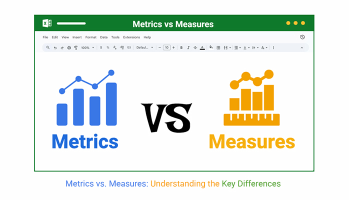
Metrics vs. measures—what’s the difference, and why does it matter? This isn’t a trick question. It’s a business essential.

Metrics vs. Measures

Why?

Think of this: A hospital might track readmission rates as a measure. But the number of readmissions per 1,000 patients? That’s a metric. One gives raw data, and the other provides context. Without both, performance insights are incomplete.

Now, look at businesses. Leaders rely on performance metrics to gauge productivity and outcomes. But if they don’t know what they’re measuring—or why—decisions fall flat. Tracking outcomes without understanding their basis leads to poor planning and missed goals.

Even in customer service, the distinction matters. Companies track satisfaction ratings, response times, and issue resolution. These customer experience measures aren’t random. They are based on precise definitions that start with understanding a measure and how metrics give it meaning.

Data is everywhere. But not all of it tells a story. Knowing how to use the right figures can drive real results. Confusing them, on the other hand, stalls progress.

The difference between metrics and measures can determine whether your strategy wins or fails. This blog breaks it down. We’ll explore how businesses, healthcare, and customer service teams achieve results by defining and using data effectively.

Are you ready? Let’s clear it up.

First…

Table of Contents:

  1. What are the Metrics vs. Measures?
  2. Why are Metrics and Measures Important?
  3. What is the Difference Between Metrics and Measures?
  4. What are the Similarities of Metrics Versus Measures?
  5. How to Visualize Metrics and Measures in Excel?
  6. FAQs
  7. Wrap Up

What are the Metrics vs. Measures?

Definition: Metrics are calculated values that show performance by comparing data over time or against a goal. Measures are raw data points collected during processes that capture what’s happening.

Think of business metrics, which often use measures to reveal trends. A measure tells you what was done; a metric tells you how well it was done. Understanding metrics and KPIs helps teams track progress. Without clarity, performance tracking becomes guesswork, but knowing both is key to smart decisions.

Top Metrics vs. Measures Charts

Check out the top metrics vs. measures charts to better understand your data at a glance. These charts were created using ChartExpo, a top-tier data visualization tool that turns complex spreadsheets into simple, insightful visuals.

Progress Circle Chart:

Metrics vs. Measures

Multi Axis Line Chart:

Metrics vs. Measures

Gauge Chart:

Metrics vs. Measures

Double Axis Line Graph and Bar Chart:

Metrics vs. Measures

Multi Axis Spider Chart

Metrics vs. Measures

Why are Metrics and Measures Important?

What if the real power behind growth wasn’t instinct or luck but clarity? Metrics and measures give that clarity. They’re not just about tracking; they’re about transforming the way teams think, plan, and improve.

Why?

  • Foundations of data-driven decisions: Measures capture raw facts—how many calls, patients, and sales. Metrics give those facts meaning, helping leaders make sharp, focused decisions.
  • Transforming data into insights: A spreadsheet full of numbers won’t tell you much on its own. However, with metrics, those numbers reveal trends, risks, and opportunities, especially in areas like quality of care measures in healthcare.
  • Enhancing performance and accountability: People perform better when expectations are clear. Using financial metrics helps teams stay aligned, accountable, and driven to reach targets.
  • Supporting continuous improvement: You can’t improve what you don’t measure. SMART KPIs make growth measurable and help teams track what matters most over time.

What is the Difference Between Metrics and Measures?

Have you encountered two people using “metrics” and “measures” as they mean the same thing? That’s wrong. Why? Mixing them up can lead to confusion, especially in reports or performance reviews.

The best way is to consider them as cousins—related but with different jobs. Once you know who does what, your data becomes much more useful.

Let’s break it down clearly:

Aspect Metrics Measures
Definition Quantitative performance indicators derived from raw data. Raw numerical values collected directly from activities.
Purpose Used to track performance against goals or benchmarks. Serve as the foundation for calculating metrics.
Example
  • Customer Satisfaction Score (CSAT).
  • Conversion Rate.
  • Number of Customers Surveyed.
  • Number of Conversions.
Context Required Requires context to be meaningful (targets, timeframes, etc.). Often stands alone without needing interpretation.
Calculated From One or more measures. Directly observed or recorded values.
Usage Helps evaluate trends and make decisions. Helps collect the data needed to create metrics.

What are the Similarities of Metrics Versus Measures?

People love to debate metrics versus measures—but here’s the twist: they have much in common. Think of them as partners in progress. One counts. The other calculates. But both drive results. If you’re building a strategy without them, you’re building blind.

Here’s how they align:

  • Both are quantitative: Metrics and measures deal in hard numbers, not guesses. They provide clear, data-driven insights that help teams see exactly what’s happening.
  • Used to monitor performance: Whether it’s the number of calls handled or the average time to resolution, these tools help organizations monitor performance. For example, customer experience measures use both to track and improve service delivery.
  • Support data-driven decisions: Smart decisions depend on solid data. Measures give the raw facts, while metrics help interpret those facts, making strategy more focused and informed.
  • Integral to business intelligence and reporting: Reporting would fall apart without both. Performance metrics and measures work together in tools like dashboards or analytics platforms to tell the full story.
  • Require consistency and accuracy: To get meaningful results, both must be tracked the same way every time. Consistent definitions and clean data ensure decisions are based on truth, not guesswork.

How to Visualize Metrics and Measures in Excel?

Have you ever felt like your Excel charts were stuck in 2003? You’re not alone. In a world driven by data, clunky visuals slow everything down.

That’s where the confusion around metrics vs measures gets worse. You’ve got the numbers, but they don’t say much. Data analysis needs more than rows and formulas. It needs smart visuals.

Excel tries, but let’s be honest—it often falls short. We have a solution: ChartExpo. This tool turns dull spreadsheets into dynamic, decision-ready visuals. And suddenly, metrics and measures make perfect sense.

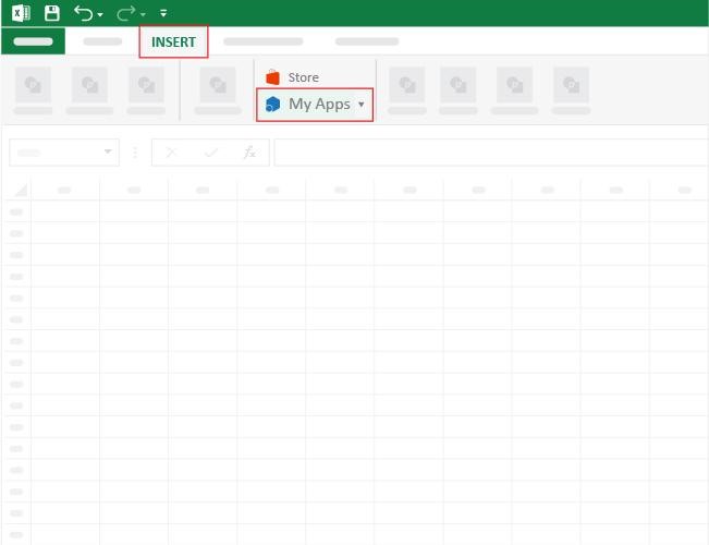
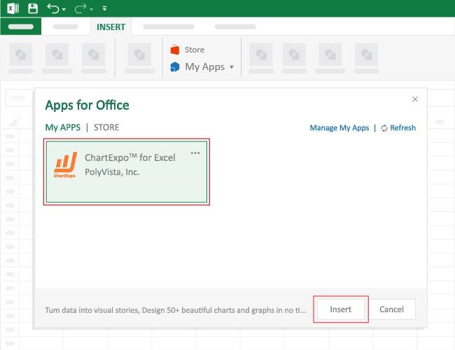
How to Install ChartExpo in Excel?

  1. Open your Excel application.
  2. Open the worksheet and click the “Insert” menu.
  3. You’ll see the “My Apps” option.
  4. In the Office Add-ins window, click “Store” and search for ChartExpo on my Apps Store.
  5. Click the “Add” button to install ChartExpo in your Excel.

ChartExpo charts are available both in Google Sheets and Microsoft Excel. Please use the following CTAs to install the tool of your choice and create beautiful visualizations with a few clicks in your favorite tool.

Example

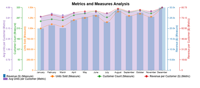
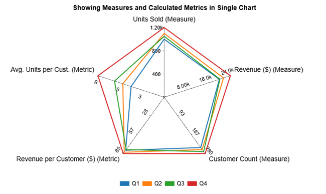
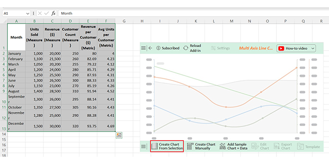
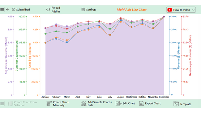
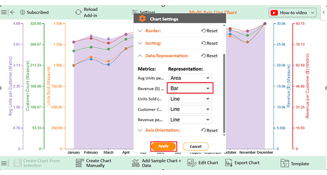
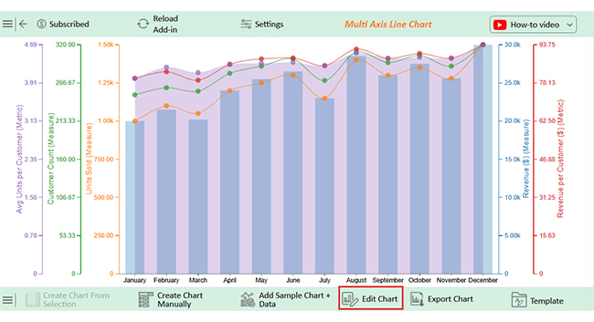
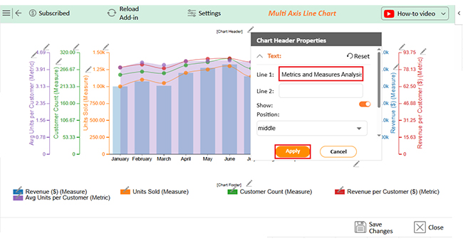
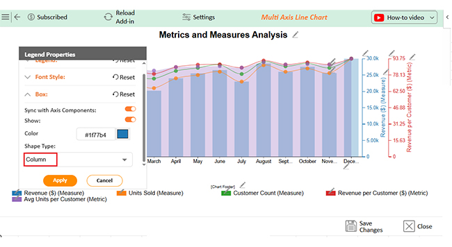
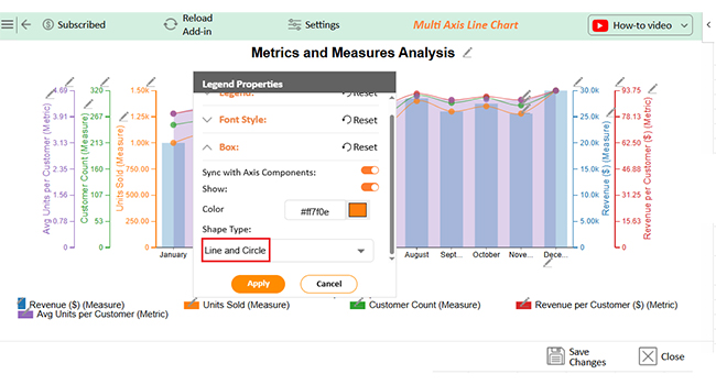
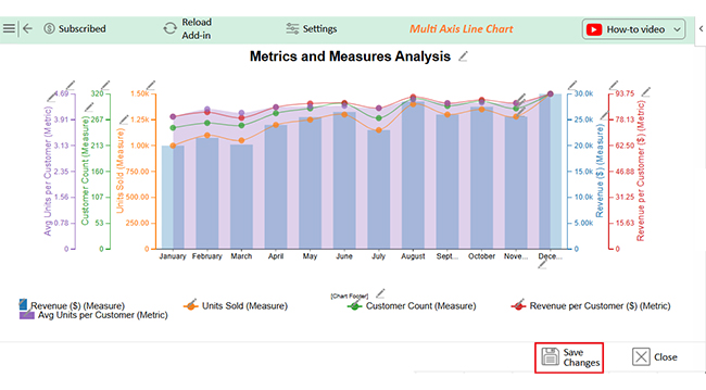
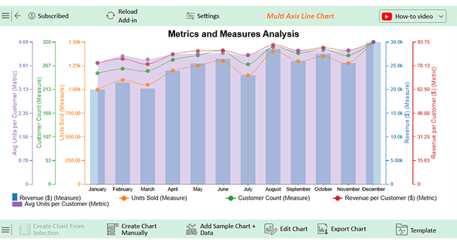
Let’s analyze this sample data in Excel using ChartExpo.

Month Units Sold (Measure) Revenue($) (Measure) Customer Count (Measure) Revenue Per Customer ($) (Metric) Avg Units per Customer (Metric)
January 1,000 20,000 250 80 4
February 1,100 21,500 260 82.69 4.23
March 1,050 20,200 255 79.22 4.12
April 1,200 24,000 280 85.71 4.29
May 1,250 25,500 290 87.93 4.31
June 1,300 26,500 300 88.33 4.33
July 1,150 23,000 270 85.19 4.26
August 1,400 28,500 310 91.94 4.52
September 1,300 26,000 295 88.14 4.41
October 1,350 27,500 305 90.16 4.43
November 1,280 25,600 290 88.28 4.41
December 1,500 30,000 320 93.75 4.69
  • To get started with ChartExpo, install ChartExpo in Excel.
  • Now, click on My Apps from the INSERT menu.
Metrics vs. Measures
  • Choose ChartExpo from My Apps, then click Insert.
Metrics vs. Measures
  • Once it loads, scroll through the charts list to locate and choose the “Multi Axis Line Chart”.
Metrics vs. Measures
  • You will see a Multi Axis Line Chart on the screen.
Metrics vs. Measures
  • Click the “Create Chart From Selection” button after selecting the data from the sheet, as shown.
Metrics vs. Measures
  • ChartExpo will generate the visualization below for you.
Metrics vs. Measures
  • Click on Settings and change the “Data Representation” as follows.
Metrics vs. Measures
  • If you want to add anything to the chart, click the Edit Chart button:
Metrics vs. Measures
  • Click the pencil icon next to the Chart Header to change the title.
  • It will open the properties dialog. Under the Text section, you can add a heading in Line 1 and enable Show.
  • Give the appropriate title of your chart and click the Apply button.
Metrics vs. Measures
  • Change the legend shapes of Revenue into Column and click the “Apply” button:
Metrics vs. Measures
  • Change the legend shapes into “Line and Circle” of Units Sold & Customer Count and click the “Apply” button:
Metrics vs. Measures
  • Click the “Save Changes” button to persist the changes made to the chart.
Metrics vs. Measures
  • Your final Multi Axis Line Chart will look like the one below.
Metrics vs. Measures

Insights

  • Units sold, revenue, and customer count steadily grow throughout the year.
  • Metrics such as revenue per customer and average units per customer improved. This indicates stronger sales efficiency and increased customer value.
  • December shows peak performance, suggesting high year-end demand and successful sales strategies.

FAQs

Is a metric and a measure the same thing?

No. A measure is a raw number or count. A metric is a calculation based on one or more measures. They work together. But they’re not the same.

Does metric mean measure?

Not exactly. A measure records what happened, while a metric shows how well it happened and uses measures to provide context. They are related, but their meanings are different.

Wrap Up

Understanding metrics vs. measures helps make sense of data. Measures are the raw numbers, and metrics are the results you calculate from them. Both are essential, but they serve different purposes.

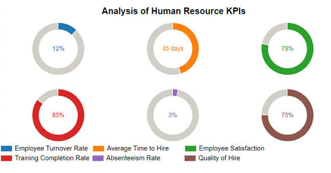
You need both to track performance. Measures show what’s happening, and metrics show how well it’s happening. One gives data, and the other offers meaning. This matters in every industry. In healthcare, for example, quality of care measures track patient outcomes. Metrics help compare performance across hospitals or departments, which is how care improves.

What are HEDIS measures? They’re standardized measures used in healthcare. They track things like screenings, follow-ups, and medication use—metrics based on HEDIS data support quality improvement.

Customer service measures help track calls, tickets, and response times in business. Metrics like Average Handling Time or Customer Satisfaction Score help teams make smart improvements.

So, what’s the takeaway? Don’t confuse the two. Use measures to gather data, then use metrics to act on it. Together, they drive smarter decisions and better results. To visualize it all with clarity, install ChartExpo.

How much did you enjoy this article?

ExcelAd1
Start Free Trial!
154951

Related articles

next previous
Data Analytics10 min read

DevOps Performance Metrics for Chart-Based Insights

DevOps performance metrics track efficiency in software delivery. This blog shows you how to use them to boost performance and streamline workflows.

Data Analytics8 min read

Social Media Dashboard to Improve Marketing Insights

This guide delves into what a social media dashboard is and how to create one. You'll also discover how to use a social media dashboard and more.

Data Analytics10 min read

Consulting Report Template for Better Decision Insights

A consulting report template organizes insights and data for clients. Click here to learn how to write, analyze, and enhance reports with charts and examples.

Data Analytics10 min read

Data Export in Salesforce: Insights Made Simple

Salesforce data export helps you download and use your CRM data. Click here to learn how to export, analyze, and track sales with easy steps and visuals.

Data Analytics10 min read

Analytics in Banking Industry: A Complete Walkthrough

Learn how analytics in the banking industry improves decisions and manages risks. Explore key types, uses, and tips to make data work for your bank.

ChartExpo logo

Turn Data into Visual
Stories

CHARTEXPO

  • Home
  • Gallery
  • Videos
  • Services
  • Pricing
  • Contact us
  • FAQs
  • Privacy policy
  • Terms of Service
  • Sitemap

TOOLS

  • ChartExpo for Google Sheets
  • ChartExpo for Microsoft Excel
  • Power BI Custom Visuals by ChartExpo
  • Word Cloud

CATEGORIES

  • Bar Charts
  • Circle Graphs
  • Column Charts
  • Combo Charts
  • Comparison Charts
  • Line Graphs
  • PPC Charts
  • Sentiment Analysis Charts
  • Survey Charts

TOP CHARTS

  • Sankey Diagram
  • Likert Scale Chart
  • Comparison Bar Chart
  • Pareto Chart
  • Funnel Chart
  • Gauge Chart
  • Radar Chart
  • Radial Bar Chart
  • Sunburst Chart
  • see more
  • Scatter Plot Chart
  • CSAT Survey Bar Chart
  • CSAT Survey Chart
  • Dot Plot Chart
  • Double Bar Graph
  • Matrix Chart
  • Multi Axis Line Chart
  • Overlapping Bar Chart
  • Control Chart
  • Slope Chart
  • Clustered Bar Chart
  • Clustered Column Chart
  • Box and Whisker Plot
  • Tornado Chart
  • Waterfall Chart
  • Word Cloud
  • see less

RESOURCES

  • Blog
  • Resources
  • YouTube
SIGN UP FOR UPDATES

We wouldn't dream of spamming you or selling your info.

© 2025 ChartExpo, all rights reserved.