In this section, we will use a chart to visualize the data from the table below.
Categories
A “Sankey Diagram in Excel” is a type of flow diagram that visualizes the flow of resources, energy, or information within a system. This representation is particularly useful for showing the distribution and flow of resources between different components or processes.
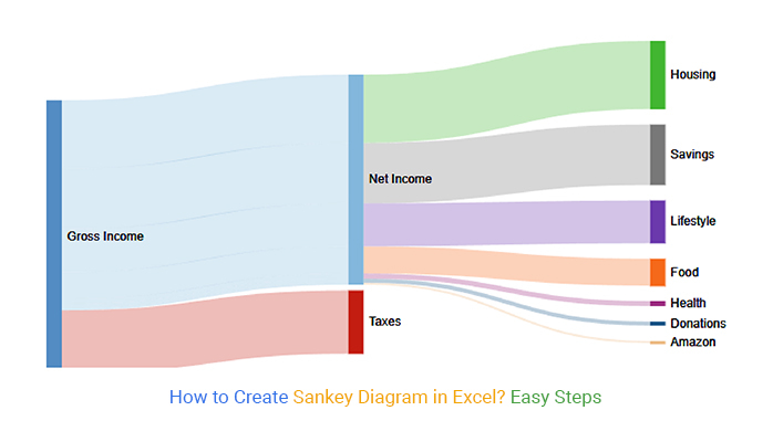
Data has become the story of the day in organizations and academic institutions, and almost every sector of our government functions with data. Imagine what it would be like if every sector did not utilize data. Think about this for a moment, and you will realize that data is the heartbeat of everything you do.
This fact can be evident to you as a data analyst. What is crucial is how you can present your data to interested parties.
An exemplary data visualization diagram will compel your audience to answer this question. How the audience reacts to your presentation is crucial to your success.
In this blog, you will learn:
A Sankey Diagram in Excel is a powerful visualization tool that helps you understand how data flows from one stage to another. It’s often used to show relationships, connections, and the proportional distribution of values across different categories.
In Excel, flow-based visuals are created using structured worksheet data with clearly defined stages and numeric values. Columns represent categories or steps in a process, while numbers determine how values move between them.
The thickness of each connection is calculated from the spreadsheet data, allowing Excel users to quickly identify larger and smaller transfers directly within the workbook.
In this video tutorial, you’ll learn how to:
Plenty of data visualizations in Excel can be used to represent the flow of resources or information between multiple entities. These are particularly useful for illustrating the distribution, allocation, or transition of quantities such as energy, materials, costs, or other resources.
Now we will discuss some of the most commonly used examples, which are as follows:

Recruiting is one of the undertakings that can produce monstrous data. As a human resource professional, you’ve got to track requests for employment until the onboarding stage.
The data produced along the way can help inform future decision-making processes. Excel flow visuals are particularly helpful here, as they allow you to refine recruiting data into meaningful insights by representing the full movement of applications through the Job Application Tracker system directly from your spreadsheet.
What’s more, this can save lots of hours, which you can use to unwind or execute different assignments.
The visualization above tracks the job application flow from the recruitment phase to onboarding.

You can use the chart to track the sentiments of a particular niche market towards a brand or its offerings.
The example above tracks market sentiments toward a fast-food brand.

You can use chart to track and analyze the cash flow diagram in Excel from cash sources to the final recipients.

The example above tracks the packages from dispatch to the intended consumers. The final recipients are segmented based on their country of residence.

The chart can also be used to track online store orders to prevent problems, such as loss of packages along the way. Also, you can use the charts in Excel to track products sold based on their respective brands.
Before we get down to business, here is a fun fact you need to know about Excel.
Excel has billions of users because it is our most common spreadsheet. With this spreadsheet in your office tool, you can create a Sankey graph in Excel. Here is the truth: an Excel worksheet does not have this advanced chart; it’s a list of graphs. Excel is limited to a few basic charts.
But don’t lose hope just yet. There is a solution to our problem. You want to know what it is. Let’s get to it.
What is the solution?
Think about this for a moment. Since Excel does not include a built-in flow visual, how can you create one? One effective approach is to enhance Excel with an add-in that allows you to build flow charts directly from your spreadsheet data.
One of the most useful tools is ChartExpo, a reliable add-in for visualizing data effectively. In other words, it serves as a powerful chart maker in Excel.
This online tool works smoothly in any browser, ensuring a stable experience while you create and customize your charts.
In addition, ChartExpo is an affordable add-in for most users. When you want to use it, you won’t incur any cost. It is available for you to use in your data analysis.
Let us explain ChartExpo and how it can help you as a data analyst.
What is ChartExpo?
In brief, ChartExpo is an add-in that utilizes cloud-hosting features to create data visualizations. This add-in to your Excel worksheet allows you to create many graphical presentations. It is one of the simplest add-ins for your Excel charts.
But that is not all.
You do not need a fancy manual to work your way around the add-in. This is because it takes quick and easy steps to create a chart of your choice. If you ever find yourself in a dilemma about which chart to use, ChartExpo has got you covered.
Let us dig deeper using a practical example:
| Energy Type | Main Source | Source type | Energy Source | Usage | End-User | Mega Watt |
| Agricultural waste | Bio-conversion | Solid | Thermal generation | Losses in the process | Lost | 3.5 |
| Agricultural waste | Bio-conversion | Solid | Thermal generation | Electricity grid | Industry | 5.1 |
| Agricultural waste | Bio-conversion | Solid | Thermal generation | Electricity grid | HVAC Commercial | 3.6 |
| Agricultural waste | Bio-conversion | Solid | Thermal generation | Electricity grid | HVAC homes | 2.6 |
| Agricultural waste | Bio-conversion | Solid | Thermal generation | Electricity grid | Appliances Commercial | 3.4 |
| Agricultural waste | Bio-conversion | Solid | Thermal generation | Electricity grid | Appliances homes | 1.4 |
| Other waste | Bio-conversion | Solid | Thermal generation | Losses in the process | Lost | 5.0 |
| Other waste | Bio-conversion | Solid | Thermal generation | Electricity grid | Industry | 3.8 |
| Other waste | Bio-conversion | Solid | Thermal generation | Electricity grid | HVAC Commercial | 4.7 |
| Other waste | Bio-conversion | Solid | Thermal generation | Electricity grid | HVAC homes | 3.4 |
| Other waste | Bio-conversion | Solid | Thermal generation | Electricity grid | Appliances Commercial | 5.2 |
| Other waste | Bio-conversion | Solid | Thermal generation | Electricity grid | Appliances homes | 1.8 |
| Marina algae | Bio-conversion | Solid | Thermal generation | Losses in the process | Lost | 0.5 |
| Marina algae | Bio-conversion | Solid | Thermal generation | Electricity grid | Industry | 0.4 |
| Marina algae | Bio-conversion | Solid | Thermal generation | Electricity grid | HVAC Commercial | 0.6 |
| Marina algae | Bio-conversion | Solid | Thermal generation | Electricity grid | HVAC homes | 0.4 |
| Marina algae | Bio-conversion | Solid | Thermal generation | Electricity grid | Appliances Commercial | 0.6 |
| Marina algae | Bio-conversion | Solid | Thermal generation | Electricity grid | Appliances homes | 0.4 |
| Biomass import | Bio-conversion | Solid | Thermal generation | Losses in the process | Lost | 0.3 |
| Biomass import | Bio-conversion | Solid | Thermal generation | Electricity grid | Industry | 0.5 |
| Biomass import | Bio-conversion | Solid | Thermal generation | Electricity grid | HVAC Commercial | 0.6 |
| Biomass import | Bio-conversion | Solid | Thermal generation | Electricity grid | HVAC homes | 0.2 |
| Biomass import | Bio-conversion | Solid | Thermal generation | Electricity grid | Appliances Commercial | 0.4 |
| Biomass import | Bio-conversion | Solid | Thermal generation | Electricity grid | Appliances homes | 0.1 |
| Nuclear reserves | Nuclear Plant | Solid | Thermal generation | Losses in the process | Lost | 35.0 |
| Nuclear reserves | Nuclear Plant | Solid | Thermal generation | Electricity grid | Industry | 9.1 |
| Nuclear reserves | Nuclear Plant | Solid | Thermal generation | Electricity grid | HVAC Commercial | 5.6 |
| Nuclear reserves | Nuclear Plant | Solid | Thermal generation | Electricity grid | HVAC homes | 4.2 |
| Nuclear reserves | Nuclear Plant | Solid | Thermal generation | Electricity grid | Appliances Commercial | 7.7 |
| Nuclear reserves | Nuclear Plant | Solid | Thermal generation | Electricity grid | Appliances homes | 2.8 |
| Gas reserves | Natural Gas | Gas | Thermal generation | Losses in the process | Lost | 3.6 |
| Gas reserves | Natural Gas | Gas | Thermal generation | Electricity grid | Industry | 5.9 |
| Gas reserves | Natural Gas | Gas | Thermal generation | Electricity grid | HVAC Commercial | 5.5 |
| Gas reserves | Natural Gas | Gas | Thermal generation | Electricity grid | HVAC homes | 3.4 |
| Gas reserves | Natural Gas | Gas | Thermal generation | Electricity grid | Appliances Commercial | 5.1 |
| Gas reserves | Natural Gas | Gas | Thermal generation | Electricity grid | Appliances homes | 2.5 |
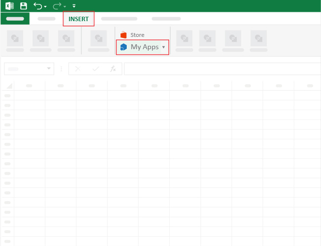
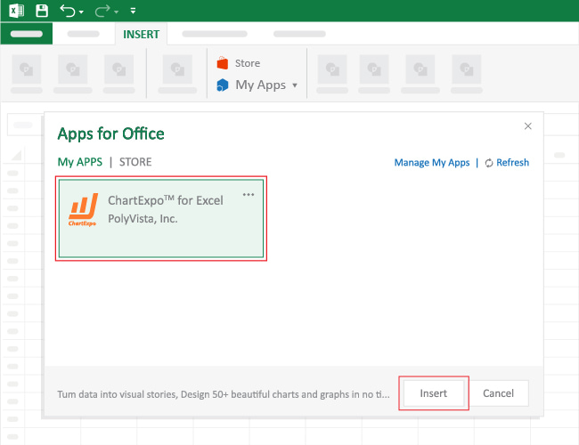

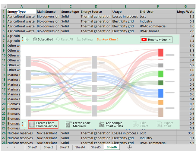

You can edit the chart with the colors you choose and add a heading. Click Edit Chart.
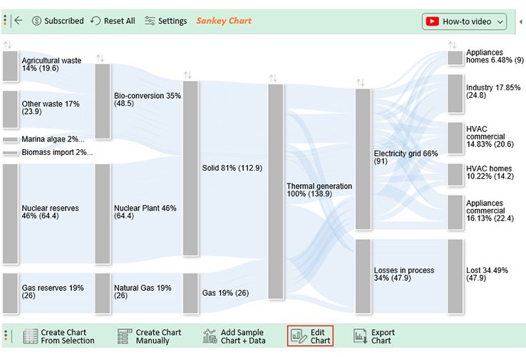
Here are some of the insights from your table that will appear like this in your chart.
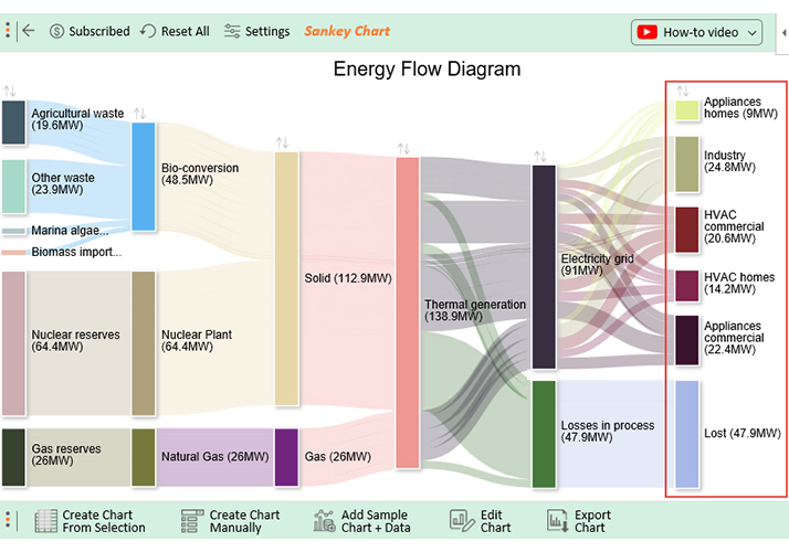
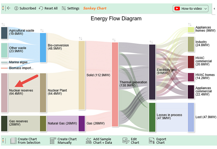
You can create a multi-level chart in Excel if your data contains multiple layers of information. In the example above, we easily built a multi-level chart in Excel with just a few clicks because the data was well-structured.

This is a question that needs a lot of interpretation to eliminate confusion. The reality is that examples are mainly used to identify weighted networks, such as flows.
In other words, your data should have flow-like attributes.
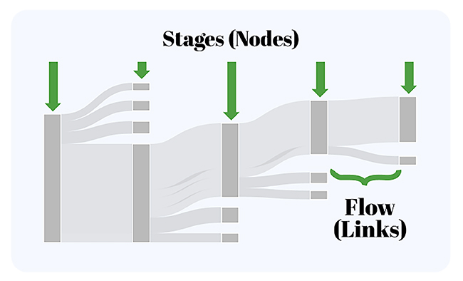
The diagram’s nodes are depicted in two or more categories that represent various data stages. Once you’ve outlined your data properly, it becomes easier to analyze it and generate essential insights.
These diagrams are magnificent, especially in communicating flow systems. They can assist with uncovering examples and help in investigating, tracking down bottlenecks, or showing clients how cycles flow.
Plus, they prove to be useful, particularly in addressing large volumes of data.
The flow of data through a system, a process, or even a decision process can undoubtedly be examined for in-depth insights.
While investigating what is happening, it’s frequently challenging to get to the root of a problem. An example can show where the issue exists and what it might mean for the general framework.
So, when should you not use this diagram?
Creating charts in Excel without add-ins can be challenging and time-consuming. Here are some key limitations:
Yes, you can achieve this by downloading and installing the ChartExpo add-in, since Excel doesn’t include a built-in template for it. ChartExpo offers a variety of chart templates, allowing you to easily create a Sankey diagram in Excel.
Let’s recap everything we’ve discussed.
We now know that this type of chart in Excel is a powerful way to capture your audience’s attention and present your data story clearly.
If you’re working in Google Sheets or Power BI, you can also create similar visuals by following our guides on these platforms.
A Sankey Diagram in Excel makes it easy to visualize complex data flows and highlight key insights, helping your audience quickly understand the most important parts of your analysis.