• Home
  • Tools dropdown img
    • Spreadsheet Charts

      • ChartExpo for Google Sheets
      • ChartExpo for Microsoft Excel
    • Power BI Charts

      • Power BI Custom Visuals by ChartExpo
    • Word Cloud

  • Charts dropdown img
    • Chart Category

      • Bar Charts
      • Circle Graphs
      • Column Charts
      • Combo Charts
      • Comparison Charts
      • Line Graphs
      • PPC Charts
      • Sentiment Analysis Charts
      • Survey Charts
    • Chart Type

      • Box and Whisker Plot
      • Clustered Bar Chart
      • Clustered Column Chart
      • Comparison Bar Chart
      • Control Chart
      • CSAT Survey Bar Chart
      • CSAT Survey Chart
      • Dot Plot Chart
      • Double Bar Graph
      • Funnel Chart
      • Gauge Chart
      • Likert Scale Chart
      • Matrix Chart
      • Multi Axis Line Chart
      • Overlapping Bar Chart
      • Pareto Chart
      • Radar Chart
      • Radial Bar Chart
      • Sankey Diagram
      • Scatter Plot Chart
      • Slope Chart
      • Sunburst Chart
      • Tornado Chart
      • Waterfall Chart
      • Word Cloud
    • Google Sheets
      Microsoft Excel
  • Services
  • Pricing
  • Contact us
  • Blog
  • Support dropdown img
      • Gallery
      • Videos
      • Contact us
      • FAQs
      • Resources
    • Please feel free to contact us

      atsupport@chartexpo.com

Categories
All Data Visualizations Data Analytics Surveys
Add-ons/
  • Google Sheets
  • Microsoft Excel
  • Power BI
All Data Visualizations Data Analytics Surveys
Add-ons
  • Google Sheets
  • Microsoft Excel
  • Power BI

We use cookies

This website uses cookies to provide better user experience and user's session management.
By continuing visiting this website you consent the use of these cookies.

Ok

ChartExpo Survey


Home > Blog > Data Analytics

Progress Report Template: A Complete Guide

Progress report templates—aren’t they everywhere now? From schools to construction sites to corporate boardrooms, tracking progress is non-negotiable. Yet, without a consistent format, updates can lead to confusion.

Progress Report Template

That’s where progress report templates change the game. Consider this: 57% of executives say poor communication is their biggest roadblock. That’s not a tech issue. It’s a reporting issue. Weekly or monthly updates without structure leave room for assumptions, missed deadlines, budget overruns, and confused teams.

Progress report templates eliminate the guessing. They organize tasks, show milestones, and keep teams aligned. Whether managing marketing campaigns or overseeing product launches, structure saves time.

Construction firms use templates to show inspectors work done, tasks ahead, and potential delays. Educators use them to update parents on student growth. In both cases, the goal is simple: transparency.

These templates are also central to management reporting. Weekly status updates, KPI dashboards, and executive summaries often start from the same building blocks. When leaders know what to expect, they focus on results, not formatting.

Paired with tools like a progress bar in Excel, these reports do more than inform—they visualize momentum. You see how far you’ve come and know what’s left.

Progress isn’t about speed. It’s about direction. And with the right tools, your direction becomes clear.

Table of Contents:

  1. What is a Progress Report Template?
  2. Why is the Progress Report Format so Important?
  3. How to Write a Progress Report Template?
  4. How to Analyze a Progress Report Template in Excel?
  5. Best Practices for Weekly Progress Report Templates
  6. FAQs
  7. Wrap Up

What is a Progress Report Template?

Definition: A progress report template is a pre-structured document that tracks and shares updates on ongoing tasks or projects. It highlights completed work, current status, and next steps. These templates are standard in BI reporting and project management. They help teams stay focused and aligned.

Using a consistent format enhances communication and streamlines the review process. Many professionals also build them using pivot reporting tools to show clear, data-driven insights. They are simple, repeatable, and effective.

Top 5 Charts to Show Progress Report Template

Are you craving for clearer insights from your progress reports? Check out the top five charts you can use to analyze them effectively. These charts were created using ChartExpo – a tool for powerful, easy-to-understand visualizations.

Multi Axis Line Chart

Progress Report Template

Overlapping Bar Chart

Progress Report Template

Progress Circle Chart

Progress Report Template

Progress Chart

Progress Report Template

Funnel Chart (aka Pyramid Chart)

Progress Report Template

Why is the Progress Report Format so Important?

Have you ever been caught in a meeting where no one is on the same page? That’s what happens without a solid WIP report or progress format. Confusion grows, deadlines slip, and accountability fades. A monthly financial report template in Excel may show the numbers, but a progress format tells the story behind them.

Here’s why format matters:

  • Enhances clarity and consistency: Using the same format every time eliminates confusion. Everyone knows where to look for key information.
  • Facilitates efficient communication: Reports become easier to read and share, and stakeholders get what they need without lengthy explanations.
  • Tracks progress over time: Templates allow you to compare past and current performance. This helps teams measure improvement or detect slowdowns.
  • Supports accountability: Each section can assign tasks and deadlines. Team members see who’s responsible and what’s expected.
  • Helps identify and address challenges: Regularly reporting surface obstacles early helps teams fix issues before they escalate.
  • Aids in decision-making: Leaders get the data they need fast. That speeds up responses and planning.
  • Saves time and improves productivity: There is no need to build a new report from scratch each time. Templates streamline updates and let people focus on work.
  • Builds trust with stakeholders: Consistent updates show transparency and organization. This helps clients and leadership gain confidence in your process.

How to Write a Progress Report Template?

You don’t need fancy tools to write an excellent progress report. You need structure. Clarity wins when you use monthly sales report templates or a basic document. The correct format keeps your team on track and your stakeholders informed.

Here’s how to write a progress report template that gets results.

  1. Objectives: Start with the goal. What is the project trying to achieve? Keep it simple and direct.
  2. Work completed: List tasks done since the last update. Be specific—dates, deliverables, and who handled them.
  3. Ongoing work: Mention tasks currently in progress. Highlight any work nearing completion or requiring extra input.
  4. Next steps: What comes next? Briefly list the upcoming actions and expected outcomes.
  5. Challenges and issues: Be honest about roadblocks. If you’re using pivot reporting, this is where those data points help tell the story.
  6. Summary/conclusion: Wrap it up with a quick recap. Tie progress to goals and give a timeline for the next update.

How to Analyze a Progress Report Template in Excel?

Let’s be honest—Excel is excellent until it isn’t. Sure, it crunches numbers like a pro. But when it comes to showing those numbers in a way that makes sense? That’s where things get messy. This way, progress report templates feel more like puzzles than progress.

Data deserves better, especially in analysis, where visuals speak louder than rows and formulas. Enter ChartExpo. This tool turns plain Excel sheets into sharp, bright visuals—no coding, no chaos.

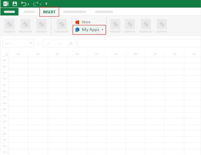
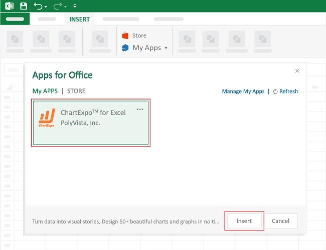
How to Install ChartExpo in Excel?

  1. Open your Excel application.
  2. Open the worksheet and click the “Insert” menu.
  3. You’ll see the “My Apps” option.
  4. In the Office Add-ins window, click “Store” and search for ChartExpo on my Apps Store.
  5. Click the “Add” button to install ChartExpo in your Excel.

ChartExpo charts are available both in Google Sheets and Microsoft Excel. Please use the following CTAs to install the tool of your choice and create beautiful visualizations with a few clicks in your favorite tool.

Example

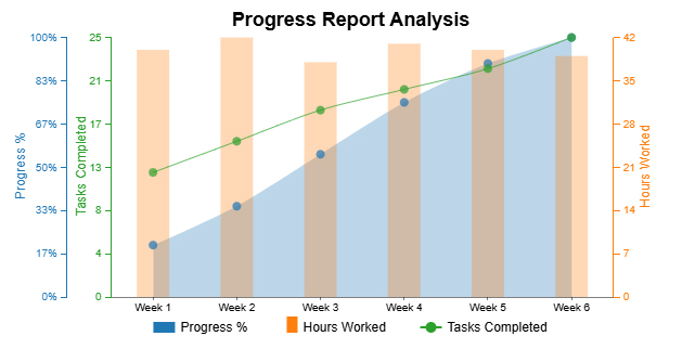
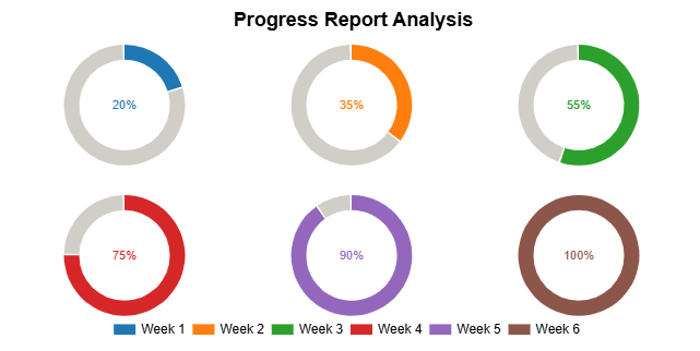
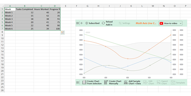
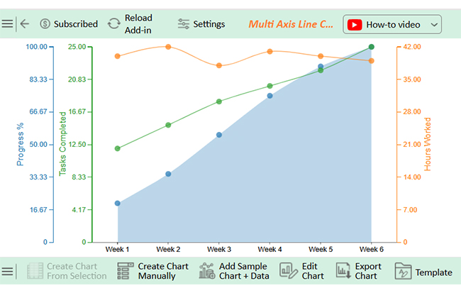
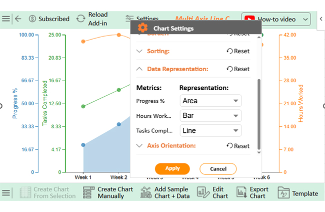
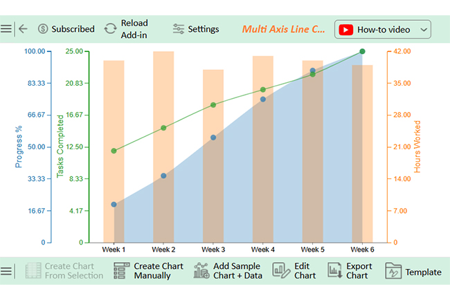
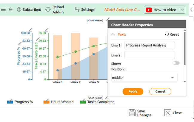
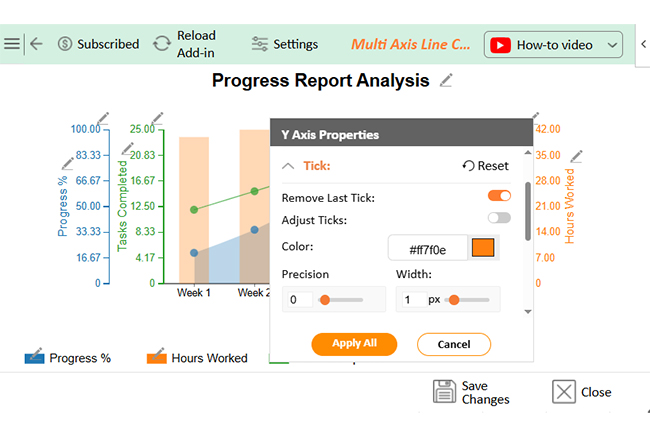
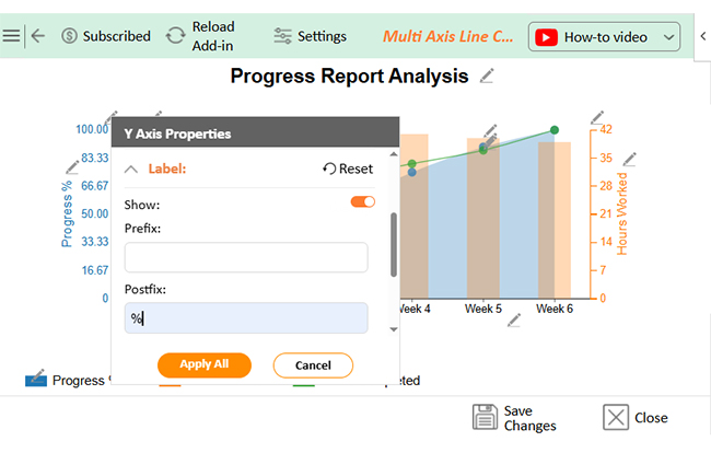
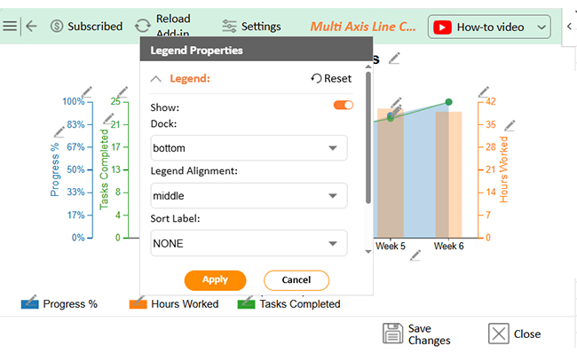
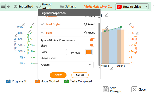
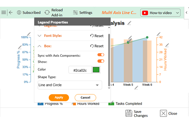
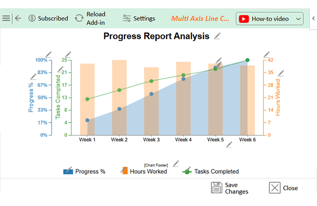
Let’s analyze this sample data in Excel using ChartExpo.

Week Tasks Completed Hours Worked Progress %
Week 1 12 40 20
Week 2 15 42 35
Week 3 18 38 55
Week 4 20 41 75
Week 5 22 40 90
Week 6 25 39 100
  • To get started with ChartExpo, install ChartExpo in Excel.
  • Now, click on My Apps from the INSERT menu.
Progress Report Template
  • Choose ChartExpo from My Apps, then click Insert.
Progress Report Template
  • Once it loads, scroll through the charts list to locate and choose the “Multi Axis Line Chart”.
Progress Report Template
  • You will see a Multi Axis Line Chart on the screen.
Progress Report Template
  • Click the “Create Chart From Selection” button after selecting the data from the sheet, as shown.
Progress Report Template
  • ChartExpo will generate the visualization below for you.
Progress Report Template
  • Click on Settings and change the “Data Representation” as follows.
Progress Report Template
  • If you want to add anything to the chart, click the Edit Chart button:
Progress Report Template
  • Click the pencil icon next to the Chart Header to change the title.
  • It will open the properties dialog. Under the Text section, you can add a heading in Line 1 and enable Show.
  • Give the appropriate title of your chart and click the Apply button.
Progress Report Template
  • You can change the value of Active Users Precision to zero as follows:
Progress Report Template
  • You can add the percentage sign with Progress and also change the precision value to zero as follows:
Progress Report Template
  • Enable the show button of legends and also change the alignment to center as follows:
Progress Report Template
  • Change the Legend shape of worked hours into a Column and click the “Apply” button:
Progress Report Template
  • Change the legend shape of Task Completed into Line and Circle, and click the “Apply” button:
Progress Report Template
  • Click the “Save Changes” button to persist the changes made to the chart.
Progress Report Template
  • Your final Multi Axis Line Chart will look like the one below.
Progress Report Template

Insights

  • Tasks completed increased from 12 to 25 over six weeks.
  • The progress percentage rose steadily from 20% to 100%.
  • Hours worked showed slight fluctuations.
  • Overall productivity improved week by week.
  • Time was used efficiently, and task management remained effective throughout.

Best Practices for Weekly Progress Report Templates

Weekly updates don’t have to feel like chores. They are powerful when done right. A strong weekly progress report template keeps your team synced and your project on track. Whether using spreadsheets or BI tools, these tips make reports clearer, faster, and more effective.

  • Keep it concise and focused: Avoid overloading your report with unnecessary details. Stick to the most important updates that reflect real progress.
  • Use a clear structure: Organize your report in a predictable format each week. This helps readers quickly absorb information without digging.
  • Align with project goals: Every update should connect directly to your primary objectives. This keeps the report relevant and purpose-driven.
  • Be honest and transparent: Clearly state what’s working and what isn’t. Hiding issues only delays solutions and hurts team trust.
  • Highlight achievements: Recognize completed milestones or standout efforts. It shows forward movement and keeps morale high.
  • Use visual aids where appropriate: Visuals like charts or a progress bar in Excel make data easier to digest. They highlight key trends to be understood at a glance.
  • Ensure timely submission: Stick to a consistent reporting schedule. Regular updates ensure better planning and smoother management reporting across the board.

FAQs

What is the format of the progress report?

A progress report format includes objectives, completed tasks, ongoing work, challenges, next steps, and a summary. It’s structured and straightforward, and each section gives clear updates. This helps track progress and keeps everyone aligned.

What is the standard format of a progress report?

The standard format has six parts: goals, completed work, current tasks, issues, upcoming steps, and conclusion. It’s used across industries, and clear headings make it easy to follow. This format supports accuracy, speed, and accountability.

Wrap Up

A progress report template keeps work on track. It organizes updates so everyone knows what’s been done and what’s next. It helps managers lead better, and teams know where to focus, resulting in less chaotic deadlines.

This kind of reporting is part of smart Pivot reporting. You get insights, not clutter. Reports become tools, not chores.

Using tools like a monthly financial report template in Excel adds consistency. You get clear, time-based data, and progress becomes measurable. Templates also support strong management reporting. Leaders see updates fast, and decisions get made quickly.

Progress doesn’t speak for itself. A template gives it a voice. Install ChartExpo to visualize progress reports better and move forward with purpose.

How much did you enjoy this article?

PBIAd1
Start Free Trial!
154140

Related articles

next previous
Data Analytics7 min read

Energy Dashboard: Insights for Energy Tracking

This guide dives deep into what the energy dashboard is, the key features of an energy dashboard, and how to use it. You'll also discover how to create one.

Data Analytics7 min read

Energy Budgeting: A Complete Visual Guide

This guide shows you everything you need to know about energy budgeting. You'll also discover the benefits of calculating the Earth's energy budget.

Data Analytics15 min read

Top 6 Visualizations for Quantitative Data Analysis Methods

Explore top quantitative data analysis methods to summarize, interpret, and visualize numerical data for smarter, data-driven decision-making.

Data Analytics7 min read

Healthcare Industry Market Research: Insights Made Easy

Discover what the healthcare industry market research is, how to use it, and the benefits of medical market research. You'll also discover why it is important.

Data Analytics14 min read

How to Conduct Customer Behavior Analytics in Excel?

Unlock the power of customer behavior analytics to track habits, predict trends, and improve customer satisfaction across every touchpoint.

ChartExpo logo

Turn Data into Visual
Stories

CHARTEXPO

  • Home
  • Gallery
  • Videos
  • Services
  • Pricing
  • Contact us
  • FAQs
  • Privacy policy
  • Terms of Service
  • Sitemap

TOOLS

  • ChartExpo for Google Sheets
  • ChartExpo for Microsoft Excel
  • Power BI Custom Visuals by ChartExpo
  • Word Cloud

CATEGORIES

  • Bar Charts
  • Circle Graphs
  • Column Charts
  • Combo Charts
  • Comparison Charts
  • Line Graphs
  • PPC Charts
  • Sentiment Analysis Charts
  • Survey Charts

TOP CHARTS

  • Sankey Diagram
  • Likert Scale Chart
  • Comparison Bar Chart
  • Pareto Chart
  • Funnel Chart
  • Gauge Chart
  • Radar Chart
  • Radial Bar Chart
  • Sunburst Chart
  • see more
  • Scatter Plot Chart
  • CSAT Survey Bar Chart
  • CSAT Survey Chart
  • Dot Plot Chart
  • Double Bar Graph
  • Matrix Chart
  • Multi Axis Line Chart
  • Overlapping Bar Chart
  • Control Chart
  • Slope Chart
  • Clustered Bar Chart
  • Clustered Column Chart
  • Box and Whisker Plot
  • Tornado Chart
  • Waterfall Chart
  • Word Cloud
  • see less

RESOURCES

  • Blog
  • Resources
  • YouTube
SIGN UP FOR UPDATES

We wouldn't dream of spamming you or selling your info.

© 2025 ChartExpo, all rights reserved.