• Home
  • Tools dropdown img
    • Spreadsheet Charts

      • ChartExpo for Google Sheets
      • ChartExpo for Microsoft Excel
    • Power BI Charts

      • Power BI Custom Visuals by ChartExpo
    • Word Cloud

  • Charts dropdown img
    • Chart Category

      • Bar Charts
      • Circle Graphs
      • Column Charts
      • Combo Charts
      • Comparison Charts
      • Line Graphs
      • PPC Charts
      • Sentiment Analysis Charts
      • Survey Charts
    • Chart Type

      • Box and Whisker Plot
      • Clustered Bar Chart
      • Clustered Column Chart
      • Comparison Bar Chart
      • Control Chart
      • CSAT Survey Bar Chart
      • CSAT Survey Chart
      • Dot Plot Chart
      • Double Bar Graph
      • Funnel Chart
      • Gauge Chart
      • Likert Scale Chart
      • Matrix Chart
      • Multi Axis Line Chart
      • Overlapping Bar Chart
      • Pareto Chart
      • Radar Chart
      • Radial Bar Chart
      • Sankey Diagram
      • Scatter Plot Chart
      • Slope Chart
      • Sunburst Chart
      • Tornado Chart
      • Waterfall Chart
      • Word Cloud
    • Google Sheets
      Microsoft Excel
  • Services
  • Pricing
  • Contact us
  • Blog
  • Support dropdown img
      • Gallery
      • Videos
      • Contact us
      • FAQs
      • Resources
    • Please feel free to contact us

      atsupport@chartexpo.com

Categories
All Data Visualizations Data Analytics Surveys
Add-ons/
  • Google Sheets
  • Microsoft Excel
  • Power BI
All Data Visualizations Data Analytics Surveys
Add-ons
  • Google Sheets
  • Microsoft Excel
  • Power BI

We use cookies

This website uses cookies to provide better user experience and user's session management.
By continuing visiting this website you consent the use of these cookies.

Ok

ChartExpo Survey


Home > Blog > Power BI

Power BI Number Format: How-To Guide

In 2023, Microsoft stated that Power BI is utilized by more than 97% of Fortune 500 companies. These companies depend on accurate data visualization to inform their strategies. The Power BI number format is fundamental. It transforms data into something easy to understand and use, revolutionizing how data analysts work.

Power BI Number Format

Imagine you’re presenting your quarterly sales data to the board. The numbers are there, but they’re a mess. Decimals run wild, currencies mix, and percentages confuse. This chaos can be avoided with the right Power BI number format.

International Data Corporation found that businesses could lose up to 20% of revenue due to poor data quality. Clear, consistent number formatting in Power BI can help prevent these costly mistakes. Using Power BI number format, you ensure your data tells the right story every time.

Assume you’re analyzing sales figures across multiple regions. Some numbers are in dollars, others in euros. Here, the Power BI number format becomes essential. It converts and displays data uniformly, eliminating confusion. You can standardize currencies, making comparisons seamless.

Think about the time saved. Manual formatting is tedious and prone to errors. Power BI number format automates this process. It guarantees uniformity and precision, enabling you to concentrate on analysis instead of layout.

Therefore, if you are creating a report or delving into data analysis, it is crucial to master the Power BI number format. It marks the distinction between disordered data and organized data.

Let’s see how to leverage the Power BI number format for data analysis.

Table of Contents:

  1. What is the Number Format in Power BI?
  2. Why is Power BI Number Format Useful?
  3. How to Format Numbers in Power BI Dashboard?
  4. How to Visualize Your Data Using Power BI?
  5. Wrap Up

First…

What is the Number Format in Power BI?

Definition: In Power BI, “Number Format” refers to how numerical data is displayed. It includes options like currency, percentages, and decimal numbers. You can customize number formats to enhance readability and align with reporting standards.

To format numbers, you can:

  1. Select a visual or field.
  2. Go to the “Modeling” tab.
  3. Choose the desired format under the “Format” options.

Formats include:

  • Currency: Displays numbers as monetary values.
  • Percentage: Shows values as percentages.
  • Decimal Number: Allows specification of decimal places.
  • Whole Number: Displays numbers without decimals.

Custom number formats can also be created using the “Custom Format String” option. This feature is useful for tailoring data presentation to specific business needs. Proper number formatting in Power BI ensures users interpret data correctly and effectively.

Why is Power BI Number Format Useful?

Imagine you’re looking at a report with a mix of raw numbers. Some have too many decimal places, and others lack clear indicators of currency or percentages. It’s like trying to read a jumbled story without punctuation. In the realm of financial reports for companies, clarity is key. This is where visual storytelling shines. Ensuring each figure is precise and properly formatted makes the data not only readable but also actionable, turning chaos into a clear, compelling narrative that drives data-driven decisions and insights.

Confusing, right?

That’s where Power BI’s number formatting comes to the rescue. Here are reasons why this feature is so useful.

  • Clarity and readability: Proper number formatting makes data easy to read and understand. You can present numbers as currency, percentages, or with the appropriate number of decimal places. This makes it easy to grasp the information without unnecessary confusion.
  • Consistency: Using consistent number formats across all visuals and reports ensures that data presentation remains uniform. This consistency helps in building trust and reliability, as users know what to expect and how to interpret the data.
  • Customization: Power BI allows you to tailor number formats to fit specific needs. It doesn’t matter whether you need to display numbers in thousands, add currency symbols, or format negative numbers differently. The customization options make your Power BI reports more relevant and effective.
  • Analysis: Correctly formatted numbers facilitate better data analysis. For instance, percentage growth rates are easier to compare when consistently formatted. This helps analysts make accurate assessments and derive meaningful insights.
  • Internationalization: Power BI’s number formatting options also support international standards. This means you can format numbers to align with regional settings, such as different currency symbols or decimal separators. This ensures your reports are suitable for a global audience. Whether you’re displaying financial metrics or calculating the No. of Days Between two Dates, Power BI helps present data in a way that’s both precise and easy to interpret across regions.

How to Format Numbers in a Power BI Dashboard?

  1. Begin by navigating to Table View on the Power BI desktop. Locate a table/column that you wish to modify. It could be a numerical quantity or an actual visible structure.
  2. Select the specific field you wish to format from the list of fields on the right side.
  3. Click on the Column Tools menu if it is not chosen automatically.
  4. Select the Format dropdown menu. It can be modified!
  5. Type or copy/paste from the formats below and click Enter/Return on the keyboard to set the format.

Format Strings to copy

The formatting strings should mimic those seen in Excel, but should not include color notations. For instance, using [Red] in the format string will display the color red instead of changing the text to that color.

Each formatting example is divided into 3 segments, which demonstrate how to showcase a positive value, a negative value, and a zero value. I intentionally left a space at the end of the first segment (before the semicolon). This ensures that numbers align visually when there are negatives (the bracket fills the space for negative values). Similarly, with the dash, ensure the dash roughly lines up with the numbers. I have added a space following the $ symbol, but you can also modify it if you prefer a different appearance.

  • Currency example: no decimals, $ sign, negatives in brackets, “-” for zeros
  • $ #,##0 ; ($  #,##0);”- “
  • Currency example with decimals (otherwise same as above)
  • $ #,##0.00 ; ($  #,##0.00);”- “
  • Number example without currency symbol (2 decimals in this case)
  • #,##0.00 ; (#,##0.00);”- “

How to Visualize Your Data Using Power BI?

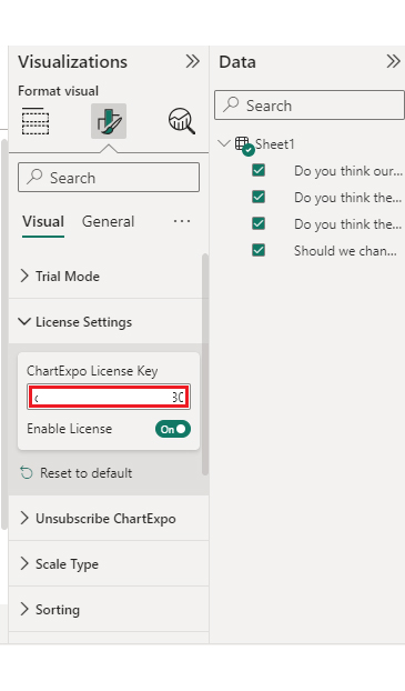
Stage 1: Logging in to Power BI

  • Log in to Power BI.
  • Enter your email address and click the “Submit” button.
Enter email to login to Power BI
  • You are redirected to your Microsoft account.
  • Enter your password and click “Sign in“.
Enter Password to login to Power BI
  • You can choose whether to stay signed in.
Click on stay signed in
  • Once done, the Power BI home screen will open.

Stage 2: Creating a Data Set and Selecting the Data Set to Use in Your Chart

  • Go to the left-side menu and click the “Create” button.
  • Select “Paste or manually enter data“.
select Paste or manually enter data in Power BI ce487
  • We’ll use the sample data below for this example.
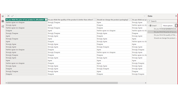
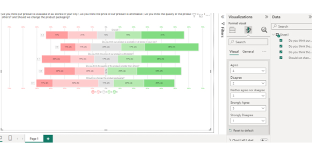
Is the price of our product affordable? Do you think the quality of the product is better than that of others? Should we change the product packaging? Is our product available in all stores in your city?
Neither agree nor disagree Strongly Disagree Agree Strongly Agree
Strongly Agree Agree Disagree Neither agree nor disagree
Neither agree nor disagree Strongly Disagree Disagree Strongly Agree
Disagree Agree Neither agree nor disagree Neither agree nor disagree
Strongly Disagree Strongly Disagree Strongly Agree Disagree
Agree Strongly Agree Disagree Strongly Agree
Strongly Disagree Agree Strongly Agree Agree
Agree Disagree Strongly Agree Neither agree nor disagree
Strongly Agree Strongly Agree Disagree Agree
Strongly Agree Strongly Agree Strongly Disagree Strongly Agree
Neither agree nor disagree Disagree Agree Strongly Disagree
Strongly Agree Strongly Disagree Neither agree nor disagree Strongly Agree
Strongly Disagree Disagree Disagree Neither agree nor disagree
Strongly Agree Strongly Agree Strongly Agree Strongly Agree
Agree Agree Agree Agree
Neither agree nor disagree Disagree Agree Strongly Disagree
Strongly Agree Strongly Agree Strongly Agree Strongly Agree
Disagree Strongly Agree Strongly Disagree Strongly Agree
Strongly Disagree Strongly Agree Agree Disagree
Disagree Disagree Disagree Strongly Disagree
  • Paste the above data table in the Power Query Window.
  • Select the “Create a dataset only” option.
Click Create a Dataset Only for Power BI Number Format
  • On the left-side menu, click “Data Hub“.
  • Power BI populates the data set list. (If you have not created a data set, refer to the Error! Reference source not found section)
  • Click on the “Create a report” dropdown.
Click Create a Report for Power BI Number Format
  • Click the “Expand All” button.
  • You can see your chart metrics:
  • Click on “Get more visuals“.
Click Get More Visuals for Power BI Number Format
  • Search for ChartExpo and select the Likert Scale Chart:
Search Liker Scale Chart for Power BI Number Format
  • Click the “Add” button.
Click Add Button for Power BI Number Format
  • You can now see the Likert Scale Chart in the visualizations list.
Get Likert Scale Chart Icon Visualization List for Power BI Number Format
  • In Visual, click License Settings, add the key, and enable the license.
  • After adding the key, you can see the Likert Scale Chart.
Add License Key for Power BI Number Format
  • Set the scale of the chart as follows:
Set Scale of Chart for Power BI Number Format
  • You can add the header text on top of the chart as follows:
Click Add Header Text for Power BI Number Format
  • Your Likert Scale Chart final look in Power BI:
Final Power BI Number Format

Insights

  • Price Affordability: Strongly Agree: Opinions on affordability vary.
  • Product Quality: Strongly Agree: Customers generally believe it surpasses competitors.
  • Packaging Change: Disagree: There is no clear consensus on the need for change.
  • Availability in Stores: Mixed: Uncertain if universally accessible in city stores.

FAQs

How do you convert text to number format in Power BI?

To convert text to a number format:

  1. Select the column with text values.
  2. Go to the “Modeling” tab.
  3. Choose “Data Type” and select “Whole Number” or “Decimal Number”.
  4. Confirm the change.

What format does Power BI use?

Power BI uses several number formats, including Whole Number, Decimal Number, and Percentage. These formats ensure data is displayed correctly. You can set the format in the “Modeling” tab. This helps in accurate data analysis and visualization.

How do I change the number format to millions in Power BI?

  1. Select the column with numbers.
  2. Go to the “Modeling” tab.
  3. Choose “Format” and select “Millions” from the dropdown.

This displays numbers in millions, helping to view large numbers more conveniently.

Wrap Up

The best practice for number formatting in Power BI involves several key steps. First, understand the data context. Knowing what your data represents guides you in choosing the most appropriate format. This ensures your data is presented accurately and meaningfully.

Second, ensure consistency across visuals. Applying uniform formats across all charts and tables in your report enhances readability. It creates a professional and cohesive look. This helps users compare data points without confusion.

Moreover, always choose the appropriate format for your data type. Use currency formats for financial data, percentages for rates, and decimal formats for precise values. This practice ensures your data is easily interpretable and relevant. Correct formatting helps prevent misunderstandings and errors.

Consider cultural and regional differences. Power BI allows you to customize formats based on regional settings. This is important for global reports, where different regions use different number symbols and formats. Adapting to these preferences ensures your reports are accessible and user-friendly.

Furthermore, take advantage of Power BI’s customization options. Tailor formats to meet specific needs, such as displaying large numbers in thousands or highlighting negative values. Custom formats can enhance the relevance and impact of your data presentation. This flexibility allows for better data communication.

Finally, regularly review and refine your number formats. As your data or audience changes, your formatting needs may also evolve. Periodic reviews ensure your reports remain accurate, clear, and effective. Staying updated with best practices in number formatting helps maintain the quality of your reports.

Following these best practices significantly enhances the clarity, consistency, and usability of your Power BI reports. Proper number formatting makes your data more accessible and supports accurate analysis and informed decision-making. Your reports will be more professional, reliable, and impactful.

How much did you enjoy this article?

PBIAd2
Start Free Trial!
137145

Related articles

next previous
Power BI12 min read

Power BI Group By Guide for Effective Data Insights

Learn how Power BI Group By helps you aggregate data, clarify trends, and create reports by grouping values to make large datasets manageable & insightful.

Power BI12 min read

How to Create Sankey Diagram in Microsoft Power BI?

Learn How to Create Sankey Diagram in Microsoft Power BI using Desktop & Web Service. What they are and how to use them effectively.

Power BI8 min read

Power BI Artificial Intelligence: Insights Using Visuals

Discover all there is to know about the Power BI artificial intelligence. You'll also discover how AI is used in Power BI, and how to use it for analysis and more.

Power BI9 min read

Budgeting in Healthcare: Use Visuals to Spot Budget Gaps

This guide helps you discover what budgeting in healthcare is. You'll also discover the factors that affect hospital budgets and types of budgeting in healthcare.

Power BI9 min read

Predictive Analytics in Power BI for Making Insightful Visuals

This guide shows you everything you need to know about Predictive Analytics in Power BI. It also shows you how it works, and how to interpret the results.

ChartExpo logo

Turn Data into Visual
Stories

CHARTEXPO

  • Home
  • Gallery
  • Videos
  • Services
  • Pricing
  • Contact us
  • FAQs
  • Privacy policy
  • Terms of Service
  • Sitemap

TOOLS

  • ChartExpo for Google Sheets
  • ChartExpo for Microsoft Excel
  • Power BI Custom Visuals by ChartExpo
  • Word Cloud

CATEGORIES

  • Bar Charts
  • Circle Graphs
  • Column Charts
  • Combo Charts
  • Comparison Charts
  • Line Graphs
  • PPC Charts
  • Sentiment Analysis Charts
  • Survey Charts

TOP CHARTS

  • Sankey Diagram
  • Likert Scale Chart
  • Comparison Bar Chart
  • Pareto Chart
  • Funnel Chart
  • Gauge Chart
  • Radar Chart
  • Radial Bar Chart
  • Sunburst Chart
  • see more
  • Scatter Plot Chart
  • CSAT Survey Bar Chart
  • CSAT Survey Chart
  • Dot Plot Chart
  • Double Bar Graph
  • Matrix Chart
  • Multi Axis Line Chart
  • Overlapping Bar Chart
  • Control Chart
  • Slope Chart
  • Clustered Bar Chart
  • Clustered Column Chart
  • Box and Whisker Plot
  • Tornado Chart
  • Waterfall Chart
  • Word Cloud
  • see less

RESOURCES

  • Blog
  • Resources
  • YouTube
SIGN UP FOR UPDATES

We wouldn't dream of spamming you or selling your info.

© 2025 ChartExpo, all rights reserved.