Categories
What does a normal distribution graph in Excel show you? More than you might think. Why? Because millions of data points, from customer behavior to delivery times, are recorded daily. This graph shows you all this with a single glance.


Think about delivery times for a popular food app. Most deliveries take 30 minutes—faster or slower than that is a normal distribution. The same logic applies to test scores, employee performance, and customer service ratings. Excel makes it easier to visualize these patterns using tools like a frequency chart.
But why Excel? Because Excel is everywhere, it’s the most accessible tool for spotting trends. With the correct formulas and tools, creating a normal distribution graph in Excel takes minutes, not hours.
Data isn’t useful until it’s clear. And nothing says clarity like a bell curve. It doesn’t matter whether you’re analyzing sales, survey results, or support call durations. The normal distribution graph in Excel shows you the center of the story and the spread around it. And that’s the key to better decisions.
This blog will explain how to create this graph, its meaning, and where it leads. You don’t need to be a data scientist to make sense of it. You need to know where to look—and how Excel can help.
Let’s explore normal distribution in Excel…
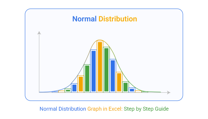
Definition: A normal distribution graph in Excel shows a symmetrical bell-shaped curve. It represents how data is spread around the mean. Most values cluster near the center, while newer values appear at the extremes. This pattern helps identify trends and outliers.
You can visualize this data using a frequency chart in Excel. It’s helpful in finance, marketing, and operations. Some use the best Excel add-ins for data analysis to make it easier. These tools speed up calculations and chart creation.
Have you ever stared at a spreadsheet full of numbers and thought, “What am I even looking at?” That’s where the normal distribution chart Excel steps in. It transforms raw data into clear, visual stories.
Let’s see why it matters—one smart reason at a time.
Have you ever felt like Excel shows numbers but hides the story? You’re not alone. Data without context is noise, and that’s where data visualization becomes a game-changer in data analysis. One powerful example? The normal distribution graph. It reveals patterns, peaks, and outliers in a snap.
But here’s the catch—Excel doesn’t always make it easy. Its charts are basic and clunky.
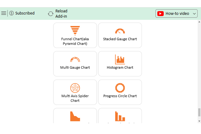
That’s where ChartExpo steps in. It plugs into Excel and upgrades your visuals instantly, including a Scatter plot in Excel with 3-variables. Think of it as Excel with a better eye for patterns and fewer headaches for you.
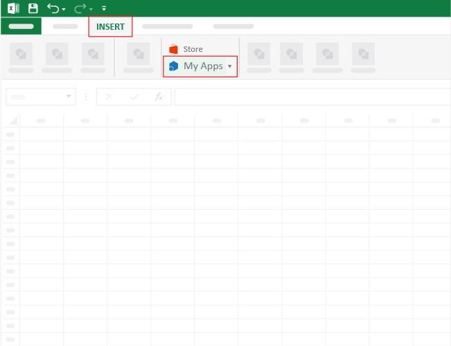
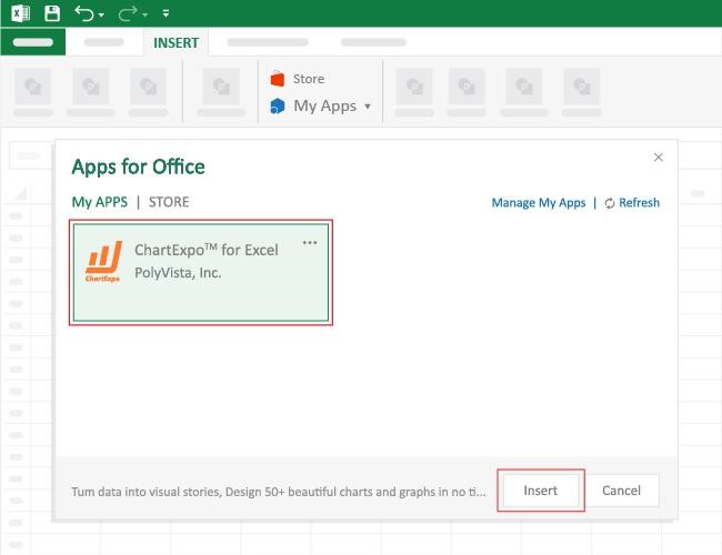
How to Install ChartExpo in Excel?
ChartExpo charts are available both in Google Sheets and Microsoft Excel. Please use the following CTAs to install the tool of your choice and create beautiful visualizations, including x and y axis charts, with a few clicks in your favorite tool.
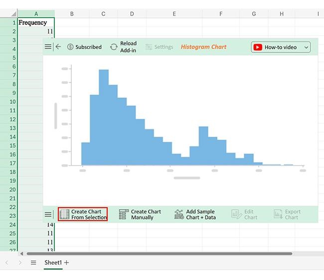
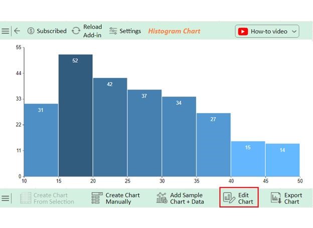
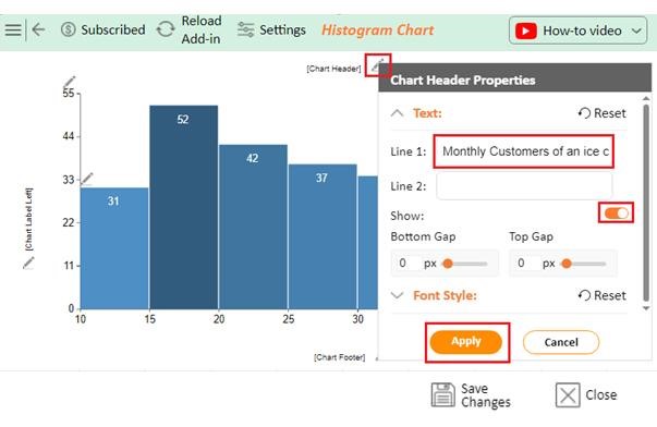
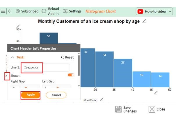
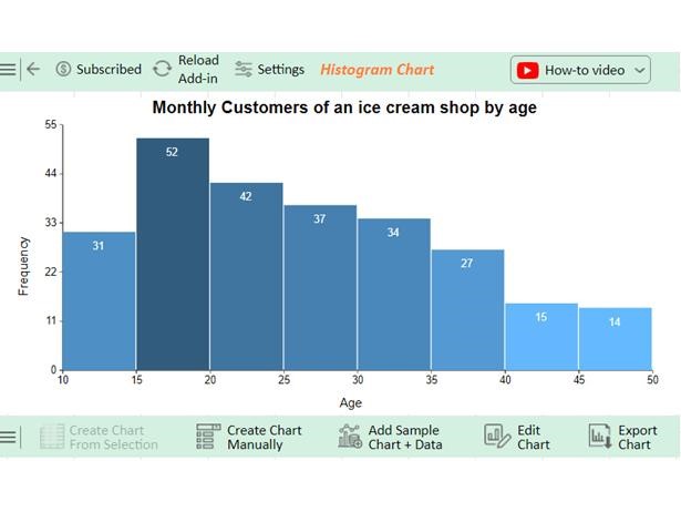
Let’s visualize and analyze this data in Excel using ChartExpo.
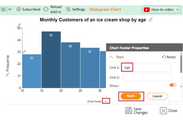
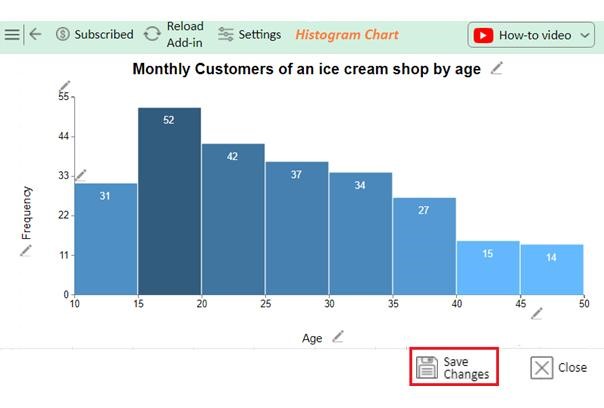
Frequency Data:


Clean visuals start with clean thinking. So, before we jump into the charts, let’s talk about the setup – a messy sheet leads to misleading graphs. To get a clear and accurate normal distribution graph in Excel, follow these smart practices:
Start with a Histogram to show frequency. For continuous data, use a normal distribution graph in Excel and combine it with data visualization tools for clarity. Overlay curves with actual data to see patterns and outliers better.
Yes!
Understanding the normal distribution in Excel helps you make sense of large data sets. It shows patterns, central values, and spreads. Most importantly, it lets you see what’s typical and what’s not.
This is key when analyzing trends. Whether you’re tracking sales, delivery times, or survey responses, the normal distribution brings structure to chaos. It simplifies decision-making.
Excel does a decent job. But it has limits. Knowing how to add a chart in Excel is essential, but that’s just the start. You still need the correct formulas and layout to understand everything. For deeper insights, pair the normal distribution with other models. The Poisson Distribution is great for rare events or count-based data. Both work well together when building a complete picture of your data.
Make your findings clear with strong data storytelling. A chart isn’t enough—it needs a message. Your audience should understand the “why” behind the curve.
In conclusion, Excel is a great start. But combining it with better visuals, context, and the right statistical tools takes your analysis to the next level.
So, do not hesitate; Install ChartExpo today to bring your data to life.
How much did you enjoy this article?


Learn how to use sparklines in Excel to quickly visualize trends inside cells. Discover types, creation steps, customization, use cases, benefits, and best practices.

Learn what a confidence interval graph is, how to create it in Excel, and how to interpret results to make more reliable, data-driven decisions.

A correlation matrix in Excel helps identify relationships between variables. Learn how to create, read, and use it for effective data analysis.


