• Home
  • Tools dropdown img
    • Spreadsheet Charts

      • ChartExpo for Google Sheets
      • ChartExpo for Microsoft Excel
    • Power BI Charts

      • Power BI Custom Visuals by ChartExpo
    • Word Cloud

  • Charts dropdown img
    • Chart Category

      • Bar Charts
      • Circle Graphs
      • Column Charts
      • Combo Charts
      • Comparison Charts
      • Line Graphs
      • PPC Charts
      • Sentiment Analysis Charts
      • Survey Charts
    • Chart Type

      • Box and Whisker Plot
      • Clustered Bar Chart
      • Clustered Column Chart
      • Comparison Bar Chart
      • Control Chart
      • CSAT Survey Bar Chart
      • CSAT Survey Chart
      • Dot Plot Chart
      • Double Bar Graph
      • Funnel Chart
      • Gauge Chart
      • Likert Scale Chart
      • Matrix Chart
      • Multi Axis Line Chart
      • Overlapping Bar Chart
      • Pareto Chart
      • Radar Chart
      • Radial Bar Chart
      • Sankey Diagram
      • Scatter Plot Chart
      • Slope Chart
      • Sunburst Chart
      • Tornado Chart
      • Waterfall Chart
      • Word Cloud
    • Google Sheets
      Microsoft Excel
  • Services
  • Pricing
  • Contact us
  • Blog
  • Support dropdown img
      • Gallery
      • Videos
      • Contact us
      • FAQs
      • Resources
    • Please feel free to contact us

      atsupport@chartexpo.com

Categories
All Data Visualizations Data Analytics Surveys
Add-ons/
  • Google Sheets
  • Microsoft Excel
  • Power BI
All Data Visualizations Data Analytics Surveys
Add-ons
  • Google Sheets
  • Microsoft Excel
  • Power BI

We use cookies

This website uses cookies to provide better user experience and user's session management.
By continuing visiting this website you consent the use of these cookies.

Ok

ChartExpo Survey


Home > Blog > Google Sheets

Grouping Rows in Google Sheets: Get More Insights

Google Spreadsheet Group Rows—Are you wondering what it is and why it matters?

Let me guide you – when your data grows, managing it becomes a chore. Scanning through hundreds of rows every day becomes time-consuming and tiring.

Google Spreadsheet Group Rows

Grouping rows brings clarity. Teams handling budgets, inventory, or project plans use this feature to speed up collaboration. Financial analysts use it to break down quarterly data, while teachers use it to track student progress.

The Google Sheets extension ecosystem even supports automation around grouped rows. With a few add-ons, repetitive work gets cut in half.

And yes, clean data matters. Before grouping, people often remove duplicates from Google Sheets to keep the sheets tidy. A clean sheet is a functional sheet.

Building dashboards can have an impact. Combine grouping with tools like Google Sheets’ progress bar, and your visuals stay sharp without distractions. Your data remains hidden or visible, exactly how you want it.

It works the same for big or small data sets. Grouping rows for the job application tracker template in Google Sheets helps keep your data organized.

This isn’t about doing more. It’s about seeing more by doing less. If your spreadsheet feels cluttered, you’re not alone. But the fix could be more straightforward than you think.

Let’s explore how grouped rows can turn messy into manageable.

Table of Contents:

  1. What is Grouping Rows in Google Sheets?
  2. Why is Google Sheets’ Collapse Rows Useful?
  3. When Should You Use Google Sheets Group Rows?
  4. How Do You Group Rows in Google Sheets Step by Step?
  5. How to Ungroup Rows in Google Sheets?
  6. How to Analyze Grouped Rows Data in Google Sheets?
  7. Tips for Grouping Rows in Google Sheets
  8. FAQs
  9. Wrap Up

What is Grouping Rows in Google Sheets?

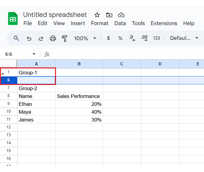
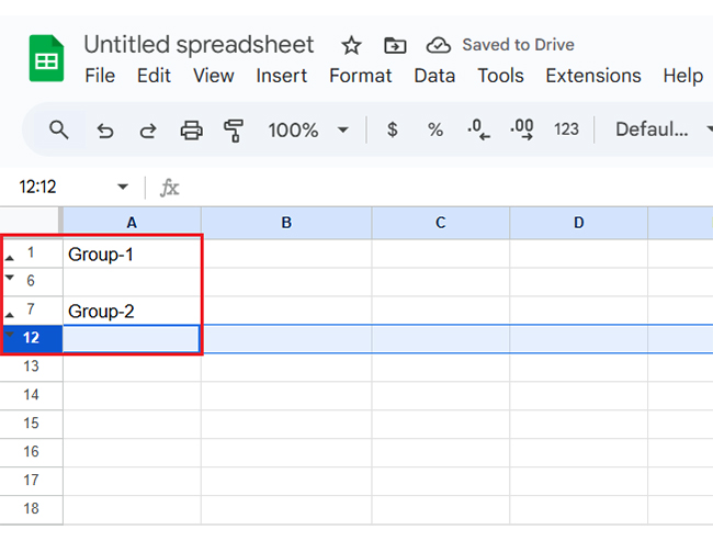
Definition: Grouping rows in Google Sheets means organizing rows into collapsible sections. It helps manage large datasets where you can hide or show rows with one click. This keeps your sheet clean and focused. It’s great for reports, budgets, and schedules. You save time by viewing what they need.

Google spreadsheets’ group rows make navigation easy and also reduce scrolling. Grouping rows is perfect for better data control and data presentation. It’s a simple way to boost your spreadsheet’s clarity.

Top Charts to Show Analysis in Google Sheets

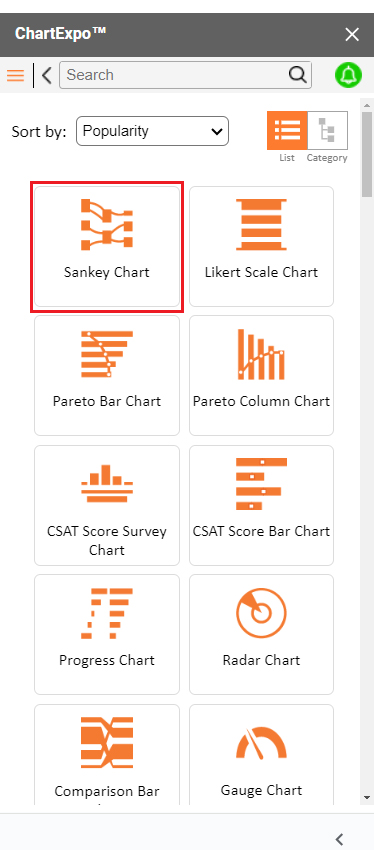
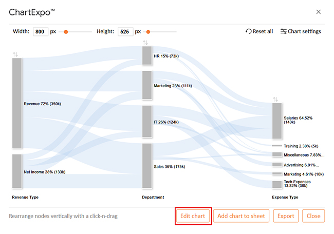
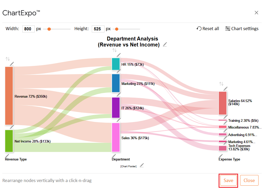
Are you looking to make sense of your grouped rows of data in Google Sheets? Check out these top charts created using ChartExpo. These charts will turn your raw numbers into clear, compelling visuals.
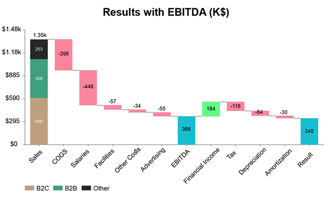
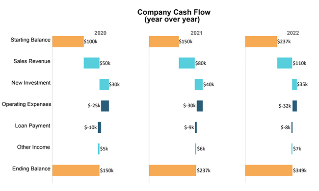
Sankey Chart:

Google Spreadsheet Group Rows

Multi Axis Line Chart:

Google Spreadsheet Group Rows

Comparison Bar Chart:

Google Spreadsheet Group Rows

Stacked Waterfall Chart:

Google Spreadsheet Group Rows

Horizontal Waterfall Chart:

Google Spreadsheet Group Rows

Marimekko (aka Mosaic)

Google Spreadsheet Group Rows

Why is Google Sheets’ Collapse Rows Useful?

Have you ever opened a sheet and instantly felt overwhelmed? You’re not alone. That’s where the power of collapsing rows steps in. With tools like Google Sheets, group rows, even messy sheets, can feel calm.

How?

  • Improved organization: Grouping rows lets you hide details you don’t need immediately, keeping your spreadsheet clean and focused.
  • Easier navigation: Collapsing rows reduces the need to scroll through long sheets. With help from a Google Sheets extension, you can jump straight to the section that matters.
  • Enhanced data analysis: Organize related data, highlighting totals or summaries without distractions. Pair it with a Google Sheets progress bar to track performance clearly and efficiently.
  • Simplified collaboration: Shared sheets become easier to read when rows are grouped by topic or task. This is especially useful for updating a budget in Google Sheets, allowing teammates to review specific sections.

When Should You Use Google Sheets Group Rows?

Have you ever felt buried under rows and rows of spreadsheet data? Scrolling through endless lines isn’t fun. That’s where Google Spreadsheets’ group rows make a real difference. It’s not about fancy tricks—it’s about getting control fast.

  • Large data sets: When your sheet has hundreds or thousands of rows, grouping helps you breathe. You can shrink the noise and expand what you need.
  • Hierarchical data: Grouping is necessary if your data follows a structure, like tasks under projects or items under categories. It turns chaos into a clean, logical view.
  • Time-based data: Are you tracking daily, weekly, or monthly trends? Use grouping to collapse timeframes and spot patterns faster. Complement it by learning how to create a chart in Google Sheets for clearer insights.
  • Collaborative work: When teams work on the same sheet, things can get messy. Grouped rows guide everyone, especially while handling a shared budget on Google Sheets or reviewing grouped tasks.

How Do You Group Rows in Google Sheets Step by Step?

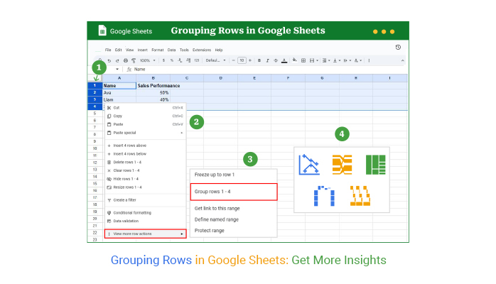
Have you ever wished your spreadsheet could clean itself up with a click? Grouping rows in Google Sheets is about as close as it gets. It’s simple, visual, and surprisingly satisfying. Here’s how to do it—step by step.

  • Enter your data into Google Sheets. Make sure it’s organized in rows that belong together.
Google Spreadsheet Group Rows
  • Highlight the rows you want to group. Right-click and choose the “Group rows X–Y” option.
Google Spreadsheet Group Rows
  • You’ll see a grey bar on the left with a minus icon. This means your rows are grouped—Group 1 is complete.
Google Spreadsheet Group Rows
  • To create Group 2, repeat the same steps with a different section of rows. You can make as many groups as you need.
Google Spreadsheet Group Rows
  • Finally, your grouped data appears structured. You can collapse or expand each group to focus on specific details without losing the big picture.
Google Spreadsheet Group Rows

How to Ungroup Rows in Google Sheets?

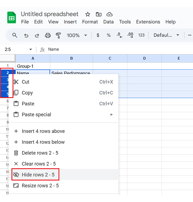
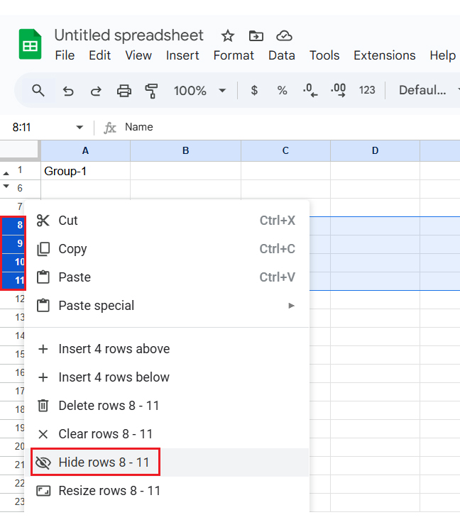
Sometimes, you need to ungroup your rows in Google Sheets. You may want to see everything simultaneously or prefer a clean, ungrouped view. Here are a few simple steps to do it.

  • Select the grouped rows: First, find the rows you want to ungroup. A small number (like “Group 1”) on the left side indicates that they’re grouped. Click on that number to select the entire group.
  • Right-click on the selected rows: Next, right-click on any of the highlighted rows. A menu with various options will pop up.
  • Choose “ungroup rows”: The drop-down menu will show the option to “Ungroup rows”. Click it, and your rows will no longer be grouped.

How to Analyze Grouped Rows Data in Google Sheets?

Have you ever felt your spreadsheet hides the story your data wants to tell? Google Sheets is great for crunching numbers, but it does not show what they mean. Data visualization plays a massive role in data analysis. It turns rows and columns into patterns and insights.

But here’s the catch: Google Sheets has limits. Its charts are basic, clunky, and sometimes flat-out boring.

That’s where ChartExpo steps in. It’s a powerful tool that brings your data to life. And it works beautifully with features like grouping rows—yes, we’re talking about grouping rows in Google Sheets.

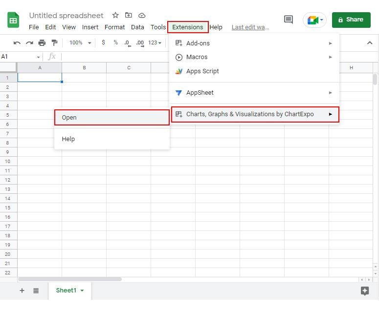
How to Install ChartExpo in Google Sheets?

  1. To start using ChartExpo, download it directly from the Google Sheets program. To do this, select Extensions from the top toolbar.
  2. A menu will appear. Click the Get add-ons option.
  3. Search for ChartExpo, and click on Charts, Graphs & Visualizations by ChartExpo when it appears in the results.
  4. Click the Install button. You will have to confirm your Google account and accept some permissions.

ChartExpo charts are available both in Google Sheets and Microsoft Excel. Please use the following CTAs to install the tool of your choice and create beautiful visualizations in a few clicks in your favorite tool.

Example

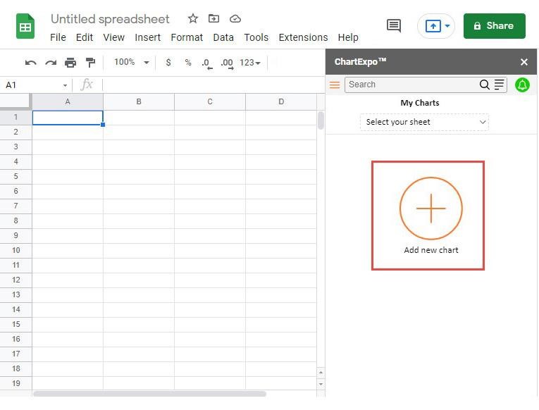
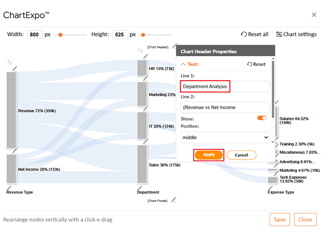
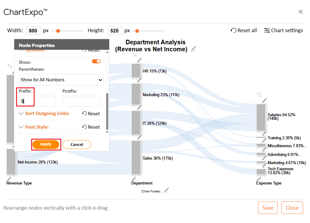
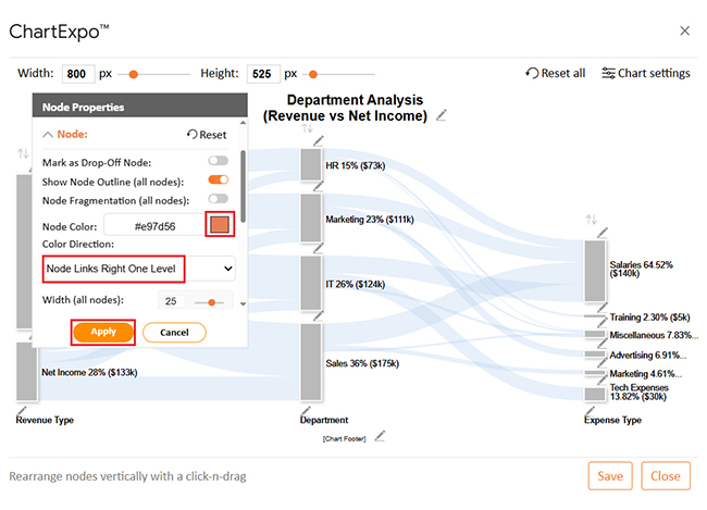
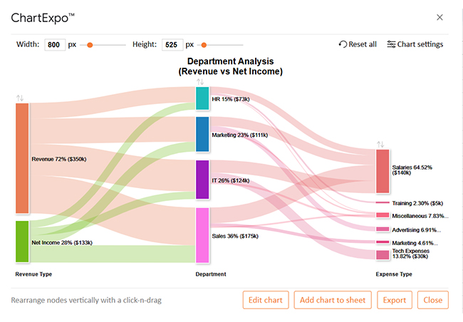
Let’s learn how to create a chart and analyze it in Google Sheets using ChartExpo.
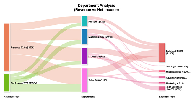
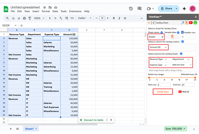
Revenue Type Department Expense Type Amount ($)
Revenue Sales 120,000
Sales Salaries 50,000
Sales Marketing 10,000
Sales Miscellaneous 5,000
Net Income Sales 55,000
Revenue Marketing 80,000
Marketing Salaries 30,000
Marketing Advertising 15,000
Marketing Miscellaneous 4,000
Net Income Marketing 31,000
Revenue HR 50,000
HR Salaries 20,000
HR Training 5,000
HR Miscellaneous 2,000
Net Income HR 23,000
Revenue IT 100,000
IT Salaries 40,000
IT Tech Expenses 30,000
IT Miscellaneous 6,000
Net Income IT 24,000
  • To get started with ChartExpo, install ChartExpo in Google Sheets.
  • Go to Extensions > Charts, Graphs & Visualizations by ChartExpo > Open.
Google Spreadsheet Group Rows
  • To access the charts library, click the Add new chart button.
Google Spreadsheet Group Rows
  • Once ChartExpo is loaded. Click on “Sankey Chart”.
Google Spreadsheet Group Rows
  • First, insert the data table into the sheet. Then, choose the Sheet name from the drop-down menu in the ChartExpo section.
  • Select the metric column; the metric is the numeric column in your data sheet.
  • Select the dimensions column; the dimension is the categorical column in your datasheet that contains text information.
  • Click the Create chart button to complete the process.
Google Spreadsheet Group Rows
  • ChartExpo will generate the visualization below for you.
Google Spreadsheet Group Rows
  • If you want to have the chart’s title, click Edit Chart, as shown in the above image.
  • Click the pencil icon next to the Chart Header to change the title.
  • It will open the properties dialog. Under the Text section, you can add a heading in Line 1 and enable Show.
  • Give the appropriate title of your chart and click the Apply button.
Google Spreadsheet Group Rows
  • You can add the dollar sign with values as follows:
Google Spreadsheet Group Rows
  • You can add the color in Nodes and set the direction as follows:
Google Spreadsheet Group Rows
  • Click the “Save Changes” button to persist the changes.
Google Spreadsheet Group Rows
  • Your final chart will appear as below.
Google Spreadsheet Group Rows

Insights

  • Sales leads: $120K revenue, high expenses, resulting in $55K net income.
  • IT: Balanced spending, showing efficiency.
  • HR: Maintains efficiency.
  • Marketing: Moderate revenue, well-managed costs, yielding $31K net income.

Tips for Grouping Rows in Google Sheets

Grouping rows in Google Sheets can make managing data a breeze. You can take your organization to the next level with a few smart tips. Here’s how to group rows like a pro.

  • Organize data logically: Group your data based on categories or related items. Whether it’s tasks under projects or products by type, this structure helps you stay organized.
  • Use grouping for hierarchical data: If your data has different levels (e.g., tasks under a project), grouping can visually organize it. It’s excellent for displaying complex information without overwhelming your viewer.
  • Name your groups: Giving each group a clear name helps with navigation. Labeling groups makes it easy to identify sections at a glance.
  • Avoid over-grouping: Don’t group every single row. Over-grouping can make your sheet harder to navigate – group only what makes sense.
  • Collapse for better focus: Collapse groups you aren’t working on. This helps you focus on what’s essential without distractions.
  • Grouping for collaboration: Grouping keeps things tidy when multiple people work on the same sheet. It makes it easier for others to find the data they need and minimizes confusion.

FAQs

How do I group rows in Google Sheets to collapse and expand them?

  • Select the rows you want to group.
  • Right-click and choose “Group rows”.
  • A minus icon will appear next to the group.
  • Click the icon to collapse or expand the group as needed.

How do I group and hide rows in Google Sheets?

  • Highlight the rows you want to group.
  • Right-click and select “Group rows”.
  • The rows are grouped with a minus icon.
  • Click the icon to collapse and hide the rows for a cleaner sheet.

Wrap Up

Grouping rows in Google Sheets is a simple yet powerful tool for organizing data efficiently. You can collapse or expand rows to keep your sheet clean and easy to navigate.

It’s beneficial for large datasets. When data grows, it becomes harder to manage. Grouping lets you hide unnecessary details and focus on what’s important. Paired with an overlapping bar chart in Google Sheets, you can track progress while keeping your data organized.

Grouping provides a clear structure for hierarchical data. It’s perfect for tasks, projects, or categories that require nesting. You can expand or collapse sections based on your needs. This improves organization and readability, ensuring nothing gets lost or overlooked.

When collaborating, grouping keeps things tidy. Teams can focus on relevant data without distractions. It simplifies working with others, especially on shared documents. This helps to remove duplicates in Google Sheets and ensure clean data.

You can easily group or ungroup rows with a few clicks. This flexible tool adapts to different tasks and is a great way to maintain control over your data.

In conclusion, grouping rows in Google Sheets improves efficiency. It helps you stay organized and makes working with large datasets much easier. For better data visualization, install ChartExpo to create more dynamic charts.

How much did you enjoy this article?

GSAd2
Start Free Trial!
151999

Related articles

next previous
Google Sheets14 min read

How to Create a Dashboard in Google Sheets?

Learn how to Create a Dashboard in Google Sheets to simplify your data analysis and keep your performance insights organized.

Google Sheets11 min read

How to Use a Job Application Tracker Template in Google Sheets?

Click to learn how the Job Application Tracker Template in Google Sheets can simplify your job search and keep your applications organized.

Google Sheets10 min read

Survey in Google Sheets: A Complete Guide

Discover what a survey in Google Sheets is and why it's great for data collection. Learn to create, analyze, and visualize survey data with quick chart tips.

Google Sheets9 min read

Payroll Template in Google Sheets for Insightful Reports

A payroll spreadsheet template simplifies pay tracking in Google Sheets. Learn how to create, use, and analyze it with easy steps and insightful visuals.

Google Sheets10 min read

Balance Sheet Template in Google Sheets for Visual Insights

A balance sheet template in Google Sheets helps track assets, liabilities, and equity. Click here to learn how to easily create, analyze, and visualize your financial data.

ChartExpo logo

Turn Data into Visual
Stories

CHARTEXPO

  • Home
  • Gallery
  • Videos
  • Services
  • Pricing
  • Contact us
  • FAQs
  • Privacy policy
  • Terms of Service
  • Sitemap

TOOLS

  • ChartExpo for Google Sheets
  • ChartExpo for Microsoft Excel
  • Power BI Custom Visuals by ChartExpo
  • Word Cloud

CATEGORIES

  • Bar Charts
  • Circle Graphs
  • Column Charts
  • Combo Charts
  • Comparison Charts
  • Line Graphs
  • PPC Charts
  • Sentiment Analysis Charts
  • Survey Charts

TOP CHARTS

  • Sankey Diagram
  • Likert Scale Chart
  • Comparison Bar Chart
  • Pareto Chart
  • Funnel Chart
  • Gauge Chart
  • Radar Chart
  • Radial Bar Chart
  • Sunburst Chart
  • see more
  • Scatter Plot Chart
  • CSAT Survey Bar Chart
  • CSAT Survey Chart
  • Dot Plot Chart
  • Double Bar Graph
  • Matrix Chart
  • Multi Axis Line Chart
  • Overlapping Bar Chart
  • Control Chart
  • Slope Chart
  • Clustered Bar Chart
  • Clustered Column Chart
  • Box and Whisker Plot
  • Tornado Chart
  • Waterfall Chart
  • Word Cloud
  • see less

RESOURCES

  • Blog
  • Resources
  • YouTube
SIGN UP FOR UPDATES

We wouldn't dream of spamming you or selling your info.

© 2025 ChartExpo, all rights reserved.