• Home
  • Tools dropdown img
    • Spreadsheet Charts

      • ChartExpo for Google Sheets
      • ChartExpo for Microsoft Excel
    • Power BI Charts

      • Power BI Custom Visuals by ChartExpo
    • Word Cloud

  • Charts dropdown img
    • Chart Category

      • Bar Charts
      • Circle Graphs
      • Column Charts
      • Combo Charts
      • Comparison Charts
      • Line Graphs
      • PPC Charts
      • Sentiment Analysis Charts
      • Survey Charts
    • Chart Type

      • Box and Whisker Plot
      • Clustered Bar Chart
      • Clustered Column Chart
      • Comparison Bar Chart
      • Control Chart
      • CSAT Survey Bar Chart
      • CSAT Survey Chart
      • Dot Plot Chart
      • Double Bar Graph
      • Funnel Chart
      • Gauge Chart
      • Likert Scale Chart
      • Matrix Chart
      • Multi Axis Line Chart
      • Overlapping Bar Chart
      • Pareto Chart
      • Radar Chart
      • Radial Bar Chart
      • Sankey Diagram
      • Scatter Plot Chart
      • Slope Chart
      • Sunburst Chart
      • Tornado Chart
      • Waterfall Chart
      • Word Cloud
    • Google Sheets
      Microsoft Excel
  • Services
  • Pricing
  • Contact us
  • Blog
  • Support dropdown img
      • Gallery
      • Videos
      • Contact us
      • FAQs
      • Resources
    • Please feel free to contact us

      atsupport@chartexpo.com

Categories
All Data Visualizations Data Analytics Surveys
Add-ons/
  • Google Sheets
  • Microsoft Excel
  • Power BI
All Data Visualizations Data Analytics Surveys
Add-ons
  • Google Sheets
  • Microsoft Excel
  • Power BI

We use cookies

This website uses cookies to provide better user experience and user's session management.
By continuing visiting this website you consent the use of these cookies.

Ok

ChartExpo Survey


Home > Blog > Microsoft Excel

Excel Template for Capacity Planning: Visuals for Efficiency

How do you analyze an Excel template for capacity planning?

This question might seem straightforward, but the answer can define success in managing resources. Capacity planning is a critical process across industries. From healthcare to manufacturing, teams depend on accurate data to meet demand. Poor planning can lead to missed deadlines, frustrated customers, and financial losses.

Google Sheet to-do list template

An Excel template for capacity planning is the first tool teams turn to for managing workloads. It’s accessible, familiar, and flexible enough to fit various needs. But analyzing one isn’t about glancing at rows and columns. It requires understanding the data flow, identifying patterns, and pinpointing potential gaps. Custom Excel charts help you visualize workload distribution and identify inefficiencies quickly.

A well-structured template can reveal whether you’re overcommitting resources or leaving potential unused. Moreover, charting and graphing help break down complex data, making it easier to track utilization trends over time. Sharp analysis turns data into action—spot trends, adjust for variability, and optimize for efficiency.

Using chart elements in Excel enhances clarity, enabling teams to make confident decisions. Whether leading a small team or scaling operations, your analysis drives success.

Let me show you how…

Table of Contents:

  1. What is Capacity Planning Template in Excel?
  2. Why Do You Need a Capacity Planning Template in Excel?
  3. When Should You Use a Capacity Planning Spreadsheet?
  4. What’s Included in the Capacity Planning Template?
  5. How to Create Capacity Planning in Excel with Example?
  6. How to Analyze Capacity Planning Template in Excel?
  7. Best Practices for Production Capacity Planning in Excel
  8. FAQs:
  9. Wrap Up

What is Capacity Planning Template in Excel?

Definition: A capacity planning template in Excel helps manage resources efficiently. It tracks workload, schedules, and resource availability. Businesses use it to predict future needs and avoid overloading or underutilizing resources. The template organizes data into tables, charts, or timelines for clear insights.

This template is customizable for different industries, from manufacturing to IT. To make informed decisions, teams must analyze data with Excel to identify trends and resource gaps. By reviewing this template, you can plan more effectively and meet demands. Excel’s flexibility makes it a popular tool for creating and managing capacity planning templates.

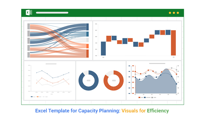
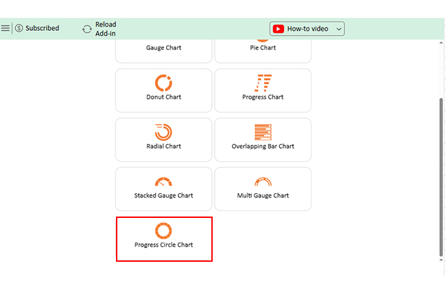
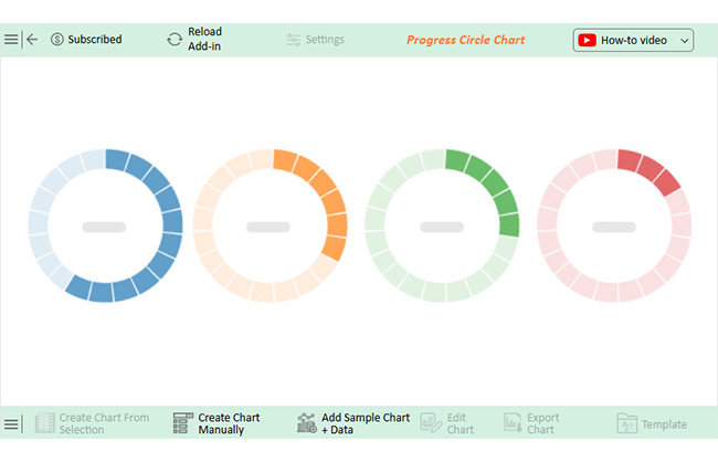
Process of Making a Capacity Planning Template in Microsoft Excel with Progress Circle Chart

Process of Making a Capacity Planning Template in Google Sheets with Progress Circle Chart

Why Do You Need a Capacity Planning Template in Excel?

Do you feel like your team constantly juggles too much or too little? That’s where a capacity planning template in Excel comes in. It’s not just a spreadsheet—it’s your roadmap to more competent resource management. Here’s why this tool matters and how it can transform your work.

  • Efficient resource allocation: A capacity planning template ensures resources are assigned where they’re needed most. It prevents some team members from being overburdened while others remain underutilized.
  • Improved workload management: The template provides a clear view of tasks and deadlines in one place. It allows for easier prioritization and smooth coordination among team members.
  • Accurate forecasting: The template analyzes past data to help predict future resource needs. Data analysis reduces the risk of unexpected bottlenecks or shortages.
  • Cost optimization: Proper resource allocation minimizes wasted time and effort. It keeps budgets in check by avoiding unnecessary expenses.
  • Data-driven decisions: The template transforms raw data into actionable insights through charts and trends. This helps teams make strategic decisions based on facts, not guesswork.
  • Customizability and accessibility: Excel templates can be adjusted to fit any industry or business size. Their widespread use ensures teams can adopt them with minimal training.

When Should You Use a Capacity Planning Spreadsheet?

Capacity planning spreadsheets are the ultimate tool for staying organized and prepared. Moreover, data presentation makes it easier to track projects and anticipate surprises. They help you stay in control, and here’s how they work for you:

  • Project planning: A spreadsheet keeps your project timelines and resources in check. With a clear overview, you can anticipate needs and prevent bottlenecks before they happen.
  • Workload balancing: It’s easy to spot who’s overworked and has capacity. By redistributing tasks, you ensure everyone stays productive without burning out.
  • Forecasting needs: Use it to predict future resource requirements based on current trends. It lets you stay ahead of demand and avoid last-minute scrambles.
  • Budget optimization: See where your resources are going and adjust to avoid waste. Planning here can save a lot of money down the line.
  • Performance tracking: Track how healthy resources are utilized and identify gaps. Regular monitoring ensures constant improvement and the achievement of goals.
  • Scaling & crisis management: A spreadsheet offers clarity whether you’re scaling up or tackling unexpected challenges. It helps you plan adjustments quickly and efficiently without losing focus.

What’s Included in the Capacity Planning Template?

A capacity planning template is like a blueprint for managing resources and staying organized. Using it with the progress bar in Excel will help you track progress visually. This template is packed with tools to balance tasks and plan effectively, and here’s what you’ll find inside:

  • Resource inventory: This is a detailed list of all your available resources, such as people, tools, and equipment. It ensures you know what’s available for every project.
  • Task and workload details: Break down tasks by project, assign responsibilities, and track progress in one place. This helps prevent bottlenecks and keeps the team aligned.
  • Capacity and demand tracker: Use it to assess current capacity utilization and predict future needs. This allows you to plan effectively and avoid over-commitment.
  • Gantt Chart or Calendar View: Data visualization helps you see timelines and deadlines at a glance. It’s a simple way to track milestones and keep projects on schedule.
  • Dashboards and reports: Access real-time insights through intuitive charts and summaries. These help you make informed decisions quickly and confidently.

How to Create Capacity Planning in Excel with Example?

Managing workloads without a clear plan can lead to stress and missed deadlines. A capacity planning template in Excel helps you allocate resources efficiently and avoid bottlenecks. Converting this Excel data to graphs makes insights clearer and decision-making easier.

Here’s how to do it:

  • Define your resources: List all team members, tools, or equipment involved in your projects. Include their weekly capacity and availability to track resource limits.
Google Sheet to-do list template
  • List tasks or projects: Create a table with details like task name, assigned resource, required effort, and deadline. This helps ensure every task has a responsible owner and a realistic timeline.
Google Sheet to-do list template
  • Calculate utilization: To track workload distribution, use the formula Utilization (%) = (Effort ÷ Capacity) × 100. This helps identify whether a resource is underused, fully booked, or overloaded.
  • Highlight overloaded resources: Apply Conditional Formatting to color-code utilization percentages. It makes it easy to spot overworked employees (red) and underused resources (green).
  • Visualize data: Use a bar chart to see utilization percentages at a glance. Moreover, a Gantt Chart helps map task durations, making scheduling more transparent.
  • Here’s the final resource utilization table.
Google Sheet to-do list template

How to Analyze Capacity Planning Template in Excel?

Analyzing an Excel template for capacity planning can feel like solving a puzzle with missing pieces. This is where data visualization comes into play. Data visualization makes insights appealing and easy to understand.

However, Excel often stumbles when creating clear and impactful visualizations. Sure, you can whip up a basic bar chart, but making data pop or telling a story? Trouble!

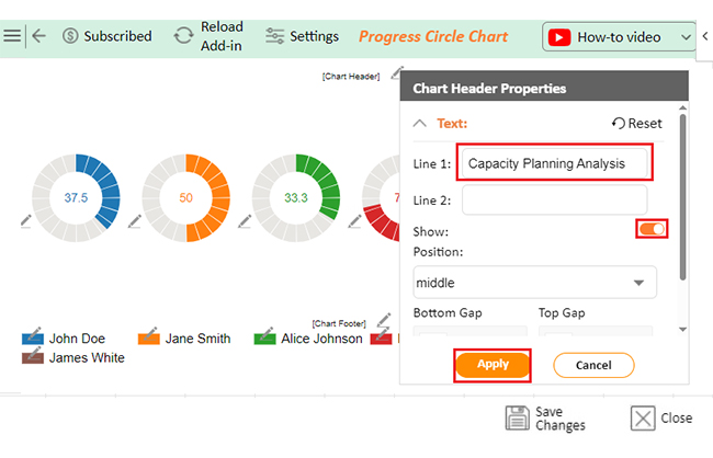
That’s where ChartExpo comes to the rescue. This chart add-in for Excel is a game-changer for turning dull spreadsheets into insightful visuals. ChartExpo’s intuitive interface and dynamic charts simplify capacity planning, making analysis faster and more insightful.

The charts below were created in Excel using ChartExpo:

Progress Circle Chart

Google Sheet to-do list template

Multi Series Line Chart

Google Sheet to-do list template

Sankey Diagram

Google Sheet to-do list template

Multi-Axis Line Chart

Google Sheet to-do list template

Waterfall Chart

Google Sheet to-do list template

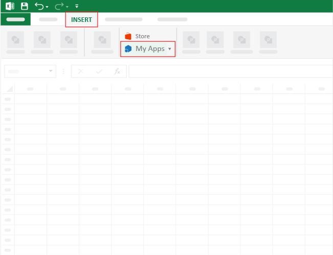
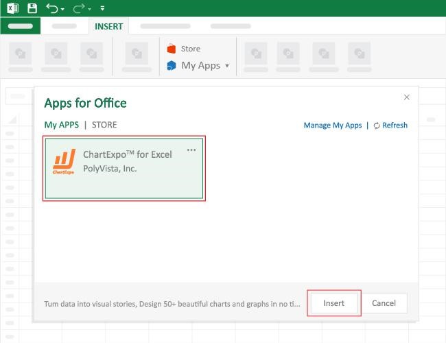
How to Install ChartExpo in Excel?

  1. Open your Excel application.
  2. Open the worksheet and click the “Insert” menu.
  3. You’ll see the “My Apps” option.
  4. In the Office Add-ins window, click “Store” and search for ChartExpo on my Apps Store.
  5. Click the “Add” button to install ChartExpo in your Excel.

ChartExpo charts are available both in Google Sheets and Microsoft Excel. Please use the following CTAs to install the tool of your choice and create beautiful visualizations with a few clicks in your favorite tool.

Example

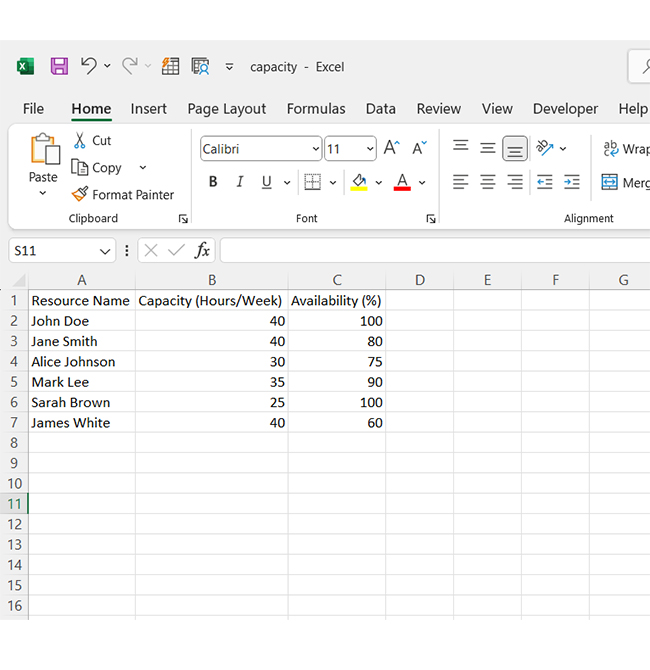
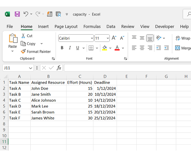
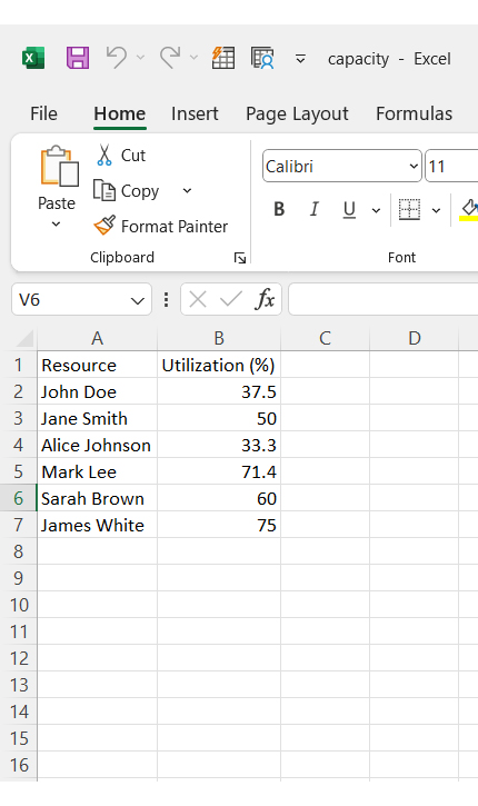
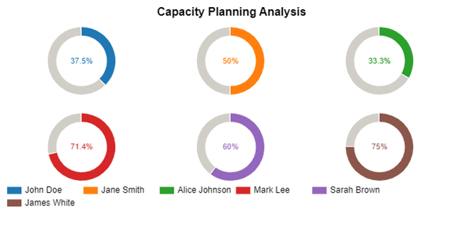
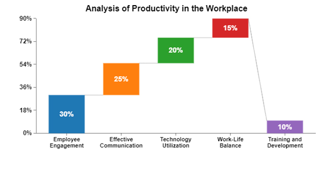
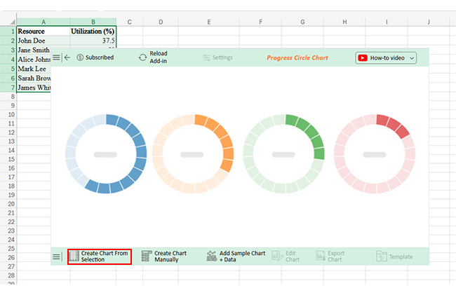
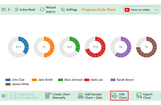
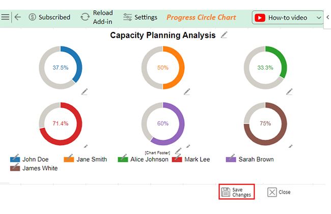
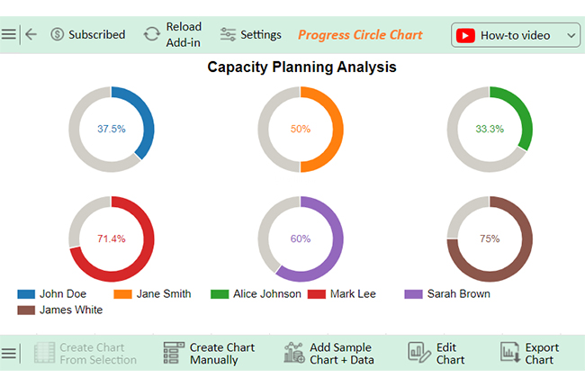
Let’s analyze this sample data in Excel using ChartExpo.

Resource Utilization (%)
John Doe 37.5
Jane Smith 50
Alice Johnson 33.3
Mark Lee 71.4
Sarah Brown 60
James White 75
  • To get started with ChartExpo, install ChartExpo in Excel.
  • Now Click on My Apps from the INSERT menu.
Google Sheet to-do list template
  • Choose ChartExpo from My Apps, then click Insert.
Google Sheet to-do list template
  • Once it loads, scroll through the charts list to locate and choose the “Progress Circle Chart”.
Google Sheet to-do list template
  • The Progress Circle Chart will appear as below.
Google Sheet to-do list template
  • Click the “Create Chart From Selection” button after selecting the data from the sheet, as shown.
Google Sheet to-do list template
  • ChartExpo will generate the visualization below for you.
Google Sheet to-do list template
  • If you want to add anything to the chart, click the Edit Chart button:
  • Click the pencil icon next to the Chart Header to change the title.
  • It will open the properties dialog. Under the Text section, you can add a heading in Line 1 and enable Show.
  • Give the appropriate title of your chart and click the Apply button.
Google Sheet to-do list template
  • You can add the (%) with all values:
Google Sheet to-do list template
  • Click on Settings and change the variation type:
Google Sheet to-do list template
  • Click the “Save Changes” button to persist the changes made to the chart.
Google Sheet to-do list template
  • Your final Progress Circle Chart will look like the one below.
Google Sheet to-do list template

Insights:

  • John Doe: 37.5% utilization (underused)
  • Alice Johnson: 33.3% utilization (underused)
  • Mark Lee, Sarah Brown: Higher utilization
  • James White: Most utilized at 75%

Best Practices for Production Capacity Planning in Excel

Production capacity planning in Excel doesn’t have to be overwhelming. With the right business analytics strategies, you can make it seamless and practical. Here are six best practices to follow:

  1. Set clear goals: Start your planning with a clear objective. Whether you optimize resources or forecast demand, know what success looks like.
  2. Organize your data: Keep your data clean, categorized, and easy to navigate. This ensures your spreadsheet works efficiently and remains user-friendly.
  3. Master Excel formulas: Use functions like SUMIF, VLOOKUP, and IF statements to automate calculations. This reduces errors and saves time.
  4. Visualize with charts: Add graphs and conditional formatting to make interpreting your data easier. A good visual can instantly highlight trends and problem areas.
  5. Stay flexible: Build your spreadsheet to adapt to changes, such as fluctuating demand or new resources. Flexibility ensures your plan stays relevant.
  6. Regular reviews: Check and update your spreadsheet frequently to keep it accurate. Continuous refinement ensures you’re always working with the best data.

FAQs

How to calculate production capacity in Excel?

To calculate production capacity in Excel:

  1. List production units or machines.
  2. Enter their output rate (units per hour).
  3. Multiply the output rate by available working hours.
  4. Sum the total output for all units or machines to find capacity.

How do I create a process capability chart in Excel?

To create a process capability chart in Excel:

  1. Collect data on process measurements.
  2. Calculate the mean and standard deviation.
  3. Set upper and lower specification limits.
  4. Plot data points on a Scatter Plot.
  5. Add control limits and capabilities lines.

Wrap Up

Analyzing an Excel template for capacity planning is essential for optimizing resource allocation. Excel is great for organizing data, but it often lacks the power to present it visually compellingly. You can track resources and workloads, but the data might be difficult to interpret. This is where data visualization comes in.

With charts and graphs, data is transformed into a story. Visuals allow you to spot trends, identify bottlenecks, and make informed decisions. As we have seen, Excel’s basic charting tools sometimes fail to create clear, insightful visuals. Therefore, upgrading to a dynamic graph Excel setup makes it easier to adjust views and update insights in real-time.

ChartExpo enhances Excel’s capability by offering powerful charts that make data clearer and more accessible. With its user-friendly interface, it simplifies the creation of complex visualizations. Further, it bridges the gap between raw data and actionable insights, enabling better decision-making through data enrichment.

Capacity planning can be enhanced by combining Excel for data management and visualization tools for analysis. Integrating a digital dashboard helps stakeholders track metrics and KPIs in real-time.

Pro tip: Install ChartExpo for better visualization, improved resource utilization, and smoother project execution.

How much did you enjoy this article?

ExcelAd2
Start Free Trial!
148823

Related articles

next previous
Microsoft Excel10 min read

Invoice Tracker Template in Excel for Better Insights

An invoice tracker Excel template helps track invoices, due dates, and payments. Learn how to use this template for better financial management.

Microsoft Excel12 min read

Key Performance Indicators in Healthcare for Better Insights

Key Performance Indicators in healthcare track patient care and efficiency. Learn about these KPIs, top examples, and how to use them to improve outcomes.

Microsoft Excel10 min read

BMI Calculation Formula in Excel for Better Fitness Insights

The BMI calculation formula in Excel helps track and analyze body mass index. Explore step-by-step instructions and tips to simplify BMI tracking in Excel.

Microsoft Excel29 min read

How to Create a Tornado Chart in Excel? A Complete Guide

Click to learn how to plot a Tornado Chart in Excel using easy-to-follow steps. Also, we’ll address the following question: what is a Tornado Diagram?

Microsoft Excel14 min read

How to Create a Scatter Plot in Excel with 3 Variables?

Click to discover how to create a Scatter Plot in Excel with 3 variables. We’ll also address the following question: why do we use Scatter Plot Graph?

ChartExpo logo

Turn Data into Visual
Stories

CHARTEXPO

  • Home
  • Gallery
  • Videos
  • Services
  • Pricing
  • Contact us
  • FAQs
  • Privacy policy
  • Terms of Service
  • Sitemap

TOOLS

  • ChartExpo for Google Sheets
  • ChartExpo for Microsoft Excel
  • Power BI Custom Visuals by ChartExpo
  • Word Cloud

CATEGORIES

  • Bar Charts
  • Circle Graphs
  • Column Charts
  • Combo Charts
  • Comparison Charts
  • Line Graphs
  • PPC Charts
  • Sentiment Analysis Charts
  • Survey Charts

TOP CHARTS

  • Sankey Diagram
  • Likert Scale Chart
  • Comparison Bar Chart
  • Pareto Chart
  • Funnel Chart
  • Gauge Chart
  • Radar Chart
  • Radial Bar Chart
  • Sunburst Chart
  • see more
  • Scatter Plot Chart
  • CSAT Survey Bar Chart
  • CSAT Survey Chart
  • Dot Plot Chart
  • Double Bar Graph
  • Matrix Chart
  • Multi Axis Line Chart
  • Overlapping Bar Chart
  • Control Chart
  • Slope Chart
  • Clustered Bar Chart
  • Clustered Column Chart
  • Box and Whisker Plot
  • Tornado Chart
  • Waterfall Chart
  • Word Cloud
  • see less

RESOURCES

  • Blog
  • Resources
  • YouTube
SIGN UP FOR UPDATES

We wouldn't dream of spamming you or selling your info.

© 2025 ChartExpo, all rights reserved.