Categories
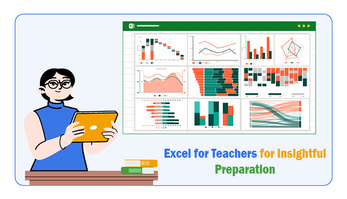
Excel for teachers—who knew a spreadsheet could be so assertive? Many educators consider Excel a tool for accountants, but it offers much more. This software helps track grades and improves data analysis in Excel for student performance.


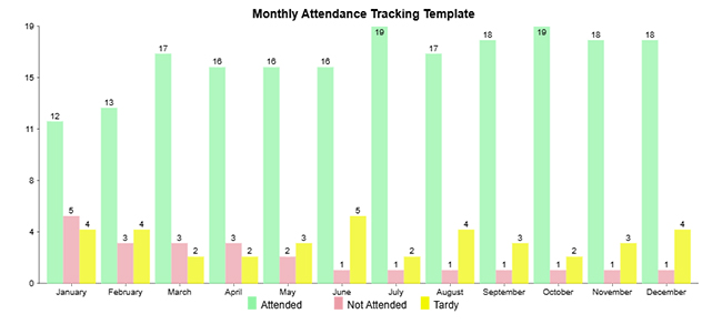
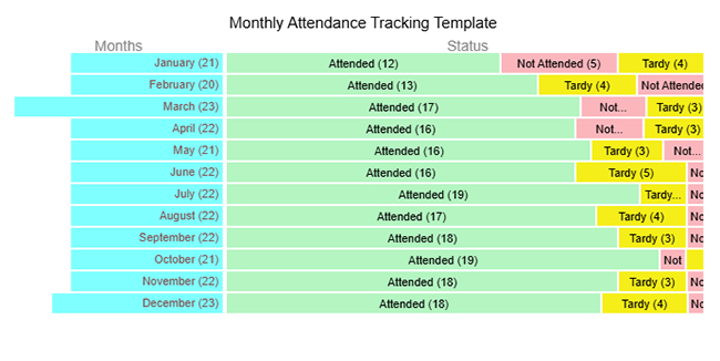
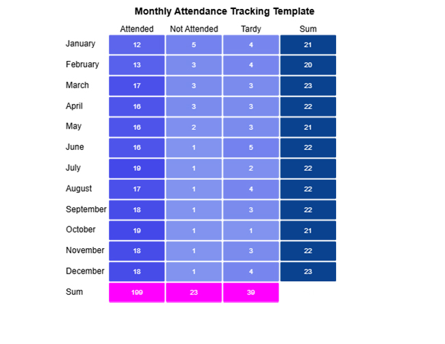
Teachers spend hours managing data. Attendance records, test scores, lesson plans—everything needs organization. Excel simplifies these tasks. A single spreadsheet replaces stacks of paper, making information easy to find and update.
Data modeling in Excel allows teachers to organize complex information effortlessly. Quick comparisons of test results highlight trends that might be missed. A struggling student? A quick formula can reveal patterns, helping teachers step in before it’s too late.
Collaboration also improves with Microsoft Excel for teachers. Shared spreadsheets allow teams to plan lessons, track attendance, and manage budgets. Data for Excel charts helps teachers create clear visuals, making reports and presentations more effective.
Microsoft Excel is more than numbers and formulas. It’s a tool that empowers teachers to save time, spot trends, and work smarter. Why stick to old methods when a simple spreadsheet can transform teaching?
Follow my lead…
Grades, attendance, lesson plans—there’s always something to organize. Microsoft Excel simplifies the workload, turning messy data into clear, helpful information. Excel functions for data analysis help teachers quickly calculate averages, identify trends, and make informed decisions. Here’s how it helps:
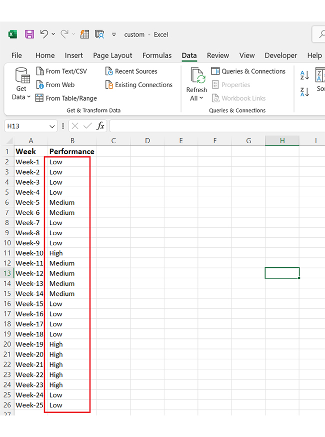
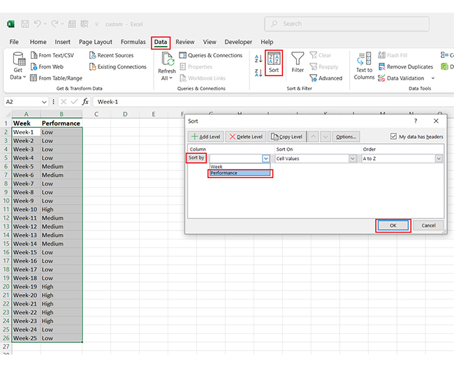
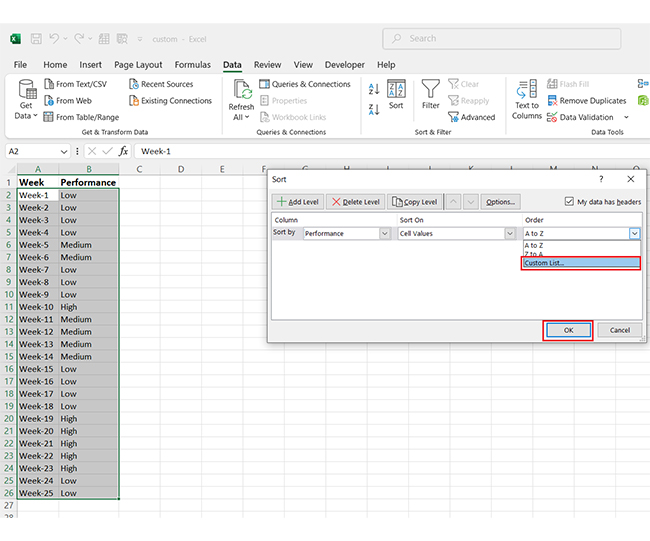
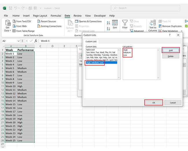
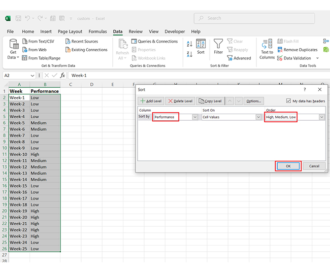
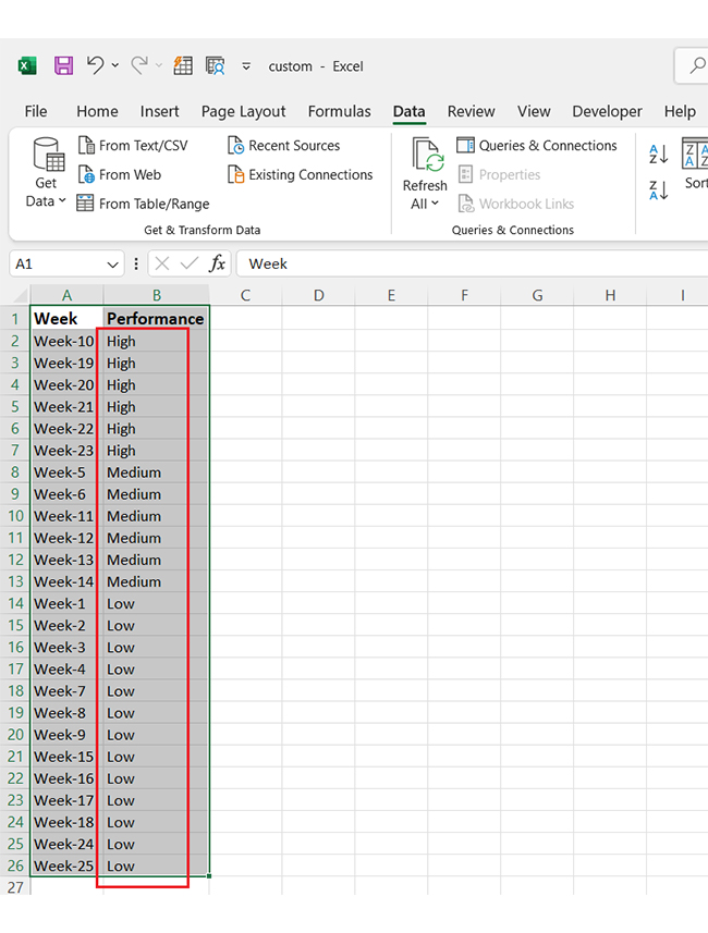
Grades, performance levels, attendance—everything needs to be organized. But what if you could arrange it exactly how you want? Excel’s features let you do just that. For instance, with Custom Sorting, you can create your order instead of sorting alphabetically or by default numbers.
Here’s how to use the best features to make life easier for teachers.
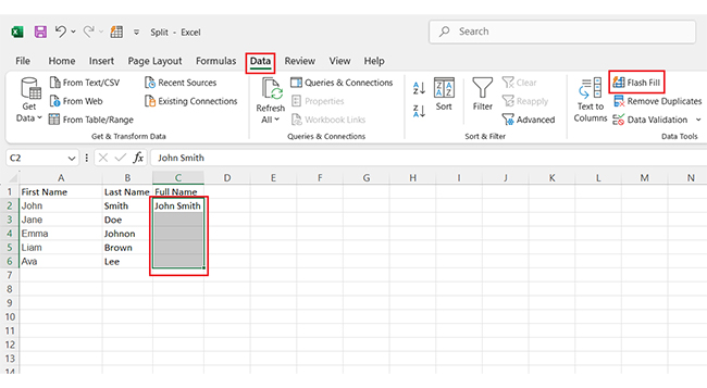
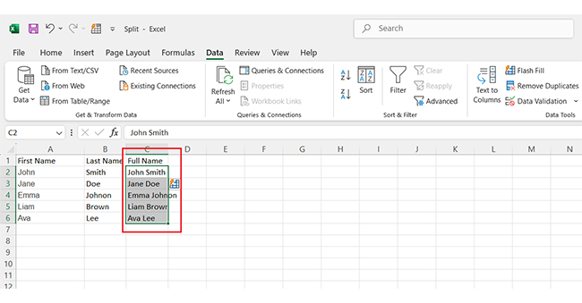
Have you ever wished Excel could figure out patterns and automatically fill in your data? That’s what Flash Fill does, and here’s how to use it:
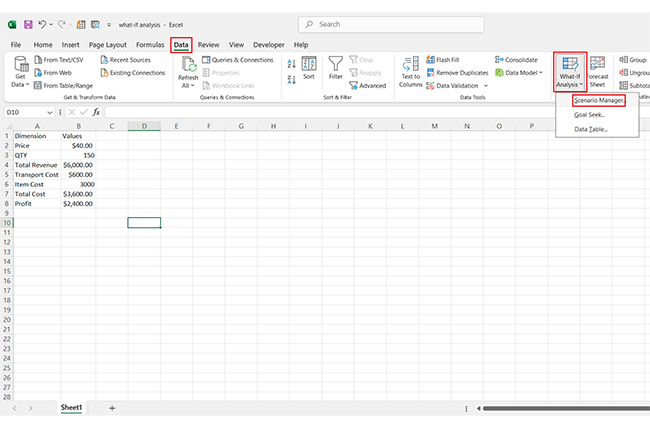
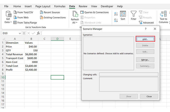
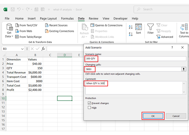
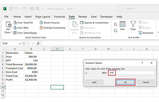
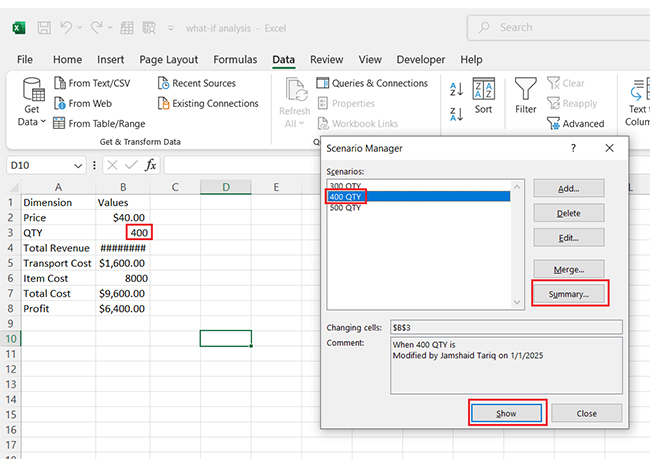
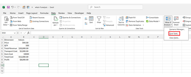
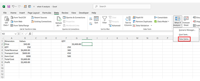
Excel’s What-If Analysis makes it easy to explore different scenarios without making permanent changes. This tool helps teachers make informed decisions based on possible outcomes. Here’s how to use it.
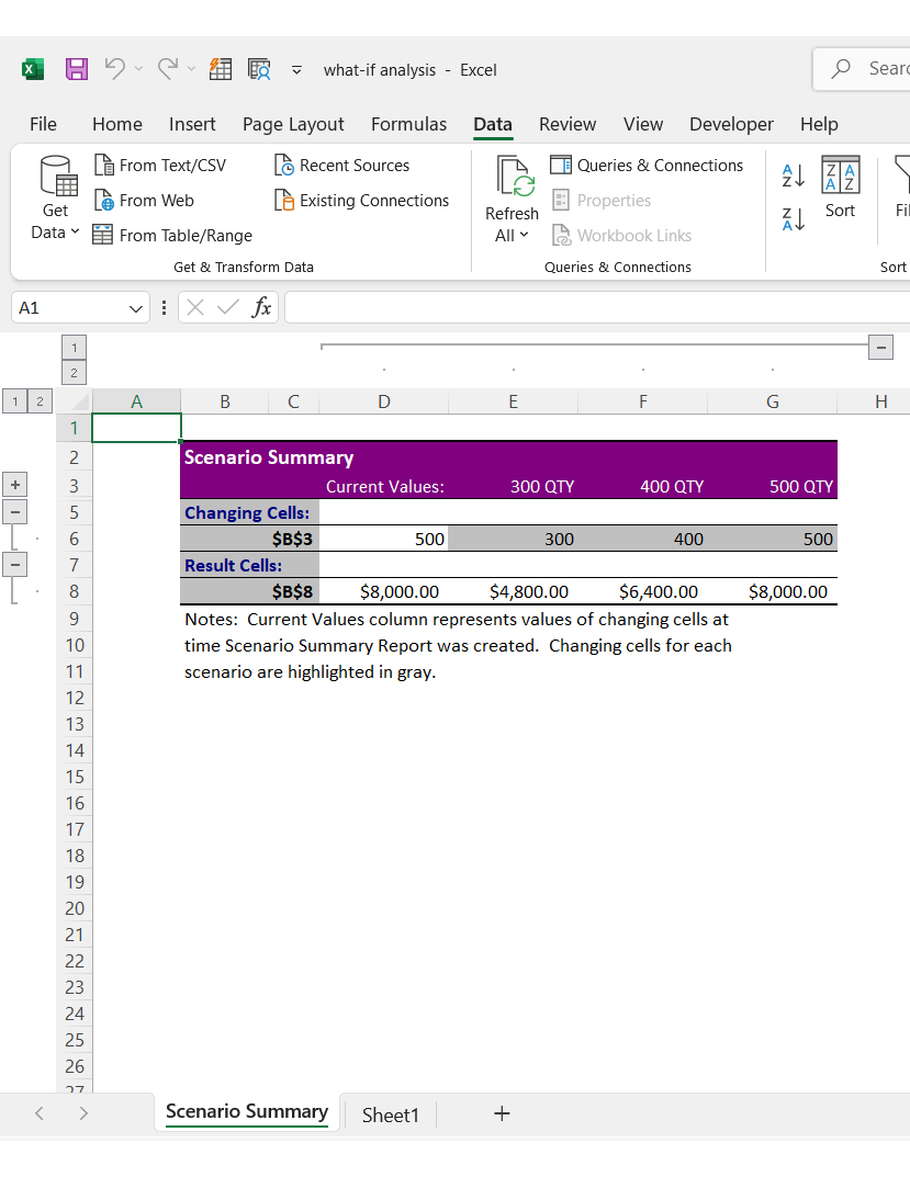
Scenario Manager is perfect for testing different grade weightings or budget adjustments.
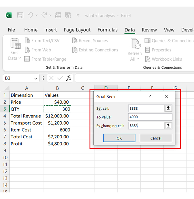
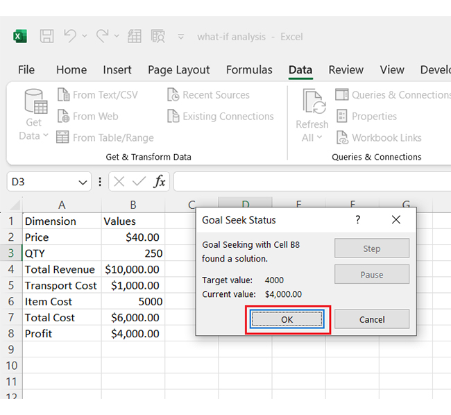
Goal Seek works excellently for setting grade targets. If a student needs a score to pass, this tool shows what’s required.
How?
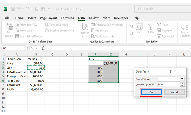
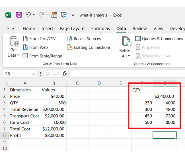
Data tables help compare multiple outcomes at once. Whether analyzing attendance trends or testing different grading scales, this feature provides quick insights:
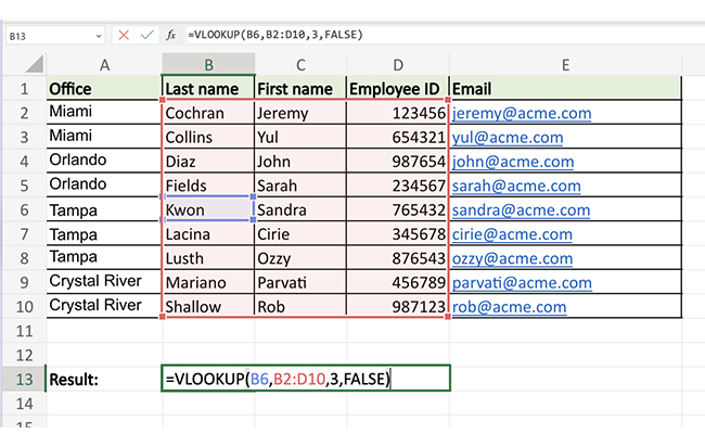
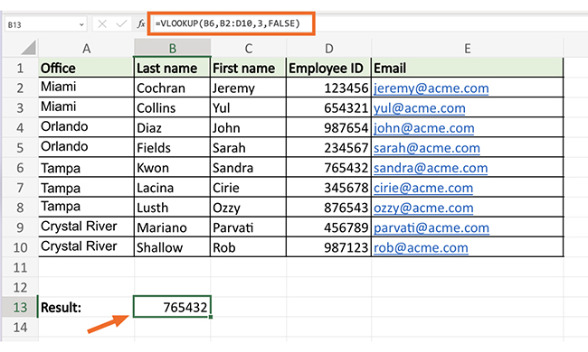
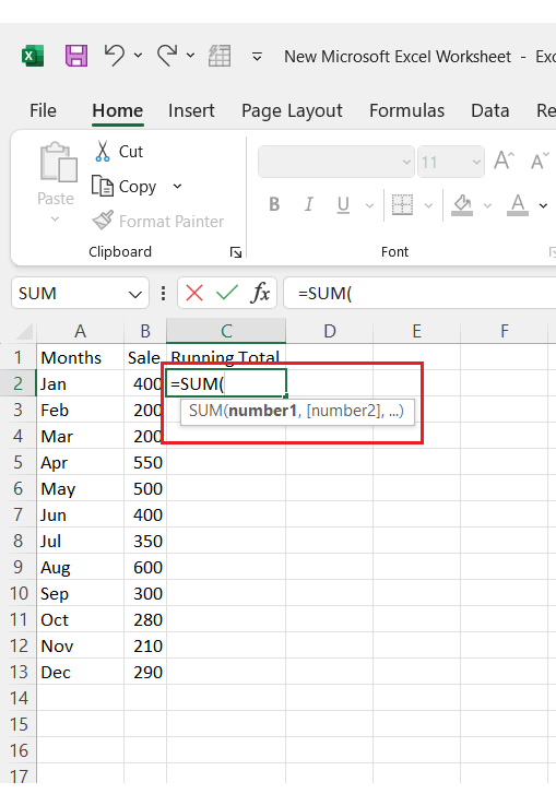
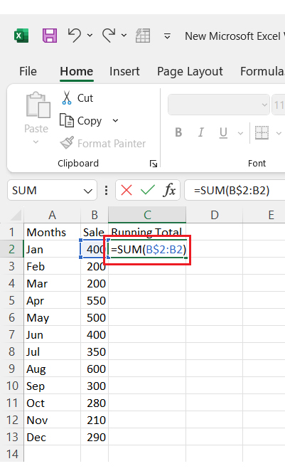
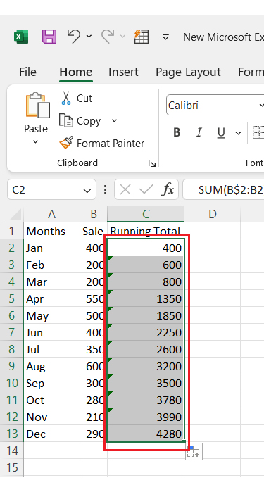
Teachers work with tons of data—grades, attendance, and student records. Finding the correct information is essential. Excel’s VLOOKUP and SUM functions help make sense of it all. These formulas do the work for you.
VLOOKUP: Find information instantly
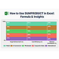
Spreadsheets are a teacher’s best friend—until they’re not. Microsoft Excel helps with grading, attendance, and lesson planning, but it falls short regarding data visualization. Basic Excel charts can only do so much.
Teachers need clear insights, not cluttered graphs. That’s where ChartExpo steps in. This chart add-in for Excel transforms raw data into insightful, easy-to-read visuals. With tools like a Sankey diagram generator, teachers can spot trends, track progress, and make smarter decisions—without the headache of complex formulas.
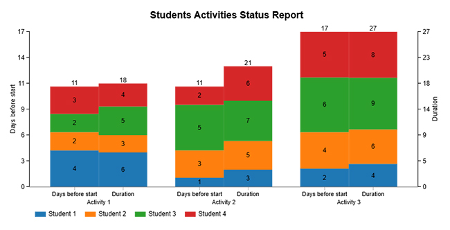
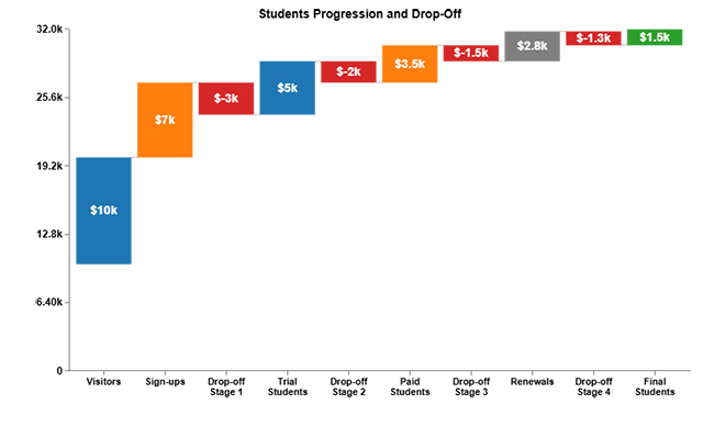
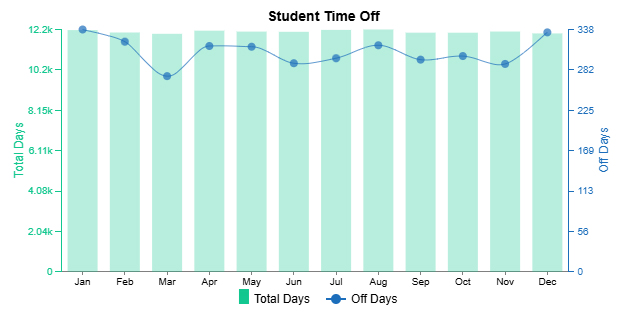
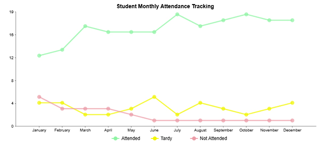
Check out these top ten charts teachers can use to make data visualization easier and more effective! These charts, including a Waterfall chart, created using ChartExpo, will help you present classroom data, student progress, and insights clearly and engagingly.
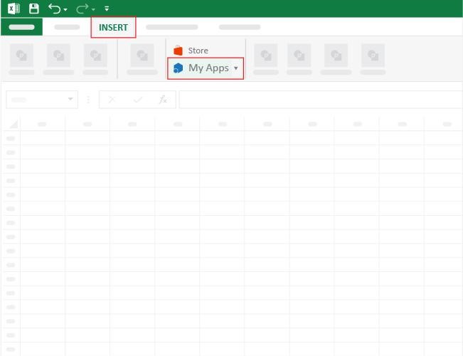
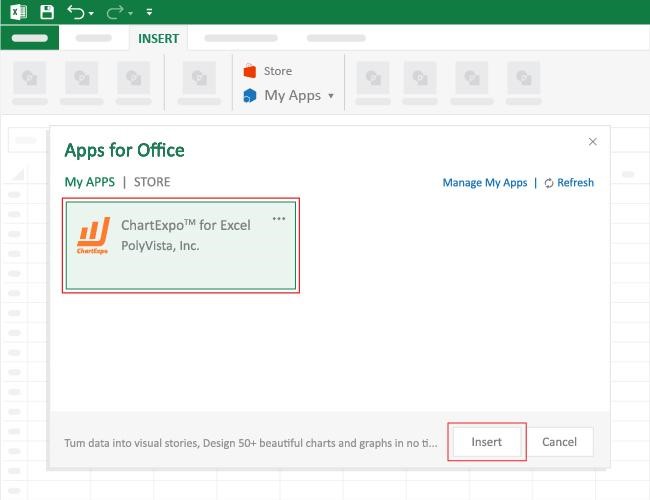
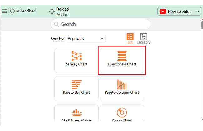
How to Install ChartExpo in Excel?
ChartExpo charts are available both in Google Sheets and Microsoft Excel. Please use the following CTAs to install the tool of your choice and create beautiful visualizations with a few clicks in your favorite tool.
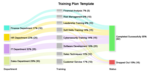
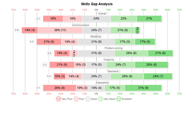
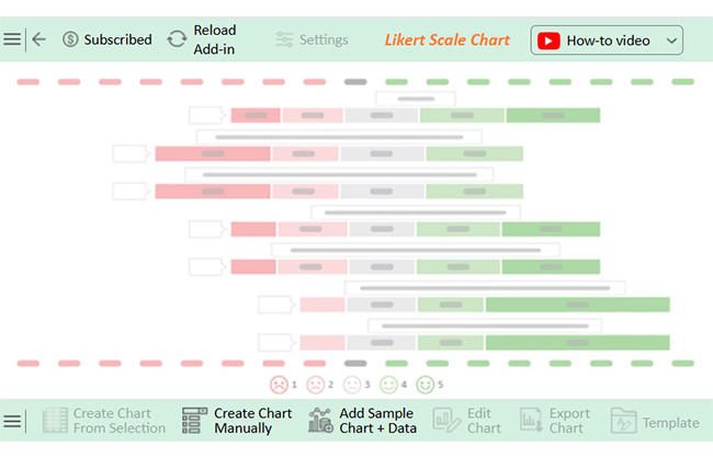
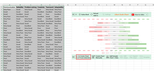
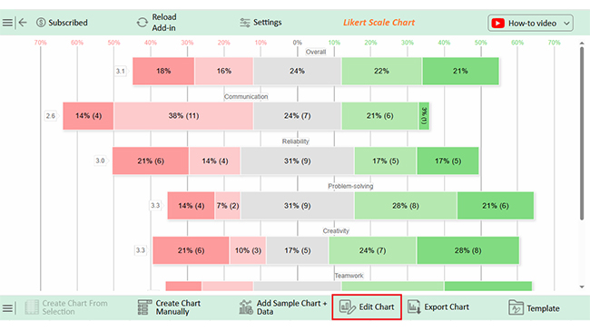
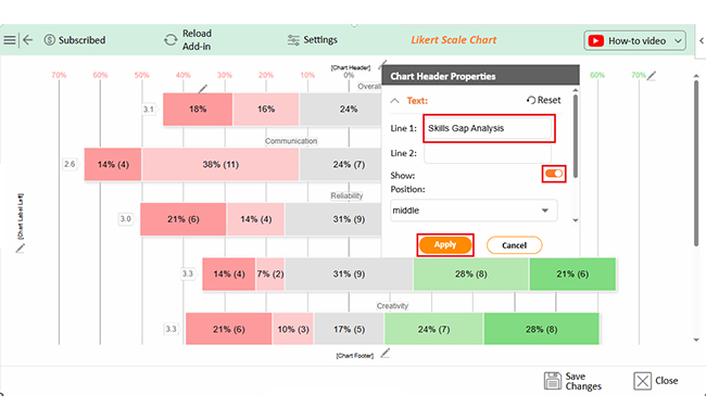
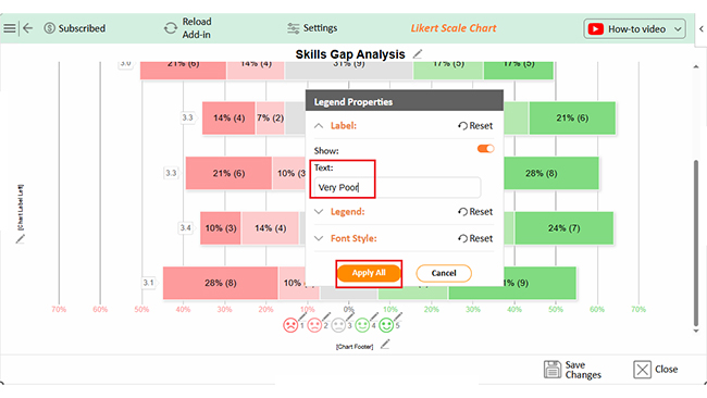
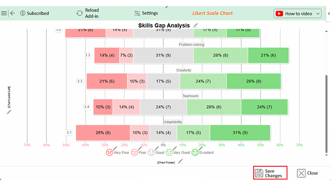
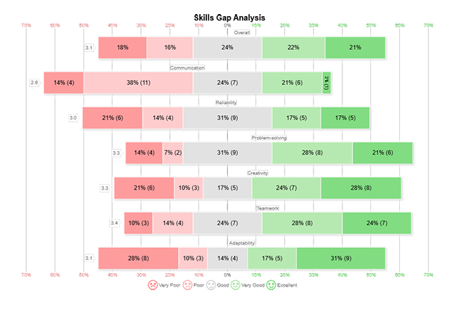
Let’s use the data below to learn how to create a Sankey chart in Excel and analyze it using ChartExpo:
| Communication | Reliability | Problem-solving | Creativity | Teamwork |
Adaptability |
| Very Poor | Good | Very Good | Poor | Very Good | Very Poor |
| Good | Good | Good | Excellent | Excellent | Very Poor |
| Good | Excellent | Good | Good | Poor | Excellent |
| Very Poor | Very Good | Poor | Excellent | Good | Good |
| Very Poor | Good | Very Good | Good | Excellent | Excellent |
| Poor | Poor | Very Poor | Excellent | Very Good | Excellent |
| Poor | Very Good | Good | Very Good | Excellent | Very Poor |
| Very Good | Poor | Excellent | Very Poor | Poor | Poor |
| Poor | Good | Very Good | Poor | Good | Poor |
| Poor | Excellent | Very Good | Excellent | Poor | Very Poor |
| Very Good | Very Poor | Very Poor | Excellent | Very Poor | Excellent |
| Good | Good | Poor | Excellent | Excellent | Excellent |
| Poor | Excellent | Very Poor | Good | Good | Very Good |
| Excellent | Poor | Excellent | Very Good | Excellent | Very Good |
| Poor | Good | Very Good | Very Poor | Poor | Excellent |
| Poor | Good | Excellent | Good | Very Good | Poor |
| Good | Good | Good | Excellent | Good | Very Good |
| Very Good | Excellent | Good | Very Poor | Very Good | Very Good |
| Poor | Very Poor | Excellent | Very Poor | Very Poor | Very Poor |
| Very Good | Very Poor | Very Good | Good | Excellent | Good |
| Very Poor | Very Poor | Excellent | Very Good | Good | Good |
| Poor | Very Poor | Good | Poor | Very Good | Very Poor |
| Very Good | Very Poor | Very Good | Very Good | Very Good | Excellent |
| Good | Very Good | Very Good | Very Poor | Good | Very Poor |
| Poor | Very Good | Good | Very Poor | Excellent | Excellent |
| Poor | Excellent | Excellent | Very Good | Very Good | Excellent |
| Very Good | Very Good | Good | Very Good | Good | Good |
| Good | Good | Good | Excellent | Very Good | Very Poor |
| Good | Poor | Very Poor | Very Good | Very Poor | Very Good |
How Teachers can Create Likert Scale Chart in Power BI
How Teachers can Create Likert Scale Chart in Microsoft Excel
How Teachers can Create Likert Scale Chart in Google Sheets
Excel makes planning lessons, tracking grades, and managing schedules easier. With a few clicks, data turns into organized, helpful information. Advanced Excel charts provide deeper insights, helping teachers analyze trends and improve decision-making.
Here’s how teachers can use Excel to stay on top of everything:
Excel isn’t just a tool—it’s a classroom essential. For teachers, it saves time and keeps everything organized. For students, it builds valuable skills for the future. From grading to project management, Excel makes learning and teaching more efficient. Here’s how it benefits both teachers and students:
Excel speeds up grading, organization, and data analysis with clever tricks. For instance, using Excel charts effectively helps visualize student performance, making trends easier to spot. These simple tips make spreadsheets more efficient and classrooms more organized.
Here are the essential Excel hacks for teachers:
Microsoft Office is a great tool, but it’s not without flaws. While it helps teachers and students stay productive, some challenges can make it harder to use. From cost to compatibility issues, there are limitations to consider:
Excel isn’t entirely free for teachers. However, many schools provide Microsoft 365 subscriptions at no cost. Teachers can also access a free version of Excel online with limited features. Moreover, Microsoft offers discounts on paid plans for educators and students.
A spreadsheet helps teachers stay organized. It simplifies grading, tracks attendance, and manages lesson plans. Teachers can analyze student performance using formulas and charts. Spreadsheets also help with budgeting, scheduling, and creating to-do lists, making daily tasks more efficient.
Microsoft Excel is a game-changer for teachers. It simplifies grading, tracks attendance, and organizes lesson plans. With Excel, managing classroom data becomes quick and efficient. An Excel spreadsheet to track students’ progress helps teachers monitor individual achievements and overall class performance.
Data analysis is essential in education. Teachers need to track student progress and identify trends. Excel’s formulas and charts help make sense of large amounts of data. Knowing how to create a report in Excel allows teachers to present insights clearly and professionally.
Adding a progress bar in Excel can make tracking assignments and student goals more interactive and visually appealing. However, Excel has its limits. Simple charts often lack clarity, and complex data visualization can be tedious and frustrating.
This is where ChartExpo comes in. It enhances Excel’s visualization capabilities, allowing teachers to create easy-to-read, professional charts in minutes.
With better visuals, decision-making becomes more effortless. Teachers can quickly identify struggling students, track behavior patterns, and improve lesson effectiveness.
Do not hesitate.
Install ChartExpo to save time, analyze data efficiently, and focus on what truly matters—helping students succeed.
How much did you enjoy this article?


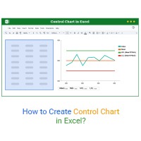
Learn how to create a Control chart in Excel to track process stability, detect unusual variation early, and improve data-driven decision-making.
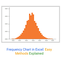
Learn how to create and use frequency charts in Excel to simplify data analysis, visualize distributions, and make better business decisions with clear insights.

Learn what box plot outliers in Excel are, how to detect them using the IQR method, and how to interpret them with real-world examples and Excel use cases.