• Home
  • Tools dropdown img
    • Spreadsheet Charts

      • ChartExpo for Google Sheets
      • ChartExpo for Microsoft Excel
    • Power BI Charts

      • Power BI Custom Visuals by ChartExpo
    • Word Cloud

  • Charts dropdown img
    • Chart Category

      • Bar Charts
      • Circle Graphs
      • Column Charts
      • Combo Charts
      • Comparison Charts
      • Line Graphs
      • PPC Charts
      • Sentiment Analysis Charts
      • Survey Charts
    • Chart Type

      • Box and Whisker Plot
      • Clustered Bar Chart
      • Clustered Column Chart
      • Comparison Bar Chart
      • Control Chart
      • CSAT Survey Bar Chart
      • CSAT Survey Chart
      • Dot Plot Chart
      • Double Bar Graph
      • Funnel Chart
      • Gauge Chart
      • Likert Scale Chart
      • Matrix Chart
      • Multi Axis Line Chart
      • Overlapping Bar Chart
      • Pareto Chart
      • Radar Chart
      • Radial Bar Chart
      • Sankey Diagram
      • Scatter Plot Chart
      • Slope Chart
      • Sunburst Chart
      • Tornado Chart
      • Waterfall Chart
      • Word Cloud
    • Google Sheets
      Microsoft Excel
  • Services
  • Pricing
  • Contact us
  • Blog
  • Support dropdown img
      • Gallery
      • Videos
      • Contact us
      • FAQs
      • Resources
    • Please feel free to contact us

      atsupport@chartexpo.com

Categories
All Data Visualizations Data Analytics Surveys
Add-ons/
  • Google Sheets
  • Microsoft Excel
  • Power BI
All Data Visualizations Data Analytics Surveys
Add-ons
  • Google Sheets
  • Microsoft Excel
  • Power BI

We use cookies

This website uses cookies to provide better user experience and user's session management.
By continuing visiting this website you consent the use of these cookies.

Ok

ChartExpo Survey


Home > Blog > Data Analytics

Enterprise Reporting: Definition, Benefits, and Examples

Is enterprise reporting the missing link in more intelligent business decisions? Every day, organizations generate over 2.5 quintillion bytes of data. Yet, without the right tools to make sense of it, data becomes noise. Enterprise reporting helps companies turn that noise into action.

Enterprise Reporting

Leaders today need faster, clearer insights. The business environment moves fast, and static reports from last month no longer cut it. Decision-makers need fresh data, delivered in clear formats, to respond in real-time. That’s where strong reporting systems step in.

Modern reporting empowers teams at every level. From sales to finance, from marketing to operations, etc. Access to clear reports sharpens decision-making. No more second-guessing, nor waiting for manual updates.

The right system doesn’t overwhelm. It simplifies. It highlights trends, tracks progress, and helps teams focus on what matters. With enterprise reporting, organizations don’t just react—they plan.

And it doesn’t stop there. Integrating tools like BI reporting and pivot reporting brings flexibility to the table. Leaders can slice and filter data to fit the moment, whether tracking sales, budgets, or project status.

Information is power, but the challenge lies in making it clear, fast, and valuable.

But don’t worry; the solution begins with enterprise reporting, and that’s what this blog is about.

So…

Table of Contents:

  1. What is Enterprise Reporting?
  2. Why is Enterprise Reporting Important for Modern Businesses?
  3. Understanding the Enterprise Reporting Strategy
  4. How to Use Enterprise Reporting Software?
  5. Enterprise Reporting Examples
  6. How to Create Enterprise Reports (Steps Here)?
  7. How to Analyze Enterprise Reports in Excel?
  8. Benefits of Enterprise Reporting
  9. Best Practices for Enterprise Reporting Across Industries
  10. FAQs
  11. Wrap Up

What is Enterprise Reporting?

Definition: Enterprise reporting involves collecting, analyzing, and sharing data to manage a business. It enables leaders to make informed decisions based on real facts. Companies can monitor their performance, detect changes in the space, and often understand downside risks ahead of time.

Most companies use analytic report templates to communicate complex data with clarity and detail. These reports also inform day-to-day and long-term plans. In context, enterprise reporting is the process of converting raw data into actionable information to drive business decision-making.

Why is Enterprise Reporting Important for Modern Businesses?

What if you could see the complete picture of your business—anytime, anywhere? That’s the power of enterprise reporting. In today’s fast-moving markets, gut instinct isn’t enough. Businesses need facts, speed, and clarity to stay competitive.

Here’s why enterprise reporting matters so much:

  • Informed decision-making: Make significant decisions with good knowledge. Enterprise reporting brings raw data to life, bridging the gap from reaction to action.
  • Transparency and accountability: When everyone is looking at the same data, trust increases. Enterprise reporting allows teams to stay on track and hold themselves accountable to shared goals.
  • Operational efficiency: Manually entering reports, even if it only takes a few minutes each time, can be time-consuming and drag everything down. Automated spend reporting removes the noise, allowing teams to focus on outcomes.
  • Compliance and audit-ready: Regulations change, but your reports stay current. Having accurate and current records will help keep compliance relatively simple and minimize audit stress.
  • Proactive management: The best managers don’t wait for problems—they prevent them. Using tools like pivot reporting, you can spot issues early and stay ahead of the curve.

Understanding the Enterprise Reporting Strategy

Think of enterprise reporting as your business’s control tower. Without a clear strategy, reports can overwhelm instead of inform. An innovative approach keeps everything on track and everyone focused.

Here’s how to build it step by step:

  1. Defining objectives: Clear objectives ensure reporting drives business value—without them, reports become noise. Ask yourself: What decisions will this data support? This will help keep your efforts focused and relevant.
  2. Data governance: Strong governance ensures data is accurate, secure, and properly managed. Without it, reports lose credibility, leading to poor business choices.
  3. Tool selection: The proper tool strikes a balance between functionality, cost, and user-friendliness. A mismatched tool creates inefficiency, frustration, and wasted resources.
  4. User accessibility:  Reports must be easily accessible and understandable for all stakeholders. If users struggle, adoption drops, and the reporting effort fails.

How to Use Enterprise Reporting Software?

Getting started with enterprise reporting software doesn’t have to be complicated. Think of it as building a more innovative way to see and share what matters. With the proper steps, you can turn scattered data into clear, actionable insights.

Here’s how to make it work:

  • Combine sources: Bring all data together and maintain it in one place to gain an accurate picture of your business. WIP report keeps you up to date in multiple areas, ensuring no important details are overlooked.
  • Custom dashboards: Create dashboards to highlight the key metrics that matter most to your team. With customized designs – even social media reporting templates – you can keep the insights relevant and readable.
  • Automate reporting: Opt for which-and how-often reports are automatically refreshed, then they’ll always be up-to-date. This is efficient, minimizes mistakes, and keeps decision-makers up to date automatically.
  • Collaborate & share insights: Share reports across teams to keep everyone aligned and focused on the same goals. Real-time data enables more innovative and faster collaboration, driving better results.

Enterprise Reporting Examples

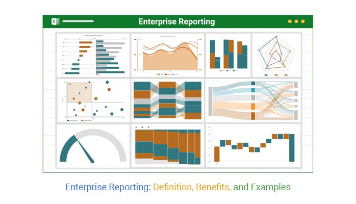
What does enterprise reporting look like in action? It’s not about endless spreadsheets or confusing charts. It’s about clear, focused reports that help people make more intelligent decisions every day. Here are real examples that bring data to life:

  • Executive summary reports: Give top leaders a snapshot of business health. These reports highlight key metrics, trends, and risks without overwhelming readers with excessive details.
  • Sales performance reports: Monitor revenue, pipeline, and team performance with one-click reports. With pivot reporting, sales managers can identify what’s selling quickly and what could use a little boost.
  • Marketing dashboards: Monitor campaign performance, engagement, and ROI from one seamless system. Social media reporting templates keep marketing departments informed and agile.
  • Financial reports: Tracks cash flow, expenses, and profitability effortlessly. These reports also help finance teams manage smart spending and catch problems in their earliest stages.
  • Operational reports: Keep daily operations running smoothly. From inventory to project status, these reports, often part of BI reporting, help teams stay on track.

How to Create Enterprise Reports (Steps Here)?

When reporting on success, the question is: how do you deliver value to your users? Businesses gather vast amounts of data every day, but without easy-to-understand reports, it’s challenging to identify what truly matters. Here’s a handy guideline on how to make reports to advance your business:

  1. Define purpose and audiences: Before building anything, determine for whom the report is being built and what they should know. Whether it’s for management reporting or your project team, purpose drives the entire report.
  2. Collect and clean data: Take the time to gather accurate information, correct errors, and remove any elements that could confuse. Clean data leads to better insights.
  3. Select a reporting tool: The right tool makes all the difference. Many teams use analytical report template tools or advanced platforms for flexibility and speed.
  4. Design report layout: A good layout leads your readers to the most important information—aggregate data into groups. Use clear titles, remove clutter, and prevent distractions from diverting you from what matters.
  5. Use visualizations: Charts, graphs, and visuals make it easier to digest trends and comparisons. Visuals work particularly well in spend reporting, as you can see patterns at a glance.
  6. Review and automate: Verify your work to ensure accuracy and consistency. Automate updates and sharing to ensure decision-makers have access to the most accurate information possible, with no delays.

Top 10 Visuals Using ChartExpo for Enterprise Report

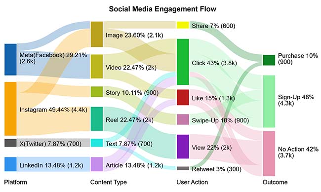
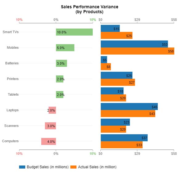
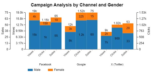
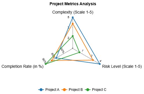
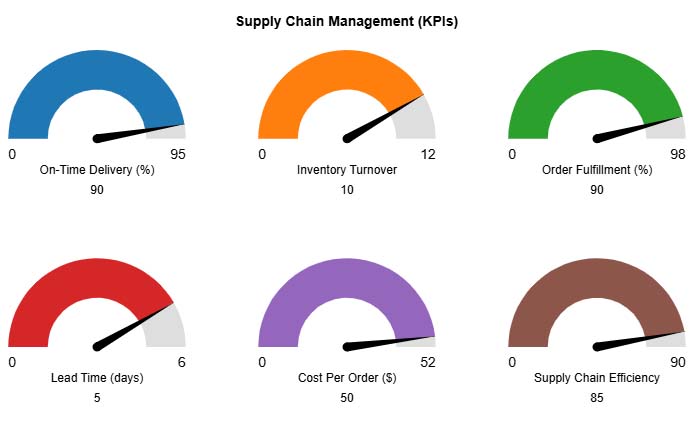
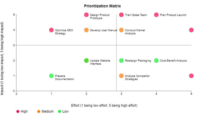
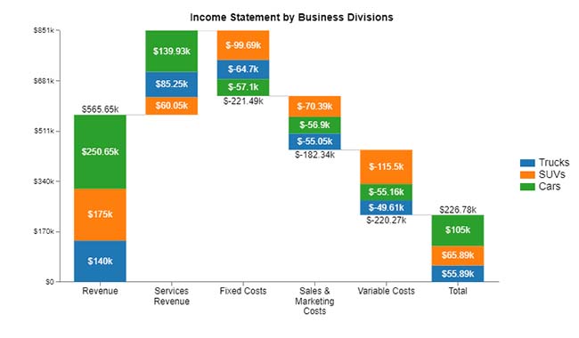
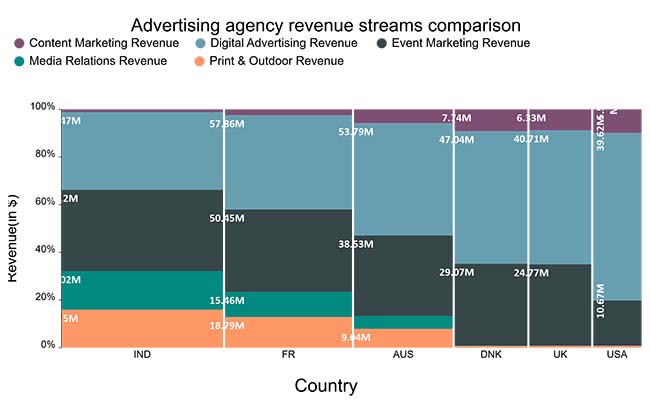
Choosing the right visual can turn confusing numbers into powerful stories. When you present data clearly, decision-makers act more quickly and effectively. With tools like ChartExpo, creating eye-catching, insightful visuals becomes easy. Here are 10 top visuals that bring your reports to life:

  • Sankey Chart: Sankey Diagram one shows how things flow from one stage to another. It is perfect for tracking conversion paths, user journeys, or project funnels. It highlights drop-offs and winning channels instantly.
Enterprise Reporting
  • Multi-Axis Line Chart: Compare different trends on one chart, even if they have different scales. The Multi Axis Line Chart helps you spot patterns across multiple performance metrics without losing clarity.
Enterprise Reporting
  • Comparison Bar Chart: See side-by-side comparisons at a glance. A Comparison Bar Chart is useful in spending reporting or departmental performance, where differences need to stand out clearly.
Enterprise Reporting
  • Progress Chart: Track how close you are to your goals. Whether it’s sales targets or project milestones, this chart shows progress in a clean, visual way.
Enterprise Reporting
  • Clustered Stacked Bar Chart: Compare groups and subcategories all in one view. This chart is ideal for management reporting where you need to break down data by teams, regions, or products.
Enterprise Reporting
  • Multi Axis Spider Chart: Visualize multiple KPIs at once in a balanced, radial layout. The Multi Axis Spider Chart is great for comparing departments or strategies against key performance goals.
Enterprise Reporting
  • Gauge Chart: Display progress toward a goal in a quick, glanceable way. A Gauge Chart is often used in BI reporting for KPIs like revenue, efficiency, or customer satisfaction.
Enterprise Reporting
  • Scatter Plot Chart: Uncover relationships between two variables. This chart helps spot trends, outliers, and correlations in complex datasets.
Enterprise Reporting
  • Stacked Waterfall Chart: Show how small pieces add up to a total. The Stacked Waterfall Chart is ideal for illustrating changes in profit, cost, or revenue over time.
Enterprise Reporting
  • Mosaic (Mekko) Chart: Compare size and composition in one visual. This chart is best used for market share, product mix, or segment performance across multiple categories.
Enterprise Reporting

How to Analyze Enterprise Reports in Excel?

Data drives decisions. But staring at endless spreadsheets doesn’t help anyone. That’s where enterprise reporting comes in—it turns raw numbers into real business insights.

The truth? Data means nothing without the right visuals. Excel tries. But let’s be honest—it often falls short. Static charts, limited visuals, and cluttered dashboards hinder productivity.

Enter ChartExpo. This tool effortlessly transforms complex data into insightful, interactive visuals. It enables enterprise reporting to be faster, sharper, and more innovative, helping you make decisions that truly drive results.

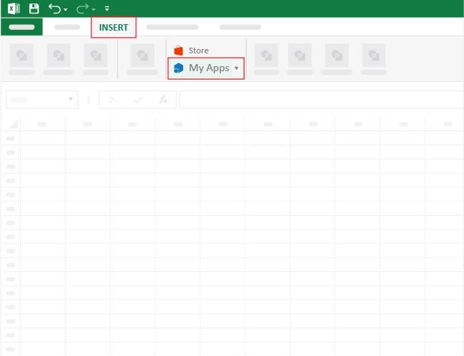
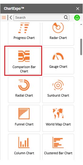
How to Install ChartExpo in Excel?

  1. Open your Excel application.
  2. Open the worksheet and click the “Insert” menu.
  3. You’ll see the “My Apps” option.
  4. In the Office Add-ins window, click “Store” and search for ChartExpo on the My Apps Store.
  5. Click the “Add” button to install ChartExpo in your Excel.

ChartExpo charts are available both in Google Sheets and Microsoft Excel. Please use the following CTAs to install the tool of your choice and create beautiful visualizations with a few clicks in your favorite tool.

Example

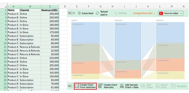
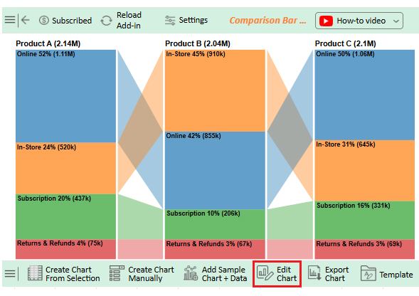
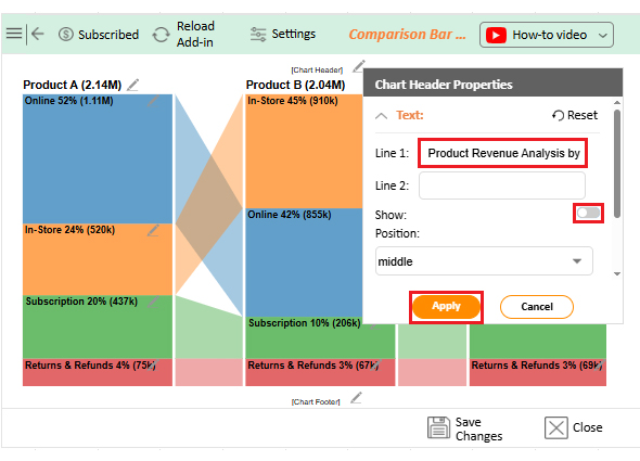
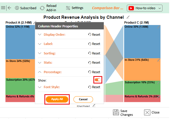
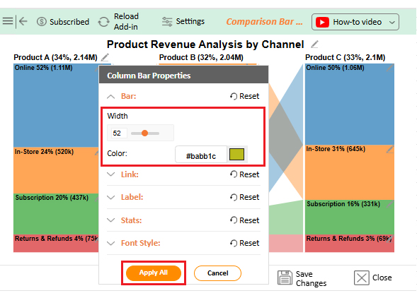
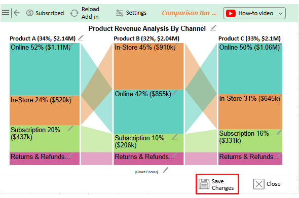
Let’s visualize what a white paper report looks like in Excel using ChartExpo.

Metric Channel Revenue (USD)
Product A Subscription 92,000
Product B In-Store 150,000
Product C Returns & Refunds 20,000
Product A Online 180,000
Product B In-Store 185,000
Product C Subscription 81,000
Product A Returns & Refunds 12,000
Product B Online 260,000
Product C Online 190,000
Product A Subscription 80,000
Product B Returns & Refunds 26,000
Product C In-Store 170,000
Product A Subscription 100,000
Product C Subscription 65,000
Product A Returns & Refunds 14,000
Product C In-Store 195,000
Product B In-Store 160,000
Product A In-Store 200,000
Product C Returns & Refunds 13,000
Product B Subscription 68,000
Product C Online 240,000
Product B Online 190,000
Product A Online 250,000
Product B Returns & Refunds 19,000
Product C In-Store 135,000
Product B Subscription 78,000
Product A Returns & Refunds 11,000
Product C Subscription 97,000
Product B In-Store 130,000
Product A Online 200,000
Product A In-Store 180,000
Product B Online 230,000
Product C Returns & Refunds 15,000
Product A Subscription 95,000
Product C Online 205,000
Product A Returns & Refunds 20,000
Product B Returns & Refunds 22,000
Product C Subscription 88,000
Product C In-Store 145,000
Product A Online 270,000
Product B In-Store 145,000
Product B Online 175,000
Product A In-Store 140,000
Product C Online 255,000
Product B Subscription 60,000
Product A Subscription 70,000
Product C Returns & Refunds 21,000
Product A Returns & Refunds 18,000
Product C Online 170,000
Product B In-Store 140,000
Product A Online 210,000
  • To get started with ChartExpo, install ChartExpo in Excel.
  • Now, click on My Apps from the INSERT menu.
Enterprise Reporting
  • Choose ChartExpo from My Apps, then click Insert.
Enterprise Reporting
  • Once it loads, scroll through the charts list to locate and choose the “Comparison Bar Chart”.
Enterprise Reporting
  • Click the “Create Chart From Selection” button after selecting the data from the sheet, as shown.
Enterprise Reporting
  • ChartExpo will generate the visualization below for you.
  • If you want to add anything to the chart, click the Edit Chart button:
Enterprise Reporting
  • Click the pencil icon next to the Chart Header to change the title.
  • It will open the properties dialog. Under the Text section, you can add a heading in Line 1 and enable Show.
  • Give the appropriate title of your chart and click the Apply button.
Enterprise Reporting
  • You can show the percentage sign from Column Header Properties as follows:
Enterprise Reporting
  • Change bar color and width as follows:
Enterprise Reporting
  • You can change the Font size for better readability as follows:
Enterprise Reporting
  • You can add a $ sign from “Column Bar Chart” as follows:
Enterprise Reporting
  • After making all changes, click on the “Save Changes” button:
Enterprise Reporting
  • Your final chart will look like the one below.
Enterprise Reporting

Insights

  • Product A leads online sales with 52% ($1.11M), contributing to 34% ($2.14M) of total revenue.
  • Product B dominates in-store sales, accounting for 45% ($ 910,000) of total revenue, which makes up 32% ($2.04 million) of the total.
  • Product C exhibits balanced performance, with 50% ($1.06M) of revenue generated online and 31% ($645K) in-store, totaling 81% ($2.1M) of the total revenue.
  • Subscriptions account for 10-16% of overall product sales.
  • Returns and refunds remain steady at 3-4% across all channels.

Benefits of Enterprise Reporting

Data is only helpful if it leads to action. Enterprise reporting transforms vast amounts of data into informed decisions that help businesses grow, stay competitive, and move forward. Here’s how it makes a real difference:

  • Better decision-making: When data is precise and current, leaders make confident choices. No more guessing—decisions are based on facts, not hunches.
  • Increased transparency: Everyone sees the same story, reducing confusion and silos. This keeps teams aligned and accountable.
  • Time savings: Automating reports means no more hours wasted on manual updates. Teams can shift their focus from reporting to real problem-solving.
  • Stronger performance tracking: With tools like pivot reporting, businesses can track key metrics in real-time. This helps spot wins and challenges early.
  • Improved compliance: Accurate, timely reports make audits stress-free. They help meet regulatory demands without last-minute scrambles.

Best Practices for Enterprise Reporting Across Industries

Regardless of the industry, one truth remains: precise data leads to smarter actions. But messy reports? They slow everyone down. Enterprise reporting works best when it’s done right. Here are simple best practices to keep your reports sharp, practical, and impactful:

  • Start with clear goals: Know what you’re measuring and why. Reports should answer specific business questions, rather than overwhelming readers with numbers.
  • Keep reports simple and focused: Too much detail creates confusion. Stick to key metrics that drive decisions.
  • Use visuals to tell the story: Charts, graphs, and dashboards make trends pop. Tools like BI reporting help bring clarity fast.
  • Automate wherever possible: Manual reports waste time. Automating regular reports keeps data fresh and teams focused.
  • Ensure data accuracy: Poor data leads to poor decisions. Regular checks and clean data reporting are essential.
  • Make reports accessible: Reports should be easy for everyone to read and use. Simple layouts and clear visuals help teams act quickly.

FAQs

What are the different types of enterprise reporting?

Different types of enterprise reporting include executive reporting examples, sales dashboards, spend reporting, and operational summaries. Each serves a purpose. They help businesses track performance, manage risk, and support informed decision-making with precise and accurate data.

What does an enterprise reporter cover?

An enterprise reporter covers key business metrics, trends, and insights. They track financials, operations, and data reporting across departments. Their reports help leaders spot issues, measure success, and plan next steps. Clear, timely reporting drives smarter business actions.

Wrap Up

Enterprise reporting is the backbone of smart business decisions. It turns raw data into clear insights. It helps leaders see what’s working and what needs to change. With the right reports, action becomes faster and sharper.

Strong reporting brings teams together. It creates a single source of truth. Whether using executive reporting examples or management reporting, the goal remains the same: clarity and action.

The power of visuals matters. Charts, graphs, and dashboards bring numbers to life. Tools that go beyond spreadsheets enable businesses to move quickly and with greater confidence. Moreover, good reporting doesn’t just look backward; it also looks forward. It helps forecast, plan, and drive growth. It tracks performance, manages risks, and ensures accountability.

Conclusively, enterprise reporting isn’t optional—it’s essential. It empowers decisions at every level, helping businesses stay competitive, informed, and ready for what’s next.

Data without action is wasted. So, do not hesitate. Get started with enterprise reporting and ChartExpo today and make data your biggest asset.

How much did you enjoy this article?

ExcelAd1
Start Free Trial!
156344

Related articles

next previous
Data Analytics12 min read

Issue Tracker Template for Smarter Issue Monitoring

Learn what an issue tracker template is and why it’s useful. This blog post shows you how to build and analyze one to track issues and boost team productivity.

Data Analytics9 min read

Lead Generation KPIs: A Guide for Better Results

Lead generation KPIs measure how well you attract and convert leads. Click here to learn how to track, analyze, and improve these KPIs for better results.

Data Analytics9 min read

Sales Pipeline Template: Visualizing Sales Flow

Sales pipeline templates organize your sales process and boost deal tracking. Click here to learn how to build and improve them in Google Sheets.

Data Analytics8 min read

Accounts Dashboard: Insights Made Easy

Discover all there is to know about the account dashboard. This guide also shows you some accounting dashboard examples, and how to create one.

Data Analytics8 min read

Inventory Dashboard for Fast and Accurate Insights

This guide shows you what an inventory dashboard is, and how to build one in Power BI. You'll also discover the benefits of using an inventory dashboard.

ChartExpo logo

Turn Data into Visual
Stories

CHARTEXPO

  • Home
  • Gallery
  • Videos
  • Services
  • Pricing
  • Contact us
  • FAQs
  • Privacy policy
  • Terms of Service
  • Sitemap

TOOLS

  • ChartExpo for Google Sheets
  • ChartExpo for Microsoft Excel
  • Power BI Custom Visuals by ChartExpo
  • Word Cloud

CATEGORIES

  • Bar Charts
  • Circle Graphs
  • Column Charts
  • Combo Charts
  • Comparison Charts
  • Line Graphs
  • PPC Charts
  • Sentiment Analysis Charts
  • Survey Charts

TOP CHARTS

  • Sankey Diagram
  • Likert Scale Chart
  • Comparison Bar Chart
  • Pareto Chart
  • Funnel Chart
  • Gauge Chart
  • Radar Chart
  • Radial Bar Chart
  • Sunburst Chart
  • see more
  • Scatter Plot Chart
  • CSAT Survey Bar Chart
  • CSAT Survey Chart
  • Dot Plot Chart
  • Double Bar Graph
  • Matrix Chart
  • Multi Axis Line Chart
  • Overlapping Bar Chart
  • Control Chart
  • Slope Chart
  • Clustered Bar Chart
  • Clustered Column Chart
  • Box and Whisker Plot
  • Tornado Chart
  • Waterfall Chart
  • Word Cloud
  • see less

RESOURCES

  • Blog
  • Resources
  • YouTube
SIGN UP FOR UPDATES

We wouldn't dream of spamming you or selling your info.

© 2025 ChartExpo, all rights reserved.