• Home
  • Tools dropdown img
    • Spreadsheet Charts

      • ChartExpo for Google Sheets
      • ChartExpo for Microsoft Excel
    • Power BI Charts

      • Power BI Custom Visuals by ChartExpo
    • Word Cloud

  • Charts dropdown img
    • Chart Category

      • Bar Charts
      • Circle Graphs
      • Column Charts
      • Combo Charts
      • Comparison Charts
      • Line Graphs
      • PPC Charts
      • Sentiment Analysis Charts
      • Survey Charts
    • Chart Type

      • Box and Whisker Plot
      • Clustered Bar Chart
      • Clustered Column Chart
      • Comparison Bar Chart
      • Control Chart
      • CSAT Survey Bar Chart
      • CSAT Survey Chart
      • Dot Plot Chart
      • Double Bar Graph
      • Funnel Chart
      • Gauge Chart
      • Likert Scale Chart
      • Matrix Chart
      • Multi Axis Line Chart
      • Overlapping Bar Chart
      • Pareto Chart
      • Radar Chart
      • Radial Bar Chart
      • Sankey Diagram
      • Scatter Plot Chart
      • Slope Chart
      • Sunburst Chart
      • Tornado Chart
      • Waterfall Chart
      • Word Cloud
    • Google Sheets
      Microsoft Excel
  • Services
  • Pricing
  • Contact us
  • Blog
  • Support dropdown img
      • Gallery
      • Videos
      • Contact us
      • FAQs
      • Resources
    • Please feel free to contact us

      atsupport@chartexpo.com

Categories
All Data Visualizations Data Analytics Surveys
Add-ons/
  • Google Sheets
  • Microsoft Excel
  • Power BI
All Data Visualizations Data Analytics Surveys
Add-ons
  • Google Sheets
  • Microsoft Excel
  • Power BI

We use cookies

This website uses cookies to provide better user experience and user's session management.
By continuing visiting this website you consent the use of these cookies.

Ok

ChartExpo Survey


Home > Blog > Data Analytics

SaaS Dashboard: A Complete Walkthrough

Subscription growth gets harder to manage when revenue, churn, adoption, and retention live in separate reports. Teams lose time, decisions slow down, and warning signs surface late.

Dashboard for SaaS

A single reporting view pulls the business into focus, so leaders can spot movement, compare trends, and act before small issues become costly problems.

Dashboard for SaaS gives teams one place to review core metrics, compare performance, and guide daily choices. This guide breaks down what it is, which metrics matter, how teams apply it, and how to build one in Power BI with a practical workflow you can follow from start to finish.

What is SaaS Dashboard?

Definition: Dashboard for SaaS brings revenue, retention, acquisition, and usage signals into one operating view for subscription teams. Instead of checking separate reports, leaders can track what changed, where it changed, and which metric needs action first across daily sales, finance, and product discussions.

The format works like a digital dashboard that connects data sources, shows current movement, and keeps teams aligned on priorities. Dashboard for SaaS also shortens review cycles because product, finance, and growth teams can review the same trends, compare results, and respond with less delay.

Why is Dashboard for SaaS Important?

Dashboard for SaaS strengthens planning because teams see risk, momentum, and gaps sooner. That visibility supports faster choices, tighter accountability, and steadier execution.

Why it matters:

  • Live visibility: Teams review revenue, churn, and engagement through SaaS KPIs, making shifts easier to catch before losses spread.
  • Better decisions: SaaS data analytics turns reporting into direction for budget, pricing, and growth choices.
  • Behavior signals: Teams spot usage changes and lifecycle patterns before churn pressure builds.
  • Growth tracking: Revenue movement becomes easier to measure across plans, channels, and periods.
  • Less manual work: Shared reporting cuts rework and keeps teams aligned on priorities.

Which Metrics Should Be Included in the SaaS Metrics Dashboard?

Dashboard for SaaS depends on the right measures to stay useful. Focus on metrics that expose revenue health, customer value, retention, and adoption, so the team can act on movement instead of scanning vanity totals.

Track these:

  • Income pace: MRR shows recurring monthly revenue and helps teams read short-term demand changes.
  • Revenue base: ARR reflects yearly subscription value and longer planning strength.
  • Acquisition cost: CAC shows how much is required to win each paying customer.
  • Account value: CLV estimates expected revenue from each customer relationship over time.
  • Loss rate: Churn reveals how many customers or dollars leave during a period.
  • Loyalty level: Retention shows how well customers continue over time.
  • Usage depth: Active users show engagement patterns and connect product analytics to feature stickiness.

Different Types of SaaS Dashboard

Dashboard for SaaS serves different teams in different ways. The shared data stays constant, but each view highlights the signals that matter most to the group using it.

  • Leadership view: This version summarizes revenue, churn, and growth trends for senior leaders, much like an executive dashboard built for a formal monthly board review.
  • Demand view: Marketing teams watch spend efficiency, lead volume, and conversion performance by channel.
  • Pipeline view: Sales teams review weekly forecast movement and deal flow, similar to the sales dashboard.
  • Retention view: Success teams monitor churn risk, onboarding progress, renewal signals, and account health.
  • Usage view: Product teams follow adoption, feature use, and behavior shifts to guide roadmap choices.
  • Finance view: Revenue, cost, cash flow, and margin stay visible daily for planning and control.

Dashboard for SaaS Examples

Examples make a SaaS dashboard easier to plan because real use cases show what decisions each view should support.

1. Subscription Revenue Monitoring Dashboard

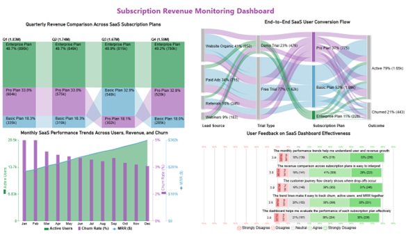
This dashboard for SaaS example centers on plan mix, conversion paths, and recurring revenue, helping teams see which subscriptions drive income and where churn patterns call for stronger retention work.

Dashboard for SaaS

2. Customer Retention and Churn Dashboard

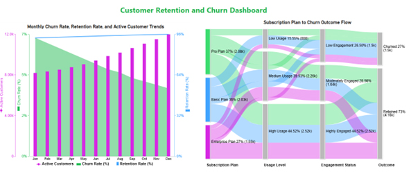
This dashboard for SaaS example highlights churn, retention, active accounts, and plan flow, showing how steady engagement and higher usage can lower overall risk across the customer base today.

Dashboard for SaaS

3. Product Usage Analytics Dashboard

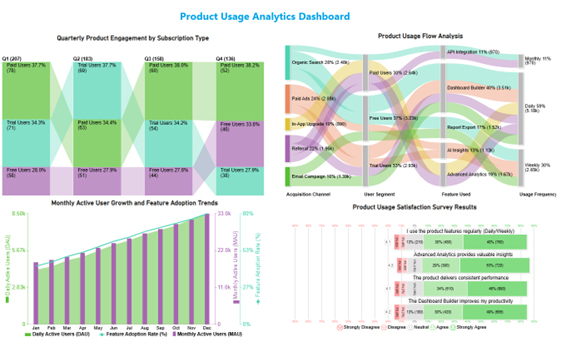
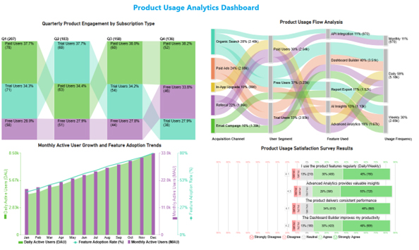
This dashboard for SaaS example tracks user movement, adoption, and feedback, showing that heavy usage and strong feature demand can shape roadmap priorities for product teams with more confidence.

Dashboard for SaaS

How to Create a Dashboard for SaaS in Power BI?

Creating a SaaS dashboard in Power BI helps you track key metrics like user growth, churn rate, and revenue in one place. Follow these steps to build an effective dashboard:

1. Define Your Key Metrics

Start by identifying the most important SaaS metrics, such as Monthly Recurring Revenue (MRR), Customer Acquisition Cost (CAC), churn rate, and active users. These KPIs will shape your dashboard.

2. Connect Your Data Sources

Import data from relevant sources like CRM systems, billing platforms, or spreadsheets into Power BI. Ensure your data is clean and well-structured for accurate reporting.

3. Prepare and Transform Data

Use Power Query to clean, filter, and organize your data. Create calculated columns or measures to track important metrics like growth rate or retention.

4. Choose the Right Visualizations

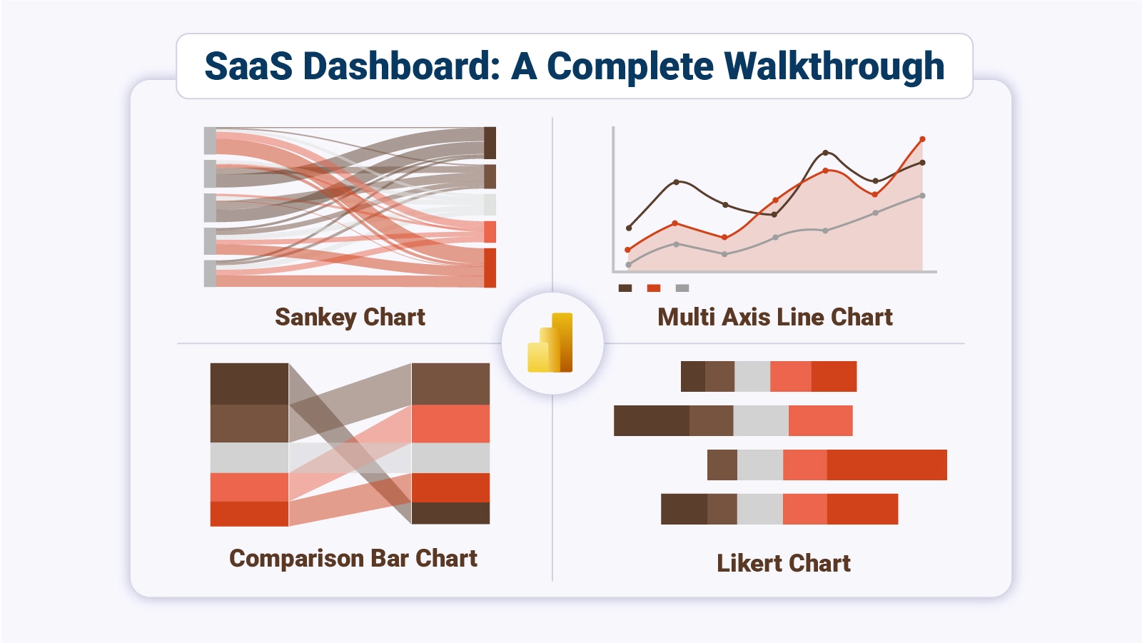
Select visuals that best represent your data, such as line charts for trends, bar charts for comparisons, and KPI cards for quick insights. For more advanced and interactive visuals, you can also explore tools like ChartExpo.

5. Build and Arrange the Dashboard

Design a clean layout by placing key metrics at the top and detailed visuals below. Keep it simple, intuitive, and easy to navigate for users.

6. Final SaaS Dashboard View

At the end, include a complete dashboard image showing all key SaaS metrics visually, giving users a clear example of the final output.

Dashboard for SaaS

Key Insights

  • Engagement is highest among organic search and paid users, while Dashboard Builder leads feature adoption and daily activity volume across the charted flows.
  • DAU, MAU, and adoption rates climb through the year, with the strongest point in December.
  • Paid users lead quarterly adoption, and trial users still suggest meaningful room for upgrades.
  • Feedback trends positive, with support for advanced analytics and feature value, which backs the overall product direction.

How to Use a SaaS Dashboard?

Dashboard for SaaS creates value when teams review it often and use it to direct work. It should influence routine decisions, not sit idle.

Use it this way:

  • Review often: Check revenue, churn, and engagement on a set cadence for teams, unlike a manufacturing dashboard built around production output.
  • Watch shifts: Spot sudden drops, spikes, or outliers early so teams can respond quickly before issues expand.
  • Study behavior: Usage and subscription patterns can point to retention problems or wins.
  • Guide choices: Current data support budgeting, forecasting, staffing, and expansion decisions today.
  • Share context: Clear visuals help leaders and teams align daily on priorities, ownership, and next steps.
  • Set thresholds: Targets and alerts help teams manage risk sooner with discipline and pursue openings faster.

Advantages of Using SaaS Metrics Dashboard

Dashboard for SaaS helps teams move from scattered reporting to coordinated action. When the data stays visible, execution improves because decisions happen with less delay and less guesswork.

Key gains:

  • One view: Revenue, marketing, sales, and product signals stay together, much like business dashboard examples used for cross-team reviews in many planning settings.
  • Faster calls: Real-time metrics cut review time and shorten the path to decisions.
  • Retention control: Teams can watch churn and engagement sooner, which helps limit customer loss.
  • Progress tracking: KPI movement stays visible against targets, plans, and growth goals.
  • Lower effort: Shared reporting reduces manual work across departments.

Best Practices for Creating a SaaS Metrics Dashboard

A SaaS metrics dashboard works best when the layout stays focused, and the measures fit the goal. Dashboard for SaaS should stay simple enough for teams to review quickly and trust.

Use these:

  • Prioritize impact: Keep only metrics tied to revenue, retention, cost, or growth targets.
  • Simplify visuals: Clear charts reduce confusion and make trends easier to read quickly.
  • Refresh data: Automated updates keep decisions tied to current numbers.
  • Keep order: Group related metrics so teams understand the layout faster.
  • Design broadly: Each team should be able to use the view.
  • Review often: Update metrics when goals, strategy, or reporting needs shift over time.

FAQs

What Data Sources Should a SaaS Dashboard Integrate?

A SaaS dashboard should integrate product analytics, CRM systems, billing platforms, marketing tools, customer support software, financial systems, and databases to provide real-time insights into user behavior, revenue, churn rate, campaign performance, and overall business growth.

What Are Current Trends in SaaS Dashboards?

Current trends in SaaS dashboards include AI-powered analytics, real-time data tracking, customizable dashboards, interactive visualizations, predictive insights, mobile optimization, automation, and seamless data integration, helping businesses make faster, data-driven decisions.

Which Tools can create the SaaS Dashboard?

Teams often use Power BI and other BI platforms, then choose the option that fits data access, scale, sharing needs, workflow constraints, and reporting habits.

How Can I Make My SaaS Dashboard More Effective?

To make your SaaS dashboard more effective, focus on clarity, real-time data, and actionable insights. Use relevant KPIs, simplify visualizations, and ensure easy navigation.

Customize views for different users, integrate multiple data sources, and regularly update metrics to support faster, data-driven decision-making.

Wrap Up

Subscription teams work better when revenue, churn, usage, and retention sit in one place. A clear reporting view reduces lag, sharpens priorities, and helps every team work from the same set of signals instead of separate reports and delayed summaries.

That shared view also cuts rework and gives teams a common reference during planning, reviews, and follow-up.

Dashboard for SaaS becomes more useful when the metrics stay focused, the layout stays simple, and the data refreshes on a steady cadence.

With the right structure, leaders can review performance faster, spot change earlier, and turn routine reporting into decisions that support growth. The result is steadier execution across the business.

How much did you enjoy this article?

PBIAd1
Start Free Trial!
160382

Related articles

next previous
Data Analytics7 min read

Employee Turnover Rate: Definition, Formula & Insights

Employee Turnover Rate shows where exits rise, how to measure change, and what numbers mean in Excel. See the formula, examples, and steps. Read on!

Data Analytics11 min read

Primary vs Secondary Research: Which Method Is Better?

Primary vs secondary research shapes data quality and analytical outcomes. Learn the key differences and when to use each method. Discover now!

Data Analytics12 min read

Staff Onboarding Template: Insights for HR Decisions

Staff onboarding template: discover how to build, track, and analyze a process that gets new hires productive from day one. Read on!

Data Analytics10 min read

What are DORA Metrics: A Complete Guide

What are DORA Metrics? Discover the four KPIs every engineering team needs to track delivery speed, stability, and reliability. Read on!

Data Analytics12 min read

Analytics in Insurance Industry: From Data to Clear Insights

Analytics in insurance industry turns claims, policy, and service data into decisions for pricing, fraud checks, and retention. Read on!

ChartExpo logo

Turn Data into Visual
Stories

CHARTEXPO

  • Home
  • Gallery
  • Videos
  • Services
  • Pricing
  • Contact us
  • FAQs
  • Privacy policy
  • Terms of Service
  • Sitemap

TOOLS

  • ChartExpo for Google Sheets
  • ChartExpo for Microsoft Excel
  • Power BI Custom Visuals by ChartExpo
  • Word Cloud

CATEGORIES

  • Bar Charts
  • Circle Graphs
  • Column Charts
  • Combo Charts
  • Comparison Charts
  • Line Graphs
  • PPC Charts
  • Sentiment Analysis Charts
  • Survey Charts

TOP CHARTS

  • Sankey Diagram
  • Likert Scale Chart
  • Comparison Bar Chart
  • Pareto Chart
  • Funnel Chart
  • Gauge Chart
  • Radar Chart
  • Radial Bar Chart
  • Sunburst Chart
  • see more
  • Scatter Plot Chart
  • CSAT Survey Bar Chart
  • CSAT Survey Chart
  • Dot Plot Chart
  • Double Bar Graph
  • Matrix Chart
  • Multi Axis Line Chart
  • Overlapping Bar Chart
  • Control Chart
  • Slope Chart
  • Clustered Bar Chart
  • Clustered Column Chart
  • Box and Whisker Plot
  • Tornado Chart
  • Waterfall Chart
  • Word Cloud
  • see less

RESOURCES

  • Blog
  • Resources
  • YouTube
SIGN UP FOR UPDATES

We wouldn't dream of spamming you or selling your info.

© 2026 ChartExpo, all rights reserved.