• Home
  • Tools dropdown img
    • Spreadsheet Charts

      • ChartExpo for Google Sheets
      • ChartExpo for Microsoft Excel
    • Power BI Charts

      • Power BI Custom Visuals by ChartExpo
    • Word Cloud

  • Charts dropdown img
    • Chart Category

      • Bar Charts
      • Circle Graphs
      • Column Charts
      • Combo Charts
      • Comparison Charts
      • Line Graphs
      • PPC Charts
      • Sentiment Analysis Charts
      • Survey Charts
    • Chart Type

      • Box and Whisker Plot
      • Clustered Bar Chart
      • Clustered Column Chart
      • Comparison Bar Chart
      • Control Chart
      • CSAT Survey Bar Chart
      • CSAT Survey Chart
      • Dot Plot Chart
      • Double Bar Graph
      • Funnel Chart
      • Gauge Chart
      • Likert Scale Chart
      • Matrix Chart
      • Multi Axis Line Chart
      • Overlapping Bar Chart
      • Pareto Chart
      • Radar Chart
      • Radial Bar Chart
      • Sankey Diagram
      • Scatter Plot Chart
      • Slope Chart
      • Sunburst Chart
      • Tornado Chart
      • Waterfall Chart
      • Word Cloud
    • Google Sheets
      Microsoft Excel
  • Services
  • Pricing
  • Contact us
  • Blog
  • Support dropdown img
      • Gallery
      • Videos
      • Contact us
      • FAQs
      • Resources
    • Please feel free to contact us

      atsupport@chartexpo.com

Categories
All Data Visualizations Data Analytics Surveys
Add-ons/
  • Google Sheets
  • Microsoft Excel
  • Power BI
All Data Visualizations Data Analytics Surveys
Add-ons
  • Google Sheets
  • Microsoft Excel
  • Power BI

We use cookies

This website uses cookies to provide better user experience and user's session management.
By continuing visiting this website you consent the use of these cookies.

Ok

ChartExpo Survey


Home > Blog > Power BI

Custom BI Development for Growing Businesses

Custom BI Development helps businesses create visuals that answer specific questions instead of relying on generic tools. This approach replaces one-size-fits-all dashboards with targeted, feature-rich reporting that directly supports strategic decisions.

Custom BI Development

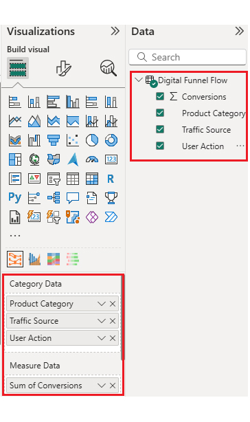
With Custom BI Development, companies can design Power BI dashboards to meet unique needs. This could mean adding interactive filters, branded visuals, or specialty chart types that better explain performance patterns.

Power BI custom visual development gives organizations control over design, features, and interactivity. By doing so, teams can merge creative design with technical analysis, resulting in reports that are not only informative but also easier for users to interpret.

Table of Contents:

  1. What is Custom BI Development?
  2. Why is Custom Visual Development Important?
  3. How to Choose the Right BI Software Development?
  4. Examples of Custom Visuals Development  in Power BI
  5. How to Use Custom BI Development for Analysis?
  6. Benefits of Using Custom Power BI Development
  7. Use Cases of Custom BI Software Applications
  8. FAQs
  9. Wrap Up

What is Custom BI Development?

Definition: Custom BI Development goes beyond built-in Power BI visuals to deliver tailored insights. It involves creating custom charts or reports that satisfy unique business requirements. This can be done using the Power BI SDK or by importing pre-built visuals from Microsoft AppSource.

You can apply advanced Power BI number format settings within custom visuals to match reporting needs—for example, currency formatting in international sales reports or percentage precision for KPI tracking.

Why is Custom Visual Development Important?

By applying Custom BI Development, organizations can add branding, interactivity, and specialized formats. This means reports can reflect corporate identity while still offering deep analytical power.

Custom visuals improve performance in large datasets, especially when paired with query folding in Power BI. They also allow advanced features such as creating relationships in Power BI to link data across sources, or views in Power BI for reusing layouts.

Certified visuals work across Power BI Desktop, Service, and Power BI for report server. Use Power BI edit interactions to control how visuals respond to each other on a page, enhancing user engagement.

How to Choose the Right BI Software Development?

Choosing visuals is easier when you understand how Custom BI Development aligns with your goals.

  • Match chart type to reporting purpose: for example, Multi Axis Line Charts for trend comparisons or Likert scales for survey feedback.
  • Confirm compatibility with all platforms, including mobile.
  • Ensure visuals allow for edits, slicers, and filters in Power BI to make reports dynamic.
  • Select visuals with documentation and support for easier onboarding.

Examples of Custom Visuals Development in Power BI

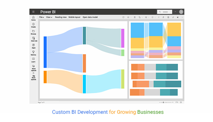
These Power BI report examples show how Custom BI Development can deliver clear comparisons and flows:

  • Comparison Bar Chart for performance contrasts.
  • Progress Circle Chart for KPI progress.
  • Heatmap for identifying trends.
  • Likert Diagram for survey sentiment.
  • Sankey Diagram for process flow analysis.

How to Use Custom BI Development for Analysis?

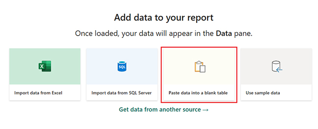
Adding a visual in Power BI is a basic step in Custom BI Development.

  1. Open Power BI Desktop or an existing report.
  2. Use “Get more visuals” from the Visualizations pane.
  3. Select and add the visual from AppSource.
  4. Drag it onto the report page.
  5. Map fields to the chart inputs.
  6. Apply styling, tooltips, and filters in Power BI for interaction.

A toggle button in Power BI lets users switch between different visual states without reloading data.

Why Use ChartExpo?

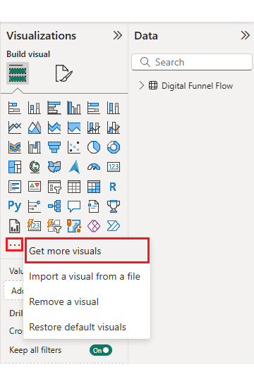
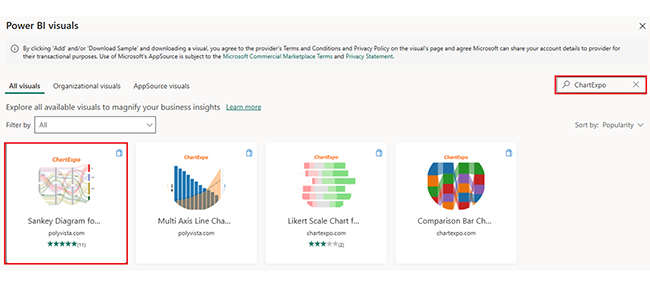
ChartExpo supports Custom BI Development with an easy interface and rich chart options. Users can build Sankey, Likert, comparison bar, and multi-axis charts without writing code.

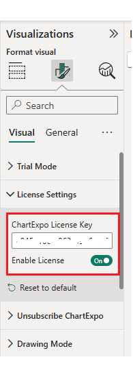
Visuals are customizable, from color schemes to axis alignment. The tool works in Power BI Service and Power BI on Report Server, with all processing done locally for data security.
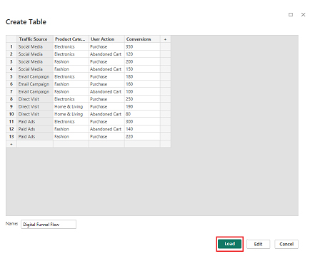
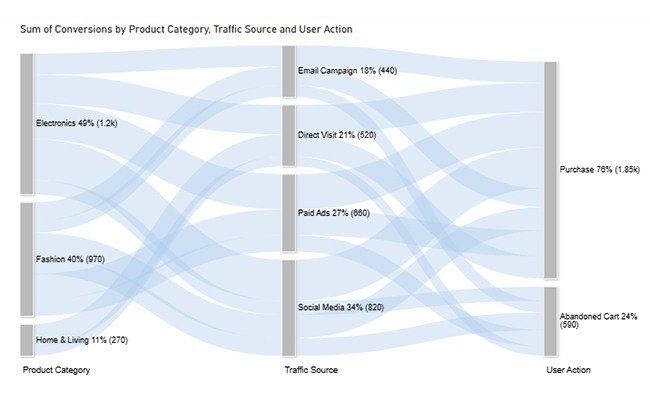
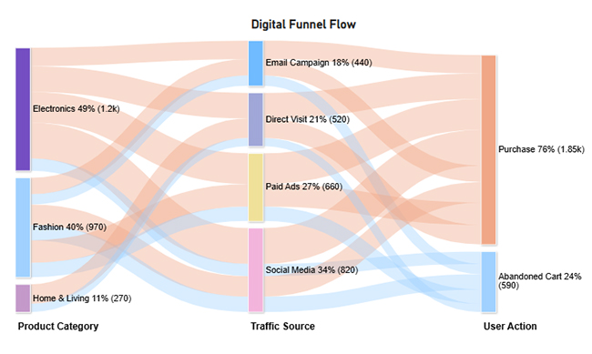
Example #1

The Sankey Chart example shows the impact of Custom BI Development in mapping flows. The dataset tracks the connections between traffic sources, product categories, user actions, and conversions. By visualizing this as a Sankey diagram, analysts can identify which sources contribute most to purchases and where users drop off.

Traffic Source Product Category User Action Conversions
Social Media Electronics Purchase 350
Social Media Electronics Abandoned Cart 120
Social Media Fashion Purchase 200
Social Media Fashion Abandoned Cart 150
Email Campaign Electronics Purchase 180
Email Campaign Fashion Purchase 160
Email Campaign Fashion Abandoned Cart 100
Direct Visit Electronics Purchase 250
Direct Visit Home & Living Purchase 190
Direct Visit Home & Living Abandoned Cart 80
Paid Ads Electronics Purchase 300
Paid Ads Fashion Abandoned Cart 140
Paid Ads Fashion Purchase 220
  • Before logging in, the user begins by entering their Power BI account email into the login field. The screen displays a simple email input box and a “Submit” button. This step confirms the account identity and moves the user to the secure password entry page.
Custom BI Development
  • After submitting the email, the password screen appears. The user enters their credentials here to access Power BI. This authentication step is required for both security and access to stored reports.
Custom BI Development
  • The next prompt asks if the user wants to remain signed in for future sessions. Accepting reduces repeated logins, while declining keeps security tighter in shared environments.
Custom BI Development
  • From the blank report, the user selects the “Paste data into a blank report” option. The interface shows an empty table area ready to receive copied data. This prepares the report for immediate visual creation.
Custom BI Development
  • Once the dataset is pasted, the user names the table and clicks “Load.” The name helps with later field mapping and organization within the Fields pane.
Custom BI Development
  • In the Visualizations pane, the user clicks “Get more visuals” to open Microsoft AppSource. This step is critical to accessing the Sankey Diagram visual for flow analysis.
Custom BI Development
  • The search box is used to find “Sankey Diagram” from ChartExpo. The listing includes an icon preview and a brief description.
Custom BI Development
  • Clicking “Add” installs the Sankey visual into the user’s Power BI environment. This action enables it for use in any report within the current file.
  • The visuals list now includes icons for Sankey, Multi Axis Line, Comparison Bar, and Likert charts. The user clicks the Sankey icon to activate it on the report canvas.
Custom BI Development
  • With the visual selected, the user maps category and measure fields in the Fields pane. This step binds the dataset to the chart.
Custom BI Development
  • Before the visual appears without a watermark, the ChartExpo license key is entered in the License Settings. This enables full use.
Custom BI Development
  • The Sankey chart now displays without the overlay, showing clean flow lines between sources, categories, and actions.
Custom BI Development
  • The user edits the chart title to better reflect the dataset’s context. This helps viewers understand the visual’s focus instantly.
Custom BI Development
  • From the “Visual” settings, bar colors are adjusted to differentiate flows. Color choices can align with brand palettes or highlight specific paths.
Custom BI Development
  • Node font size and width are adjusted for readability, making the diagram easier to interpret on both large and small screens.
  • The final Sankey Chart clearly shows traffic movement and drop-offs, ready for inclusion in the dashboard.
Custom BI Development

Example #2

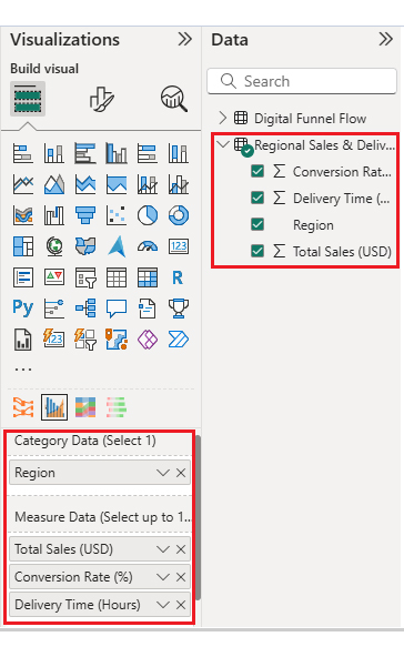
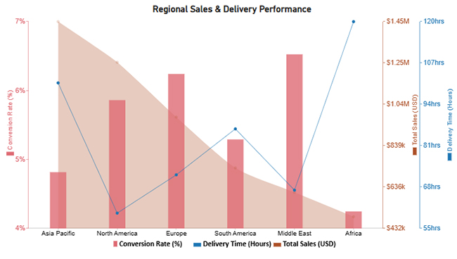
A Multi Axis Line Chart reveals performance patterns through Custom BI Development. The dataset compares regional sales, conversion rates, and delivery times, each requiring different measurement scales.

Region Total Sales (USD) Conversion Rate (%) Delivery Time (Hours)
North America 1,250,000 5.8 60
Europe 980,000 6.2 72
Asia Pacific 1,450,000 4.7 100.8
South America 730,000 5.2 86.4
Middle East 610,000 6.5 67.2
Africa 490,000 4.1 120
  • After pasting the regional dataset, the user clicks the Multi Axis chart icon in the Visualizations pane. This action prepares Power BI to map multiple metrics on different scales within a single chart.
Custom BI Development
  • The category and measure fields are mapped next. This links regions to sales, conversion rates, and delivery times on separate axes.
Custom BI Development
  • The data is sorted so that the chart displays regions in a logical sequence, which makes comparisons easier for stakeholders.
Custom BI Development
  • From the properties panel, the representation format is changed. This could involve switching from a line to a column, depending on clarity needs.
Custom BI Development
  • Axis orientation is adjusted to align with reading habits or presentation style, such as flipping from vertical to horizontal.
Custom BI Development
  • Legend properties are set to show different shape types, box, column, line, or circle, making the chart easier to interpret.
Custom BI Development
  • Bar width and opacity are fine-tuned for better visual balance, preventing overcrowding or excessive spacing.
Custom BI Development
  • Prefixes are added to axis values, such as a dollar sign for sales, helping viewers quickly understand the data’s context.
Custom BI Development
  • The final Multi Axis Line Chart presents a clear, multi-metric comparison across all regions, ready for dashboard integration.
Custom BI Development


Example #3

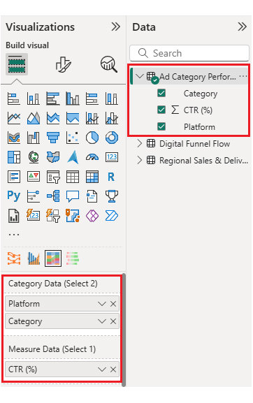
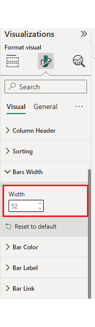
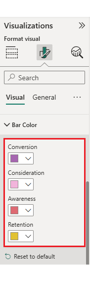
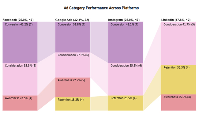
The Comparison Bar Chart illustrates differences effectively thanks to Custom BI Development. This dataset compares click-through rates (CTR) across advertising platforms and campaign categories.

Platform Category CTR (%)
Google Ads Awareness 5
Google Ads Conversion 7
Google Ads Retention 4
Google Ads Consideration 6
Facebook Awareness 4
Facebook Consideration 6
Facebook Conversion 7
Instagram Consideration 6
Instagram Conversion 7
Instagram Retention 4
LinkedIn Awareness 3
LinkedIn Retention 4
LinkedIn Consideration 5
  • The user selects the Comparison Bar Chart icon in the Visualizations panel. This initializes the chart setup in the report canvas.
Custom BI Development
  • They then map the appropriate category and measure fields. This step links the platform and campaign type to CTR values.
Custom BI Development
  • Bar width is adjusted to make the visual less cramped, ensuring labels and data are clearly visible.
Custom BI Development
  • From the “Bar Color” settings, colors are updated to differentiate categories or align with brand guidelines.
Custom BI Development
  • The completed Comparison Bar Chart shows platform performance differences in a clear, easy-to-read format.
Custom BI Development

Example #4

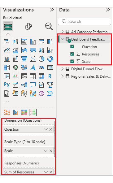
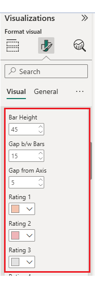
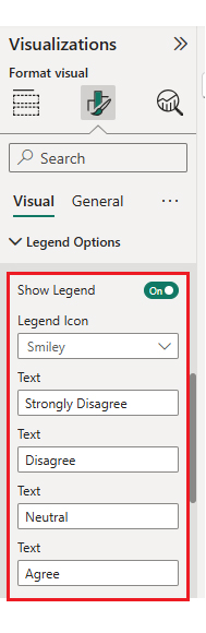
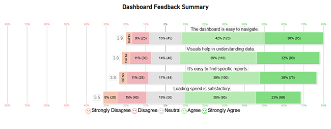
The Likert Chart demonstrates how Custom BI Development can analyze survey results. This dataset captures user ratings on dashboard usability, visual clarity, load speed, and ease of finding reports.

Question Scale Responses
The dashboard is easy to navigate. 1 10
The dashboard is easy to navigate. 2 25
The dashboard is easy to navigate. 3 45
The dashboard is easy to navigate. 4 120
The dashboard is easy to navigate. 5 85
Visuals help in understanding data. 1 15
Visuals help in understanding data. 2 30
Visuals help in understanding data. 3 40
Visuals help in understanding data. 4 110
Visuals help in understanding data. 5 90
Loading speed is satisfactory. 1 20
Loading speed is satisfactory. 2 40
Loading speed is satisfactory. 3 50
Loading speed is satisfactory. 4 95
Loading speed is satisfactory. 5 60
It’s easy to find specific reports. 1 12
It’s easy to find specific reports. 2 28
It’s easy to find specific reports. 3 44
It’s easy to find specific reports. 4 100
It’s easy to find specific reports. 5 75
  • From the Visualizations panel, the user clicks the Likert Chart icon. This starts the setup for visualizing scaled survey responses.
Custom BI Development
  • They then map the category and measure fields, linking each question and scale rating to its response count.
Custom BI Development
  • Rating colors are customized in the “Bar and Label Option” menu. This helps distinguish low scores from high ones at a glance.
Custom BI Development
  • Legend text is adjusted in the “Legend Options” panel, making it easier for viewers to interpret chart elements.
Custom BI Development
  • The completed Likert Chart presents survey results in a clear, color-coded format.
Custom BI Development

Finally, the dashboard is assembled by placing the Sankey, Multi Axis, Comparison Bar, and Likert charts together. This layout provides a cohesive view of multiple analysis perspectives.

Key Insights

  • Electronics (49%) and Fashion (40%) dominate purchases.
  • Email Campaign (18%) and Paid Ads (27%) drive the highest conversions.
  • Facebook and Instagram achieve a combined conversion rate of 41.2%.
  • North America leads sales with $1.25M despite longer delivery times.

Benefits of Using Custom Power BI Development

Using Custom BI Development ensures visuals are interactive and fit your brand style. It simplifies complex flows and comparisons through targeted chart types.

Brand consistency is maintained across reports, while scalability improves with reusable visual templates. Features like slicers, toggle buttons, and query folding in Power BI further boost performance and user control.

Use Cases of Custom BI Software Applications

  • Trend Analysis: Multi-axis line Charts for revenue vs. cost over time.
  • Survey Analysis: Likert charts for sentiment and satisfaction tracking.
  • Flow Mapping: Sankey diagrams for tracking process steps.
  • Comparisons: Comparison Bar Charts for planned vs. actual results.
  • Geography: Tile grid maps for regional performance.

Edit queries in Power BI to prepare clean datasets before applying any of these visuals.

FAQs

How do I update a custom visual in Power BI?

Follow the how to update the Power BI process to keep visuals and features current. You can re-import from AppSource or upload a newer .pbiviz file.

Are custom visuals secure?

Yes. Microsoft AppSource visuals meet security standards, and tools like ChartExpo process data locally.

Wrap Up

Custom BI Development remains vital for long-term reporting success in Power BI. It lets businesses create dashboards that serve specific needs, whether through Sankey charts mapping customer flows or Multi Axis charts comparing KPIs.

By combining tailored visuals, brand alignment, and interactive features, Custom BI Development turns data into clear, actionable narratives. For organizations aiming to improve analytics, this approach offers both flexibility and precision.

How much did you enjoy this article?

PBIAd1
Start Free Trial!
152910

Related articles

next previous
Power BI9 min read

Date Table for Power BI: Steps to Unlock Hidden Insights

Date Table for Power BI helps you run accurate time-based analysis, track trends, and build dynamic reports with consistent date logic.

Power BI8 min read

Apps for Power BI: From Data to Insights in a Few Clicks

This guide dives deep into what Apps for Power BI are, how to use them, and the types of Power BI Apps. You'll also discover the limitations of Power BI Apps.

Power BI7 min read

Power BI Features: Insights Made Easy with Power BI

This guide uncovers various Power BI features. It explains why they're important, lists the top 10 best features, and offers tips for using them.

Power BI14 min read

Power BI Data Visualizations: Building Charts That Inspire

Discover and navigate Power BI data visualizations. Enhance your data visualization capabilities. Choose the most appropriate tools for your use case.

Power BI8 min read

Power BI Incremental Refresh: A Complete Guide

This guide dives deep into what the Power BI incremental refresh is. It shows you why you should use it, and how to set up incremental refresh in Power BI.

ChartExpo logo

Turn Data into Visual
Stories

CHARTEXPO

  • Home
  • Gallery
  • Videos
  • Services
  • Pricing
  • Contact us
  • FAQs
  • Privacy policy
  • Terms of Service
  • Sitemap

TOOLS

  • ChartExpo for Google Sheets
  • ChartExpo for Microsoft Excel
  • Power BI Custom Visuals by ChartExpo
  • Word Cloud

CATEGORIES

  • Bar Charts
  • Circle Graphs
  • Column Charts
  • Combo Charts
  • Comparison Charts
  • Line Graphs
  • PPC Charts
  • Sentiment Analysis Charts
  • Survey Charts

TOP CHARTS

  • Sankey Diagram
  • Likert Scale Chart
  • Comparison Bar Chart
  • Pareto Chart
  • Funnel Chart
  • Gauge Chart
  • Radar Chart
  • Radial Bar Chart
  • Sunburst Chart
  • see more
  • Scatter Plot Chart
  • CSAT Survey Bar Chart
  • CSAT Survey Chart
  • Dot Plot Chart
  • Double Bar Graph
  • Matrix Chart
  • Multi Axis Line Chart
  • Overlapping Bar Chart
  • Control Chart
  • Slope Chart
  • Clustered Bar Chart
  • Clustered Column Chart
  • Box and Whisker Plot
  • Tornado Chart
  • Waterfall Chart
  • Word Cloud
  • see less

RESOURCES

  • Blog
  • Resources
  • YouTube
SIGN UP FOR UPDATES

We wouldn't dream of spamming you or selling your info.

© 2025 ChartExpo, all rights reserved.