Categories
Query folding in Power BI is a feature that helps users to efficiently run transformations on a huge volume of data. To get the most out of query folding, you need to understand what it is, and how it works.


In this guide, you’ll discover what query folding in Power BI is, understand how it works, and why it is important.
First…
Query Folding is the feature that enables the Power Query to transform and execute large volumes of data from the data source. With query folding, Power Query can efficiently handle vast volumes of data.
Query folding is synonymous with writing down detailed instructions in SQL code, and running it through the database for enforcement. Simply put, the heavy lifting is done by the data source, and that will, in turn, reduce the volume of data that is transferred and processed by the Power BI.
Before Power Query executes the query folding, the following conditions have to be met:
Here’s the overview of how query folding is important in Power BI.
With query folding, data transformation tasks are delegated to the data source. That means operations like aggregating, joining data, and filtering are performed by the server — a more efficient and powerful way of processing data.
Along with features like conditional formatting in Power BI, this approach ensures optimized performance and cleaner visual outputs. Since queries are processed by the data source, only the needed data is transferred to Power BI, minimizing the volume moved across the network. This, in turn, speeds up data retrieval and reduces latency.
Since the heavy lifting is handled by the data source, it becomes easy to work with complex and large datasets. Furthermore, the risk of discrepancies is reduced since the operations are handled within the data source.
Query folding helps in optimizing data workflows. Since data transformations are performed at the data source level, local resources are freed up – and that gives room for more efficient data visualization and modeling tasks.
Here are steps to help you enable query folding in Power BI.
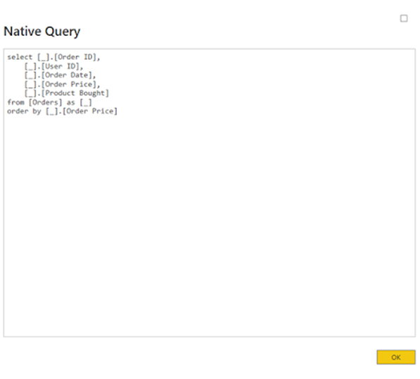
There are cases where the “View Native Query” option is grayed out – and that shows that query fold cannot be applied in the operation.
Query folding indicators use an underlying query plan to determine if a query will fold or not. Here is the list of the various indicator icons and their meaning.
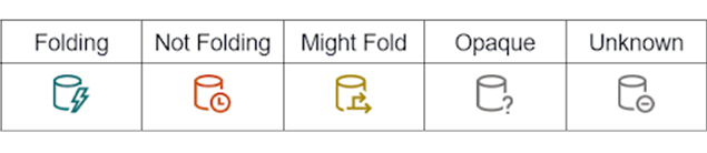
The folding indicator shows that the query will be executed by the data source up to this step.
This indicator shows that certain parts of the query will not be processed by the data source. You need to rearrange the query to enable the data source to execute as many transformations as possible.
The indicators show that the folding status will be determined during the runtime. It cannot be determined beforehand. Might Fold only appears when you’re using ODBC connections or OData.
This indicator shows that the Power BI connector does not support the query plan indicator and tool. As a result, the query plan remains indeterminate.
This indicator shows that the query plan is absent. It could be due to an error. It could also happen when you try running the query plan evaluation, or when you try running something that’s not the query table.
Here are easy steps to help you set up a query folding.
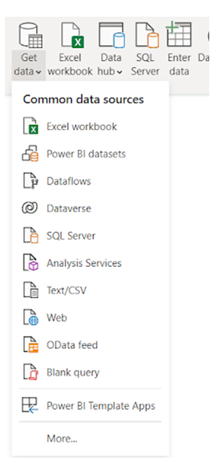
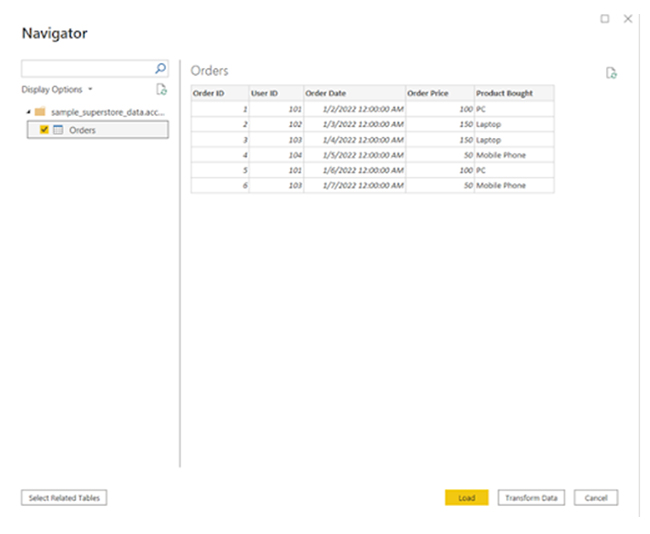
The first step is to connect to a data source that supports query folding. In this illustration, the Power BI will be connected to the Microsoft Access Database. Connecting to the data source is easy. You’ll have to click on “Get Data” and choose your preferred data source.
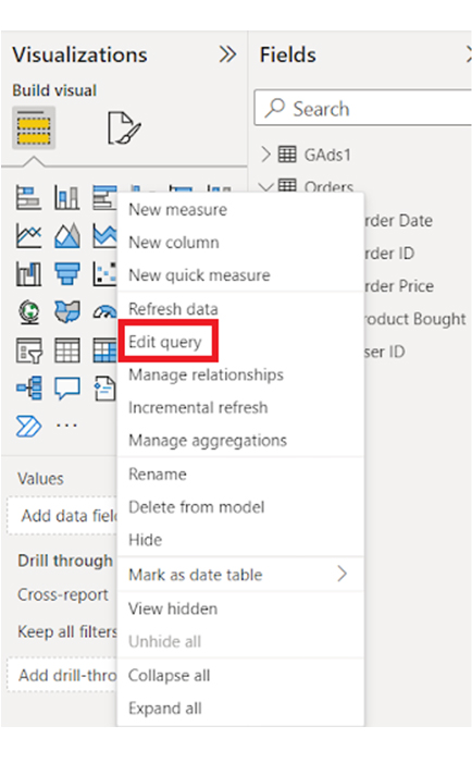
Edits are made in the “Query Edit.” To go to the “Query Editor,” click on “Transform Data.”
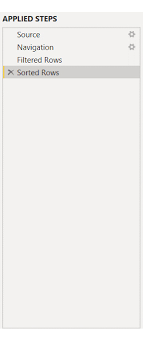
After opening the “Query Editor,” perform transformations. And that can be done by pushing them into a data source. Transformations could be sorting rows of a column in ascending order.
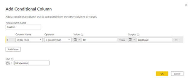
There is also the option of performing complex transformations like adding a conditional column. To do that, navigate to “Add column,” and click the “Conditional column” icon.
To load your data onto the Power BI, search for the “Close & Apply” button on the home tab and click on it. Repeat the process for all the columns that require query folding.
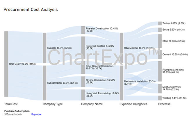
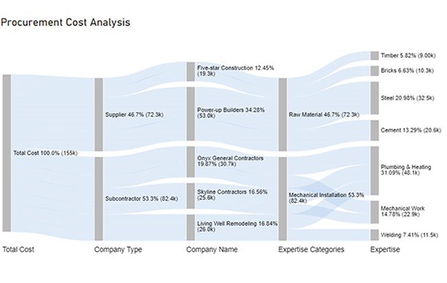
You can use the Sankey graph in Power BI to visualize query folding and understand how data flows through different query steps.
Stage 1: Logging in to Power BI


| Total Cost | Company Type | Company Name | Expertise Categories | Expertise | Cost |
| Total Cost | Subcontractor | Skyline Contractors | Mechanical Installation | Plumbing & Heating | 15456 |
| Total Cost | Subcontractor | Skyline Contractors | Mechanical Installation | Mechanical Work | 10159 |
| Total Cost | Subcontractor | Onyx General Contractors | Mechanical Installation | Plumbing & Heating | 18045 |
| Total Cost | Subcontractor | Onyx General Contractors | Mechanical Installation | Mechanical Work | 12695 |
| Total Cost | Subcontractor | Living Well Remodeling | Mechanical Installation | Plumbing & Heating | 14589 |
| Total Cost | Subcontractor | Living Well Remodeling | Mechanical Installation | Welding | 11456 |
| Total Cost | Supplier | Power-up Builders | Raw Material | Cement | 20561 |
| Total Cost | Supplier | Power-up Builders | Raw Material | Steel | 32456 |
| Total Cost | Supplier | Five-star Construction | Raw Material | Bricks | 10253 |
| Total Cost | Supplier | Five-star Construction | Raw Material | Timber | 9000 |
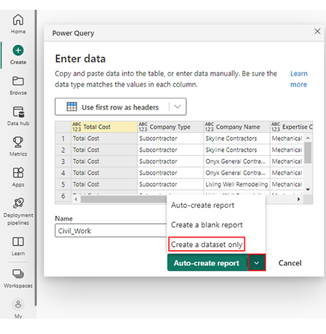
Paste the data table onto the “Power Query” window. After that, choose “Create a dataset only” from the options.
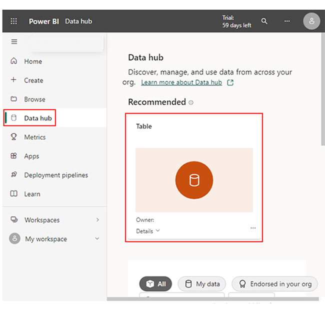
Take a look at the left-side menu, and click on “Data Hub.” If there is no data set, you’ll get an error message. However, if there is a data set, Power BI will populate it.
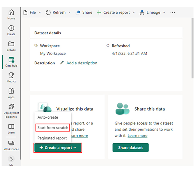
Select the data set that will be used in creating the Sankey diagram. After that, an image similar to the one below will be displayed.
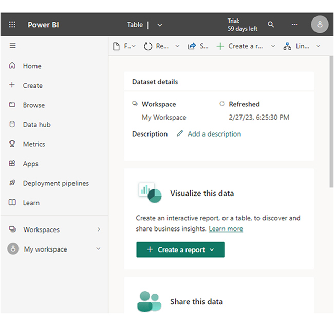
From the dropdown menu, click “Create a report.” After that, choose “Start from scratch.”
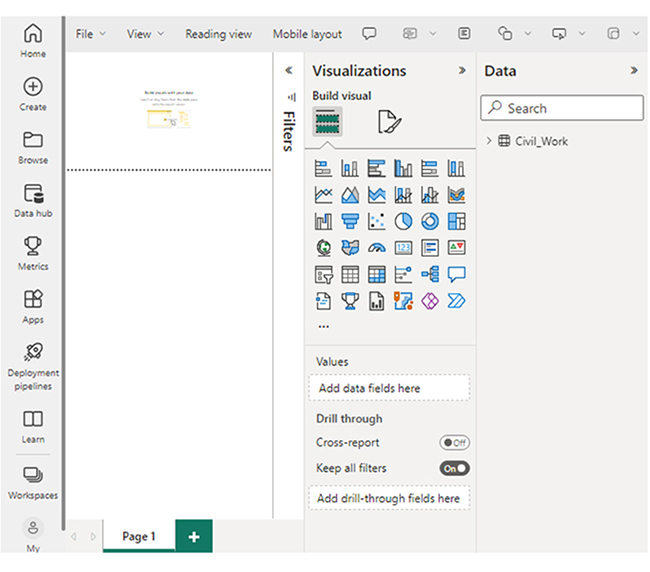
The report will be similar to the one below.
Stage 3: Add the Power BI Sankey Diagram Extension by ChartExpo
To get started, you’ll have to use the Power BI visual from AppSource or get the add-in. After that, you’ll have to follow the steps outlined below:
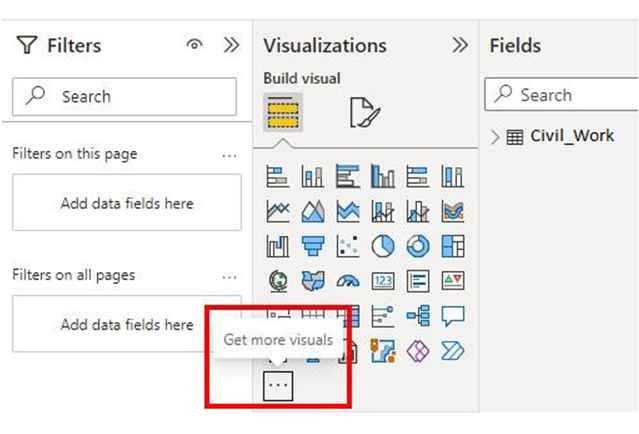
Click “Get more visuals.”
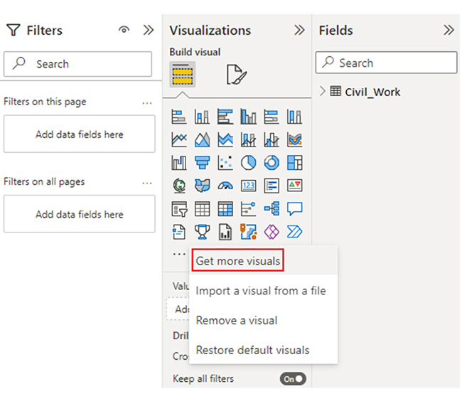
Using the search box, input “Sankey Diagram for Power BI by ChartExpo.”
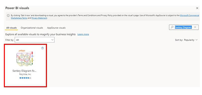
Click on the “Add” button.
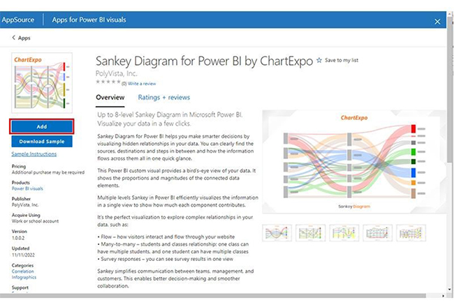
The “Sankey Diagram for Power BI by ChartExpo” icon will be added to the visualization panel.
Stage 4: Drawing the Sankey Diagram with ChartExpo’s Power BI extension
There are ways of resizing the visual. Moving on, you’ll have to navigate to the right side of the Power BI dashboard, and look out for “Fields” found next to “Visualizations.”
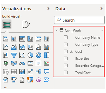
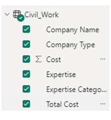
Choose the fields that will be used in your Sankey Chart. And you have to select the fields using the sequence below.
You’ll have to provide your email address or ChartExpo license key.

Stage 5: Apply a Subscription Key or Activate the ChartExpo Trial.
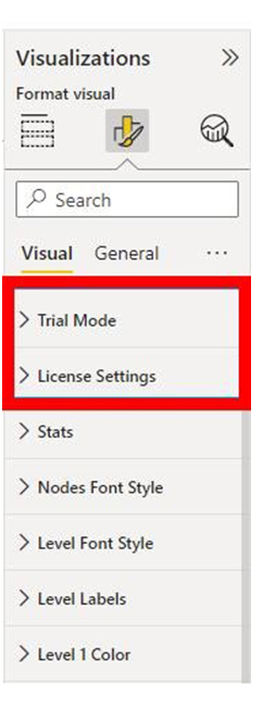
Choose the ChartExpo visual, and look out for the three icons below the “Build Visual” option.
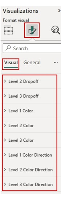
Select the “Format visual” option. After that, visual properties similar to the one below will be displayed.
If you’re a new user, you can begin using ChartExpo by:
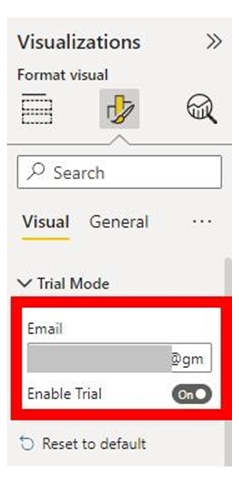
Since you’re using the 7-day trial, you’ll get a ChartExpo watermark on all Sankey Diagrams you create.
If you have a license key, you should:
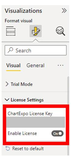
If done properly, the Sankey diagram will not come with a watermark.
You can add the prefix (like the $ sign) to the chart. After that, expand the “Stats” properties to include the Prefix value.
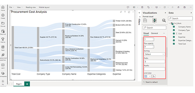
To add colors, expand the “Level Colors” properties, and choose the colors.
The changes will be automatically saved.
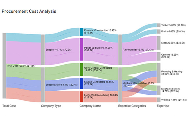
Here is the Sankey diagram we created using a Sankey diagram generator with ChartExpo.
Here are three insights you can draw from the chart.
With query folding in Power BI, data transformation is pushed to the source. This reduces data transfer, takes advantage of the source processing power, and optimizes performance.
When data transformation is pushed to the data source, it improves performance and reduces data transfer.
The “Table.Buffer” function is used in disabling query folding in Power BI.
Query folding (or query collapsing) helps to improve the efficiency, performance, and resource management of Power BI. Since data is processed in the data source, only relevant data is transferred to the Power BI – and that minimizes the volume of data that is moved over the network.
Query folding helps in the optimization of the data workflows. Since transformations are performed at the data source level, local resources are freed up – and that allows for more efficient data visualization and modeling tasks.
To get the most out of query folding, the following conditions must be fulfilled:
Now you know what query folding in Power BI is, what transformations and data operations will be performed using the feature?
How much did you enjoy this article?


Discover diverse and high-quality Power BI report examples for inspiration and insights. Elevate your reporting with strategic visualization techniques.

A Customer Relationship Management Dashboard centralizes data, tracks key metrics, and drives smarter business decisions. Discover now!

Explore Healthcare Dashboard Examples and learn how to turn complex healthcare data into clear, actionable insights for better decision-making.


