Categories
By ChartExpo Content Team
You see a spike in sales. Then you see a rise in social media likes. Correlation analysis says they’re related. But are they?
This is where many teams fall. Correlation analysis shows patterns. But patterns can trick. You might be right statistically and still wrong strategically.
High correlations feel safe. But some are noise. Others are traps. One false move and your dashboard becomes fiction. Correlation analysis should raise better questions, not create false answers. To use it right, you need more than math. You need a mindset.
Correlation analysis can help you make smarter decisions. But first, it has to pass three tests—strength, relevance, and action. Without those, it’s a guess dressed up in numbers. Let’s look at how to use correlation analysis without being fooled by it.
Many believe correlation reveals connection. But it’s more about dismissing coincidences. By analyzing data, we can spot when things truly relate or just appear to.
False hope often lurks in numbers. Imagine thinking rain makes you lucky because you found a dollar on a rainy day. Correlation filters out these illusions. It helps focus on real patterns, not flukes.
Correlational statistics offer a peek into patterns. They show connections that might be real. But beware of the illusion. Patterns can deceive. They often arise by chance, not due to real ties.
Think of patterns as mirages. They seem real from afar. But get closer, and they vanish. Correlational statistics can mislead if we’re not careful. It’s crucial to approach with a discerning eye.
Correlation regression analysis often seems precise. Numbers and graphs make it look smart. But overconfidence in this precision can mislead. It’s like trusting a map without checking for errors.
Regression analysis can trick us into believing it’s foolproof. It predicts based on past data. But the future isn’t always like the past. Blind trust in this analysis can lead to wrong conclusions. It’s essential to use it wisely, recognizing its limits.
| Common Misinterpretations in Correlation Analysis | ||
| Misinterpretation | What People Assume | What’s Actually True |
| Correlation = Causation | “X causes Y to happen.” | Correlation only shows a relationship, not cause. |
| Strong correlation means important | “It’s statistically strong, so it must matter.” | Strength doesn’t equal relevance or impact. |
| Negative correlation = bad outcome | “A negative trend means failure.” | It might signal a healthy inverse relationship. |
| No correlation = no relationship | “If r = 0, they’re unrelated.” | Nonlinear or lagged relationships may still exist. |
| Correlation is symmetric | “If X correlates with Y, Y affects X too.” | Correlation doesn’t imply direction of influence. |
| Visual similarity = correlation | “The lines move together—it must be linked.” | Patterns can align by coincidence or external factors. |
| Higher R² means better analysis | “This model explains 90%—it must be good.” | High R² can result from overfitting or irrelevant data. |
| One correlation tells the whole story | “This one stat says it all.” | Context, data quality, and method all matter. |
| Outliers don’t affect correlation much | “One or two weird points won’t change the result.” | Outliers can heavily skew correlation values. |
| All variables can be correlated the same way | “Just run Pearson on everything.” | Method must match the data type and distribution. |
(The Causation Costume Party)
A strong link between two factors might seem like a sure bet. But beware, this can be a mirage. It creates confidence based on false premises. This is where strategies fail. People think they’re on solid ground, but they’re just walking on thin ice.
The mirage of confidence can lead to overinvestment in strategies that don’t pay off. Businesses might pour resources into areas that don’t bring returns. It’s like buying a luxury car because the salesperson says it’s a great deal, only to realize it guzzles gas and drains your wallet.
Correlation testing can reveal links, but it doesn’t tell you everything. It can’t explain why two things move together. It doesn’t account for outside influences that may drive both factors. This limitation is where businesses need to be cautious.
Understanding the true impact requires looking beyond numbers. It involves considering context, external factors, and deeper insights. This broader view helps prevent misguided strategies based on misleading links. It’s not just about what the numbers say, but why they’re saying it.
False certainty can be a trap. It happens when people nod in agreement, thinking they’ve found a sure thing. But this confidence can lead to expensive mistakes. It’s like betting everything on a hunch that turns out wrong.
These traps occur when businesses rely too heavily on correlation. They think they know the answer, but they don’t. The result? Poor decisions and wasted resources. Avoiding these traps means questioning assumptions and seeking deeper insights.
This content aims to engage readers with relatable analogies, clear explanations, and a conversational tone. It addresses the importance of understanding the difference between correlation and causation in strategy planning.
The following video will help you to create a Scatter Plot in Microsoft Excel.
The following video will help you to create a Scatter Plot in Google Sheets.


(Method Mayhem)
Pearson is the life of the party, often the go-to choice. It measures linear relationships between continuous variables. But it’s not always the best fit. It assumes a normal distribution and can mislead if data isn’t linear. Imagine trying to fit a square peg into a round hole.
Spearman steps in when data isn’t normal. It ranks values instead of using raw data, which makes it great for monotonic relationships. But even Spearman has limits. It doesn’t suit non-monotonic trends. Kendall Tau is similar but better with smaller samples or tied ranks. Knowing these differences helps avoid awkward mismatches.
| Correlation Methods and When to Use Them | ||
| Method | Best Used For | Limitations |
| Pearson | Linear relationships between continuous variables | Assumes normal distribution and linearity |
| Spearman | Monotonic relationships with ordinal or non-normally distributed data | Not suitable for non-monotonic trends |
| Kendall Tau | Small samples or data with many tied ranks | Less powerful with large datasets compared to Spearman |
| Point-Biserial | Correlation between one continuous and one binary variable | Only works with true dichotomous variables |
| Cramér’s V | Association between nominal (categorical) variables | Does not indicate direction or cause |
| Phi Coefficient | 2×2 contingency tables (binary variables) | Only works with dichotomous data |
| Partial Correlation | Examining correlation between two variables while controlling for others | Can be misleading with multicollinearity |
| Canonical Correlation | Relationships between two sets of variables | Complex and requires large datasets |
| Distance Correlation | Non-linear relationships across any data type | More computationally intensive |
| Pointwise Mutual Information | Co-occurrence in categorical or text data | Sensitive to low-frequency events |
Canonical correlation analysis is like pairing dance partners for a perfect performance. It examines relationships between two sets of variables.
This tool shines when you’re dealing with complex data sets. It finds the best linear combinations, revealing hidden connections. A frequency chart in Excel can also support this kind of analysis by helping you quickly see how often values or patterns occur within each dataset.
Imagine two orchestras playing in harmony. Each instrument represents a variable. Canonical correlation analysis ensures they’re in sync. It’s about finding balance and understanding how groups interact. This method uncovers deeper insights, providing a complete picture when dealing with multiple variables.
Point-biserial correlation is the bridge between continuous and binary variables. Imagine a translator connecting two languages. When one variable is dichotomous, point-biserial steps in. It helps find connections where others might fail. But it’s not alone in the categorical world.
Cramér’s V handles nominal data. Think of it as the glue for categories. It measures strength without assuming order. In the categorical confusion zone, these tools help make sense of jumbled data. They offer clarity, turning chaos into order.
| Best Correlation Tests for Categorical Data Types | ||
| Test | Best For | Key Consideration |
| Cramér’s | Nominal variables (no inherent order) | Does not show direction or causality |
| Chi-Square Test of Independence | Testing association between categorical variables | Requires sufficient sample size and expected frequencies |
| Contingency Coefficient | Association strength in a contingency table | Less interpretable for large tables |
| Phi Coefficient | 2×2 categorical tables | Only suitable for binary data |
| Point-Biserial | One binary and one continuous variable | Binary variable must be truly dichotomous |
| Tetrachoric Correlation | Two latent binary variables | Assumes underlying normal distribution |
| Polychoric Correlation | Ordinal variables from latent continuous variables | Used when ordinal data approximates continuous traits |
| Goodman and Kruskal’s Lambda | Nominal variables for predictive association | May underestimate strength of association |
| Goodman and Kruskal’s Tau | Directional association in nominal data | Rarely used, less intuitive |
| Yule’s Q | Strength of association in 2×2 tables | Does not apply to tables larger than 2×2 |
Imagine an HR leader sifting through exit surveys. Employee burnout signals hide in the data. Using the right correlation tools, patterns emerge. Point-biserial might reveal links between work hours and burnout. Cramér’s V could show connections between departments and stress levels.
The HR leader doesn’t guess. They use data to make informed decisions. This approach helps identify problem areas and address them. Detecting burnout early can improve employee well-being and reduce turnover. It’s about seeing the bigger picture through the right lens.
(Dirty Data, Doomed Insight)
Before diving into analysis, check your data’s health. First, verify the source. Is it reliable? Next, ensure consistency across datasets. Look for missing values, as they can distort results. Fix these gaps by filling in or excluding the incomplete data.
Examine outliers, too. These oddballs can warp your analysis. Think of them as party crashers in your data set. Finally, scrutinize data types. Mixing numbers with text in a numerical column is a recipe for disaster. Think of it as trying to calculate a sum with a word thrown in. It’s bound to fail.
| Pre-Analysis Checklist for Reliable Correlation Analysis | ||
| Check | Why It Matters | How to Validate It |
| Data source credibility | Ensures your foundation isn’t flawed | Verify origin, documentation, and collection method |
| Variable consistency | Prevents comparison of mismatched definitions | Standardize labels and formats across datasets |
| Missing values | Avoids skewed or invalid results | Use imputation or filter out incomplete records |
| Outlier detection | Stops extreme values from distorting correlations | Use boxplots, z-scores, or IQR method |
| Data type matching | Guarantees you’re using the right correlation method | Check each variable’s type (categorical, continuous, etc.) |
| Distribution shape | Some tests assume normality or monotonicity | Use histograms, Q-Q plots, or normality tests |
| Sample size adequacy | Small samples can mislead with unstable results | Rule of thumb: >30 observations per variable |
| Feature relevance | Avoids “garbage in, garbage out” insights | Use domain knowledge or exploratory analysis |
| Time alignment | In time-series, misaligned data can fake correlation | Check timestamps and apply lag adjustments if needed |
| Data cleanliness | Dirty data can break even the best models | Audit for typos, duplicates, and formatting issues |
Feature selection can sometimes lead you down the garden path. Picking the wrong variables might show patterns that aren’t there. It’s like seeing shapes in clouds—beautiful but not real. This happens when irrelevant features sneak into your analysis.
Imagine you’re analyzing sales data, but throw in random weather data. Suddenly, it looks like rain boosts sales. But in reality, it’s just noise. This misleads decision-makers into chasing shadows. The fix? Choose features that logically connect to your analysis goal.
Dirty inputs can derail regression analysis. Picture building a house on a shaky foundation. No matter how well-designed, it will crumble. Similarly, unreliable data skews regression results, leading to incorrect predictions.
Inaccurate inputs affect everything. They make predictions uncertain, like forecasting the weather with yesterday’s news. Cleaning your data ensures robust models and reliable outcomes. It’s the difference between a strong bridge and a wobbly rope.
Picture a crowded room where everyone talks at once. That’s what it feels like when a correlation matrix overflows with variables. While it might seem like more information leads to better understanding, the reality can be quite the opposite. With too many variables, the chart turns into a jumble of numbers and lines that confuse more than clarify. Instead of meaningful insights, you end up with noise.
To tackle this, focus on what truly matters. Identify the key variables that drive your analysis. Cut through the clutter. Simplifying the matrix can reveal clear patterns and connections, allowing you to make informed decisions. Remember, more isn’t always better. Sometimes, less is more when it comes to finding true meaning in data.
Once upon a time in a bustling hospital, an analyst faced a daunting task. A correlation chart had been misinterpreted, leading to misguided decisions. But our analyst knew better. They tweaked the chart, removing unnecessary variables and highlighting the critical data. This newfound clarity transformed the hospital’s approach to patient care.
The result? Improved patient outcomes and a pat on the back for the analyst. This story shows the power of a well-crafted chart. By focusing on what matters, you can drive real change. It’s not about the quantity of data but its quality and relevance. A single chart, when done right, can make all the difference.
Stakeholders often misinterpret correlation charts due to a lack of understanding. They might see a strong correlation and jump to conclusions, assuming causation without considering other factors. This can lead to misguided decisions and missed opportunities. Education is key here. Explaining the nuances of correlation and causation helps stakeholders make informed choices.
Preventing misinterpretation also involves clear communication. Use simple language and visuals to convey complex ideas. Provide context and explain potential pitfalls. By doing so, you empower stakeholders to see beyond the surface, making them better equipped to navigate the challenges of data interpretation.
Ever tried fitting a square peg in a round hole? Variable mismatches in analysis feel the same way. The first mismatch is scale. Mixing scales, like apples and oranges, leads to misleading results. Keep your variables consistent—convert them if needed.
Second, there’s the type mismatch. You wouldn’t compare text with numbers, right? Ensure your data types align. Lastly, watch out for missing data. Gaps can skew results or render them useless. Fill in the blanks or adjust your methods accordingly.
Imagine a decision tree for analysts. If this condition, then that method. It’s all about making your process fast and repeatable. This framework takes the guesswork out of choosing the right correlation method. It guides you step-by-step, cutting down the time spent pondering what to do next
No judgment here—just a clear path. Set your conditions, follow the guide, and get your results. It’s like having a roadmap to navigate the data jungle. This approach reduces errors and boosts your confidence in the analysis.
| If-This-Then-That Guide to Correlation Method Selection | ||
| If This Condition | Then Use This Method | Why |
| Both variables are continuous and normally distributed | Pearson | Measures linear correlation assuming normality |
| One or both variables are ordinal | Spearman | Ranks values, suitable for monotonic but not linear data |
| Dataset includes many tied ranks or is small | Kendall Tau | More robust than Spearman in small or tied-rank datasets |
| One variable is binary, the other is continuous | Point-Biserial | Designed for dichotomous-continuous relationships |
| Both variables are nominal (unordered categories) | Cramér’s V | Measures association strength without implying direction |
| Both variables are binary (2×2 table) | Phi Coefficient | Specialized for binary-binary relationships |
| You want to remove the effect of other variables | Partial Correlation | Controls for confounding factors |
| You’re comparing two sets of variables | Canonical Correlation | Examines relationships between variable groups |
| You suspect nonlinear relationships | Distance Correlation | Captures both linear and nonlinear associations |
| You’re analyzing ordinal data from latent continuous traits | Polychoric Correlation | Assumes ordinal data stems from normally distributed traits |
Mosaic plots are your secret weapon for complex data relationships. They reveal patterns without diluting the information. Think of them as a visual story, where each tile tells a part of the tale.
These plots handle multiple categories effortlessly. They’re perfect for showing how different variables interact. With mosaic plots, your data comes alive, making complex relationships easy to understand at a glance.
| Mosaic Plot Use Cases in Correlation Analysis | ||
| Use Case | Why Mosaic Plots Work Well | Key Considerations |
| Exploring relationships between categorical variables | Clearly displays proportions across categories | Works best with limited number of variables |
| Visualizing multi-way frequency tables | Helps understand intersections of multiple factors | Avoid overly granular splits that reduce clarity |
| Spotting interaction effects | Makes it easy to see how one variable affects another | Requires thoughtful color and grouping choices |
| Summarizing survey results across demographics | Visually separates responses by age, gender, etc. | Ensure balanced sample sizes across groups |
| Detecting anomalies in categorical combinations | Reveals unexpected or rare category combinations | Look for small or disproportionately large tiles |
| Comparing categorical variable distributions | Shows how distributions vary across subgroups | Labels must be concise and clearly legible |
| Displaying data from contingency tables | Translates cross-tabulation into a visual format | Can be hard to read with too many nested categories |
| Presenting education, income, or employment segments | Effective for illustrating societal or demographic trends | Interpretations should be contextually explained |
| Highlighting missing or zero-frequency data | Empty or tiny tiles show gaps in category pairing | Be sure users understand what “empty” implies |
| Supporting exploratory data analysis (EDA) | Quick overview of variable relationships | Best used before diving into deeper statistical modeling |
Sometimes, the best decision is to walk away. When data lacks consistency or doesn’t follow any pattern, correlation may not be the answer. This is your kill-switch moment—knowing when to stop can save resources and sanity.
Correlation isn’t always the hero. Recognize when it’s not fitting the situation. Look for alternatives like regression or classification. Trust your instincts and let the data guide you. Walking away isn’t failure—it’s wisdom.
| When to Ditch Correlation: Situational Checklist | ||
| Scenario | Why Correlation Fails Here | What to Do Instead |
| Data lacks sufficient volume | Small datasets produce unreliable correlation values | Collect more data or use qualitative analysis |
| Variables are clearly non-linear and non-monotonic | Correlation underestimates or misses relationships | Use decision trees, clustering, or mutual information |
| High multicollinearity across variables | Correlation can’t separate overlapping influences | Apply dimensionality reduction (PCA) or regression techniques |
| Time lags distort relationships | Events appear out of sync, masking true interactions | Use cross-correlation or lagged regression models |
| One variable is constant or nearly so | No variation = no correlation | Remove or reconsider variable relevance |
| Data is mostly categorical with complex groupings | Correlation assumes numerical continuity or order | Use contingency tables or association rules |
| Causal direction is critical to decisions | Correlation gives no insight into what causes what | Conduct experiments or use causal inference frameworks |
| Signal is buried under noise | Correlation will reflect noise more than insight | Clean data or use smoothing and filtering |
| Business impact depends on rare events | Correlation dilutes the importance of outliers | Use anomaly detection or segment-based analysis |
| Stakeholders misinterpret correlation repeatedly | Misuse leads to poor decisions despite valid analysis | Shift to clearer visuals or guided interpretation methods |
(The Misread Matrix)
Picture this: you’ve got a shiny new gadget, but it doesn’t fit in your pocket. Statistical significance is that gadget. It’s impressive, but doesn’t always align with strategic goals. A statistically significant result is like finding a rare coin—it’s valuable, but only if it fits your collection. In strategy, relevance trumps significance every time. A correlation might be statistically valid, but if it doesn’t drive your business strategy, it’s just a pretty number.
Think of it this way: a correlation might scream “look at me,” but if it doesn’t help you predict or improve outcomes, it’s not worth the attention. It’s crucial to balance significance with practical relevance. Otherwise, your strategy might end up as useful as a chocolate teapot—sweet but ineffective.
Let’s paint a picture with a Case Study. A company launches an A/B test to boost sales. They find a correlation between website color and customer clicks. Excited, they change the site’s color scheme. But sales don’t budge. Why? They chased a phantom. The correlation was there, but it didn’t impact sales. It was a classic case of mistaking correlation for causation.
This example shows how easy it is to stumble into the correlation trap. It’s like seeing a shadow and thinking it’s a monster. The team learned the hard way that a phantom correlation can lead to misguided decisions. The lesson? Always question if the correlation truly affects your goals, or if it’s just a shadow on the wall.
Time is a trickster. It can make data dance to its tune, leaving you puzzled. The lag effect is one such trick. In time-series forecasts, timing can distort correlation, making it look stronger or weaker. Imagine trying to catch a train that’s already left the station. That’s what happens when you don’t account for the lag. You’re left standing on the platform, wondering where you went wrong.
The lag effect can mislead forecasts, causing a ripple effect in decision-making. It’s like hearing an echo and thinking it’s someone answering you. To counter this, always consider the timing of data points. Align them correctly, and you’ll see the true picture, instead of a distorted echo.
Ever tried juggling flaming swords while riding a unicycle? That’s what comparing multiple variables across time and teams feels like. A radar chart can be your safety net here. It helps visualize different variables over time, giving you a clearer picture. Instead of juggling blindly, you can focus on what matters.
Radar charts allow teams to compare predictive power across different variables. It’s like having a bird’s eye view of a maze. You can see the paths clearly and choose the best route. This tool helps in identifying which variables have the most impact, saving time and resources.
Data can be like a messy room—full of hidden treasures and heaps of junk. A noisy dataset is just that. Correlation in such a dataset may echo loudly, but it’s often just noise, not music. It’s like a parrot mimicking words without understanding them. You might hear what you want, but it doesn’t make sense.
To avoid this trap, clean your data first. Remove the noise and focus on the melody. This way, you ensure that the correlation you find is worth your attention. Otherwise, you risk making decisions based on echoes rather than facts.
Many people get starry-eyed over R², the statistic that explains how well data fits a line. But let’s be honest, a high R² can sometimes lead you astray. It’s not the holy grail. It might look nice, but it doesn’t always mean what you think.
Focusing on tradeoffs is where the real value lies. It’s like choosing a car. You wouldn’t pick one just because it has a shiny paint job, right? You’d think about safety, fuel efficiency, and comfort too. The same goes for data. Look beyond the surface to find what really matters.
Testing is like the rehearsal before a big show. You learn a lot, but it’s useless if it doesn’t translate into a plan. The real trick is making sure the insights don’t get lost in the noise. You need a strategy that takes the test results and uses them wisely.
Imagine a dance floor with everyone moving in sync. Each step is based on the rhythm of the music. That’s what a well-executed strategy feels like. It’s where testing meets planning, creating a flow that’s as smooth as a well-practiced routine.
Data storytelling is an art. But there’s a fine line between selling the story and overselling the signal. You want to be engaging without making promises the data can’t keep. It’s like writing a book that’s interesting without being exaggerated.
Your audience likes a good story, but they also need honesty. Use the data to tell them something true and useful. It’s about finding that sweet spot between fact and fiction. Keep it real, and your audience will thank you for it.
Imagine you’re preparing for a big presentation. You want to make sure everything is perfect. The 5-Minute QA Checklist is your quick check before showtime. It’s a series of questions that ensure you’ve covered every angle.
First, check your data sources. Are they credible and up-to-date? Examine your calculations. Double-check for errors or inconsistencies. Then, review your visuals. Are they clear and easy to understand? This checklist gives you confidence, ensuring you’re ready to face any question or challenge.
The checklist isn’t just about finding mistakes. It’s about ensuring your work stands up to scrutiny. It helps you anticipate questions from your audience. Consider potential objections, and prepare answers. Think of it as a rehearsal. The checklist boosts your confidence, knowing you’ve done your homework.
This preparation makes your presentation stronger, enhancing credibility and impact. You present with confidence, knowing your work is solid and reliable.
Imagine driving and spotting warning signs on the road. The Red Flag Grid is like those signs for your data analysis. It alerts you to potential dangers in your conclusions. This grid identifies weak correlations that could mislead you. It helps you avoid jumping to conclusions based on shaky evidence.
The grid examines factors such as sample size and unusual patterns. It ensures your findings are robust and reliable.
Ignoring these red flags can damage your credibility. A single flawed conclusion can undermine your entire analysis. The Red Flag Grid acts as a safeguard. It prompts you to question and verify your findings.
This process protects you from making hasty decisions. You can confidently present results, knowing you’ve addressed potential pitfalls. This grid not only strengthens your analysis but also builds trust with your audience.
| Red Flags in Correlation Interpretation | ||
| Red Flag | What It Looks Like | Why It’s Dangerous |
| High correlation with no logical link | “Revenue rises with coffee consumption” | Could be a spurious or coincidental relationship |
| Ignoring data distribution | “Let’s use Pearson—it’s always best” | Misapplying methods skews results and invalidates findings |
| Small sample size | “This trend is clear from 10 responses” | Increases volatility and false positives |
| Overfitting to noise | “The R² is 0.99—must be great!” | Might capture noise instead of meaningful signal |
| Misreading time lags | “Sales drop the same week ads run” | Lag effects distort timing of correlation |
| Unchecked outliers | “Ignore those two weird points” | Outliers can exaggerate or hide relationships |
| Reverse causation assumptions | “Increased sales cause ads” | Confuses cause and effect, flipping interpretation |
| Multicollinearity in variables | “Let’s include all features” | Creates redundancy and masks individual impact |
| Visual bias from charts | “The lines match—clearly related” | Overreliance on visuals without statistical testing |
| Ignoring external factors | “A and B move together—it must be real” | Hidden variables might influence both factors |
Picture a bustling media analytics team. They face tight deadlines and mountains of data. Mistakes mean rework, which wastes time and resources. Enter the sanity system. This system acts as a checkpoint. It ensures data is clean and accurate before analysis begins. The team uses it to catch errors early, saving countless hours of rework. This system becomes their secret weapon, streamlining processes and boosting efficiency.
The team’s productivity soars. They produce insights faster and with greater accuracy. The sanity system becomes an integral part of their workflow. It reduces stress and increases confidence in their findings. The team can focus on creative analysis, knowing their foundation is solid.
This Case Study shows the power of a sanity system. It transforms chaos into order, allowing the team to thrive under pressure.
Imagine you’ve got a story to tell, but it’s complex. You want to convey multiple factors clearly. Enter the clustered stacked bar chart. It’s a visual tool that breaks down complexity. This chart shows different categories side by side, stacked to show subcategories. It’s like seeing layers of a cake, each slice representing a different factor. The chart helps viewers grasp the whole picture at a glance.
The beauty of this chart is its simplicity. It presents intricate data without overwhelming your audience. Viewers can see relationships between factors, understanding the broader context. It’s a powerful way to communicate insights without losing your audience in details.
This chart turns complex information into a visual story, making it accessible and engaging. Your audience walks away with a clear understanding of the key points you’re presenting.
Think of the correlation kill-switch as your decision-making compass. It’s a single page that guides your next move. It tells you when to stop, pivot, or go ahead with your analysis. This page evaluates the strength and reliability of your findings. It considers factors like statistical significance and real-world relevance. The kill-switch helps you avoid pursuing dead ends or overhyped results.
This tool is crucial in preventing wasted effort. It helps you focus on what truly matters. By knowing when to pivot, you can adjust your approach and explore new angles. If the analysis is solid, you can proceed with confidence. The kill-switch ensures your decisions are informed and strategic. It’s your guide to making the most of your analysis, maximizing insights and minimizing risks.
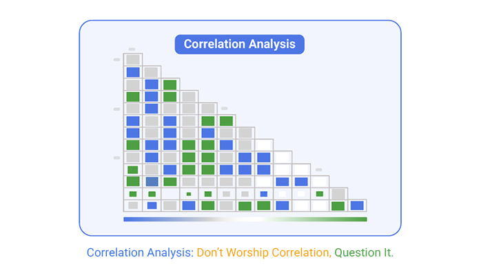
Correlation analysis is a way to measure the strength and direction of a relationship between two variables. It helps show whether changes in one factor are linked to changes in another. A positive correlation means both move in the same direction, while a negative one means they move in opposite directions. Correlation analysis is often used in forecasting, trend detection, and strategy validation, but it does not prove one variable causes the other.
It’s easy to misread correlation analysis because strong relationships can appear meaningful but hide false signals. A high correlation might tempt teams to assume causation, especially when data supports their beliefs. But patterns don’t always mean impact. Without asking if the result is valid, relevant, or actionable, teams risk making wrong decisions. Misuse often comes from skipping context, overfitting models, or choosing the wrong statistical method for the data.
To present correlation analysis well, keep it simple and grounded. Use visuals to show trends clearly, avoid jargon, and focus on what the numbers actually mean. Be honest about what the data does and doesn’t say. Explain the limits and highlight any assumptions. Don’t sell the correlation as proof—frame it as insight that supports smarter thinking. This helps build trust and avoids false expectations in decision-making conversations.
Correlation analysis helps spot patterns—but not all patterns matter. That’s the trap. Many mistake correlation for meaning. But meaning comes from asking better questions, not just crunching numbers.
Correlation can’t tell you why two things move together. It can’t tell you what matters to your business. It won’t warn you when the data is bad, the timing is off, or when the signal is a fluke.
That’s your job.
This guide showed how easy it is to get fooled: strong-looking links, misleading visuals, overused tools, and clean charts that hide dirty data. We’ve seen real-world teams lose money, misread patterns, and chase noise—because they stopped thinking once the stats looked good.
To use correlation analysis well, you need discipline. Choose the right method. Match the test to the data. Watch for the timing. Clean before you believe. Focus on relevance, not just significance. Use visuals to explain, not confuse. And know when to stop.
Data won’t think for you.
You’re the one who turns numbers into judgment, charts into action, and findings into strategy. That’s the real job.
That’s how smart decisions get made.


How much did you enjoy this article?


Calculate accounts receivable turnover ratio to measure credit collection speed, improve cash flow, and strengthen your financial strategy. Read on!

Change Management KPIs are the key to tracking adoption, performance, and ROI during transitions. Find out which metrics matter. Read on!

Data collection methods and techniques determine the quality of every insight you act on. Explore key approaches for gathering reliable data. Read on!


