Categories
Presenting complex findings to clients demands more than solid research. Without a clear structure, even well-supported insights can fail to land before the conversation ends.
Professionals who communicate value consistently know that a well-organized report is what separates credible advisors from those who struggle to be heard.
This guide breaks down the Consulting Report Template: what it includes, why structure matters, which types exist for different engagements, and how to analyze data within one effectively. Whether you are new to client reporting or refining a long-running process, each section here offers practical detail you can put to use right away.
Definition: A consulting report template is a structured document that organizes a consultant’s findings, analysis, and recommendations into a format clients can follow from the problem definition through to the final action plan.
Rather than rebuilding a report layout for each engagement, consultants rely on templates to keep deliverables organized, professional, and complete. A reliable template covers executive summaries, research methodology, data analysis, and strategic recommendations.
This approach lets consultants communicate complex ideas without sacrificing clarity. Many teams also use a consultant report template in Excel to process raw datasets, then translate results into polished reports that follow a consistent consultation report format.
A consulting report template in Excel ensures that client deliverables follow a clear, predictable structure from one project to the next. Key reasons include:
Every consulting report template organizes content so readers move logically from the problem definition through to concrete next steps. Key components include:
Each consulting engagement calls for a reporting format that fits its scope and objectives. The structure of a consulting report template shifts depending on the industry, project type, and the nature of the analysis involved.
Below are common types consultants use in practice.
The strategy report template supports long-term business planning by mapping out market opportunities, competitive positioning, and growth priorities for executive decision-making.
A financial report template presents a company’s revenues, costs, profitability, and key financial indicators in a structured layout covering a defined reporting period.
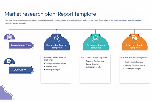
A market research template provides a structured format for gathering, organizing, and interpreting data about target markets, customer segments, and competitive dynamics.
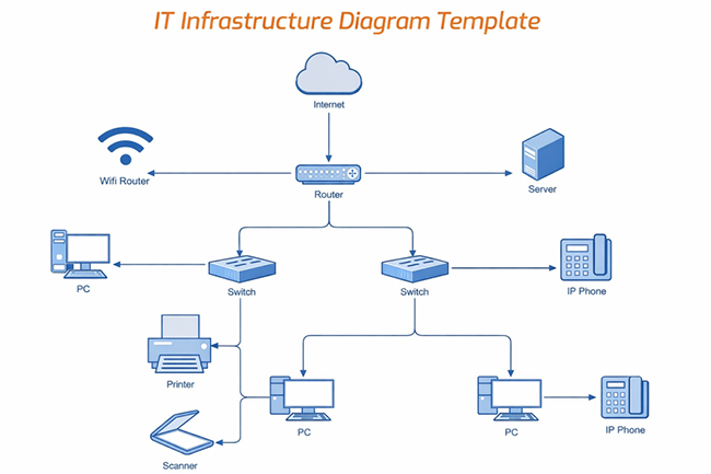
An IT consulting template offers a structured approach for assessing technology systems, identifying gaps, and documenting recommended solutions.
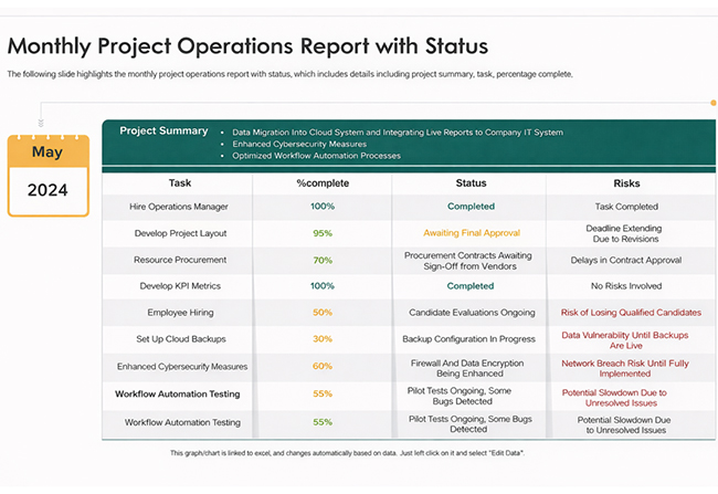
An operations report template tracks and summarizes operational activities, resource utilization, and performance against targets across defined time periods.
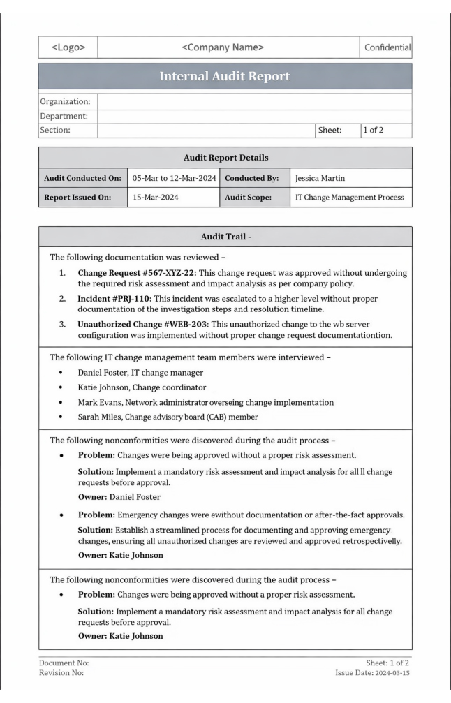
An audit report template documents findings from a formal audit, recording observations, compliance gaps, and the corrective actions recommended.
Seeing a consulting report template in context clarifies its value. These examples show how data insights become structured recommendations that businesses can act on.
Below are three common examples used by consulting firms.
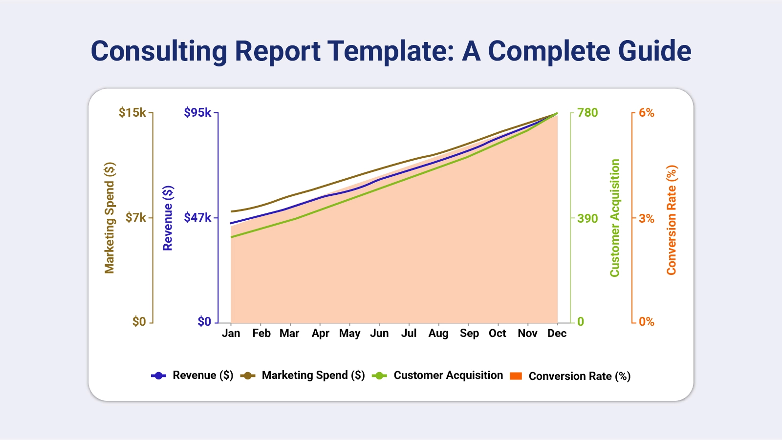
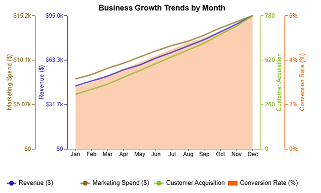
The Monthly Business Growth Trends example tracks consistent gains across revenue, marketing spend, customer acquisition, and conversion rate throughout the year.
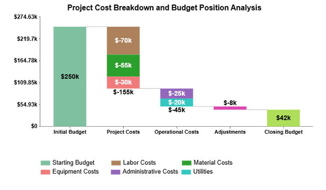
The Project Cost Breakdown example illustrates how individual expense reductions across categories combine to lower total operational costs.
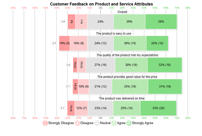
The Customer Feedback on Product and Service Attributes example measures client satisfaction levels across key product and service dimensions.
Building a professional report demands both logical structure and deliberate content choices. A consulting report template guides consultants through each stage so nothing critical gets overlooked.
Follow these steps to create an effective report:
Establish the project’s purpose and specify the questions the analysis must answer before any content is drafted.
Create a logical content framework that covers summaries, supporting findings, and recommendation sections.
Apply consistent heading styles, typography choices, and layout rules across every section of the document.
Reserve space for charts, tables, and insights pulled from an expense report template in Excel or similar data sources.
Incorporate company logos, color schemes, and visual design elements that reflect organizational identity.
Verify that the finished report delivers its insights clearly and conforms to the intended consultation report format before submission.
A consultant report template in Excel turns raw datasets into an organized analysis that supports strategic decisions.
Follow these steps to analyze consulting data effectively:
Pull datasets from relevant sources and arrange them in a clean table structure, which is the foundation of how to create a report in Excel.
Eliminate duplicate entries, resolve inconsistencies, and verify that all values meet accuracy requirements before proceeding.
Apply formulas or pivot tables to aggregate key metrics and surface trends across the dataset.
Transform aggregated data into visual formats that make comparisons and patterns immediately apparent.
While standard charts provide an overview, add-in tools let consultants produce advanced visuals such as Multi Axis Line Charts and comparative dashboards.
Use the visual output to surface patterns, flag risks, and build conclusions comparable to those derived from a cost versus value report.
The chart shows steady monthly growth across key metrics—revenue, marketing spend, customer acquisition, and conversion rate—all increasing consistently from January to December.

A structured consulting report template raises both the quality and the speed of every consulting deliverable. Benefits include:
Strong analytical skills alone do not guarantee a useful consulting report. Certain reporting habits reduce the value of even solid research. Common mistakes include:
An effective consulting report template requires deliberate planning at the design stage. When the structure is sound, even complex insights come through clearly.
Follow these best practices when designing consulting reports:
A consulting report typically opens with an executive summary, followed by a problem statement, methodology, key findings, data visuals, and recommendations that move stakeholders from analysis to a clear course of action.
Length depends on project scope. Focused engagements may require only a concise summary, while complex strategic projects can justify a more detailed document.
A complete report covers project objectives, research methodology, key insights, supporting visuals, and specific recommendations that give stakeholders a foundation for decision-making.
A consulting report centers on analysis and strategic recommendations, whereas a business report primarily documents operational activity or tracks performance against set targets.
A Consulting Report Template gives every client engagement a solid foundation for clear, credible communication. From identifying the core problem through to laying out specific implementation steps, a well-structured format ensures clients receive findings they can act on directly rather than raw data they must interpret without guidance.
Apply the types, components, and best practices covered in this guide to build deliverables that reflect real analytical rigor and professional discipline. When you pair the right template structure with reliable visualization tools, each finished report becomes a stronger and more convincing basis for the strategic decisions your clients need to make.
How much did you enjoy this article?


Calculate accounts receivable turnover ratio to measure credit collection speed, improve cash flow, and strengthen your financial strategy. Read on!

Change Management KPIs are the key to tracking adoption, performance, and ROI during transitions. Find out which metrics matter. Read on!

Data collection methods and techniques determine the quality of every insight you act on. Explore key approaches for gathering reliable data. Read on!


