• Home
  • Tools dropdown img
    • Spreadsheet Charts

      • ChartExpo for Google Sheets
      • ChartExpo for Microsoft Excel
    • Power BI Charts

      • Power BI Custom Visuals by ChartExpo
    • Word Cloud

  • Charts dropdown img
    • Chart Category

      • Bar Charts
      • Circle Graphs
      • Column Charts
      • Combo Charts
      • Comparison Charts
      • Line Graphs
      • PPC Charts
      • Sentiment Analysis Charts
      • Survey Charts
    • Chart Type

      • Box and Whisker Plot
      • Clustered Bar Chart
      • Clustered Column Chart
      • Comparison Bar Chart
      • Control Chart
      • CSAT Survey Bar Chart
      • CSAT Survey Chart
      • Dot Plot Chart
      • Double Bar Graph
      • Funnel Chart
      • Gauge Chart
      • Likert Scale Chart
      • Matrix Chart
      • Multi Axis Line Chart
      • Overlapping Bar Chart
      • Pareto Chart
      • Radar Chart
      • Radial Bar Chart
      • Sankey Diagram
      • Scatter Plot Chart
      • Slope Chart
      • Sunburst Chart
      • Tornado Chart
      • Waterfall Chart
      • Word Cloud
    • Google Sheets
      Microsoft Excel
  • Services
  • Pricing
  • Contact us
  • Blog
  • Support dropdown img
      • Gallery
      • Videos
      • Contact us
      • FAQs
      • Resources
    • Please feel free to contact us

      atsupport@chartexpo.com

Categories
All Data Visualizations Data Analytics Surveys
Add-ons/
  • Google Sheets
  • Microsoft Excel
  • Power BI
All Data Visualizations Data Analytics Surveys
Add-ons
  • Google Sheets
  • Microsoft Excel
  • Power BI

We use cookies

This website uses cookies to provide better user experience and user's session management.
By continuing visiting this website you consent the use of these cookies.

Ok

ChartExpo Survey


Home > Blog > Microsoft Excel

Compound Annual Growth Rate in Excel for Data Insights

Picture yourself as a financial analyst at a thriving technology startup. Your CEO enters your office with shining eyes, brimming with excitement. “We’ve hit a milestone! I need to show our investors our growth trajectory. Can you whip up a report?”

You nod confidently, knowing Excel has your back. As you open a fresh spreadsheet, you recall a powerful tool: compound annual growth rate (CAGR). This metric showcases steady growth over time, perfect for impressing investors.

Compound Annual Growth Rate in Excel

But how do you calculate it? Enter compound annual growth rate in Excel. This versatile software isn’t just for basic math; it’s a powerhouse for complex financial analysis.

Statistics say one in ten people on the planet use Excel. Therefore, it is no surprise that Excel has become the standard for financial modeling and data analysis.

As you delve into your task, you discover the wonders of using compound annual growth rate on Excel. It’s more than just inputting numbers; it’s about narrating a tale. You analyze the figures: your company’s income increased from $1 million to $5 million in three years.

Impressive! But how do you show consistent growth? CAGR is the answer. With a few clicks and formulas, Excel reveals a 71% compound annual growth rate.

Who knew Excel could turn raw data into such a compelling narrative?

Let’s unravel the mastery of compound annual growth rate in Excel.

Table of Contents:

  1. What is the Compound Annual Growth Rate?
  2. How to Calculate Compound Annual Growth Rate?
  3. How to Analyze Compound Annual Growth Rate in Excel?
  4. What are the Advantages and Disadvantages of CAGR?
  5. What are the Tips and Tricks for Calculating CAGR?
  6. Wrap Up

First…

What is the Compound Annual Growth Rate?

Definition: The Compound Annual Growth Rate (CAGR) measures an investment’s average annual growth over a specific period. It accounts for the effect of compounding and shows how much an investment grows year over year.

Unlike simple growth rates, CAGR smooths out fluctuations, providing a clearer picture of steady growth.

To calculate CAGR, divide the final value of the investment by the initial value. Then, raise it to the power of 1 over the number of years and subtract 1.

Businesses and investors use CAGR to assess long-term performance and compare different investments. It’s a reliable indicator of consistent growth.

How to Calculate Compound Annual Growth Rate?

CAGR is the go-to formula for knowing how well your investment has performed over time. Let’s walk through the steps to calculate it easily:

Step 1: Identify the values: Find your investment’s initial and final values. These numbers represent where you began and where you ended.

Step 2: Count the years: Determine the total years the investment was held. This will be your period for the calculation.

Step 3: Apply the Formula

Use the CAGR formula:

CAGR = ( EV/BV)^1/n – 1)

Where:

EV=Ending value

BV=Beginning value

n=Number of years

Step 4: Convert to Percentage: Multiply the result by 100 for the percentage growth rate. You now have the average annual growth rate.

How to Analyze Compound Annual Growth Rate in Excel?

Numbers can overwhelm even the sharpest minds, where spreadsheets often resemble cryptic puzzles.

Enter data visualization, the unsung hero of data analysis. It transforms raw data into digestible insights.

Compound Annual Growth Rate (CAGR) calculations are no exception. They demand clear, visual representation. However, Excel, while powerful, falls short in this arena. Its charting capabilities can be clunky and limited.

But don’t worry; ChartExpo steps in to fill this gap. It’s the ace up the sleeve for data analysts. This tool supercharges Excel’s visualization prowess, turning complex data into compelling visual stories.

With ChartExpo, CAGR analysis becomes a breeze.

Let’s learn how to install ChartExpo in Excel.

  1. Open your Excel application.
  2. Open the worksheet and click the “Insert” menu.
  3. You’ll see the “My Apps” option.
  4. In the Office Add-ins window, click “Store” and search for ChartExpo on my Apps Store.
  5. Click the “Add” button to install ChartExpo in your Excel.

ChartExpo charts are available both in Google Sheets and Microsoft Excel. Please use the following CTAs to install the tool of your choice and create beautiful visualizations with a few clicks in your favorite tool.

Compound Annual Growth Rate Example

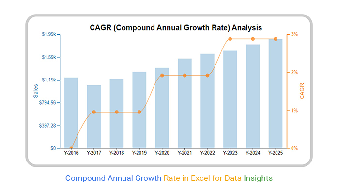
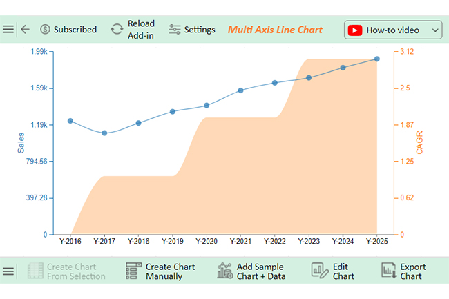
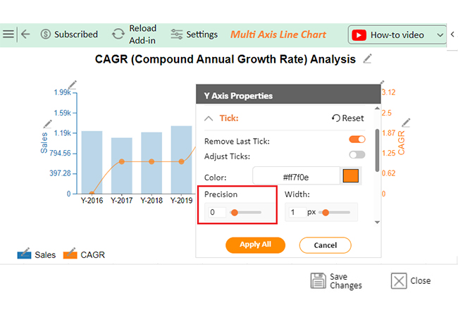
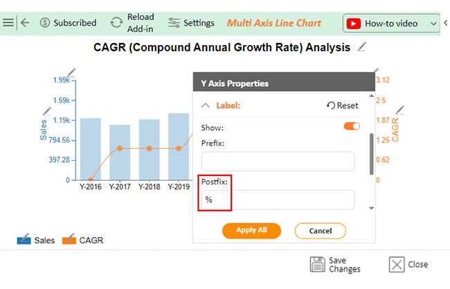
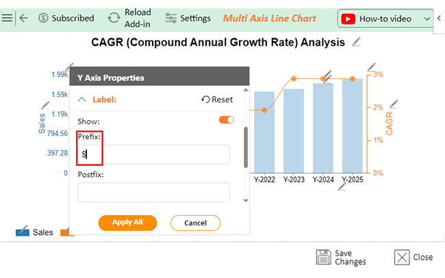
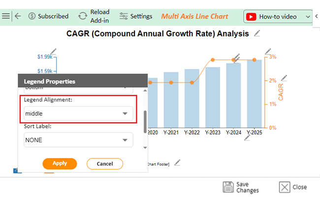
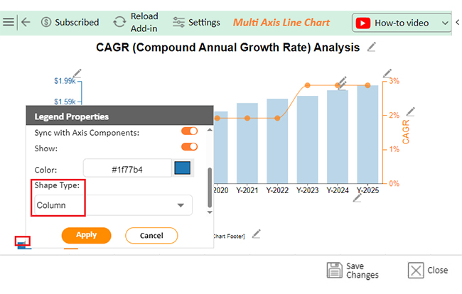
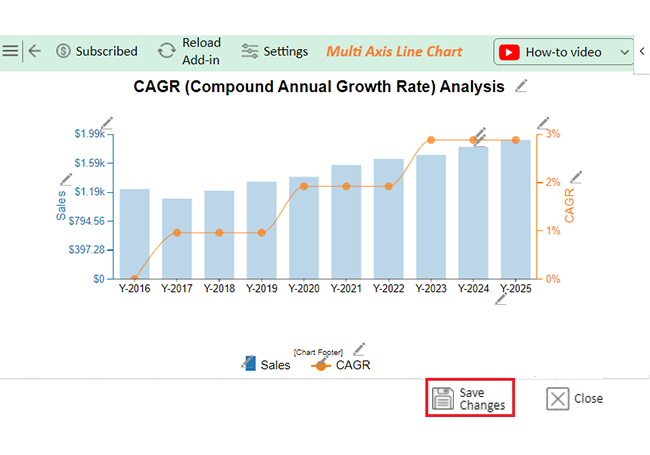
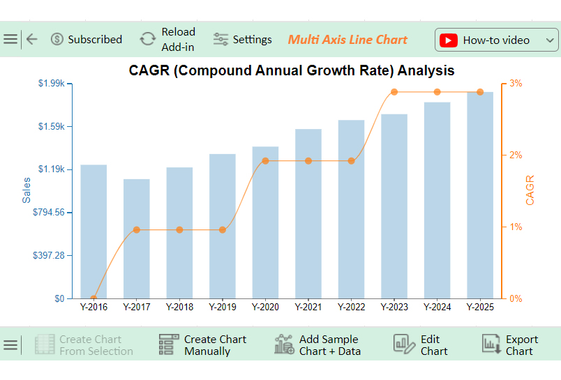
Let’s visualize the CAGR sample data below using ChartExpo and glean valuable insights.

Years Sales CAGR
Y-2016 1237 0
Y-2017 1105 1
Y-2018 1213 1
Y-2019 1337 1
Y-2020 1405 2
Y-2021 1567 2
Y-2022 1650 2
Y-2023 1705 3
Y-2024 1815 3
Y-2025 1910 3
  • To get started with ChartExpo, install ChartExpo in Excel.
  • Now Click on My Apps from the INSERT menu.
insert chartexpo in excel
  • Choose ChartExpo from My Apps, then click Insert.
open chartexpo in excel
  • Once it loads, scroll through the charts list to locate and choose the “Multi-Axis Line Chart”.
search multi axis line chart in excel
  • Click the “Create Chart From Selection” button after selecting the data from the sheet, as shown.
Click Create Chart From Selection After Doing Compound Annual Growth Rate in Excel
  • ChartExpo will generate the visualization below for you.
Initial Visual After Doing Compound Annual Growth Rate in Excel
  • Click on Settings and change the “Data Representation” of Profit Markup into Bar as follows.
Change Data Representation After Doing Compound Annual Growth Rate in Excel
  • If you want to add anything to the chart, click the Edit Chart button:
Click Edit Chart After Doing Compound Annual Growth Rate in Excel
  • Click the pencil icon next to the Chart Header to change the title.
  • It will open the properties dialog. Under the Text section, you can add a heading in Line 1 and enable Show.
  • Give the appropriate title of your chart and click the Apply button.
Add Chart Header After Doing Compound Annual Growth Rate in Excel
  • Change the precision value of CAGR to zero:
Change Precision Value of CAGR to Zero After Doing Compound Annual Growth Rate in Excel
  • You can add the percentage sign with the CAGR value:
Add Percentage Sign with CAGR Value After Doing Compound Annual Growth Rate in Excel
  • You can add the dollar sign with sales:
Add Dollar Sign with Sales After Doing Compound Annual Growth Rate in Excel
  • You can change the legend alignment:
Change Legend Alignment After Doing Compound Annual Growth Rate in Excel
  • You can change the legend shapes into “Column” of Sales and CAGR into “Line and Circle” as follows:
Change Legend Shapes into Column of Sales After Doing Compound Annual Growth Rate in Excel
  • Click the “Save Changes” button to persist the changes made to the chart.
Click Save Changes After Doing Compound Annual Growth Rate in Excel
  • Your final Multi Axis Line Chart will look like the one below.
Final Compound Annual Growth Rate in Excel

Insights

  • Sales data reflects a steady growth trend from 2016 to 2025.
  • Compound Annual Growth Rate (CAGR) began increasing in 2017.
  • From 2020 onwards, growth accelerated significantly.
  • The strongest performance is seen after 2023.

What are the Advantages and Disadvantages of CAGR?

CAGR is a handy tool for investors and businesses alike. It offers a straightforward way to measure growth over time. However, like any metric, it has its pros and cons.

Let’s explore the key advantages and disadvantages of using CAGR.

Advantages of CAGR:

  • Simplicity and clarity: CAGR is easy to calculate and understand, making it a popular choice for investors.
  • Compounds growth: CAGR shows the impact of compounding over time, providing a realistic growth picture.
  • Time comparisons: It helps compare growth over different periods, making it easier to evaluate investments.
  • Neutralizes short-term volatility: CAGR smooths out any short-term fluctuations by focusing on long-term growth.
  • Broad application: It works for investments, business metrics, and personal financial planning.

Disadvantages of CAGR:

  • Ignores volatility: CAGR overlooks the ups and downs that occurred along the way, presenting a smoothed result.
  • There is no reflection of interim performance: It only shows the start and end values, ignoring what happened in between.
  • Sensitive to start and end points: A slight change in these values can significantly affect the CAGR calculation.
  • Misleading for short periods: CAGR may not accurately represent growth or performance for shorter durations. Why? It assumes compound growth, which might not have had enough time to fully take effect.
  • Requires a stable time frame: CAGR becomes less reliable if the period is inconsistent.

What are the Tips and Tricks for Calculating CAGR?

Calculating CAGR is pretty straightforward. But to get the most accurate and meaningful results, there are a few tips to remember. These small adjustments can make a big difference in your analysis and help avoid common pitfalls:

  • Make Adjustments for Non-Annual Periods

CAGR is typically used for annual growth. However, not all investments follow a neat yearly timeline. Therefore, adjust the formula to reflect the exact period if your time frame is shorter or longer than a year. This ensures you’re calculating growth over the correct period.

  • Be Aware of the Time Frame

The time frame you choose can significantly impact the result. A longer time period usually smooths out fluctuations, while a shorter one can exaggerate growth or decline. Always double-check that your chosen time frame is relevant to the context of the data.

  • Avoid Misleading Start and End Values

Choosing unusual or extreme start and end values can distort the CAGR. Ensure the initial and final values accurately represent the time period to avoid misleading results. Outliers at the start or end can drastically affect the growth rate.

  • Use CAGR with Other Metrics

CAGR gives you a clear picture of long-term growth. But it’s best to pair it with other metrics like the standard deviation or internal rate of return (IRR). This helps give a fuller view of investment performance, especially when volatility is involved.

  • Check for Interim Cash Flows

Factor significant cash flows (like dividends or additional investments) during the period into your analysis. Ignoring interim cash flows can lead to inaccurate CAGR calculations, particularly when they significantly impact overall returns.

FAQs

What are the common mistakes when calculating CAGR in Excel?

  • Incorrect start or end values.
  • Misapplication of the CAGR formula.
  • Using inconsistent time periods.
  • Failing to convert percentages properly.
  • Not anchoring cells in formulas when dragging.

How do I display the Compound Annual Growth Rate (CAGR) as a percentage in Excel?

  1. Use the formula = ((End Value/Start Value)^(1/Years))-1.
  2. Format the result as a percentage.
  3. Right-click the cell, select “Format Cells,” then choose “Percentage.”

Can Excel plot the Compound Annual Growth Rate (CAGR) over different periods?

Yes, Excel can plot CAGR over different periods. First, calculate the CAGR for each period. Then, organize the data in a table. Use a line or bar chart to plot the CAGR values, showing growth trends over time.

Wrap Up

Analyzing the Compound Annual Growth Rate (CAGR) in Excel is simple and efficient. With the right formula, you can calculate growth over any time period. Excel makes it easy to organize and compare data.

First, enter your initial and final values. These are the starting and ending points of your data range. Include the number of years for the analysis.

Next, use the CAGR formula. In Excel, this is written as (Final Value / Initial Value)^1/n – 1).

Once you’ve calculated the CAGR, convert the result to a percentage; multiply by 100. This percentage gives a clearer picture of performance.

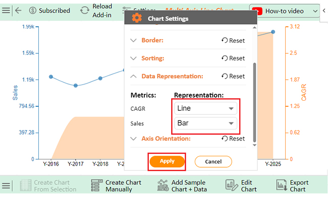
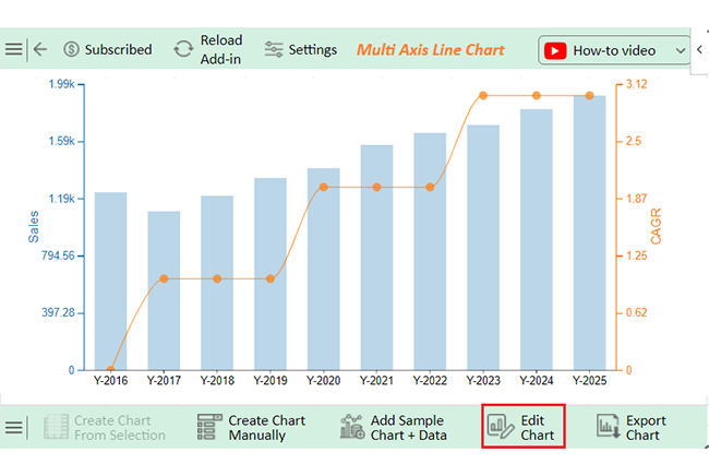
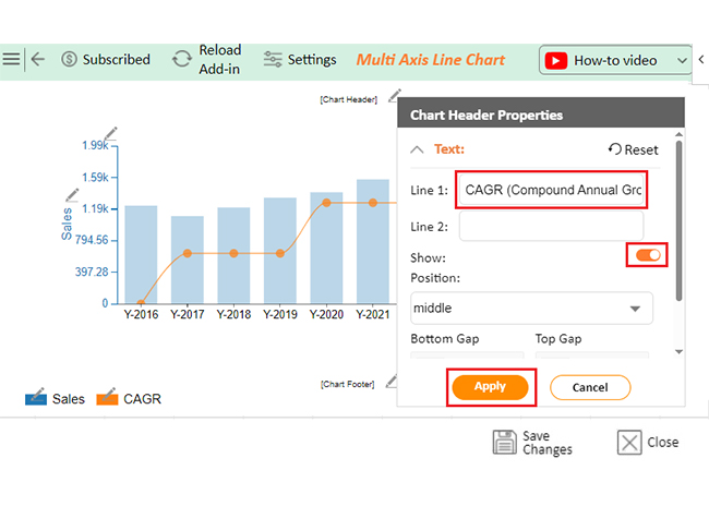
To make your analysis more useful, create graphs in Excel. Visual representations help compare growth rates across different investments. They also make it easier to spot trends.

Lastly, pair CAGR with other financial metrics. This ensures a balanced analysis of the data, and you’ll gain a more comprehensive understanding of growth patterns.

Do not hesitate.

Start using Excel and ChartExpo to analyze CAGR today. This is a powerful way to track investments, providing both clarity and flexibility.

How much did you enjoy this article?

ExcelAd2
Start Free Trial!
142009

Related articles

next previous
Microsoft Excel13 min read

Excel for Teachers for Insightful Preparation

Excel for teachers simplifies grading, tracks attendance, and organizes data. Find its key features, expert tips, and how ChartExpo enhances data visualization.

Microsoft Excel14 min read

How to Make a Cash Flow Diagram in Excel?

Learn how to make a Cash Flow Diagram in Excel. It will help you learn to visualize and analyze inflows and outflows of your business cash flow.

Microsoft Excel11 min read

Succession Planning Template for Long-Term Success

Succession Planning Templates help businesses prepare for leadership changes. Learn to create, analyze, and use them for seamless transitions and growth.

Microsoft Excel10 min read

Grant Tracking Spreadsheet: Insights Made Easy

A Grant Tracker Spreadsheet helps track funding, deadlines, and expenses in Excel. Learn to use grant tracking templates, analyze data, and stay organized.

Microsoft Excel10 min read

What is Excel Software Used for: A Complete Guide

What is Excel software used for? It organizes, analyzes, and manages data. Explore its workplace applications, benefits, and top tips for efficiency and more.

ChartExpo logo

Turn Data into Visual
Stories

CHARTEXPO

  • Home
  • Gallery
  • Videos
  • Services
  • Pricing
  • Contact us
  • FAQs
  • Privacy policy
  • Terms of Service
  • Sitemap

TOOLS

  • ChartExpo for Google Sheets
  • ChartExpo for Microsoft Excel
  • Power BI Custom Visuals by ChartExpo
  • Word Cloud

CATEGORIES

  • Bar Charts
  • Circle Graphs
  • Column Charts
  • Combo Charts
  • Comparison Charts
  • Line Graphs
  • PPC Charts
  • Sentiment Analysis Charts
  • Survey Charts

TOP CHARTS

  • Sankey Diagram
  • Likert Scale Chart
  • Comparison Bar Chart
  • Pareto Chart
  • Funnel Chart
  • Gauge Chart
  • Radar Chart
  • Radial Bar Chart
  • Sunburst Chart
  • see more
  • Scatter Plot Chart
  • CSAT Survey Bar Chart
  • CSAT Survey Chart
  • Dot Plot Chart
  • Double Bar Graph
  • Matrix Chart
  • Multi Axis Line Chart
  • Overlapping Bar Chart
  • Control Chart
  • Slope Chart
  • Clustered Bar Chart
  • Clustered Column Chart
  • Box and Whisker Plot
  • Tornado Chart
  • Waterfall Chart
  • Word Cloud
  • see less

RESOURCES

  • Blog
  • Resources
  • YouTube
SIGN UP FOR UPDATES

We wouldn't dream of spamming you or selling your info.

© 2025 ChartExpo, all rights reserved.